How in-camera tricks, colourful paper and patience brought Sam Nicklin’s reflective photographs for Alessi to life
The photographer’s collaboration with the iconic Italian homeware brand is a key reminder that “simple ideas can often have the biggest impact.”
The Italian brand Alessi has become a beacon of well-designed homeware since its inception in 1921 because of its unique approach to product creation; namely, its collaboration with those you wouldn’t typically find conjuring up kettles and coffee pots. Commissioning industrial designers and architects to design its products (including the likes of Frank Gehry and Zaha Hadid), has left Alessi with products that feel like feats of engineering: with sharp edges, mechanical quirks and unconventional curves, all enhanced by the brand’s common usage of polished steel. With such a natural point of creative intrigue, when the photographer Sam Nicklin had the chance to photograph some of the brand’s most iconic wares, he was set on not only putting their distinctive forms front and centre, but using in-camera tricks to exaggerate and elevate them even further.
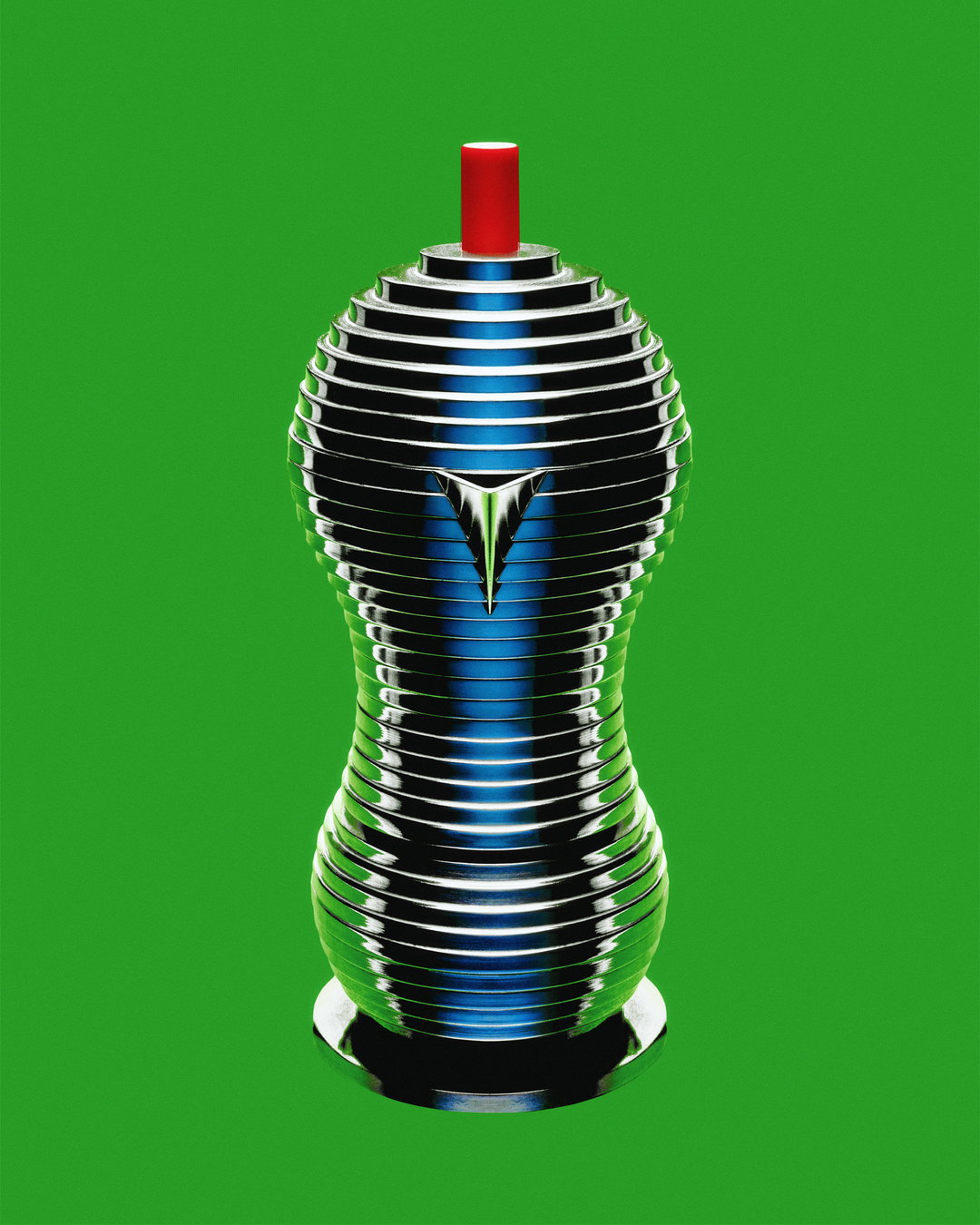
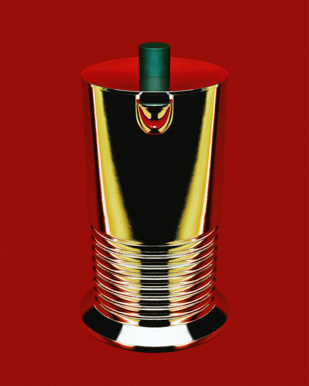
Sam’s always been a fan of the brand, not only for its sleek products but its legacy of tongue-in-cheek advertising too. “They have a way of combining clean, considered design with a sense of humour, which is something I like to bring into my own work as well,” says Sam. To simply try his luck Sam slid into the brand’s Instagram DMs and ended up landing a project with them. Sam wanted to stay true to the brand’s legacy while putting a personal spin on it, and he pitched a series – Chrome & Colour – that combined aspects of Alessi’s vintage advertising with his penchant for bold colour combinations, as demonstrated in the photographer’s Colours series, where he created photo collages of meticulously collected and curated items all of the same hue.
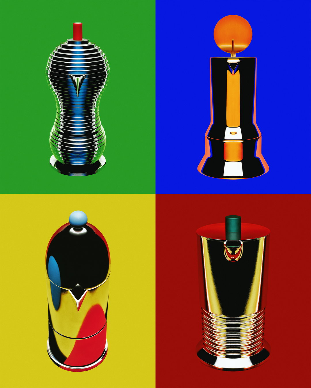
Sam Nicklin: Chrome & Colour (Copyright © Sam Nicklin, 2026)
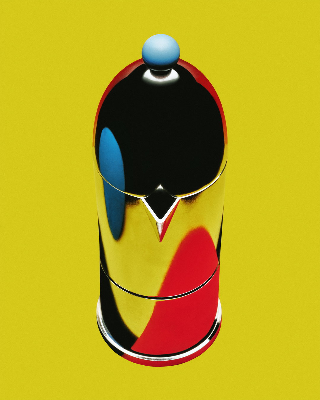
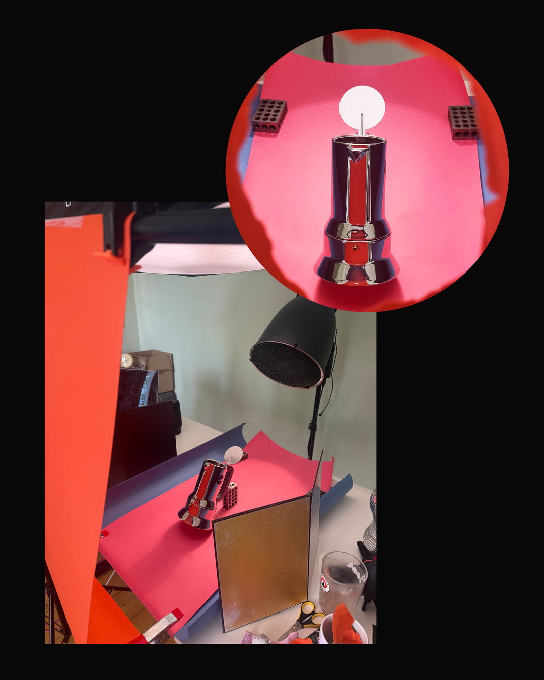
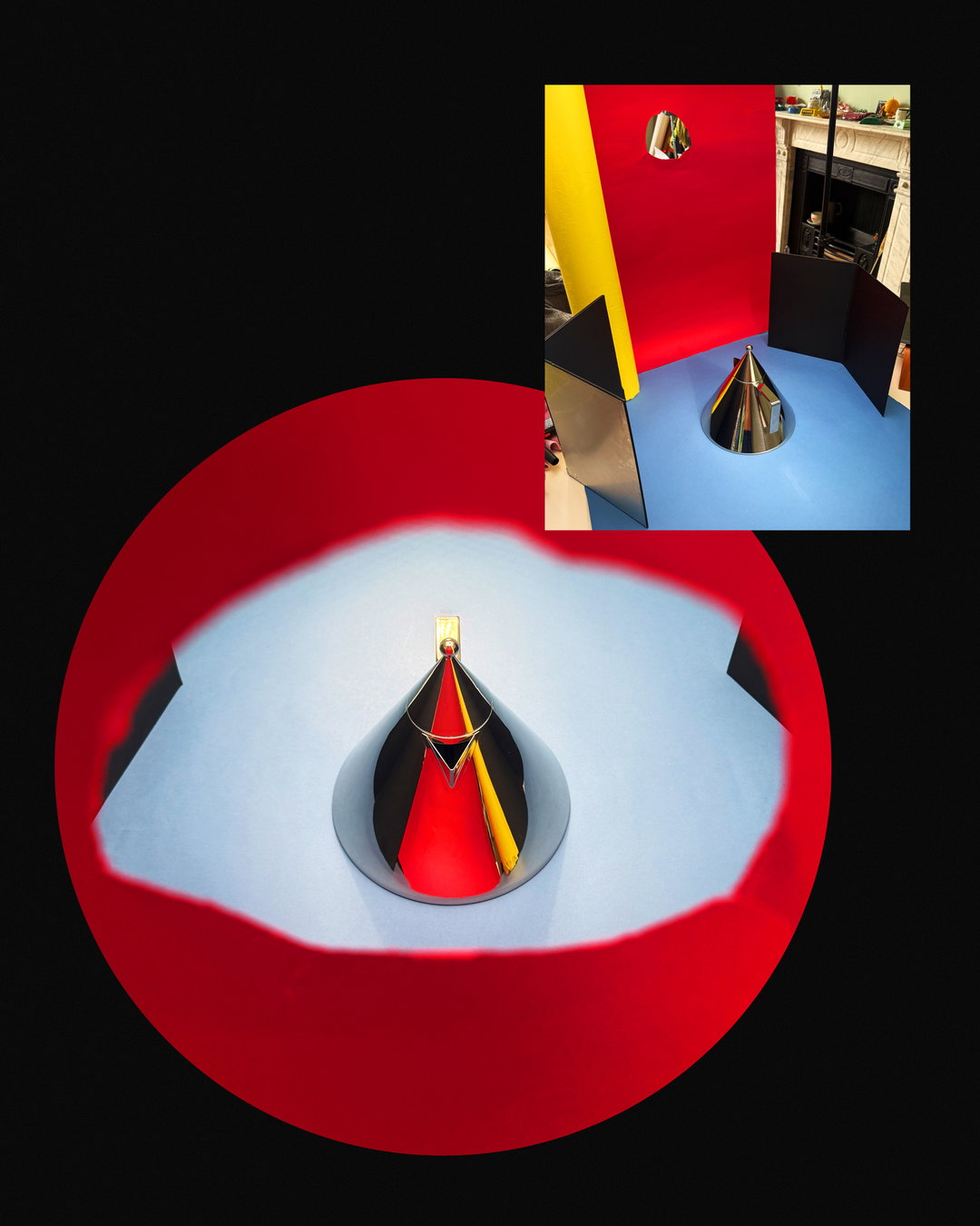
“My main goal was to define the silhouette of each object through colour in the reflections, using negative space and keeping highlights to a minimum to really make them pop,” says Sam. Then, he followed up with his poppy approach to colour-grading in post, to give the images the feel of adverts from the 1970s and 80s. To master the coloured reflections, Sam went truly analogue, using the time-consuming process of holding sheets of coloured paper cut to different shapes and moving them around the objects until the reflection was exactly as he envisaged. While it’s commendable that everything was done in-camera, it was, in fact, actually somewhat unavoidable. “I was slightly limited by the fact that I still don’t own a tripod which, at this stage in my career, is daft,” Sam admits. “It meant I couldn’t composite multiple images or keep the camera locked off while fine-tuning the reflections, so everything had to be done in-camera.”
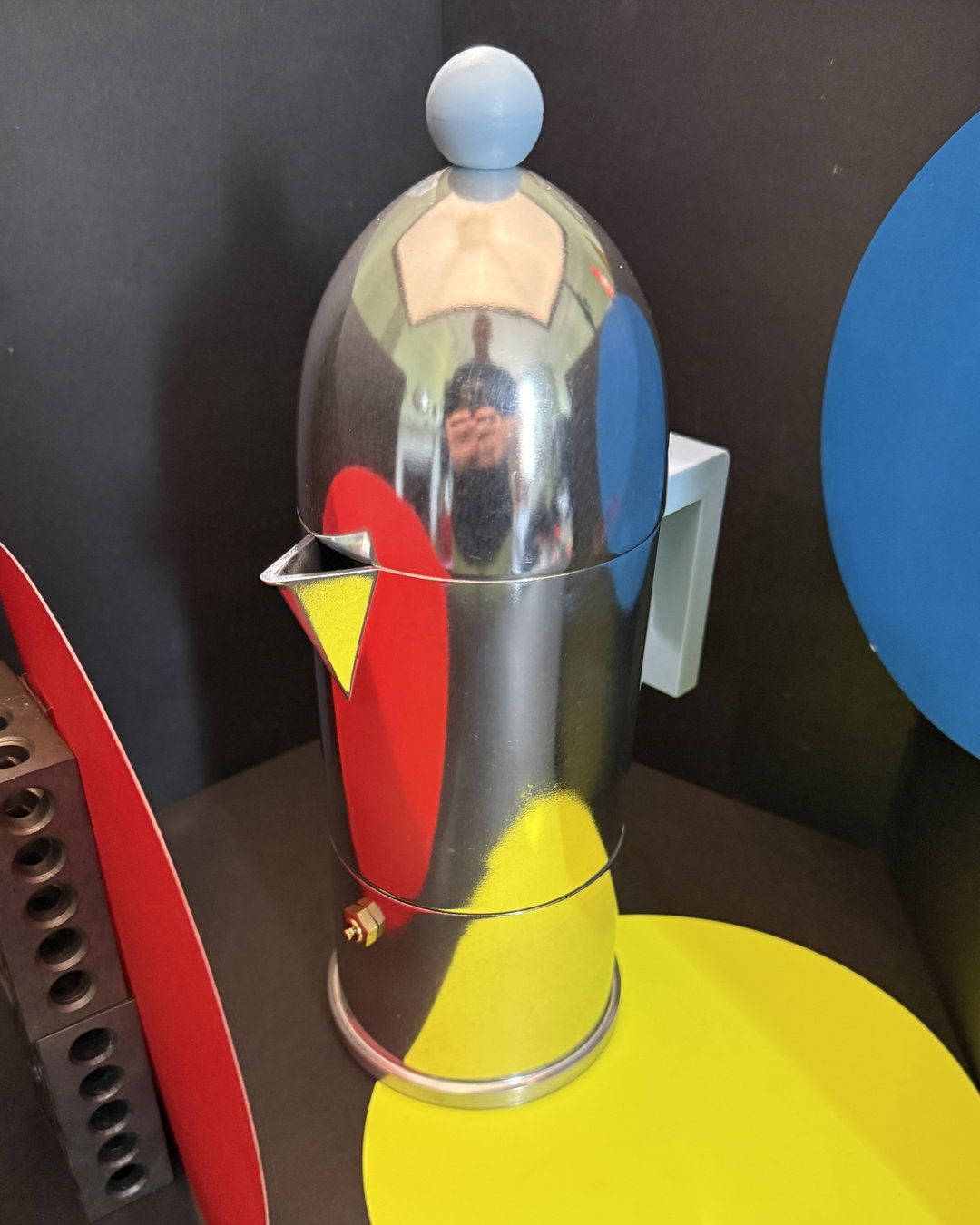
One product’s image took significantly longer to perfect than others: the La Cupola, a sleek espresso coffee maker which Sam initially just couldn’t quite get right, in part down to its taller form and domed top, which made getting clean reflections more tricky. Sam tried a wide angle, only to find it made it look more “surreal” and so detached from the rest of the series, while a symmetrical reflection ended up making it look too much like a rocket, “which is definitely not the vibe”, Sam adds. Eventually Sam settled on a slight angle with reflections made with small circles of coloured card, which created “pockets of colour” and broke up the domed surface of the lid. “If I’m honest, it was the piece that tested my patience the most, but it’s become my favourite,” says Sam.
If there’s one thing that the Alessi project has reminded Sam, it’s that “simple ideas can often have the biggest impact”. He continues: “Although the process itself was quite technical and took a lot of patience, the final images are built from a very simple combination of colour, light and polished steel.” In a landscape of bland product photography, we need more inventive ways of showing goods – especially those with such singular design – and Sam’s work for Alessi is perfect proof that when used with consideration, a creative’s personal vision and flair can in fact enhance a brand’s distinct wares, rather than overshadow them.
GallerySam Nicklin: Chrome & Colour (Copyright © Sam Nicklin, 2026)



GallerySam Nicklin: Chrome & Colour BTS (Copyright © Sam Nicklin, 2026)
Share Article
Further Info
About the Author
—
Olivia (she/her) is associate editor of the website, overseeing the day-to-day editorial projects as well as Nicer Tuesdays events. She joined the It’s Nice That team in 2021. ofh@itsnicethat.com
To submit your work to be featured on the site, see our Submissions Guide.