Ovarian Cancer Action rebrand by Revolt strikes just the right tone
Featuring illustrations by Cécile Dormeau, and a subtly clever logo, the charity’s new identity is impactful and hopeful, while recognisable in its sector.
Last year, we covered Revolt London’s clever campaign against loneliness, using tobacco merchandising to draw attention to an often overlooked issue. Now, the purpose-led creative agency has set its sights on another equally important subject: ovarian cancer. According to Cancer Research UK, ovarian cancer is the sixth biggest cause of cancer death among females in the country, and many charities have been set up over the years to raise awareness of the disease. One such charity is Ovarian Cancer Action (OCA), which is based in London and recently became the focus of Revolt’s latest branding project.
Eager to stand out against a sea of other charities working in this area, the team at OCA asked Revolt to refresh its branding and tone of voice, helping to turn it into an organisation that can cut through the noise with their proactive messaging and ambitious mission. Myron Darlington, creative director of Revolt, says the key to this transformation was finding a way to push the visual conventions of the category, whilst retaining its roots.
Revolt London: Ovarian Cancer Action (Copyright © Revolt London, 2024)
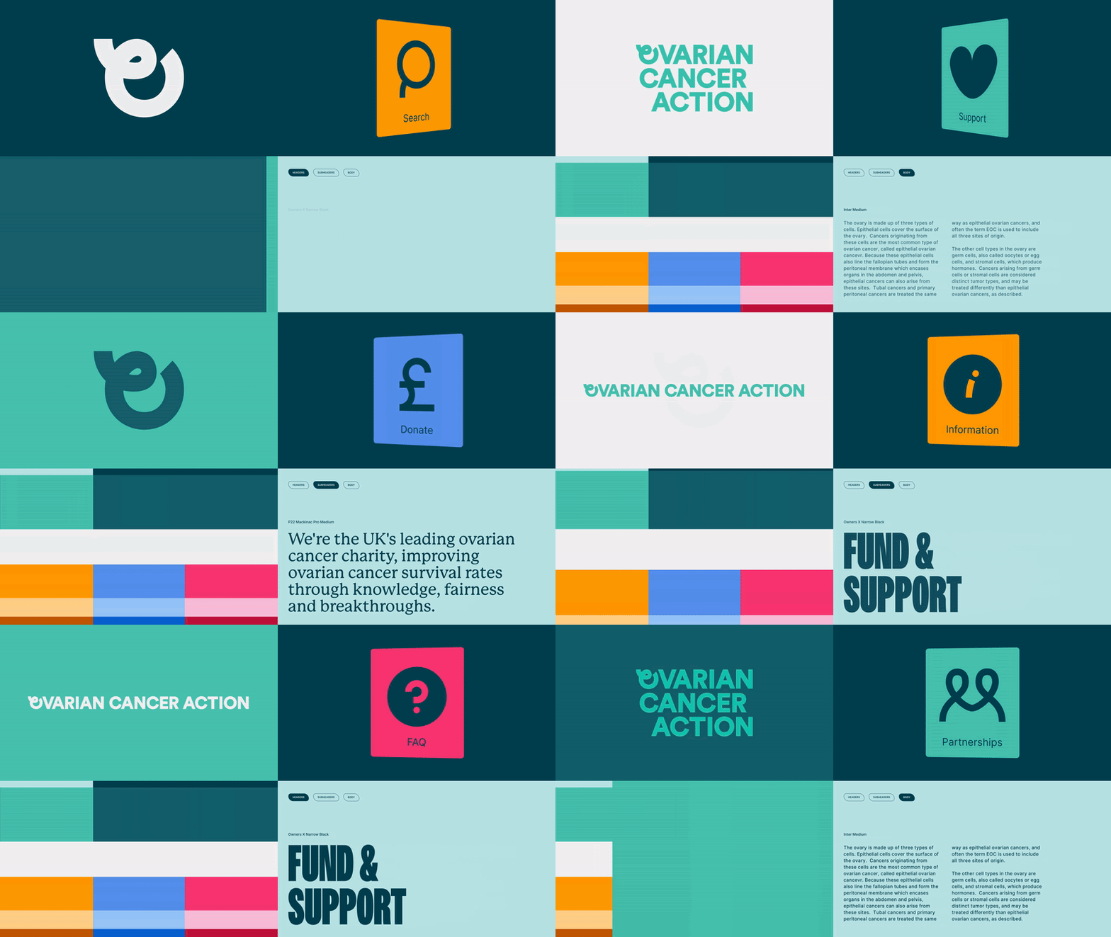
“Charities in this space are tied to a well-established visual language, with a reliance on teal and the cancer ribbon,” he explains. “While these elements form an important foundation of the identity that we didn’t want to fully depart from, we saw an opportunity to build the identity around a bolder and more impactful visual approach.”
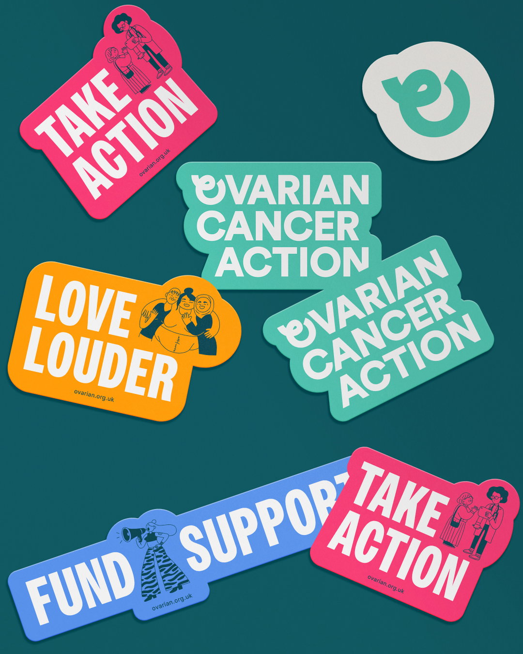
Most importantly, the OCA logo needed a facelift, so the team at Revolt took it upon themselves to develop a new symbol for the brand, using the iconic shape of the cancer ribbon and teasing it into an ‘O’ that many people will recognise as a symbol for cancer. The slinky form is also reminiscent of an ovary, further cementing the link between OCA’s branding and the specific cause that it stands for. This logo has been neatly slotted into the logotype for the brand, providing cohesion across the visual system.
In terms of the typography, Revolt opted for Circular Bold for the logotype, because it “carries the impactful character that we wanted when moving to an uppercase logo” and “it complements the other brand fonts used [whilst remaining] distinct from them”. Elsewhere, Owners, a display font by the MCKL type foundry, serves as the headline font, while P22 Mackinac Pro is used for the subtitles, due to its “rounded terminals and humanist forms [which provide] a balanced contrast to the dominant headlines”.

Revolt London: Ovarian Cancer Action (Copyright © Revolt London, 2024)
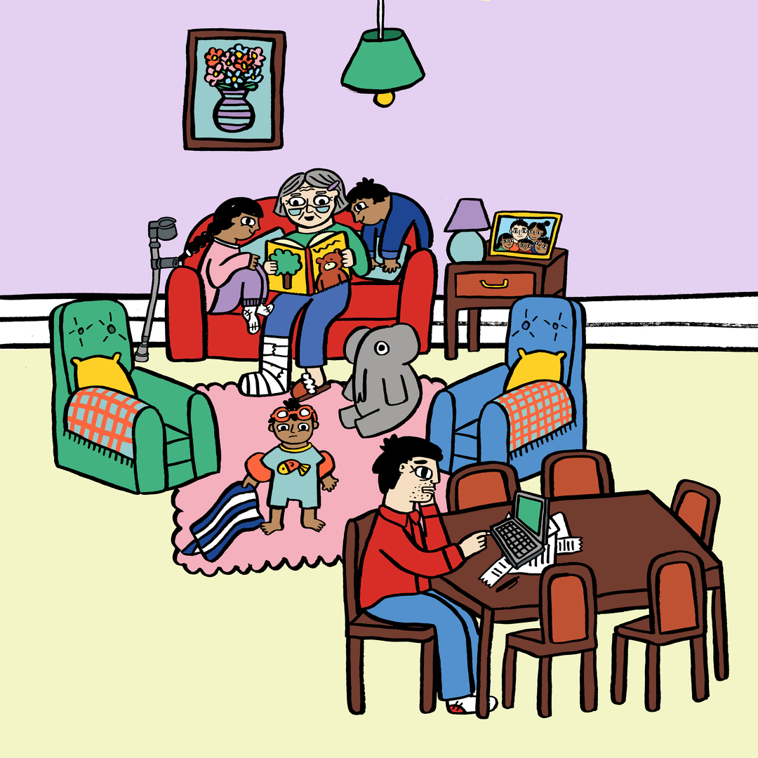
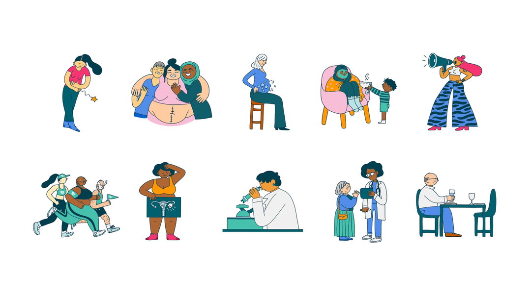
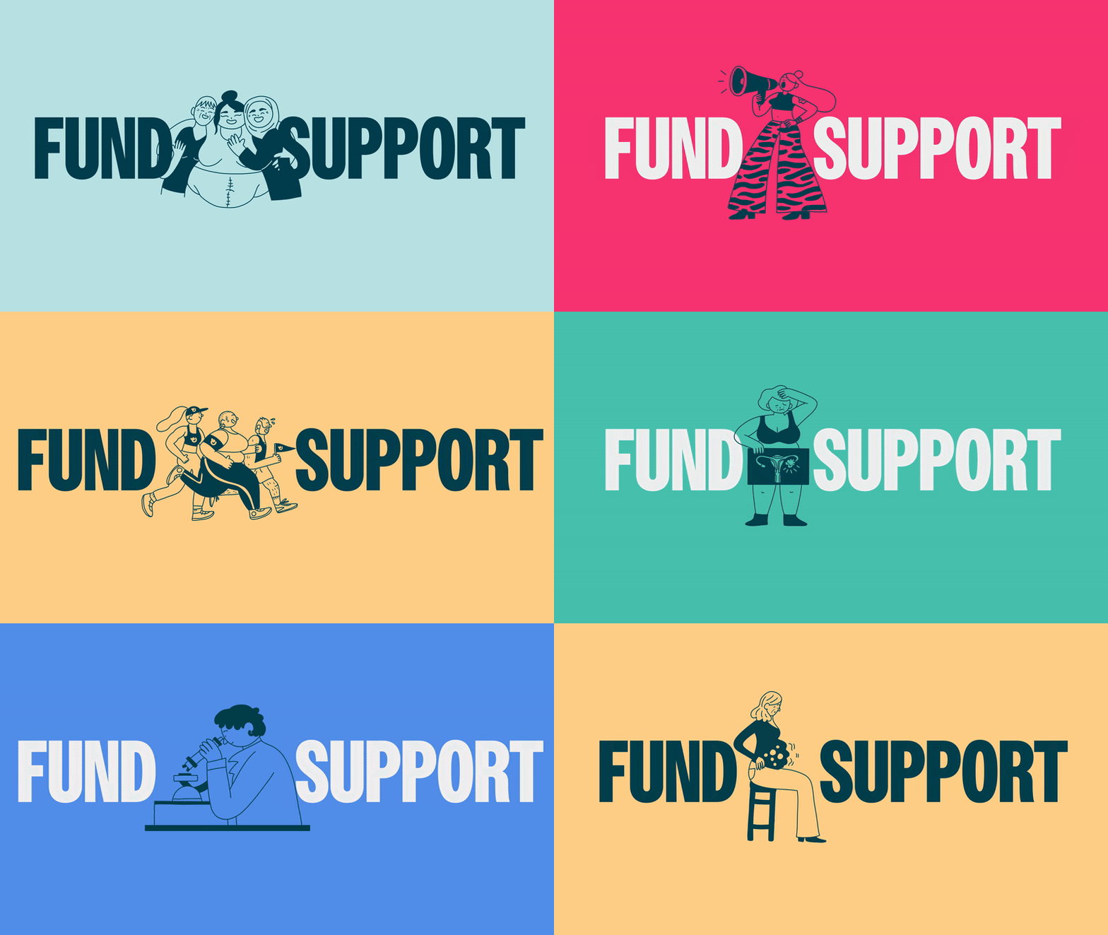
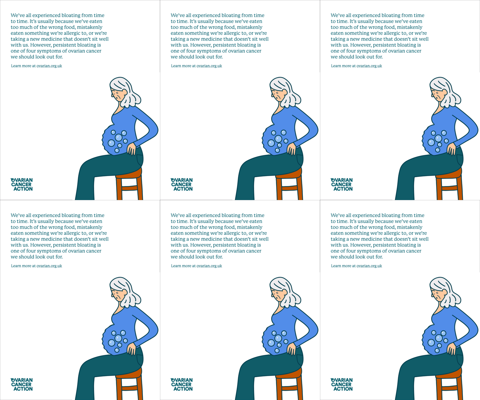
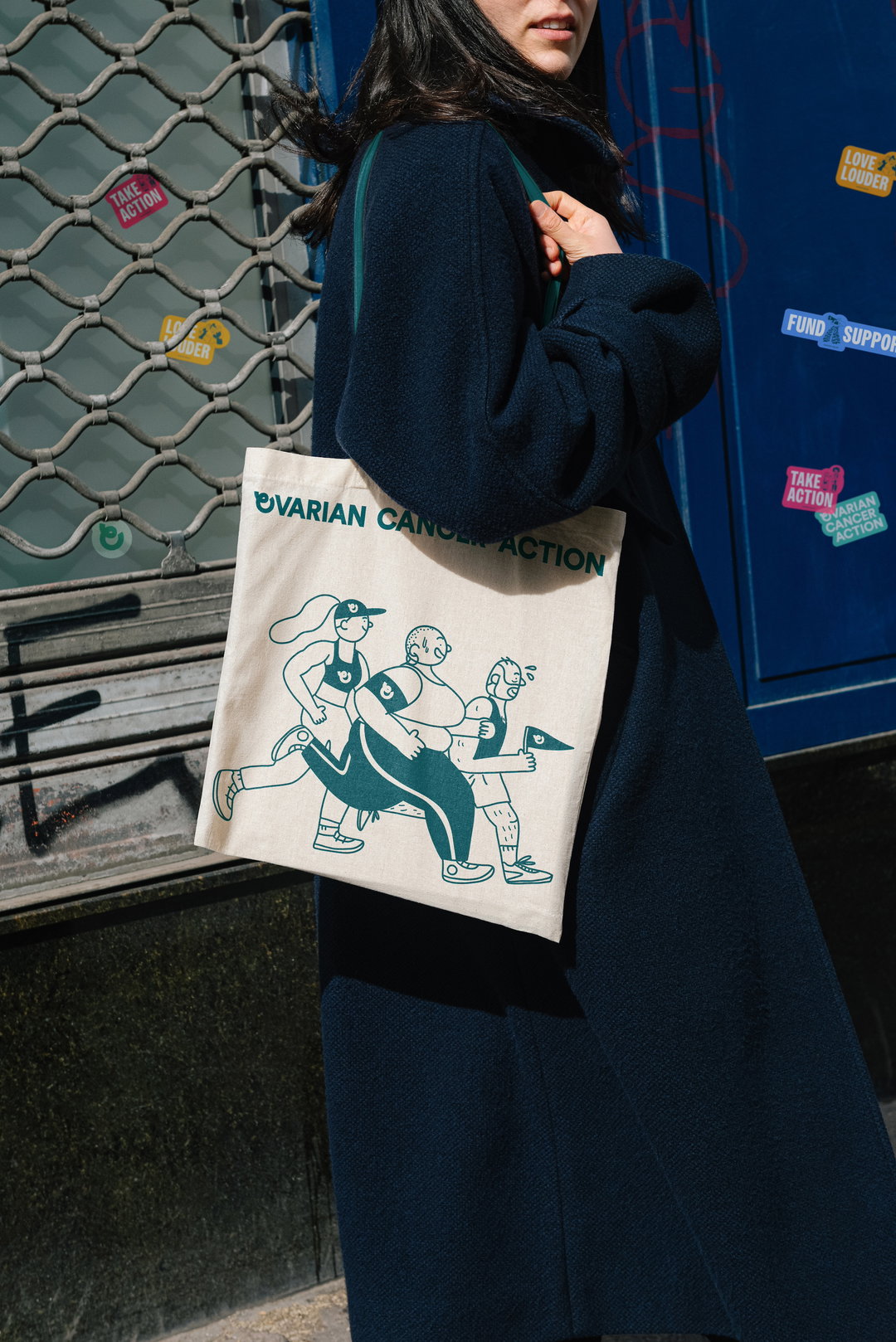
Aside from the design elements created by Revolt, the branding also features a selection of illustrations by French artist Cécile Dormeau, who has depicted much of the range of emotions experienced by ovarian cancer sufferers and their loved ones. In her drawings, we see a collection of figures representing different parts of the journey, from diagnosis and treatment to recovery and even loss. Dormeau’s bright yet intimate style gives a realistic perspective on the disease, and highlights the importance of raising awareness and spreading hope.
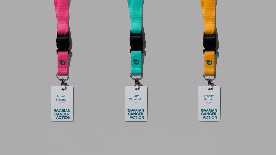
The final piece of the puzzle for Revolt was to develop a stand-out colour palette for OCA. Much like the imagery of the ribbon, the designers were reluctant to completely abandon convention here, and stuck with the teal hue that many other charities in this category use. However, they also combined this core colour with bolder shades of orange, blue and pink, helping to differentiate OCA from the crowd. These shades also directly correlate to the organisation’s core values, with orange representing energy and vibrancy, blue representing trust and expertise, and pink representing warmth and optimism.
Speaking on the overall project, Shahina Ahmed, senior designer at Revolt says: “The brand identity is strategically positioned at the intersection of assertiveness and empathy. It's a balancing act, aiming to embody our tone of voice principles to ‘grab attention’, ‘be the trusted expert’ and ‘inspire action’. The visual language is designed to be dynamic and capable of shifting tone to suit different contexts through a design system that is both bold and nuanced.”
GalleryRevolt London: Ovarian Cancer Action (Copyright © Revolt London, 2024)

Hero Header
Revolt London: Ovarian Cancer Action (Copyright © Revolt London, 2024)
Share Article
Further Info
About the Author
—
Daniel joined It’s Nice That as an editorial assistant in February 2019 and continues to work with us on a freelance basis. He graduated from Kingston University with a degree in Journalism in 2015. He is also co-founder and editor of SWIM, an annual art and photography publication.