Inclusive Sans makes the case for accessibility being standard, not secondary
Olivia King’s legibility-first type family looks to change the conversation around readability in type design – where accessibility is default and not supplemental.
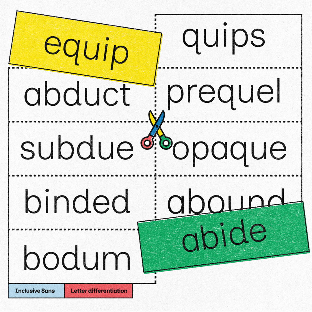
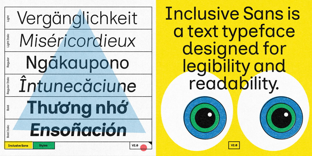
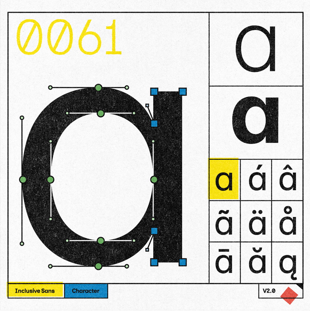
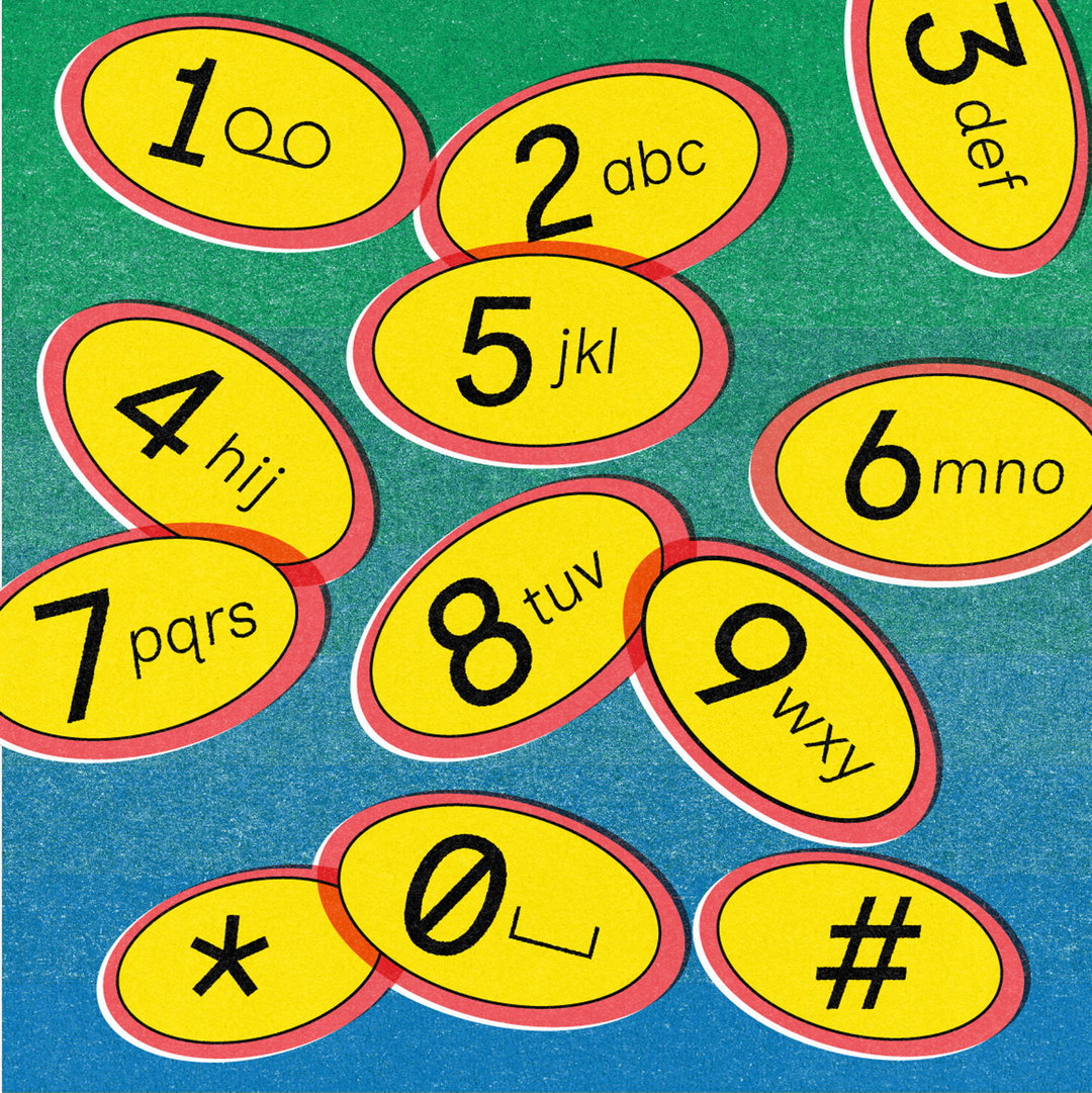
Inclusive Sans is a new typeface from Olivia King that puts accessibility at the forefront. It’s arisen from the type designer’s research into typographic accessibility and readability – from highly regarded traditional guides and papers to more modern approaches to letterform legibility. “A few years ago, I was working on branding projects in the disability and government sectors, where accessibility was always a big focus,” Olivia tells It’s Nice That. Olivia wanted to take things a step further, however, and she and her colleague, Jo Roca, began to explore typographic accessibility at the character level rather than through the typeface as a whole.
Leading the pair down numerous rabbit holes, it also introduced them to Sophie Bier’s research papers and book, Reading Letters. “It was fascinating but also frustrating because there weren’t many typefaces that actually met [Sophie’s] accessibility standards, and the ones that did often didn’t feel quite right for branding,” says Olivia. “Comic Sans is one of the most accessible fonts out there, but it’s probably not the look you’d want for, say, a disability advocacy organisation working in policy and research.”
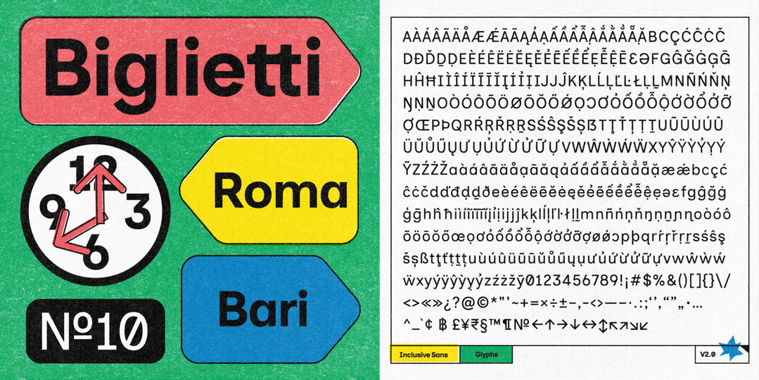
Olivia King: Inclusive Sans (Copyright © Olivia King, 2025)
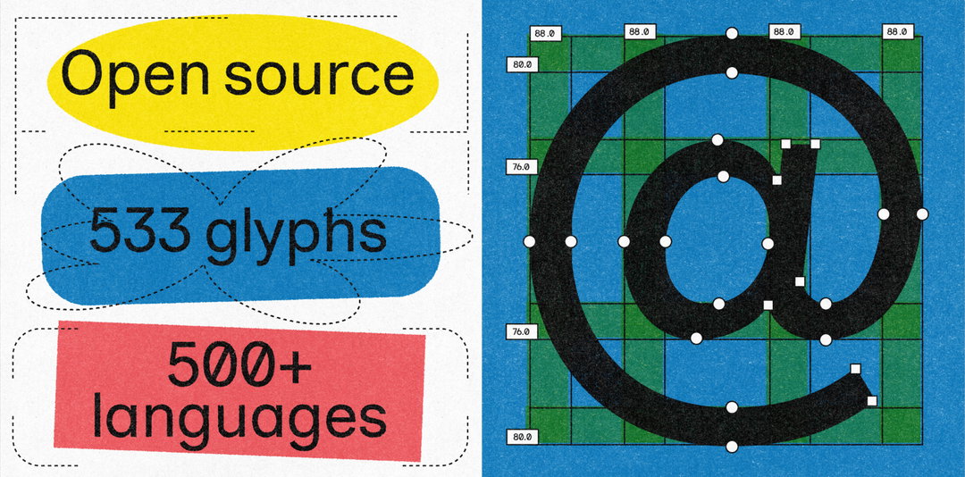
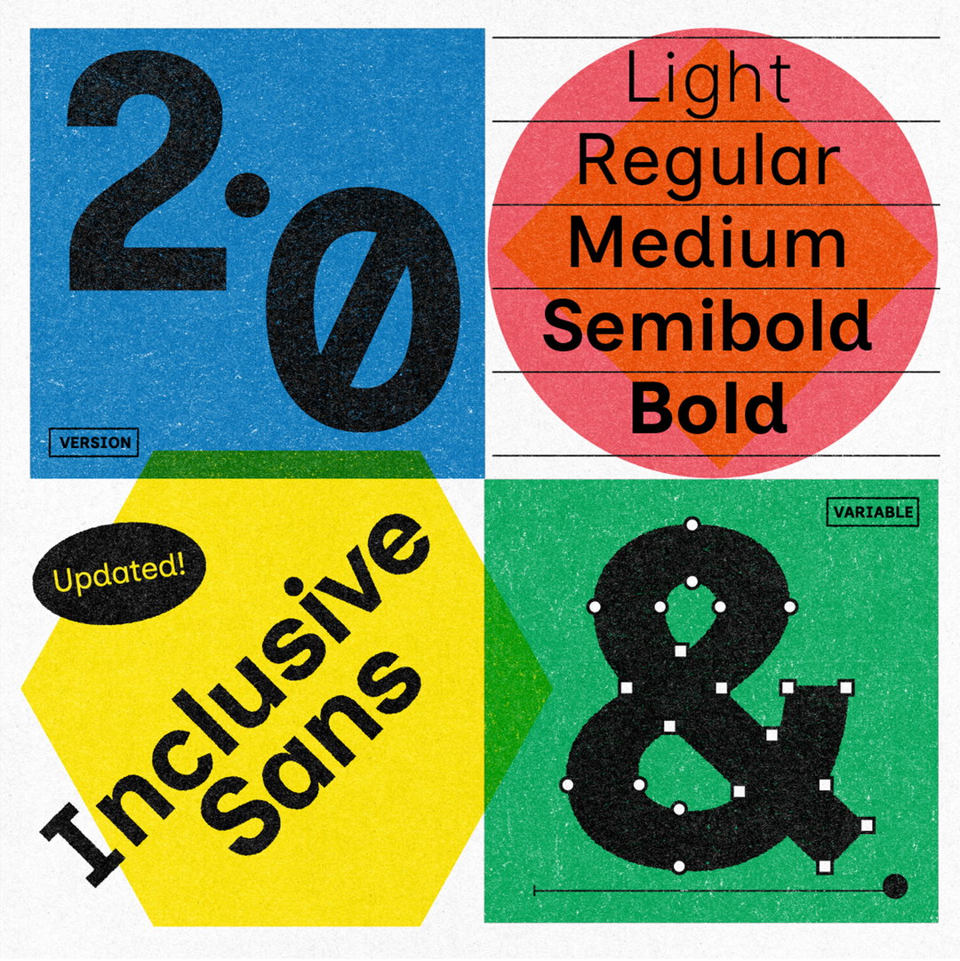
In taking on the challenge to create a slick, contemporary, uber-accessible sans serif, Inclusive Sans was born, originally released in 2022 with one regular weight and corresponding italic style. In 2025, now fully open-source and freely available on Google Fonts, Inclusive Sans 2.0 was released in all its fully variable, five-weight glory. “The latest update expands Inclusive Sans into a full ten-style family,” Olivia says, “which meant a lot of redrawing and tweaking to make sure everything worked smoothly.”
It’s now exponentially more versatile, and can be used across tiny UI text to big, bold headlines, something proven in practice. “I had an email from a company in the US who were using Inclusive Sans for an app they had developed for schools to plan and track nutrition in their lunches,” she recalls. The email sender also included a side-by-side comparison of the interface with Inclusive Sans and with another accessible typeface. “It was amazing to see the difference,” Olivia says, with her typeface showcasing how objectively easier to read everything was. “That kind of real-world impact is exactly what I hoped for when designing Inclusive Sans,” says Olivia.
Considering the typeface’s further applications in the real world, Olivia hopes to see it more where readability matters most, namely in public spaces. “The whole idea behind Inclusive Sans was to create something highly functional but also nice enough that it could fit in anywhere,” Olivia ends, “so that accessibility isn’t an afterthought, but just the default.”
GalleryOlivia King: Inclusive Sans (Copyright © Olivia King, 2025)
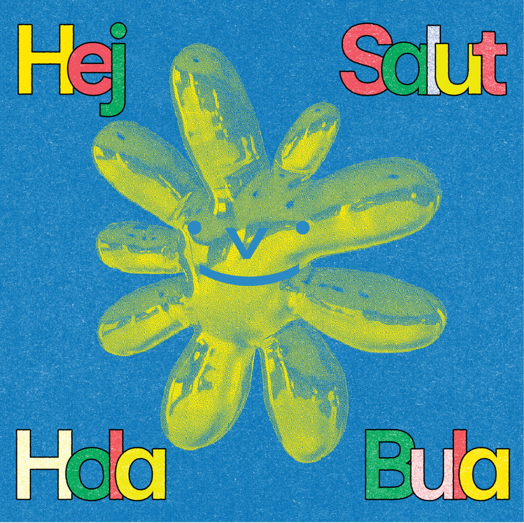
Hero Header
Olivia King: Inclusive Sans (Copyright © Olivia King, 2025)
Share Article
About the Author
—
Hailing from the West Midlands, and having originally joined It’s Nice That as an editorial assistant in March 2020, Harry is a freelance writer and designer – running his own independent practice, as well as being one-half of the Studio Ground Floor.