




Montreal-based studio Nother balances “timeless and contemporary” graphic design
Simon Langlois, the studio’s founder humbly accepts that Nother is just “another studio,” but his work is nonetheless ambitious.
Share
“Collaboration,” begins Montreal-based designer Simon Langlois, “is crucial in my lifestyle.” Having started his studio Nother (officially) in August last year, he functions alongside a vast network of collaborators to produce a graphic output largely centred on visual identities.
The name of the studio, he tells us, is “a diminutive of 'another', a somewhat ironic nod to the large number of young professionals who leave big agencies or studios to start their own project.” From the outside, Nother is just “another studio” and Simon’s goal is to create work which stands out on its own, not because of the studio’s “flashy presence.” He adds: “We humbly accept that we’re just another studio, but what we create is ambitious.”
When it comes to the studio’s approach, Simon explains that it’s all about the right sources of inspiration and influences. He looks for inspiration on a project-to-project basis, attempting to find exact and specific references. “This helps me extract the creative essence and, ultimately, communicate in a more effective manner,” he explains. “The creative angle that I believe in is concerned not only with the main elements of a project, but also with all the small details that are the cornerstone of coherence and innovation for me. I also have great concern for the balance between timeless and contemporary design.”
This breadth of references, of course, means Simon’s projects change aesthetically depending on the brief. In fact, having a signature visual language is something he actively avoids. “My ambition on each project is to reinvent my visual approach constantly,” he says. “I don’t rely on trendy styles, I force myself to build a visual identity that is derived from the personality and peculiarities of my clients.”
Nother: vinvinvin
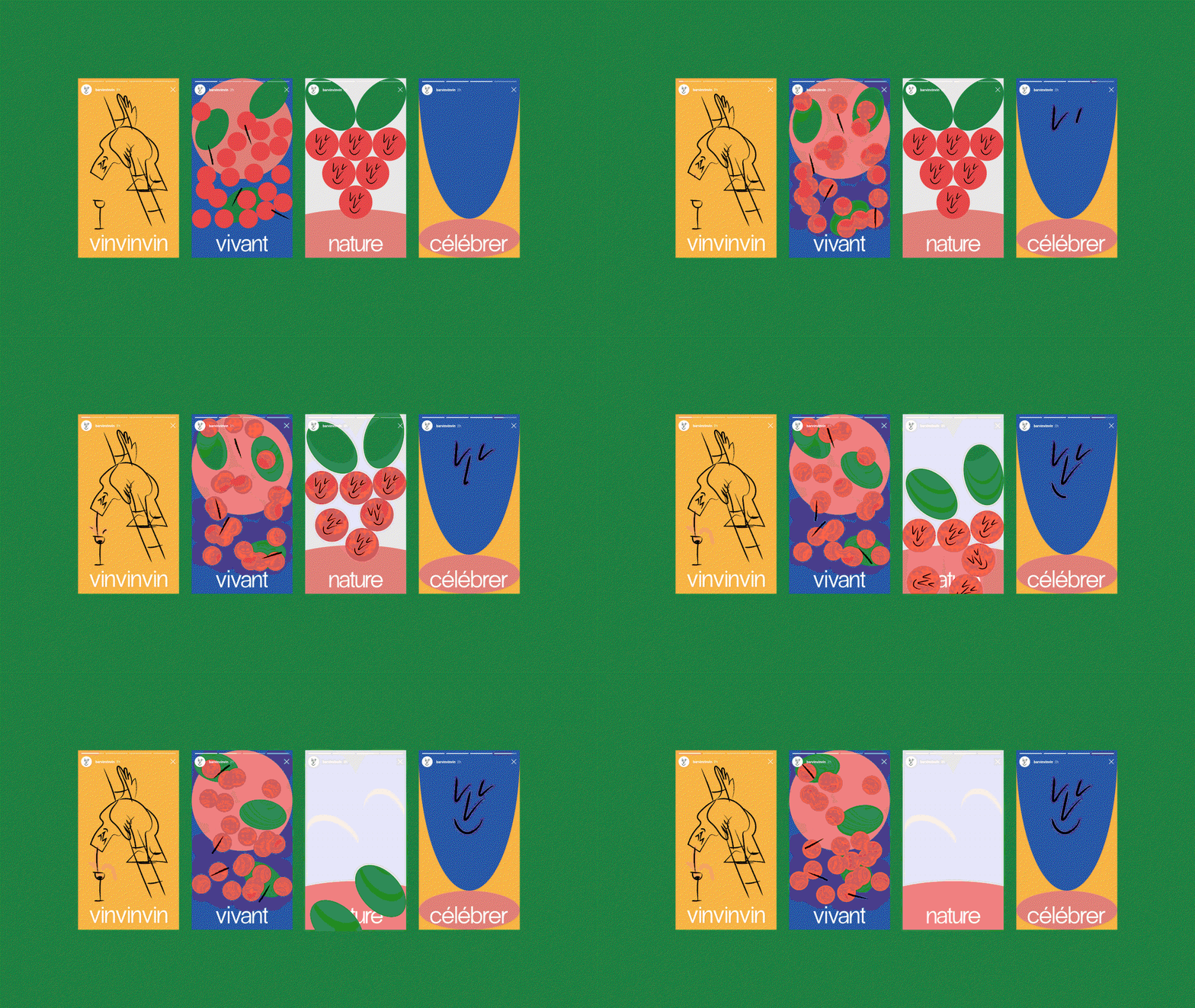
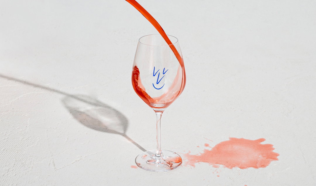
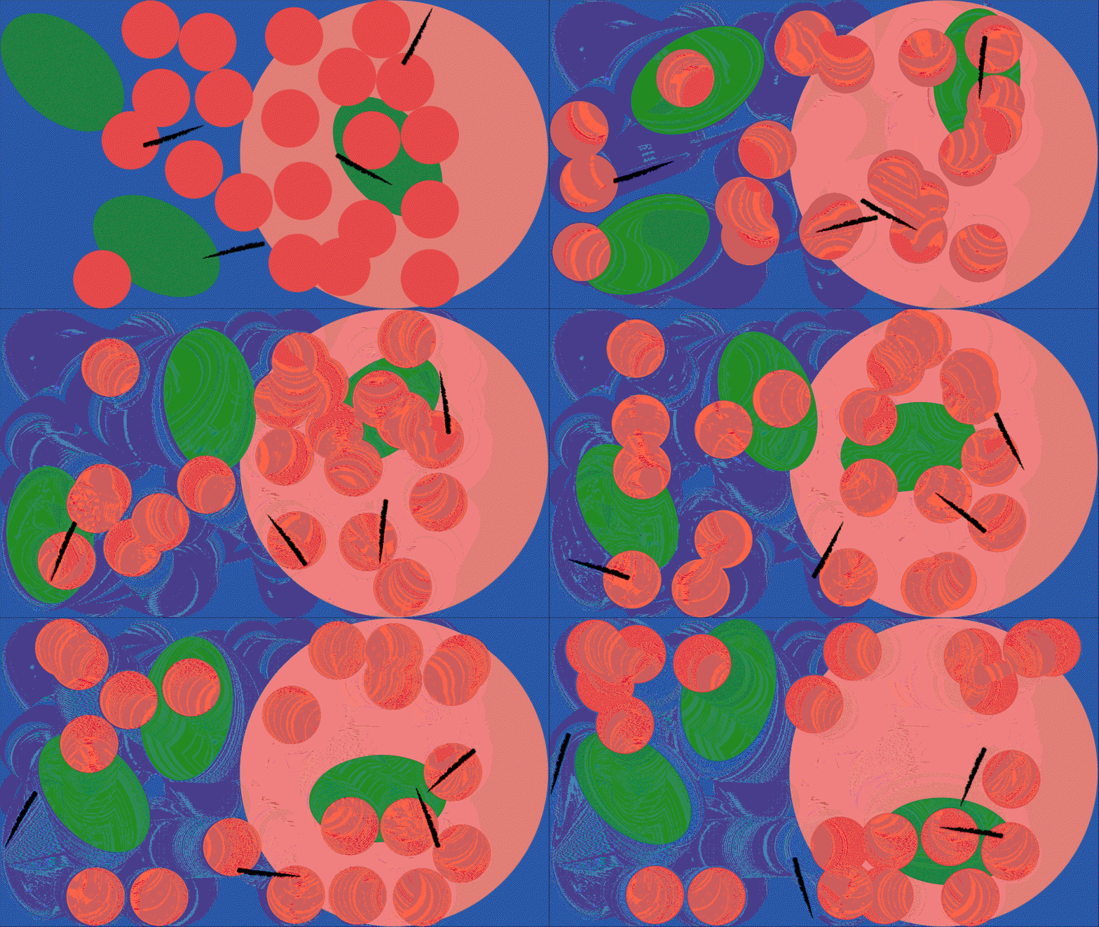
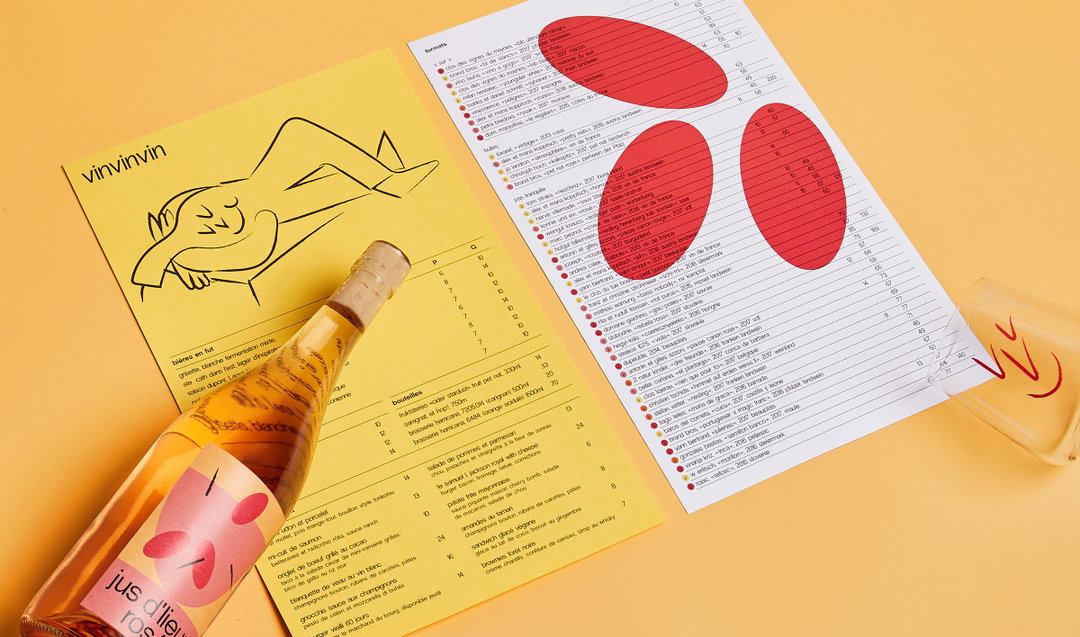
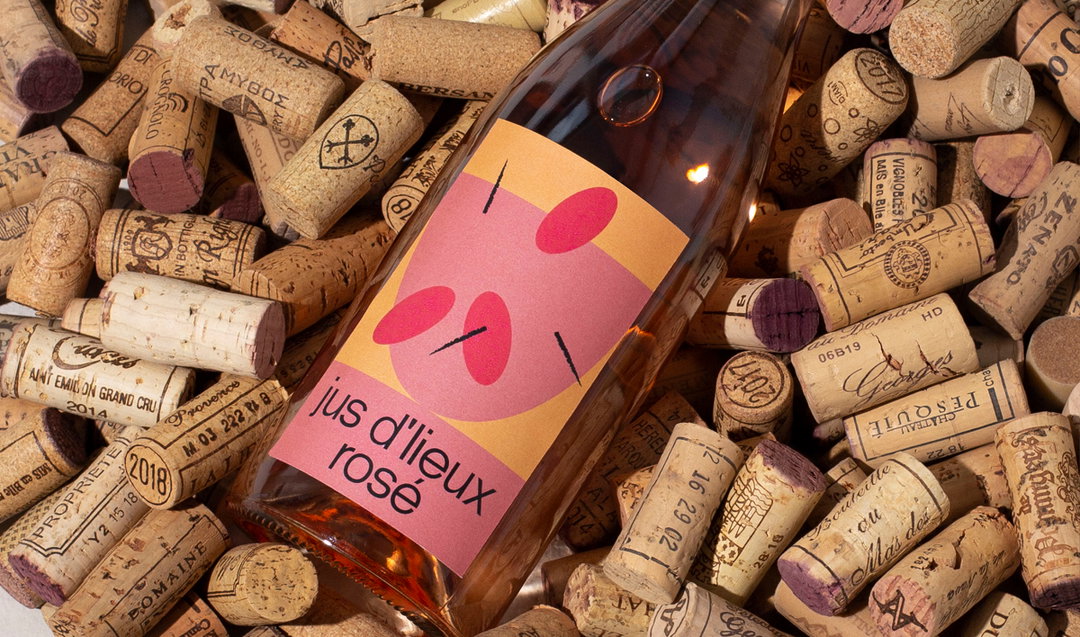
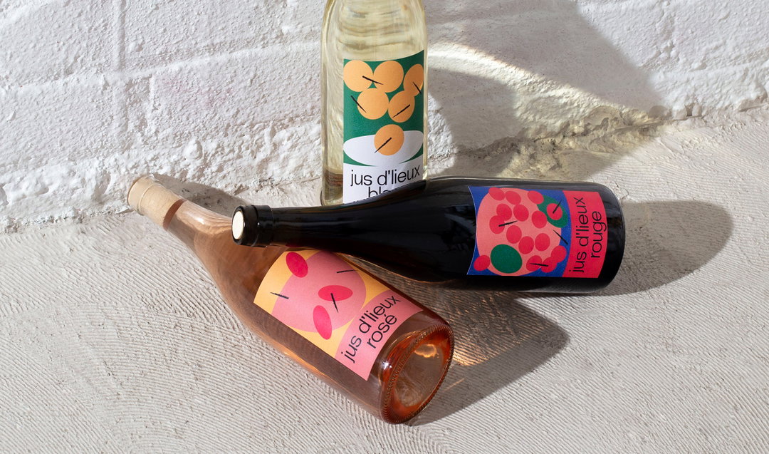
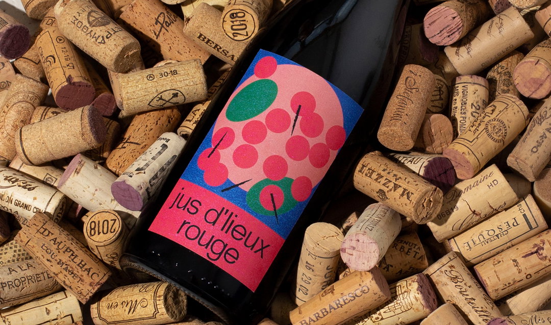
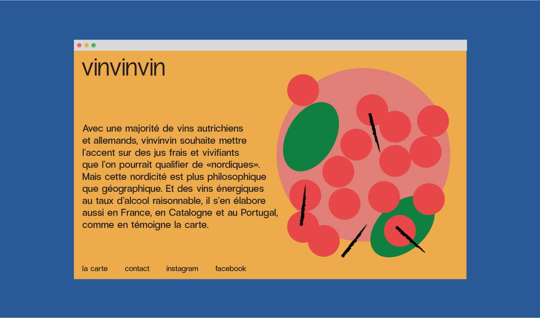
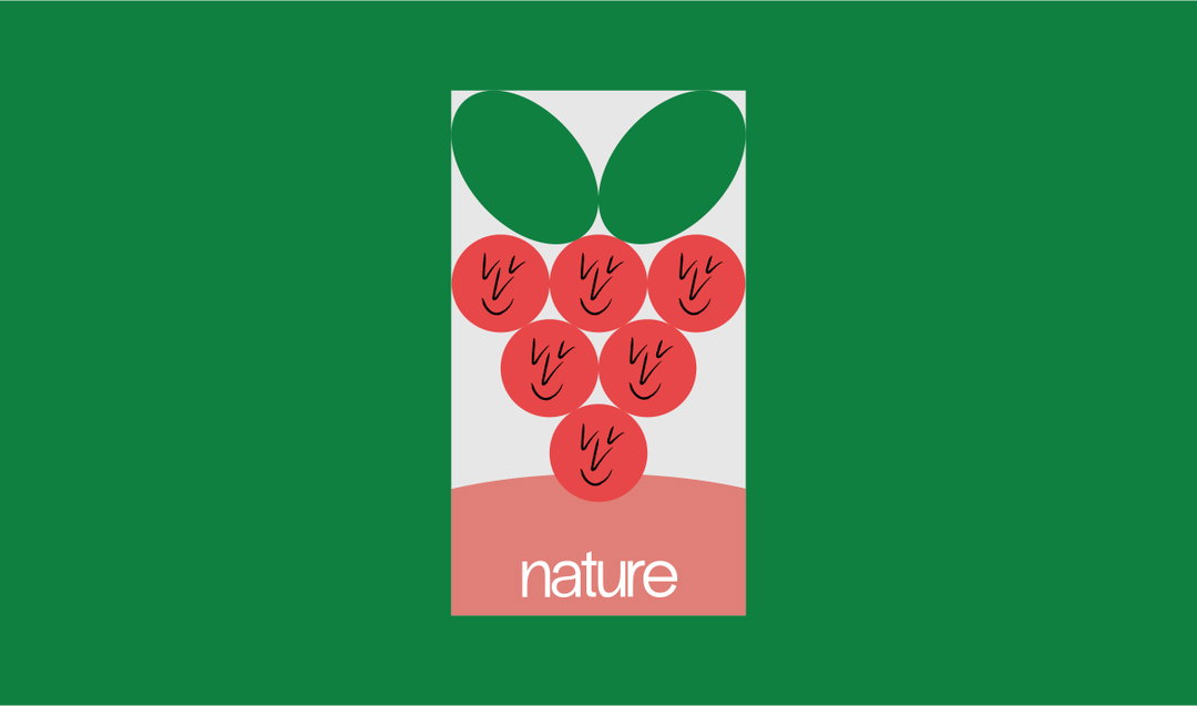
A project of Nother’s which initially caught our eye is an identity for a wine bar called vinvinvin. A 70-seater in Montreal serving exclusively organic wines could, in the wrong hands, develop an identity which could turn out to be very pretentious. Simon’s response, however, is in his own words “simple, honest and a little bit silly.”
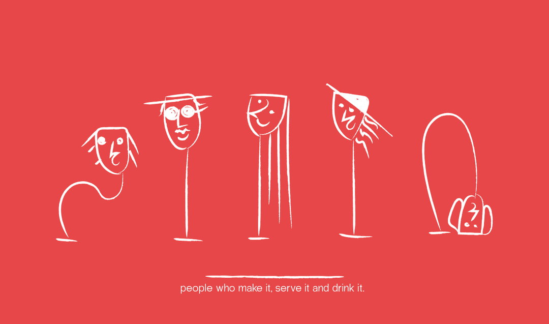
Firstly, he tells us that the name itself comes from the three types people in the wine industry: those who make it, those who serve it, and those who drink it. The bar is also a collaboration between partners Da Fonseca, chef Marina De Figueiredo, and Antonin Frenette-Laporte. Da Fonseca says: “It’s really a human project. We want to work with humans that share the same values as we do, in the winemaking, in the food making.” In turn, vinvinvin’s identity reflects this ethos, promoting the fact that you don’t need to know anything about wine to enjoy it.
Simon explains the concept in full: “The graphic language revolves around the adventures of Jean Jus, a ‘bon vivant’ character illustrated by Catherine Potvin. The jovial and silly nature of the illustrations, combined with the simplicity of the typography, makes the art of wine feel approachable and fun. There’s no room for any pretentiousness at vinvinvin. No Château or Domaine, just good wine and good people.”
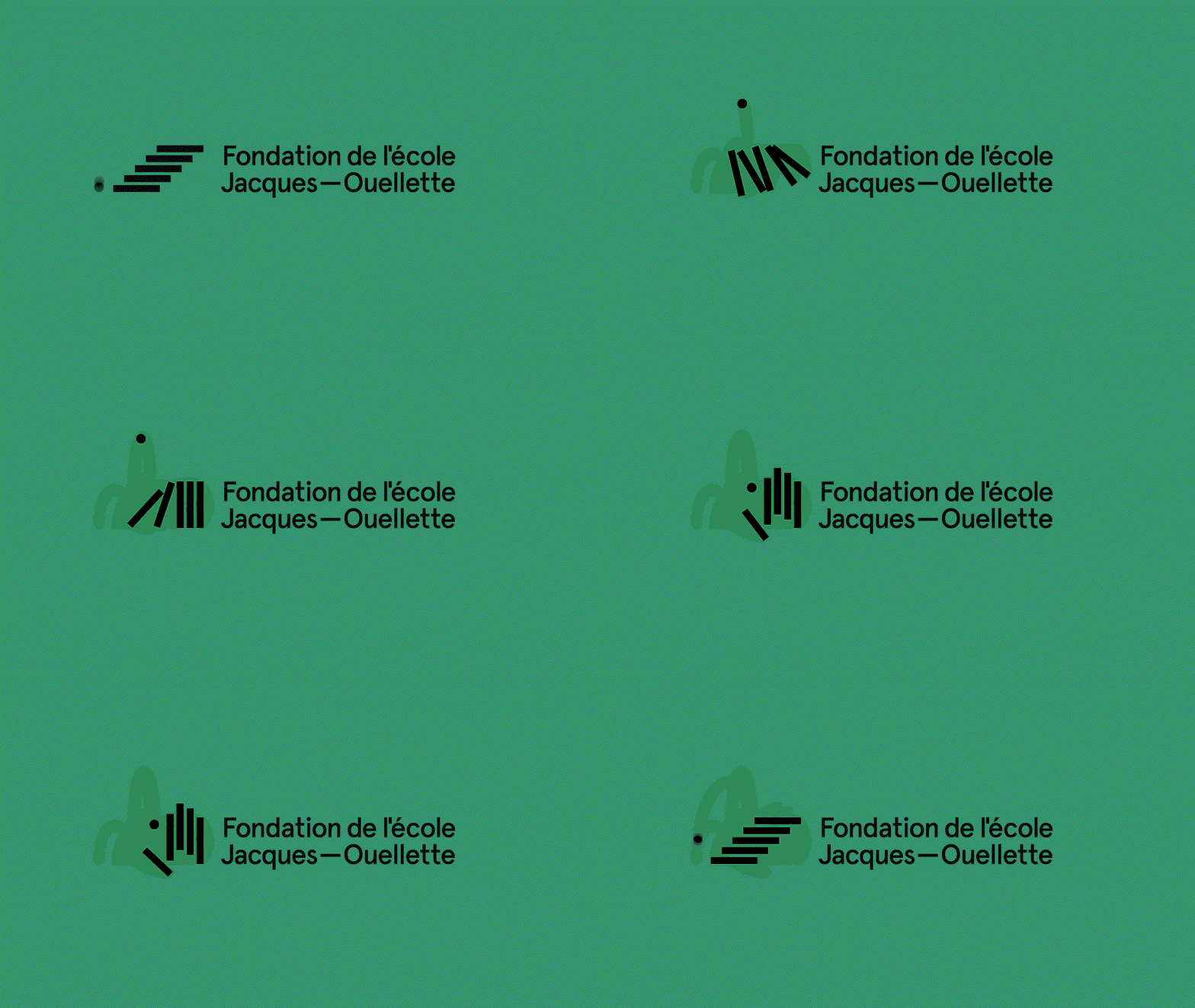
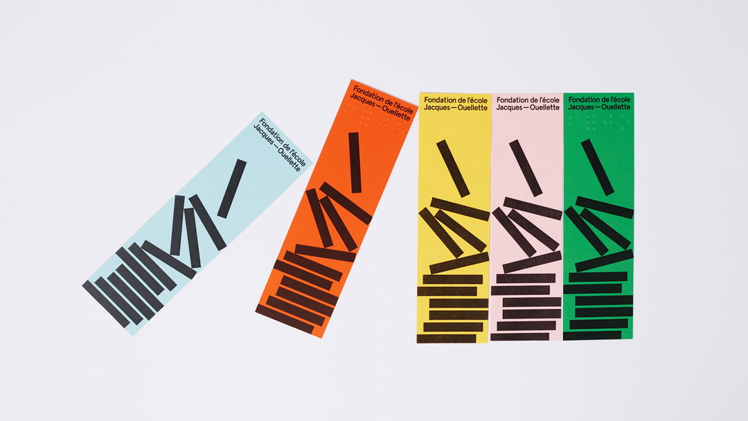
Other projects of Nother’s include creating an identity for the Jacques-Ouellette School Foundation. This, Simon tells us, was a particularly special project for him, as “it's not every day that we can do design that will directly impact the lives of many people. Design always has an important communication function, but it is while working on projects like this that we can truly realise the impact that it can have and its importance.”
It’s projects such as this that he hope to take on under the Nother umbrella moving forward. He concludes: “It is projects like these that also give a lot of meaning to our work and it’s why we want to share it. All the better if it can influence other people around us to help foundations and contribute to good causes.”
GalleryNother
vinvinvin
vinvinvin
vinvinvin
vinvinvin
vinvinvin
vinvinvin
vinvinvin
vinvinvin
Jacques-Ouellette School Foundation
Jacques-Ouellette School Foundation
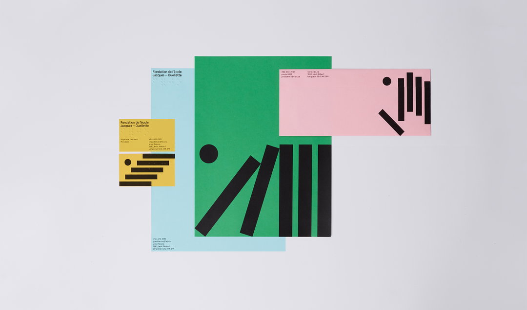
Jacques-Ouellette School Foundation
Share Article
Further Info
About the Author
—
Ruby is Senior Creative at It's Nice That, overseeing our visual output across platforms and projects. Before that, she was associate editor on the editorial team, after joining in September 2017 following graduation from Central Saint Martins.


