Launch Recite Me assistive technology
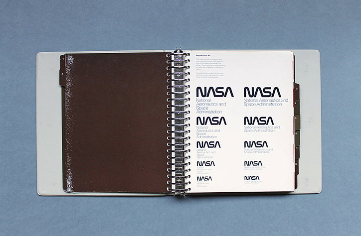
An open spiral-bound brand manual showing the Nasa logo. The page displays several variations of the “NASA” wordmark and the full “National Aeronautics and Space Administration” title.

A look inside the brand guidelines for the amazing 1970s Nasa "worm" logo

—
Date
19 August 2015

Design/space geeks, maybe you’ll want to sit down for this one. The good people of Wired magazine have drawn our attention to lovely designs that New York studio Danne & Blackburn created for Nasa in the 1970s. According to Display who first wrote about their design programme back in 2011, the black and white typographic marque was designed as a replacement for the famous blue roundel that features a rocket ship and red arrow. The new “worm” design aimed to create a look that was futuristic and a little more grown up. Danne & Blackburn’s graphic design guidelines manual is shown in all its glory over on Flickr, but here’s a little preview to whet your graphics-hungry palette.
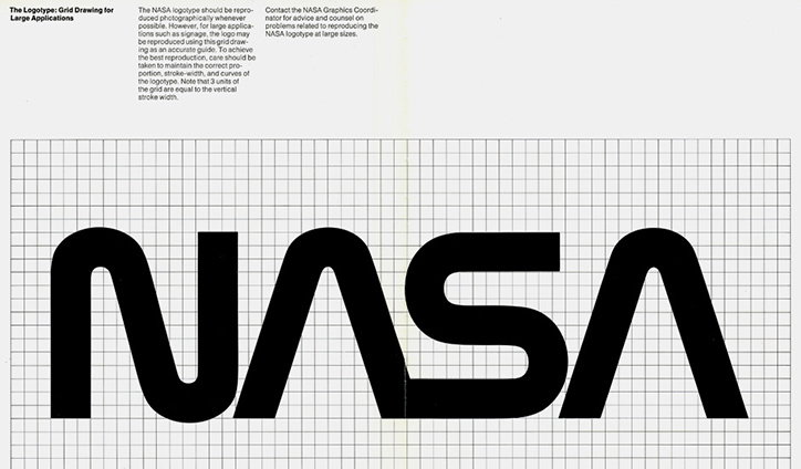
The Nasa “worm” logotype in black is set against a grey technical grid. Above the logo, a heading reads “The Logotype: Grid Drawing for Large Applications” alongside instructional text.
Above

Danne & Blackburn: Nasa identity

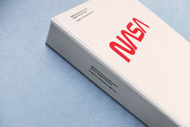
A white hardback book featuring the red Nasa “worm” logo on the cover. Text in the top left and on the spine reads “National Aeronautics and Space Administration Graphics Standards Manual”.
Above

Danne & Blackburn: Nasa identity

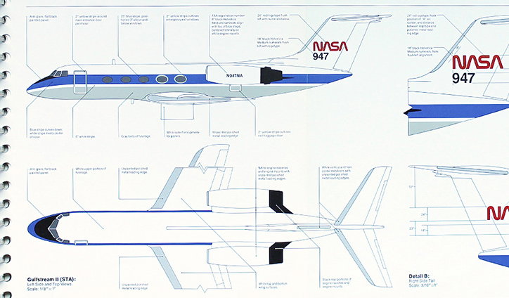
A technical diagram of a Nasa Gulfstream II aircraft, showing the plane from the side and from above. Fine lines point to various parts of the fuselage and wings, accompanied by detailed descriptive notes.
Above

Danne & Blackburn: Nasa identity

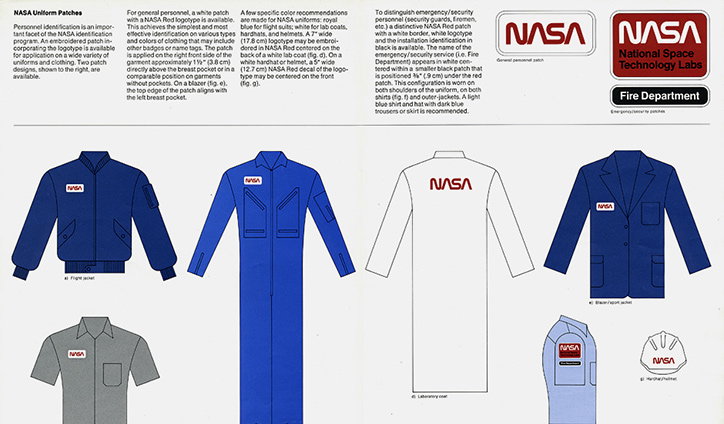
A style guide for Nasa uniform patches, showing various blue, white and grey garments. Each piece of clothing features a red and white “Nasa” logo patch in a consistent position.
Above

Danne & Blackburn: Nasa identity

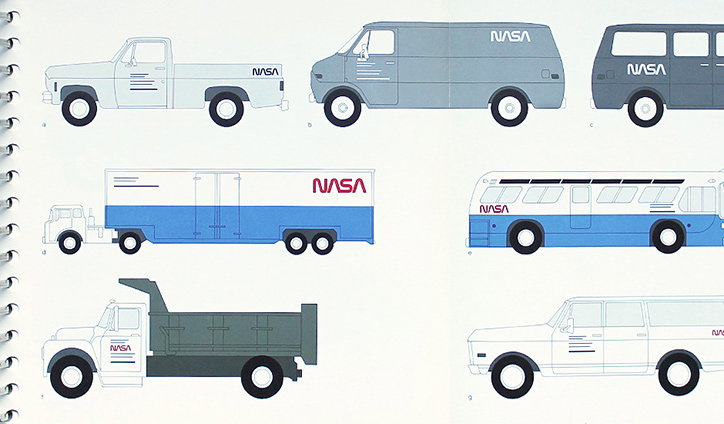
A graphic guide showing the branding and livery for various Nasa vehicles. The layout includes side-profile illustrations of a pickup truck, vans, a semi-truck, a bus and a dump truck.
Above

Danne & Blackburn: Nasa identity

Share Article

About the Author

Emily Gosling

—

Emily joined It’s Nice That as Online Editor in the summer of 2014 after four years at Design Week. She is particularly interested in graphic design, branding and music. After working It's Nice That as both Online Editor and Deputy Editor, Emily left the company in 2016.


It's Nice That Newsletters

Fancy a bit of It's Nice That in your inbox? Sign up to our newsletters and we'll keep you in the loop with everything good going on in the creative world.