Launch Recite Me assistive technology
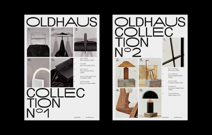
Two minimalist posters for “Oldhaus”, featuring a grid of furniture and lighting photography. The first is “Collection No. 1” and the second is “Collection No. 2”, both pairing black and white imagery with a numbered list of design pieces.

Naranjo-Etxeberria’s identity for Oldhaus mixes functionality and suave

—
Date
14 March 2018

How do you create the atmosphere of a slick boutique and cultivate waves of uncontrollable desire when your shop doesn’t actually have a physical space? This was the challenge faced by online gallery Oldhaus, which specialises in selling limited-edition art, design and ceramics. The answer appears to be getting Naranjo-Etxeberria on the case, as the Madrid-based studio has just developed a sophisticated new identity for Oldhaus that has got us reaching for our credit cards.

The strength of the identity lies in the pairing of an esoteric, midcentury-inspired typeface with slick, fashion-led art direction. To develop Oldhaus’ identity Naranjo-Etxeberria dispersed five brand values through different parts of the project: unique (by forming the new typeface); elegant (with classic secondary typography); personality (through the restrained colour palette); sensitive (with the unconditional yet perfectly balanced composition); and aspirational (using the photographic language), N-E’s Diego Etxeberria tells It’s Nice That.

The new typeface has been crafted by merging two existing fonts, cleverly nodding to the two aspects of Oldhaus’ business, Diego explains. “We represented the functionality of midcentury furniture by using the consonants and punctuation marks of Helvetica,” he says, “while the more artistic side is represented through Ace Lift, using the vowels and numbers – the most creative part [of the alphabet] learnt in childhood.”

N-E tasked Nacho Alegre, creative director of Apartamento magazine and art director Ana Dominguez, with developing the photography for the site. “Having no physical gallery, the goal was to transmit desire through the images, treating each object as an art piece in itself,” says Diego. “The photos themselves became artistic works that would generate devotion.” We can confirm that the project has the desired effect. Visit the site at your own risk.
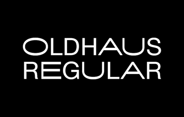
White sans-serif text on a black background reads “OLDHAUS REGULAR”.
Above

Naranjo-Etxeberria: Oldhaus typeface

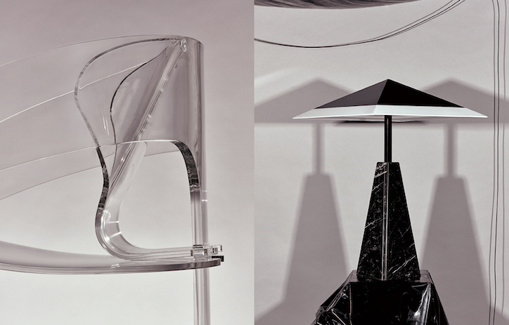
A diptych of two images. On the left, a close-up of a curved, transparent acrylic chair. On the right, a sculptural lamp with a black marble base and a sharp, angular white shade.
Above

Naranjo-Etxeberria: Oldhaus identity. Art direction: Nacho Alegre and Ana Dominguez
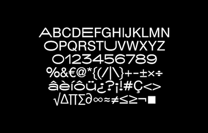
A white typographic character set displayed against a black background. The layout includes the alphabet in uppercase, numerals zero to nine, and various symbols and mathematical signs.
Above

Naranjo-Etxeberria: Oldhaus typeface

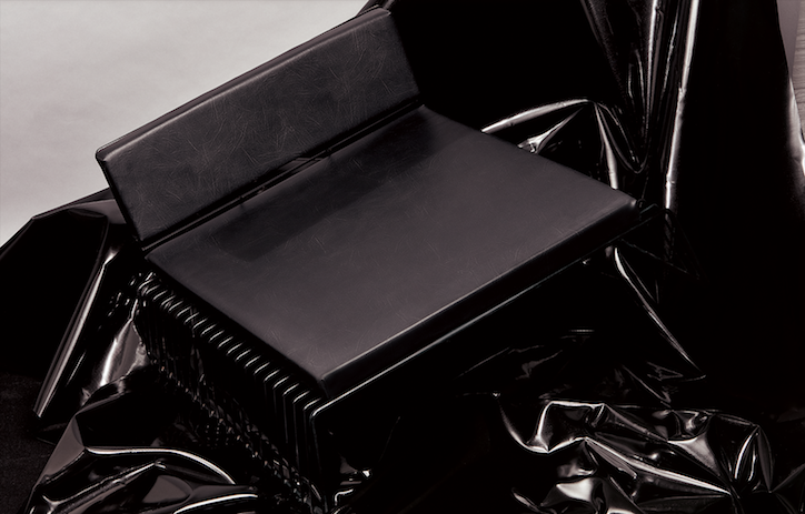
A black, leather-textured object resembling a folder or book rests on a heap of glossy black plastic sheeting. The material catches the light, creating sharp highlights and deep shadows across the folds.
Above

Naranjo-Etxeberria: Oldhaus identity. Art direction: Nacho Alegre and Ana Dominguez
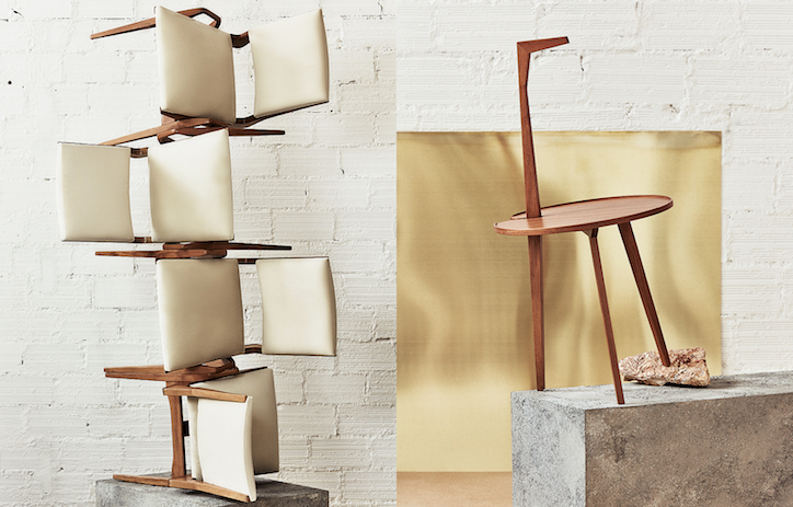
Two wooden chairs with cream leather upholstery are displayed against a white brick wall. One chair is disassembled and stacked vertically, while the other stands on a concrete plinth against a gold backdrop.
Above

Naranjo-Etxeberria: Oldhaus identity. Art direction: Nacho Alegre and Ana Dominguez
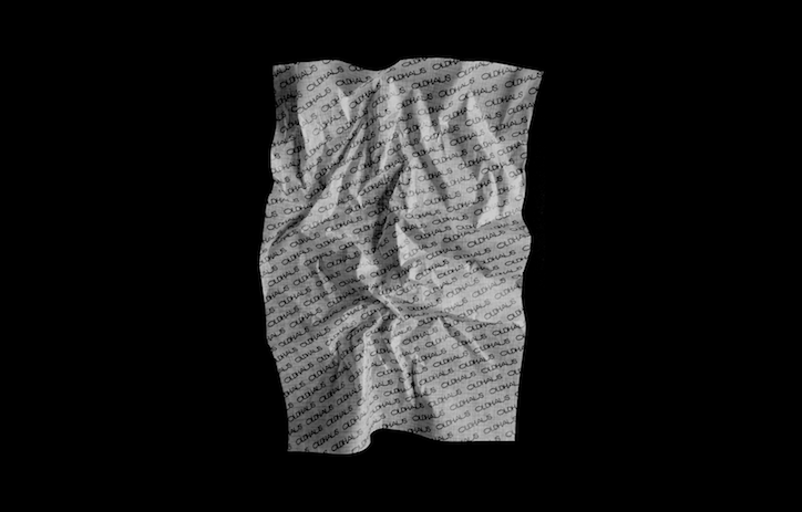
A piece of crumpled white paper set against a black background. The paper is covered in a repeating pattern of the word “CLO3D”.
Above

Naranjo-Etxeberria: Oldhaus identity

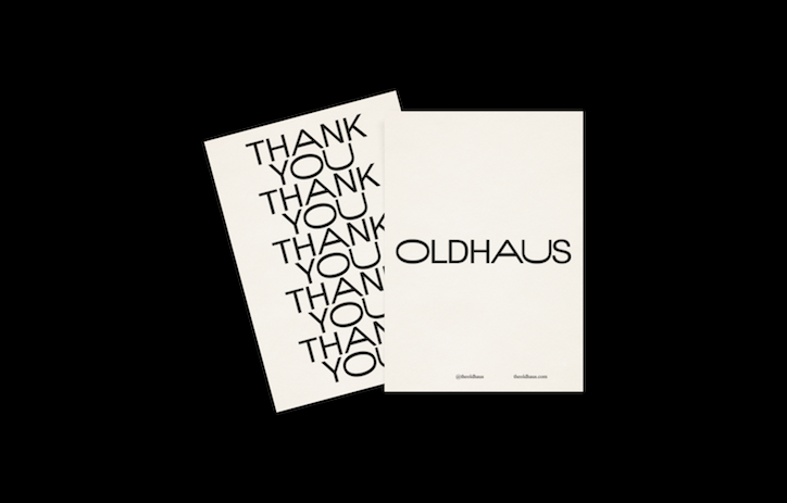
Two white cards set against a black background. One card features the word “Oldhaus” in a clean sans-serif typeface, while the other repeats the phrase “Thank You” in a bold, stacked layout.
Above

Naranjo-Etxeberria: Oldhaus identity

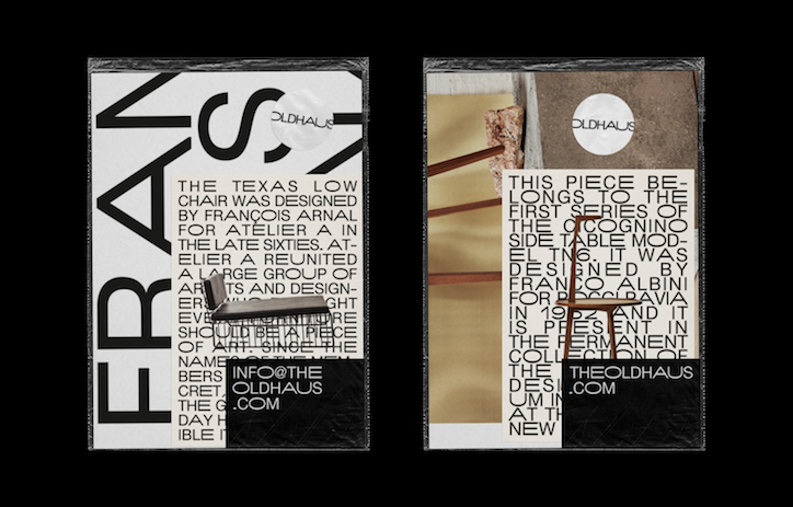
Two design layouts for Oldhaus. The first features a large, vertical “FRANÇOIS” alongside a description of the Texas Low chair and a small image of the furniture. The second shows a close-up of a wooden table and a text block describing a piece by Franco Albini.
Above

Naranjo-Etxeberria: Oldhaus identity

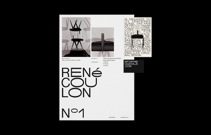
A minimalist black and white design layout featuring two photographs of chairs. Large, bold typography reads “René Coulon” and “No 1”, with a smaller block of text describing the furniture.
Above

Naranjo-Etxeberria: Oldhaus identity

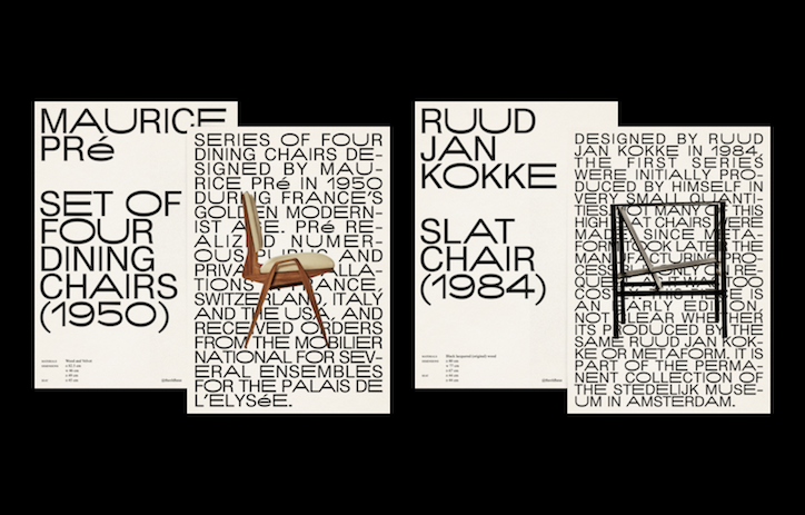
Two minimalist posters side by side against a black background. The first features a wooden chair and reads “Maurice Pré” and “Set of four dining chairs (1950)”, while the second shows a black metal chair and reads “Ruud Jan Kokke” and “Slat chair (1984)”.
Above

Naranjo-Etxeberria: Oldhaus identity

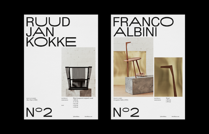
Two minimalist posters side by side against a black background. The left poster features a black chair and reads “Ruud Jan Kokke”, while the right features a wooden table and reads “Franco Albini”. Both include technical details and the text “No 2” at the bottom.
Above

Naranjo-Etxeberria: Oldhaus identity

Share Article

About the Author

Laura Snoad

—

Laura is a London-based arts journalist who has been working for It’s Nice That on a freelance basis since 2016.
It's Nice That Newsletters

Fancy a bit of It's Nice That in your inbox? Sign up to our newsletters and we'll keep you in the loop with everything good going on in the creative world.