




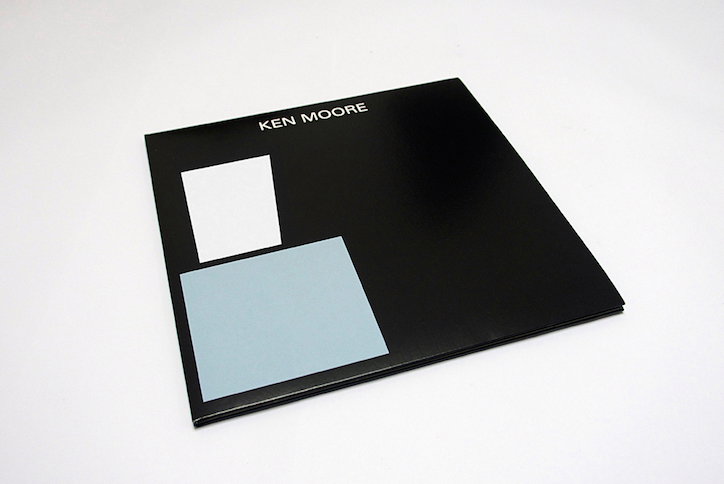
Minimalist record sleeves by Belgian graphic designer Jelle Martens
Belgian graphic designer Jelle Martens’ latest work demonstrates a clear stylistic progression from work previously featured on It’s Nice That. Jelle’s recent record sleeve designs continue to reflect the minimalist themes demonstrated in earlier works, but represent a significantly refined visual direction and communicate an increased focused on bold contrast and singular objects portrayed in asymmetric layouts.
Featuring sans serif type that extends only as far as the musician’s name (front cover) and logically formatted track listings (back cover), the Ghent-based creative’s sleeve designs are consistently monochrome. The black and white backgrounds act to emphasise the relevance of Jelle’s presentation of select colours and abstract shapes, the definitive features of his visual interpretations of the music.
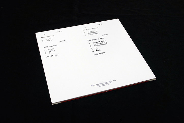
Jelle Martens: VOD139. Galen Herod
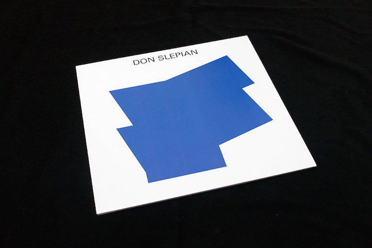
Jelle Martens: VOD139. Don Slepian
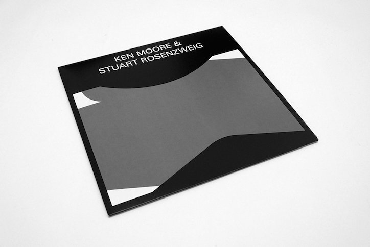
Jelle Martens: VOD139. Ken Moore & Stuart Rosenzweig
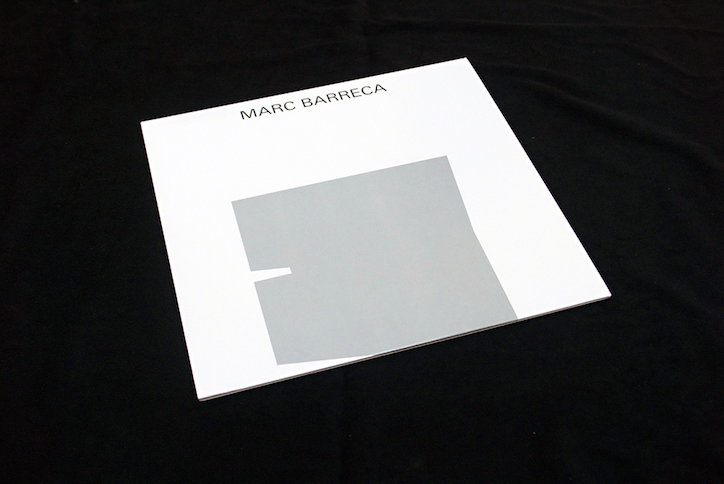
Jelle Martens: VOD139. Marc Barreca
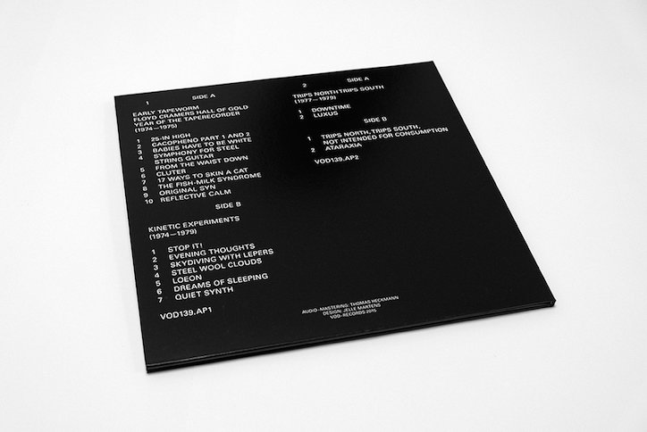
Jelle Martens: VOD139. Anode Productions
Share Article
Further Info
About the Author
—
Milly Burroughs (@millyburroughs2.0) is a Berlin-based writer and editor specialising in art, design and architecture. Her work can be read in magazines such as AnOther, Dazed, TON, Lux, Elephant, Hypebeast and many more, as well as contributing to books on architecture and design from publishers Gestalten and DK. She is It’s Nice That’s Berlin correspondent.



