




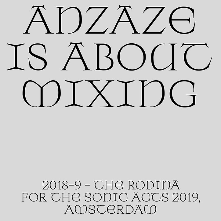
Mateo Broillet likes to reflect elements of type history in his contemporary designs
Though we regularly write about the Amsterdam-based design studio The Rodina, we have never written about its regular type collaborator Mateo Broillet. Originally from French Switzerland, the type designer also works with the type foundry Bold Decisions, as well as being a freelance graphic designer and typographer in Amsterdam.
Most recently, Mateo developed Anzaze, a custom type design for this year’s Sonic Acts festival in Amsterdam. Commissioned by The Rodina strictly for the festival, Mateo tells It’s Nice That how Anzaze was designed to “directly structure the poster while being versatile enough with two OpenType styles and ligatures.” Influenced by Medieval engraving, the letterform’s strong Latin roots are evident in the elongated serifs and sleek rounded counters. Mateo adds, “I tried to be a bit more ‘open’ and vernacular with Anzaze,” creating a typeface that feels both historic and contemporary depending on the context.
By contrast, for last year’s Sonic Acts festival, Mateo designed a typeface based on Pompeian graffiti and an irregular Trajan typeface. “I wanted to have a ‘sharp’ look that is somewhat wrong with a clear touch of arrogance,” says the typographer. Titled Nero, the typeface slowly evolved from Mateo’s first year studying for a masters degree and it gradually developed into a condensed and rather striking alphabet. With particularly poignant “R”s that possess a hint of the gothic, Nero Condensed is a powerful display text evoking a sense of quirky sophistication.
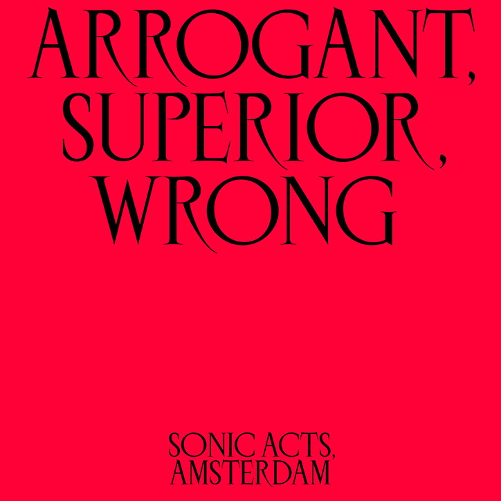
Mateo Broillet: Nero Condensed
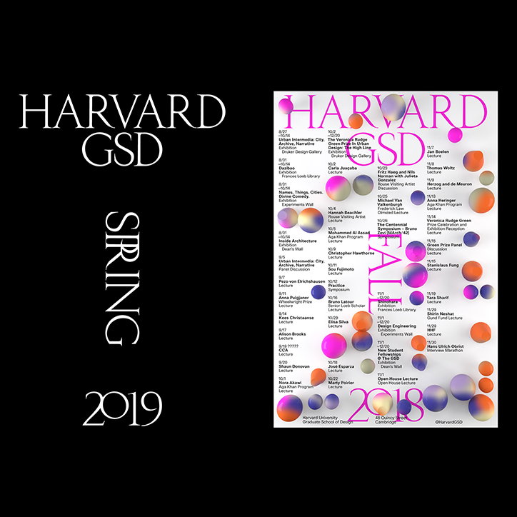
Mateo Broillet: Ward
In a similar vein, Mateo designed the typeface Ward for the Harvard Graduate School of Design’s visual identity. Designed specifically for next year’s lecture posters, Mateo comments on how he wanted the typeface to be “as classic as possible” to reflect the notable institution. “Nonetheless, I wanted to have a set of letters that would fit with a strong design communication,” says Mateo. And he successfully achieves this through his design that suggests an “institutionalised visual language” that is also relevant within modern graphic design. Another commission from The Rodina, Ward complimentarily befits their signature aesthetic that plays with 3D, sculptural illustrations that pop out of the page.
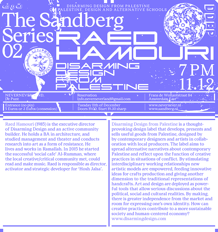
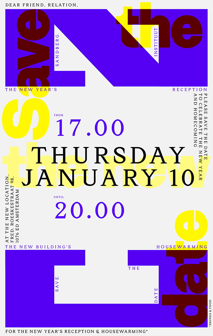
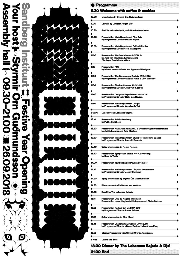
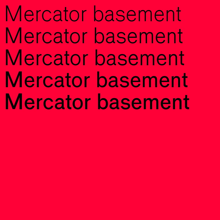
This summer gone, Mateo completed his master’s in fine arts and design from the Sandberg Instituut in the Netherlands. “My time at the Sandberg Instituut was a wonderful occasion to learn more about typography and to discuss (in broad terms) the effect of type design in a historical and political context.” It was during this period of study that Mateo developed a way to incorporate his research interests into his designs. “I like the idea of structuring a graphic design project around typographic research because I appreciate seeing type history reflected in the design process,” he adds. Not just a student, Mateo worked as the institution’s in-house designer, creating a range of experimental works for the school where he could flex his design talents amongst his cohort.
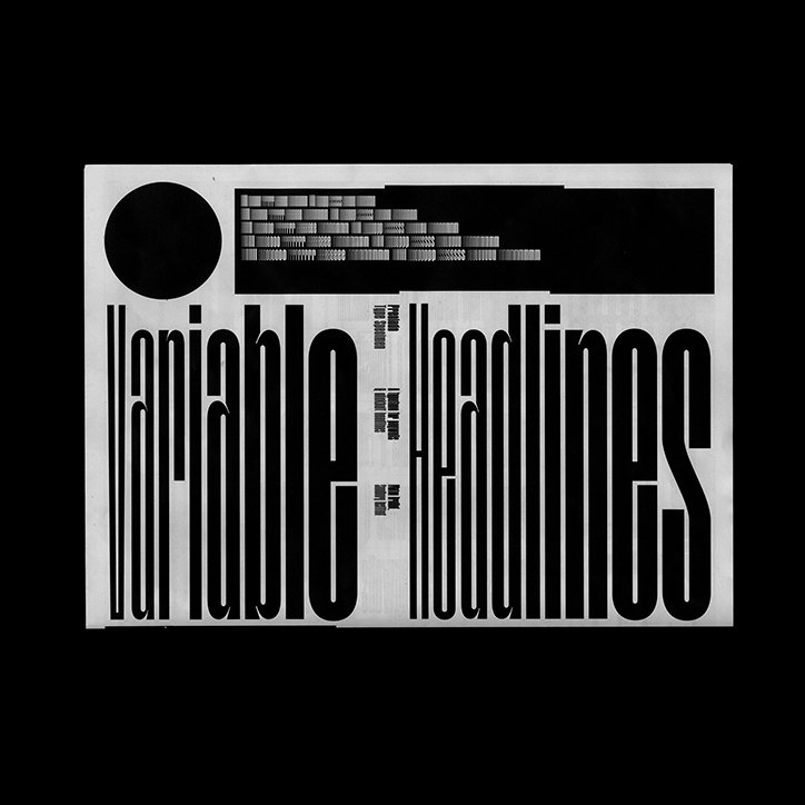
Mateo Broillet: Sandberg Institut
Mateo Broillet: Sandberg Institut
Mateo Broillet: Sandberg Institut
Mateo Broillet: Sandberg Institut
Mateo Broillet: Sandberg Institut
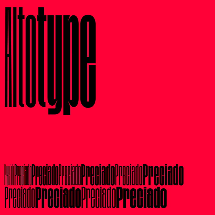
Mateo Broillet: Sandberg Institut
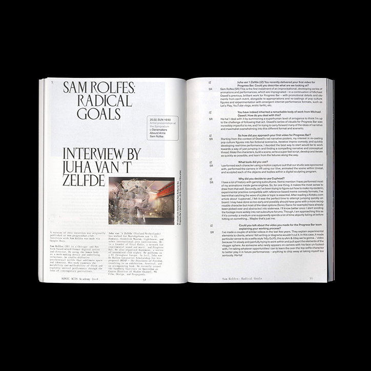
Mateo Broillet: Nero Condensed
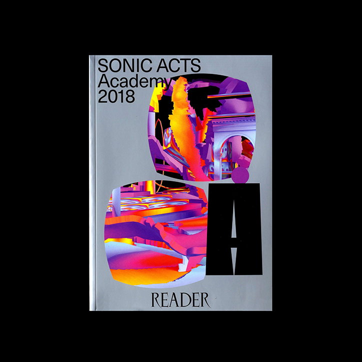
Mateo Broillet: Nero Condensed
Share Article
Further Info
About the Author
—
Jynann joined It’s Nice That as an editorial assistant in August 2018 after graduating from The Glasgow School of Art’s Communication Design degree. In March 2019 she became a staff writer and in June 2021, she was made associate editor. She went freelance in 2022.