Marina Willer crafts letters with light and projection for BFI London Film Festival’s new identity and campaign
In an age of streaming domination and scattergun viewing habits, how do you pay homage to the slow craft of cinema? The Pentagram partner’s analogue identity for London’s biggest film festival lights the way.
Share
Marina Willer isn’t just a designer and partner at Pentagram London, she’s also a filmmaker; she’s behind numerous short films made for the likes of architect Richard Rogers, and her 2017 feature documentary Red Trees– about her family fleeing Nazi occupation in Prague during World War II – saw its premier at Cannes. With this wealth of experience, it’s no surprise that Marina and her team were tasked with creating the new identity and campaign for the 2026 BFI London Film Festival, the capital’s largest festival celebrating the cinematic arts. The designer’s many hours trawling away on shoots, sets and edits pushed her to place one question at the heart of the project: how, in an age of streaming domination and hyper-digitisation, do you create something that celebrates the experience and slow craft of cinema?
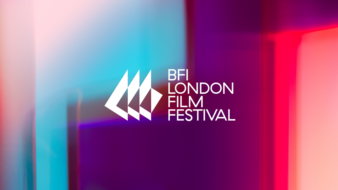
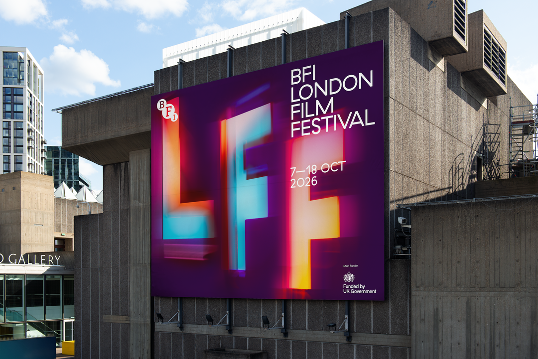
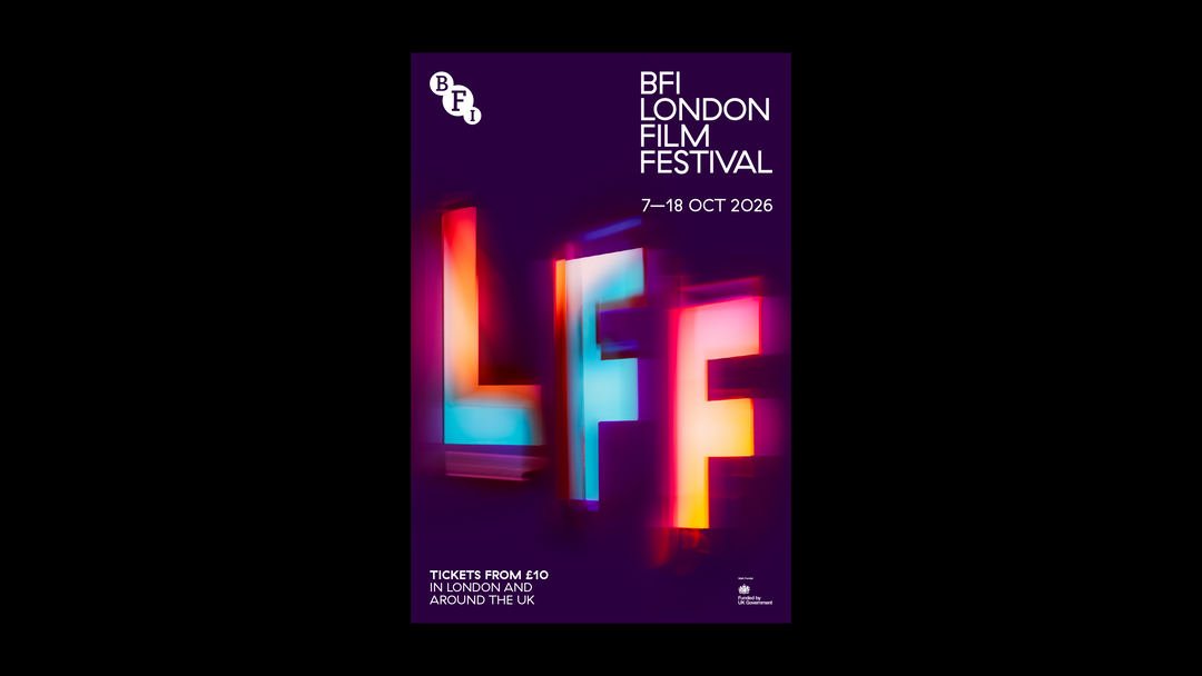
The answer was simple: make the methods of filmmaking and film-screening central to the campaign. Rather than the LFF letters that feature in the key art of the campaign being made digitally, they’re crafted with projections of coloured light. Using cut-outs of the letters, the coloured light was projected onto a black background (a nod to the cinema screen) and then filmed and photographed to create the sense of movement. As is to be expected from Marina and her team, the methods they experimented with to create this motion were incredibly hands-on [you can learn more about Marina’s analogue experimentations in her Nicer Tuesday talk from earlier this year], from the more expected handheld movement of the camera, to physically hanging letters and, finally, testing out a rotating table. When motion was sufficiently captured in-camera additional movement was injected digitally to “dramatise each detail of the letters” as they’re slowly revealed on screen, Marina tells It‘s Nice That.
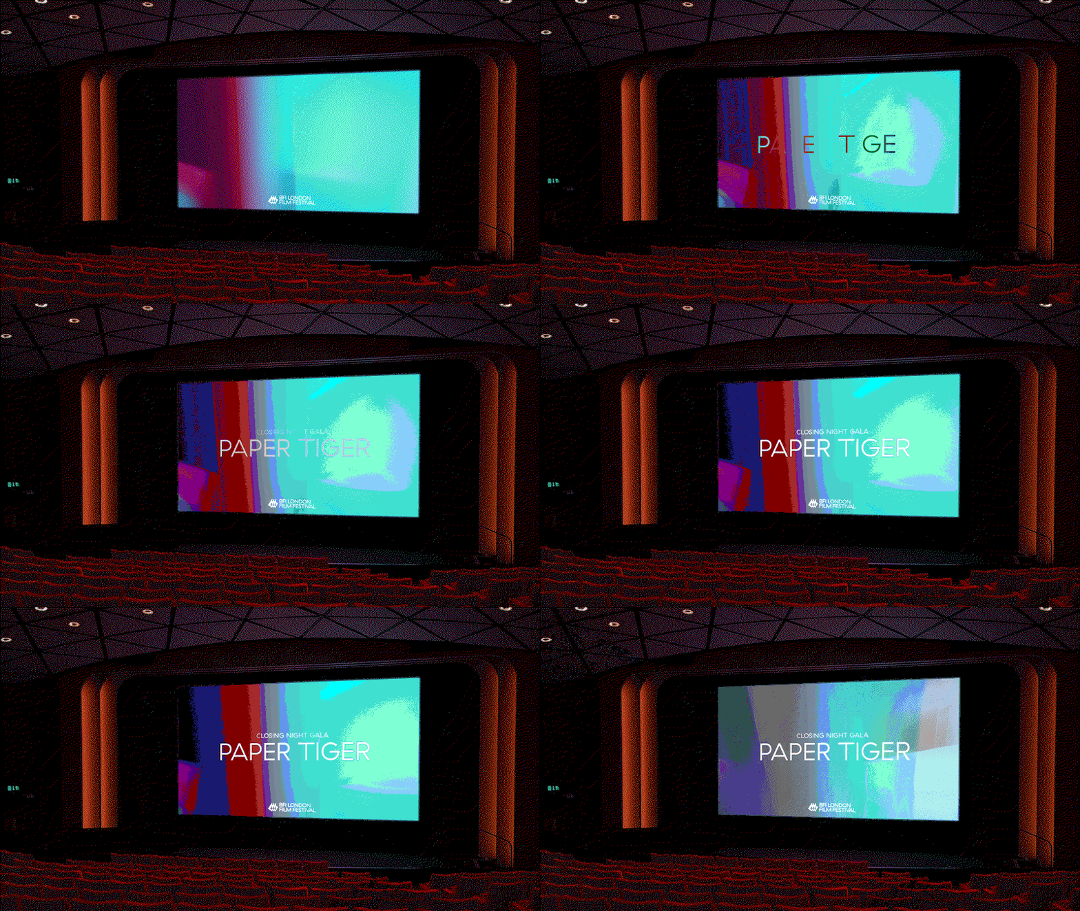
Marina Willer: BFI London Film Festival (Copyright © Marina Willer, 2026)
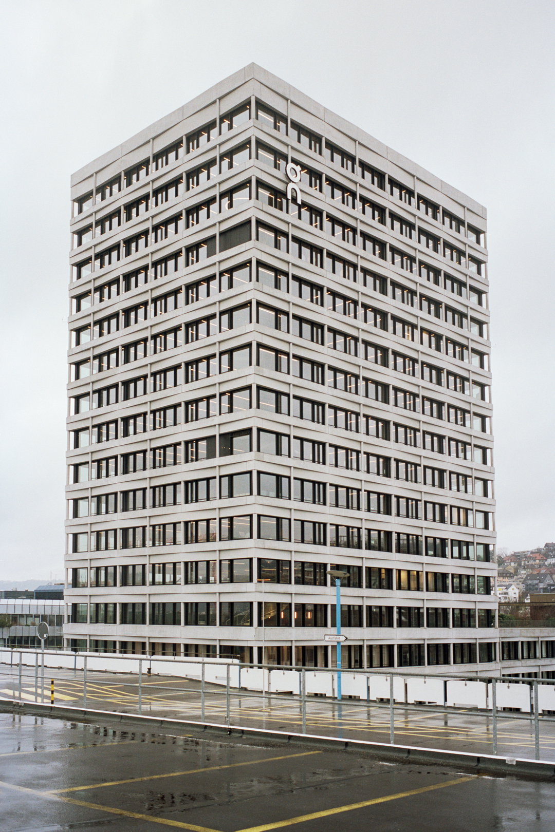
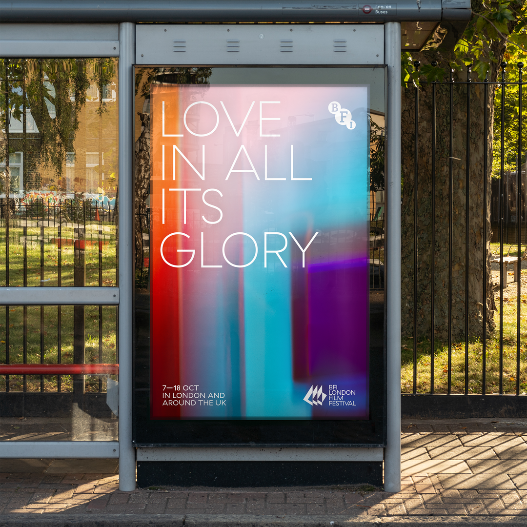
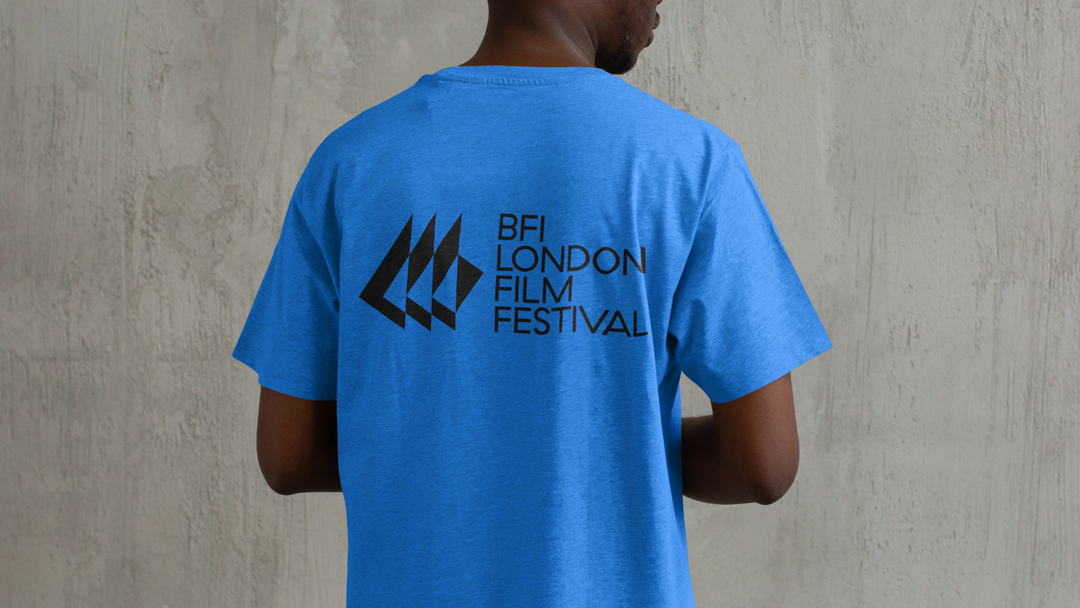
As with such a stalwart event and location, part of the brief was to maintain some of its heritage, like the logo you’ll find on the iconic cascade of the building, designed by Norman Engleback in 1957, which lights up as the day turns to night. “We created a shortcut version of that, simple and flat, making it easy to use and memorable for a brand that comes to life as a digital-first identity,” details Marina. Of course, likewise, aspects of this new visual world were also about trying to find ways to help the festival stand out and maintain relevance as a forward-thinking space premiering groundbreaking cinema. This is where colour came into play, and after extensive research Marina and her team discovered that light blue wasn’t used in any major film festivals or brands. The lighter hue adds a refreshing dimension to the other wash of colours, deep purple and warm pink, that you might already associate with the event, solidifying its place away from the more stuffy, buttoned-up approach to something that feels more modern and open-minded.
Unlike many film events and festivals that are as revered and exist at such a scale, London Film Festival is open to the public, with the vast majority of tickets open to anyone, and a span of free events and experiences, something Marina wanted to capture in the new look. “LFF is truly democratic, it’s not an industry event – it invites everyone,” ends the designer. “Therefore it needed a bold and celebratory identity that connects with film and the history of the BFI as an authority that curates and guides people to a really inclusive festival.”
GalleryMarina Willer: BFI London Film Festival (Copyright © Marina Willer, 2026)
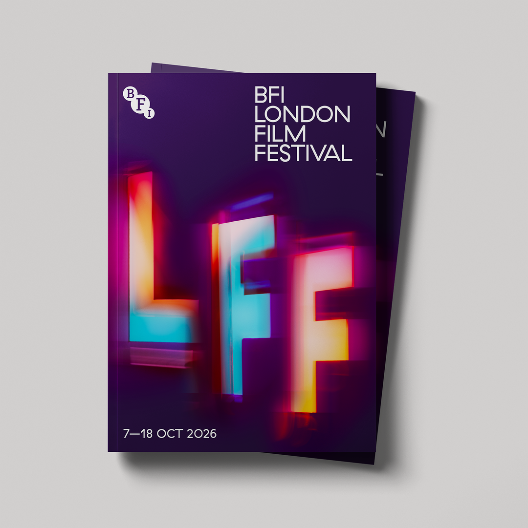
Hero Header
Marina Willer: BFI London Film Festival (Copyright © Marina Willer, 2026)
Share Article
Further Info
About the Author
—
Olivia (she/her) is associate editor of the website, overseeing the day-to-day editorial projects as well as Nicer Tuesdays events. She joined the It’s Nice That team in 2021. ofh@itsnicethat.com
To submit your work to be featured on the site, see our Submissions Guide.