




Little Troop channels 70s retrofuturism for a new home storage brand
The studio blended decades of references and created a logo that “clicks” together.
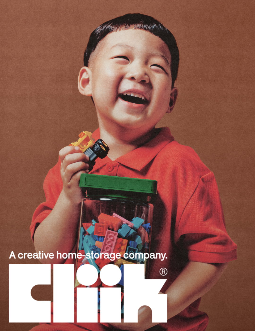
Little Troop has made something of a name for itself creating brands imbued with nostalgia, that still feel fresh and fun. Much the same can be said for its most recent branding project, Cliik, which sees the home organisation company given a look that blends decades of references – predominantly 1970s retrofuturism, but with a touch of 60s modernism and even 80s lego advertising sprinkled in.
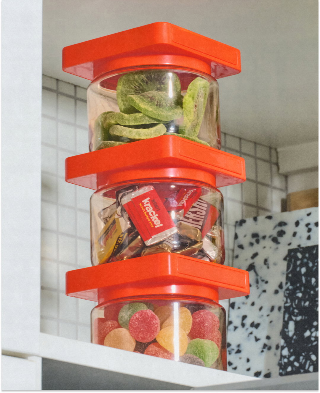
The storage company launched two weeks ago, and aims to bring a sense of “creativity and joy” to home organisation with modular, magnetic and stackable containers, or as Noemie Le Coz, founder and co-creative director of Little Troop puts it, “put the fun in functional”. The studio was approached by the company’s founder Ally Dayon to take on all of the design elements of the brand – which was originally named Magnique – early last year. Despite being busy the studio took the project on because of how much they loved the product, and renamed it Cliik to kick things off. “Ally wanted to create a brand that felt fresh, thoughtful, fun and creative, and had heart and integrity – which aligned perfectly with how we approach our projects,” says Noemie.
Little Troop: Cliik (Copyright © Little Troop, 2024)
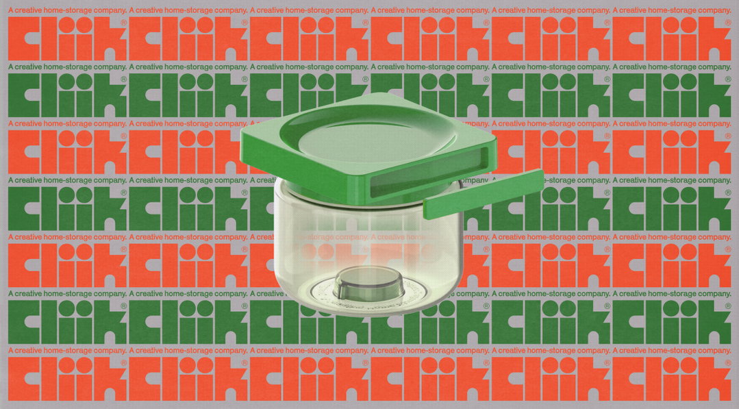
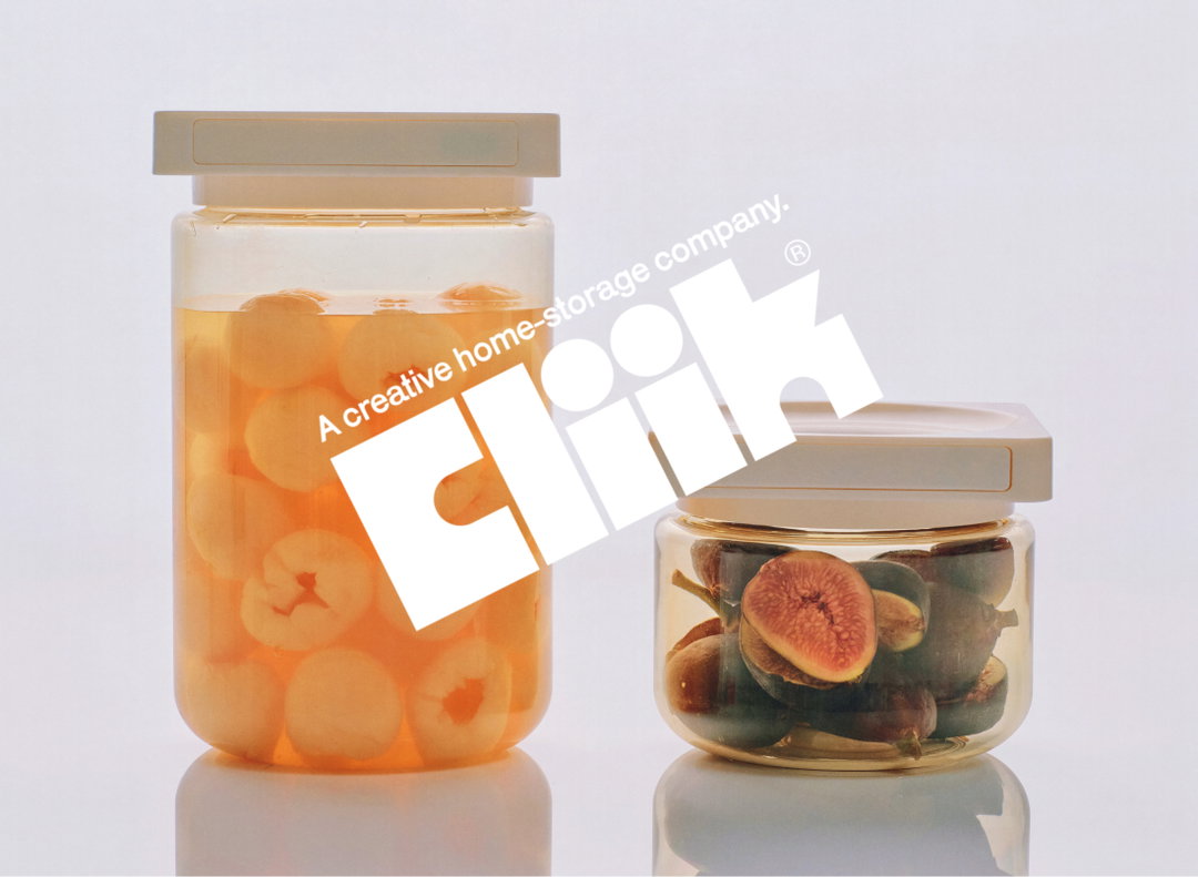
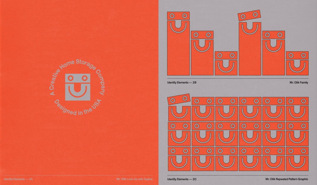
To centre the brand, they created a logo that was “fun, bold and chubby”, like the product itself, only then to be contrasted with some sharpness to reflect its functionalism. The result is something of a “mash-up” of all the studio’s references, with a clever nod to the product; the C and L letterforms flip on the side to create the smiling container mascot Mr Cliik; the I’s are reminiscent of two of the containers stacked together (especially apparent in animated assets); and the K feels like a “door to a home” – “everything sort of ‘clicked’!”, Noemie says. In what Noemie describes as quite a “bold” move the team opted for Karrik for the type system, a free, open-source font. “The typeface intentionally brought back some of the original irregularities of early sans-serifs which we loved, but when used alone, created this sense of restraint to balance out the ‘fun’ and ‘functional’.”
As one of the key references, Ally initially sent over a vintage Lego ad from 1981, which sparked a lot of excitement, and also pushed the Little Troop team to create something with a toy-like charm. Taking inspiration from the containers themselves, the studio also wanted to include some references to the modular style of 1960s modernism, but, in the main, 1970s retrofuturism. Rather than simply creating a facsimile of these references, they wanted to find ways to reimagine them, building something “equal parts fresh and familiar”.
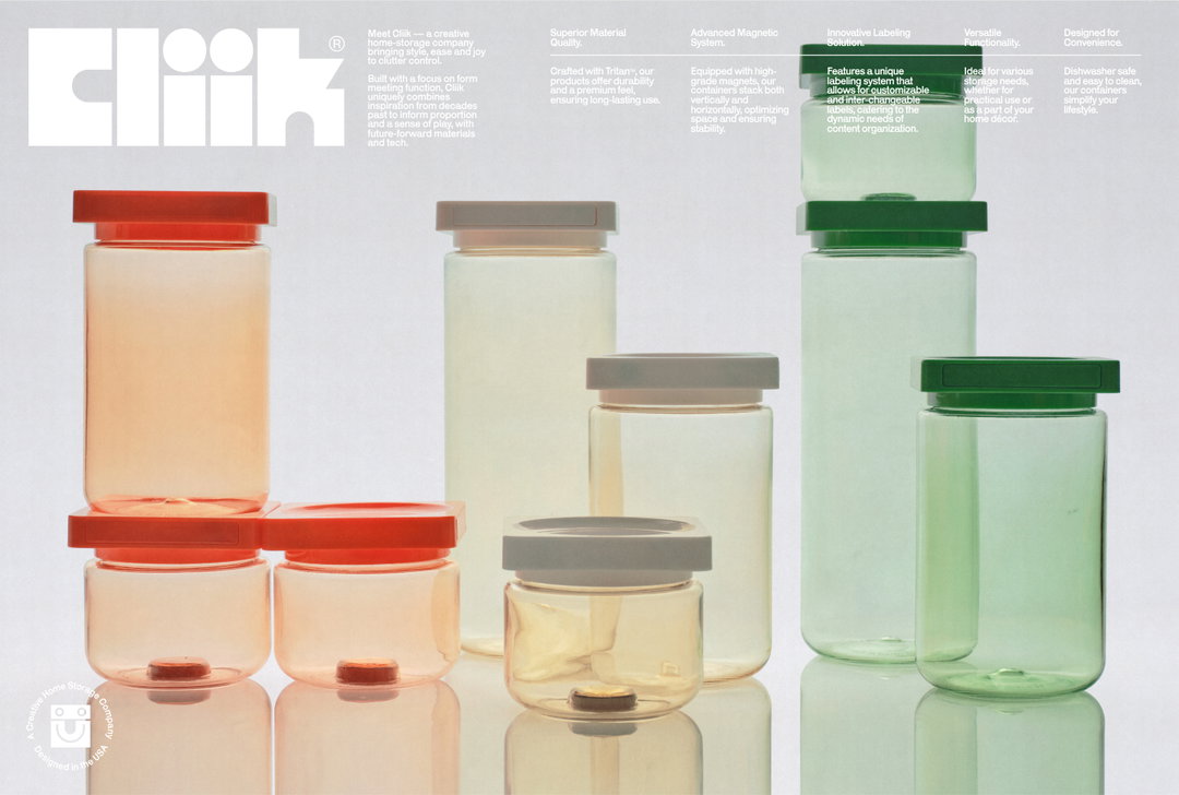
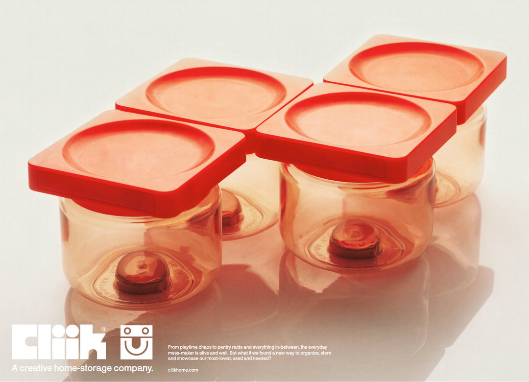
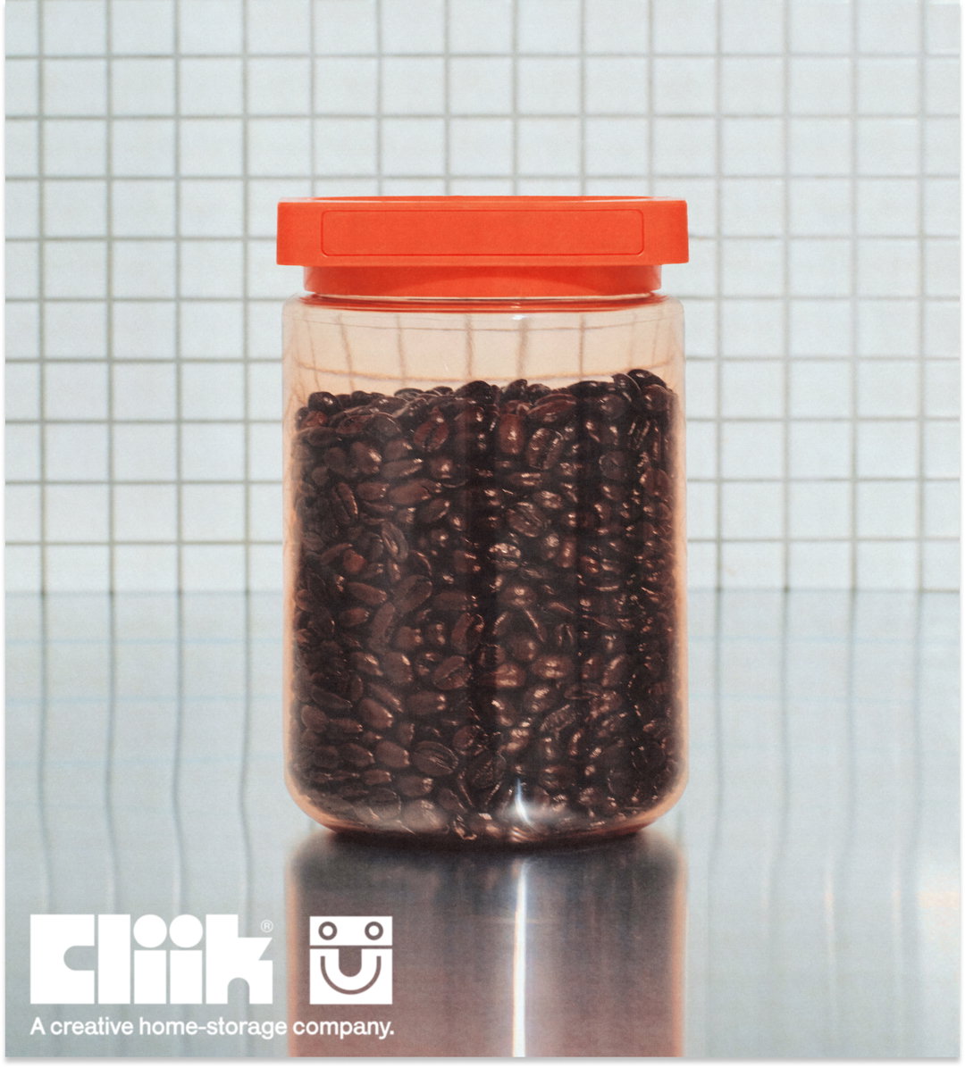
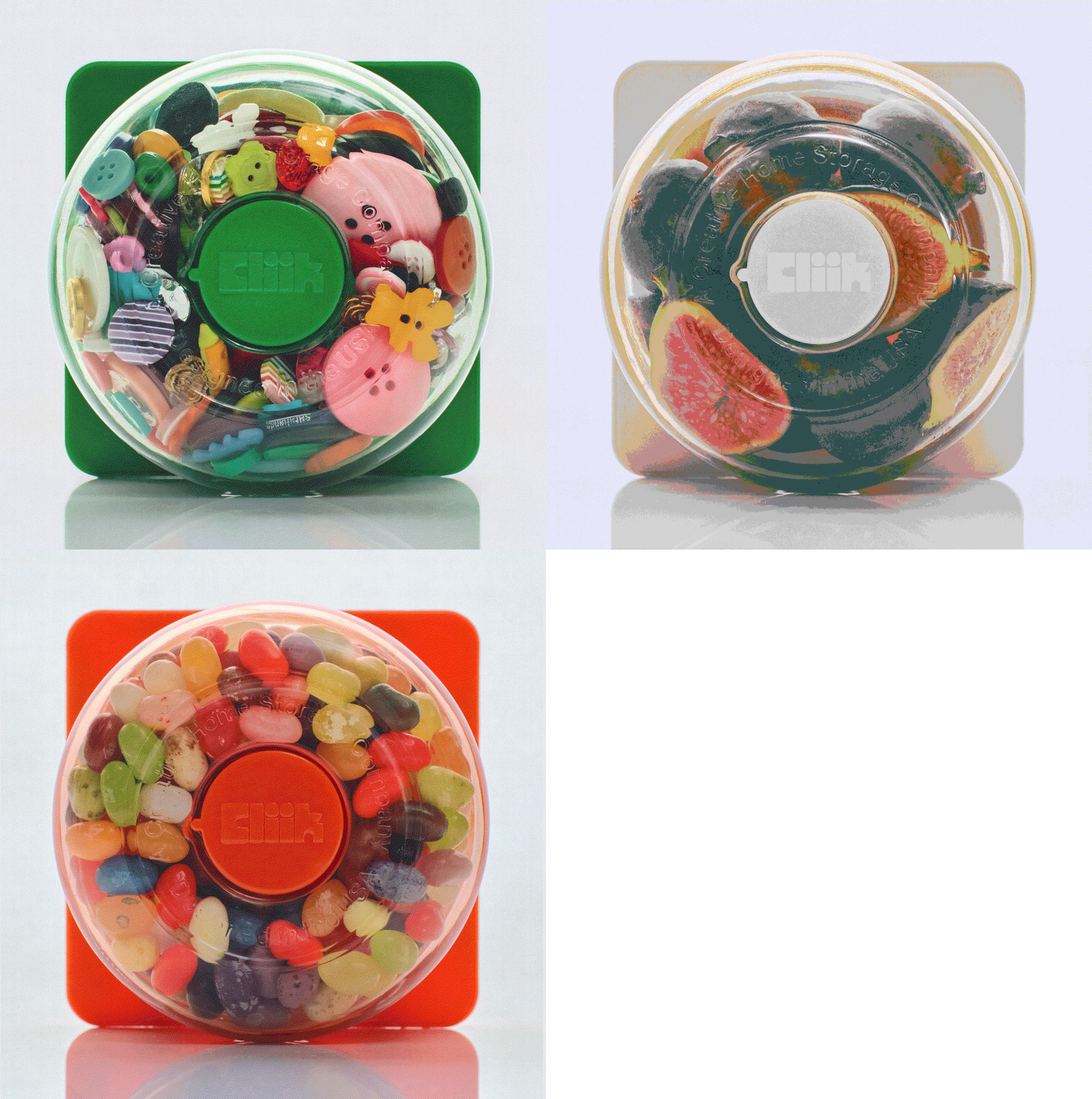
What mainly drew the team to the 1970s retrofuturist vibe was the sense of optimism for the future the trend had at its core, and the “tension of aesthetics between mid-century and space-age”, as seen in The Jetsons and 2001: A Space Odyssey. The brand colours also became the colourways for the first drop, and were named Aerospace Orange, Off white and Toy Green, and they opted for clear packaging, so as to both show off the product and to enhance the space-age feel.
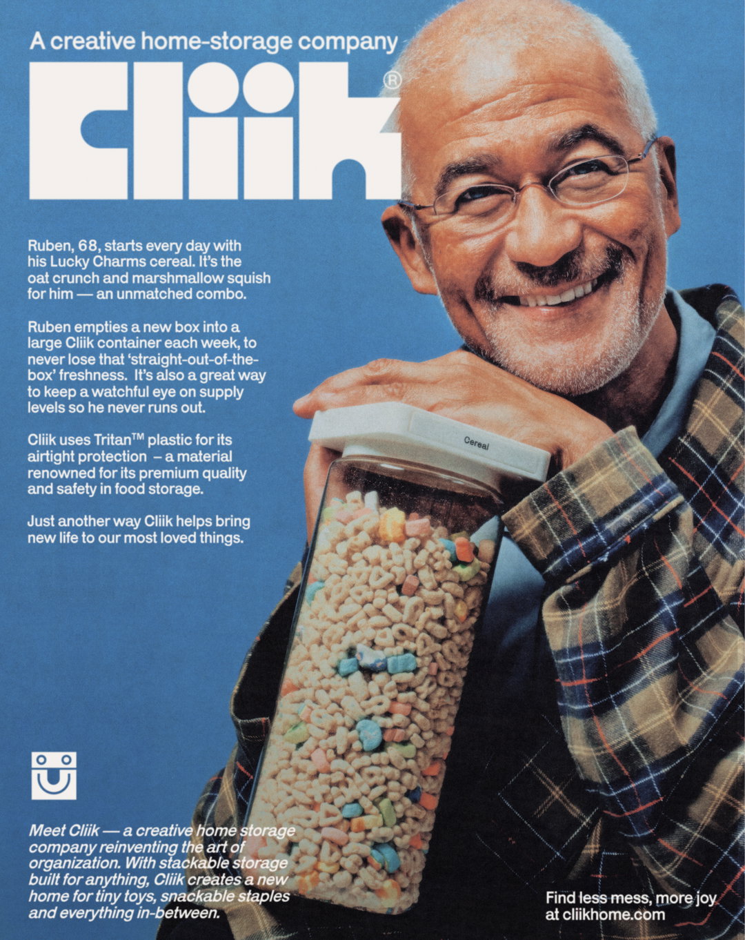
When it came to photography, this subtle 1970s feel maintained. Working with regular collaborator, photographer Luca Venter, in product shots the containers were back-lit and the surroundings stripped back, to evoke the “iconic 70s product advertising that elusively positioned the product in empty space”, says Noemie. This is contrasted with a portrait series of happy Cliik customers, who proudly show off the things they keep in their containers. “This series was a really important inclusion to us, as a way to bring in a sense of warmth, humanity and character to the brand, and we’re really excited to shoot more of these — maybe even with some more known names in the future,” says Noemie.
GalleryLittle Troop: Cliik (Copyright © Little Troop, 2024)


Hero Header
Little Troop: Cliik (Copyright © Little Troop, 2024)
Share Article
Further Info
About the Author
—
Olivia (she/her) is associate editor of the website, overseeing the day-to-day editorial projects as well as Nicer Tuesdays events. She joined the It’s Nice That team in 2021. ofh@itsnicethat.com
To submit your work to be featured on the site, see our Submissions Guide.




