Hotel Retro revives graphic luggage labels from the golden age of travel
Reproduced as 330 peelable stickers, these original designs from the Letterform Archive’s collection haven’t just been republished for reference – they’re to put straight on your suitcase.
Among Letterform Archive’s collection of more than 100,000 objects tracing the history of type design and lettering is a hefty assemblage of thousands of vintage luggage labels. Commissioned by grand hotels in the late nineteenth and early twentieth centuries, these relics were produced to stick to traveller’s trunks – “miniature marketing tools that became badges of pride for the emergent middle class, who viewed international travel as a luxury,” Letterform Archive Books publisher Lucie Parker tells us.
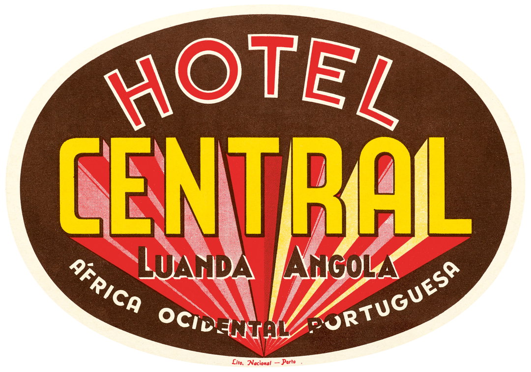
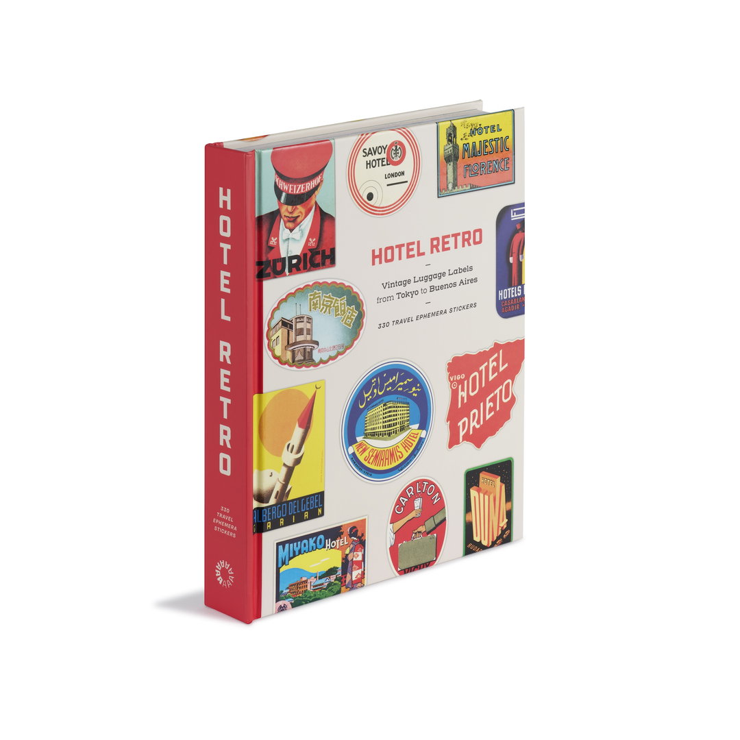
Surfacing this collection from it’s back catalogue for new audiences to enjoy today, Letterform Archive has published a new large format peel and stick book Hotel Retro: Vintage Luggage Labels from Tokyo to Buenos Aires. A 330-sticker-long journey through this new age of global travel by train and sea designed by San Francisco agency MacFadden & Thorpe, this incredible design archive of souvenirs takes you on a tour around the world: “From cosmopolitan European capitals to cultural havens in Bali, from pristine ski resorts in the Alps to the bustling beaches of Rio de Janeiro,” Lucie says. “The sheer variety of their represented styles is also fascinating, reflecting both regional preferences and the rapid aesthetic developments of their moment.”
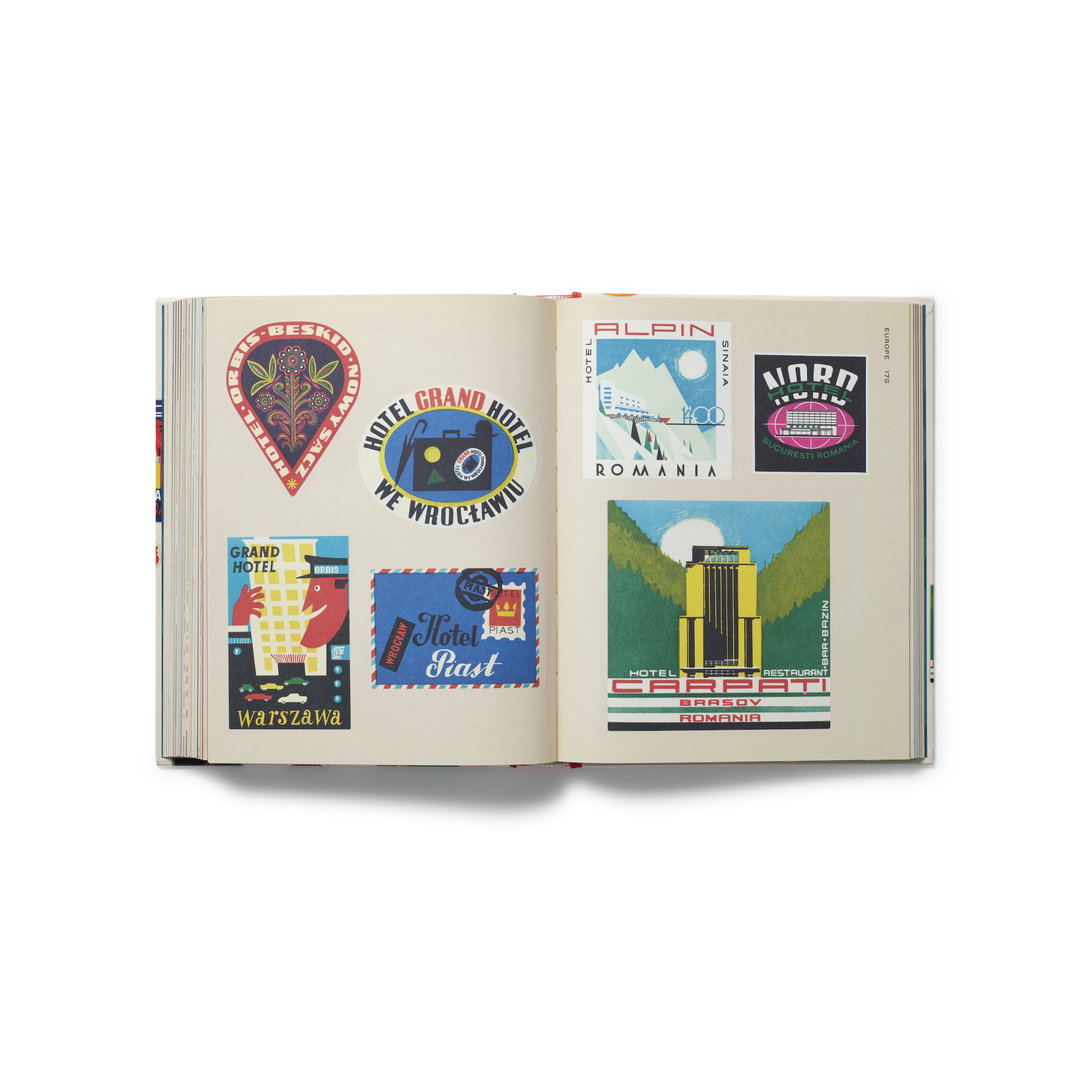
Letterform Archive Books: Hotel Retro: Vintage Luggage Labels from Buenos Aires to Tokyo (330 Travel Ephemera Stickers) (Copyright © Letterform Archive Books, 2026)
These stickers are not only miniature relics from a history of design – tracing visual developments from art deco to Swiss minimalism – they also evidence “a parallel boom in print ephemera, when advances in chromolithography allowed commercial artists to translate their talents to mass production for the first time”, Lucie shares. Produced before the invention of the computer, each miniature design object is an original artwork and shows the hand of artists, illustrators and printers alike – many boasting incredibly beautiful typographic solutions for stamps just a few inches wide.
While some stickers “owe their success entirely to their letterforms”, Lucie says, several hotels saw this as an opportunity to nod to the artistic legacies of their regions in their labels, “such as Delphi’s Hotel Vouzas, with its ancient ruins and Greek-inspired lettering, Kyoto’s Miyako Hotel, with an illustrative scene reminiscent of traditional Japanese woodcuts and the Hotel Alhambra Palace in Granada, whose label’s lettering incorporates the arches and geometric motifs of a local wonder of Moorish architecture.”
The challenge for the publisher was finding examples of the luggage label trend from every continent. The graphic craze started in Europe in the late 1800s and spread across the globe, which is why Letterform Archive’s collection contains such a far-ranging series of adhesive artefacts, “sweeping from the Americas to Africa and Asia to Oceania,” Lucie says. “But the bulk of our labels did originate in Europe, so we strategically sought out additions from areas like the Middle East and Indonesia to tell a well-rounded story.”
In the process, the team encountered all the regular restrictions that come with working with archival material, except things were, let’s say, a bit more sticky... than usual. Many of the luggage labels were stuck to cases or backing boards, housed by previous collectors that had to be carefully removed by the team for the purpose of digitisation before each individual design could be reproduced in print for the book.
Now the book is finally on shelves, Lucie hopes that the pages don’t stay intact for too long. She wants the stickers to end up in all kinds of places, as these original touring designs once did. “We just suggest that folks buy two copies: one to joyously use up – spreading stickers on surfaces far and wide – and one to keep intact for their own reference,” she ends. “It’s been an honour and a privilege to usher these artefacts out of the library stacks and make them available again in their original ephemeral form.”
GalleryLetterform Archive Books: Luggage label stickers from Hotel Retro: Vintage Luggage Labels from Buenos Aires to Tokyo (330 Travel Ephemera Stickers) (Copyright © Letterform Archive Books, 2026)
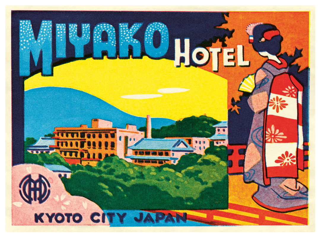
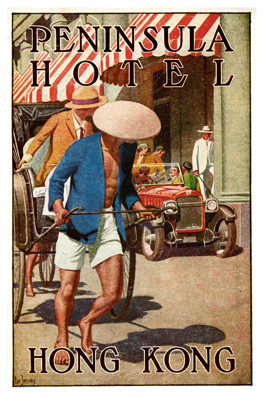
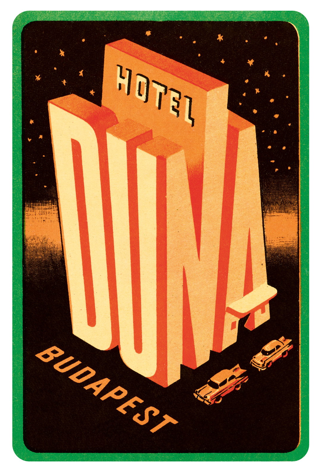
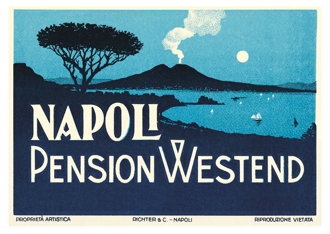
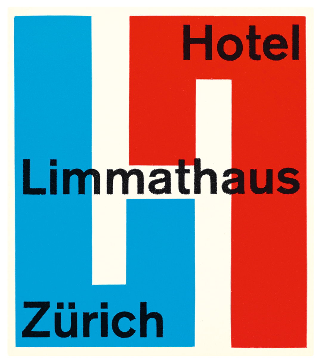

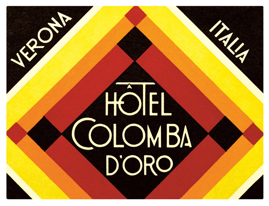
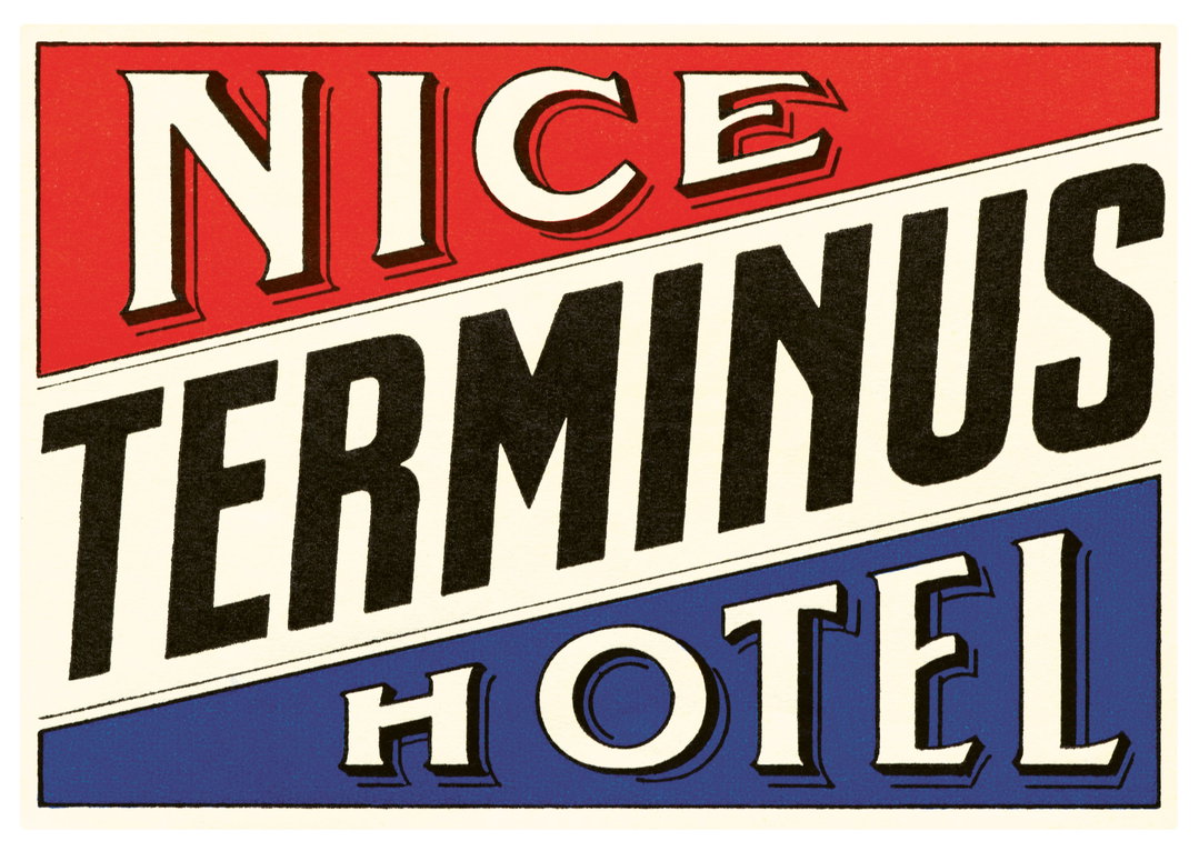
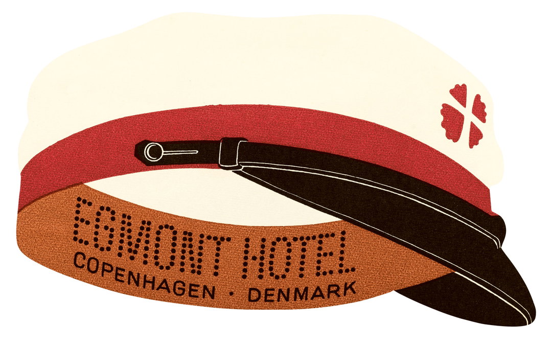
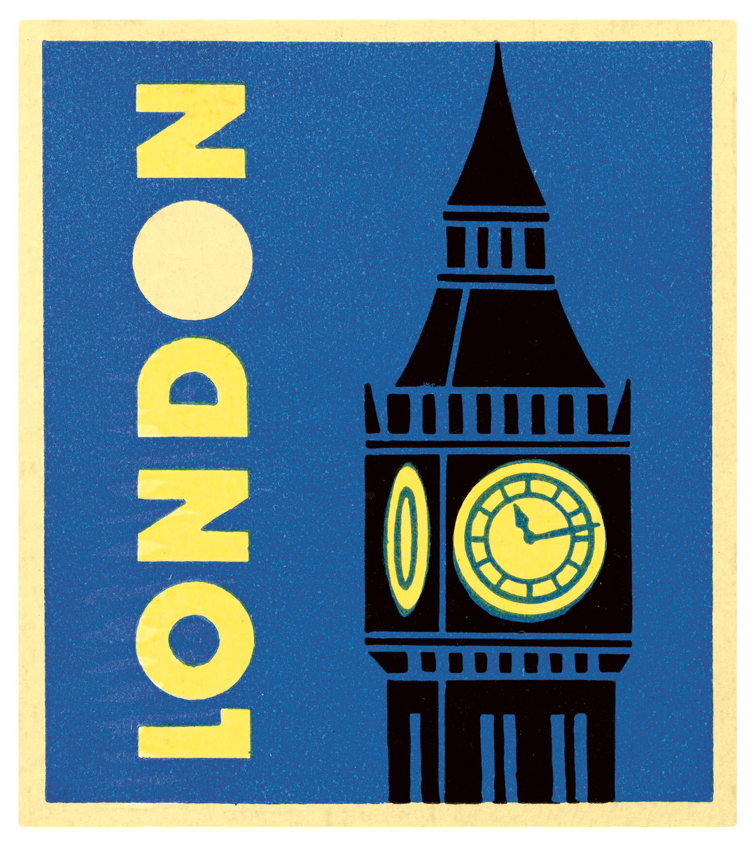
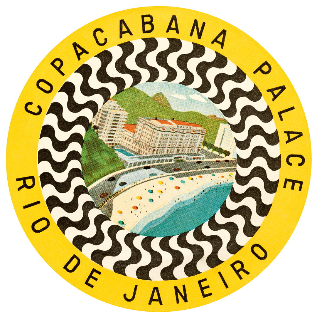
Letterform Archive Books: Hotel Retro: Vintage Luggage Labels from Buenos Aires to Tokyo (330 Travel Ephemera Stickers) (Copyright © Letterform Archive Books, 2026)
Share Article
About the Author
—
Ellis Tree (she/her) is a staff writer at It’s Nice That. She joined as a junior writer in April 2024 after graduating from Kingston School of Art with a degree in Graphic Design. Across her research, writing and visual work she has a particular interest in printmaking, self-publishing and expanded approaches to photography. ert@itsnicethat.com
To submit your work to be featured on the site, see our Submissions Guide.