Launch Recite Me assistive technology
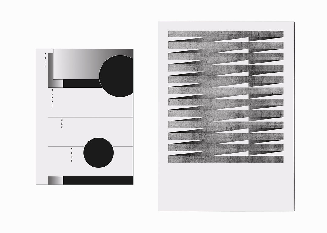
Two black and white graphic prints. The first features a minimalist layout with circles and the vertical text “2016”, “HAPPY”, “NEW” and “YEAR”. The second shows a series of stacked, textured grey ribbons that create a rhythmic, zig-zagging pattern.

The reductive and exacting work of graphic designer Laura Prim

—
Date
10 February 2017

Graphic designer Laura Prim set up her own studio in 2014 in her hometown of St Gallen in Switzerland. Laura studied graphic design at the School of Art and Design in Lucerne, and Typography at Zurich University of the Arts, and has worked at agencies in Berlin, London and St Gallen. Her portfolio includes posters and book designs for a number of cultural institutions and agencies, and shows how her education has resulted in a precise and exacting creative output.

“If there is enough time I love to go through an extensive design process,” explains Laura. “I start with defining the conditions but without any idea regarding what the design will look like in the end. It‘s an adventure! The results tend to be very reduced and focused on typography. I guess my preferred method of work is the method of reduction.”

Sharing her studio space with other designers allows for collaboration and experimentation. “I share my studio with a couple of good friends and talented designers from Kasper-Florio and Bureau Collective as well as the photographer Ladina Bischof. We maintain an enriching exchange on contemporary graphic design but also about music, films, art, exhibitions… it inspires me enormously to work in an environment like this,” says Laura. “I also find inspiration in books and blogs. Currently, among my main influences is the designer and architect AG Fronzoni, I also love of the art of Suprematism. Reduced, minimalistic work with beautiful details.”

Laura is currently working on a visual identity for a music festival and has ongoing projects with a local architect and a fashion designer, as well as a collaboration with another designer. “I cherish the unexpected influences, this brings excitement and surprising turns to the daily routine,” she says. “I should do this more often in the future!” 
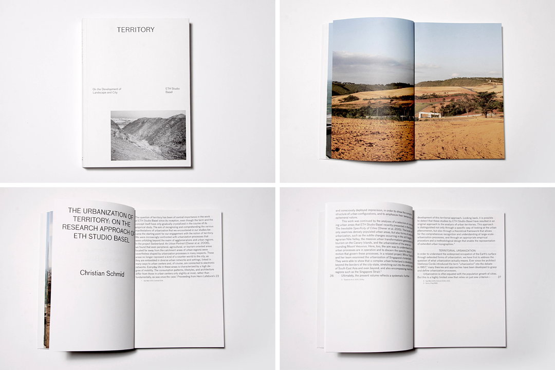
Four views of a book titled “Territory”. The images show the white cover with a landscape photograph, an open spread of a wide landscape, and a double-page spread of text and a small image.
Above

Laura Prim: Territory, On the Development of Landscape and City, ETH Studio Basel
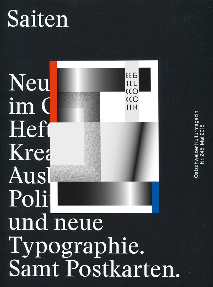
A magazine cover with a black background and white serif text. A central abstract composition features a grid of grey, white and black gradients, with a red strip on the left and a blue strip on the right. The main text reads “Saiten” at the top, and “Neu im Heft Kreat Ausl Poli und neue Typographie. Samt Postkarten.” across the middle and bottom. Vertical text on the right reads “Ostschweizer Kulturmagazin Nr. 245, Mai 2015”.
Above
Left

Laura Prim: Postcard for the Saiten Magazin

Right

Laura Prim: Kulturfestival St.Gallen 2015
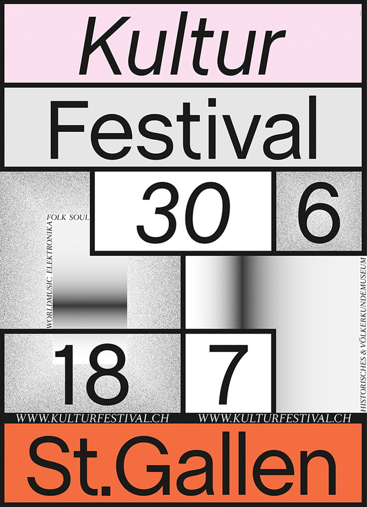
A typographic poster for “Kultur Festival” in St Gallen. The layout uses a grid of black, white, grey and pink blocks containing the dates “30 6” and “18 7”. Smaller text lists genres including “folk soul”, “worldmusic” and “elektronika”.
Above

Laura Prim: Kulturfestival St.Gallen 2015
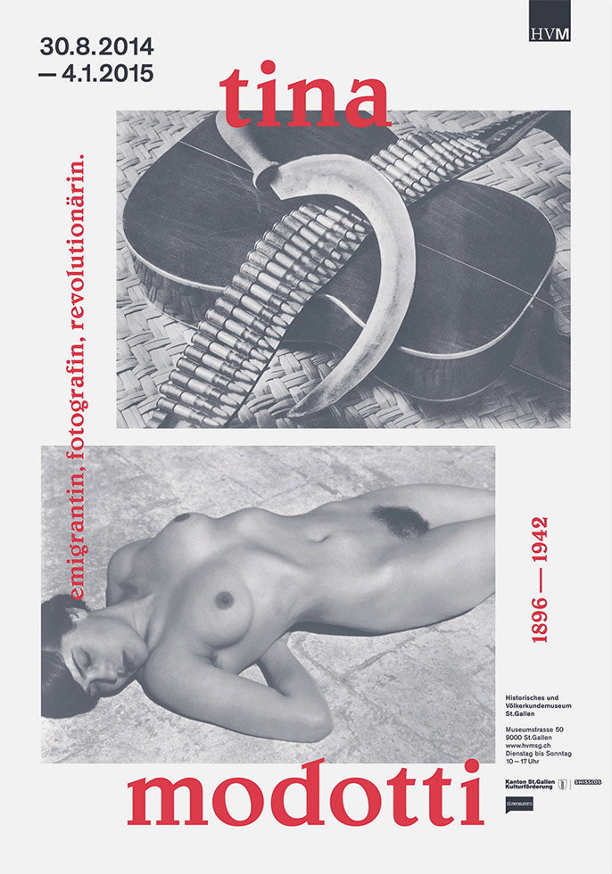
An exhibition poster for Tina Modotti featuring two black and white photographs. The top image shows a sickle and a strip of film laid over a guitar, while the bottom image is a nude figure reclining. Red text reads “tina modotti” and “emigrantin, fotografin, revolutionärin.”
Above

Laura Prim: Tina Modotti, Historical and Ethnological Museum St.Gallen
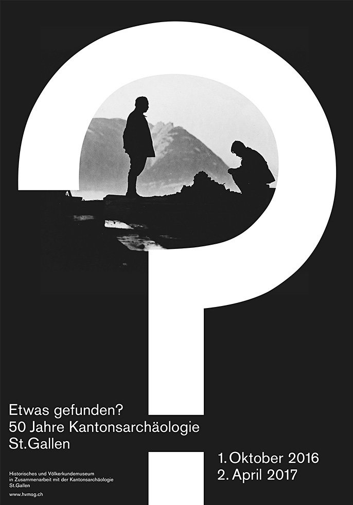
A black and white poster featuring a large white letter “P” that frames a photograph of two people silhouetted against a mountain landscape. One person stands while the other crouches, examining the ground. Text at the bottom reads “Etwas gefunden? 50 Jahre Kantonsarchäologie St. Gallen” and lists the dates “1. Oktober 2016” and “2. April 2017”.
Above
Left

Laura Prim: 50 Jahre Kantonsarchäologie, Historical and Ethnological Museum St.Gallen

Right

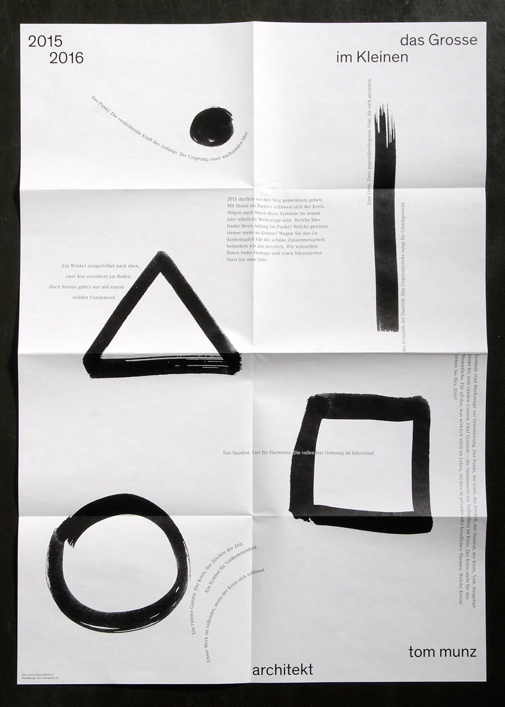
Laura Prim: Tom Munz Architect

A minimalist graphic design layout on white paper featuring black geometric shapes. A solid circle, a triangle, and a square are arranged alongside German text and the names “das Grosse im Kleinen”, “architekt” and “tom munz”.
Above

Laura Prim: Tom Munz Architect

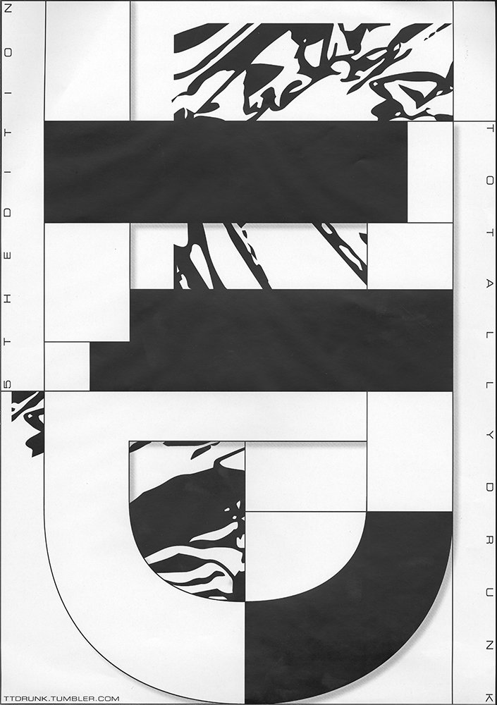
A black and white graphic poster featuring a large, abstract composition of bold shapes and organic, ink-like patterns. Vertical text on the left reads “5th edition” and text on the right reads “totally drunk”.
Above

Laura Prim: Totally Drunk, 5th Edition
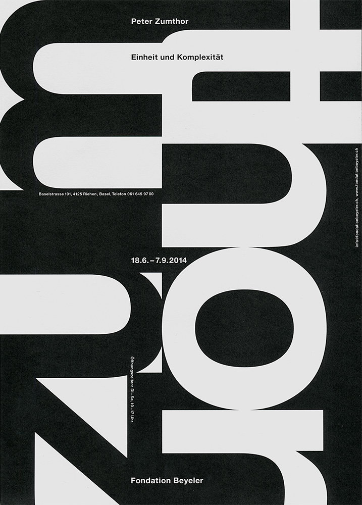
A black and white typographic poster for an exhibition by Peter Zumthor. Large, bold, cropped lettering fills the frame, overlaid with the text “Einheit und Komplexität”, the dates “18.6.–7.9.2014” and “Fondation Beyeler”.
Above

Laura Prim: Zumthor, Project Work ZhdK
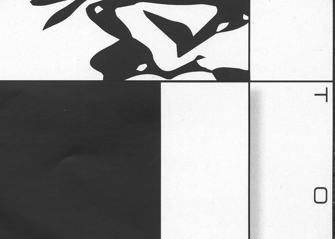
A black and white abstract composition. The top section features fluid, organic shapes, while the bottom is split into a solid black block and a white area containing the letters “T” and “O”.
Above

Laura Prim: Poster Totally Drunk, 5th Edition

Share Article

Further Info

About the Author

Owen Pritchard

—

Owen joined It’s Nice That as Editor in November of 2015 leading and overseeing all editorial content across online, print and the events programme, before leaving in early 2018.


It's Nice That Newsletters

Fancy a bit of It's Nice That in your inbox? Sign up to our newsletters and we'll keep you in the loop with everything good going on in the creative world.