Koto says Skyscanner rebrand is a shift in identity from “function-led to emotion-led”
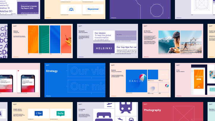
Skyscanner was a pioneer of sites of its ilk but, since its launch in 2003, the market for holiday booking has exploded with the arrival of sites like Booking.com, Expedia and Kayak. Meanwhile Skyscanner’s offering from simply a flight booking tool to a place to plan your entire trip, has also expanded. Its brand identity needed an overhaul to reflect its evolution, and London studio Koto has spent the past year doing just that, working with 50 or so people from the Skyscanner design team to come up with a new logo, type design, photography suite, colour palette and a whole host of new features to roll out across its diverse range of content.
Firstly, the logo had to change. It was too literal and prescriptive, showing scan lines through a cloud, and no longer communicated everything the company does. “Their product has developed to provide services beyond just flight comparison, but their previous logo only communicated this single offer,” explains Koto’s founder and executive creative director James Greenfield. “We designed the brand around their guiding principle, to put travellers first, which made it very clear that they needed to externalise a shift from a function-led to an emotion-led brand.”
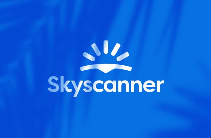
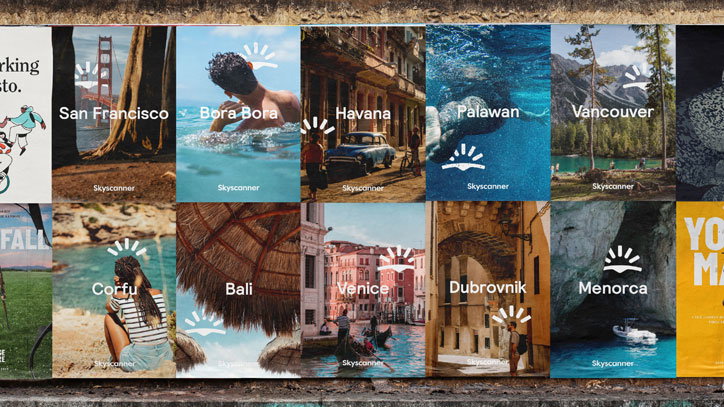
As any brand working as an app will know, the recognisability of its logo was paramount, doubly so because a lot of users still access Skyscanner in browser with lots of other tabs open to compare prices on other holiday sites. The simple icon now depicts the curve of the earth, with a subtle indent to signify a place pinned on a map, and with sunbeams emerging over the horizon.
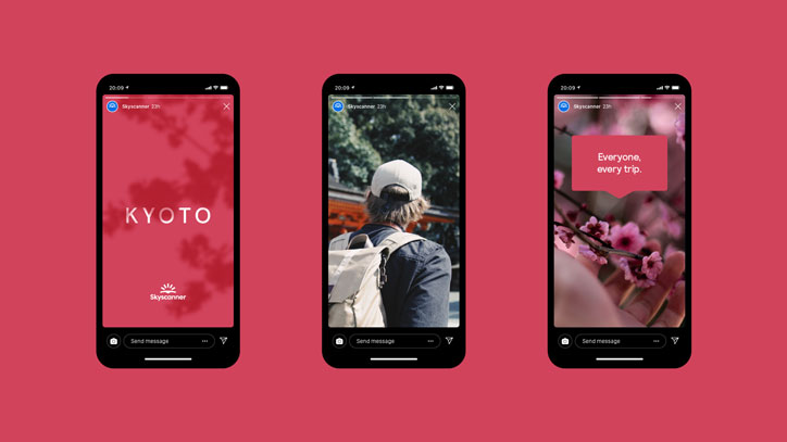
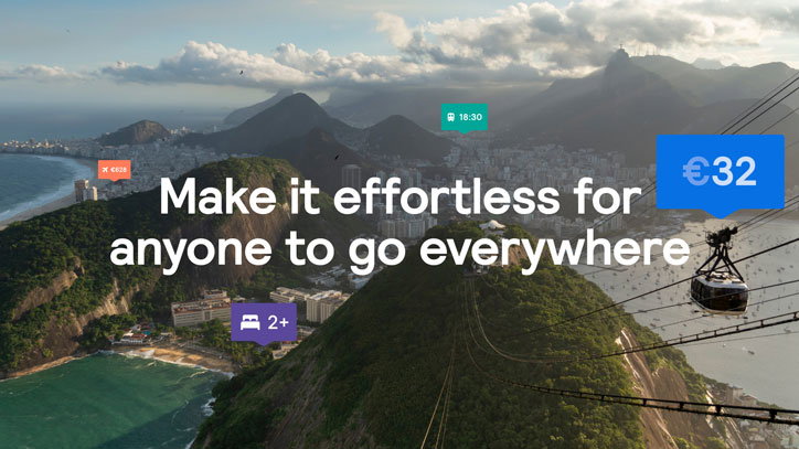
The core brand colour is still blue, because “when sky is in the name, anything else maybe just feels wrong,” says James, but also as it’s the main link with the old brand. Meanwhile there’s a wide range of secondary colours for designers to choose from in the palette, cherry-picked from nature in destinations around the world to “reflect the variety of colours that can be found world-over”. These were tested extensively to work for accessibility, James says, and across all different outputs. “We created clear guidance on how to use each colour in different types of content,” he explains, for example a cold blue for a story on Brooklyn.
Photography purposely goes against the types of imagery we’re used to seeing on holiday marketing. “The industry is so full of cliches, so we selected imagery showing moments you wouldn’t necessarily take a photo of, for example the long, golden hour shadows of palm leaves. They give a sense of place without your typical horizon shot,” continues senior designer Ben Dolphin.
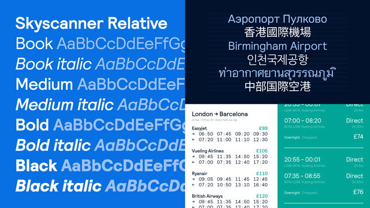
The typeface is Relative by Colophon, chosen because it “reflects the rounded nature of the beams in the symbol,” Ben says, plus it is “friendly and informative, and proportionally weighted, something that’s incredibly useful in complex product screens”. Colophon also developed a new custom black weight for Skyscanner to use in priority locations.
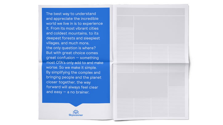
Overall, the process of rebranding took a year, and comes complete with brand identity guidelines for the Skyscanner team to use at their will, on an extensive range of outputs, to be seen by 100 million monthly users. “What’s important to note is there are lots of moving parts in a project like this,” James concludes. “There’s just so much output that you don’t take into account at first glance. It’s not just us in a room coming up with a design vision, it’s an iterative process.”
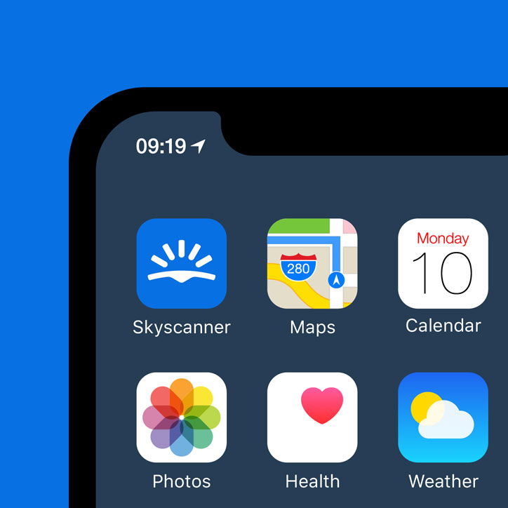
Koto: Skyscanner rebrand
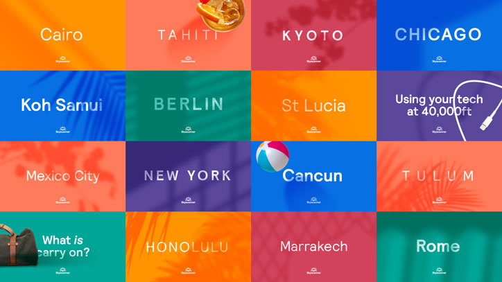
Koto: Skyscanner rebrand
Koto: Skyscanner rebrand
Koto: Skyscanner rebrand
Koto: Skyscanner rebrand
Koto: Skyscanner rebrand

Koto: Skyscanner rebrand
Koto: Skyscanner rebrand
Koto: Skyscanner rebrand
Share Article
Further Info
About the Author
—
Jenny oversees editorial output across It’s Nice That. Get in touch with writing pitches for features or opinion pieces, big creative story tips, or questions about all things editorial. jb@itsnicethat.com
To submit your work to be featured on the site, please see our Submissions Guide.