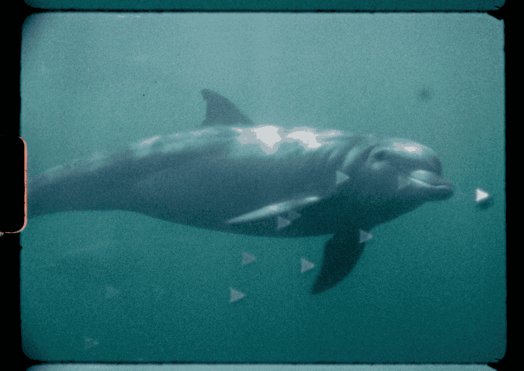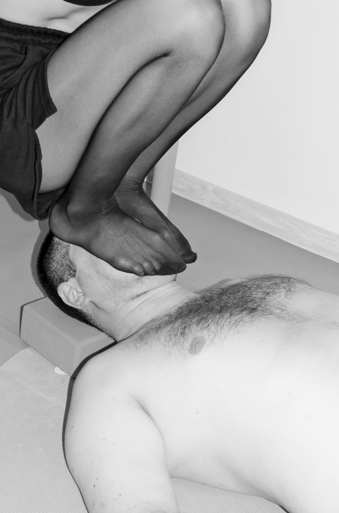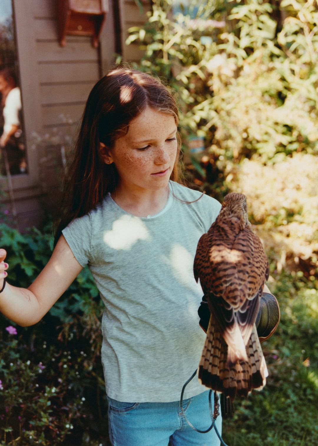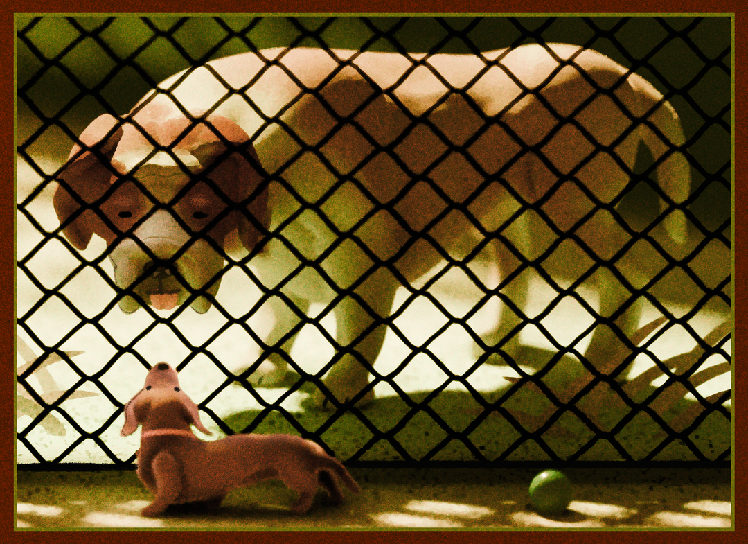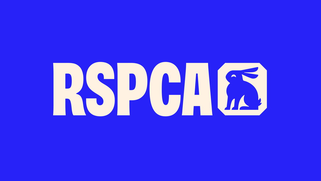
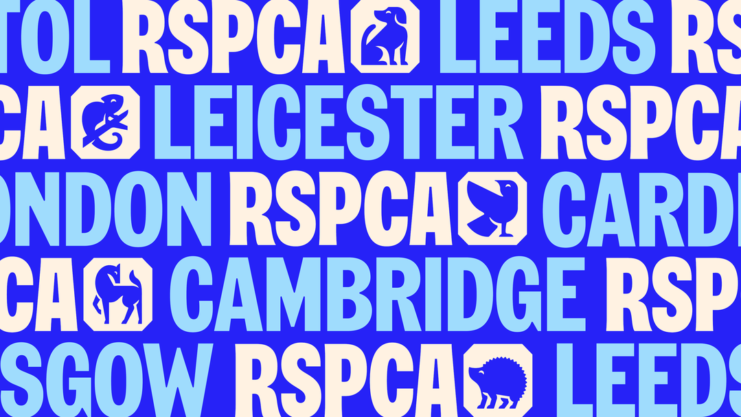
The octagonal shape that features in the RSPCA logo is well known. Yet, this recognisable element of the 200-year-old charity had come to represent a problem. “When it comes to animal welfare, RSPCA are the originals, leading society forward for 200 years. But their outdated brand didn’t reflect that status,” says Ellen Moriarty, design director at Jones Knowles Ritchie; “they [are] seen as cold and authoritarian”. So, JKR has discarded the old octagon, “literally opening it up to all”.
It’s the first major rebrand in 50 years for the RSPCA, the largest welfare animal charity in the world, and its been transformed from head-to-toe. Jones Knowles Ritchie is the design agency responsible for the work, and is also the name behind some of the most complete brand transformations in recent years, like the Burger King rebrand. The hope is that the design overhaul will help the company as it readies itself to tackle some of its most urgent struggles yet.
“Between intensive farming, climate change and urbanisation, farmed animals and wild animals are now facing some of the biggest challenges ever,” says Chris Sherwood, RSPCA chief executive. “In the face of these challenges, the organisation realised the need to evolve the brand to broaden its appeal and reconnect with society,” Ellen adds.
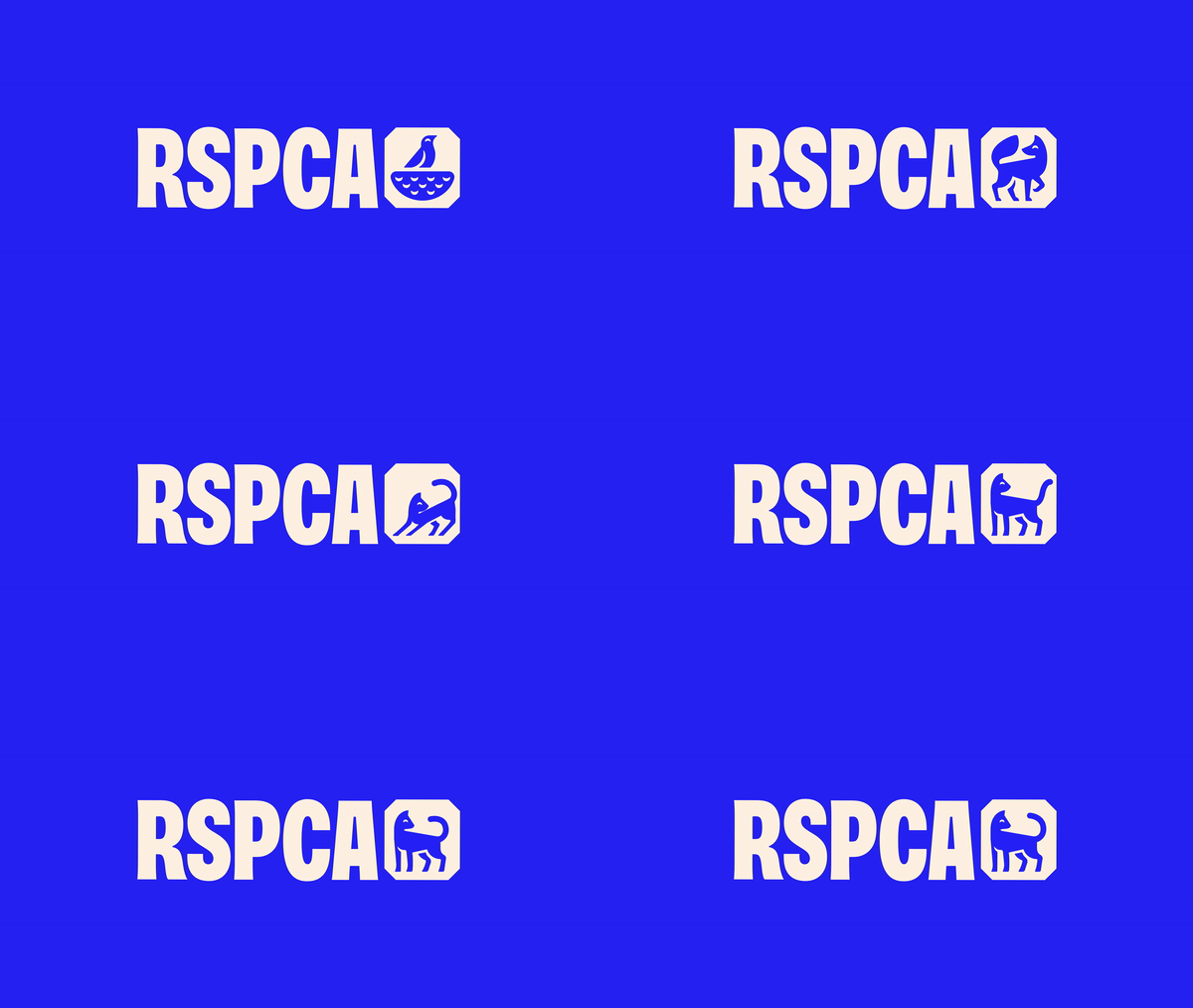
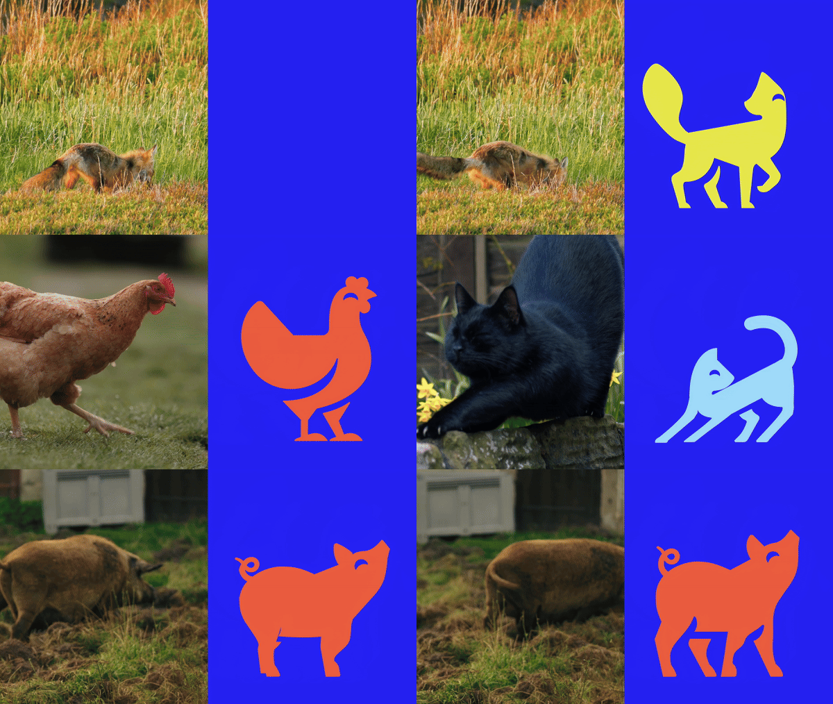
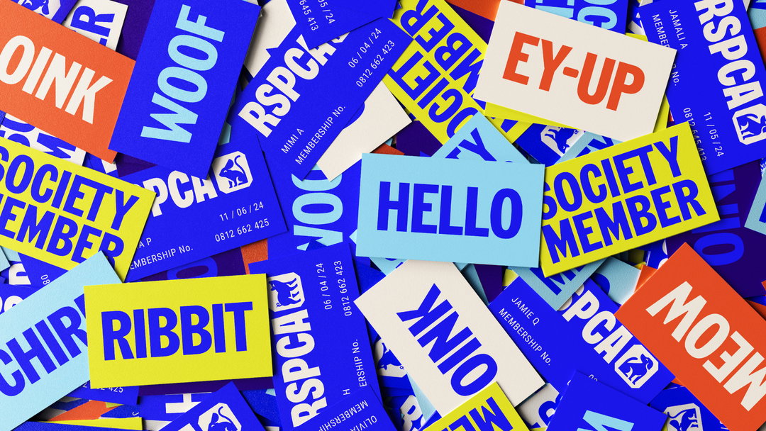
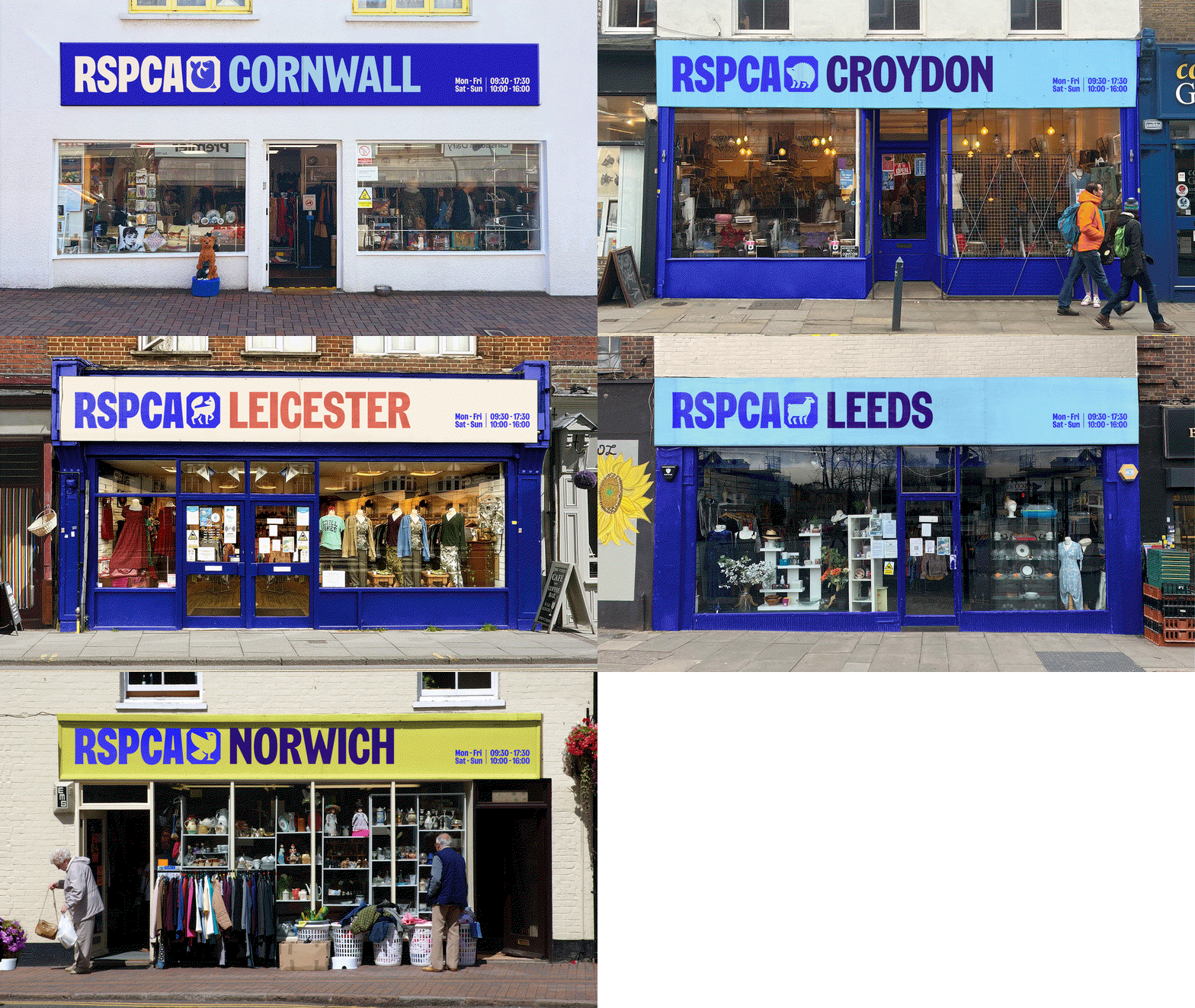
To help with this next step, JKR is hoping to appeal to audiences’ humanity. The tone of the rebrand is unmistakably positive – bold, but non-intimidating. The major design changes are a custom brandmark and new octagon shape, that frames the breadth of animals the RSPCA protects. Apparently branches across the country can customise the RSPCA logo using this shape and a suite of illustrations portraying “happy, healthy animals”, by picking an animal that “best reflects them” in their brand communications.

Jones Knowles Ritchie (JKR): RSPCA (Copyright © RSPCA, 2024)
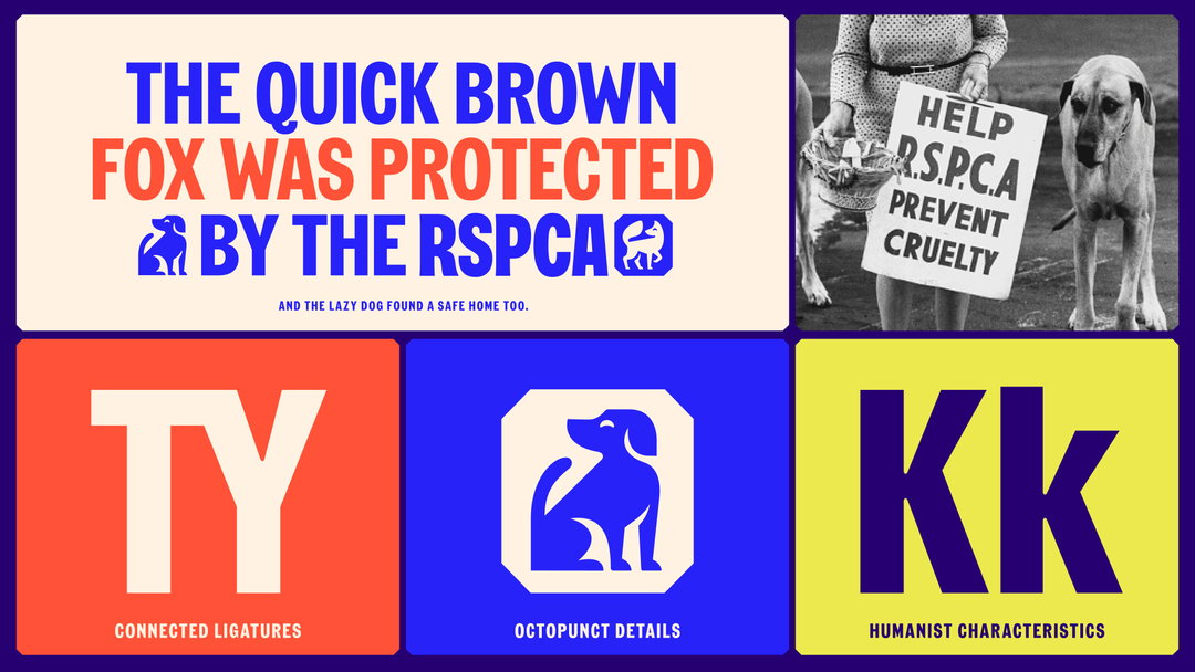
RSPCA’s previous, more sombre, blue has been traded for a colour palette better fit for digital use. JKR says the bespoke font developed for RSPCA with Studio Drama is inspired by protest placards found in the brand’s archive and mirrors small details within the illustrations.
The research process was extensive. JKR travelled to animal centres, hospitals, branches and its national call centre, meeting RSPCA volunteers, inspectors, vets, wildlife experts and branch managers. It sought to gain a “comprehensive” understanding of the charity’s broad work to ensure the brand would support, not restrict this work.
Beyond the rebrand, this is a significant, wide-reaching public awareness moment for the charity. A wider campaign has been developed with creative agency AMV BBDO, to “nudge each and everyone to up the scale of animal welfare, one kind action at a time”, says the press release. It includes a film directed by Raine Allen-Miller through Somesuch and media strategy extending across TV, cinema, OOH and digital.
GalleryJones Knowles Ritchie (JKR): RSPCA (Copyright © RSPCA, 2024)


Hero Header
Jones Knowles Ritchie (JKR): RSPCA (Copyright © RSPCA, 2024)
Share Article
Further Info
About the Author
—
Liz (she/they) is the senior editor at Insights, a research-driven department within It’s Nice That. They previously ran the news section of the website. Get in contact with them for potential Insights collaborations or to discuss Insights’ public-facing reports.