




Behind the Cop26 brand identity with Johnson Banks, as it takes centre stage at the global conference
“The end result is clearly earth-like, yet slightly other-worldly” – how the swirling globe graphic shows a planet united in flux.
When design studio Johnson Banks first started discussing the Cop26 brand identity with its client The Cabinet Office, they knew it would be big news – but even they couldn’t predict the attention it would receive. “The reaction to it has been amazing – the highest traffic to our site and social media we’ve ever had,” Michael Johnson tells It’s Nice That. “Perhaps it’s because it’s unusual for such a ‘conceptual’ design idea to be seen on the world’s stage? To see it being discussed, critiqued, celebrated and lampooned in equal measure is a rollercoaster ride…” Rewind a couple of years and the project, of course originally planned for November 2020, did have ambitious goals. Aiming to raise the bar compared with “underwhelming” and “cliched”, even “amateurish” previous graphic identities, the project set out with “an overall desire to express hope with a sense of urgency,” Michael says.
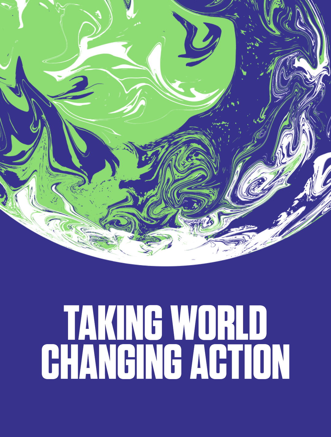
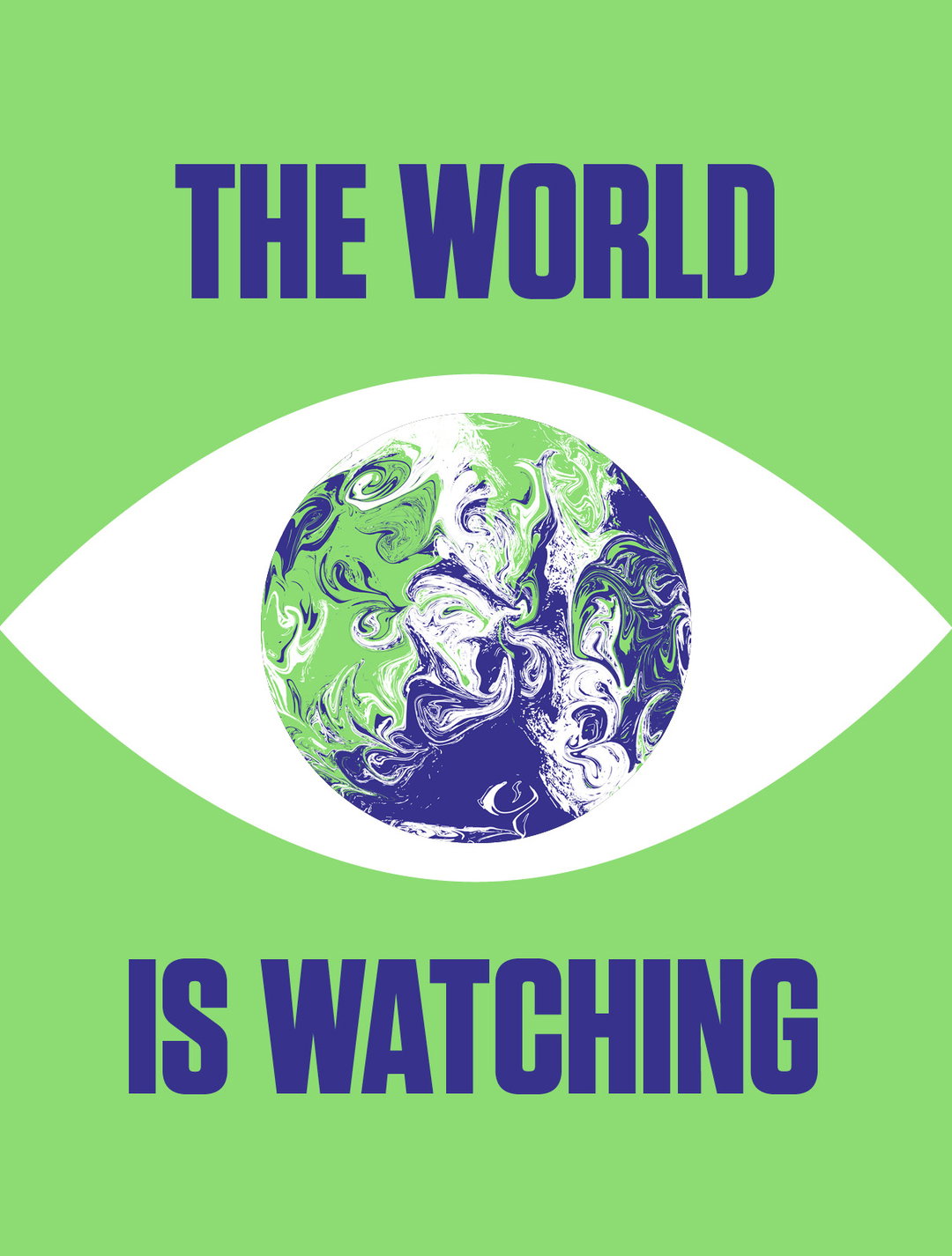
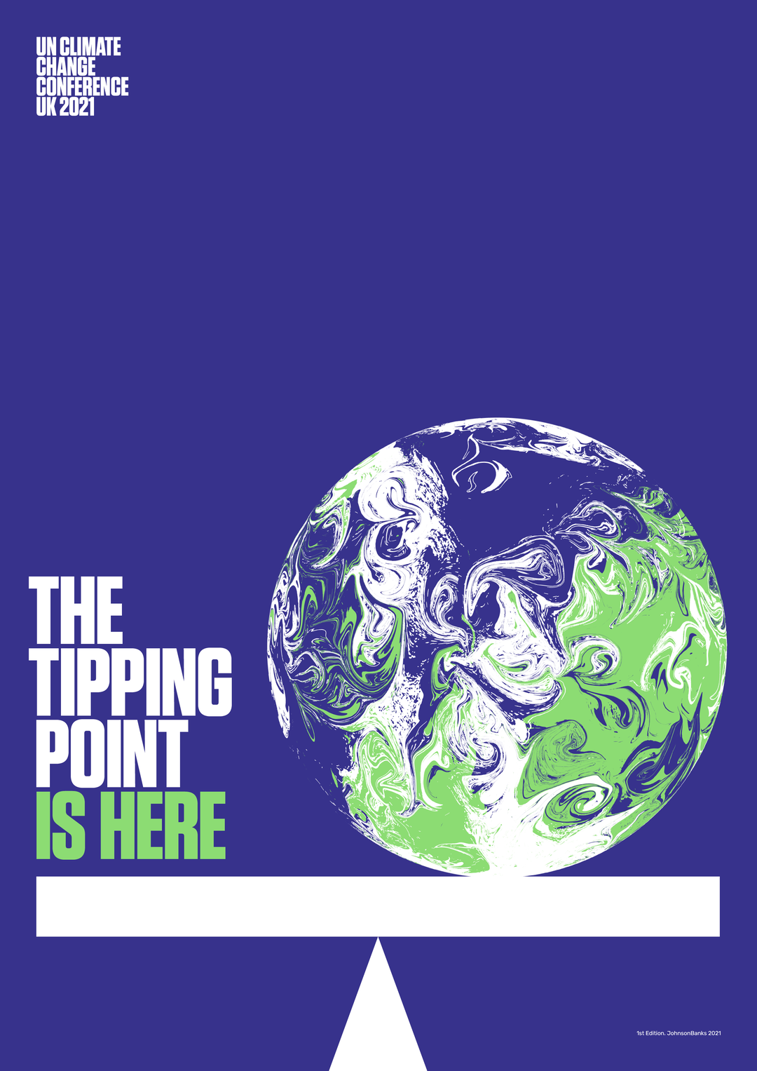
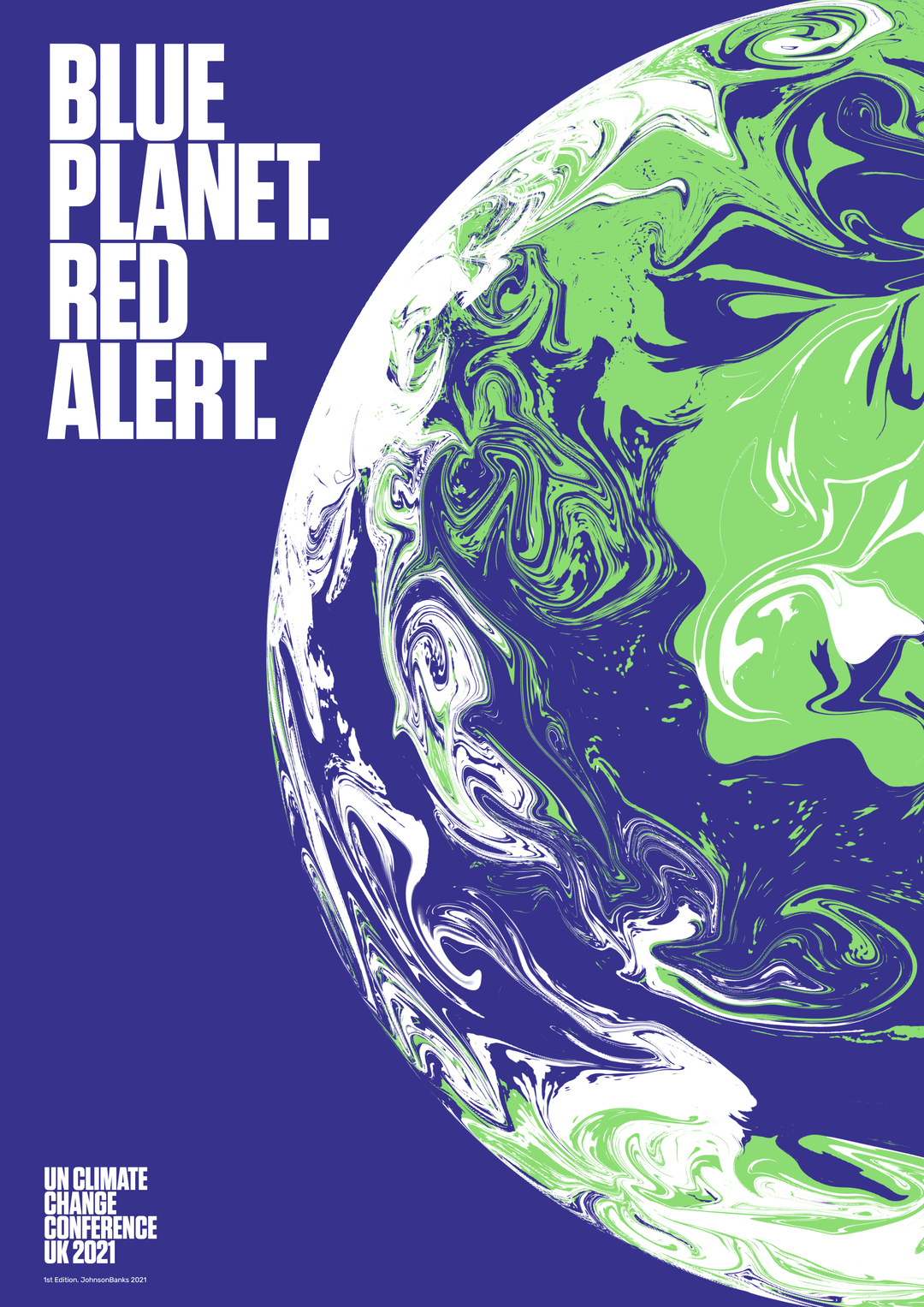
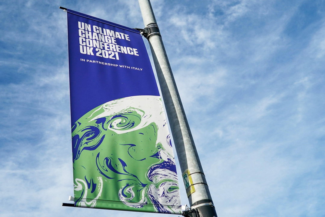
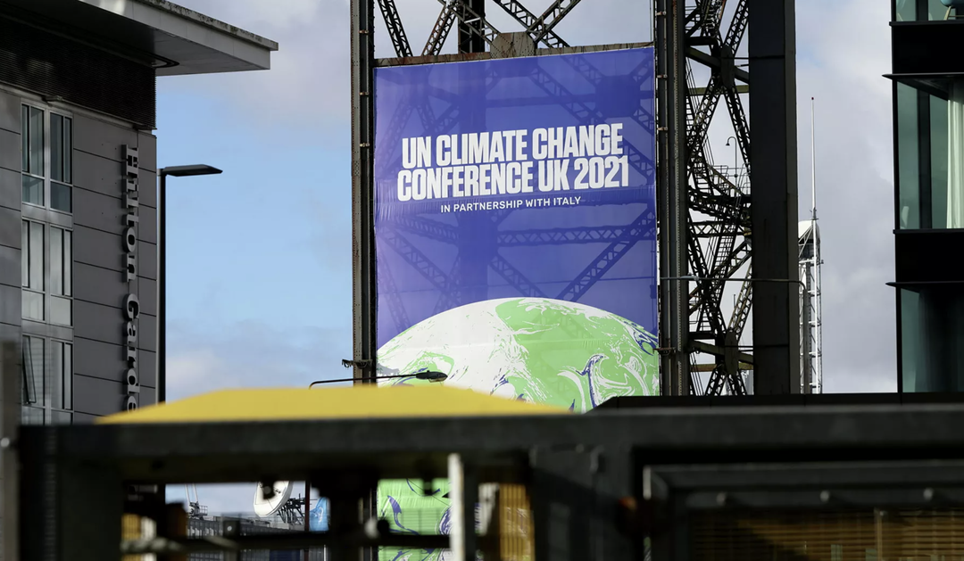
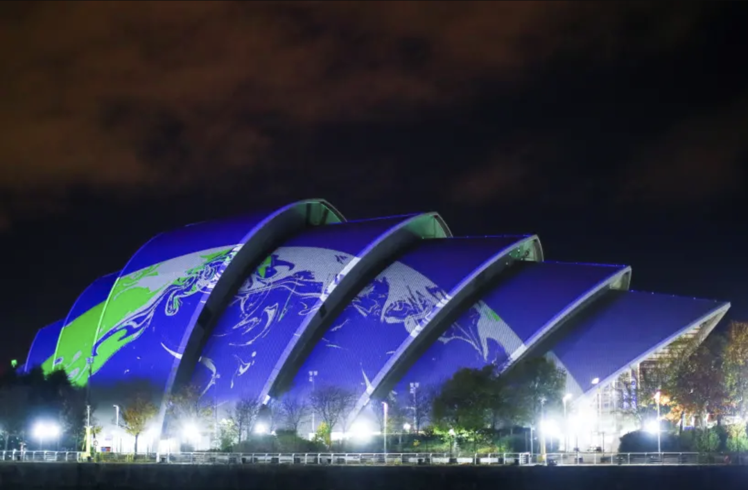
The identity centres around an image of a globe, but not exactly as we know it. The planet is identifiable with its forms of green and blue, but those continents and oceans have been given a swirling effect akin to marbling. While this comes with aesthetic benefits, the reasoning behind the idea was to anonymise the countries, so none were visually prioritised when discussing the effects of climate change. “Right from the off, it was clear that if we did use an Earth image, we had to avoid showing one particular continent over another – no one country can be either at the fore, or to blame,” Michael says. That led to many discussions about the world being “in flux” and “how the climate crisis crossed every border” he continues, and experiments which abstracted recognisable imagery of the planet. “The end result (after a lot of experimentation) is clearly earth-like, yet slightly other-worldly,” he describes. The swirling comes to life beautifully in animated graphics by The Mill, which during Cop26 have been everywhere including being projected on the roof of the conference venue, the SEC.
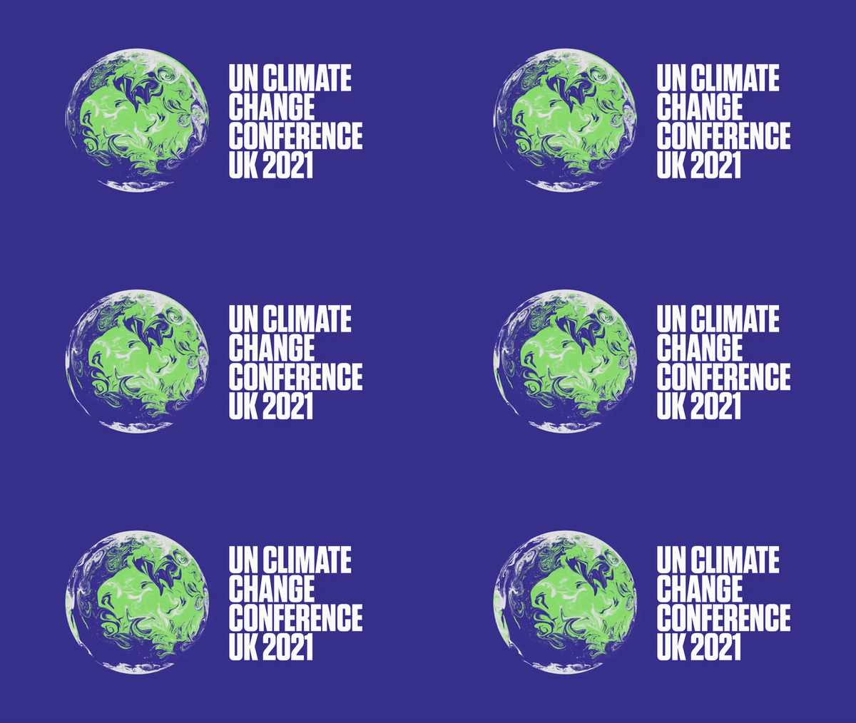
Johnson Banks: Cop26 graphic identity (Copyright © The Cabinet Office, 2021)
This slightly alien world concept extends to the colour scheme, which too is the result of abstracting more typically natural imagery. While the imagery started off photographic, it evolved to a more graphic feel, so the design team (Beth Johnson, Steven O’Neil, and Michael himself) removed colours until it distilled to three: deep blue, bright green and white. “Again Earth-like but perhaps not quite the colours you would expect.”
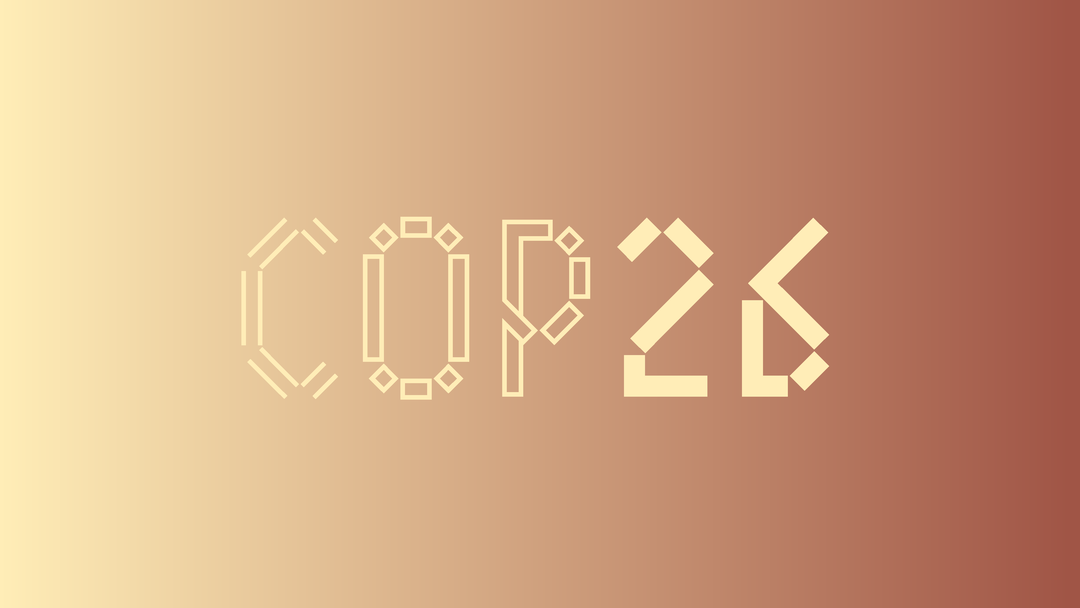
The studio’s approach to type has been to get the urgency of the message across as boldly as possible, in a typeface that was contemporary yet still mindful of the serious nature of the event and the widely varied audiences it would reach. Johnson Banks went for Tungsten, a Hoefler typeface that Michael describes as “a really non-nonsense, punchy condensed serif” that conveyed urgency and gravitas, strident but not shouty”. He adds that it also allows for headlines and the conference’s full name to be tightly kerned and have leaded capital letters.
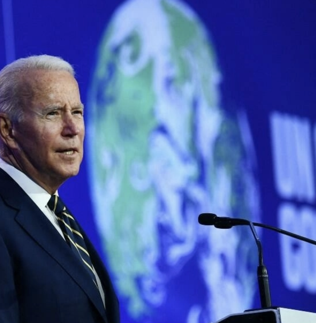
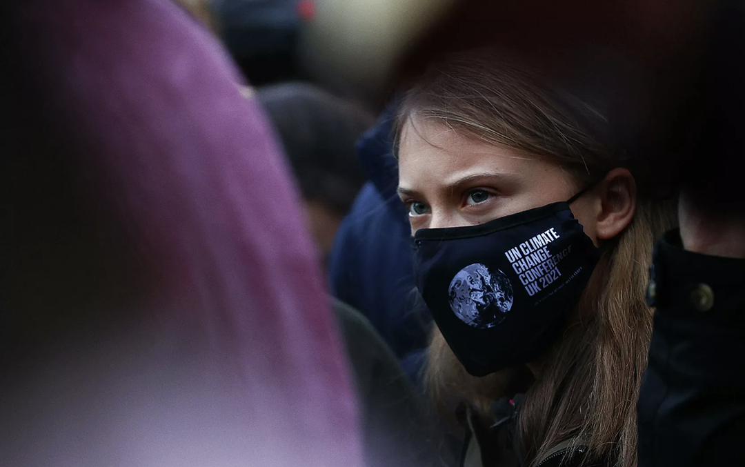
After a frustrating, pandemic-delayed launch, the studio are now enjoying seeing their work seemingly “literally everywhere” – not just the streets of Glasgow but other UK cities, and all over the media, with world leaders and superstar climate activists such as David Attenborough alike standing amidst the identity. “It’s not every day that both Greta Thunberg and an American president wear or stand in front of your logo, or it’s printed to a massive scale and attached to a crane, or a Guardian cartoonist turns your logo into the Prime Minister’s buttocks, for example!” Michael laughs. “When it was delayed I think we slightly forgot about it – but there’s always a worry that an idea that seemed pertinent two years previously has been overtaken by events, or looks ‘of a time’. Luckily I think this idea still holds and the fact that the COP team have used it so boldly, and so extensively, has just made a big idea even bigger.”
GalleryJohnson Banks: Cop26 graphic identity (Copyright © The Cabinet Office, 2021)

Response & Responsibility – Cop26
During the next two weeks, over 120 world leaders are meeting in Glasgow to agree on the actions needed to pull the earth back from the brink of a climate catastrophe. The most important conference of our lifetime, in response, we are exploring creative responses to the climate crisis throughout the duration of Cop26.
Hero Header
Johnson Banks: Cop26 graphic identity (Copyright © The Cabinet Office, 2021)
Share Article
Further Info
About the Author
—
Jenny oversees editorial output across It’s Nice That. Get in touch with writing pitches for features or opinion pieces, big creative story tips, or questions about all things editorial. jb@itsnicethat.com
To submit your work to be featured on the site, please see our Submissions Guide.


