Launch Recite Me assistive technology
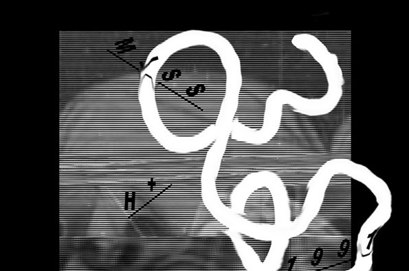
A white, looping line twists across a background of fine horizontal black and white stripes. Hand-drawn markings and letters, including “W” and “H”, appear alongside diagonal lines.

Great music-focussed graphic design portfolio from Manchester's Joe Stratton

—
Date
20 April 2012

Manchester-based creative Joe Stratton epitomises current graphic design trends. That is, his portfolio – which abounds with wavy lines, internet-sourced imagery and manipulated type – tends towards fine art (why are young designers so scared of designing sweetener packaging?). But Stratton instead displays compositional nous, a keen visual eye and technical finesse. And combine this with the fact he seems to be working mainly for clients in music – an industry dependent on its ability to reflect contemporary fashions – and you can conclude Stratton’s pretty much nailing it.
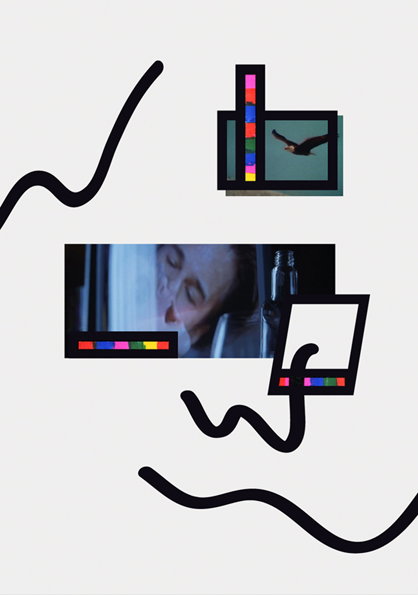
A collage featuring fragmented photographic strips and black squiggly lines on a plain white background. The images include a close-up of a person’s face and a bird in flight, accented by small, multi-coloured test bars.
Above

Joe Stratton: ✈

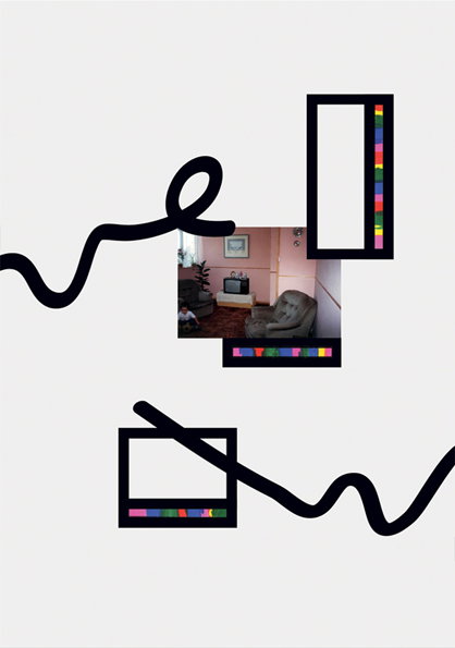
A collage featuring three rectangular frames on a pale pink background. One frame contains a photo of a living room with a sofa and a television, while the others are empty. A thick, black squiggly line weaves across the composition. Small, multicoloured blocks line the edges of the frames.
Above

Joe Stratton: ✈

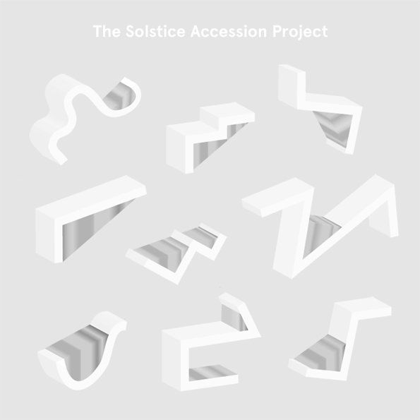
A 3D render of ten abstract, white architectural forms arranged in a grid against a light grey background. Text at the top reads “The Solstice Accession Project”.
Above

Joe Stratton: The Solstice Accession Project
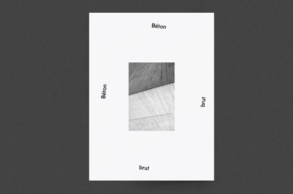
A white poster features a central black and white photograph of textured concrete surfaces. The words “Béton” and “brut” are placed around the image, with “Béton” at the top and left, and “brut” at the bottom and right.
Above

Joe Stratton: Béton brut

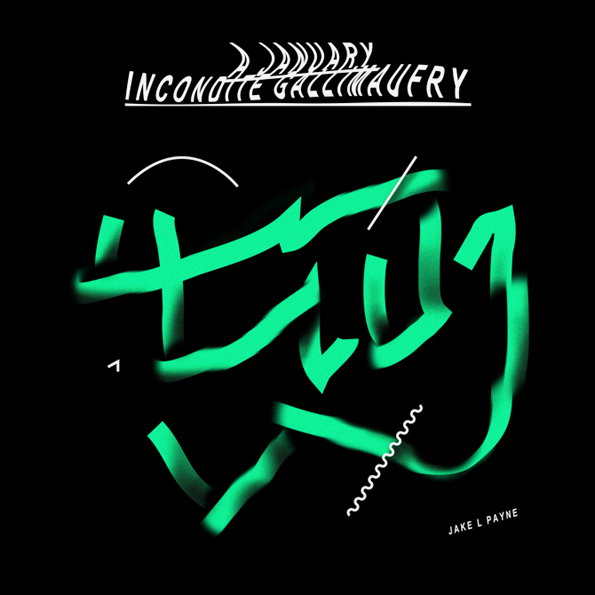
A digital illustration of abstract, flowing calligraphic shapes in neon green against a black background. White text at the top reads “INCONNUETTE GALLIMAUFRY”, with the name “JAKE L PAYNE” in the bottom right corner.
Above

Joe Stratton: A January Incondite Gallimaufry

Share Article

About the Author

Alex Moshakis

—

Alex originally joined It’s Nice That as a designer but moved into editorial and oversaw the It’s Nice That magazine from Issue Six (July 2011) to Issue Eight (March 2012) before moving on that summer.


It's Nice That Newsletters

Fancy a bit of It's Nice That in your inbox? Sign up to our newsletters and we'll keep you in the loop with everything good going on in the creative world.