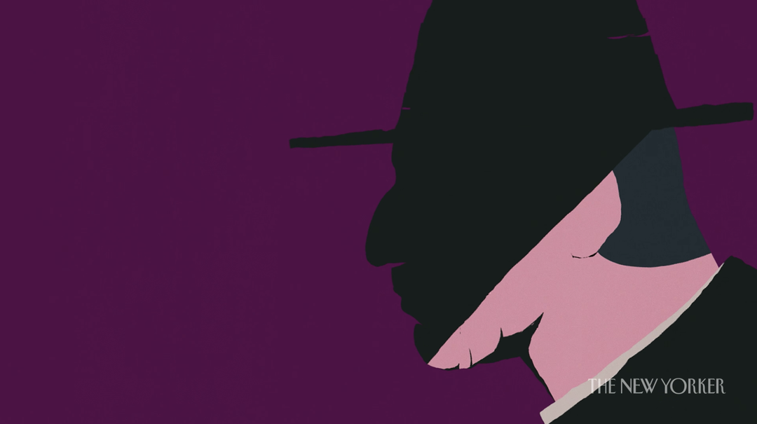
Joe Donaldson visualises the voices of Leonard Cohen and David Attenborough for The New Yorker
Working on the publication's venture into animated storytelling, the Florida-based animator proves the magic in narrative-led motion design.
Share
Despite his long winding career as an animator – including a stellar list of clients including Instagram, Google and The New York Times, as well as founding Holdframe, an ever-growing collection of animation led project files for educational purposes – Joe Donaldson still gets a new thrill when a possible job pops into his inbox.
Recently, this included an email from The New Yorker, asking the Florida-based animator to join the publication on a relatively new venture: animated visual essays. “Even after 12 years of doing this, it’s still exciting when you get a new email from a client you’ve never worked with,” Joe iterates, “especially when it’s The New Yorker!”
Contacted by Yara Bishara and Soo-Jeong Kang from the title’s video department, The New Yorker was in need of Joe’s knack for storytelling to bring to life an interview with Leonard Cohen – which soon developed into a series also featuring absolute creative heavyweights, Janelle Monáe and David Attenborough. With such rich nuggets of advice and insight from each interviewee, Joe was then left with the incredible job of visualising their tales, spanning from heartbreaking conversations on death in Cohen’s case (recorded just before his untimely passing in 2016), the subject of privilege with Monáe, and an eye-opening discussion on nature and technology with Attenborough.
Created over 15 weeks – with Joe working out of his home studio in Florida, The New Yorker out of its office in the Big Apple, and sound designer Ambrose Yu in Los Angeles – the script was the obvious starting point for each short. Going through “the typical back and forth during the original development phase… once we were happy with that it was off to the races!” the animator tells It’s Nice That.
As a publication with possibly the most care taken towards its interviewees for profiles (remember when Daniel Radcliffe fact-checked his ownNew Yorker piece – fantastic), even though these were animated pieces, the same level of thought was given: “With most projects, you start with an initial idea and at each step along the way it tends to get whittled down, tweaked and changed, and in the end, you’re left with a Frankenstein of what you originally set out to create,” Joe explains. “That couldn’t be further from the case here.” Operating with relative freedom, aside from the obvious timeline and budget of the series, “from there the goal was simply to make the best thing I could, given those parameters.”
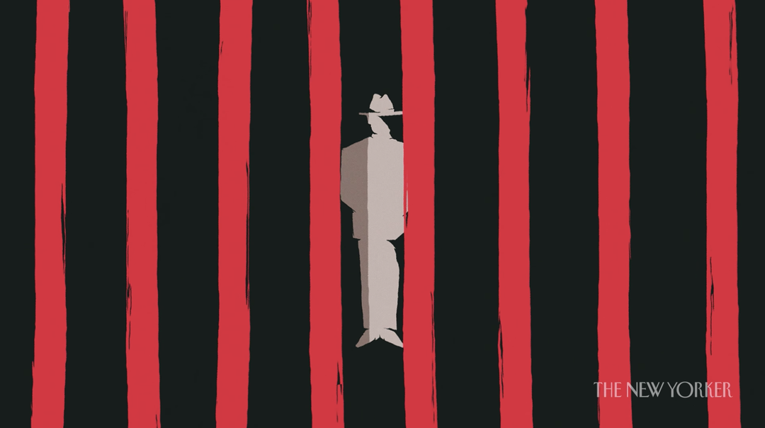
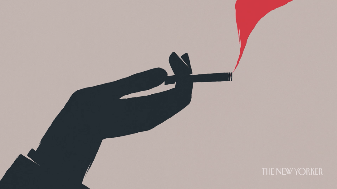
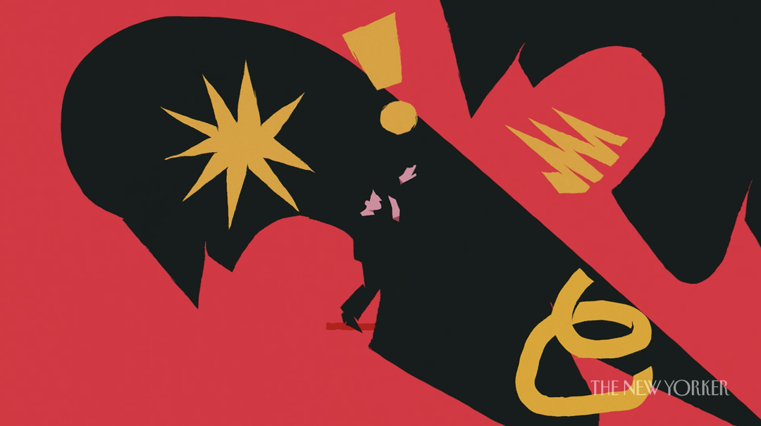
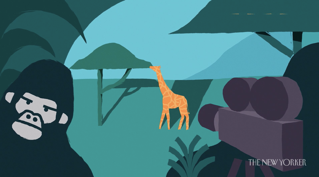
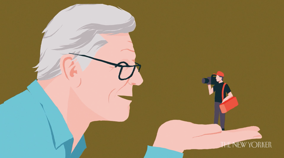
As a result Joe’s three shorts are some of the best examples of delicate storytelling, slick transitions and visual metaphors we’ve seen in an editorial context. In particular, the colour palette of each piece not only differentiates one from the other, but elevates its individual personality. Considering the Cohen film was the first made, “that really helped to dictate the direction” of the following releases. “Given the subject matter of Cohen’s narration, it was only natural that it ended up with a darker, moodier palette,” Joe elaborates on this element of the animations. “From there, I tried to create the same structure using a limited palette for each film but wanted to let the narrator and subject matter inform the colour choices. Monáe has a more vivid, almost neon, contemporary and optimistic tone filled with bright pinks and purples; while Attenborough has a playful palette informed by nature with more greens, blues and yellows.”

Joe Donaldson: The New Yorker, Janelle Monáe on Privilege and Survival
When it came to what these colours would illustrate, as mentioned, Joe’s use of visual metaphor is second to none. “I have to admit that I was extremely lucky here,” he tells us modestly. “Not only was the client great, but also the stories and individuals. The stars definitely aligned for me on this one,” the animator laughs. Working with a personal almost literal “see and say moments with visual metaphors” coupled with “the more abstract and surreal,” Joe says on reflection that his process was just to try “to let the personality and delivery of each narrator help guide the storytelling.”
In more detail this led Cohen’s film to follow a much slower pace. “It’s the most tonal of the three,” adds Joe. “There are moments where we just sit there, take it in and let it burn.” Contrastingly, “Monáe’s film is going about 100 times faster,” he continues. “We’re almost bombarded as we segue from one scene to the next.” Finally, Attenborough’s short acts as “kind of the middle ground between the three,” the animator concludes. “I wanted to really play off the whimsy and almost playful nature in his voice and for the animation to have the same charm and wonder that can be found in everything he touches.” A further element Joe is keen to point out on the successful tone of each of these shorts is the sound design by Ambrose, who composed original music for each. “I can’t overstate the role his work had in each,” adds Joe. “He worked tirelessly to really match the intent, rhythm, and flow of the storytelling in each film.”
Now out in the world for fans of The New Yorker, Cohen, Monáe or Attenborough – and of course Joe – to enjoy, the animator hopes each short displays his belief that “visual essays as a whole are very valuable and have a lot to offer,” he tells us. “They leverage the best parts of design and animation, without trying to force something on the viewer or sell them anything, while also offering the information in a unique and very digestible way. Oftentimes this feeling is very personal, almost like a conversation and not like something is being dictated at you.” More broadly, Joe hopes viewers “like what they see, and so do the companies at large, and that they continue to offer artists the freedom, time and money needed to make this beautiful and meaningful work".
GalleryJoe Donaldson: The New Yorker, Leonard Cohen and the Divine Voice
GalleryJoe Donaldson: The New Yorker, Janelle Monáe on Privilege and Survival

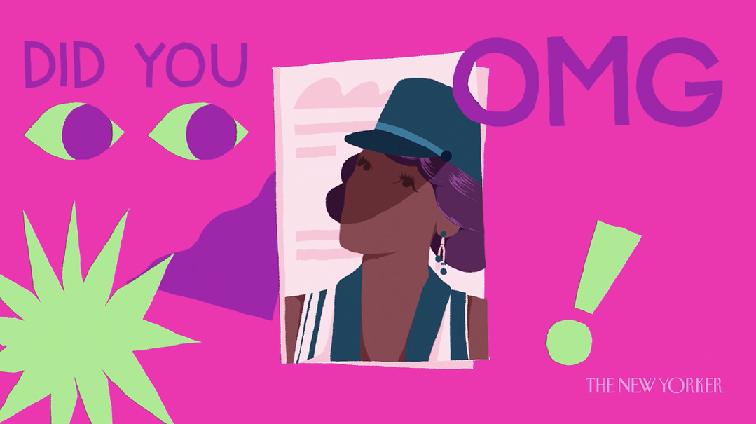

GalleryJoe Donaldson: The New Yorker, David Attenborough and the Resiliency of Nature

Share Article
Further Info
About the Author
—
Lucy (she/her) was part of the It’s Nice That team from 2016–2025, first joining as a staff writer after graduating from Chelsea College of Art with a degree in Graphic Design Communication, eventually becoming a senior editor on our editorial team, and most recently at Insights, a research-driven department with It’s Nice That.