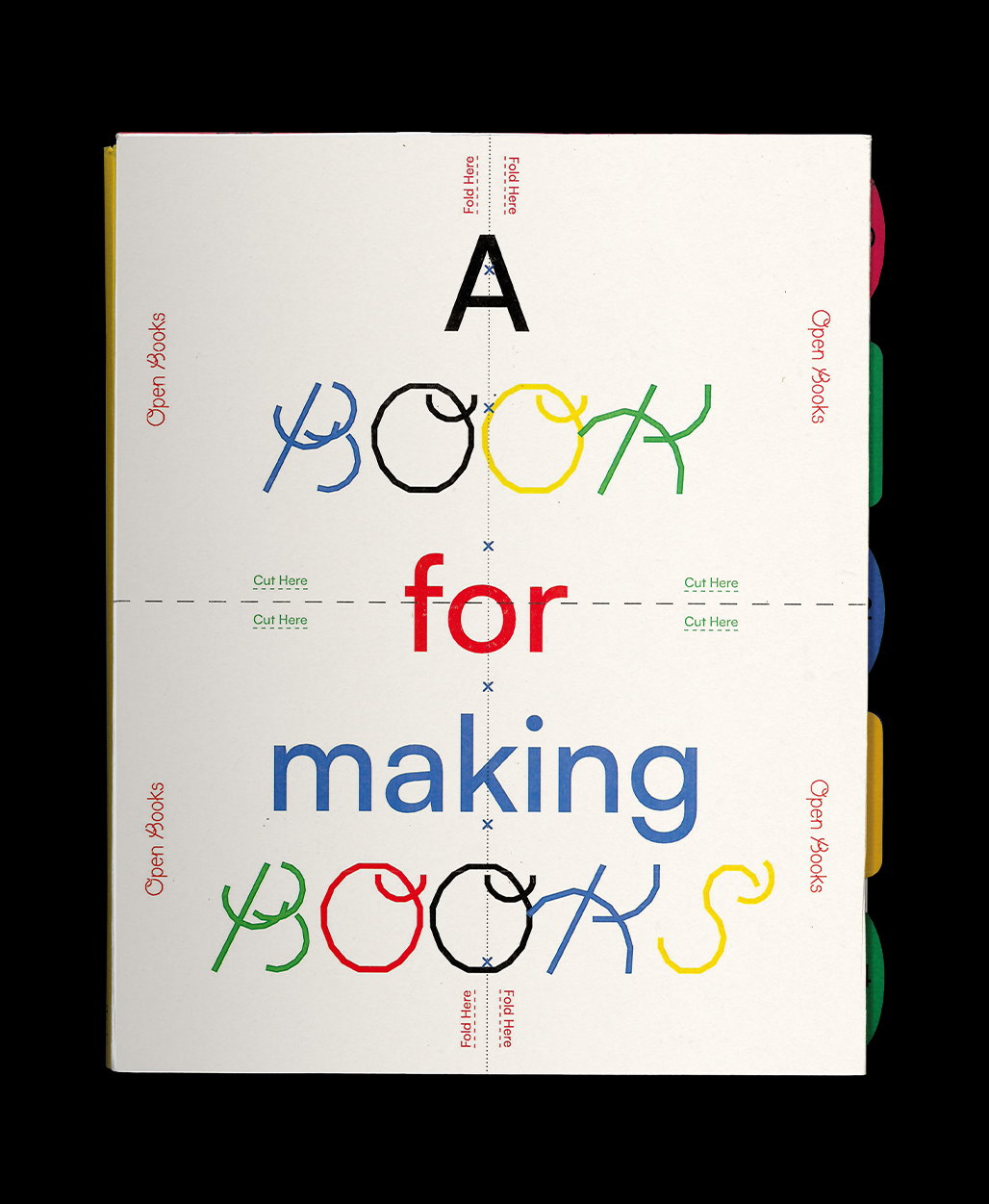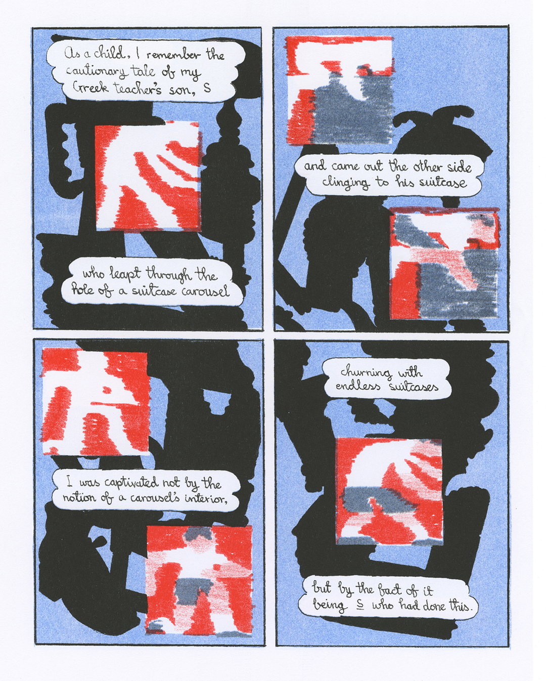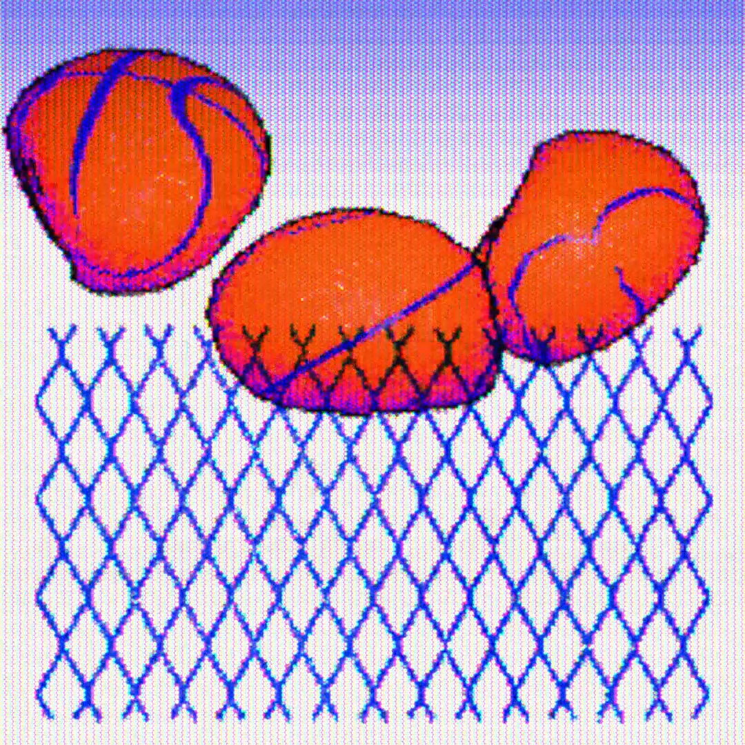
Inspired by PS1 games and “shitty graphics”, James Marshall’s design portfolio is a welcomed trip to the past
When it comes to his personal work, the New York-based designer cares less about the rules and more about the idea – especially if it comes from the early 2000s.
The resurgence of retro graphics has been on the steady incline for some time now, dominating the worlds of illustration, animation and design in all its nostalgic glory. But no one has hit the mark quite like James Marshall, a multimedia designer from Baltimore who’s now based in the Big Apple.
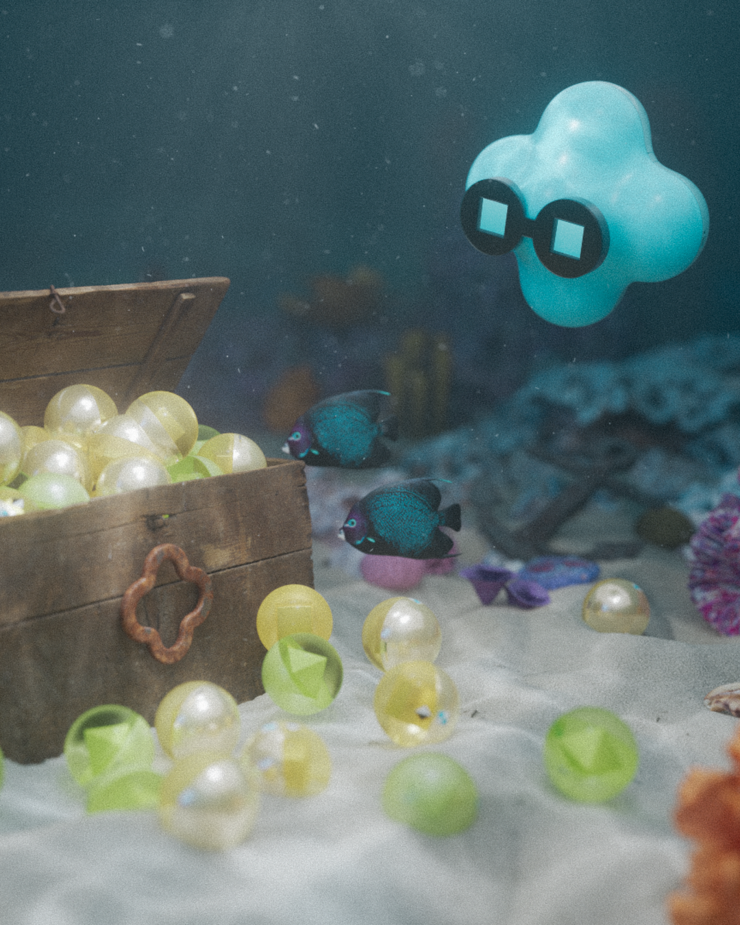
In his work, you’ll see pixelated graphics outlining basketball games, rubbish bins, graffiti to (very) random objects – the type of subject matter that could easily have been plucked from Crash Bandicoot 2: Cortex Strikes Back. When asked what his influences are, he admits that, if we had asked him this a couple of years ago, he’d probably “rattle off” a list of contemporary designers. Although this still sings true to his pool of influences, James now looks in a few different directions. The first is New York, a surrounding that he “regurgitates” through his creations. “Maybe I’ll find a trash bag that looks like a rabbit, take a picture of it and redraw it into my new zine [more on this below], or maybe I’ll take inspiration from the barbed wire fences that litter the streets throughout my neighbourhood.” Otherwise, it’s the memories from his childhood that reigns supreme; the days spent playing Spiderman on his PS1 and eating bagel bites (a frozen snack pizza bagel… need we say more). “Now that I’m older, I’ve taken a second look at shitty graphics from that era and realised how amazing it actually is, seeing the blurry low-res faces of video games from 2003 really excites me, so now I’m rendering everything I make at 200x200pc (no anti-aliasing).”

James Marshall: Two Lovers (Copyright © James Marshall, 2022)
To date, James has worn many hats in terms of commissions and in-house work. In the very beginning – after he graduated amidst the global pandemic – he scored an internship at &Walsh, then Sagmeister & Walsh, before freelancing with Luke Hayman and the team at Pentagram. Since then, he’s worked on a plethora of editorial illustrations for publications like The Times, held a position as a senior designer at The New York Times, and is currently freelancing as a designer at Wieden + Kennedy. Whatever hat he’s wearing, he’ll alter his creative process accordingly, often using After Effects or Cinema 4D. Sketching also plays a huge role in the determining of ideas, which is something he’s been doing since his undergrad, “and it’s probably the only way I can actually fully flesh out a project,” he shares. For the more personal and illustrative work, he’s much less “careful” with his sketches: “I don’t really give a shit what happens to it when I’m trying to come up with an idea on the page, I just start.”
So when it came to the making-of his new zine named In Between, James forged all of his inspirations, interests and processes into one; it's his own “digital playground”. Living in Baltimore at the time of creation, James went out on daily walks and took pictures, reinterpreting what he saw through drawings, hand-drawn typography and photography. In this sense, he sees work – like the zine – as less of a “proper” project and more of a way for him to communicate his feelings. “The whole zine is about being stuck in the crossroads of leaving and staying in Baltimore, so you’ll see typography that is a direct response to that,” he concludes. “Baltimore is, and forever will be, my home.”

James Marshall: The New York Times - Opinion (Copyright © James Marshall, 2022)
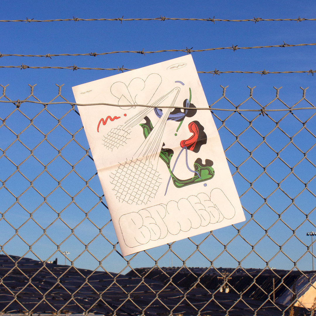
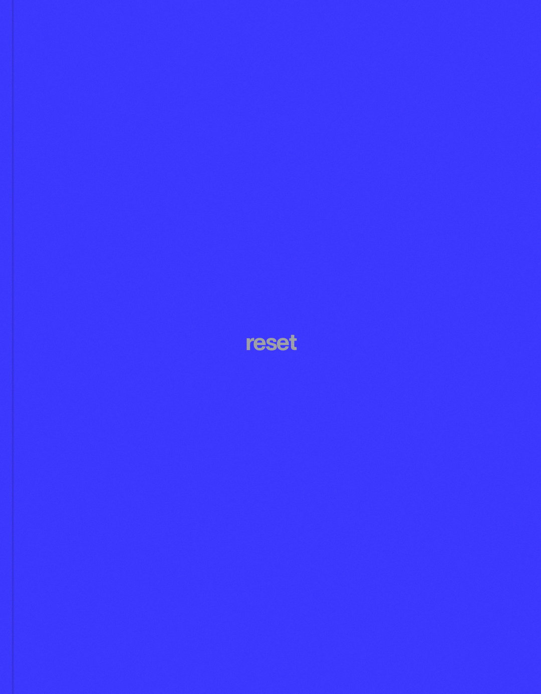
James Marshall: Cover of Zine "In Between" (Copyright © James Marshall, 2021)
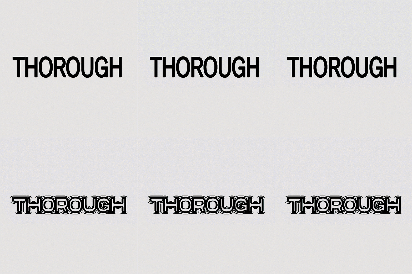
James Marshall: Logo Experiments for Thorough (Copyright © James Marshall, 2022)
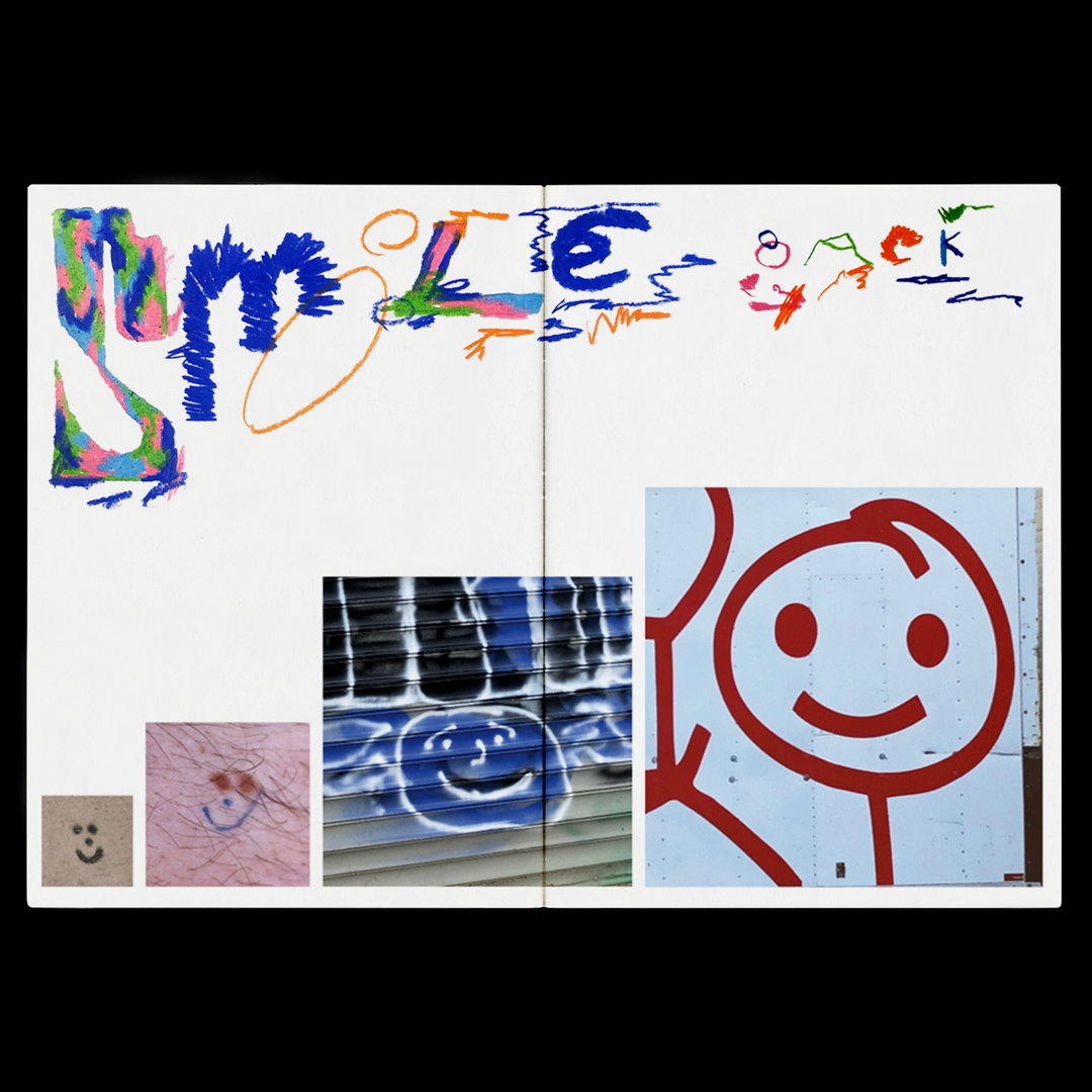
James Marshall: Spread From Zine "Curious" (Copyright © James Marshall, 2022)

James Marshall: The New York Times - On Tech (Copyright © James Marshall, 2020)
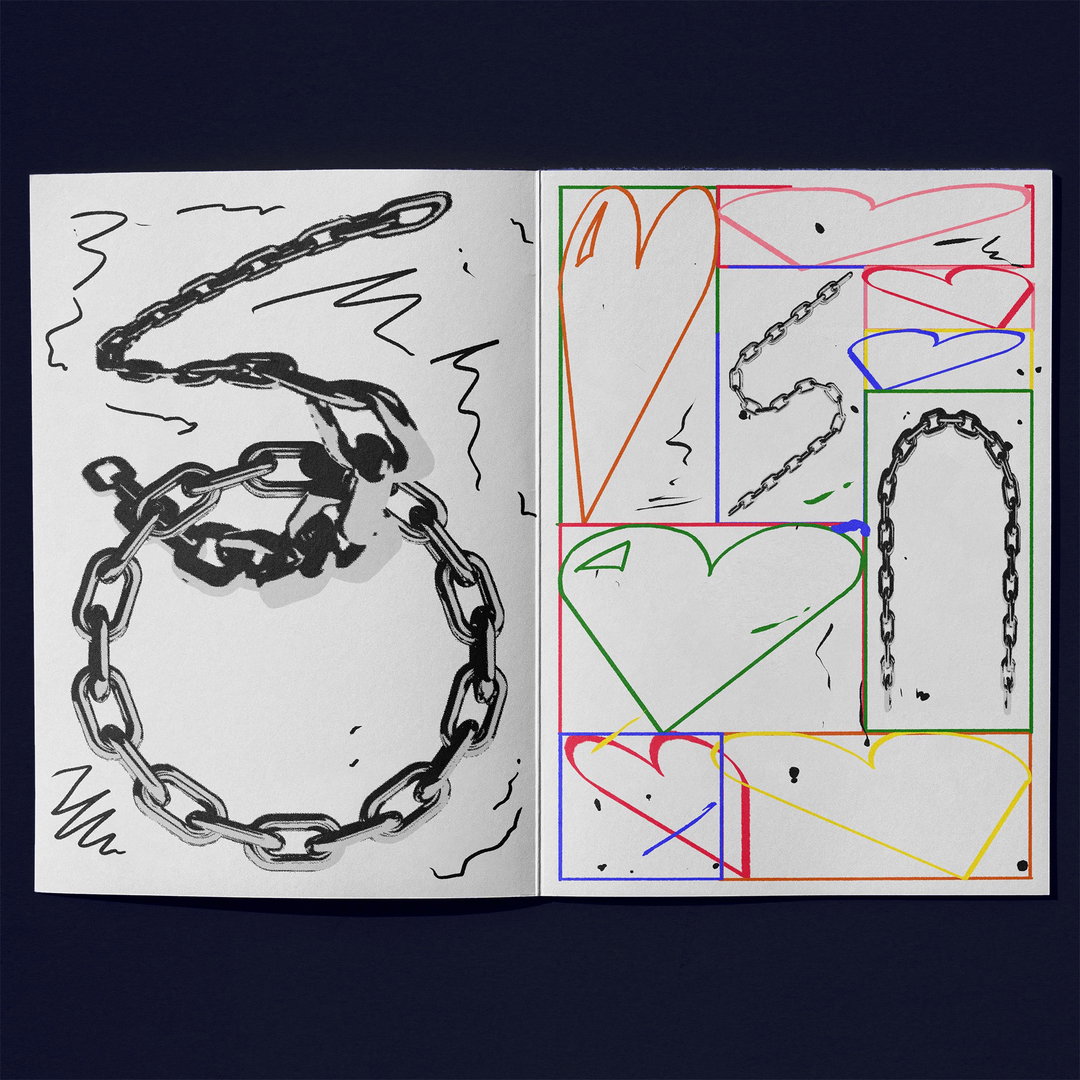
James Marshall: Spread From Zine "You 2" (Copyright © James Marshall, 2022)
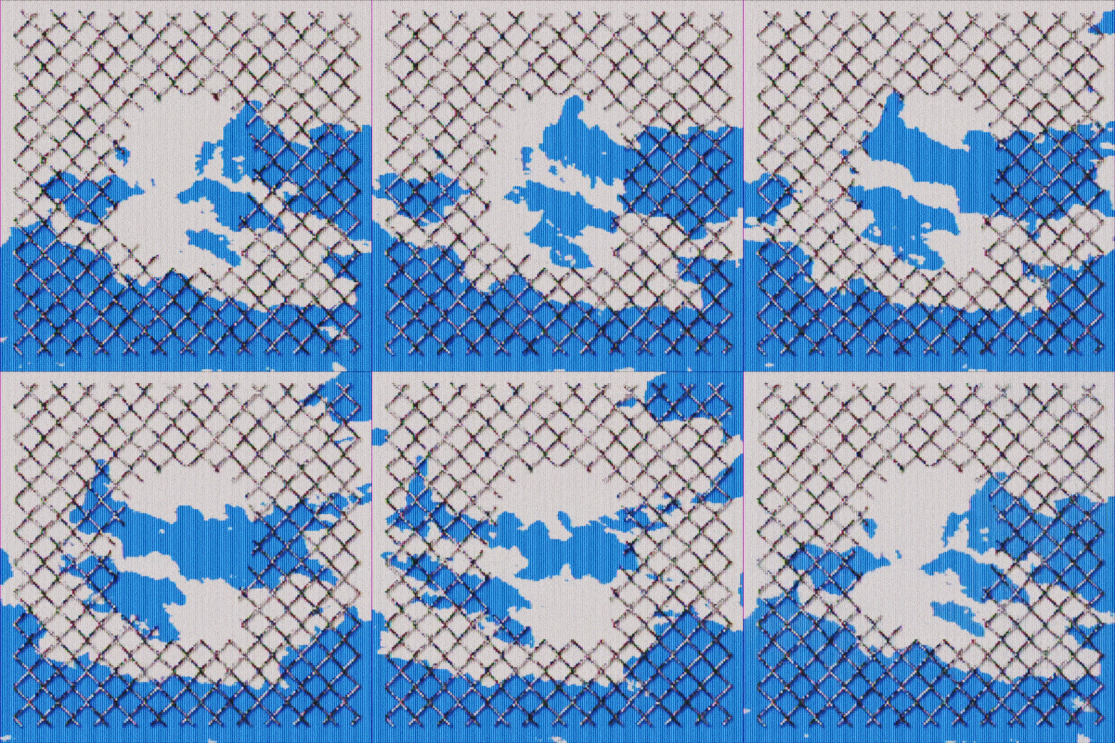
James Marshall: Hole In The Sky (Copyright © James Marshall, 2021)
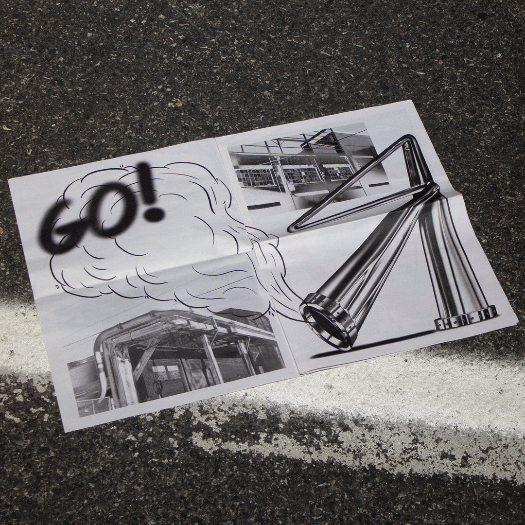
James Marshall: Spread From Zine "In Between" (Copyright © James Marshall, 2021)
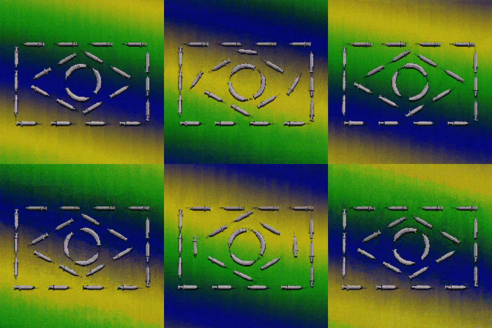
James Marshall: The New York Times - Opinion (Copyright © James Marshall, 2021)

James Marshall: Canarsie (Copyright © James Marshall, 2022)
Hero Header
James Marshall: Fight On The Court (Copyright © James Marshall, 2021)
Share Article
Further Info
About the Author
—
Ayla is a London-based freelance writer, editor and consultant specialising in art, photography, design and culture. After joining It’s Nice That in 2017 as editorial assistant, she was interim online editor in 2022/2023 and continues to work with us on a freelance basis. She has written for i-D, Dazed, AnOther, WePresent, Port, Elephant and more, and she is also the managing editor of design magazine Anima.