




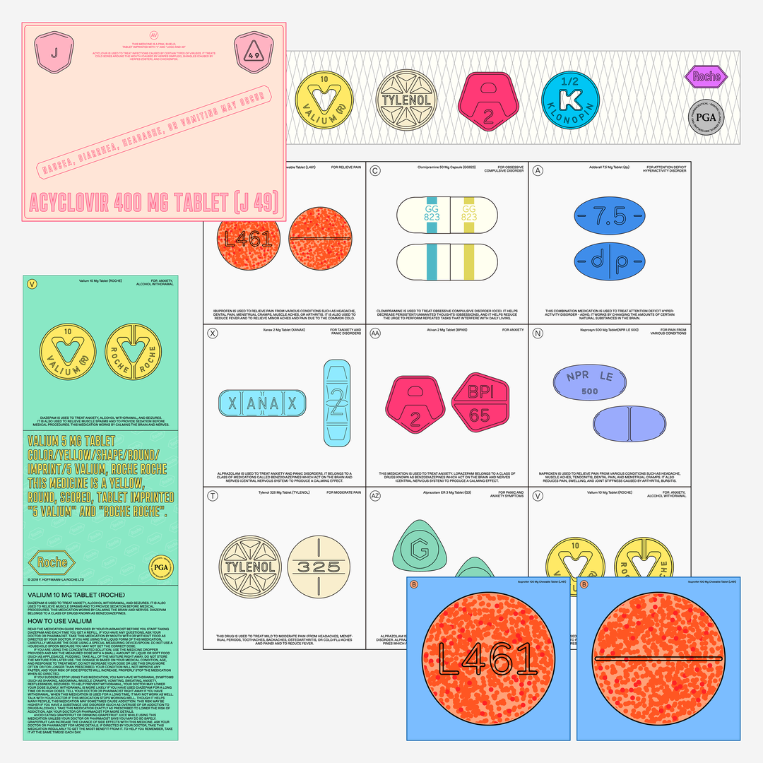
Graphic designer Jaehoon Choi finds form in function when combining the abstract with strict rules
Jaehoon’s pharmaceutically inspired design practice partners colour with strict typographic and informatic systems.
Seoul-based graphic designer Jaehoon Choi began his creative journey, not in design, but in conceptual fine art, which he studied at the Korean National University of Arts. Although “unfamiliar with the design environment” to begin with, Jaehoon used this lack of cognisance to his advantage, saying that “I could work without being tied to certain design methods or styles, which has worked well for me.” With a fine art approach to the design world, Jaehoon could freely explore without the notion of existing design conventions, almost approaching the field transiently. His practice manifests in identity design, web design and publishing.
Coupled with his conceptual nature, Jaehoon also has an avid interest in layouts and schematics – fascinated by the compositions created due to information and elements being “classified into certain types or patterns.” With an enthusiasm for “collecting and using” Jaehoon is attracted to schematic structures due to how an aesthetic is born from the process of collating information and less from cognisant design, design decisions formed by “specific systems or rules.” His inspiration is found in “architecture, pharmaceuticals, scientific study, as well as industrial marks or symbols” which have since become the starting point for all of his work. “At the same time, I have a lot of interests in colour studies,” Jaehoon tells us, adding, “I think colour is an infinite material.” This manifests in design work that is both illustrative and satisfying.
The harmonious crossover between these two contrasts of interest – one innately abstract, and one based on strict rules – is where Jaehoon’s work exists and thrives. Here we see a fresh voice in design that isn’t afraid to fill a page. In a world of graphic minimalism, Jaehoon embraces space, systems and information; he’s someone who thrives on simplicity over minimalism. The result is work that has the utmost respect for the typographic discipline, demonstrating consideration and attention to function, coupled with wonderful colours and an enjoyment of his practice – resulting in a form inspired by function.
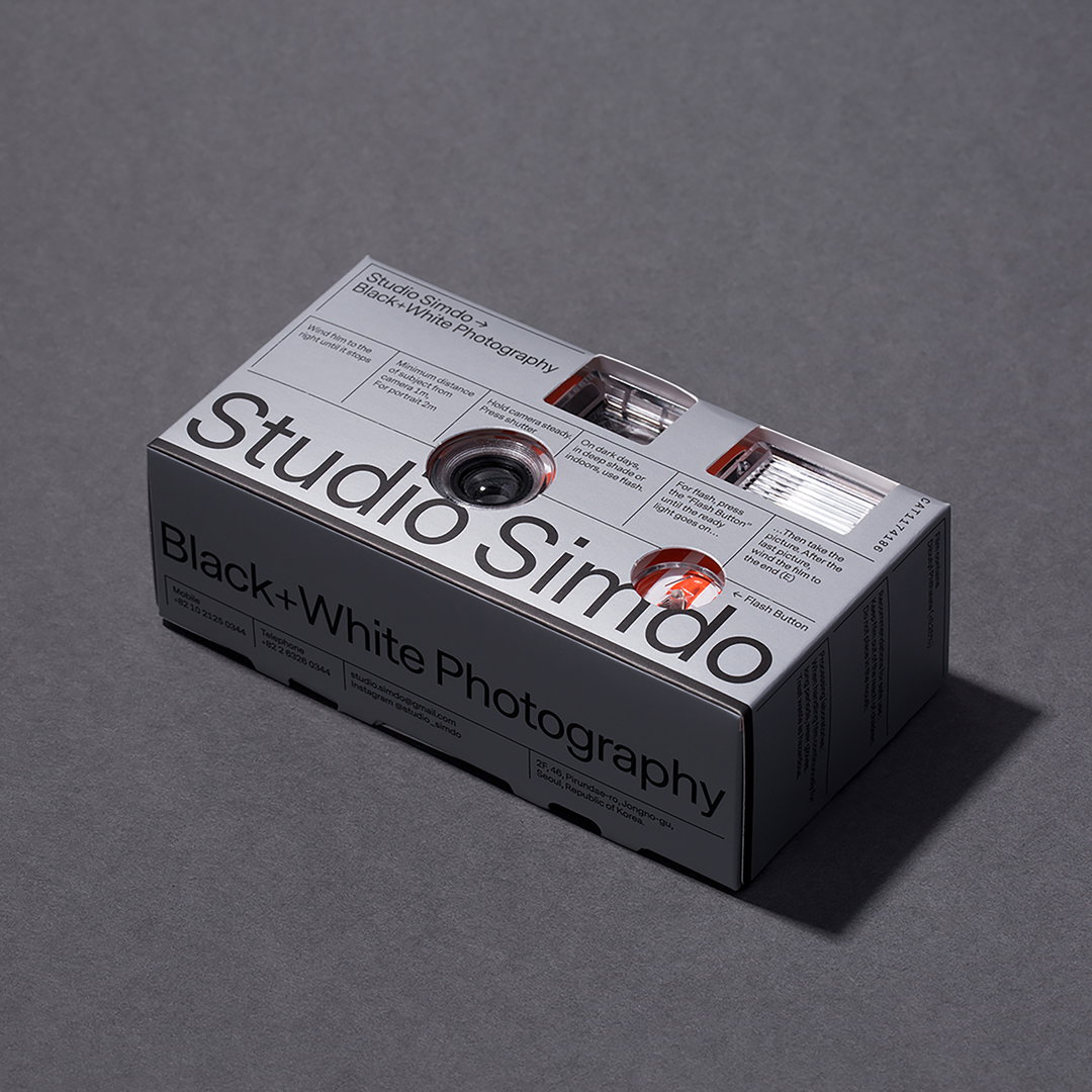
Jaehoon Choi: Studio Simdo
“I think the biggest advantage is that graphic design can be connected to people and genres in various fields,” Jaehoon explains, “so if there’s anything I could approach and create, I’m willing to try it without hesitation.” In a commercial context, Jaehoon finds the most enjoyment in identity design, saying that “it’s like designing a human being, giving them a look and a character.”
A recent example is his identity design for Studio Simdo, a black and white photography practice. “The identity is based on clear rules and systems, with the connection between photography and optics,” Jaehoon tells us, adding that he partnered his strict typographic treatment with illustrations from the Chambers' Cyclopaedia or Universal Dictionary of Arts and Sciences by Ephraim Chambers. “I think the ideal identity system should be clear and logical. And I think my work for Studio Simdo has those characteristics. So it was the most satisfying work for me,” Jaehoon commented.
Looking ahead, Jaehoon tells us that he plans to continue trying to implement his love for systems into commercial projects, pursuing a desire for creative, joyful order. Personally, Jaehoon looks to explore printed domestic ephemera in greater depth, considering “specific patterns or systems found in our lives” such as “small prints, stamps, and books.” His intention would be to exhibit these smaller features, in doing so highlighting the micro-systems that go unnoticed and unappreciated day-to-day.
GalleryJaehoon Choi
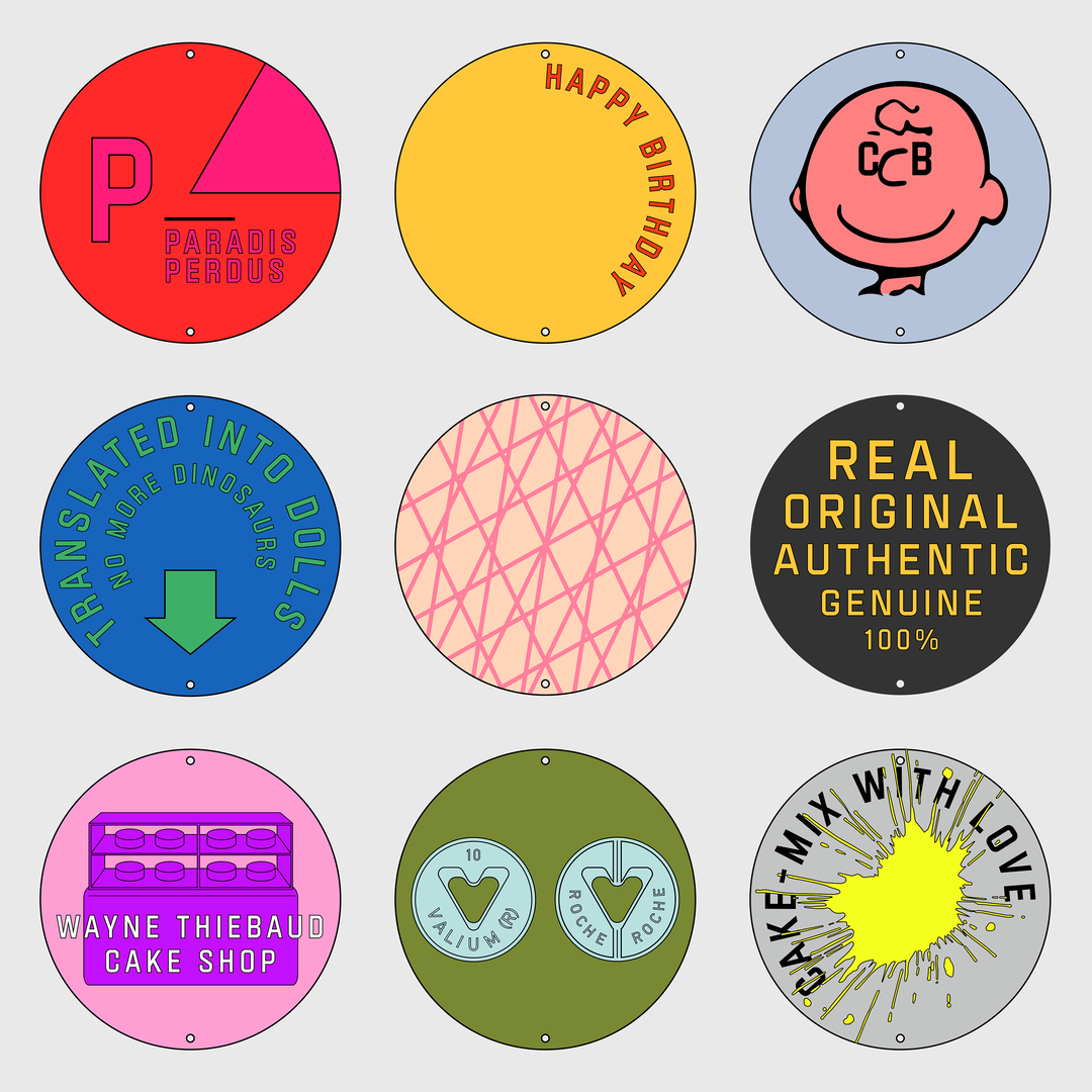
Form of Cover
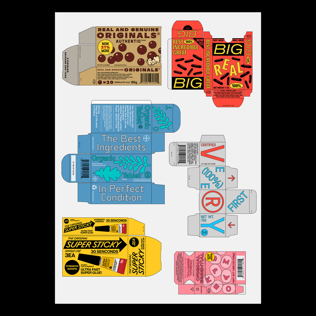
Form of Cover
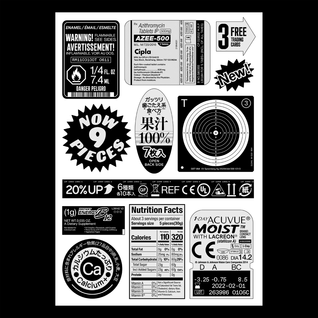
Form of Cover
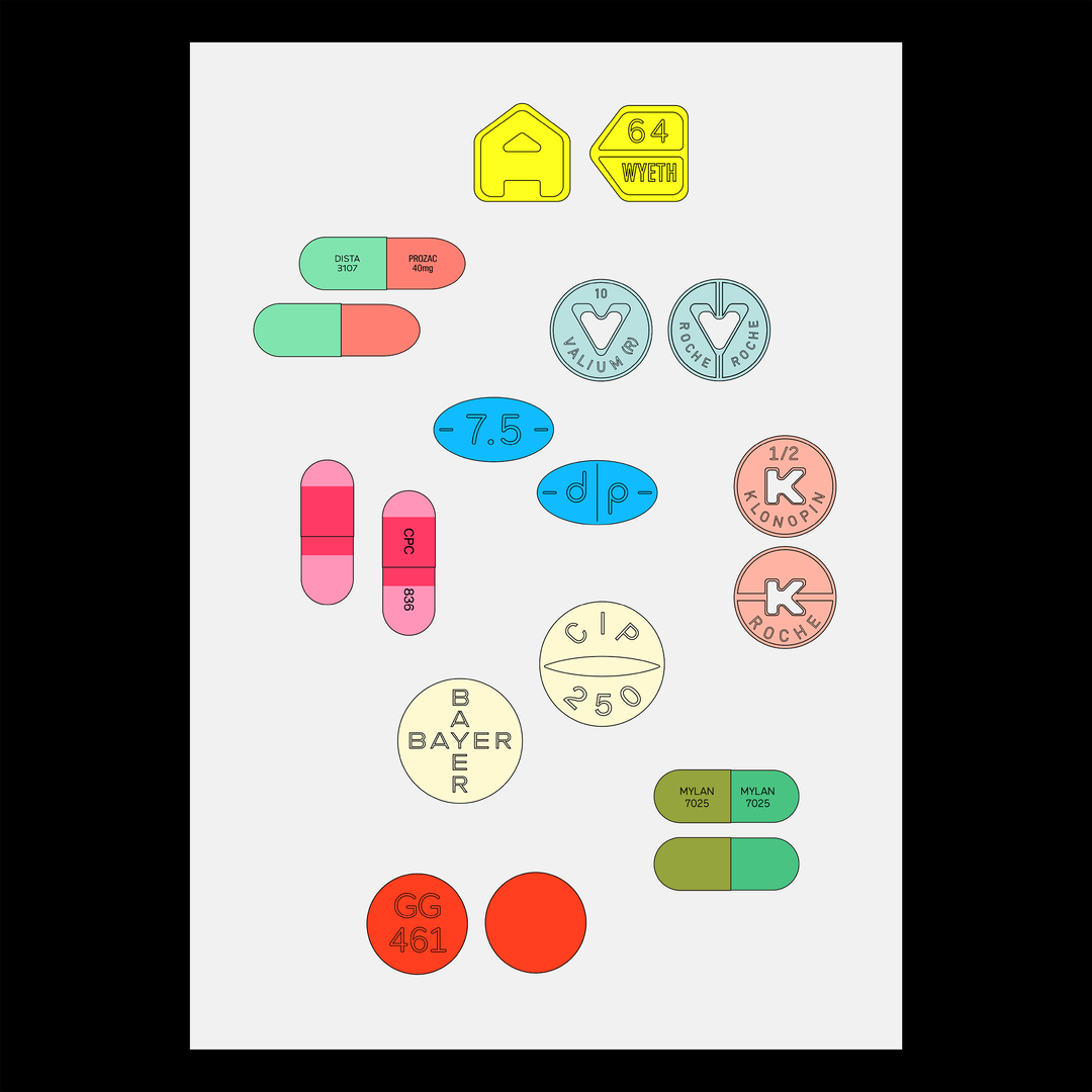
Form of Cover
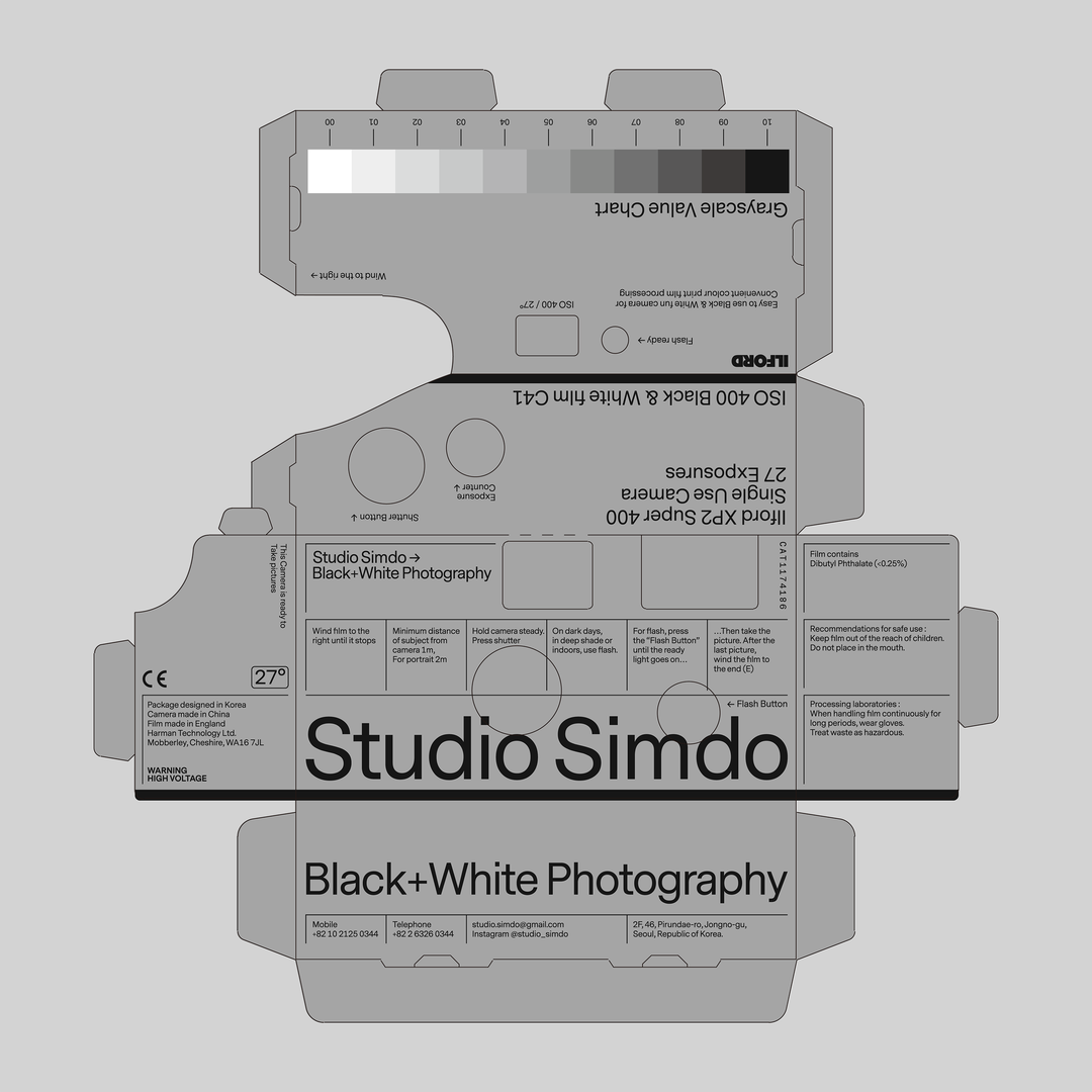
Studio Simdo
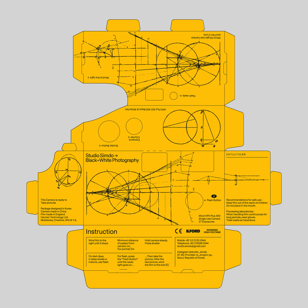
Studio Simdo
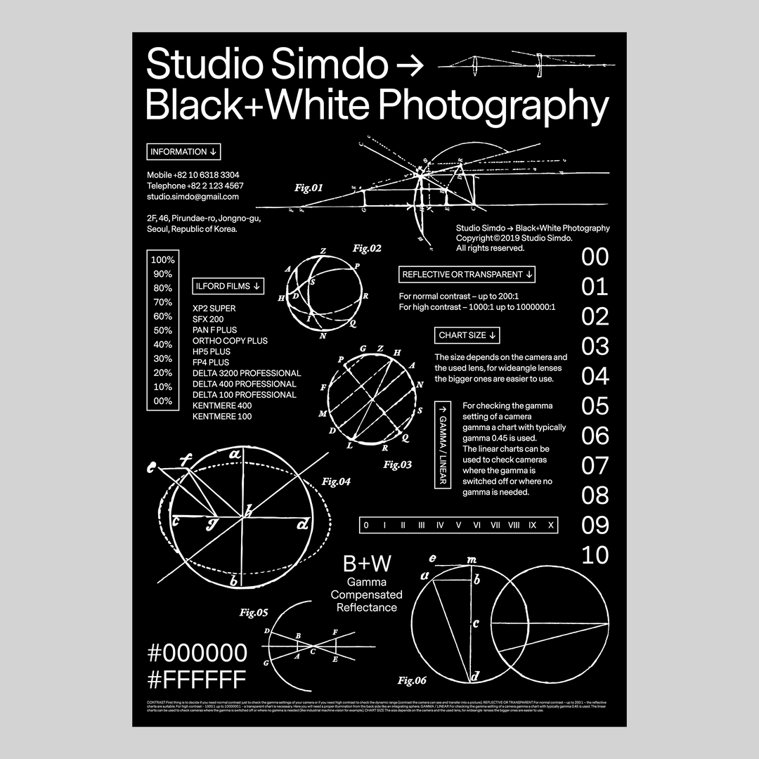
Studio Simdo
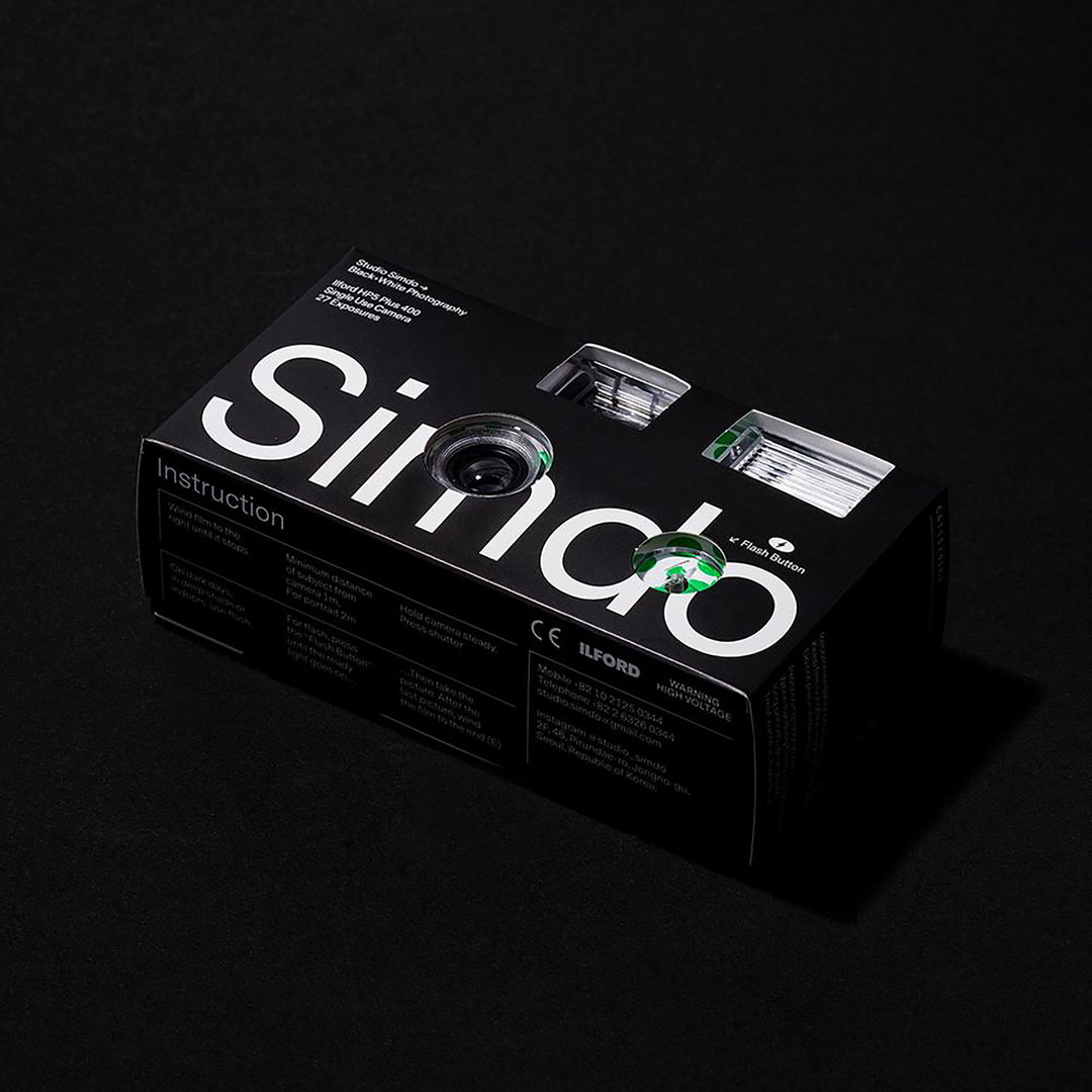
Studio Simdo
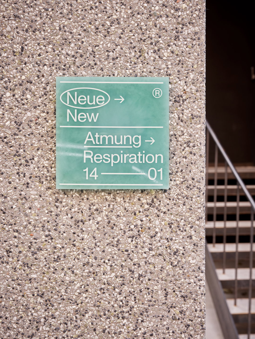
Neue Atmung
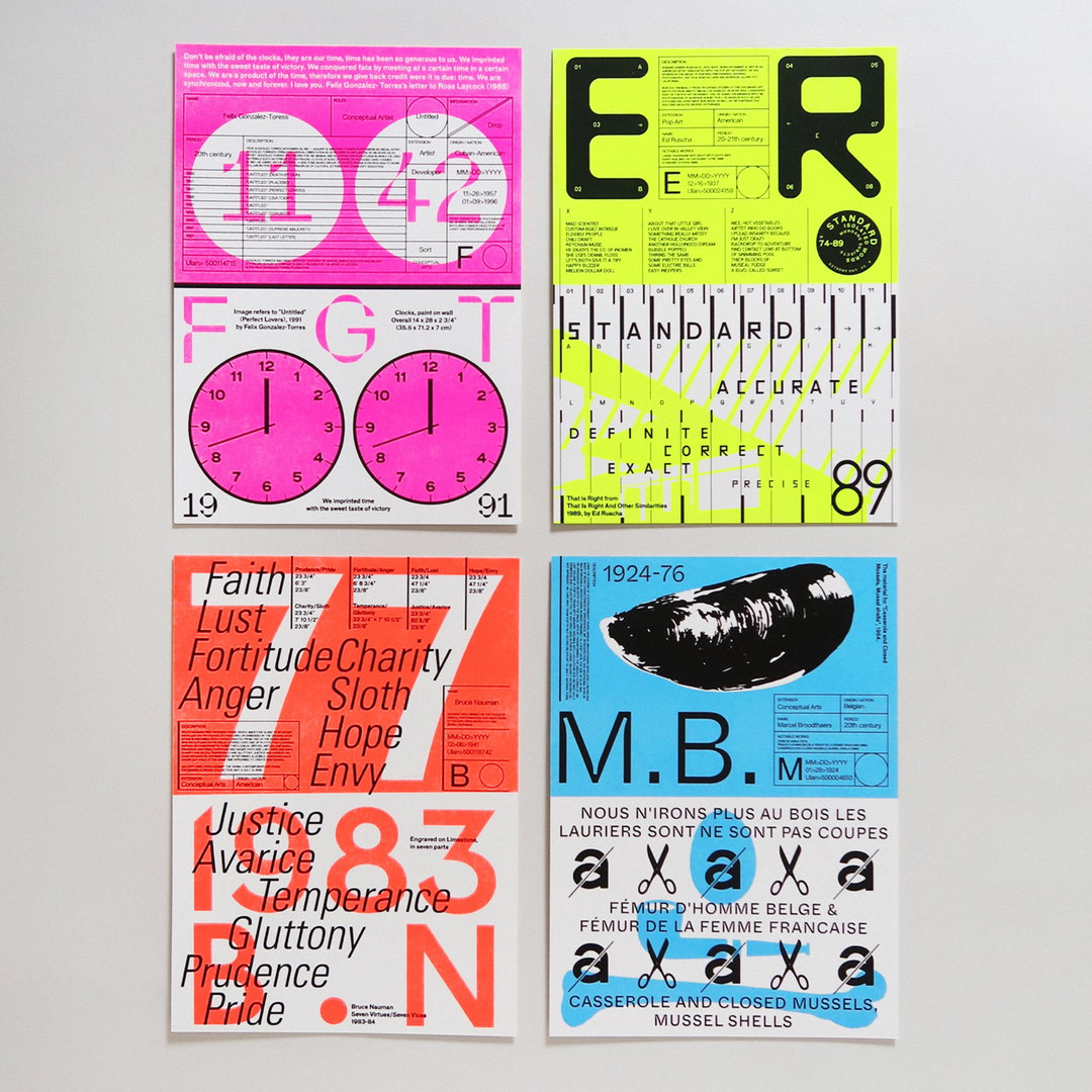
Double
Color Bits
Share Article
Further Info
About the Author
—
Hailing from the West Midlands, and having originally joined It’s Nice That as an editorial assistant in March 2020, Harry is a freelance writer and designer – running his own independent practice, as well as being one-half of the Studio Ground Floor.


