




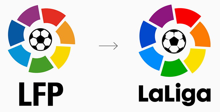
LaLiga’s identity refreshed and modernised by IS Creative Studio
IS Creative Studio has produced a subtle refresh of LaLiga’s visual identity, tweaking many of the graphic details, integrated across the organisation’s communications. Though the easily recognisable graphic mark of LFP has been carried forward, the rainbow colour scheme has been tweaked, the ball modernised, and the fanning petals have been refined. The most noticeable change in the communication system can be seen through the newly introduced typefaces.
The changes follow the RFEF General Assembly’s approval of the Spanish football association’s formal name change from LFP (Liga de Fútbol Profesional) to LaLiga.
It’s Nice That spoke to Richars Meza, IS Creative Studio founder and creative director, to discuss the process behind the rebrand.
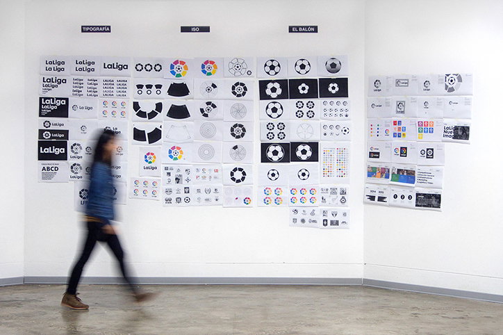
IS Creative Studio: LaLiga iterations
What was the brief from LaLiga?
Last year, the association decided to change its name to LaLiga. There has always been strong competition with other European leagues, so the approach was to get a contemporary look that keeps the competition’s heritage and the strong and solid entity.
In the beginning they wanted to keep their symbol as it is, but seizing the opportunity of the name change we proposed a refresh of the symbol to emphasis the clean game, respect, unity and diversity.
How many iterations did you go through, and what was the process whittling down the details?
With the typography we had it clear since we started work on the project that we wanted to present a lowercase version to add a more friendly, close approach, without losing the bold statement.
The work on the symbol was what took us the longest time, specially to understand how it was built, and then correct imperfections. We softened and rounded the corners on the ring, accentuating them to give a more friendly, warm and human approach. It’s a detail you see on large applications but it also has been used for other graphic pieces like the business cards and stationery.
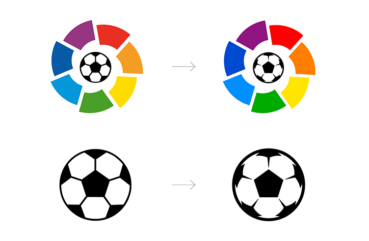
IS Creative Studio: LaLiga ball design changes
Tell us more about the changes you made to the centric ball design
The football was the most interesting part of the design because it’s what makes the difference between an 80s and a contemporary style. The old ball looked static, flat and a bit naive, we want a ball that represents more dynamism, volume and power, a ball that looks like its coming towards us.
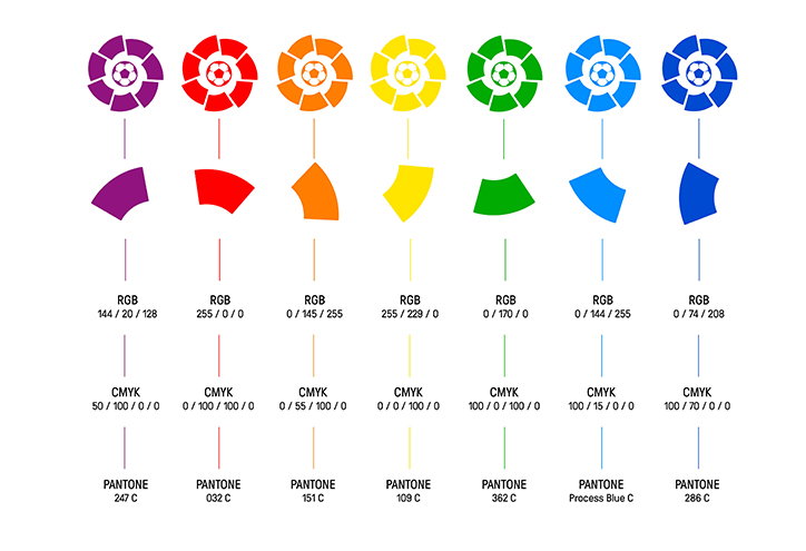
IS Creative Studio: LaLiga new colour palette
What prompted the update of the colour palette?
With the digitisation of formats as the main channel to display, and knowing that the logo will be more visible on social media, we made the RGB version more bit more vivid in its colours to stand out more on digital devices.
The internal department of LaLiga is doing a great job following the guidelines we gave them. All the applications of communication online and social media are done in house.
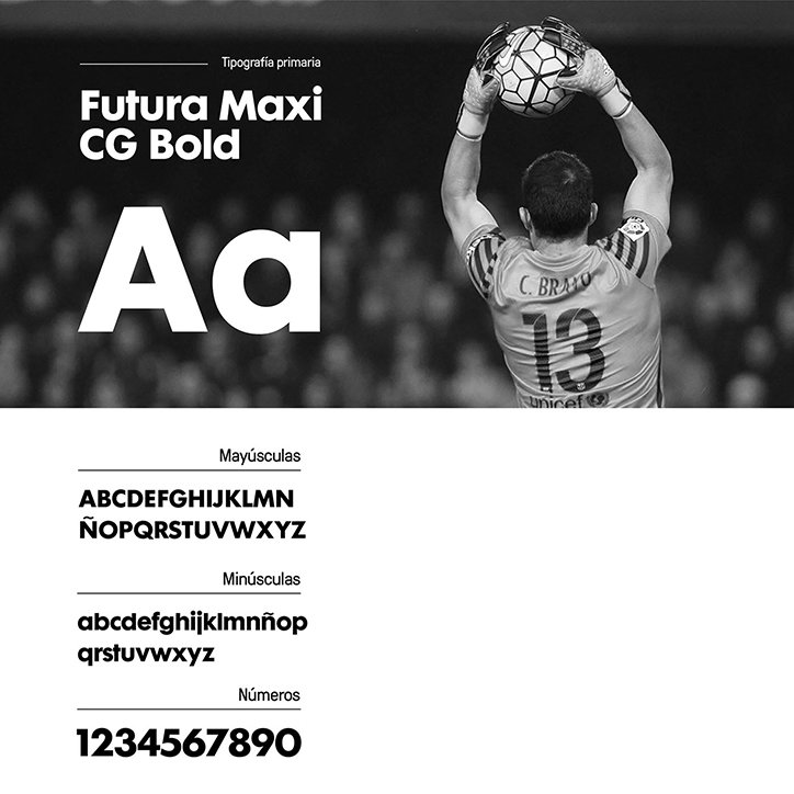
IS Creative Studio: Futura Maxi CG Bold used as primary typeface in LaLiga identity
IS Creative Studio: GT Pressura used as secondary typeface in LaLiga identity
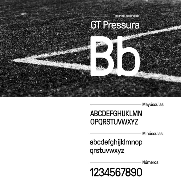
IS Creative Studio: GT Pressura used as secondary typeface in LaLiga identity
You’ve overhauled the typefaces used throughout the identity and communications, can you explain your choices?
We chose Futura Maxi as the main font because as a big mother brand that has more brands, we need a font that can adapt to a family of brands.
GT Pressure is the secondary typeface that we chose as it has a very modern look and a not-too-strong rounded shape, it also has a nice family of alternates.
"It is a huge responsibility to work on a global brand like LaLiga, maintaining integrity is a strong challenge. Style over substance is what most agencies are failing to do; it is a risky game."
Richars Meza, founder and creative director of IS Creative Studio
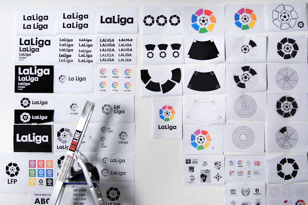
IS Creative Studio: LaLiga iterations
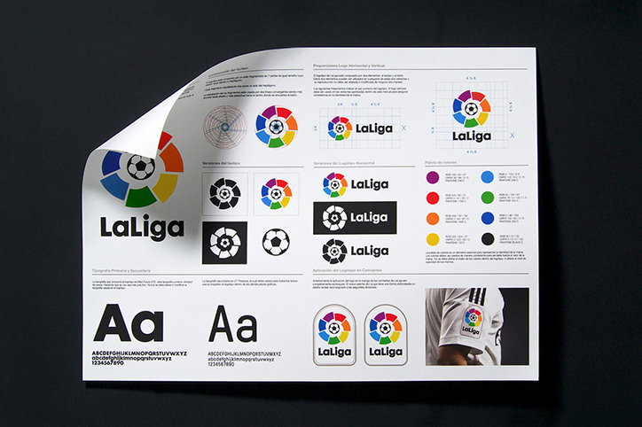
IS Creative Studio: LaLiga colour palette
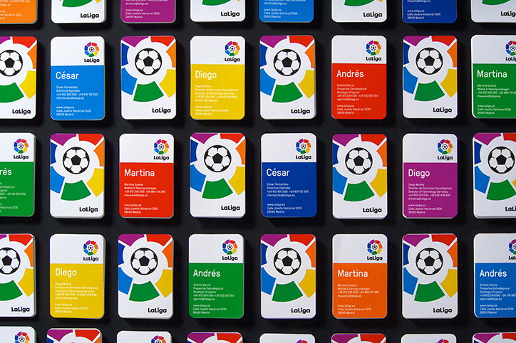
IS Creative Studio: LaLiga communications
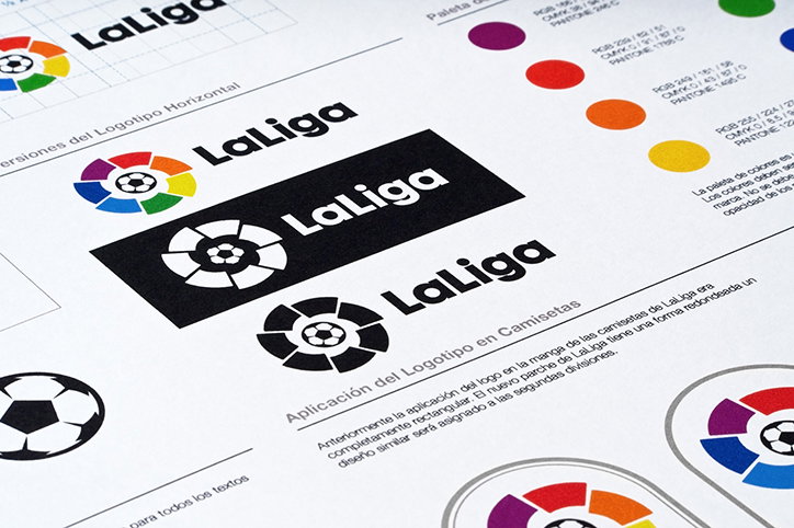
IS Creative Studio: LaLiga communications
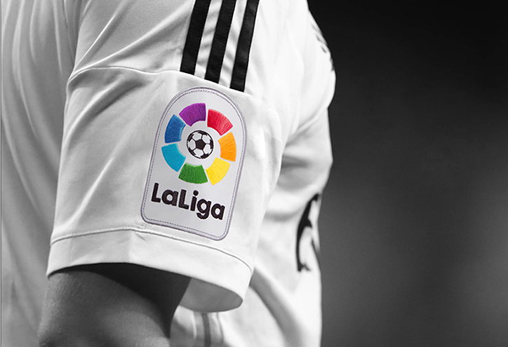
IS Creative Studio: LaLiga refresh in use
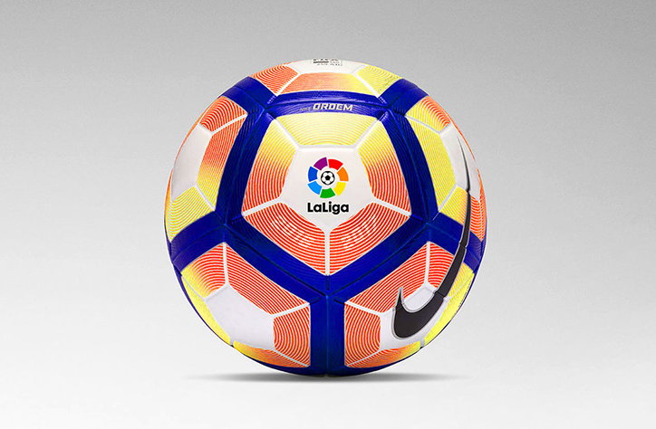
IS Creative Studio: LaLiga refreshed logo in use on association football
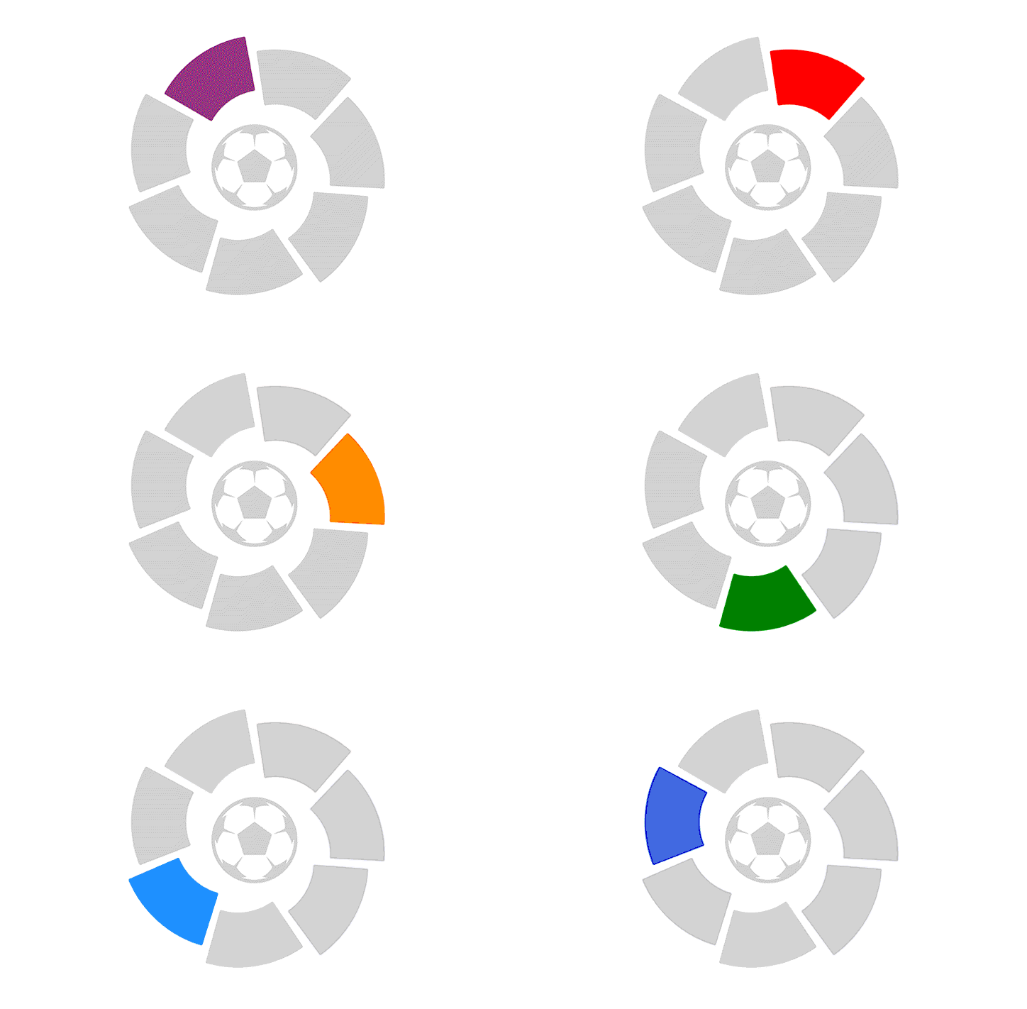
IS Creative Studio: LaLiga petals
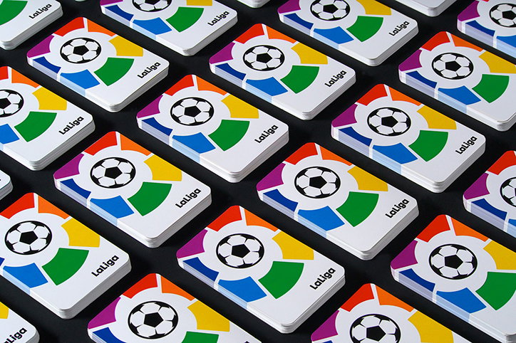
IS Creative Studio: LaLiga communications
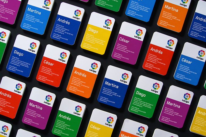
IS Creative Studio: LaLiga communications
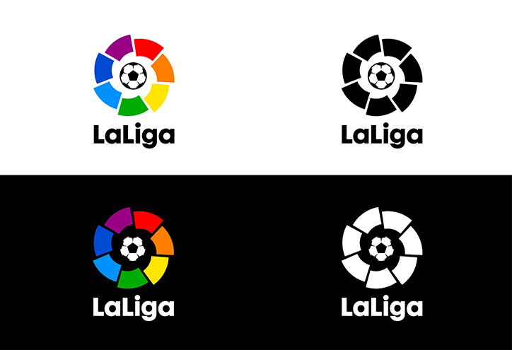
IS Creative Studio: LaLiga colour and monotone logos
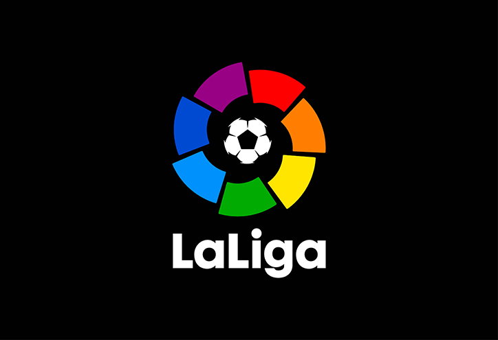
IS Creative Studio: LaLiga colour palette
Share Article
Further Info
About the Author
—
Jamie joined It’s Nice That back in May 2016 as an editorial assistant. And, after a seven-year sojourn away planning advertising campaigns for the likes of The LEGO Group and Converse, he came back to look after New Business & Partnerships here at It’s Nice That until September 2024.



