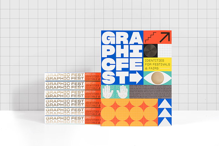
Graphic Fest has all you need to know about visual identities for festivals and fairs
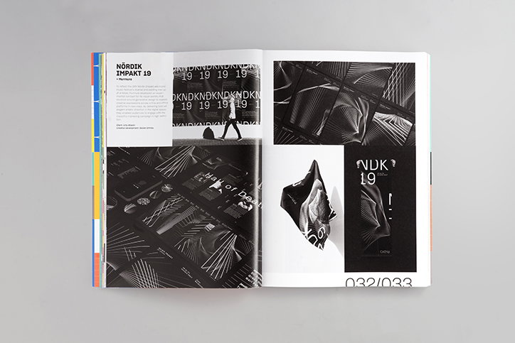
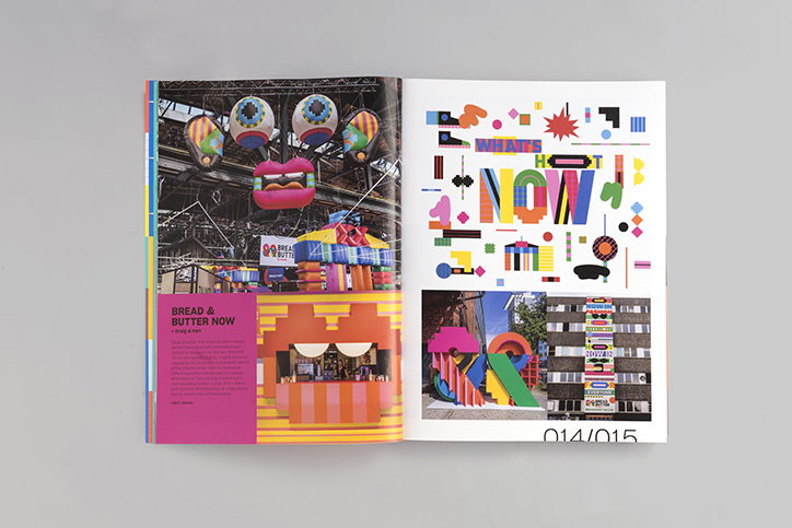
As much of our esteemed It’s Nice That audience very well knows, the visual identity of any event plays a great importance to its success. To the general public however, the role of the visual identity is rather overlooked. Designers, art directors, photographers and so on spend copious amounts of time slogging away at the perfect identity. The ever-enduring efforts to find the right balance between visual intrigue, information and conceptual rigour is no easy task (as many of our readers will be familiar with I’m sure) so it comes as no surprise that a recently published book Graphic Fest pays tribute to these identities and the designers behind them.
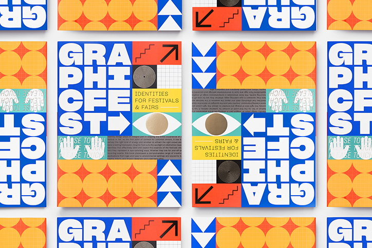
As well as being a thorough guide for any kind of identity-related inspiration, the book reflects on how the personality of festivals and events can be translated through the punchy visuals of an identity. Published by vic:tionary, the book manages to cram all manner of visual identities from over the years. Leanne Lee, a designer at the Hong Kong-based publishers tells It’s Nice That, “Besides being inspired by all the exciting projects out there, we also wanted to feature the designers behind the scenes who find the equilibrium between form and function in bringing the event to life.”
When asked about what she has learnt in putting together this colourful compendium of graphic language, Leanne asserts how “cohesion between all communication materials is essential.” From online, to on the ground, the way viewers consume information differs depending on its physicality, not to mention budget. And so, designers need to be versatile as well as effective communicators across all kinds of platforms, from motion to print and through its logo and typography.
Graphic Fest’s featured designers are as varied as their international locations. From Ordinary People, Spassky Fischer, Another Design and Dimitris Papazoglou Studio, the compendium spans our most inhabited continents and in turn, the events they host. In the process of gathering this array of international identities for the book, Leanne and her team learned a great deal about what makes up a good identity. For one, having “open and clear communication with the client” — which is something that we hear a lot at It’s Nice That. Amidst this, she maintains the importance of transparency between team members through every step of the creative process, and perhaps most crucially, she goes on to say: “By properly understanding what is needed and why in an identity, you can have more fun within the design.”
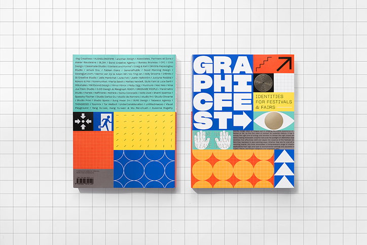
Graphic Fest
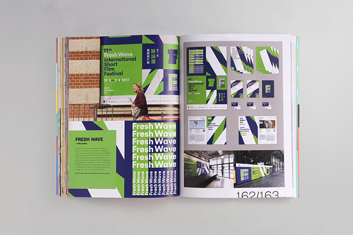
Graphic Fest
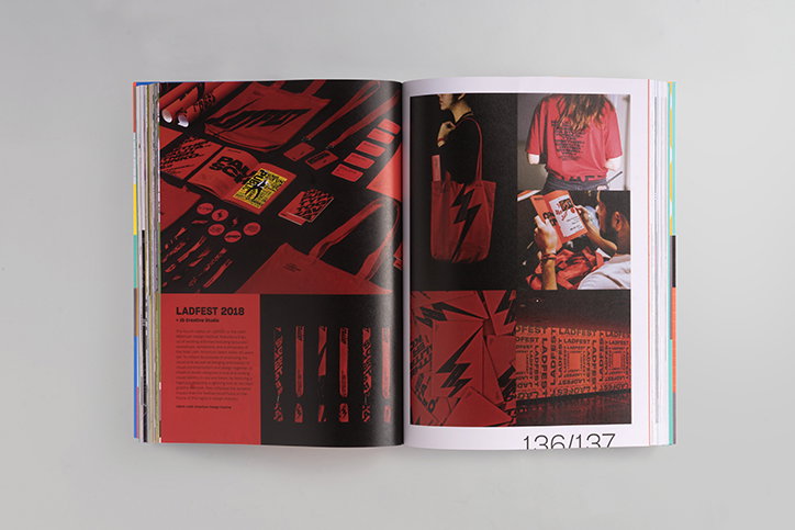
Graphic Fest
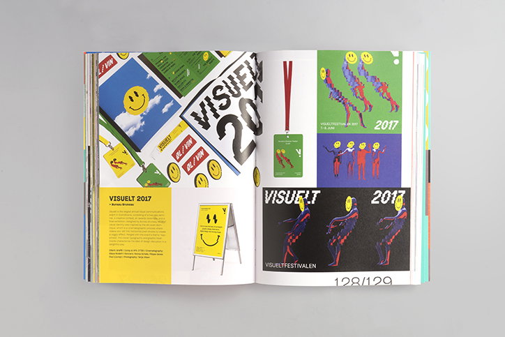
Graphic Fest
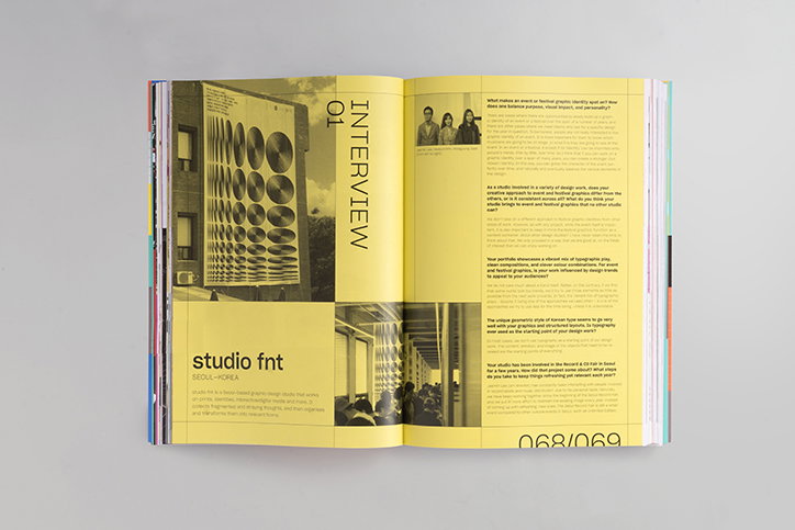
Graphic Fest
Graphic Fest
Graphic Fest
Graphic Fest
Share Article
About the Author
—
Jynann joined It’s Nice That as an editorial assistant in August 2018 after graduating from The Glasgow School of Art’s Communication Design degree. In March 2019 she became a staff writer and in June 2021, she was made associate editor. She went freelance in 2022.