Launch Recite Me assistive technology
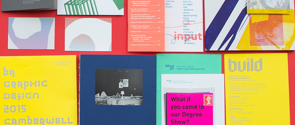
A collection of graphic design portfolios and brochures laid out on a red surface. A yellow cover on the left reads “ba graphic design 2015 camberwell”, while a yellow cover on the right reads “build”.

Voilà! Our round-up of the best degree show identities we've seen this year

—
Date
15 July 2015

Degree show season might be the very best time of the year to be in the It’s Nice That studio. Not least because we have more invitations, flyers, posters and catalogues flying through the letterbox than at any other time, all plying us with free semi-chilled beers and frazzling our eyes with a wealth of new work.

Rather than sit on these like the unfriendly giant of creative goods, we thought we’d share the ten best degree show identities we’ve spotted thus far. From fluorescent type to beautiful accompanying websites, with a whole bunch of stuff in between, here they are!
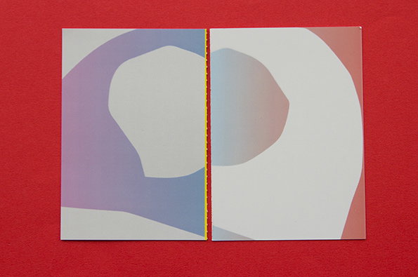
An open booklet featuring abstract, organic shapes in soft gradients of purple, blue and peach. The pages are bound with a yellow stitched spine and set against a bright red background.
Above

Glasgow School of Art, Assembly

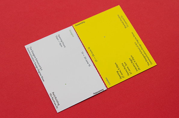
A folded invitation card with one white and one yellow panel, set against a red background. The text reads “The Glasgow School of Art Communication Design Degree Show” and lists dates in June 2015 for events in Glasgow and London.
Above

Glasgow School of Art, Assembly

A white rectangular card against a red background. It reads “Glasgow”, “13 – 20 June 15” and “Assembly.” along the top and side edges. Further text lists the “Opening Hours 10am – 6pm” and the event as “The Glasgow School of Art Communication Design Degree Show” at the “Reid Building 164 Renfrew St.”
Above

Glasgow School of Art, Assembly

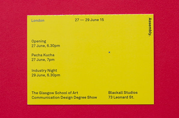
A yellow card against a red background promotes “The Glasgow School of Art Communication Design Degree Show”. It lists events in London from “27 – 29 June 15” at “Blackall Studios 73 Leonard St.”.
Above

Glasgow School of Art, Assembly

Glasgow School of Art, Assembly
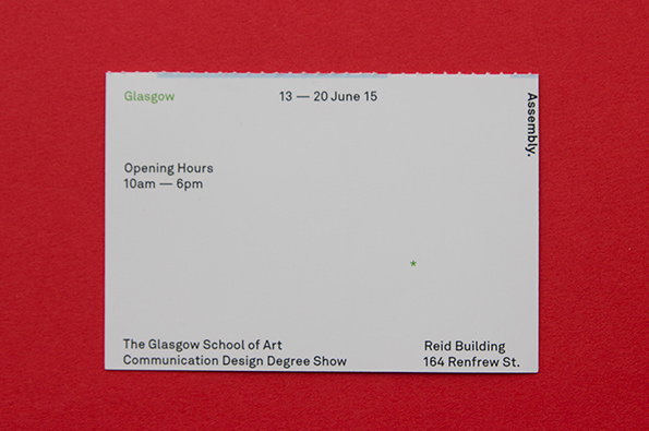
Graphic design is all about clear communication, and Glasgow School of Art’s invitation to both its London and Glasgow shows, titled Assembly, hit the nail on the head. The invite is divided into two by a perforation down the middle with the London invite on one side and the Glasgow on the other. It’s a neat way to navigate the confusion of holding two shows in two countries and inviting guests to one or the other, and the UV gloss in a pastel gradient is so nice we’re unable to remove it from our desk.
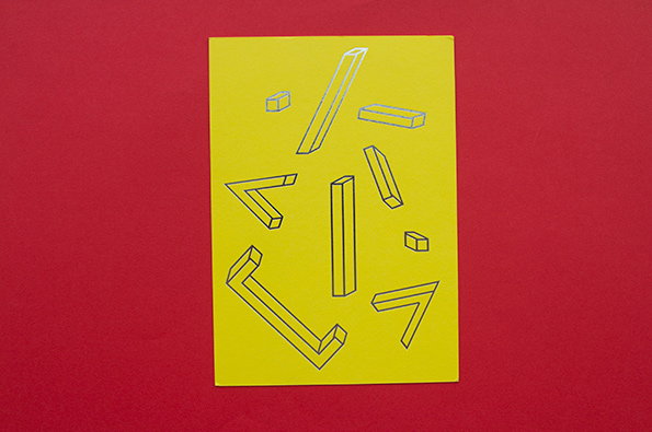
A yellow card featuring a series of 3D geometric shapes in thin black outlines. The shapes, including blocks and angled lines, appear to float across the surface against a bright red background.
Above

University of Bedfordshire, Build

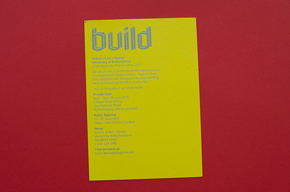
A yellow invitation card against a red background features the word “build” in large, grey lowercase letters. Below, text announces the University of Bedfordshire School of Art + Design Undergraduate Degree Show 2015, including dates and venue details.
Above

University of Bedfordshire, Build

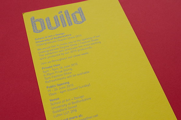
A yellow invitation card on a red background features the word “build” in large, outlined letters. Text below invites viewers to the University of Bedfordshire undergraduate degree show in June 2015.
Above

University of Bedfordshire, Build

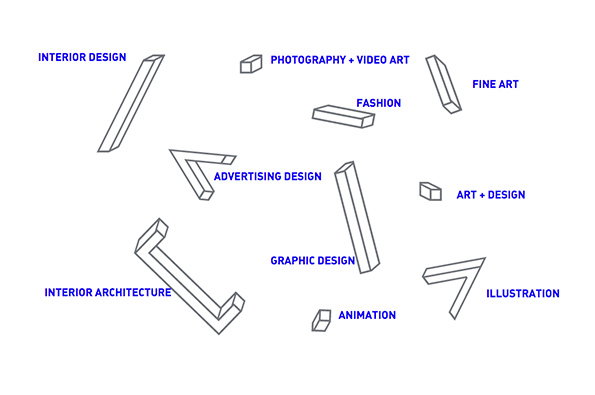
An illustration of various 3D rectangular blocks scattered across a white background. Each block is paired with a blue label, including “Graphic Design”, “Fashion” and “Interior Architecture”.
Above

University of Bedfordshire, Build, website
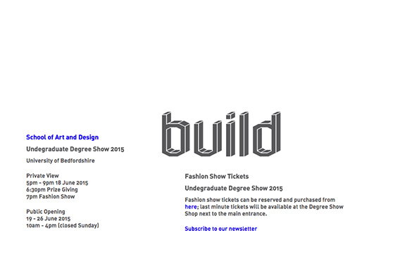
A minimalist poster for the University of Bedfordshire’s “Undergraduate Degree Show 2015”. The word “build” appears in the centre in a bold, 3D block typeface. Text on the left and right provides event details, including a private view on 18 June and a public opening from 19–26 June.
Above

University of Bedfordshire, Build, website

University of Bedfordshire, Build

Bedfordshire isn’t necessarily a key player when it comes to our annual round-up of degree show identities but they had us with this striking yellow invitation to the undergraduate art and design shows. Entitled Build, the logo is composed of a number of components which are debased in silver on the invite and scroll satisfyingly down the screen on the website. 
www.build.wecreatetogether.net
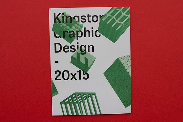
A white booklet against a red background features green 3D geometric shapes. Bold black text reads “Kingston Graphic Design – 20x15”.
Above

Kingston Graphic Design, 20×15

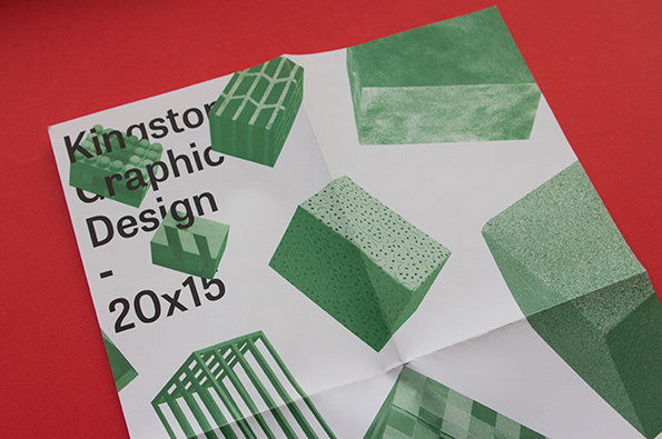
A white folded brochure on a red background features green 3D renders of textured cubes. Bold black text reads “Kingston Graphic Design – 20x15”.
Above

Kingston Graphic Design, 20×15

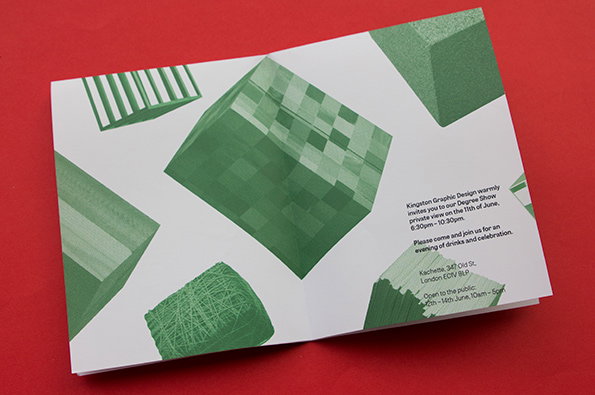
A folded white invitation card featuring green 3D geometric shapes. Text on the right reads “Kingston Graphic Design warmly invites you to our Degree Show private view on the 11th of June”.
Above

Kingston Graphic Design, 20×15

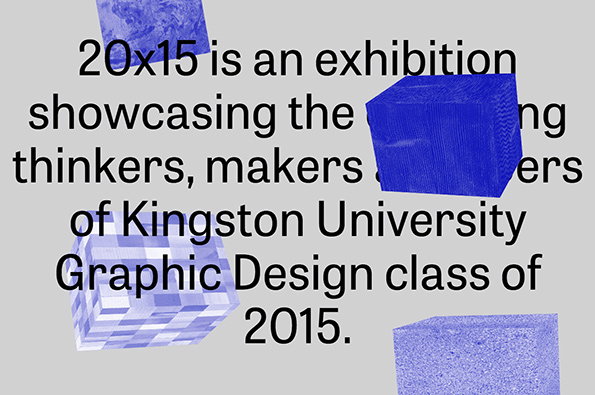
A graphic featuring blue 3D cubes floating around black text on a grey background. The text reads “20x15 is an exhibition showcasing the thinkers, makers and designers of Kingston University Graphic Design class of 2015.”
Above

Kingston Graphic Design, 20×15, website
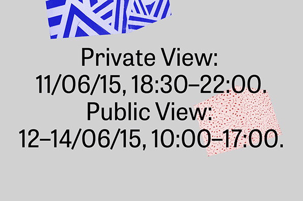
A typographic layout on a grey background reads “Private View: 11/06/15, 18:30–22:00.” and “Public View: 12–14/06/15, 10:00–17:00.” Torn scraps of blue and pink patterned paper overlap the edges of the text.
Above

Kingston Graphic Design, 20×15, website

Kingston Graphic Design, 20×15

Truth be told it doesn’t take an awful lot to grab our attention, and Kingston’s Graphic Design course smashed it with this delightfully simple identity. 3D renders of tactile-looking objects in the form of cubes float happily over a white background on the poster, while the website uses the same concept (again with the satisfying scrolling, nice one web designers!) but in blue, green and red. Everything we need is right there – no bells and whistles, no extras. In true Kingston fashion, they save those for the show. 
www.kingston20x15.com
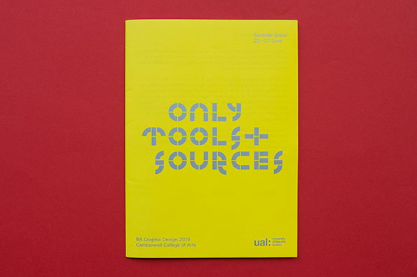
A bright yellow booklet set against a red background. Bold, grey typographic text in the centre reads “ONLY TOOLS + SOURCES”. Smaller text at the bottom identifies the “BA Graphic Design 2015” show at Camberwell College of Arts and the Ual logo.
Above

Camberwell College of Arts, Only Tools and Sources
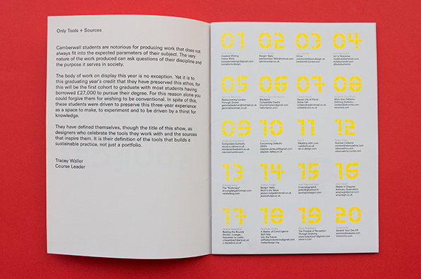
An open booklet with a white left page and a yellow right page. The left page contains an introductory text titled “Only Tools + Sources” signed by course leader Tracey Waller. The right page features a grid of numbers from 01 to 20, each paired with a name and contact details.
Above

Camberwell College of Arts, Only Tools and Sources
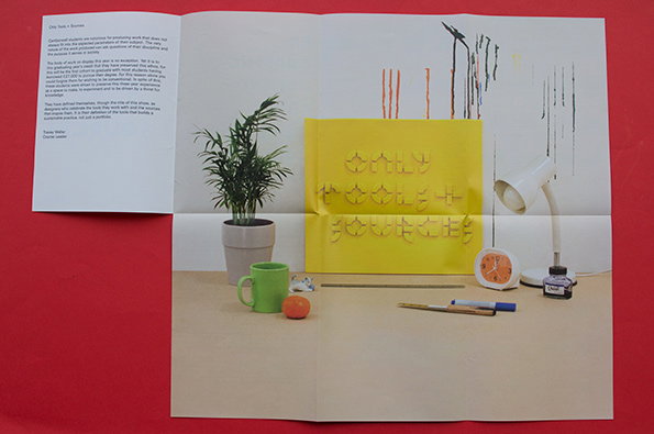
An open brochure featuring a photograph of a desk with a green mug, an orange, and a white desk lamp. A yellow poster in the background reads “Only Tools + Sources”.
Above

Camberwell College of Arts, Only Tools and Sources
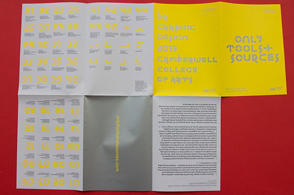
A yellow and grey folded brochure laid open on a red surface. The cover reads “only tools + sources” and “graphic design 2015 camberwell college of arts”.
Above

Camberwell College of Arts, Only Tools and Sources
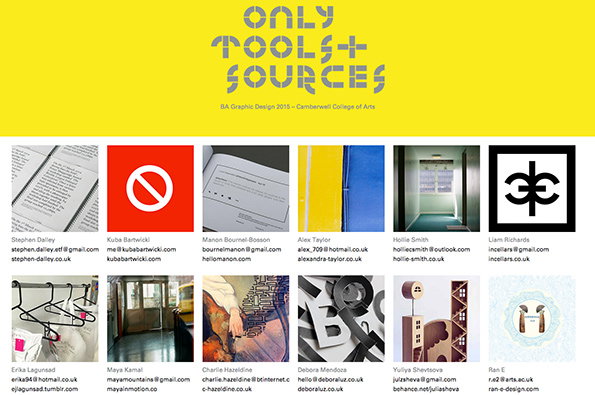
A yellow webpage header reads “Only Tools + Sources” in bold, blocky type. Smaller text below reads “BA Graphic Design 2015 – Camberwell College of Arts”. Below the header, a grid of twelve square tiles displays a mix of student work and contact details. The images include a red “no entry” symbol, a black and white logo, and various photographs and illustrations.
Above

Camberwell College of Arts, Only Tools and Sources, website
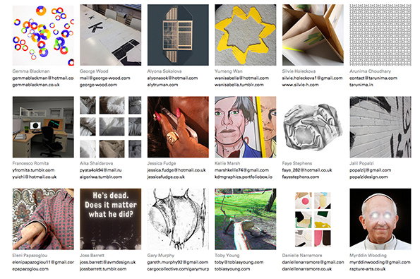
A grid of 18 portfolio thumbnails, each featuring a different image and the artist’s name and contact details below. The works vary in style, including 3D renders, photography, illustration and abstract patterns.
Above

Camberwell College of Arts, Only Tools and Sources, website

Camberwell College of Arts, Only Tools and Sources

Quintessentially British TV show Only Fools and Horses wasn’t actually filmed in Peckham (where, contradictorily, Camberwell College of Arts is basically situated) but that doesn’t stop us from enjoying the glorious pun which takes the name of the Camberwell graphic design show, Only Tools and Sources. As course leader Tracey Waller points out in her brief intro to the degree show inside the fold-out, this year’s graduates are the first to have paid the full £27,000 fees introduced by the Conservative party three years ago, which makes Camberwell’s presiding ethos of producing work that doesn’t necessarily “fit inside the expected parameters of their subject” even more admirable. The identity is yellow and silver, and based around a nicely tactile shot of various props in front of the sign bearing the show’s name, forming a kind of multi-purpose leaflet/poster.
www.onlytoolsandsources.com
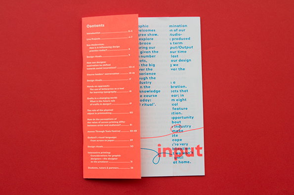
A red and white folded brochure lies open on a red background. The left panel contains a “Contents” list, while the right panel features columns of text with the word “input” handwritten in blue ink across the bottom.
Above

London College of Communication, _Input – Output
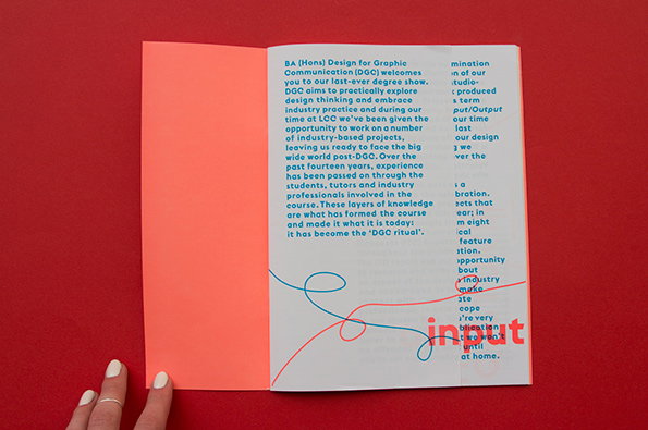
An open brochure with a bright orange cover and white pages, laid against a red background. The right page features a block of text and a blue and red scribbled line that weaves through the words “in” and “out”.
Above

London College of Communication, _Input – Output
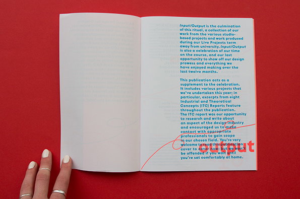
An open book with blue text on white pages rests on a red background. A hand with rings holds the left page, while a red line circles a paragraph on the right.
Above

London College of Communication, _Input – Output
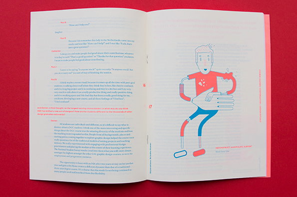
An open book with a red cover. The left page contains a text-heavy interview, while the right page features a colourful illustration of a stylised figure with a large hand resting on its chest. Small text at the bottom of the illustration reads “DECONSTRUCT, MANIPULATE, SURVIVE”.
Above

London College of Communication, _Input – Output
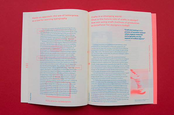
An open book with red and white pages. The left page features a column of text under the heading “Hands-on approach: the use of letterpress as a tool for learning typography”, with several sections highlighted in red.
Above

London College of Communication, _Input – Output
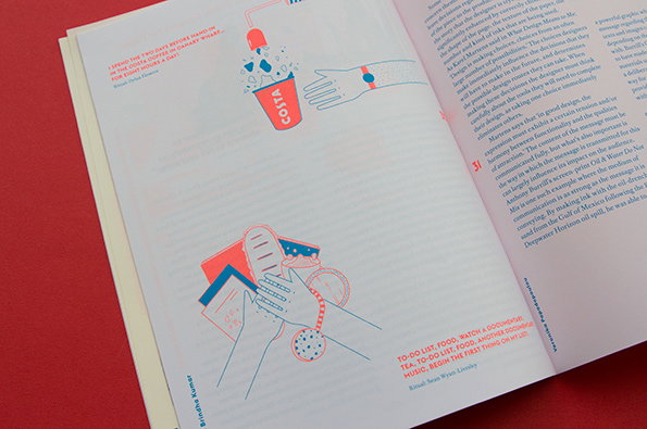
An open book featuring two minimalist illustrations in red and blue line work. The first shows a hand holding a “Costa” coffee cup, while the second shows hands holding a sandwich and a drink.
Above

London College of Communication, _Input – Output
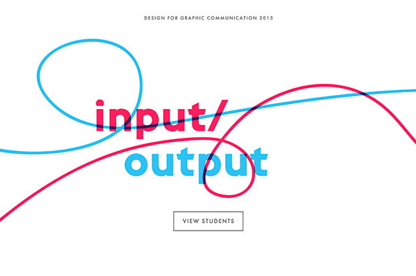
A graphic design layout featuring the words “input/output” in red and blue. Two sweeping, colourful lines loop across the text against a plain white background. Small text at the top reads “Design for Graphic Communication 2015” and a button at the bottom says “View Students”.
Above

London College of Communication, _Input – Output, website

London College of Communication, Input – Output

There isn’t enough eyeball-searing fluorescent orange in graphic design, so the publication which accompanied London College of Communication’s Design for Graphic Communication show, called Input – Output, was a welcome distraction. The book feels like it’s inside out, with its contents on a skinny front cover for all to see and its innards poking out, which is exactly the kind of process-as-practice we like to see exposed at the shows. 

Brindha Kumar’s illustrations, accompanying essays on Eco-Modernism, the future role of crafts and Godard’s visual language make this much more than just a way to show off current students’ work, and instead serves to round up the DGC course as a whole.
www.dgclcc.com
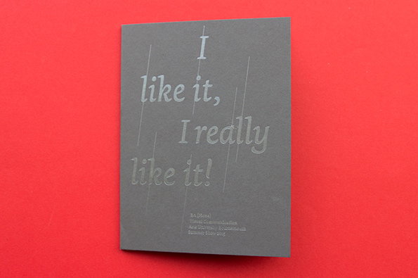
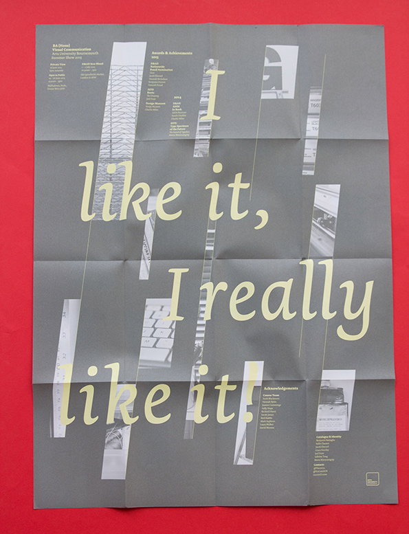
A grey card against a bright red background features embossed text that reads “I like it, I really like it!”. Smaller embossed text at the bottom provides credits for the project.
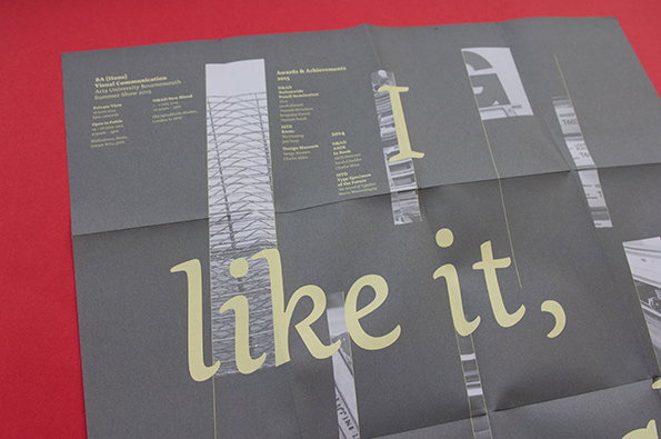
A grey printed document on a red background features the phrase “I like it,” in large, pale yellow typography. The layout includes columns of small text listing “Awards & Achievements” and university details.
Above

Arts University Bournemouth, I Like It, I Really Like It!
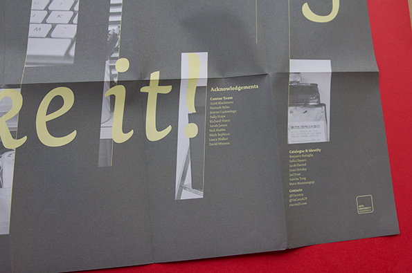
A grey folded poster features large, pale yellow text that reads “re it!”. To the right, a list of “Acknowledgements” credits the course team and those responsible for the catalogue and identity.
Above

Arts University Bournemouth, I Like It, I Really Like It!

A yellow folded brochure is spread open on a red surface. It features a grid of black and white photographs and typographic elements, including the word “Roam”.
Above

Arts University Bournemouth, I Like It, I Really Like It!

A grey poster featuring large, pale yellow typography that reads “I like it, I really like it!”. The text is layered over a collage of small, monochromatic photographs and columns of fine print.
Above

Arts University Bournemouth, I Like It, I Really Like It!

Arts University Bournemouth, I Like It, I Really Like It!
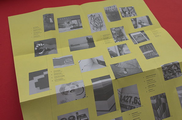
The title sounds something like your unconvinced grandma might say when you show her your final project (we’ve all had a “so it’s the graphical design you do, dear, isn’t it?”) but the poster for Arts University Bournemouth’s visual communication course, rendered in warm grey and lemon yellow, serves well to show work by every student from the show. It arrived in this neat little card, too, changing up the format of invitations as it encourages you to stick the poster up on the wall for the world to see.
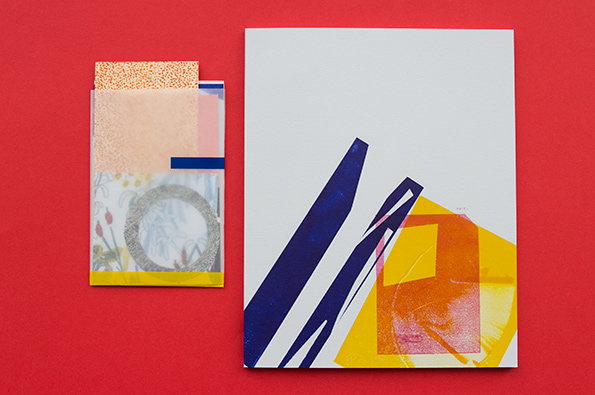
A collage of two paper compositions laid against a bright red background. The larger piece features sharp blue diagonal shapes and a yellow square with an orange circular form.
Above

Camberwell College of Arts, Rock, Paper, Scissors
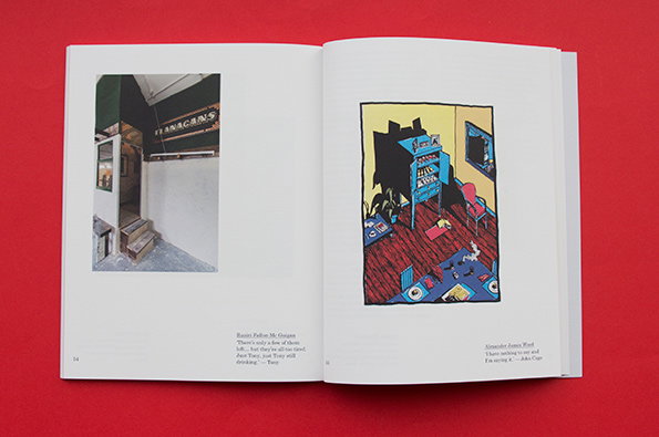
An open book on a red background. The left page shows a photo of a pub entrance with a sign reading “Flanagans”, while the right page features a colourful illustration of a cluttered room.
Above

Camberwell College of Arts, Rock, Paper, Scissors

A collage of layered papers and translucent films on a bright red background. The composition includes a dotted orange pattern, a grey circular shape, and a strip of yellow tape at the bottom.
Above

Camberwell College of Arts, Rock, Paper, Scissors

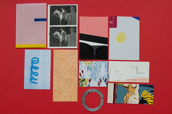
A collage of various paper cut-outs and prints arranged on a bright red background. The pieces include abstract shapes, a black and white image of a person on a horse, and a floral illustration.
Above

Camberwell College of Arts, Rock, Paper, Scissors

Camberwell College of Arts, Rock, Paper, Scissors
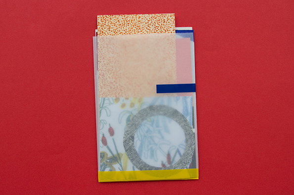
Perhaps it puts the school at an unfair disadvantage, but I can’t help but expect great things from Camberwell’s illustration course year on year, and it has yet to disappoint. This year the catalogue and invitation came hand-delivered (hand-delivered! What a joy) and included not only a considered, tactile catalogue of the work included, but also a sweet little handmade package containing cut-outs from prints by a selection of the students, signed by each – an effective and intriguing peek at the work to come, and perfect bookmark material.
www.rockpaper-scissors.tumblr.com
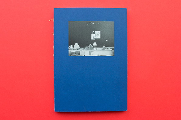
A blue book cover featuring a small, square black-and-white photograph in the centre. The photo shows a dimly lit room with a table and small artworks on the wall.
Above

Brighton University, Studio 350

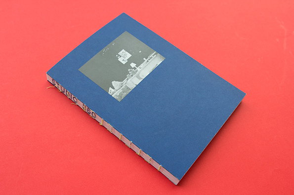
A blue hardcover book rests on a bright red surface. A small black and white photograph is centered on the cover, and the spine reads “Studio 350”.
Above

Brighton University, Studio 350

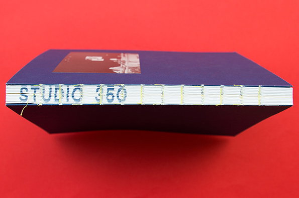
A dark blue book rests against a bright red background. The spine is bound with yellow thread and reads “STUDIO 350”.
Above

Brighton University, Studio 350

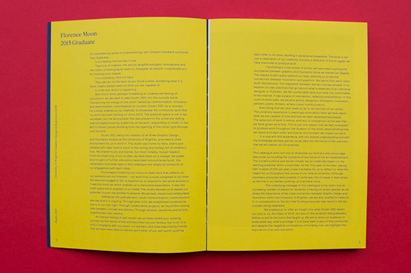
An open book with yellow pages set against a red background. The left page features the heading “Florence Moon 2015 Graduate” followed by several paragraphs of text.
Above

Brighton University, Studio 350

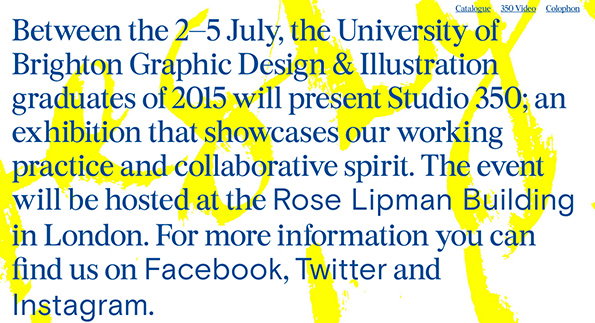
Blue text on a white background is layered over a large, abstract yellow shape. The text announces “Studio 350”, an exhibition by University of Brighton graduates held 2–5 July 2015 at the Rose Lipman Building in London.
Above

Brighton University, Studio 350, website

Brighton University, Studio 350

The name for Brighton University’s graphic design and illustration degree show, Studio 350, came from the room the students shared for three years while studying, which I imagine as a kind of crucible of creative energy, with ideas flying off like sparks from all angles. Brighton’s course is one of few to merge the two disciplines, and flicking through the catalogue the blend seems to have benefited all of the students involved. 

Made with exposed coptic binding, the catalogue feels wonderfully lo-fi in spite of its high production values, and with giant, fluorescent pink spray-painted signs saying simply “350” still lining the street outside the It’s Nice That studio (the degree show was just next-door but one) I can testify that the show itself echoed this sentiment. 
www.studio350show.co.uk

Share Article

Further Info

About the Author

Maisie Skidmore

—

Maisie joined It’s Nice That fresh out of university in the summer of 2013 as an intern before joining full time as an Assistant Editor. Maisie left It’s Nice That in July 2015.


It's Nice That Newsletters

Fancy a bit of It's Nice That in your inbox? Sign up to our newsletters and we'll keep you in the loop with everything good going on in the creative world.