




No more serifs, same bright colours: Google launches new identity
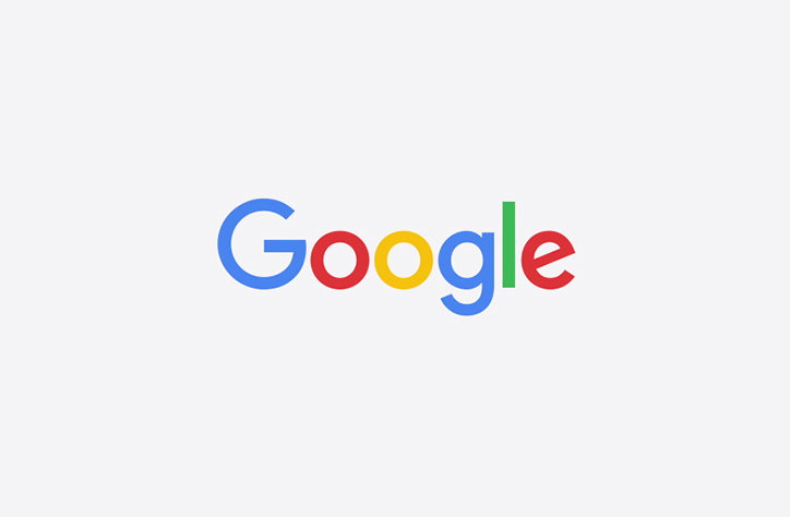
Google has just launched a new visual identity and redesign of its multicoloured logo. At the time of writing the new logo is shown on the Google homepage being drawn by an animated hand. The brand has published its case study online, in which Alex Cook, Jonathan Jarvis and Jonathan Lee say: “Users now engage with Google using a constellation of devices, and our brand should express the same simplicity and delight they expect from our homepage, while fully embracing the opportunities offered by each new device and surface.”
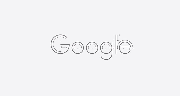
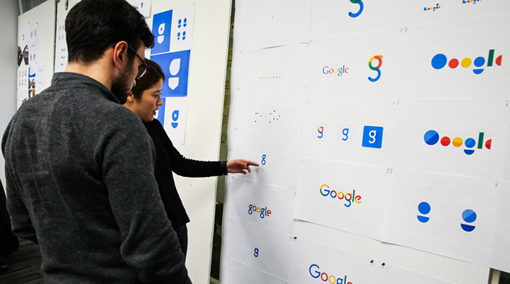
Google says the identity was created by designers across the company, including its Creative Lab arm and central design team. Those involved met in New York for “an intense, week-long design sprint.” The aim was to create a scalable mark with “intelligent motion” that brings consistency for Google users across different platforms.
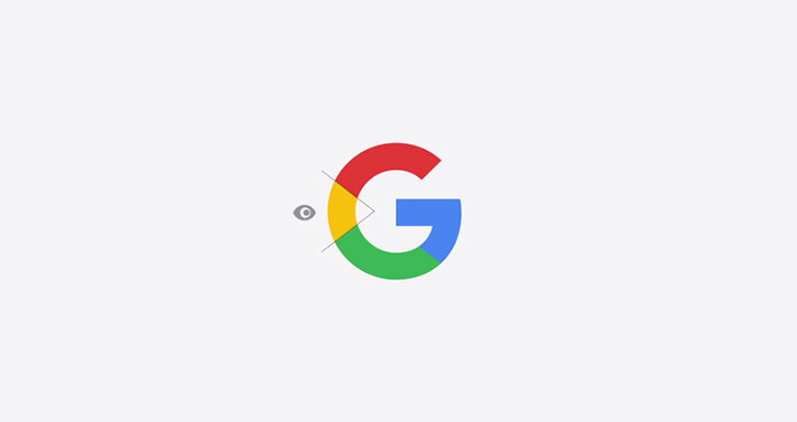
The new identity uses colured dots to signify different actions, such as speaking into a device or to show someone is replying. The redrawn logo uses a sans serif typeface and the same multicoloured colour sequence as the previous Google design. The new Google G has been compacted to work better on small devices.
“The Google logo has always had a simple, friendly, and approachable style,” says the brand. “We wanted to retain these qualities by combining the mathematical purity of geometric forms with the childlike simplicity of schoolbook letter printing. Our new logotype is set in a custom, geometric sans-serif typeface and maintains the multi-coloured playfulness and rotated ‘e’ of our previous mark—a reminder that we’ll always be a bit unconventional.”
Google’s new identity
Google’s new identity
Google’s new identity
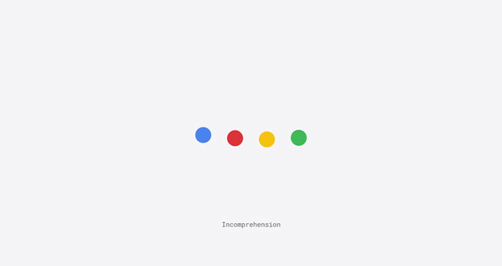
Google’s new identity
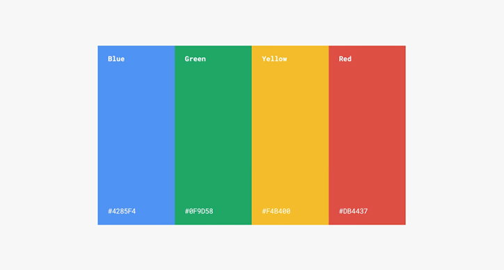
Google’s new identity
Share Article
Further Info
About the Author
—
Emily joined It’s Nice That as Online Editor in the summer of 2014 after four years at Design Week. She is particularly interested in graphic design, branding and music. After working It's Nice That as both Online Editor and Deputy Editor, Emily left the company in 2016.



