Launch Recite Me assistive technology
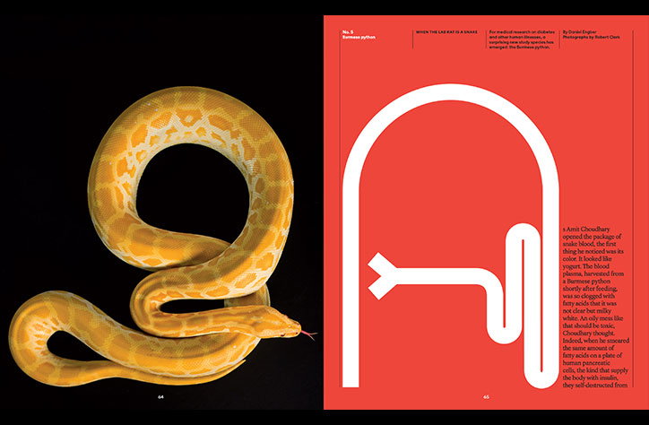
A two-page magazine spread. The left page shows a yellow and white Burmese python coiled against a black background. The right page is bright red with a white abstract line drawing of a snake and a column of text.

Design director, Gail Bichler, on The New York Times Magazine typography exhibition

—
Date
10 July 2017

The New York Times Magazine is currently exhibiting an impeccable range of typographic highlights at the Type Directors Club, running until 5 September.

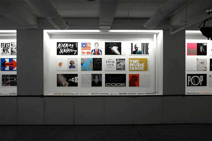
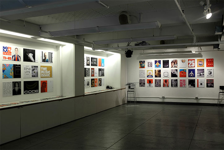
“It includes covers, spreads, and special issues that make use of our custom typefaces designed by Henrik Kubel of A2-TYPE,” Gail Bichler, design director of The New York Times Magazine, tells It’s Nice That. Featuring “typographic treatments and bespoke fonts made by the magazine’s design team and other collaborators,” the show aims to celebrate all of the outstanding work that’s been put into the magazine since its redesign in 2015.

“We looked for instances where both the design and imagery were standouts and where they worked together in meaningful or unique ways,” says Gail on how she curated the exhibition. “We also tried to show as much variety as possible in terms of topic and visual tone.”

Memorable spreads and covers from recent issues, alongside a 40-page specimen showcasing the bespoke typography, will demonstrate how much care and attention goes into the magazine’s design and art direction. Gail tells us exactly what makes a particular issue or piece of work stand out: “The special issues are often memorable because we have the opportunity to work with different fonts and flush out a new visual language across an entire issue.”

“For our 2016 New York Issue with a theme of ‘life above 800 feet’, we rotated the magazine 90 degrees. The magazine’s art director, Matt Willey, made custom typography to work within the vertical spaces that the new orientation created. For our 2017 Music Issue, we commissioned a poster weight of our sans serif font and combined that with illustrated custom lettering by illustrator Braulio Amado. Another favourite was the 2016 Lives Issue. We worked with an existing font by Kristina Bartosova and commissioned a number of special characters and ligatures to customize the face.”

Since its relaunch, the new format has flourished with “all new custom typefaces” and “lots of subtle tweaks to the look and the content.” The magazine is constantly evolving: “As we’ve gotten to know our fonts better and understand how they work we’ve made adjustments to how we use them and also to the fonts themselves,” says Gail.

The New York Times Magazine holds many exciting projects in the pipeline and will continue to cherish its growth. “Some of the most significant ways that we’ve grown are in mediums beyond the printed magazine. We’ve done some ambitious online presentations which use the visual language of our special issues and make use of sound, video and animation in interesting ways,” says Gail.

“We’ve been experimenting with alternate forms of storytelling, like virtual reality, and we have made short films ranging from documentary to collaborations with Hollywood directors and actors in that medium. We’ve even branched out to other print formats and are making special highly-designed, magazine-produced sections of the paper – like the special kids’ section last month and the annotated constitution. We have many more exciting things in the works.”
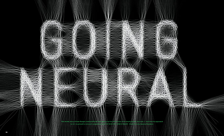
A 3D render of the words “GOING NEURAL” in a bold, white typeface against a black background. The letters are formed from a dense web of glowing white lines that stretch outwards like neural networks. Small green text at the bottom provides a summary of a story about Google and artificial intelligence.
Above

The New York Times Magazine: Going Neural
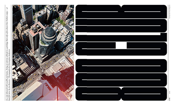
A two-page magazine spread. The left page shows an aerial view of New York City skyscrapers, while the right page features a bold, black typographic design.
Above

The New York Times Magazine: 800 Club
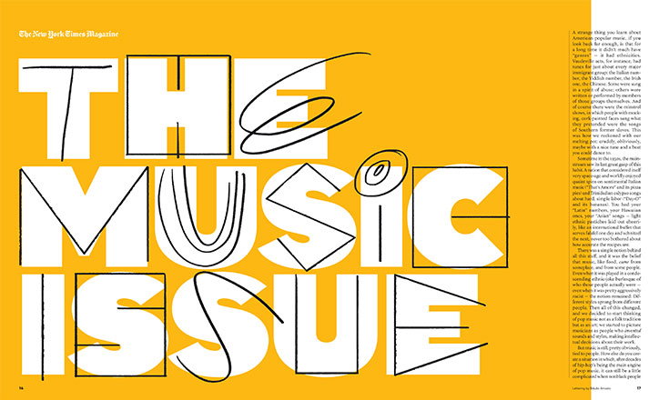
A double-page magazine spread with a bright yellow background. Large, stylised white typography reads “THE MUSIC ISSUE”, with black line drawings of musical notes and shapes layered over the letters. A column of body text sits to the right, under the header “The New York Times Magazine”.
Above

The New York Times Magazine: The Music Issue
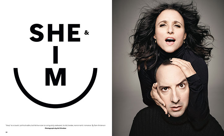
A two-page spread featuring a portrait of Julia Louis-Dreyfus and Tony Hale. Louis-Dreyfus stands behind Hale, resting her hands on his head and cheeks with a surprised expression. The opposite page features bold black typography that reads “SHE & I M” above a large curved line.
Above

The New York Times Magazine: She and Him
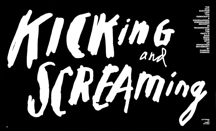
A bold typographic image in white on a black background reads “KICKING and SCREAMING”. A small block of text to the right discusses the 2016 election and the Democratic party.
Above

The New York Times Magazine: Kicking and Screaming
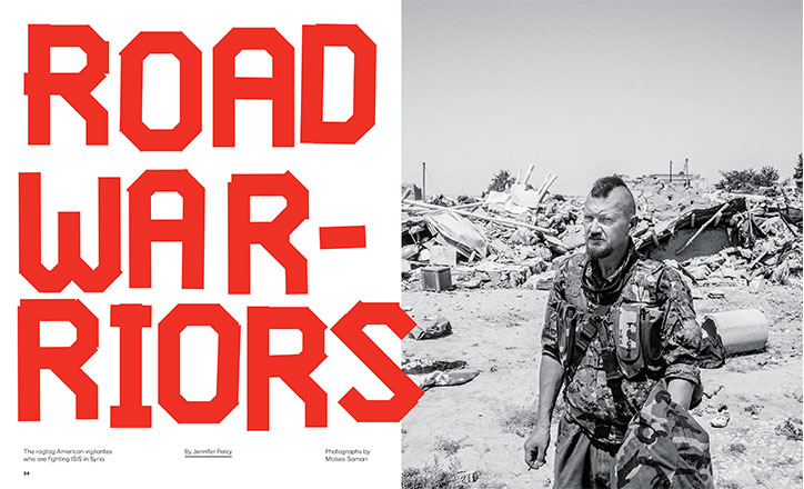
A two-page magazine spread. The left page features bold red typography that reads “ROAD WARRIORS”, with smaller credits below for Jennifer Percy and Moises Saman. The right page is a black and white photo of a person in camouflage gear standing amidst rubble and ruins.
Above

The New York Times Magazine: Road Warriors
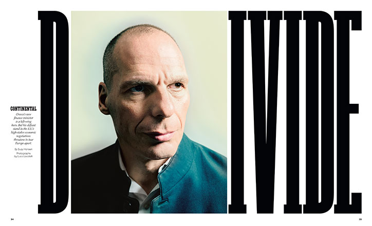
A portrait of a person looking off-camera, framed by the word “DIVIDE” in large, bold black type. A small column of text to the left introduces the subject as Greece’s new finance minister.
Above

The New York Times Magazine: Divide

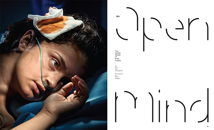
A close-up of a child lying in a hospital bed with a nasal cannula and a bandage on their forehead. Beside the image, a minimalist typographic layout reads “An open mind” and “The terrible beauty of brain surgery.”
Above

The New York Times Magazine: Open Mind
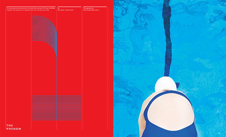
A two-page magazine spread. The left page is bright red with a blue linear graphic and the title “The Phenom”. The right page shows a person in a blue swimsuit and white swim cap, seen from behind, facing a swimming pool.
Above

The New York Times Magazine: The Phenom
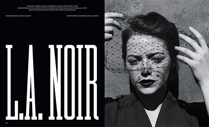
A black and white magazine spread. The left page features a bold white headline that reads “L.A. NOIR” against a black background. The right page shows a person wearing a dark veil, holding the netting away from their face with both hands.
Above

The New York Times Magazine: LA Noir

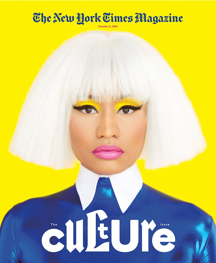
Nicki Minaj appears on the cover of The New York Times Magazine, dated “October 11, 2015”. She wears a white bob wig, bright yellow eyeshadow, and a shiny blue outfit with a white collar. Large white text across the bottom reads “The Culture Issue”.
Above

The New York Times Magazine

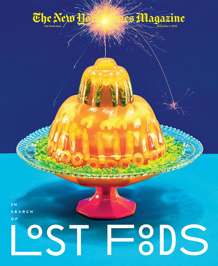
A magazine cover for The New Yorker featuring a tiered, orange gelatin mould on a glass cake stand. A sparkler sits atop the jelly, emitting bright golden sparks against a deep blue background. Text at the top reads “The New Yorker Magazine” and “The Food Issue”, while bold white text at the bottom reads “IN SEARCH OF LOST FOODS”.
Above

The New York Times Magazine

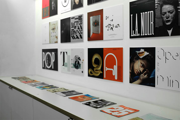
A gallery wall displays a grid of graphic design posters and prints. A long white table in the foreground holds a row of open lookbooks and magazines.
Above

Photography by Matt Willey

A gallery display of various graphic design prints and posters arranged in a white recessed wall. The works feature a mix of bold typography, portraits and abstract imagery, including a yellow poster that reads “The Music Issue”.
Above

Photography by Matt Willey

A gallery space with white walls displaying grids of posters and prints. A long white plinth runs along the left wall, holding a row of books and pamphlets.
Above

Photography by Matt Willey

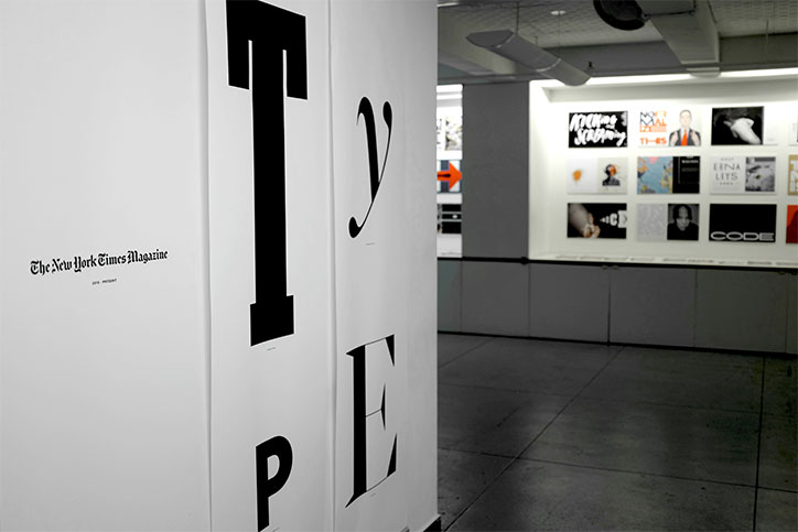
Large black letters spelling “TYPE” are spread across white gallery walls. To the left, a small logo reads “The New York Times Magazine”.
Above

Photography by Matt Willey

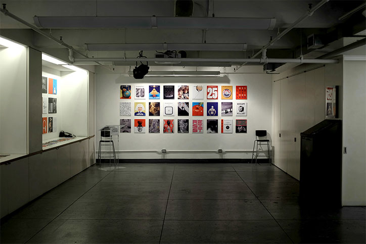
A grid of 18 colourful posters is displayed on a white gallery wall. Two black stools stand on either side of the collection in a sparsely furnished, industrial room.
Above

Photography by Matt Willey

Share Article

About the Author

Ayla Angelos

—

Ayla is a London-based freelance writer, editor and consultant specialising in art, photography, design and culture. After joining It’s Nice That in 2017 as editorial assistant, she was interim online editor in 2022/2023 and continues to work with us on a freelance basis. She has written for i-D, Dazed, AnOther, WePresent, Port, Elephant and more, and she is also the managing editor of design magazine Anima. 

It's Nice That Newsletters

Fancy a bit of It's Nice That in your inbox? Sign up to our newsletters and we'll keep you in the loop with everything good going on in the creative world.