Launch Recite Me assistive technology
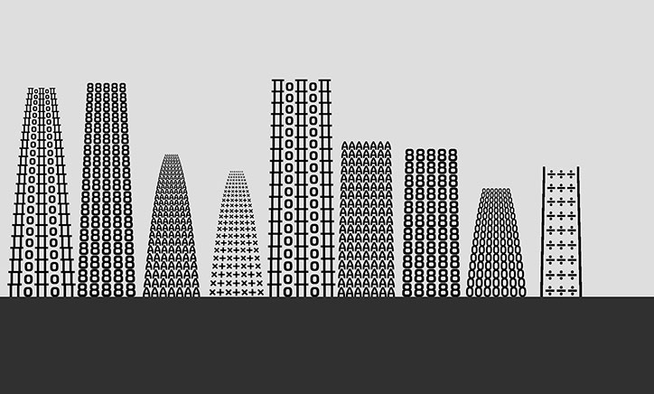
An illustration of a city skyline where the buildings are formed from repeating black characters and symbols. The figures vary in height and shape, set against a plain grey sky and a solid black foreground.

Introducing FS Untitled and a new digital typeface playground from Fontsmith

—
Date
16 March 2016

Creating a digital typeface already too flexible to name must come with its challenges, most of all when it comes to presentation. If you’re Fontsmith you create a digital playground to showcase the pixel-friendly face FS Untitled.

For the typeface – an update on one previously licensed to Channel 4 – Fontsmith have developed 12 new weights with the intention of meeting all on-screen needs. The Clerkenwell-based foundry has created two versions of each weight – two weights for each weight – to allow designers and developers to adjust as needed.

“It’s a digital-first world and I wanted to make something that was really functional for brands,” explains founder Jason Smith. “I also wanted to create something that stylistically was open to its use. So a thin weight, large, gives a very different feel to the text font in body copy.”

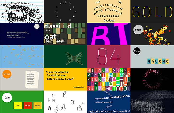
The site built to launch the typeface includes 48 interactive scenes, with each weight given four, and an interactive specimen sheet designed by The Space Between. ‘We worked hard to create many different kinds of typographic execution,” says co-designer Matt Rudd. “All scenes are interactive – for example, FS Zombie is a fully-functioning arcade game and FS Alchemist takes the user from Lead to Gold via every letter in the alphabet.”
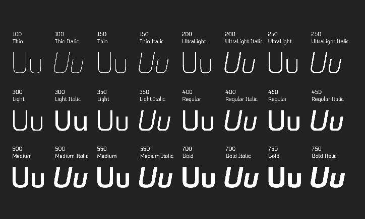
A specimen of a rounded sans-serif typeface showing various weights and styles against a black background. The letters “Uu” are repeated in a grid, labelled with weights from “Thin” to “Bold” and their corresponding italic versions.
Above

Fontsmith: FS Untitled

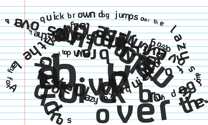
A digital collage of the phrase “the quick brown fox jumps over the lazy dog” scattered across lined notebook paper. The black letters are distorted, overlapping and rotated in a chaotic jumble.
Above

Fontsmith: FS Untitled

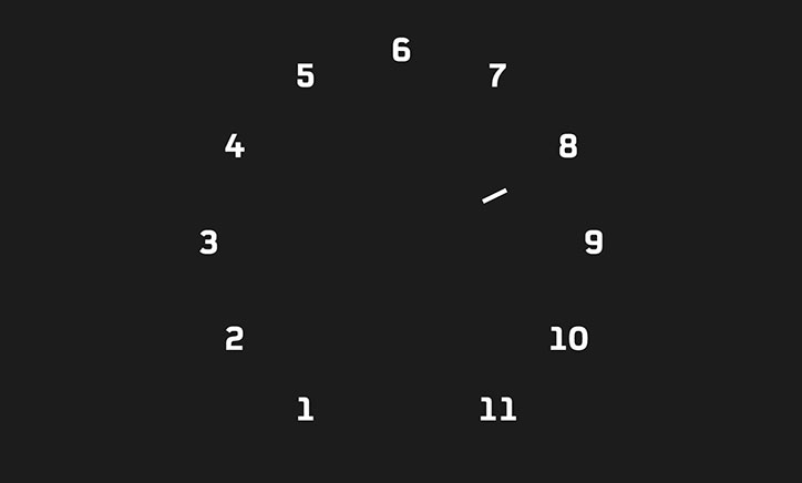
A minimalist clock face on a black background. White numerals from “1” to “11” are arranged in a circle, with a single white hand pointing towards the “8”.
Above

Fontsmith: FS Untitled

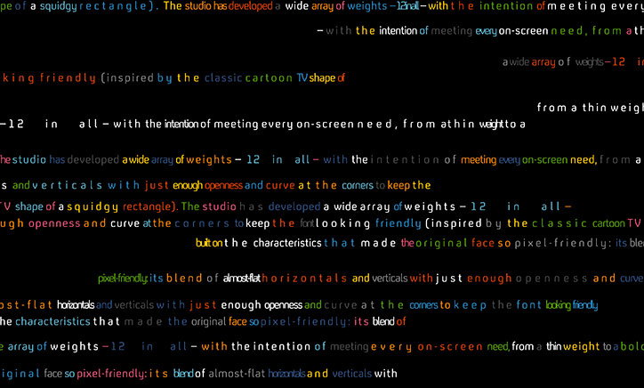
A close-up of a black screen filled with lines of colourful, monospaced text in red, yellow, green, blue and orange. The text repeats phrases such as “a wide array of weights – 12 in all” and “pixel-friendly”.
Above

Fontsmith: FS Untitled

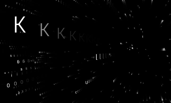
A series of white letters and symbols float across a black background. A large, bright “K” leads a receding line of smaller, fading “K” characters.
Above

Fontsmith: FS Untitled

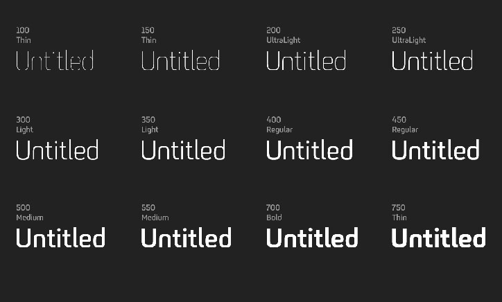
A typography specimen showing the word “Untitled” in various weights of a sans-serif typeface. The weights range from “Thin” to “Bold”, displayed in a grid against a dark grey background.
Above

Fontsmith: FS Untitled

A grid of 20 diverse graphic design experiments exploring typography and layout. The works feature a mix of bold colours, distorted text, and minimalist compositions, including a yellow slide with a quote by “Muhammad Ali”.
Above

Fontsmith: FS Untitled

Share Article

Further Info

About the Author

Alexander Hawkins

—

It's Nice That Newsletters

Fancy a bit of It's Nice That in your inbox? Sign up to our newsletters and we'll keep you in the loop with everything good going on in the creative world.