Launch Recite Me assistive technology
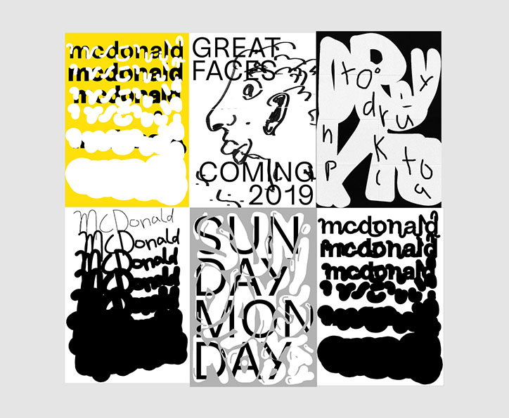
A grid of six graphic posters featuring bold, distorted typography and abstract shapes. The designs use a high-contrast palette of yellow, black and white, with repeated words including “mcdonald”, “great faces”, “coming 2019”, “sunday” and “monday”.

Designer and typographer Fabio Biesel aims to be “surprising, not perfect”

—
Date
4 February 2019

Fabio Biesel is a graphic designer and typographer based in southern Germany, “between cows and the lake of Constance”, as he describes. Rather than technical perfection, he wants his typography to “convey a feeling”: “it’s the imperfections that inspire me more”, Fabio tells It’s Nice That. After doing a vocational training course in graphic design, he started a degree in communication design at the University of Technology, Business and Design in Constance, but chose to defer after taking on work as a freelancer: “I got to work on some cool projects, and I decided to leave for a while to gain more work experience”.

His typeface, Güggeli, was inspired by “a house in Denmark with windows that were always totally awry. It’s not the most legible font, but it’s one that conveys a mood”. The balance between clarity and playful details is explored in his second typeface, Increase, too. “It’s chaotic and stubborn, but also very personable,” hell tells us. The typeface is another great example of Fabio’s approach, defined by “not taking my work too seriously, and making fun visible”. His typographic approach is full of expressive imperfections, combining hand-drawn elements with computer graphics: “It can be hard to find a way to be funny and serious at the same time. My aim is for my work to be surprising, not perfect.”
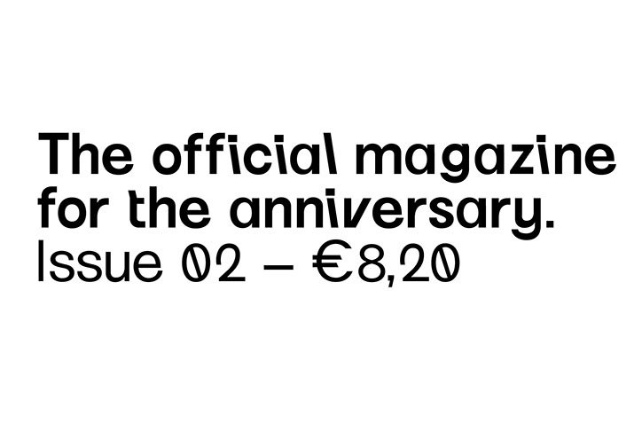
Black text on a white background reads “The official magazine for the anniversary.” A second line reads “Issue 02 – €8,20”.
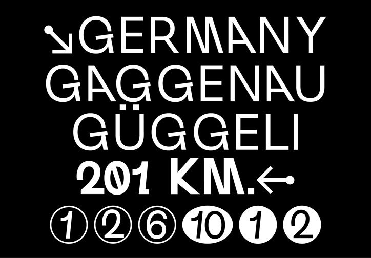
White typographic elements on a black background. The text includes “GERMANY”, “GAGGENAU”, “GÜGGELI” and “201 KM.” accompanied by directional arrows. A row of circled numbers from one to 12 sits at the bottom.
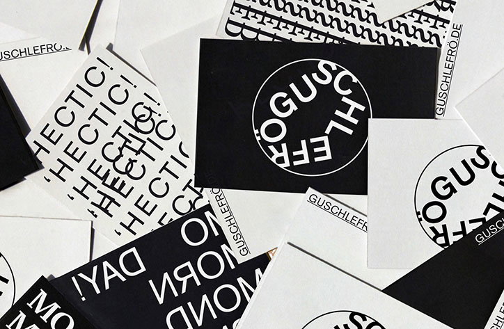
A scattered pile of black and white graphic cards. Some feature the word “HECTIC!” repeated in a bold sans-serif font, while others show a circular logo reading “GUSCHLEFRO”.
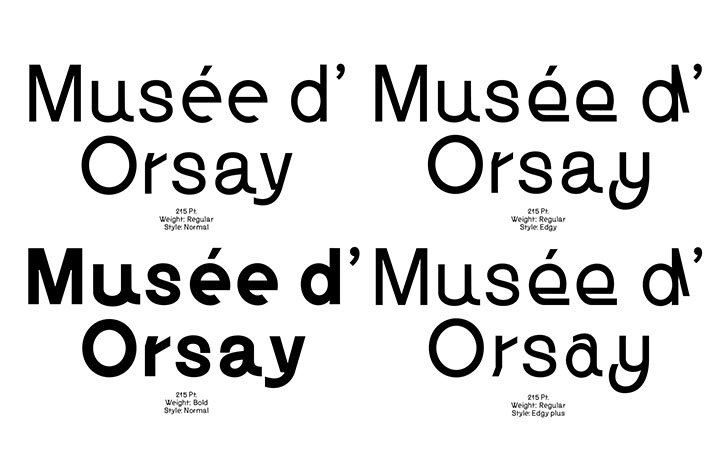
A typography specimen showing four variations of the text “Musée d’Orsay”. Each version is paired with technical details regarding point size, weight and style.
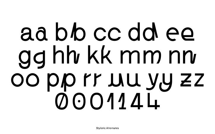
A specimen of a typeface showing lowercase letters from a to z, each paired with a stylistic alternate. Below the alphabet, a row of numbers from 0 to 4 is shown with their alternates.
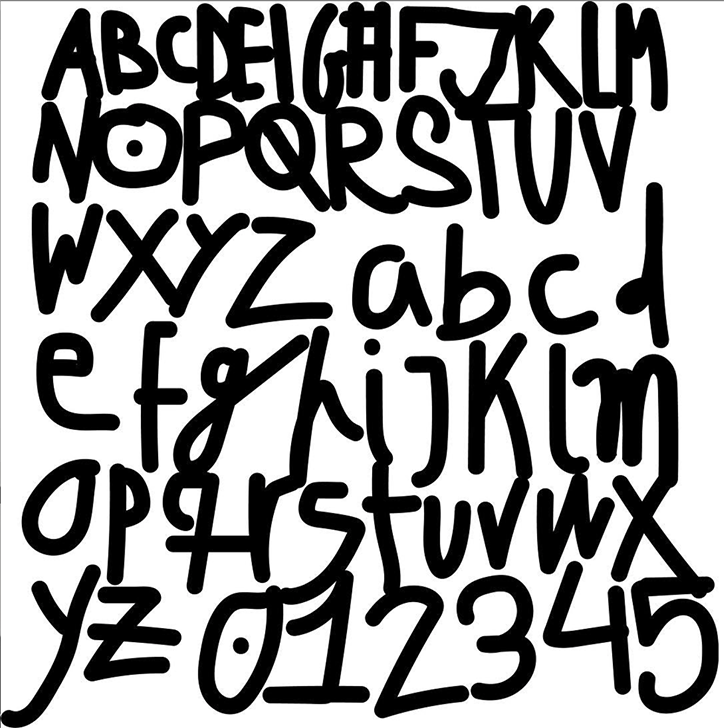
A black and white illustration of a hand-drawn alphabet and number set. The characters are rendered in a bold, irregular marker style across six rows.
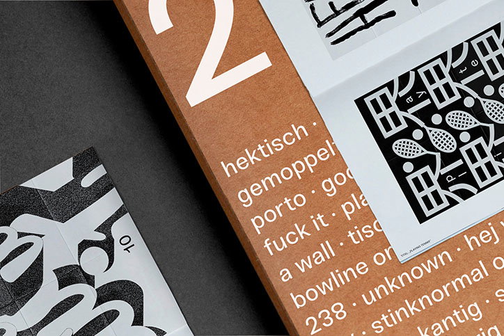
A close-up of printed materials on a dark surface. A brown cardboard folder features a large white “2” and a list of words including “hektisch”, “gemoppelt” and “fuck it”. Beside it, a white page shows a black and white graphic of tennis rackets.
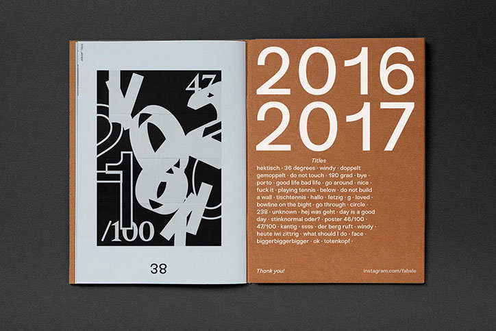
An open book shows a black and white abstract graphic on the left page and a brown page on the right. The brown page features the years “2016” and “2017” in large white type above a list of words titled “Titles”.
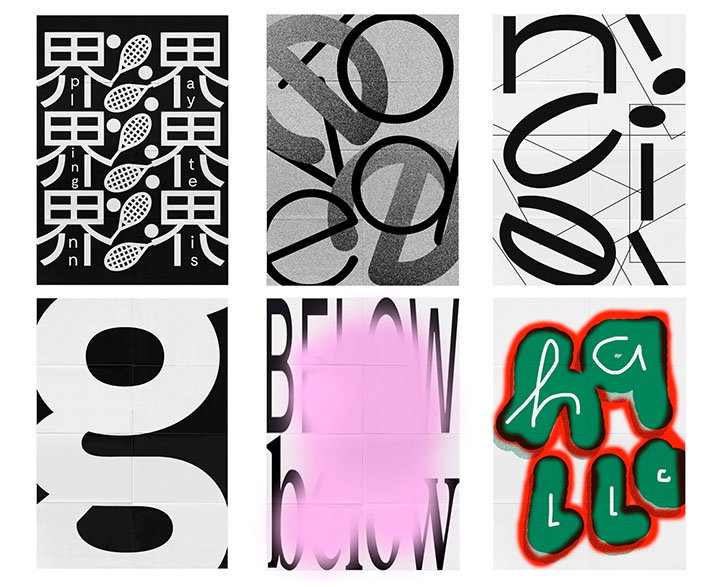
A grid of six graphic posters exploring typography and abstract shapes. The designs use a high-contrast palette of black, white, grey, green and pink.

Share Article

Further Info

About the Author

Billie Muraben

—

Billie studied illustration at Camberwell College of Art before completing an MA in Visual Communication at the Royal College of Art. She joined It’s Nice That as a Freelance Editorial Assistant back in January 2015 and continues to work with us on a freelance basis.

It's Nice That Newsletters

Fancy a bit of It's Nice That in your inbox? Sign up to our newsletters and we'll keep you in the loop with everything good going on in the creative world.