Launch Recite Me assistive technology
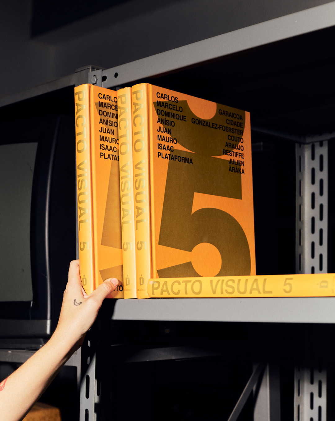
A person’s hand reaches for a row of bright yellow books on a grey metal shelf. The covers and spines feature the title “Pacto Visual 5” and a list of names.

Estudio Cru wants it’s responsive design to pose questions rather than offer answers

With critical thinking and creative concept at the core of its practice, the Rio de Janeiro-based studio recognises the influential dialogue that design can create between company and consumer.

—
Date
28 October 2026

Situated within the streets of Rio de Janeiro is Estudio Cru, a thoughtful graphic design agency that is über-conscious of its role in creativity, commerce and culture. As Estudio Cru tells us, “when the outcome is all that matters, we are running on the treadmill of capitalism.” This notion underpins the philosophy of its practice, perpetually redefining what it makes and how it creates. “Where images and culture often serve only to sustain the existing system,” says Bernado Winitskowski, co founder of Estudio Cru, “we believe more in the power of questions than in the certainty of answers.”

As a result, Estudio Cru’s work, led by Bernardo and fellow co-founder Maria Alice Leal, is refreshing. Whilst playing within existing boundaries of slick, refined typographic execution, the studio leads by concept; translating these critical notions across exhibitions, experiences, books and brands. Design becomes a tool for Estudio Cru to wield, using its progressive practice as an opportunity to broaden perspectives and creatively engage with the wider world. After all, designers often have a direct dialogue with the consumer, and Estudio Cru doesn’t intend to waste that chance. 

Whilst there is an intellectual bedrock to Estudio Cru’s work, its success is found in how accessible it is. Brands aren’t laden with overwrought, superfluous additions, far from it – Estudio Cru’s practice is sincere, but doesn’t take itself too seriously. The studio’s work is responsive to the task at hand, be that an identity for a Japanese bakery, a festival identity based around play, or a fitness equipment brand. Each as thoughtful and aesthetically enigmatic as the last.
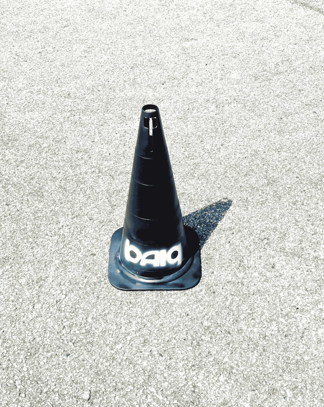
A black traffic cone stands alone on a light grey concrete surface. White graffiti on the base reads “baio”.
Above

Studio Cru: baiq (Copyright © Studio Cru, 2026)
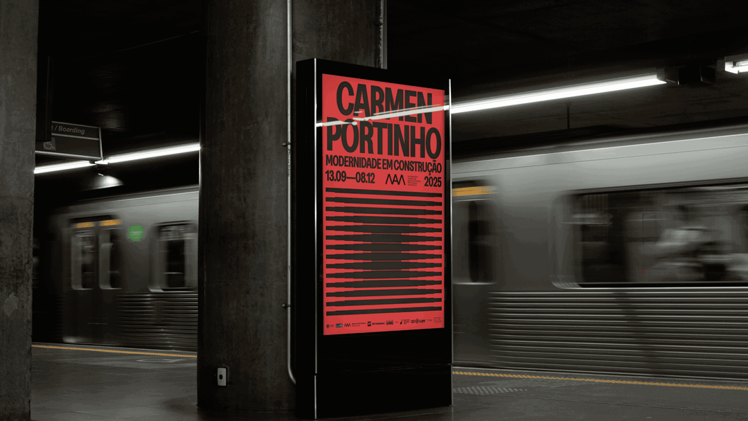
A red poster stands on a subway platform as a train blurs past in the background. The poster reads “Carmen Portinho” and “Modernidade em Construção”, with the dates “13.09–08.12 2025”.
Above

Studio Cru: Carmen Portinho (Copyright © Studio Cru, 2026)
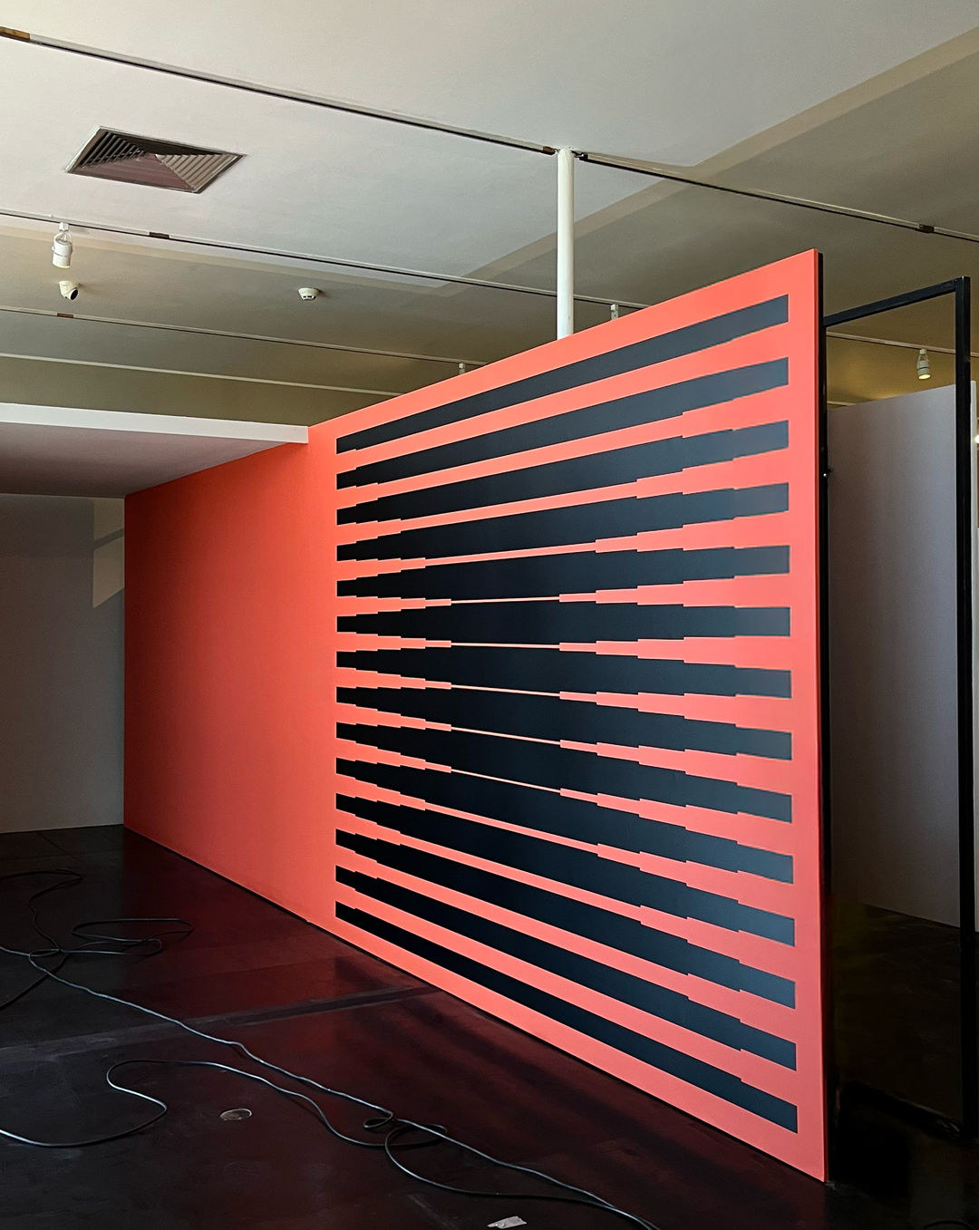
A large, red partition wall stands in a gallery space. It features a series of bold, horizontal black stripes that vary in length to create a rhythmic, optical effect.
Above

Studio Cru: Carmen Portinho (Copyright © Studio Cru, 2026)
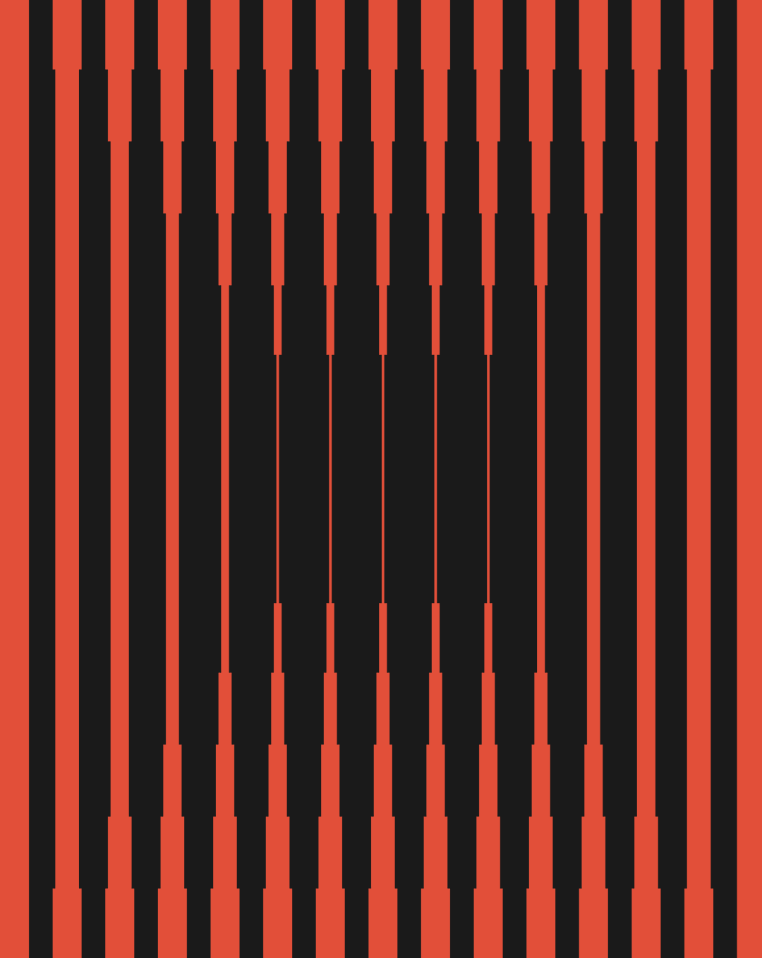
An abstract graphic of alternating red and black vertical stripes. The stripes taper and widen in the centre, creating a distorted, optical illusion effect.
Above

Studio Cru: Carmen Portinho (Copyright © Studio Cru, 2026)
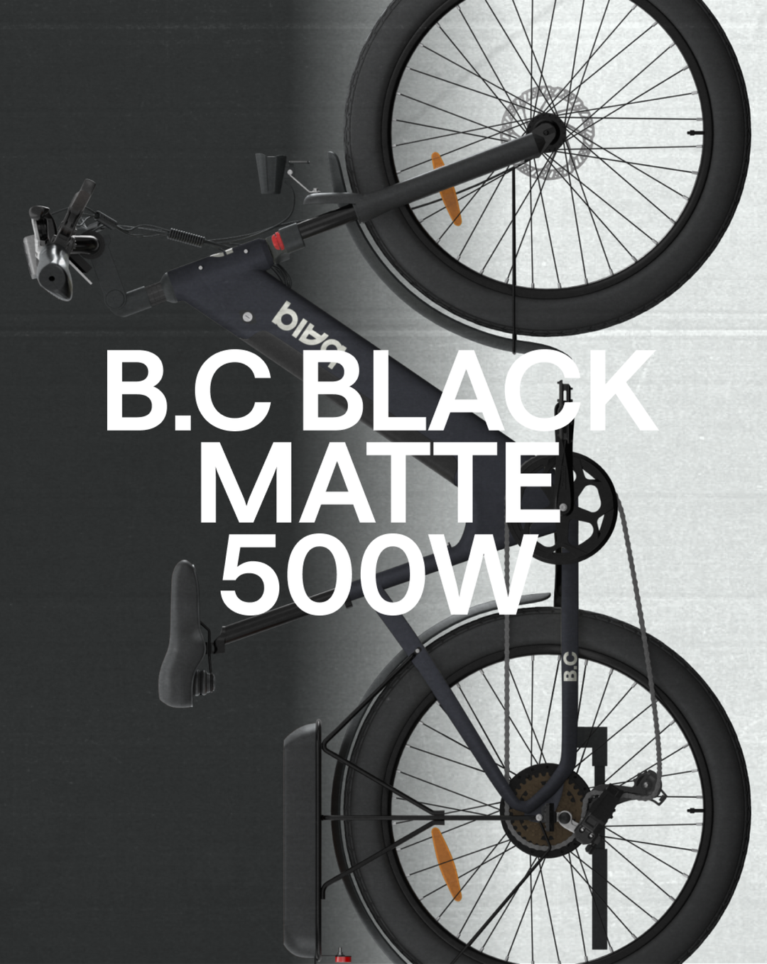
A matte black electric bicycle is positioned vertically against a split grey and white background. Bold white text laid over the centre reads “B.C BLACK MATTE 500W”.
Above

Studio Cru: baiq (Copyright © Studio Cru, 2026)
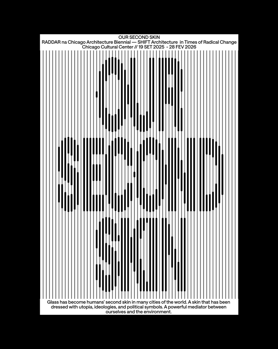
A black and white poster featuring a pattern of thin vertical lines. The words “OUR SECOND SKIN” are integrated into the lines using a distorted, stretched typographic style. Text at the top reads “OUR SECOND SKIN” followed by “RADDAR na Chicago Architecture Biennial — SHIFT Architecture in Times of Radical Change” and the dates “19 SET 2025 - 28 FEV 2026”. A short paragraph at the bottom discusses glass as humans’ “second skin” in cities.
Above

Studio Cru: Our Second Skin, Raddar (Copyright © Studio Cru, 2026)
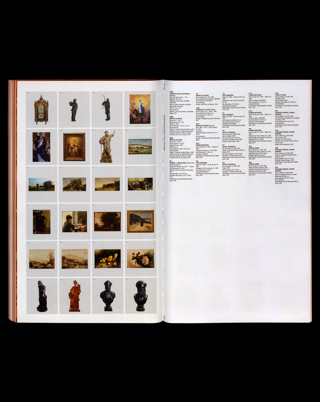
An open art catalogue showing a grid of small images on the left page and columns of descriptive text on the right. The images include a mix of paintings, sculptures and sketches.
Above

Studio Cru: Pretagonismos, Museu Nacional de Belas Artes (Copyright © Studio Cru, 2026)
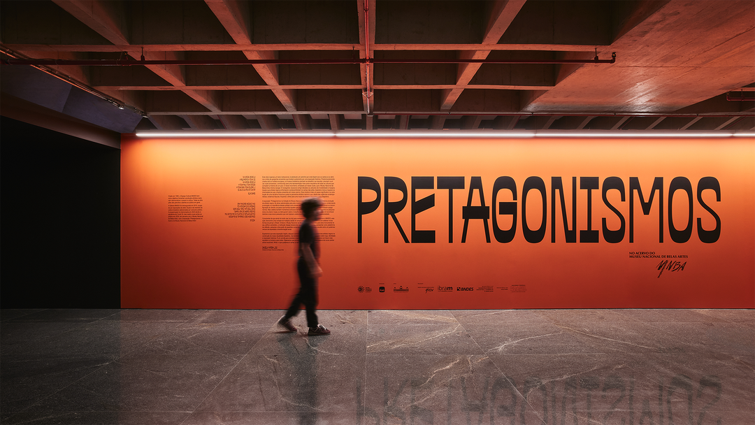
A person walks past a large, bright orange wall in a gallery. Bold black text across the wall reads “PRETAGONISMOS”, with smaller blocks of text and logos beneath.
Above

Studio Cru: Pretagonismos, Museu Nacional de Belas Artes (Copyright © Studio Cru, 2026)
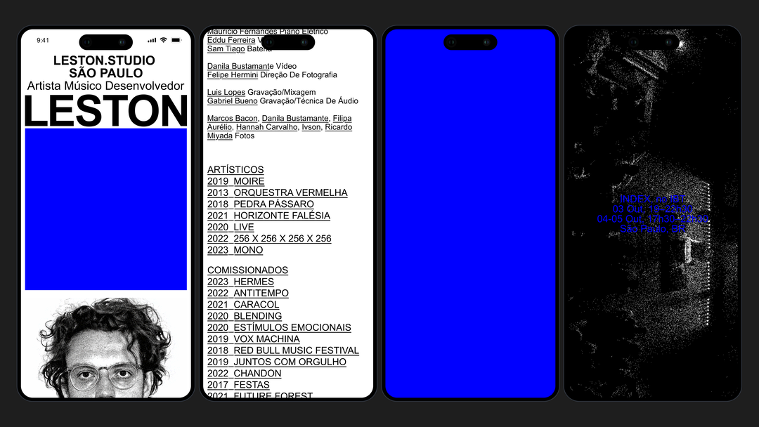
Three smartphone screens showing a portfolio website. The first displays the word “LESTON” in bold black type above a black and white portrait of a person with glasses. The second lists credits and a series of project titles, while the third is a solid blue screen.
Above

Studio Cru: Leston (Copyright © Studio Cru, 2026)
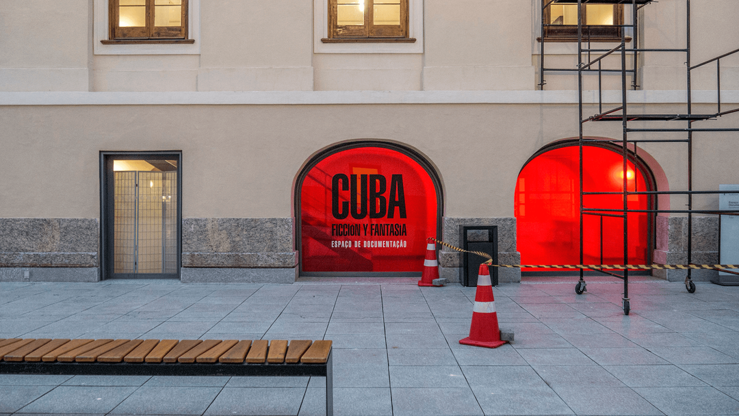
Two arched windows at ground level glow with a bright red light. The left window features bold black text that reads “CUBA”, “FICCIÓN Y FANTASÍA” and “ESPAÇO DE DOCUMENTAÇÃO”.
Above

Studio Cru: Cuba, Casa Daros (Copyright © Studio Cru, 2026)

A film poster for “Paradise”, a film by Ana Rieper. The top half shows a small wooden hut engulfed in a massive wall of orange fire and thick grey smoke. The bottom half is a bold red block with the title “PARADISE” in large black type, followed by a list of credits and production logos.
Above

Studio Cru: Paradise, Ana Rieper (Copyright © Studio Cru, 2026)
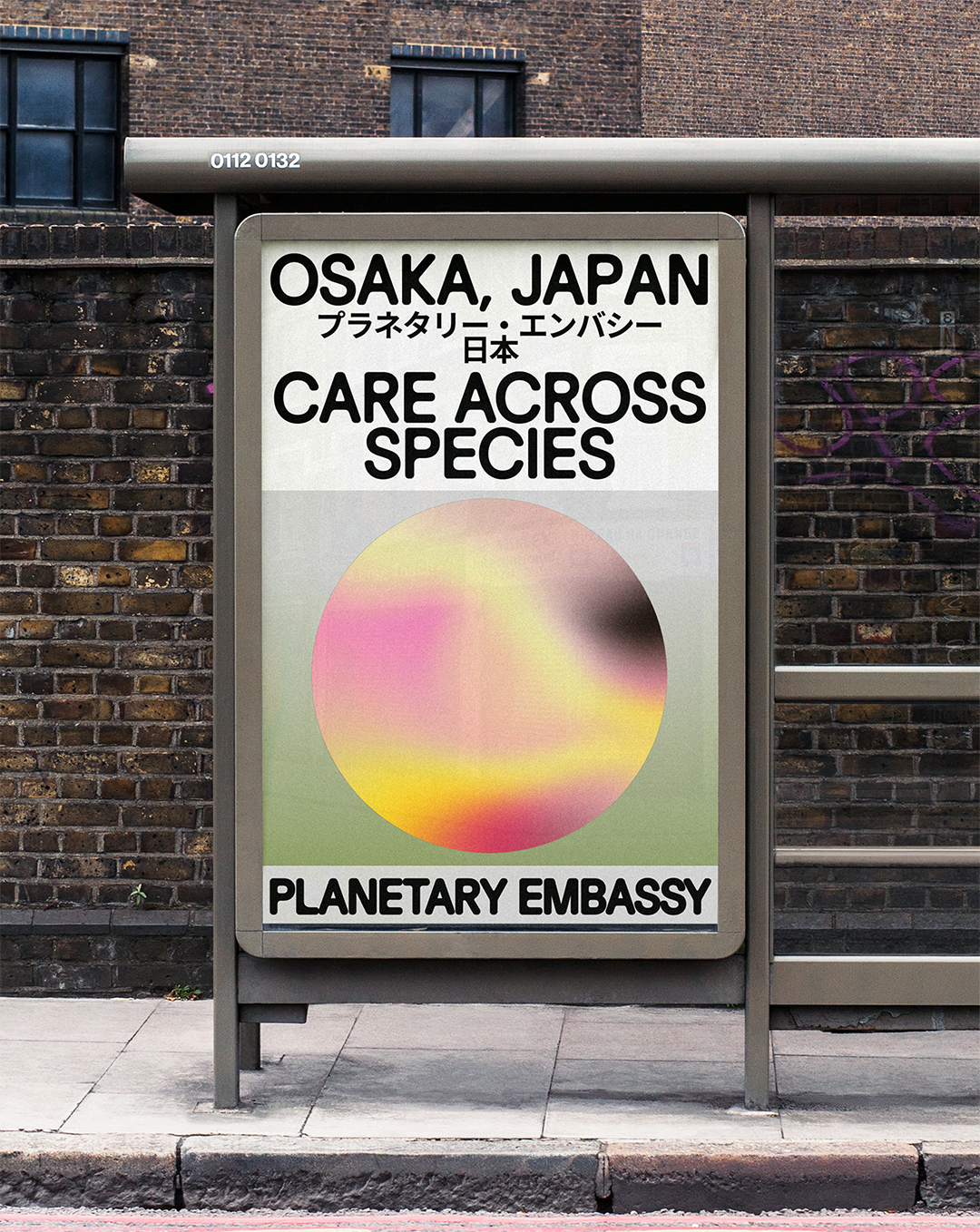
A bus stop poster reads “OSAKA, JAPAN” and “CARE ACROSS SPECIES” in bold black type. Below the text is a soft, blurred gradient circle in shades of pink, yellow and green. The bottom of the poster reads “PLANETARY EMBASSY”.
Above

Studio Cru: Planetary Embassy, Swissnex (Copyright © Studio Cru, 2026)

Hero Header

Studio Cru: Pacto Visual 5 (Copyright © Studio Cru, 2026)

Share Article

About the Author

Harry Bennett

—

Hailing from the West Midlands, and having originally joined It’s Nice That as an editorial assistant in March 2020, Harry is a freelance writer and designer – running his own independent practice, as well as being one-half of the Studio Ground Floor.

It's Nice That Newsletters

Fancy a bit of It's Nice That in your inbox? Sign up to our newsletters and we'll keep you in the loop with everything good going on in the creative world.