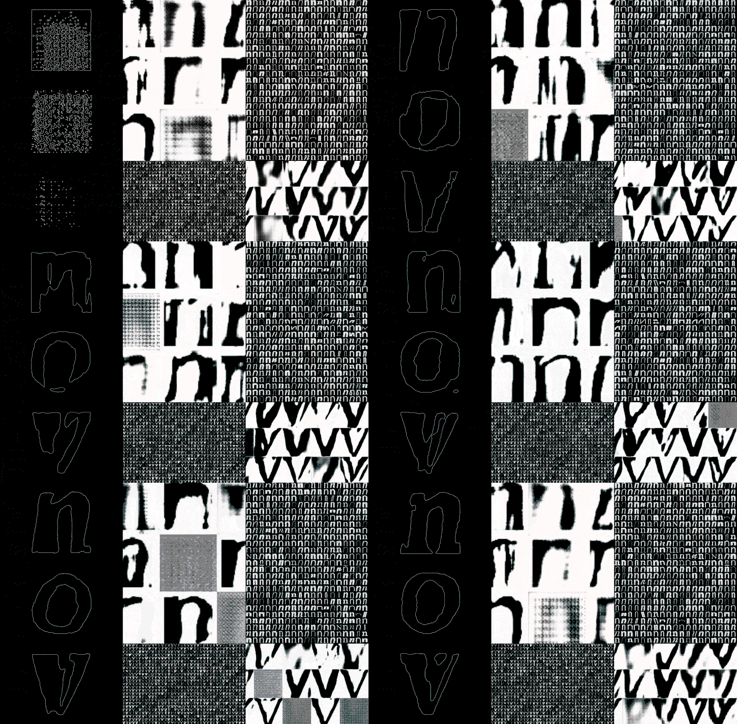
Phase, a generative type tool by Elias Hanzer, manipulates letters by hand or sound
Since It’s Nice That started championing graphic design one sector of the discipline, in particular, has become a regular focus and consequent talking point: type design.
Whether it’s lettering, a typographic identity or just the exciting rise of independent type foundries popping up in all corners of the globe, type design piques the interest of designers with an eye for detail. Communication is consistently at the heart of the graphic design practice and so it makes sense that the letterforms used to communicate ideas as words are at its centre. But as technology expands the remit of what a designer can actually do with a piece of type, variable fonts appear to be a key element designers are attempting to push into their portfolios. Just last week we covered a new type tool by Dinamo and this week a designer we’ve written about multiple times, Elias Hanzer, talks us through his new generative type concept, making use of variable font technology.
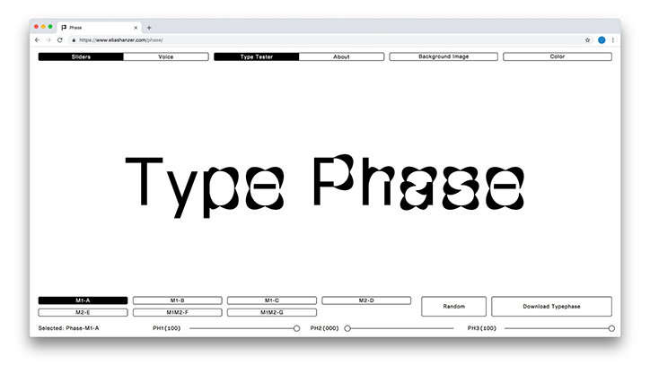
Built as a digital tangent microsite to Elias’ already strong typographic portfolio of work, the project titled Phase features a new typeface by the designer which can react to either a manual slider or sound, with web development by Florian Zia. Depending on your choice of typographic manipulation, characteristics of Elias’ typeface will grow thicker or thinner, morphing from the readable into the decorative, or vice versa.
An experiment, Phase developed from “the specific question on what a modular typeface can be and wherein lie its strengths,” Elias tells It’s Nice That, “as well as the statement that every visual code or style is built upon a more or less modular system.” Identifying how the emergence of typographic styles goes hand-in-hand with technological assistance, “the extent to which or whether this technology will influence the shape of our writing and symbols cannot be predicted at this point” says the designer. In turn, this unknowingly led Elias to conduct his own research.
With this idea in mind, Phase features a modularly designed font “that consists of only two building blocks – a circular and a linear one,” points out Elias. Each of the blocks can then be pushed and pulled, and in turn, “a typeface is built that is no longer visible in its modular structure.” Modular typefaces are beneficial as if you manipulate one element everything else changes, leading Elias to use this as a base, before encouraging it to take on its own forms through phases.
Consequently, Elias’ website should be used more “as a kind of construction kit and at the same time a showcase for Phase,” says the designer while simultaneously acting as a digital embodiment of how the type design world is changing in how it “moves, adapts or reacts to external influences.”
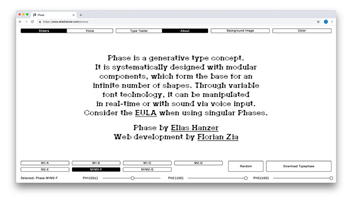
Elias Hanzer: Displayed Typephase: Phase-M1M2-F-51-100-100
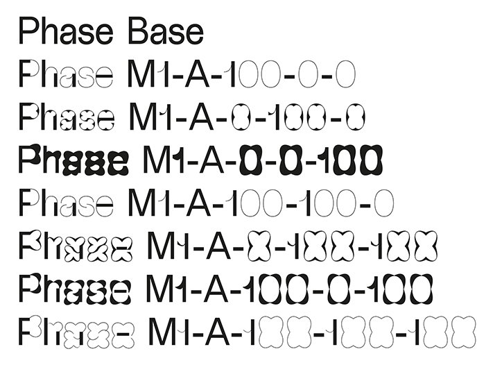
Elias Hanzer: Overview #1 of Extremes of Phase M1-A
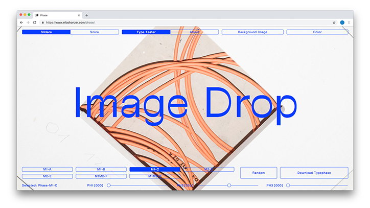
Elias Hanzer: Displayed Typephase: Phase-M1-C-0-51-0, background image: Photography by Nora Hollstein
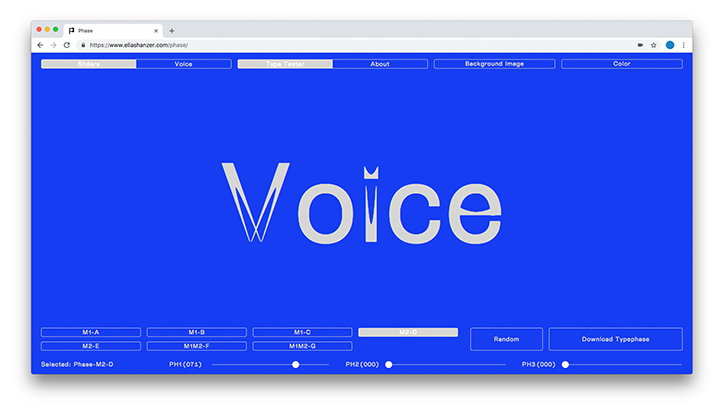
Elias Hanzer: Displayed Typephase: Phase-M2-D-71-0-0
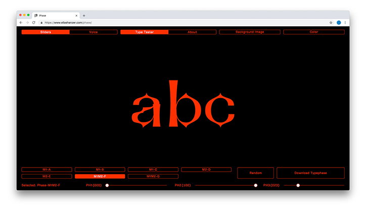
Elias Hanzer: Displayed Typephase: Phase-M1M2-F-0-100-23
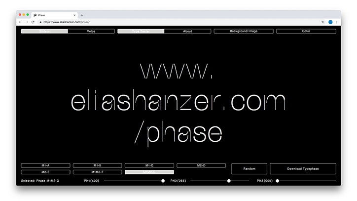
Elias Hanzer: Displayed Typephase: Phase-M1M2-G-100-65-0
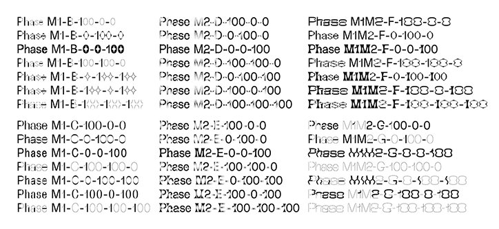
Elias Hanzer: Overview #2 of Extremes of Phase B-G
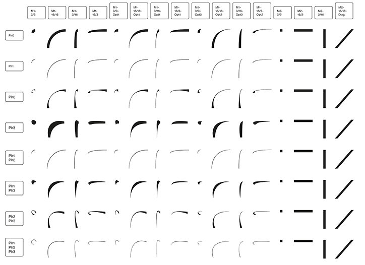
Elias Hanzer: Overview of Smart Components of Phase M1-A
Share Article
Further Info
About the Author
—
Lucy (she/her) was part of the It’s Nice That team from 2016–2025, first joining as a staff writer after graduating from Chelsea College of Art with a degree in Graphic Design Communication, eventually becoming a senior editor on our editorial team, and most recently at Insights, a research-driven department with It’s Nice That.