




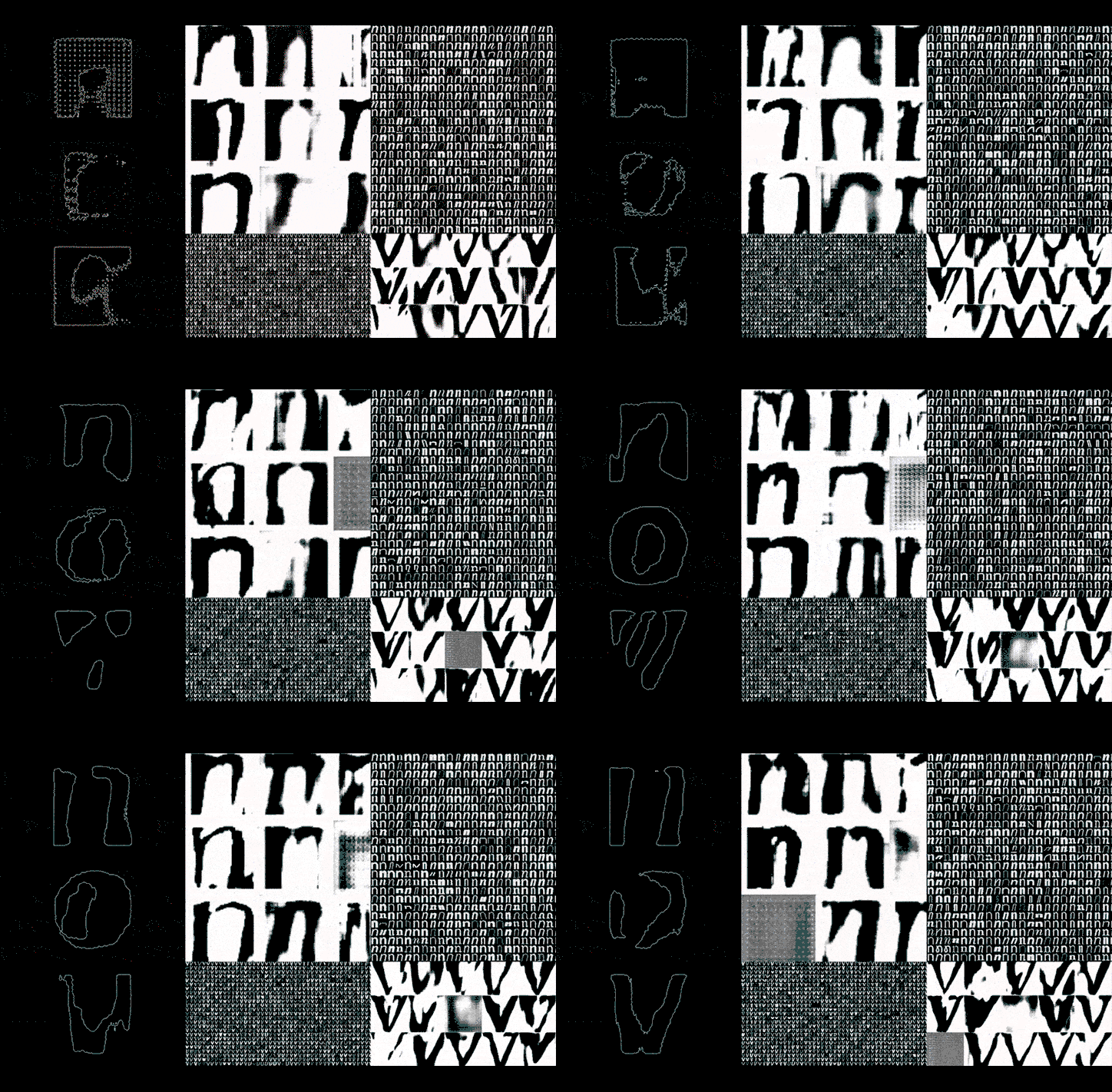
Daniel Wenzel faces the question of automation in creativity head-on in Automatic Type Design
The last time we spoke to Daniel Wenzel, he was running a series of experiments on the Ginto typeface, creating an interactive specimen that responds to sound, mouse position and other sensor data that was available from our devices. What seemed like a series of exploratory experiments turned out to be the roots of a deeply philosophical project that tries to define the boundaries of the autonomy of creatives in the face of increasing automation.
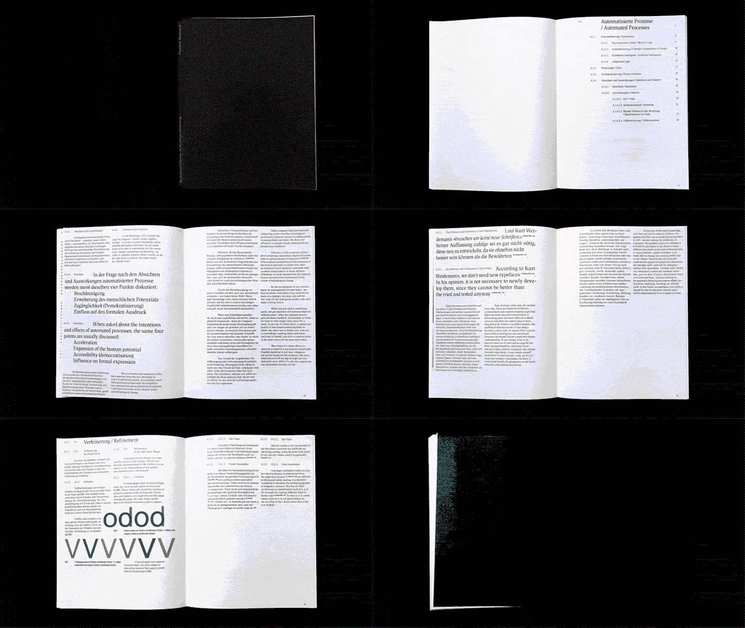
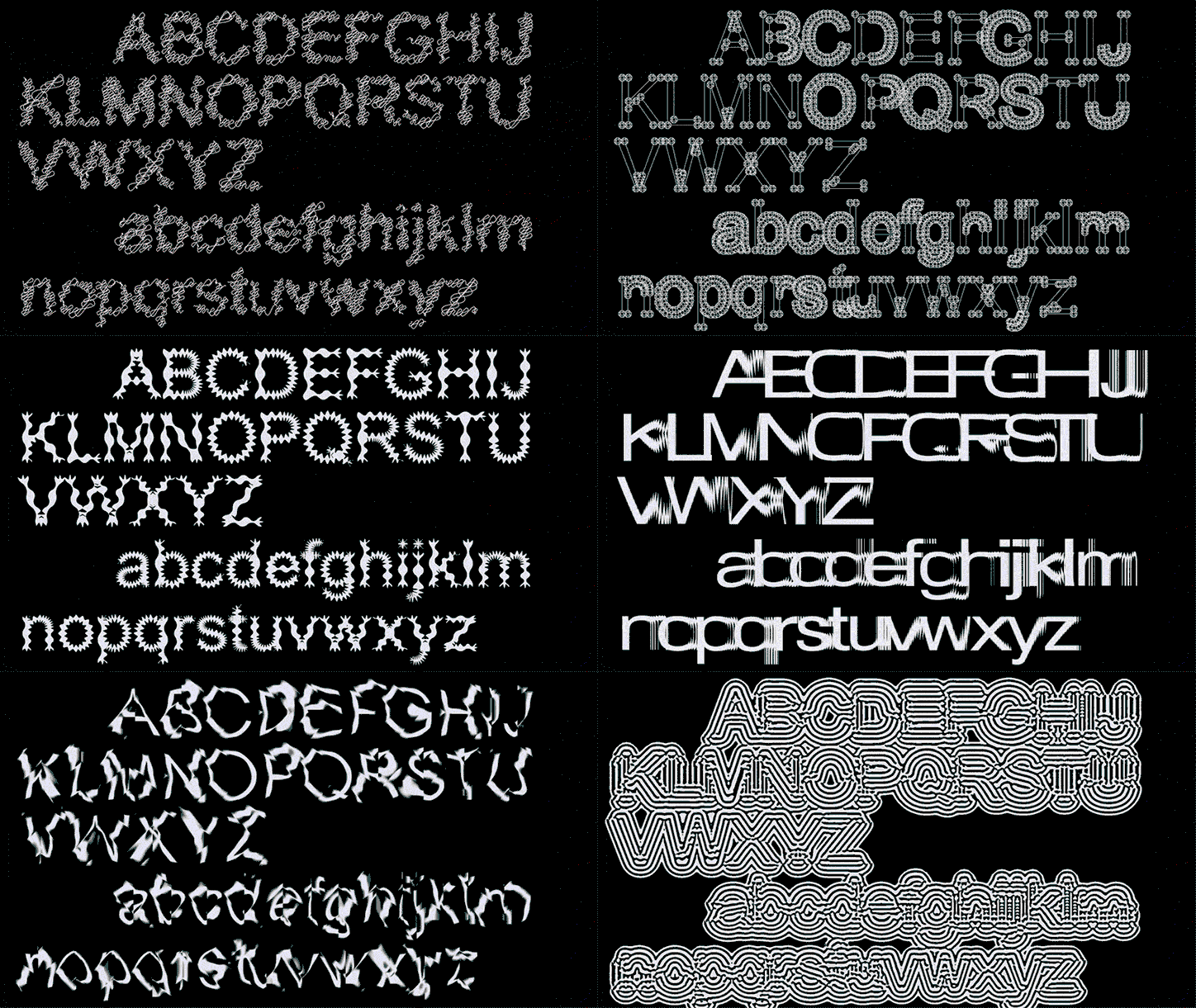
Bringing questions surrounding artificial intelligence, mechanisation, and the reorganisation of the work process into the realm of design, Automated Type Design is Daniel’s thesis project for HTWG Konstanz, where he tried to use “any kind of automated process to create fonts or font designs,” producing over 100 designs in an intense period of 16 weeks.
In dealing with a common technological anxiety today (that robots will take away our jobs) Daniel decides to face the issue head-on and fully incorporate this automation into his process. “Automation affects all of us. It cannot be ignored,” Daniel tells It’s Nice That. “I don’t think we will necessarily be replaced by machines, as is the case in many other fields, but if we don’t learn how to use progress to our advantage, other people will.”
In essence, this is made possible by delineating creativity from technique. “Good type designers should not feel threatened by automation,” he writes for the project’s statement. “The idea will always be more important than the craft,” he continues, stating that machines will always be superior in the crafts. The result of this is a distillation of the type design process, used in a way such that he could automate each part of the process while still owning some form of creative autonomy in the process.
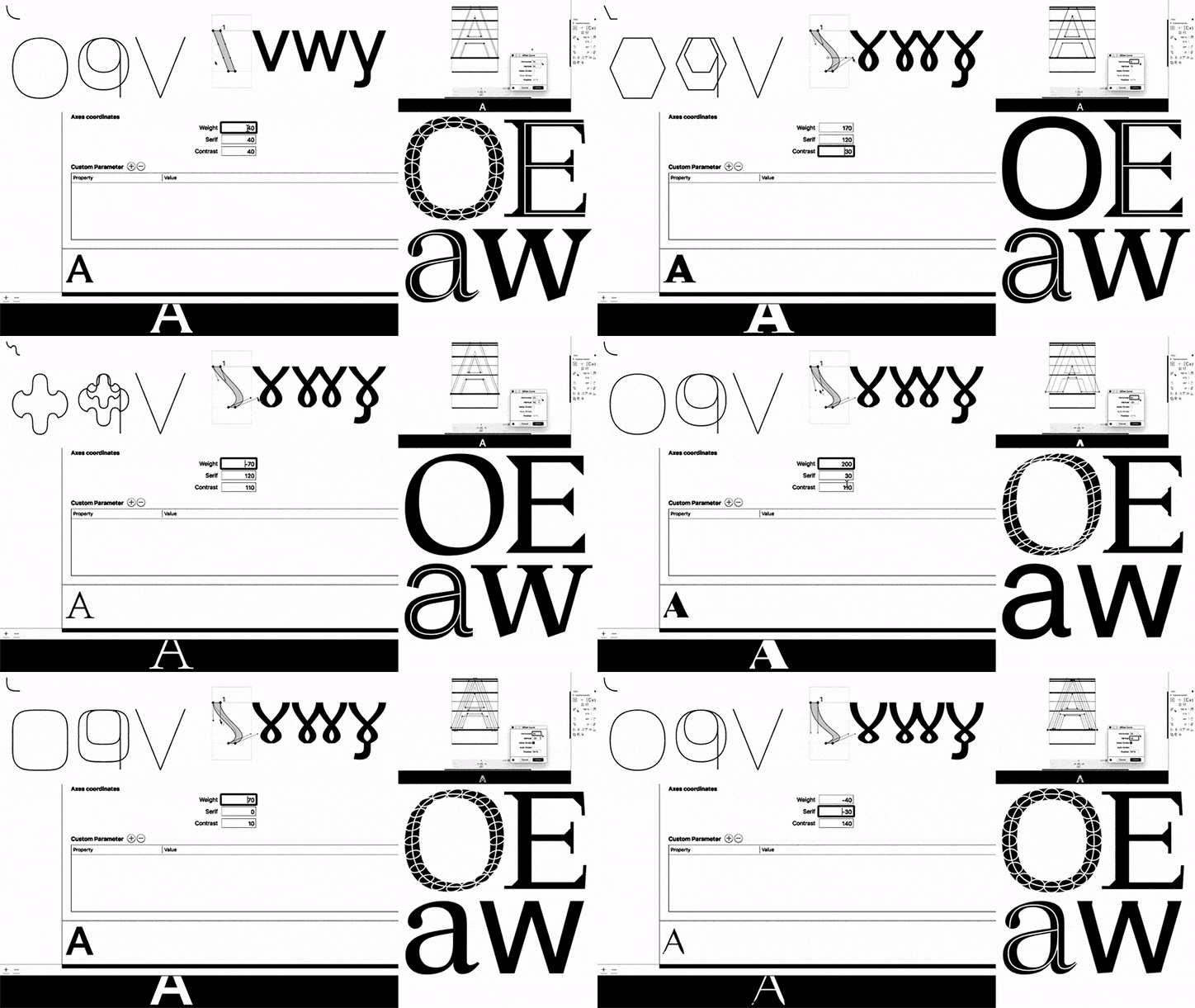
Daniel Wenzel: Automated Type Design
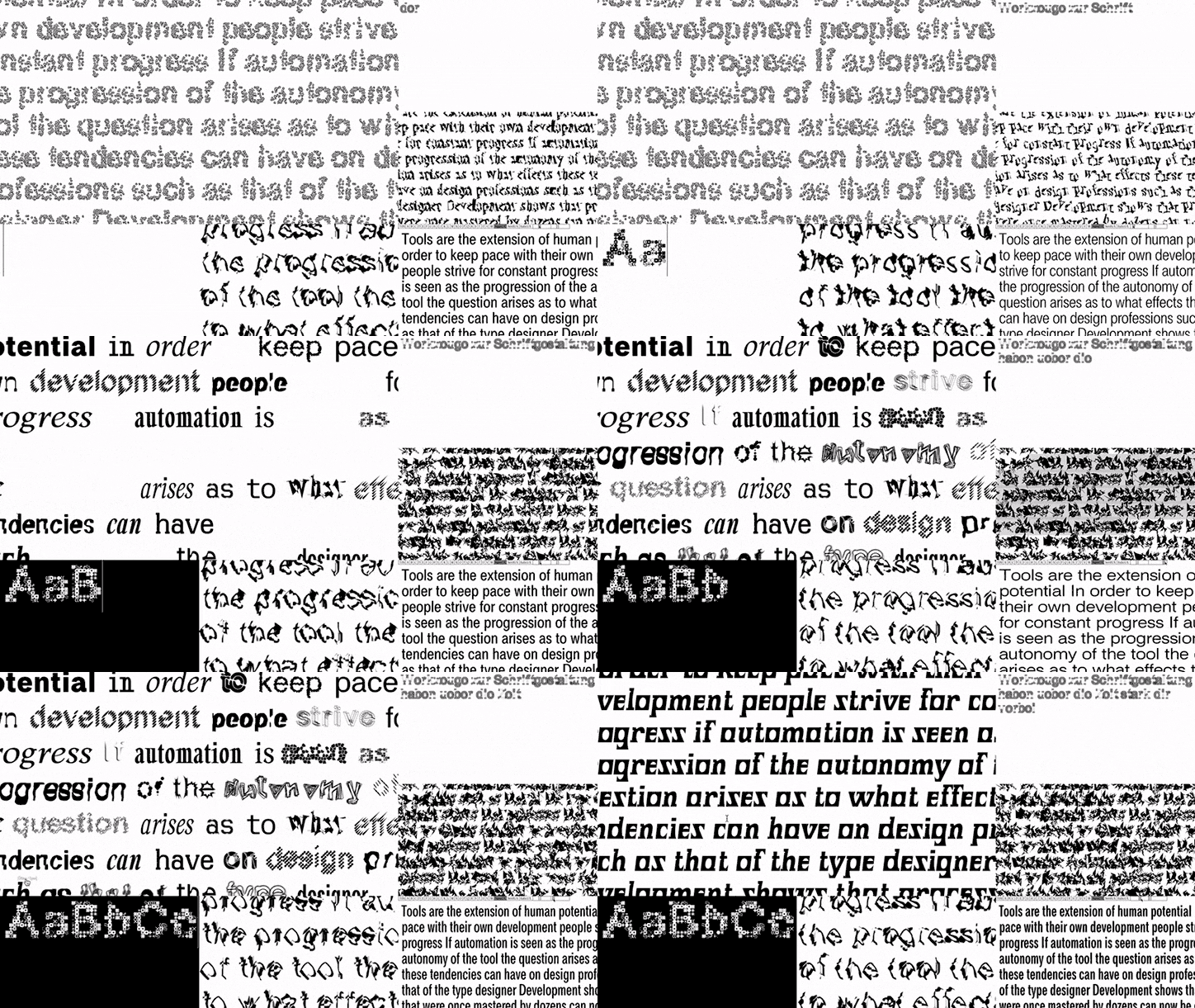
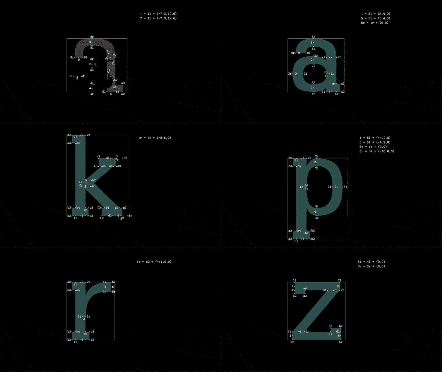
“I used tools which were [specifically] designed for type design, misused programmes, and created my own to simulate processes which were not possible,” Daniel says. What results are five general processes that Daniel used to create new fonts: fonts by variation (comparable to Neville Brody’s FF Blur), fonts through limited tools (intentionally using the limitations of generators like FontARk or Prototype), fonts by “Art Direction” (using mathematical formulas to describe fonts rather than drawing curves by hand), fonts with the help of assistive processes (generating new weights, scripts and optical corrections using assistive tools like brush simulations), and fonts with the help of autonomous processes (using machine learning to generate new “AI fonts”). These variations, all available to view on the web version of the project, produce dynamic, restless and often truly unique fonts that still bubble with creativity.
Despite his awareness of the acceleration of the integration of computing in the creative process, Daniel is far from a technophobe, sitting squarely in a long history of technologists and designers who champion the assistive potential of machines. A gallery text about the aforementioned FF Blur in the MoMA, from the 2011 exhibition Standard Deviations shares this thought, reminding us of an earlier moment in the history of design and technology: “The digital revolution and introduction of the Macintosh computer in the mid-1980s made the construction and deconstruction of typographical elements easier than it had been in the past. Embracing technology that was growing exponentially more sophisticated, designers realised more and more complex typographic experiments.”
“I think a very important point I would like to share is that you should not turn your back on new technologies or write them off right away,” Daniel states. “I hope to be able to pass on as many of my gained experiences and insights as possible,” he continues, adding that he might publish a book of the project in the future.
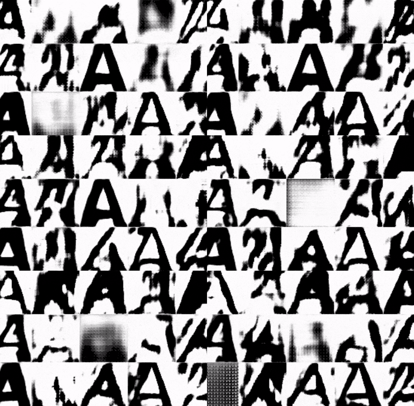
Daniel Wenzel: Automated Type Design
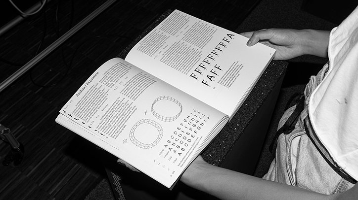
Daniel Wenzel: Automated Type Design
Daniel Wenzel: Automated Type Design
Daniel Wenzel: Automated Type Design
Daniel Wenzel: Automated Type Design
Daniel Wenzel: Automated Type Design
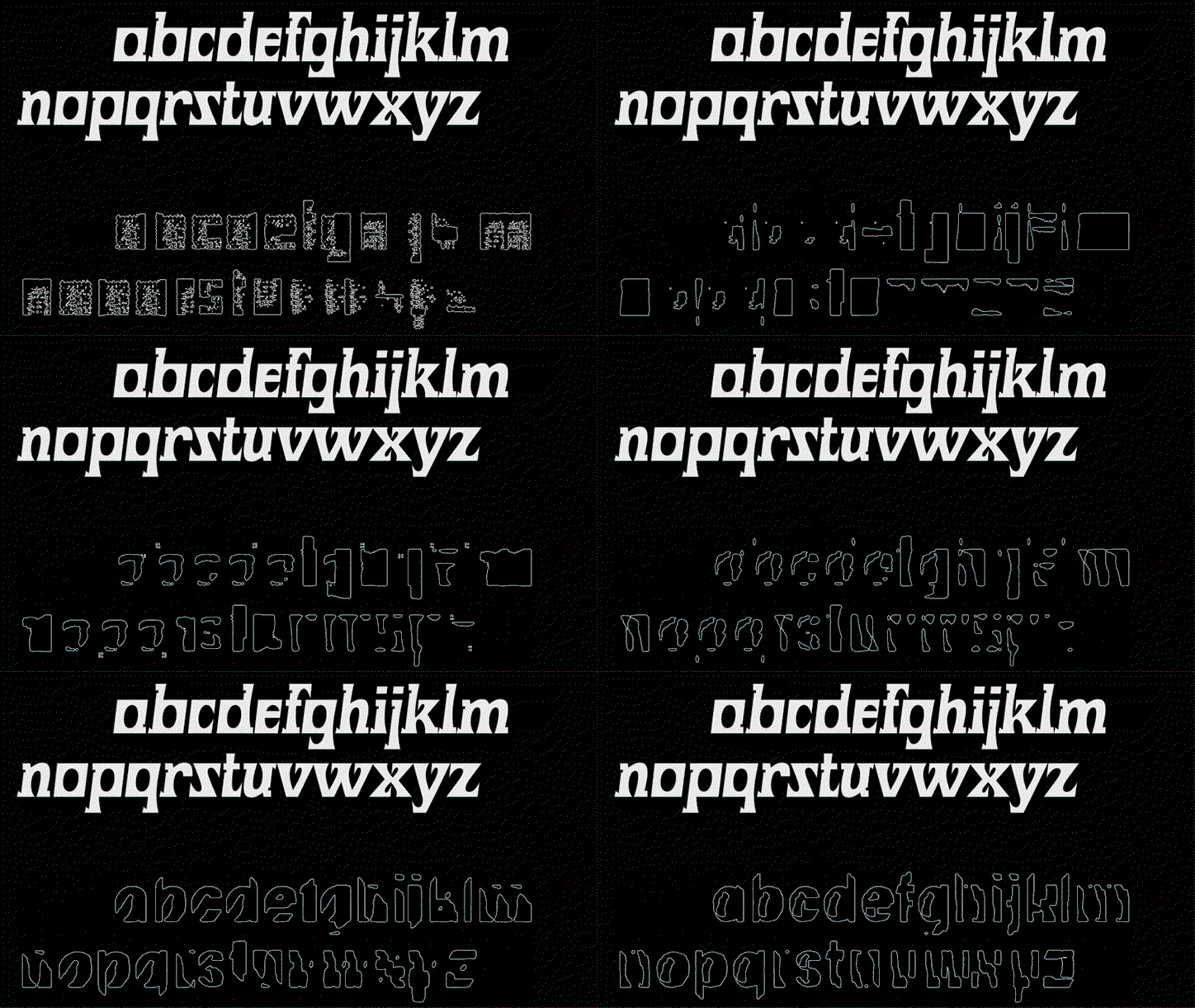
Daniel Wenzel: Automated Type Design
Share Article
Further Info
About the Author
—
Alif joined It's Nice That as an editorial assistant from September to December 2019 after completing an MA in Digital Media at Goldsmiths, University of London. His writing often looks at the impact of art and technology on society.