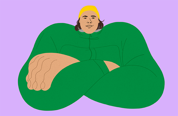
Designer Chrissie Abbott's Aftershock lyric video draws inspiration from 80s film credits
Designer, art director and artist Chrissie Abbott’s wide-ranging portfolio is a dream come true for any Saved by the Bell fan. Inspired by the visual overload of the 80s and 90s, Chrissie’s work oozes electric colours and bold visuals. Born in London but living in Germany, Chrissie has worked across creative genres from animation to zines and has collaborated with huge names like Adidas, Dazed, AnOther Magazine, The New York Times and Wallpaper*.
“Art and design was the only avenue I wanted to pursue when I was growing up. The saturation of the 80s must have seeped into my brain. I studied illustration at London College of Communication and the course included design. I think that really shaped my practice as a hybrid of both,” the artist tells It’s Nice That.
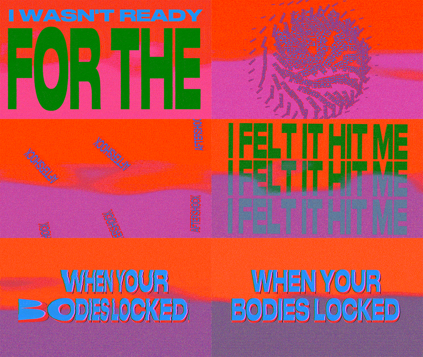
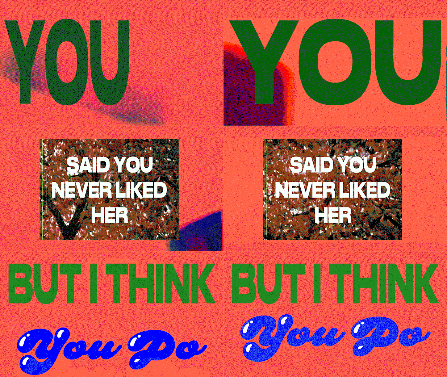
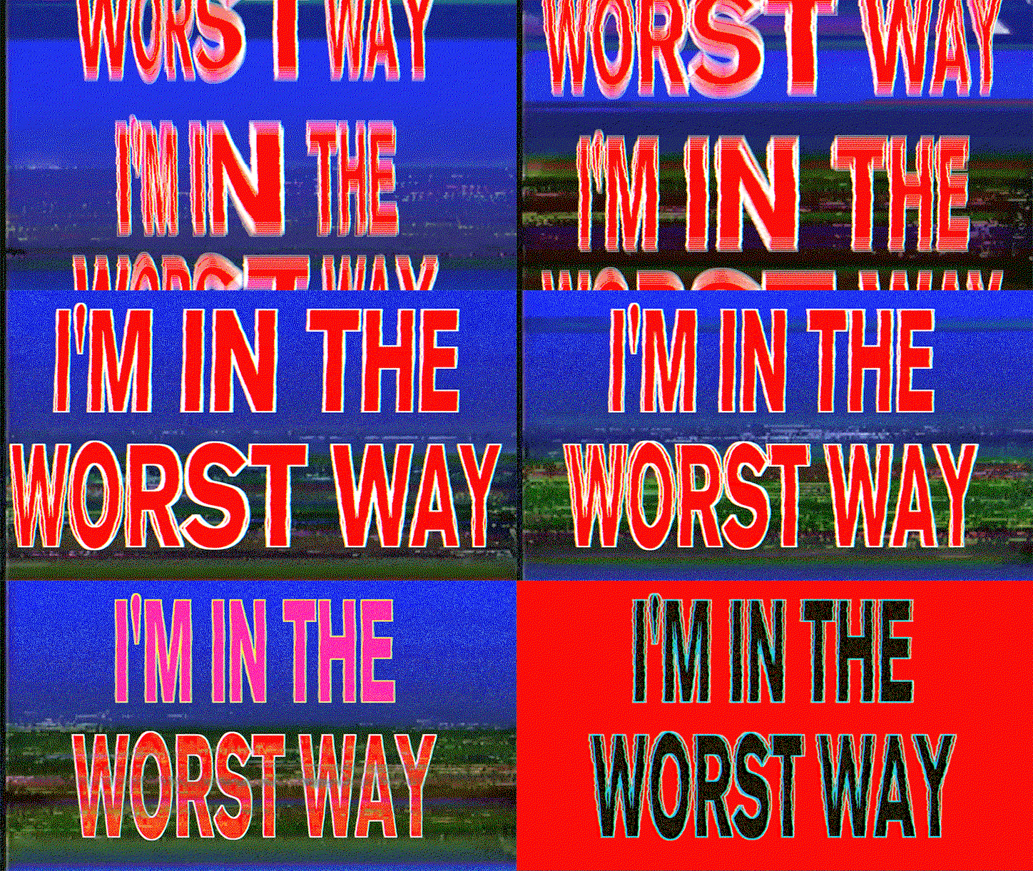
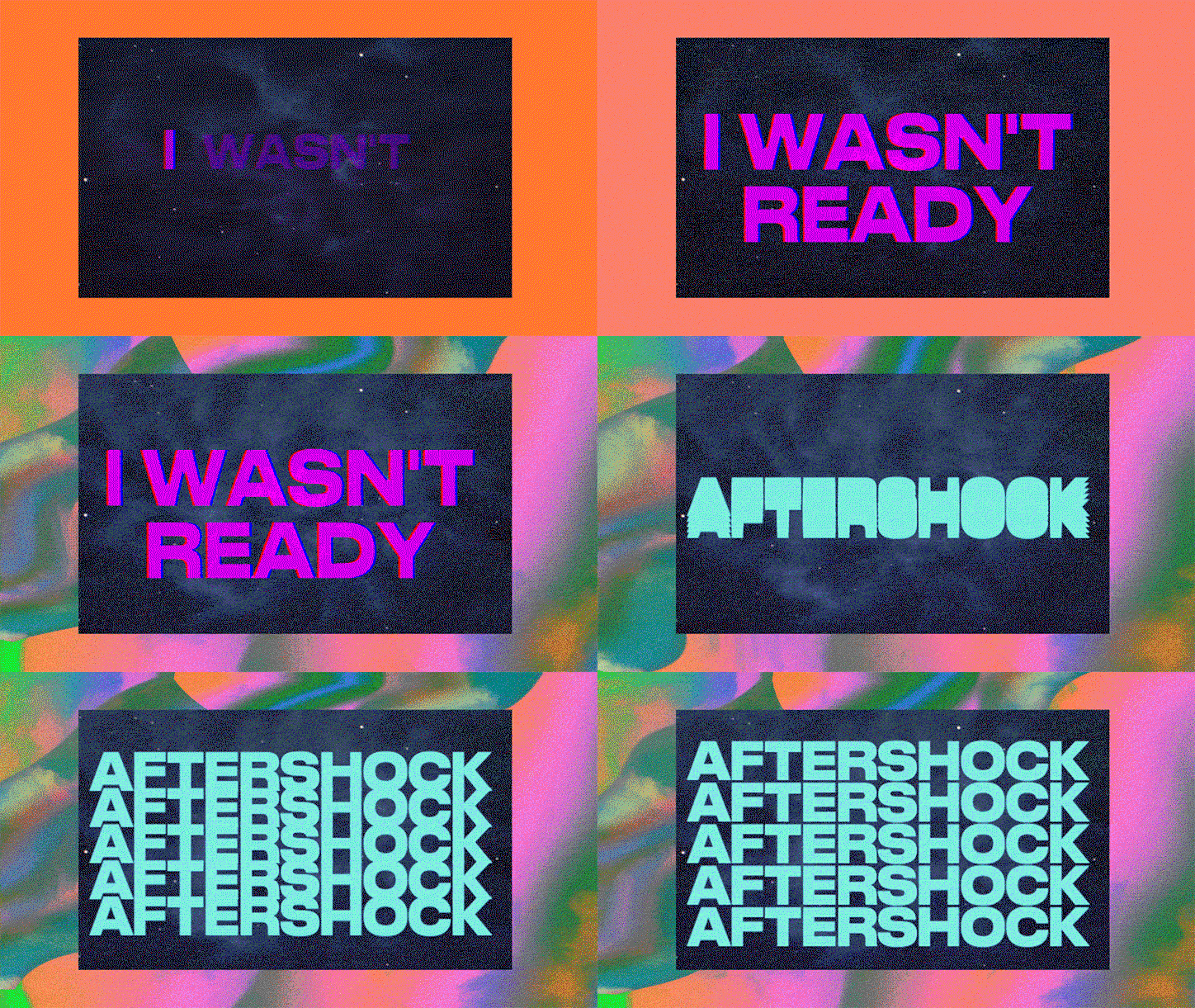
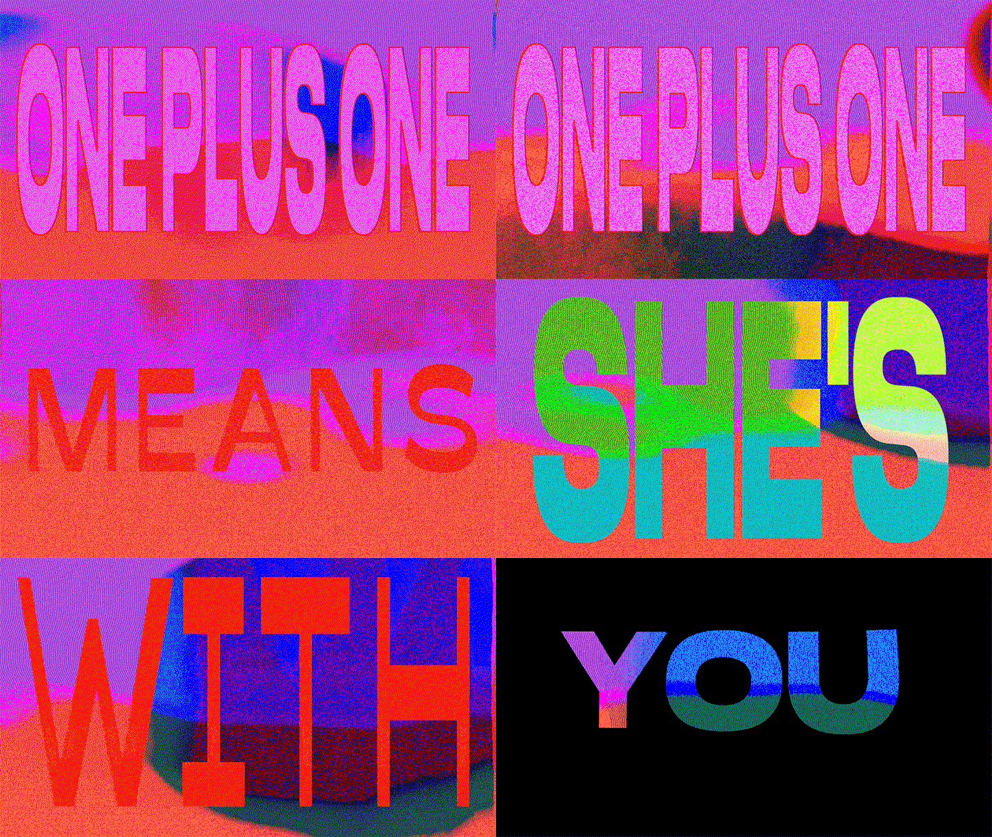
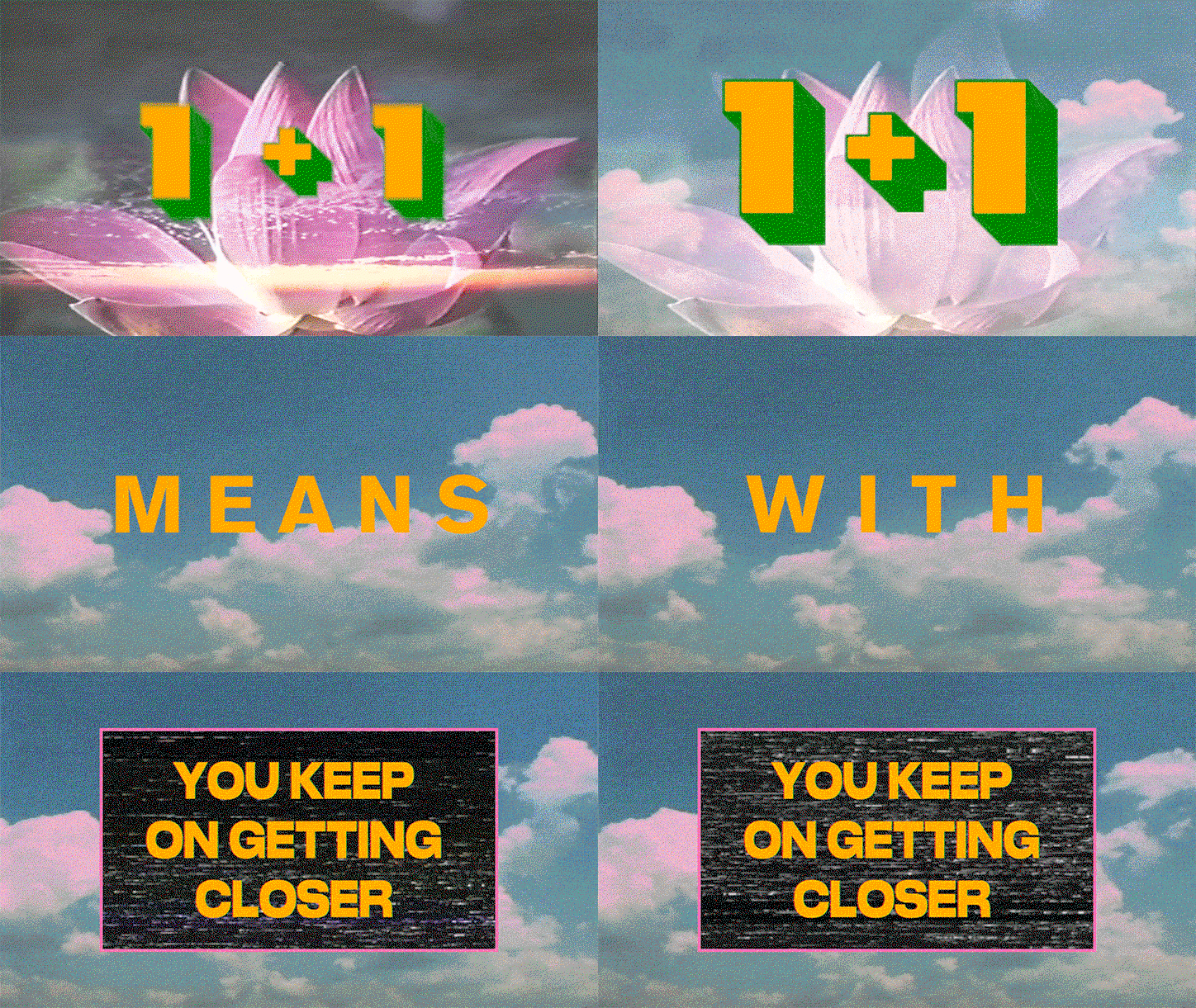
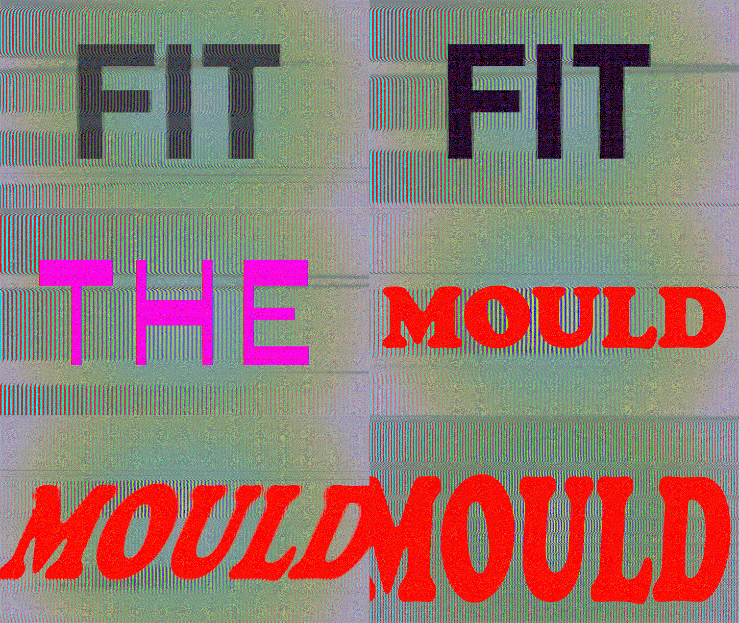
Chrissie’s latest venture is her dynamic lyric video for Hannah Jane Lewis’ cheesy pop-banger Aftershock. Chrissie was recommended for the project by the record label’s creative consultants Studio Bowden, whom Chrissie had worked with a few years back. Chrissie set to work planning, structuring and animating the music video, layering vibrant texts over retro images. “It was cool because the brief was fairly open so I had a lot of creative free reign to do what I wanted. I guess that’s an added benefit to working with people you’ve done things with before,” Chrissie explains. The artist was clearly able to flex her creative muscles. Her experimental approach to the video sees Chrissie play with colours, transitions and fonts, casting a cheery light on what is ultimately a heartbreak story.
Chrissie lists film credits and opening sequences as main sources of inspiration. “I also thought it would be funny to make it look a bit like those karaoke videos that have lyrics with random stock footage as the backdrop. I wanted to mirror the feelings of the song in the video as much as possible without being too girly or cutesy. Even though it’s a commercial pop song it has darker undertones too so although bright colours are my go-to stylistically, I mixed it up with darker shades,” Chrissie says. The narrative, she explains, felt visual from the start. Aftershock is about a presumably ex-boyfriend and his new love interest, which Hannah Jane Lewis thought she was over but is evidently not. Chrissie masterfully commands the individual words and phrases to mirror their content; the words “not okay” glitch, “aftershock” vibrates and spreads across the screen, and “growing ego” enlarges to fill the frame.
A keen typographer, this was Chrissie’s ideal project. The artist used 13 different typefaces but has tied them together seamlessly with relevant visuals and unexpected transitions. “It was difficult to keep the video interesting and varied right the way through because who has an attention span any more? I wanted to avoid the repetition of images even when lyrics were reiterated,” the designer discloses. Chrissie names Druk her favourite typeface, which features in the video three times; in the lines “keep hitting on you”, “my God I want it” and in the final repeat of the chorus. Despite its chunky aesthetic, Druk shows itself to be surprisingly versatile and looks good even when stretched.
“Trial and error was central to the animation process because there are things I’m still learning. But this also led to many happy accidents, which was fun and brought about some unexpected results. It may seem like a chaotic approach but I was into it,” Chrissie explains. After creating a mood board to inform her client of the overall visual direction, Chrissie put a placeholder type into the video to ensure she got the timings right. She then went back through the video to develop and format each individual shot. “I finally sent it to the client who made pretty much no changes; a rare occurrence.”
Chrissie Abbott: Aftershock
Chrissie Abbott: Aftershock
Chrissie Abbott: Aftershock
Chrissie Abbott: Aftershock
Chrissie Abbott: Aftershock
Chrissie Abbott: Aftershock
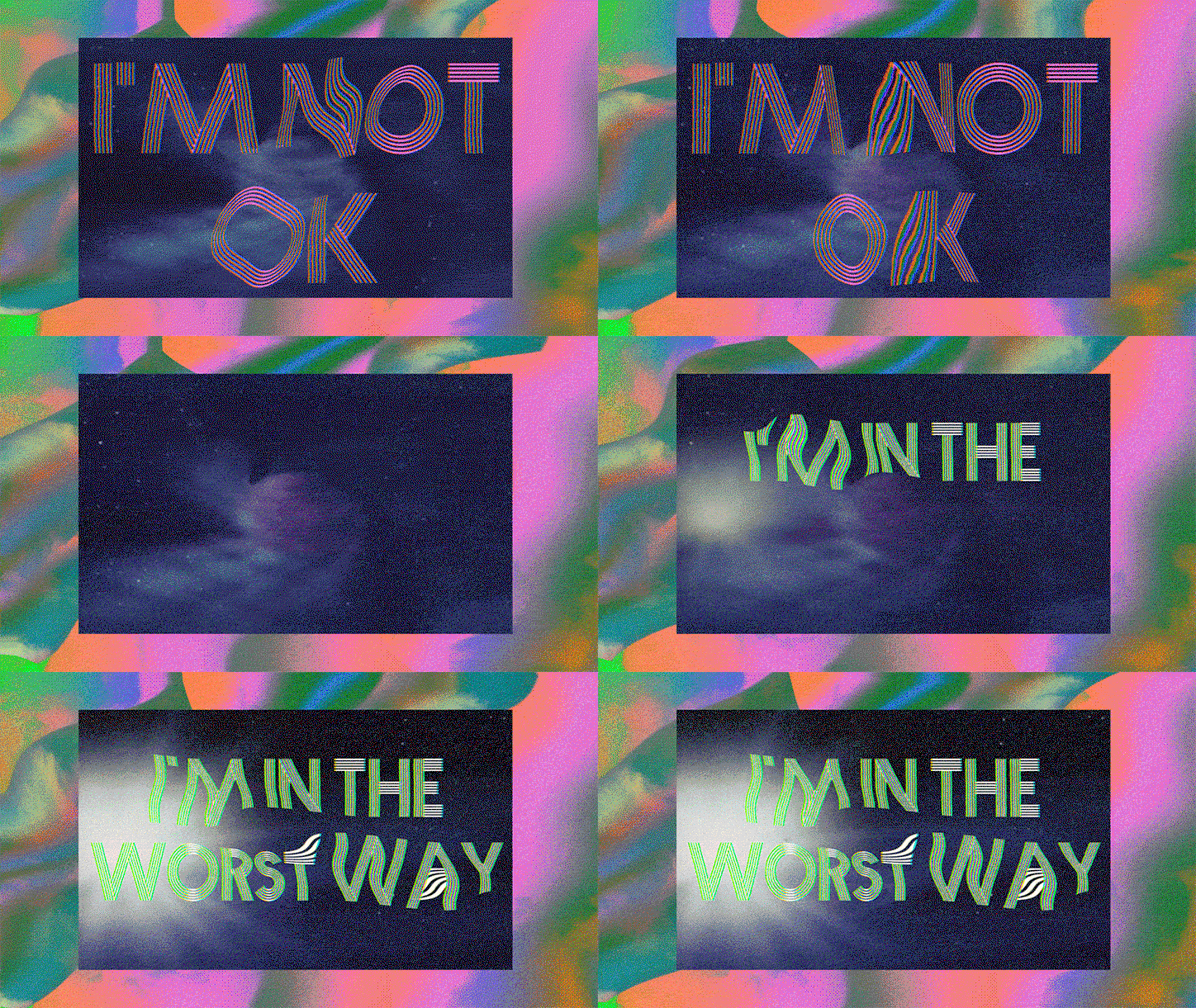
Chrissie Abbott: Aftershock
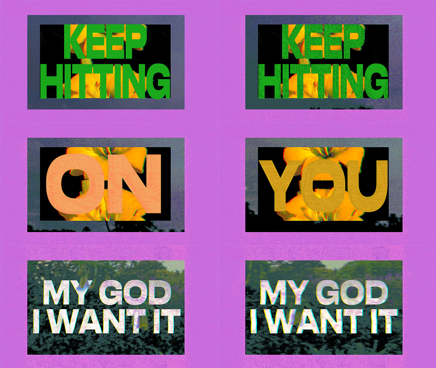
Chrissie Abbott: Aftershock
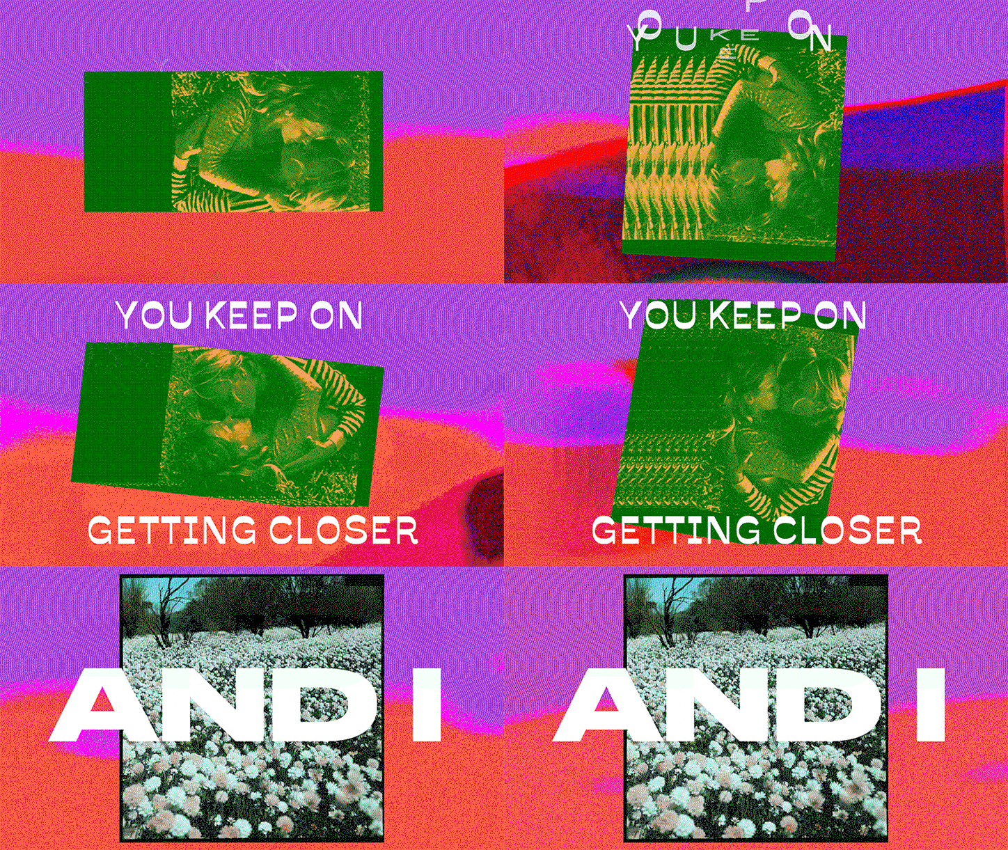
Chrissie Abbott: Aftershock
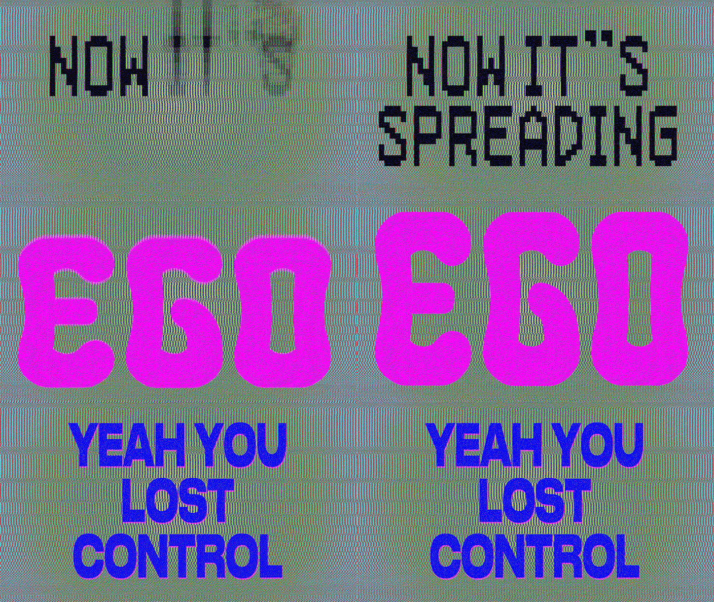
Chrissie Abbott: Aftershock
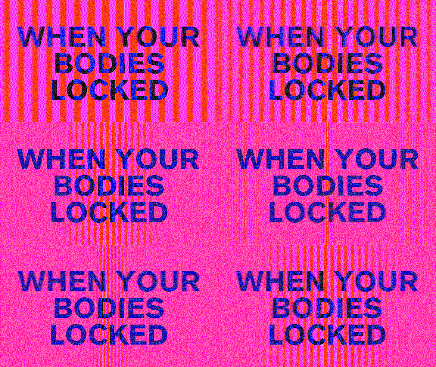
Chrissie Abbott: Aftershock
Share Article
Further Info
About the Author
—
Daphne has worked for us for a few years now as a freelance writer. She covers everything from photography and graphic design to the ways in which artists are using AI.