Blurr Bureau gives us a lesson in how to brand something that’s been around forever: Apples
This colourful new brand identity for state farm fruit is packed with New York pride.
For Jessica Dimcevski, founder and creative director of the New York branding studio Blurr Bureau, developing the visual identity for Yes! Apples, a collective of small, family-run apple orchards in New York, came pretty close to the dream brief. It’s one that’s quite rare for a design team to come by, because the produce aisle in any supermarket is almost devoid of branding, except, of course, for those glorious stickers you find on fruit (that Kelly Angood is so good at collecting). “In a space that hasn’t already been saturated by branding, we got to set the benchmark for how a brand can show up in the category,” Jessica says.
Despite Apples being one of the most “culturally embedded foods we have – from Adam and Eve through to Apple Mac’s!”, says the founder, the red and green globes actually turned out to be quite difficult to brand at first. “One of the biggest challenges behind this brief was that apples have historically been marketed as a commodity, and commodities are hard to scale,” Jessica says. The brief therefore posed a much larger strategic question than just a simple refresh on the products packaging. So, Jessica says, the team asked: “What would it look like if apples were marketed more like a modern consumer brand, rather than a traditional produce item?”
Blurr Bureau: Yes! Apples (Copyright © Blurr Bureau, 2026)
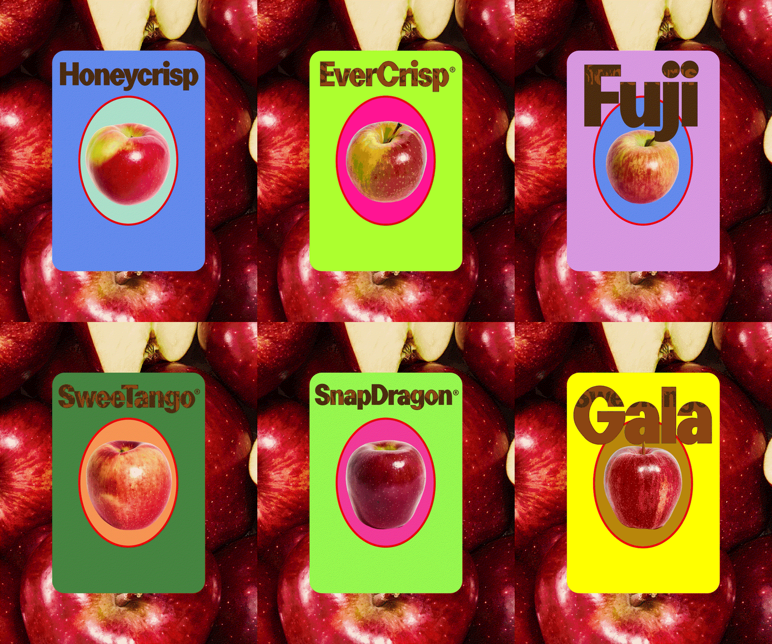
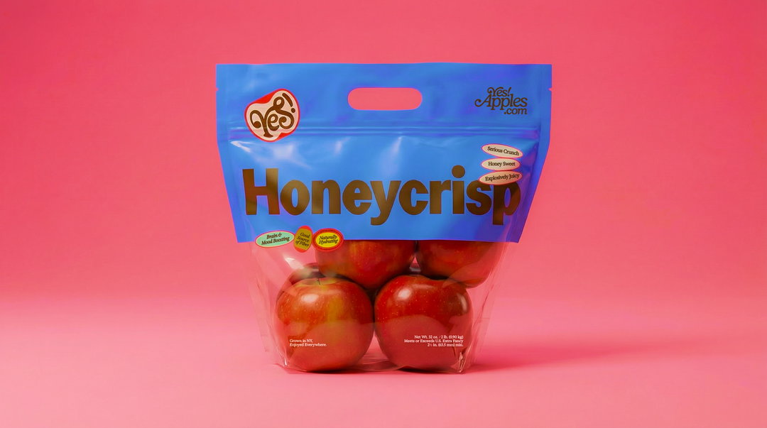
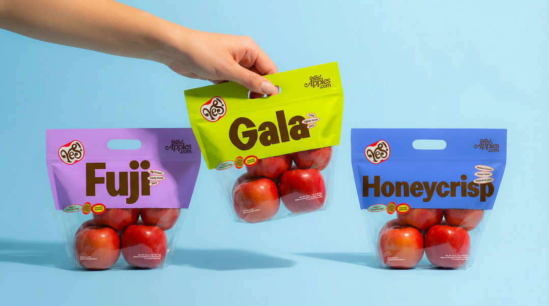
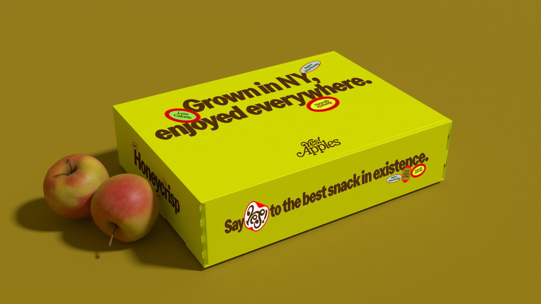
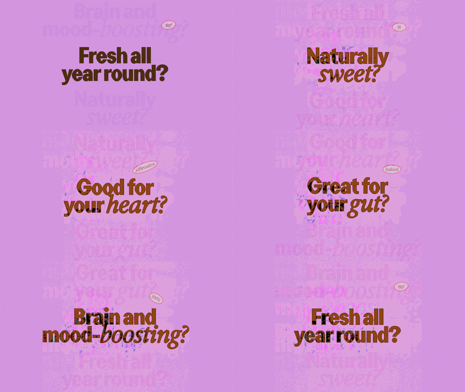
This question pushed the branding studio to create a new visual world around a product everyone already knows, tapping into nostalgia for family recipes, fruit picking and everyday snacks, all while trying to evoke the feeling of discovering something new. Since apples are in what Jessica calls such a “sleepy category”, the identity needed to reflect a sense of joy that wasn’t going to be easy to walk past on the shelf. “We wanted the packaging to feel as bold and eye-catching as possible,” design director at Blurr, Alex Darkovski says. Hand picking their inspiration from the colours and compositions found on a range of fruit stickers and nostalgic market signs, bold typography and a colour coded system for each apple variety defined the studio’s approach.
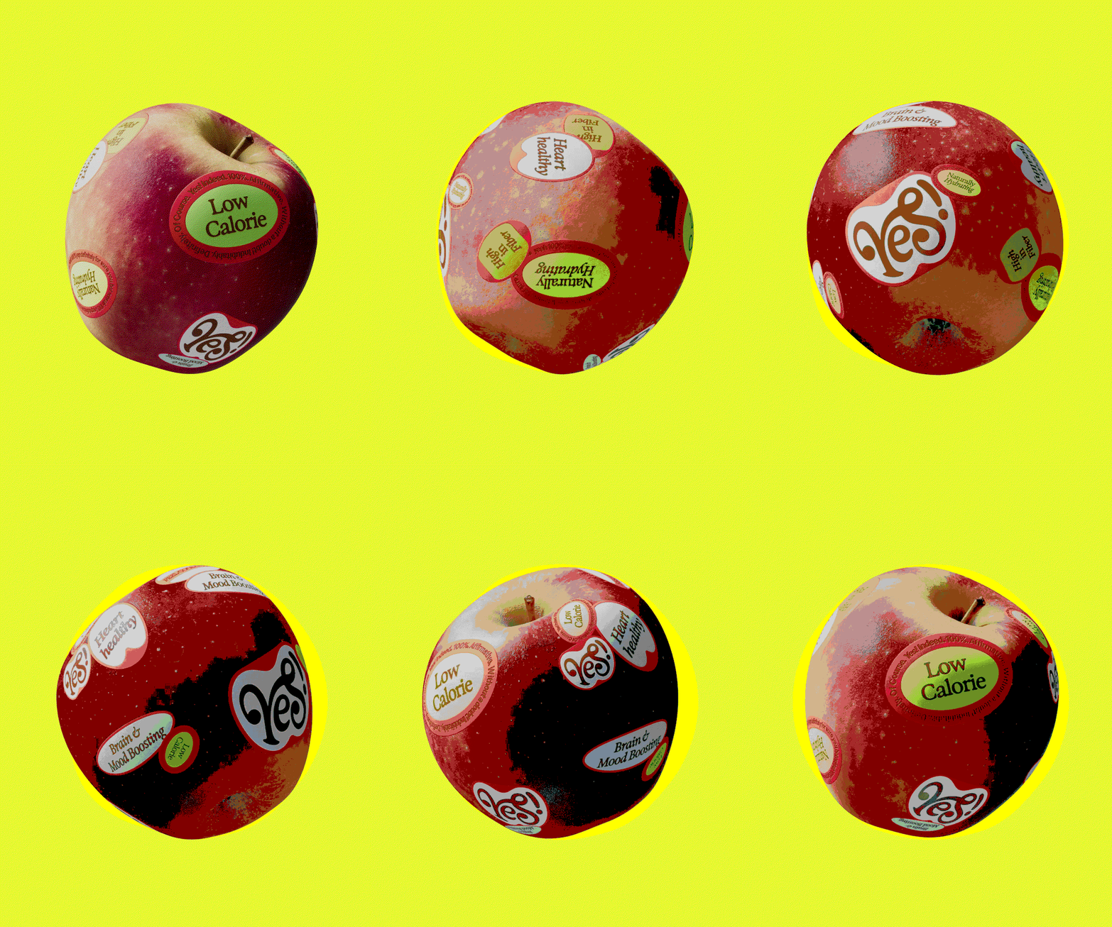
Rather than just seeing an apple as an apple, Blurr wanted shoppers to find out a bit more information about the fruit when they picked up a bag. Through the format of a fruit sticker, the team designed all kinds of labels that acted as fun accessories to the packaging, highlighting nutritional value and flavour profiles of each variety in a digestible way. Something that the studio uncovered in its research is that people often buy the same apple type because there isn’t every any information about what each one can offer you in the supermarket. “The researched showed that if you’re a pink lady, lady you’re unlikely to ever pick up another kind of apple,” Jessica says, so the studio’s layered approach to packaging sought to be informative enough to inspire people venture further a-field.
Blurr Bureau: Yes! Apples (Copyright © Blurr Bureau, 2026)
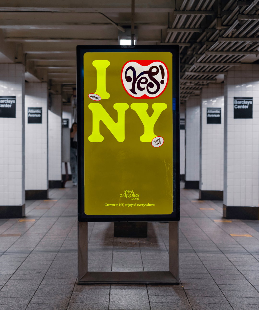
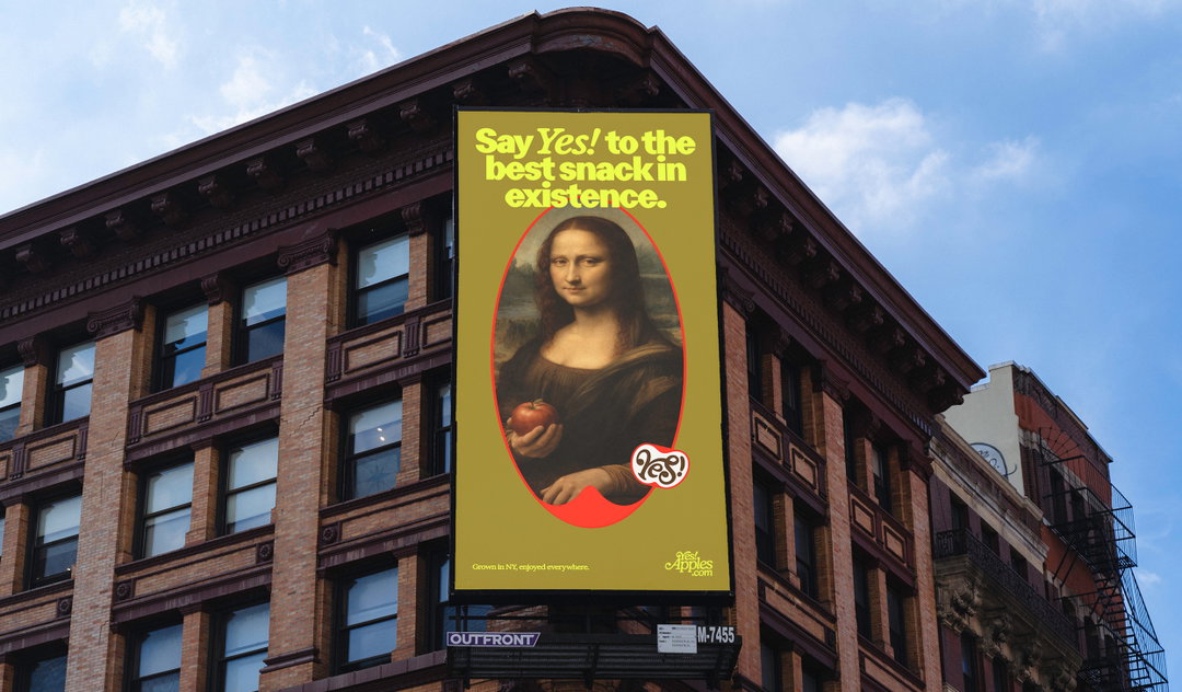
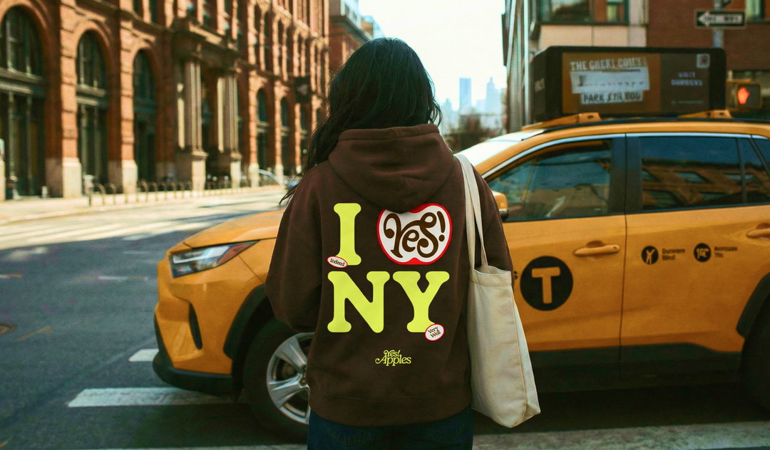
For the logo, Blurr Bureau didn’t want to miss out on the fact that all of Yes!’s apples were home grown in the Big Apple, so the team took its own clever spin on Milton Glaser’s iconic ‘I love NY’ logo, placing an apple instead at its core. If you look a little bit closer at the Y in Yes!, you’ll notice that it also doubles up as an illustration of a tree sprouting from a seed in the ground – a hidden, added emblem for the brand. This state pride is also stamped on every apples sticker: ‘Yes! We’re grown in NYC’.
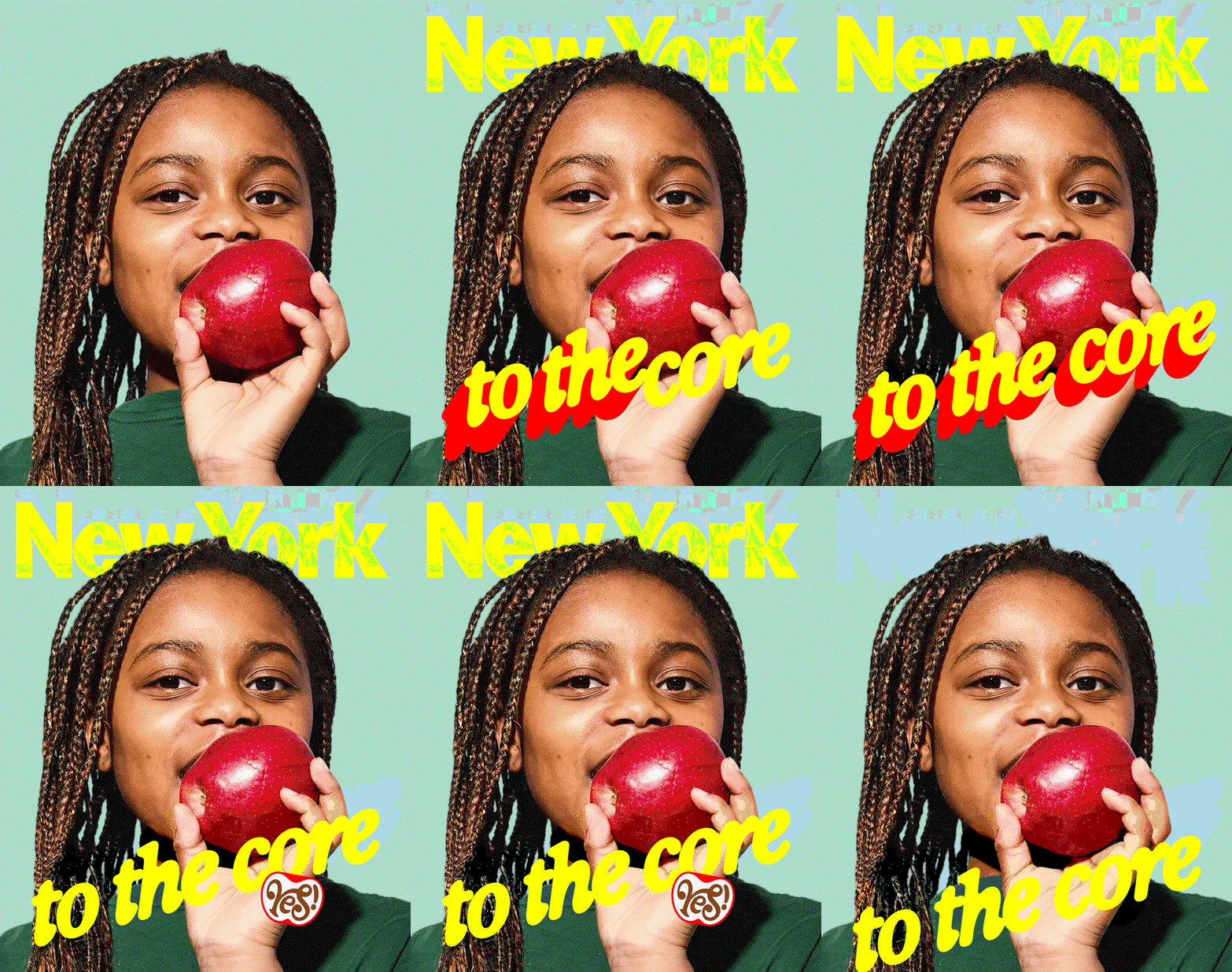
Across the brand Blurr Bureau paired the boldness of Displaay’s Perfekta with Exposure from 2025TF foundry. “Together they create a modern yet nostalgic combination that gives the brand flexibility across multiple applications,” says Alex. “The letterforms in Perfekta also have a softness and roundness that subtly echo the shape of an apple, which helped reinforce the visual language of the brand,” he says. For Blurr, this typographic dance was the perfect balance for a brand that set out to draw on fond memories of a fruit we all know but look decisively fresh, contemporary and full of character.
GalleryBlurr Bureau: Yes! Apples (Copyright © Blurr Bureau, 2026)


Hero Header
Blurr Bureau: Yes! Apples (Copyright © Blurr Bureau, 2026)
Share Article
About the Author
—
Ellis Tree (she/her) is a staff writer at It’s Nice That. She joined as a junior writer in April 2024 after graduating from Kingston School of Art with a degree in Graphic Design. Across her research, writing and visual work she has a particular interest in printmaking, self-publishing and expanded approaches to photography. ert@itsnicethat.com
To submit your work to be featured on the site, see our Submissions Guide.