Graphic designer Benoît Brun’s comics-inspired typography leaps off the page
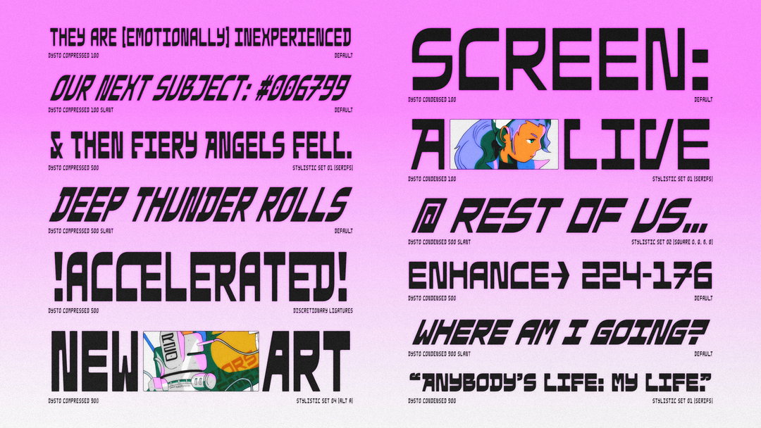
For graphic designer Benoît Brun, there is “another dimension” to typography, which goes beyond readability: “[It] can also stimulate, give emotion and excitement," the designer tells It’s Nice That. “Lettering on a poster can give someone walking on the street the opportunity to get an eyeful. I like that we can contemplate a set of letters, give them a certain amount of time and ask ourselves what they mean”, he continues. “In my work, I like to handle drawing, create new formal repertoires and develop my own tools while keeping a strict and rigorous approach,” Benoît says. “That’s why in typography I’m interested in display fonts for their formal and expressive character. Through their abstraction, I see drawings, surface games, full and empty, in the letters.”
Currently based in Lausanne, Switzerland, completing his MA in type design at ÉCAL, Benoît finds inspiration in everything from his daily environment to childhood memories: “As a child, I was passionate about comics and the juxtaposition of text and image has driven my interest in composition and expression. In my daily environment I can find inspiration in a shape from nature or by a craftsperson, a tuned car, an inscription engraved on an abandoned building or a shadow cast on the ground.”
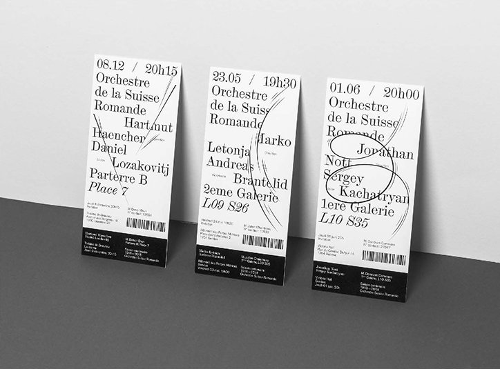
The influence of comics can be seen in his identity design for the Roman Swiss Orchestra, a project marking its centenary. In the work, a series of posters and programmes, Benoît employs jiggle marks and motion lines to disrupt and animate the typography: “It transcribes music motion and the harmonics between different instrument chords. This universe is inspired by the world of comic books – with childhood and innocence confronting the prestigious and strict sides of classical music", Benoît explains. The narrative structure of a comic is also integral to his BA project, Shakaton, “a lettering project inspired by Japanese tuning” in which Benoît used “shaped inspired by curves in cars, ornaments and stickers that suggest motion and speed”. The lettering is laid out in strips, interspersed with suggestions of narrative “action” – explosions, leaps, and conversation.
“I like to experiment with character drawing as an abstract shape that stands in the limit of visibility and readability” Benoît says. “The idea that there are no mistakes, no rules in typography is liberating for me. Each letter has its own singularity, but it’s part of a whole and when they interact together, they create a story, take on common meaning.”
Having returned to ÉCAL for his MA, Benoît is hoping to continue to develop his knowledge of typography: “It’s essential to know your sources, to study the history of type in order to be able to reinterpret and modify it.”
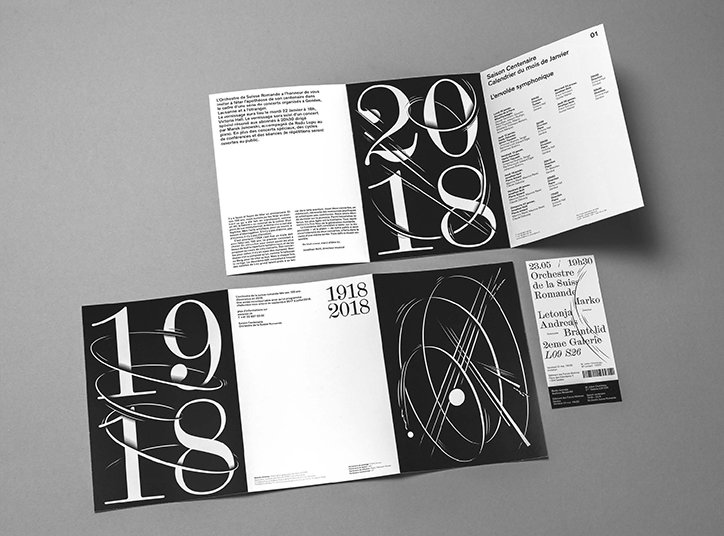
Benoît Brun: Roman Swiss Orchestra
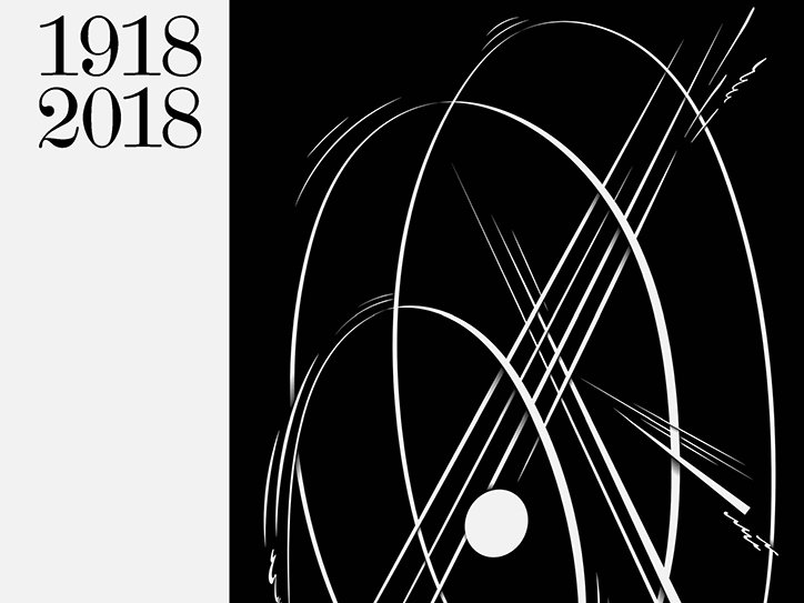
Benoît Brun: Roman Swiss Orchestra
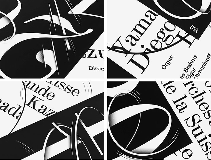
Benoît Brun: Roman Swiss Orchestra
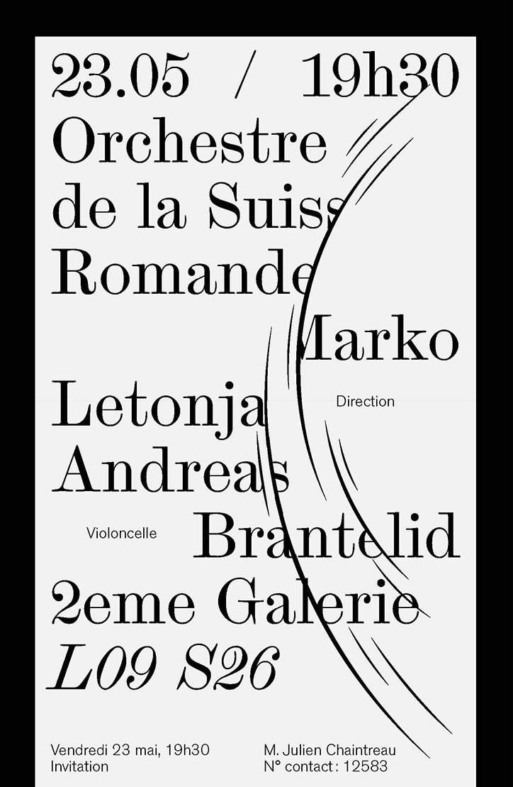
Benoît Brun: Roman Swiss Orchestra
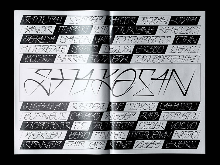
Benoît Brun: Shakaton
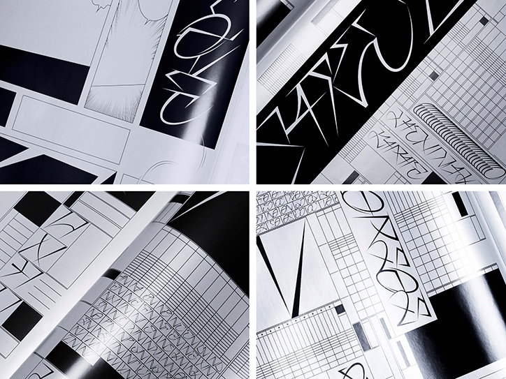
Benoît Brun: Shakaton
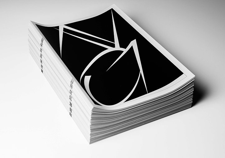
Benoît Brun: Shakaton
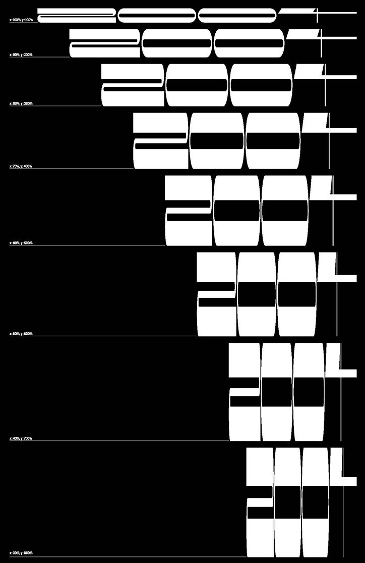
Benoît Brun: A$AP Typeface
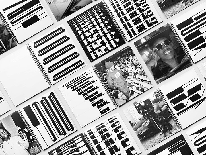
Benoît Brun: A$AP Typeface
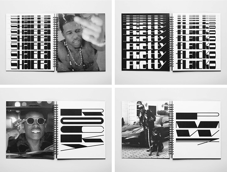
Benoît Brun: A$AP Typeface
Share Article
Further Info
About the Author
—
Billie studied illustration at Camberwell College of Art before completing an MA in Visual Communication at the Royal College of Art. She joined It’s Nice That as a Freelance Editorial Assistant back in January 2015 and continues to work with us on a freelance basis.