




Cheers! A round-up of some of our favourite beer branding
It doesn’t take much to persuade most people to kick back with a beer, but it certainly doesn’t hurt to make it look great too. With the rise of craft breweries, the scene has fostered a proliferation of great branding and design for their wares. Here’s a round-up of some of our favourites.
Manual: Fort Point Beer Company
Manual: Fort Point Beer Company
Manual: Fort Point Beer Company
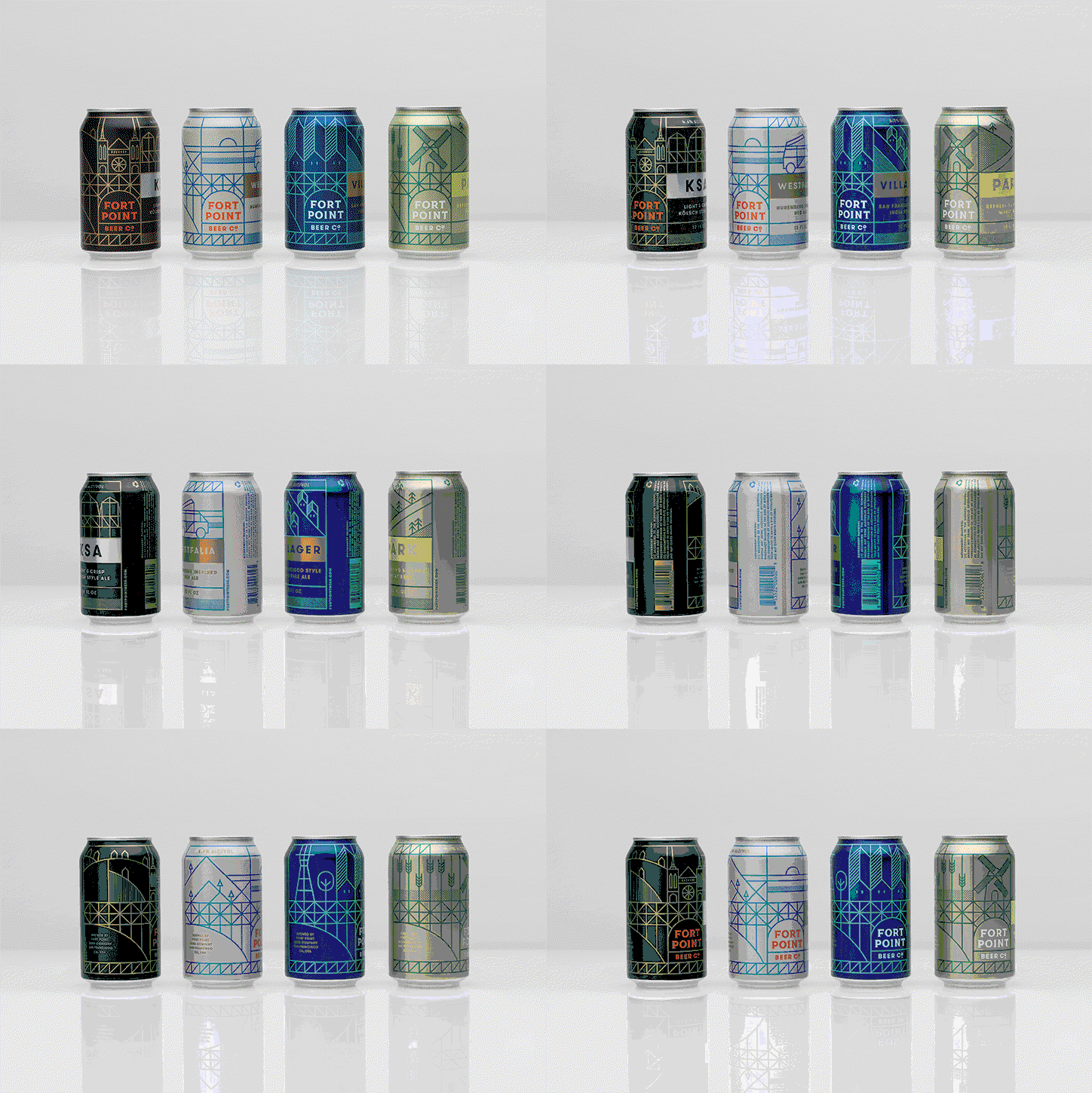
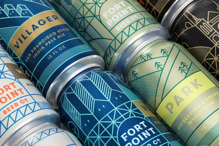
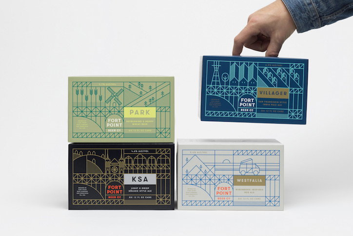
When San Francisco’s fastest growing craft brewery Fort Point Beer Company wanted a brand that would grow as it spread throughout the US, but always tether it visually to its native city, it approached San Fran-based branding studio Manual to design its identity and packaging.
No doubt inspired by the brewery’s former army motor pool Presidio building home, close to the iconic Gold Gate Bridge and the brand’s namesake Fort Point national historic site, Manual has created an illustrative brand identity featuring elements of easily recognisable local landmarks and Bay Area culture to channel a visually relatable sense of place.
Delivering a comprehensive package of brand identity, illustration and packaging design, Manual’s work for Fort Point Beer Company wraps itself seamlessly around cans, boxes, beer pumps and business cards.
DR.ME: Cloudwater Brew Co
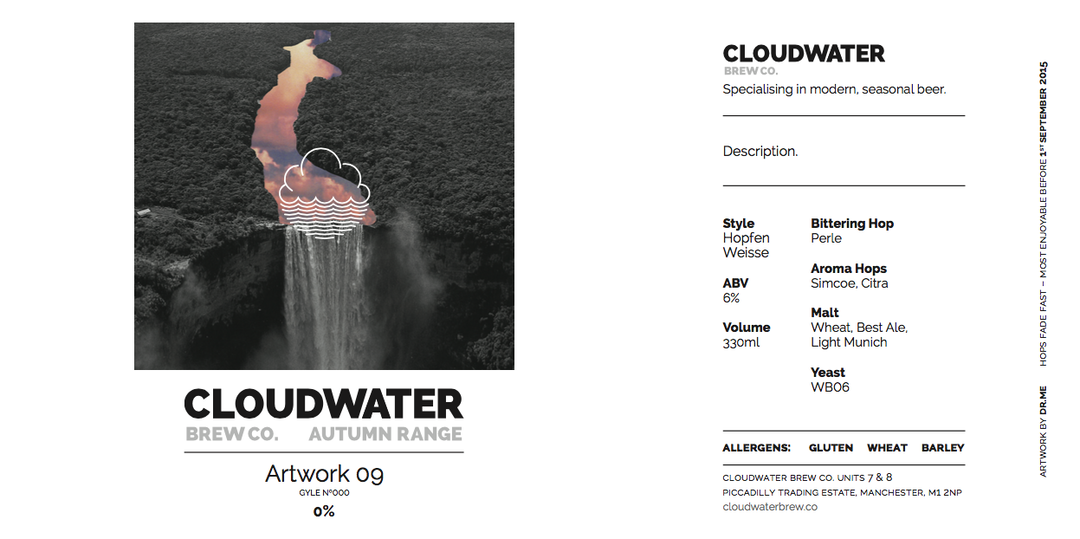
DR.ME: Cloudwater Brew Co
DR.ME: Cloudwater Brew Co
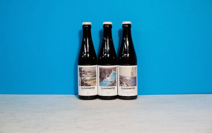
One for all the visual pun fans, Manchester-based creative studio DR.ME was commissioned to create artwork for local seasonal beer brand Cloudwater Brew Co.
Following its ambitious 365 days of collage project, DR.ME has taken inspiration from Cloudwater’s brand identity, created by Textbook Studio, and produced a series of surreal collages depicting idyllic natural beauty spots with rivers and lakes replaced by clouds. These collages have been applied to Cloudwater’s labels with a simple logo overlay reiterating the brand’s primary design identity.
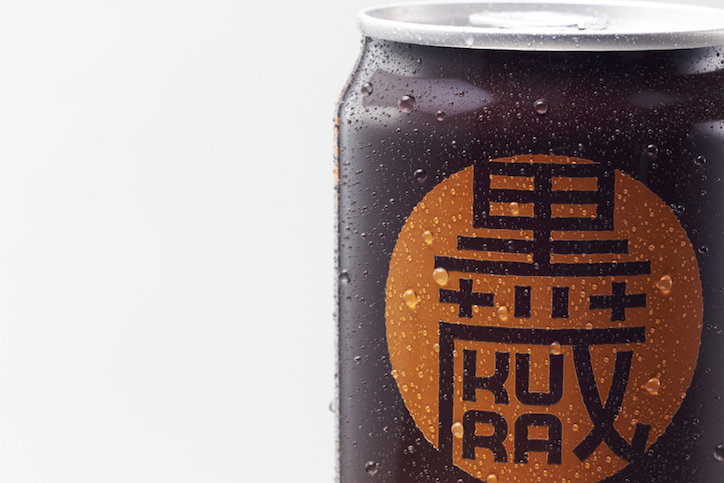
Nendo: Kinkura
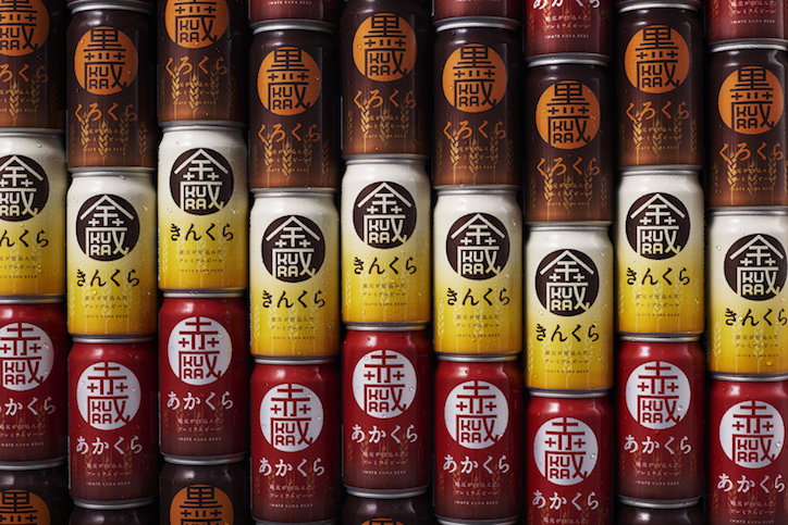
Nendo: Kinkura
Nendo: Kinkura
Omnipresent multidisciplinary studio Nendo has lent its globally recognisable design skills to Japanese craft beer Kinkura. Produced to support the Sekinoichi brewery located in Ichinoseki, Iwate, a city that suffered heavily at the hands of the Great East Japan Earthquake in 2011, Kinkura’s name comes from the unique combination of a beer and sake brewery, know in Japanese as “kura”.
Reflecting the brand’s three beer varieties, a pale ale (Kin Kura), a dark pilsner (Aka Kura) and a stout (Kuro Kura), Nendo has incorporated the Chinese characters for gold, red and black into a family crest style logo that also features the characters’ English transliteration “KURA”.
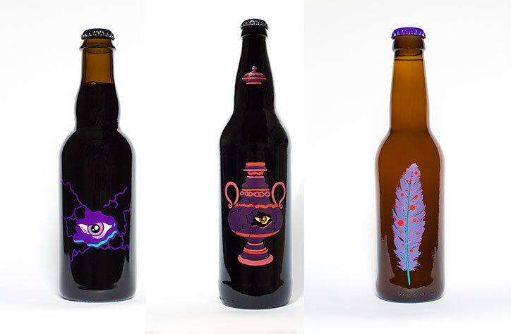
Karl Grandin: The Omnipollo
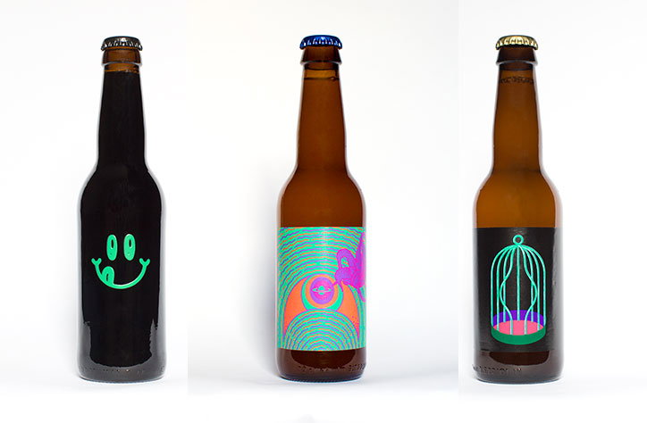
Karl Grandin: The Omnipollo
Karl Grandin: The Omnipollo
Frothing with Scandinavian minimalism, artist Karl Grandin has collaborated with Henok Fentie to create design-led craft beer brand The Omnipollo.
Swedish beer enthusiasts Karl and Henok concoct and brew small-scale batches of their beers in cooperation with breweries around the globe. The Omnipollo’s story is told through Karl’s psychedelic, sometimes dark and consistently varied illustrations. Maintaining a homogenous trail of minimalism, the brand’s signature labelling style provides a level of uniformity throughout The Omnipollo’s range of products.
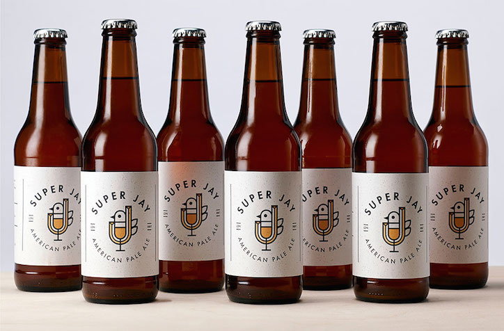
PWW: Super Jay
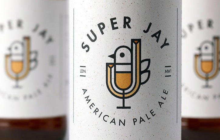
PWW: Super Jay
PWW: Super Jay
London and Seattle-based design firm PWW has produced its own signature craft beer, Super Jay. Devised only once the American pale ale’s flavour had been chosen, Super Jay’s brand identity is the result of the convergence of two streams of creative thought.
The jaybirds of PWW graphic designer Mark Johnson’s Lake District upbringing became the focal point of his drawings, shaping the identity of PWW’s venture into the craft beer movement and providing its namesake Jay.
Capturing the imagination of PWW’s creatives, the jaybird’s colonisation of Asia, Europe and Africa, and eventual migration to North America, somewhat mirrors the historical growth of beer throughout Europe with a subsequent transition to North America.
A result of this cross-continent amalgamation, PWW has combined typography and soft graphic design to merge an illustrated jaybird and traditional beer glass.
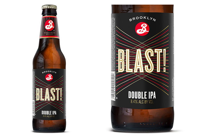
Milton Glaser: Brooklyn Blast!
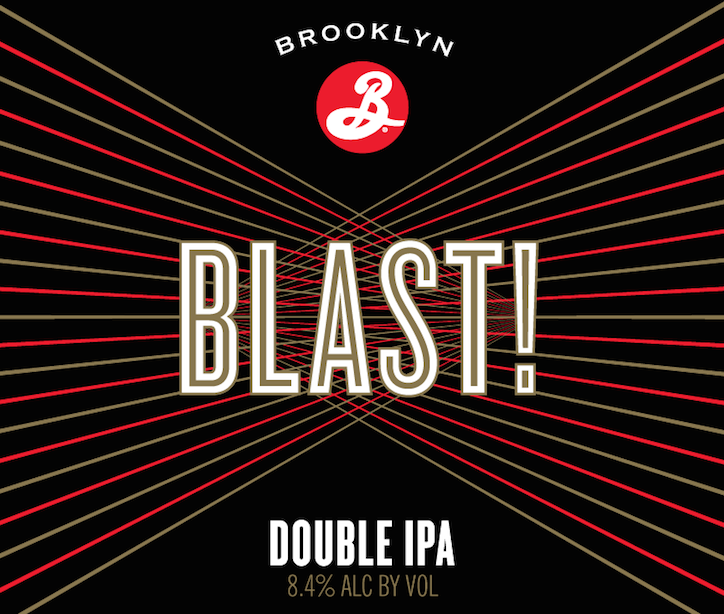
Milton Glaser: Brooklyn Blast!
Milton Glaser: Brooklyn Blast!
Having created its iconic logo, Brooklyn Brewery reconnected with renowned graphic designer Milton Glaser for the redesign its double IPA Blast!.
A year after their initial design meetings surrounding Blast!, Brooklyn Brewery re-approached Milton and his senior art director Sue Walsh to create an identity that “captures the true energy of the beer.”
Channelling the intentionally explosive but highly drinkable nature of Blast!, Milton and Sue combined the elegance of fine red and gold lines with the impact of bold typography to create this simplistic design that highlights the defining elements of the beverage
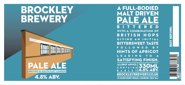
James Ingram: Brockley Brewery
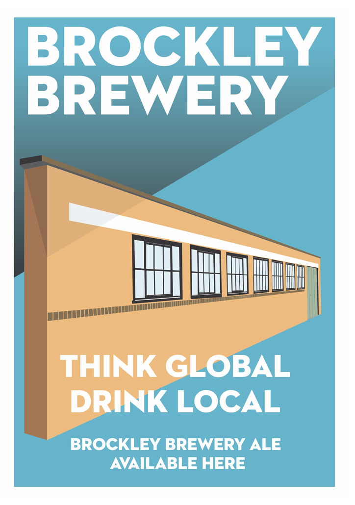
James Ingram: Brockley Brewery
James Ingram: Brockley Brewery
Moving back across the Atlantic to south east London, Brockley Brewery’s chosen designer, freelancer James Ingram, has gone back to basics with its distinctive brand design.
Taking his creative lead from the sustainable values promoted by the business, James has taken a very literal approach to communicating Brockley Brewery’s local-mindedness by creating an architecturally minimalist illustration of the brewery’s home. James’ illustration sits comfortably against the bold colours and uniformly white type of the brand’s labels and marketing materials to provide a consistently clean aesthetic.
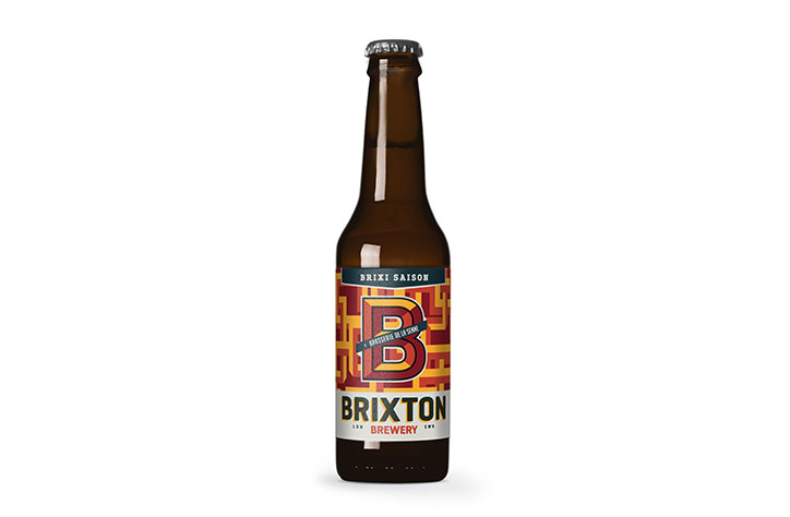
EleyKishimoto: Brixton Brewery
EleyKishimoto: Brixton Brewery
Eley Kishimoto: Brixton Brewery
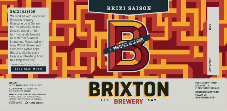
In the spirit of celebrating Brixton’s thriving creative community, Brixton Brewery collaborated with local design powerhouse Eley Kishimoto to create the label for its Brixi Saison beer, produced in collaboration with Belgian Brewery Brasserie de la Senne.
Brixi Saison’s distinctive label sees Brixton Brewery layer its own branding over the widely recognised Connect Brixton print designed by Eley Kishimoto, seamlessly blending the two aspects with a palette of burnt orange hues.
Share Article
Further Info
About the Author
—
Milly Burroughs (@millyburroughs2.0) is a Berlin-based writer and editor specialising in art, design and architecture. Her work can be read in magazines such as AnOther, Dazed, TON, Lux, Elephant, Hypebeast and many more, as well as contributing to books on architecture and design from publishers Gestalten and DK. She is It’s Nice That’s Berlin correspondent.



