




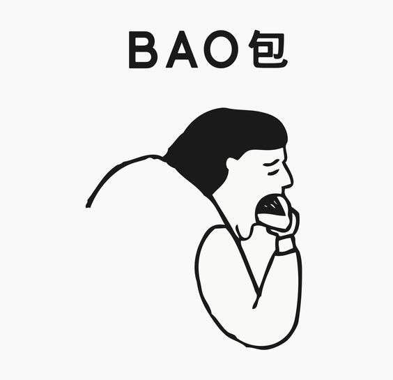
The delicious design history of Bao, from its iconic Lonely Man logo to its pixelated Rice Error delivery menu
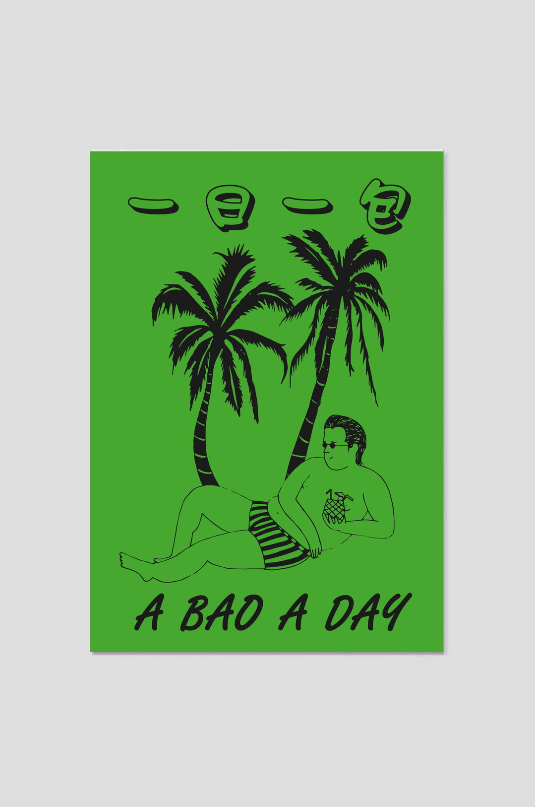
The second best thing about Bao (after its buns) is its humorous and eclectic visual identity, the vision of its creative polymath founders Shing, Erchen and Wai Ting.
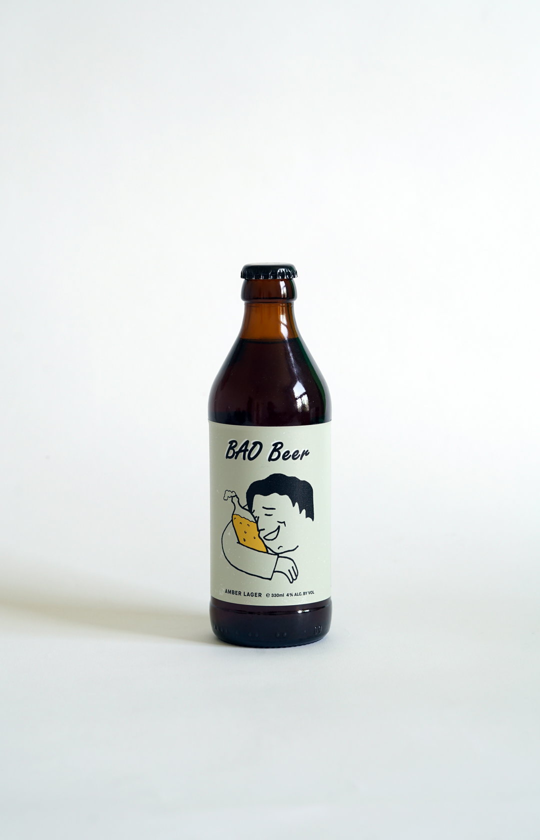
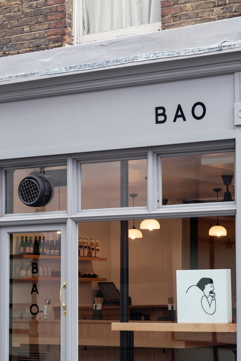
Bao opened in a Hackney car park in 2012 and has gone on to become one of the most lauded restaurants in London, with keen beans (this writer included) queuing outside day in, day out for a spot on its pews. Vital to that success is its visual identity, from the effortlessly iconic logo “Lonely Man” – a man scoffing a Bao bun – to the restaurant’s chic interiors, and more recently the eclectic and fun visuals for its many brand offshoots. So it may come as no surprise that the restaurant was started by two artists, now husband and wife Shing Tat Chung and Erchen Chang, along with Shing’s sister Wai Ting Chung.
Shing and Erchen met at Slade School of Fine Art, where Erchen studied sculpture and media, focusing on performance and installations, while Shing says he moved through the departments from painting, to sculpture, to media. He also studied a master’s in design interactions at the RCA. Soon after graduation, Bao was founded. That multi-disciplinary flitting continues now, and, it turns out, is ideal practise for running a restaurant. “Just from the nature of our practice during education and how we work as a team, we delve into various disciplines. On a daily basis we are involved in the graphic design, web design, restaurant interior design, artistic direction, food design – which generally means a lot of inspiration from various areas,” Shing tells It’s Nice That. Among those he cites Thomas Demand, Wes Anderson and Issey Miyake as influential on the Bao aesthetic, as well as Yosujiro Ozu, Seijun Suzuki and Momoko Sakura.
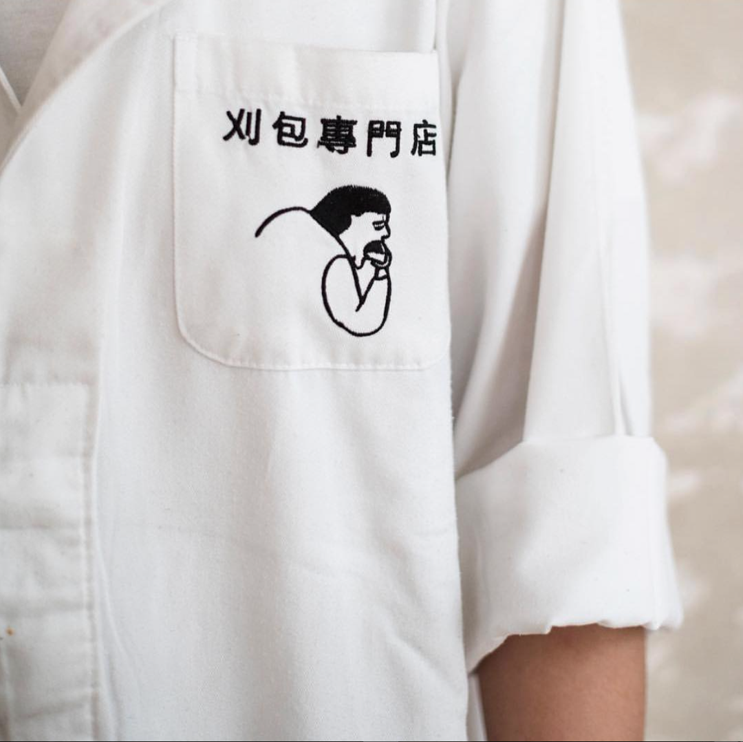
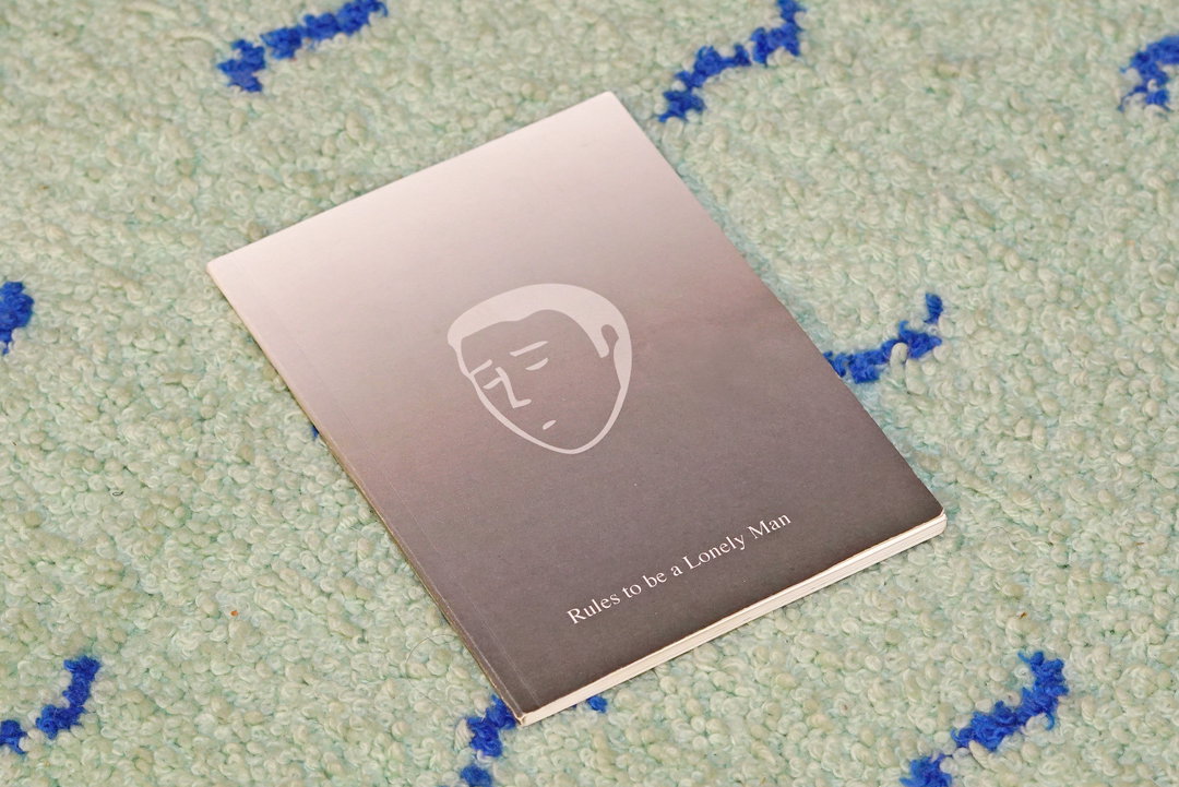
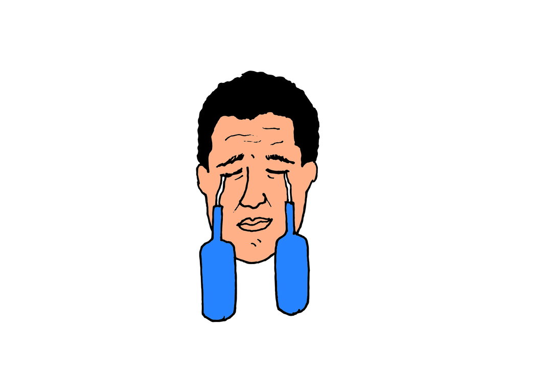
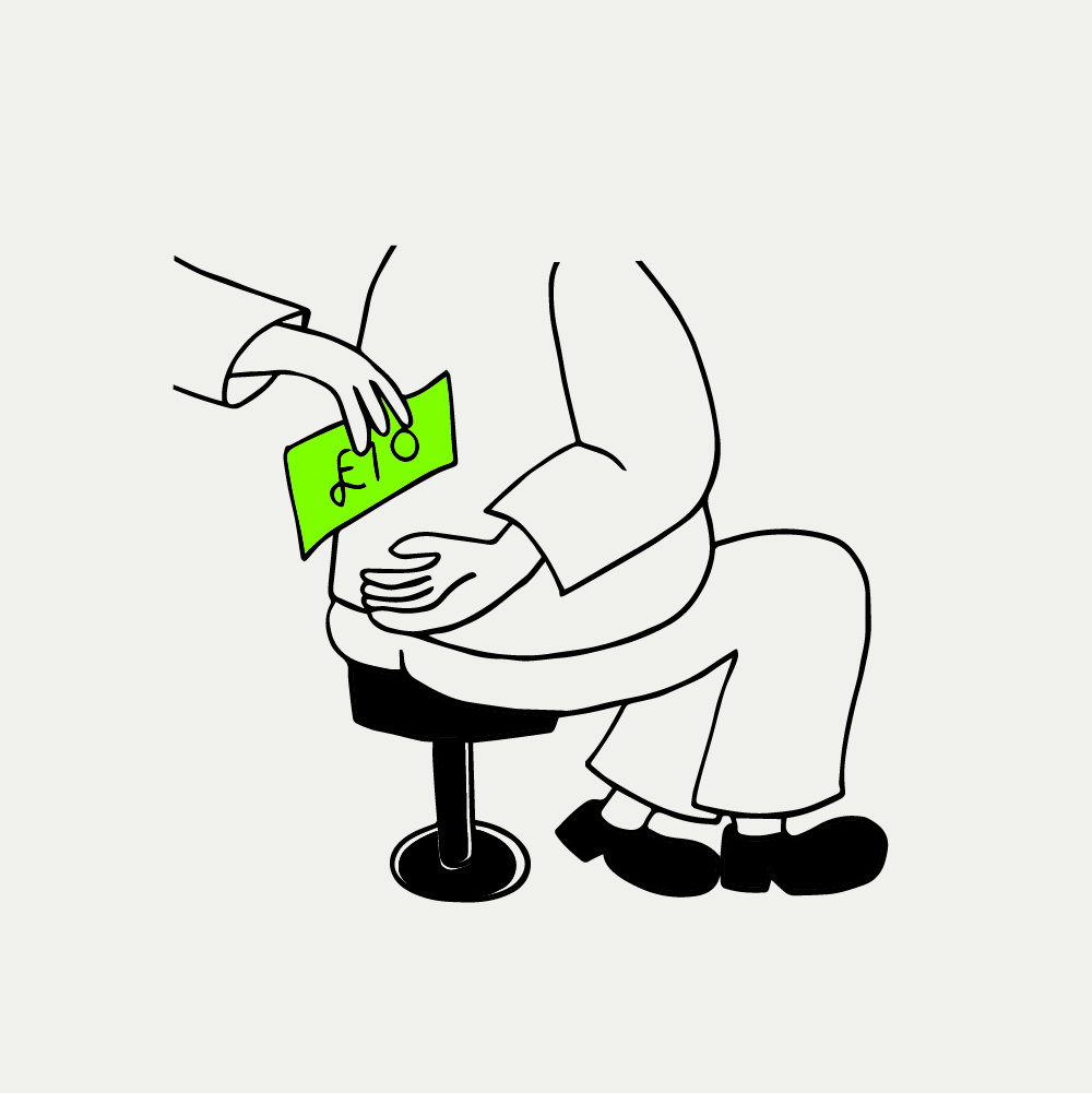
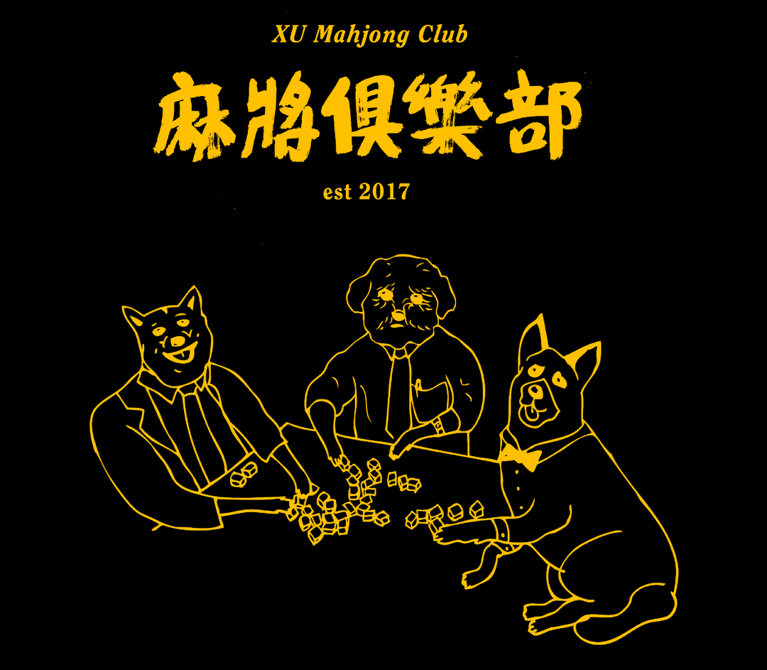
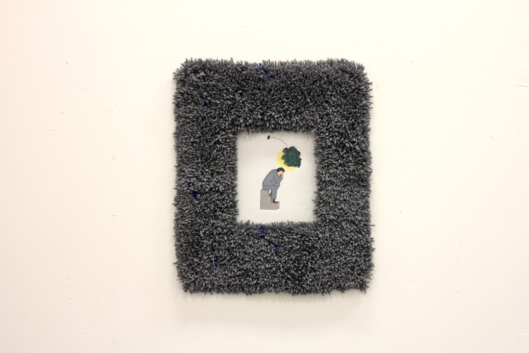
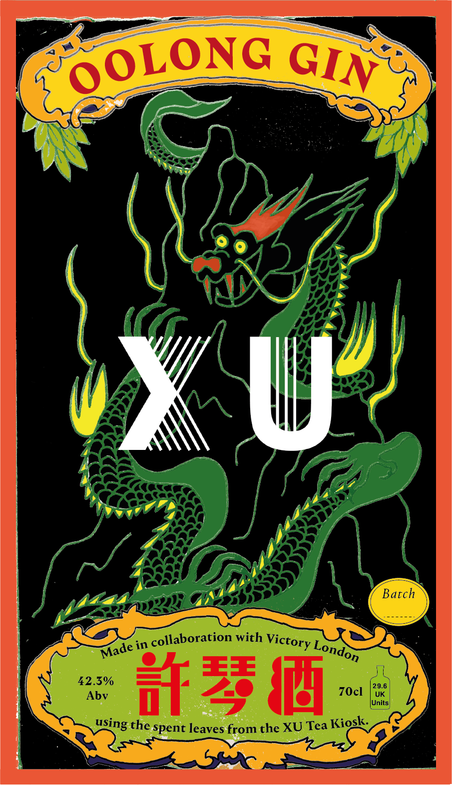
Erchen is behind the “Lonely Man” logo, a character that originated from one of her art pieces, a performative installation titled Rules to be a Lonely Man wherein the illustration made its first appearance. Originally it was “a lonely man sitting on a three-step plinth under a single cheese plant branch with his hand under chin,” Shing describes, which evolved into the logo as it stands, while the core values, emotions and ethos of Erchen’s artwork became the foundation of Bao, he says. “Bao restaurants are stories of our upbringing and travel around Asia. Our interpretations of slices of this culture. The lonely man was inspired by Japanese B movies, the salaryman, oversized suits, lonely dining. This resonates with us and our ethos – we can picture all our restaurants as where the Bao man would eat. For example, the single dining table at our sister restaurant XU, or the small plates in Bao Soho, and the counter dining catered for one. Whenever we think of our next project, we always picture the Bao Man dining there and how the design works around him.”
As such, the core Bao brand is understated, utilitarian, cute and graphic-led, with an underlying feeling of humour and friendliness. Yet as the business grew and diversified, new influences came into play. Each restaurant interprets a “different slice of culture in Asia,” for example Bao Borough is inspired by late-night grill culture. This means they’ve had to become more flexible with their identity – while most Bao restaurants favour minimalism and therefore have no artwork on the walls, Borough has colourful posters, to reaffirm the theme.
GalleryBao branding (Copyright © Bao, 2020)
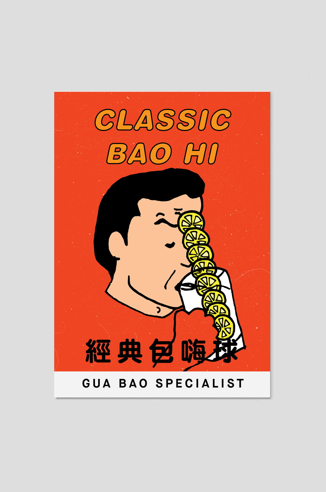
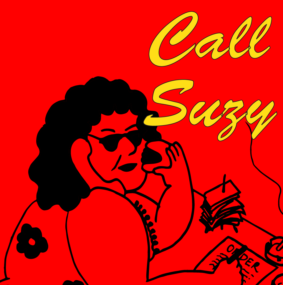
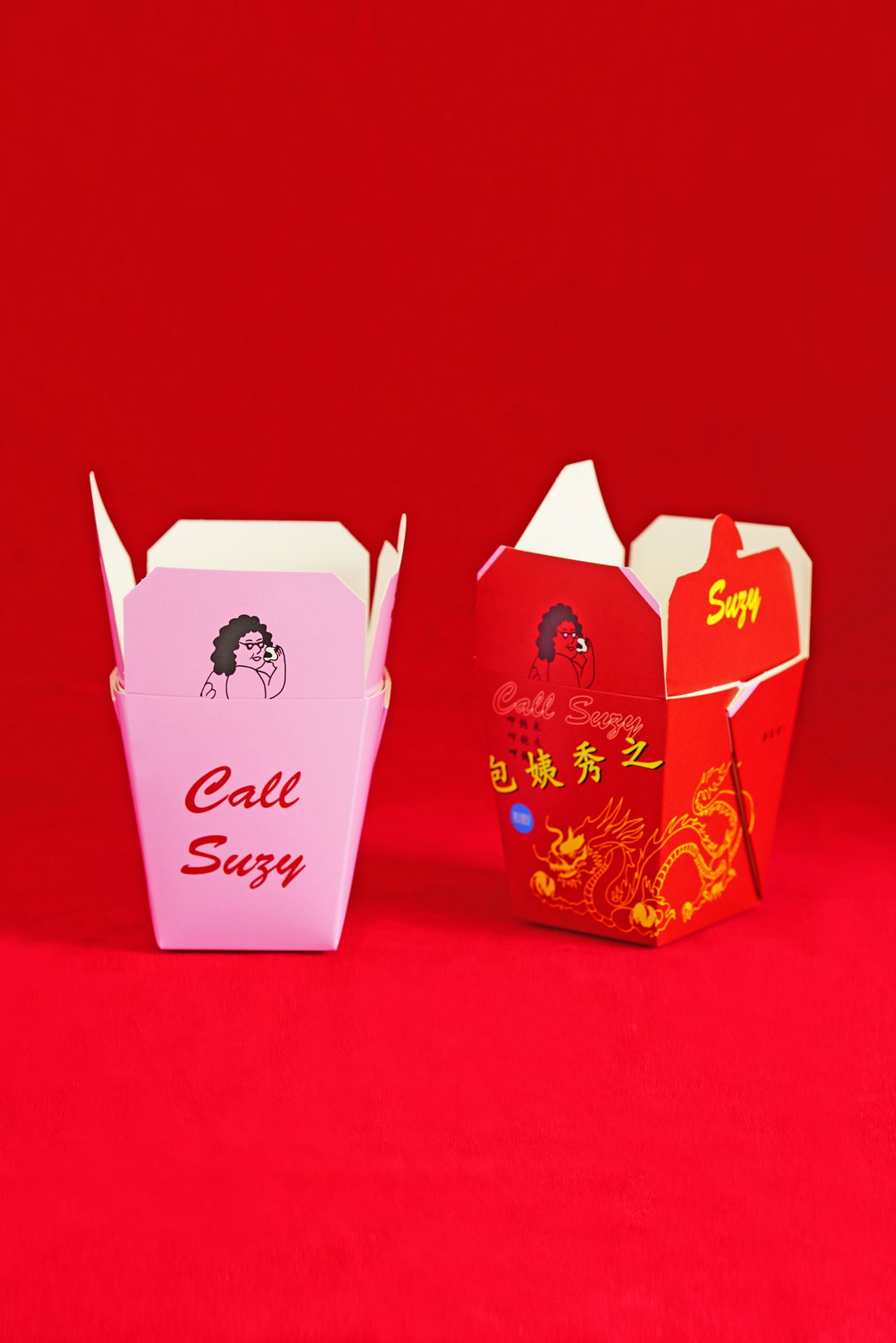
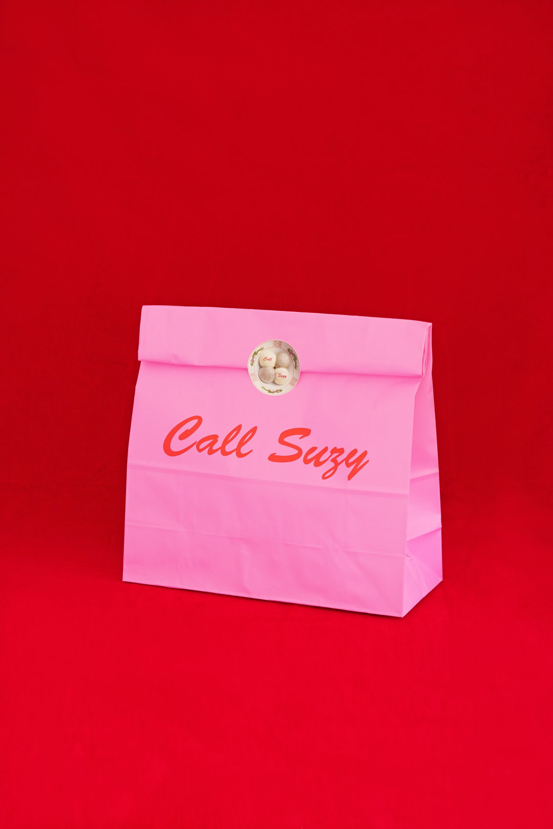
Another outlet for the team’s creativity came in Call Suzy, their first pop-up of a different cuisine – Cantonese – where the logo seems to come from the same family as Lonely Man, but its look and feel is very different to the simplicity of Bao. Like with Bao, Shing did the graphics and packaging, and Erchen did the illustrations. “My sister Wai Ting and I grew up living and breathing Cantonese restaurants, as my parents were in the hospitality business in Nottingham,” explains Shing. The starting point was the name Suzy: taken from Lazy Susan, a staple of old Chinese restaurants, and named Call Suzy as the food is based on a Chinese takeaway. “We had this image of someone sitting at a counter answering phone calls,” Shing describes, saying the identity drew from memories of these restaurants, “the red, the symbols saying ‘Thank you, Enjoy’. So it was a little more romantic with a burst of bright colours and fun artwork, inspired by the vibrant and neon colours of Taiwan.”
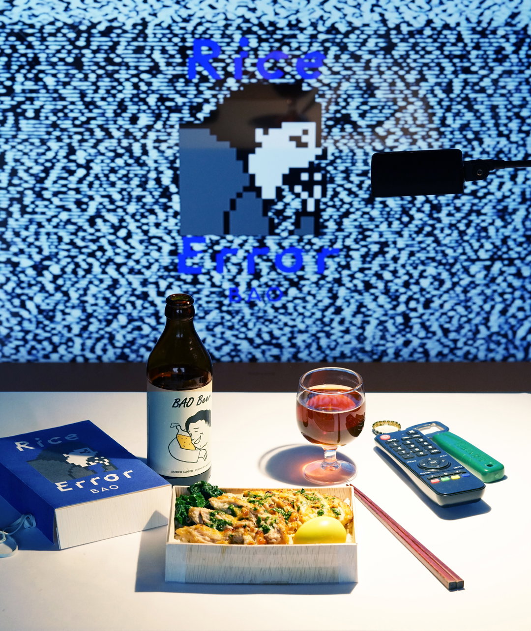
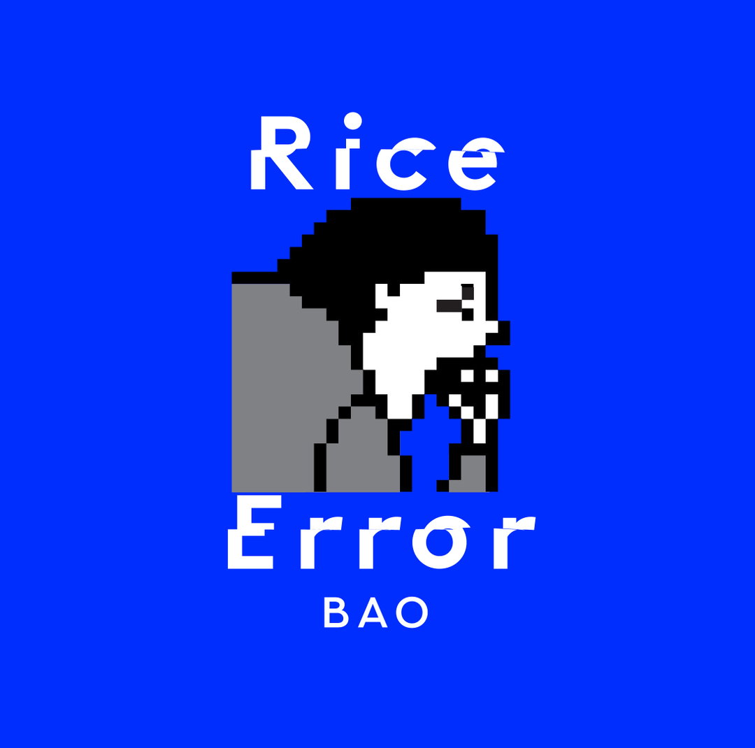
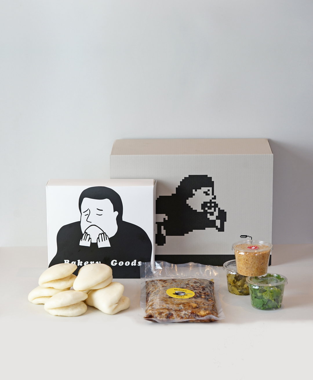
As Bao has evolved, its shrewd founders have found multiple outlets for their creativity. While ideas to create a shop and delivery service have been on their minds for a while, the pandemic and a pressing need to broaden their offering have egged them on (ahem). Rice Error is Bao’s new delivery brand, where hungry fans can order kits to cook and build their own Bao at home. Design-wise, Shing says they were going for “playful and punchy… Bao is often understated, so Rice Error gave us the opportunity to be bolder.” The team worked with isometric artist Marcelo, who created Bao’s full menu and even a newly digitised Lonely Man in pixelated form, playing on the online error theme and inspired by retro computer graphics. These feature everywhere from the website to the food packaging in the delivery box.
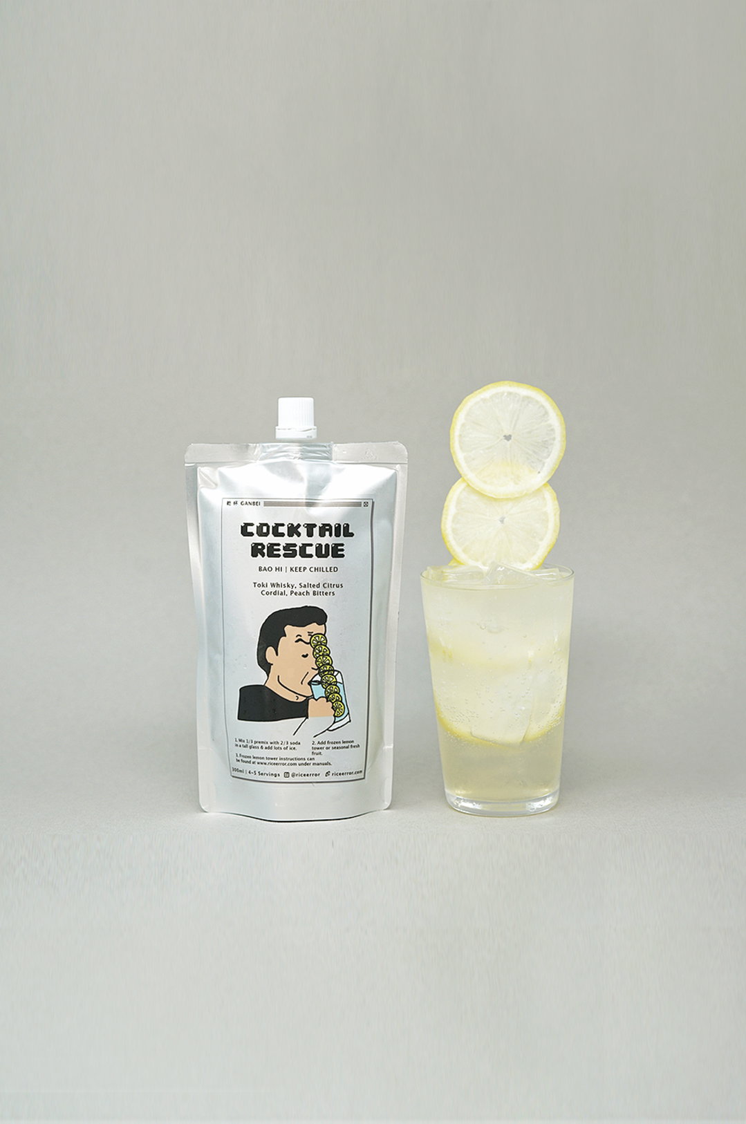
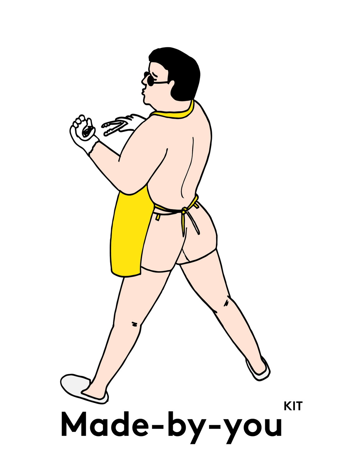
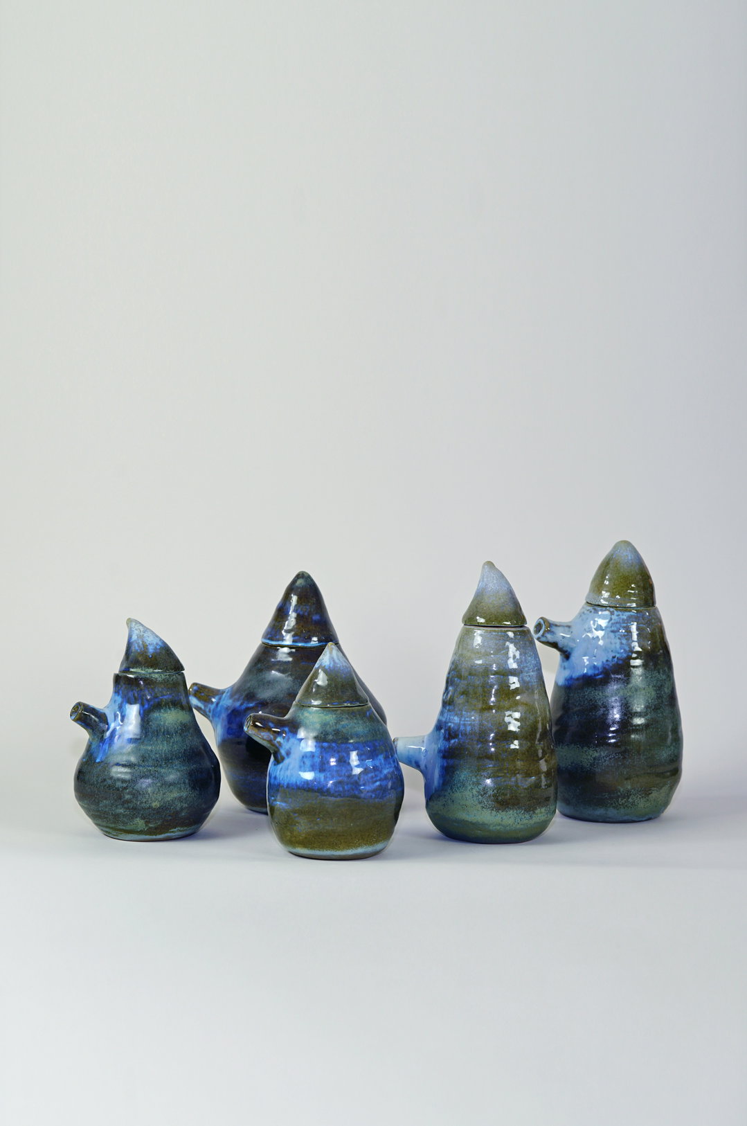
And there’s Convni, its online shop selling products and posters. Diversifying to retail was something the team always wanted to work towards, Shing says, “to step up from a restaurant brand to a food and drink brand”. Shing and Erchen create most of the artworks and products themselves but do some collaborations with external creatives, for example, ceramicist Anna Hodgson, who makes the ceramics for the restaurants.
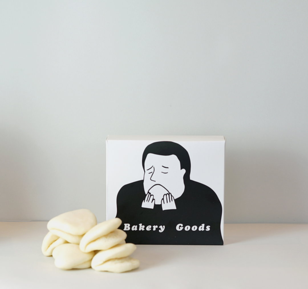
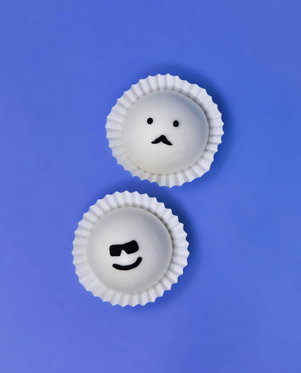
As if that wasn’t enough, its new venue Cafe Bao is also in the works and aiming to open in November, featuring another new sub-brand Bao Bakery Goods Counter. “Erchen has designed the first collection of six BBGs based on cartoon aesthetics – so you have a mini Bao loaf filled with coconut looking like a mini six-pack and a cartoon pizza BAO slice filled with meat sauce and cheese.” See you there.
GalleryBao branding (Copyright © Bao, 2020)

Share Article
About the Author
—
Jenny oversees editorial output across It’s Nice That. Get in touch with writing pitches for features or opinion pieces, big creative story tips, or questions about all things editorial. jb@itsnicethat.com
To submit your work to be featured on the site, please see our Submissions Guide.


