




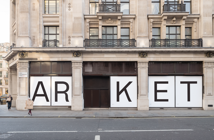
“It needed to be functional, a workhorse”: Arket’s in-house team on its brand identity
Earlier this year it was announced that a new high-street brand was launching, Arket, a name deriving from the Swedish translation, meaning “sheet of paper”. On the surface, the branding is simplistically elegant and evocative of its values and products.
But, minimal designs often have the most interesting back story, a journey of how and why it appears so refined and consequently chic. This is certainly the case for Arket in terms of branding, led by an in-house team working for more than two years before the brand’s launch. The result is a brand that includes a bespoke typeface with breadth, cultivated store designs and a publication to match.
Starting in the spring of 2015, a small team set to work on the identity of the upcoming clothing brand, a group which has now grown to around 30 including marketing, social media, digital design, an image studio as well as working with a specialist group of collaborators. At the helm is Michael Evidon and Axel von Friesen, working with creative director Ulrika Berhardtz.
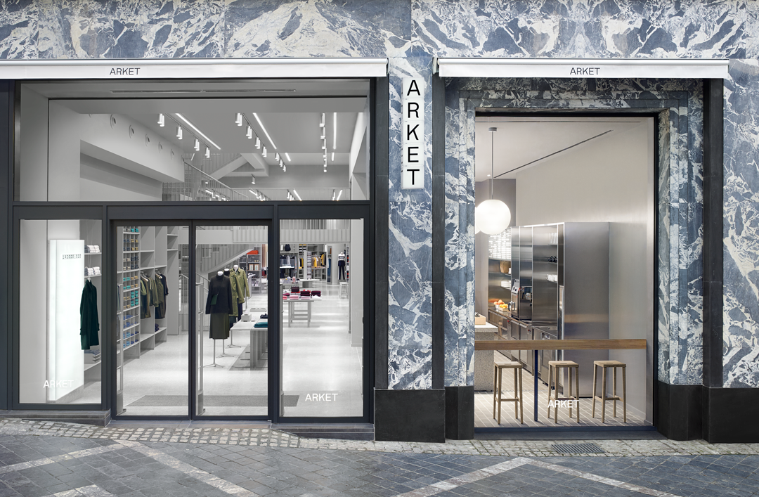
Arket: Brussels store
Despite the name’s literal meaning relating to paper, the brand’s inspiration “came from the concept of the archive, which is a theme common to all parts of our output,” Michael Evidon tells It’s Nice That. The focus therefore was about “finding a clear system to build and present a broad but carefully selected collection, one that celebrates products that have stood the test of time as much or even more than it does newness,” he continues. “This was largely made possible by the way in which we worked together with the collection teams, developing the brand identity in constant dialogue with the collection, not as a reaction to it, or as something separate.”
The main counterpart of Arket’s identity is its typeface, Arket Sans by Icelandic and Danish design duo, Or Type. The pair had the difficult task of responding to a brief “that did not yet reveal the brand name or much of the concept, but alluded to it,” Arket explain. “It asked for a European sans serif with humanist qualities, looking for an archetypal appearance at first glance, but some character and imperfection up-close.”
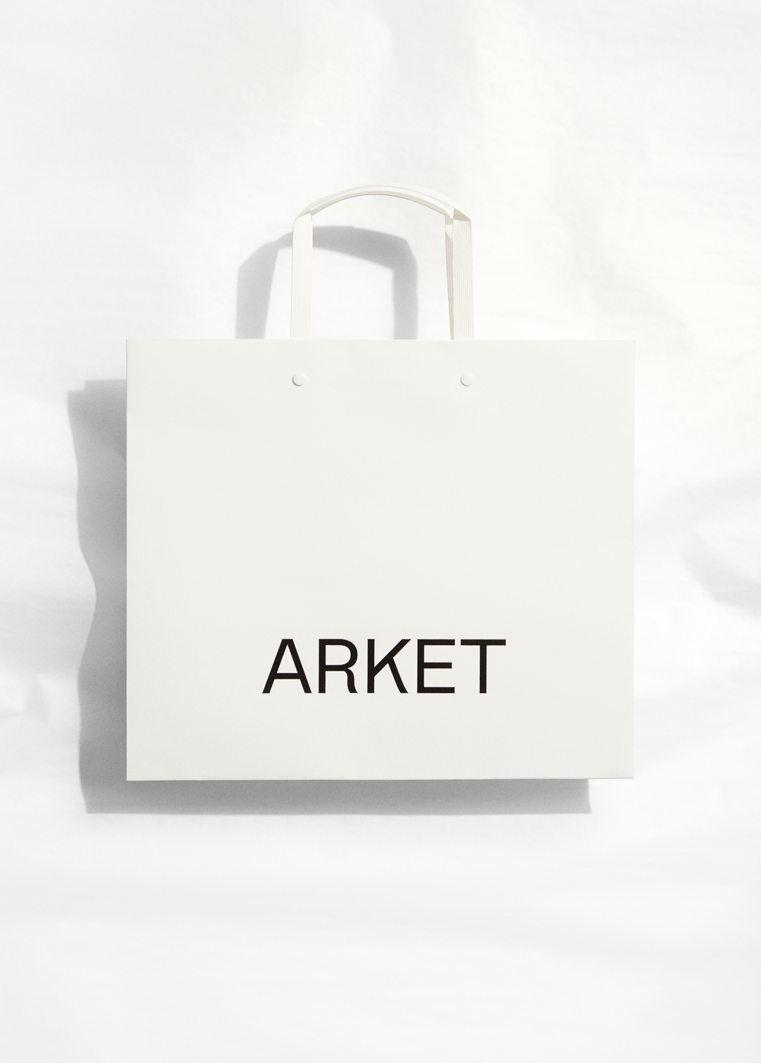
Arket: Medium paper shopper
Arket: Medium e-commerce mailer
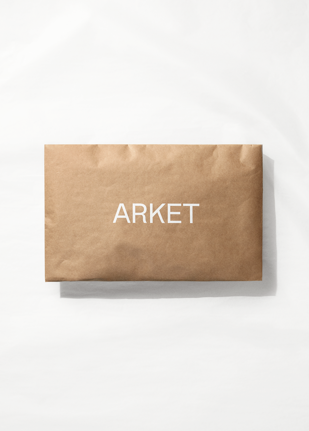
Arket: Medium e-commerce mailer
This loose brief was to enable the development of an identity “that was strong and recognisable, but not rigid,” Michael explains when discussing the initial aims. “A logo that was not a logo but merely the name of the brand set in uppercase in our own typeface.” In turn, this would create a type of branding that “always communicated the product and content over and above the brand name,” by using a “palette of functional and untreated materials” and “a family of applications that were connected but not uniform — a single, strong typeface was a good tool to secure this”.
Designing a bespoke typeface is a route many brands are regularly deciding to take in recent years. It adds an edge to the brand, but it’s mouldable and can include a character set to suit a company’s needs. “We knew the practical requirements we had would be difficult to find in a single existing font,” Arket explain. “It needed to be functional, a workhorse.” Therefore, the final typeface includes monospace numerals, small caps, icons for Arket’s digital store and custom care symbols, and all had to be “equally effective”.
Or Type’s development of Arket Sans also began back in 2015, researching and sketching for “over more than a year” in order to create versions that would work optimally both in print and online. While aiming for visible perfection, Or Type also had the task of giving the typeface a flair in the minor details, “the distinctive off-balance R, a swing in the K, and the pinched number five,” say Arket, pointing out the “characteristic quirks” of the final design.
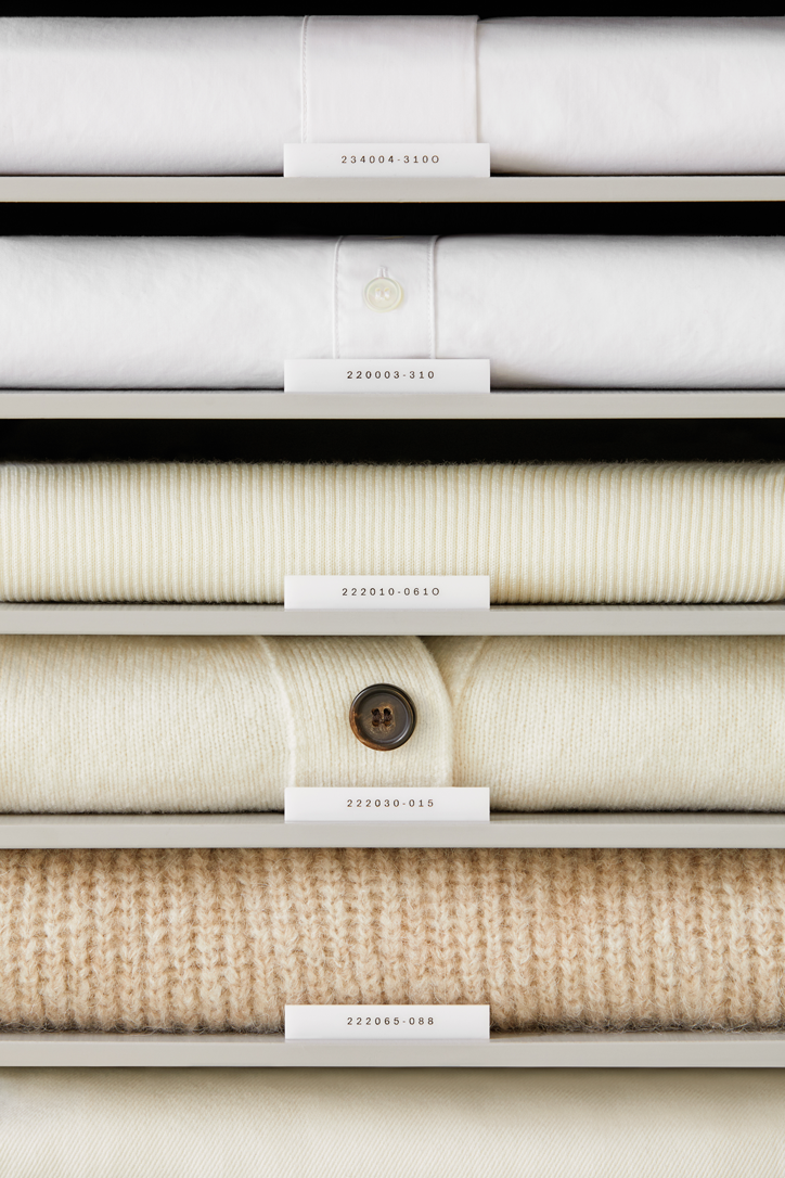
Arket: Arket ID
The personality featured in the characters also answered the branding team’s question of whether a logotype needs to be visible “on product branding that is mainly seen by the customer, and does not need to compete with other brands in the same way as something that is also sold wholesale”. An example of this is the Arket ID, a nine-digit code “given and shown with each product” and “the simplest expression of the archive".
By applying a numerical system to gender, product and material, a system is created “to make it easy for customers to find and re-find products both in physical and digital stores, and a tool for our archive — a way to record and preserve products.” This ID is not only shown in store but on the clothing too, adding its country of origin and the date of production allowing “the customer to understand which products really have stood the test of time,” explains Michael. The application of the typeface this way creates a change in pace, but still fits in with the exterior signs of stores and packaging; overall communicating to both current customers and passersby.
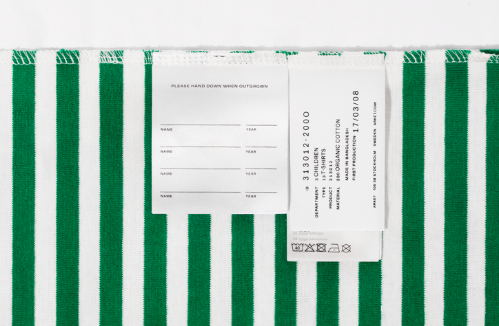
Arket: ID label (right), children’s inherit label (left)
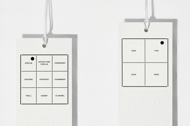
Arket: Hangtags, featuring characteristic grid
Now a number of Arket stores have launched across Europe, the latest opening in Munich tomorrow (13 October), Michael explains the feeling of seeing the stores finally open has been “very satisfying to see all the parts come together”. “For most, if not all of us in the team, it’s a unique project in that it was conceived and carried in such a holistic way, and over a relatively long period of time.”
To represent this momental effort, Arket’s design team has created a 536-page publication, documenting the overarching theme of the brand and displaying details such as the prints made from Francois Ducharne’s fabrics, Carina Seth Andersson’s ceramics for the shop, and nods to materials, tailoring and suppliers. “It’s a visual archive of our first collections, supplies, stores and other elements that Arket is made up of at the time of its launch, many of which will remain so for years to come.”
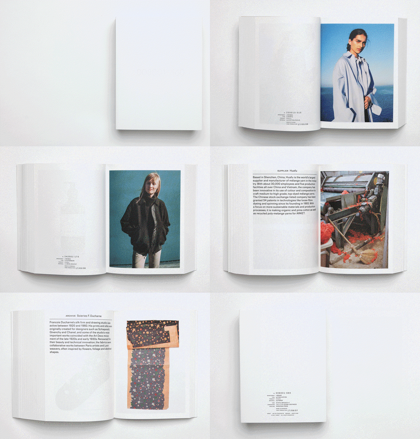
Arket: Publication
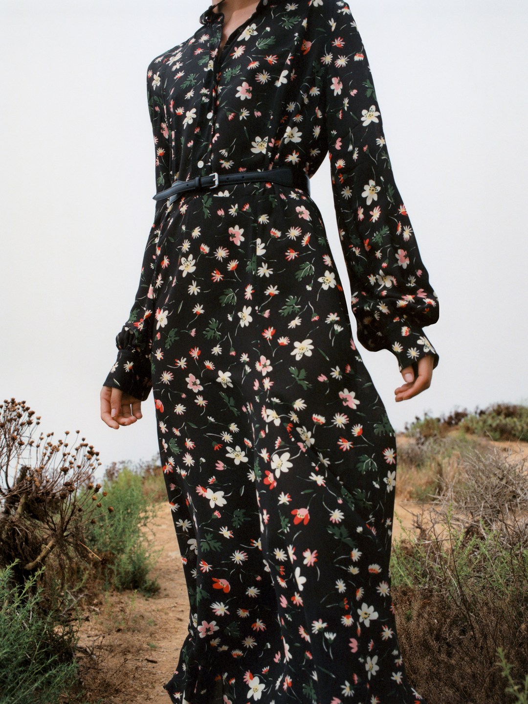
Arket: Ducharne archive
Arket: Ducharne archive
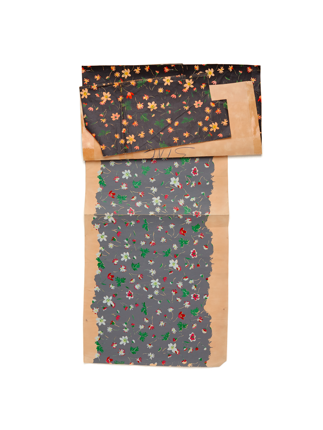
Arket: Ducharne archive
“We took the decision to make the publication for several reasons, probably the most important one being that we wanted a way to preserve the work that so many had put into creating the brand over a 2-and-a-half-year period,” explains Michael. Although there is a personal attachment to the work within the publication, it a physical representation of the brand’s ethical and enticing values which encompass a love of product rather than throw-away culture. To see for yourself, any orders made on arket.com today (12 October) will also receive a publication in their delivery.
After two years of research, tests and discussion, now Arket’s design team’s hard work is unleashed on the world Arket explain the plan is “to iterate, refine and focus on communicating what we have”. After refining the identity as much as they have — but still endeavouring to keep it broad — the room for experimentation and opportunity is endless.
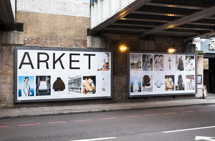
Arket: Pre-launch posters, Old Street, London
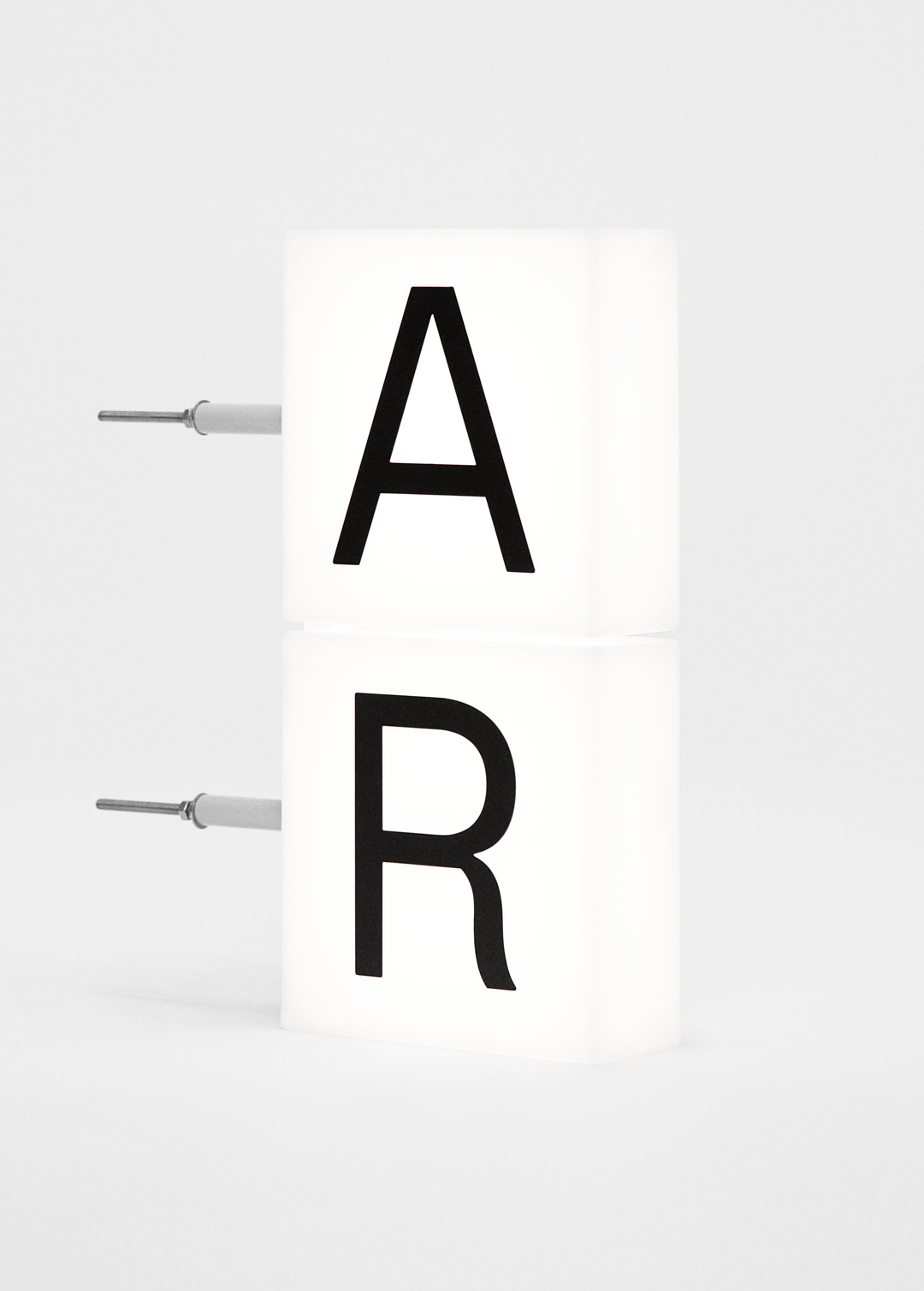
Arket: Exterior signage prototype
Arket: Internal way finding
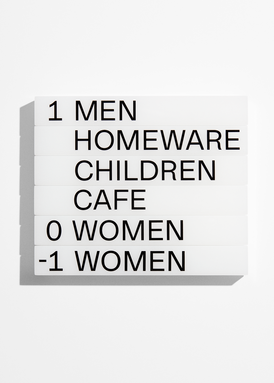
Arket: Internal way finding
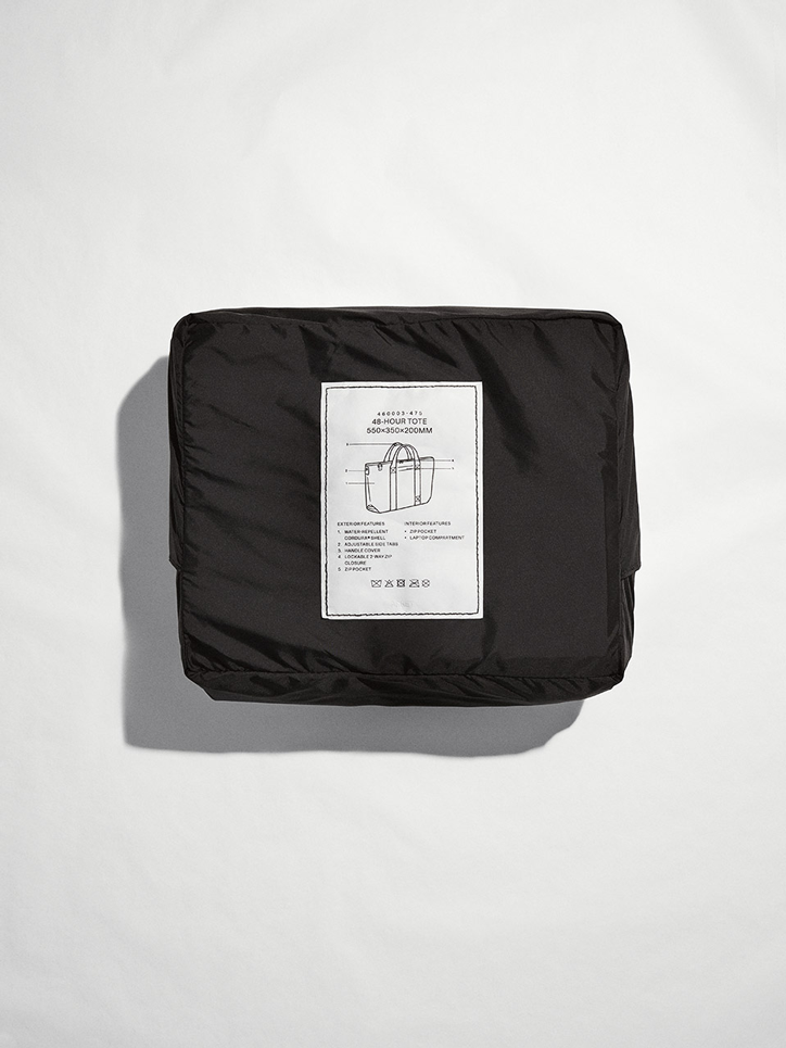
Arket: Luggage series
Arket: Children’s functional outerwear label
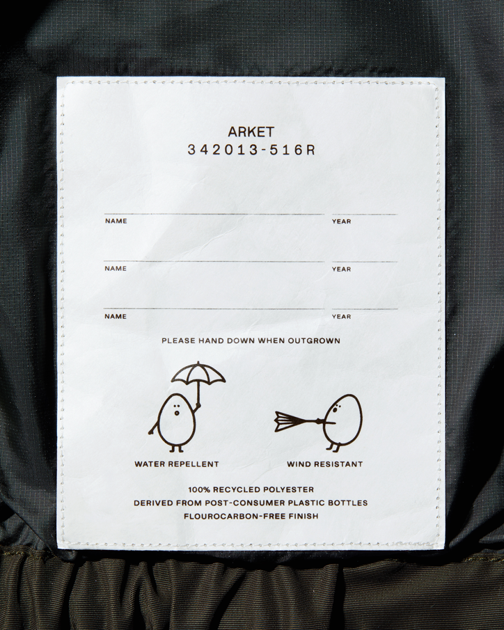
Arket: Children’s functional outerwear label
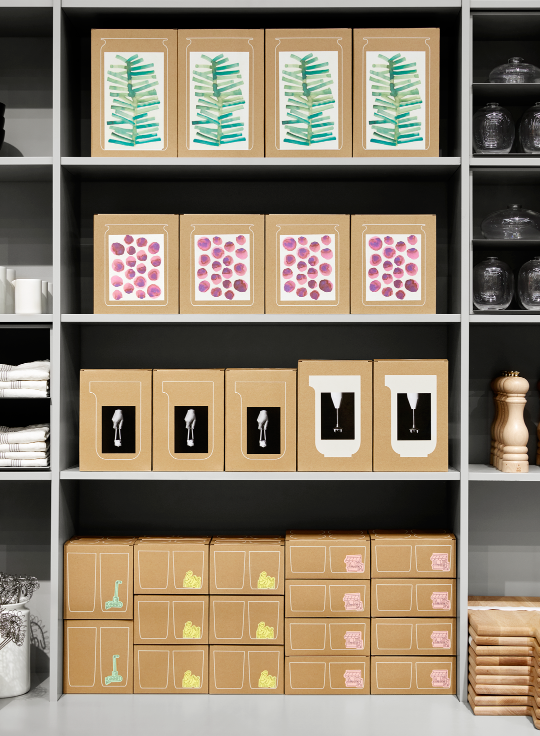
Arket: Homeware packaging
Arket: Homeware packaging
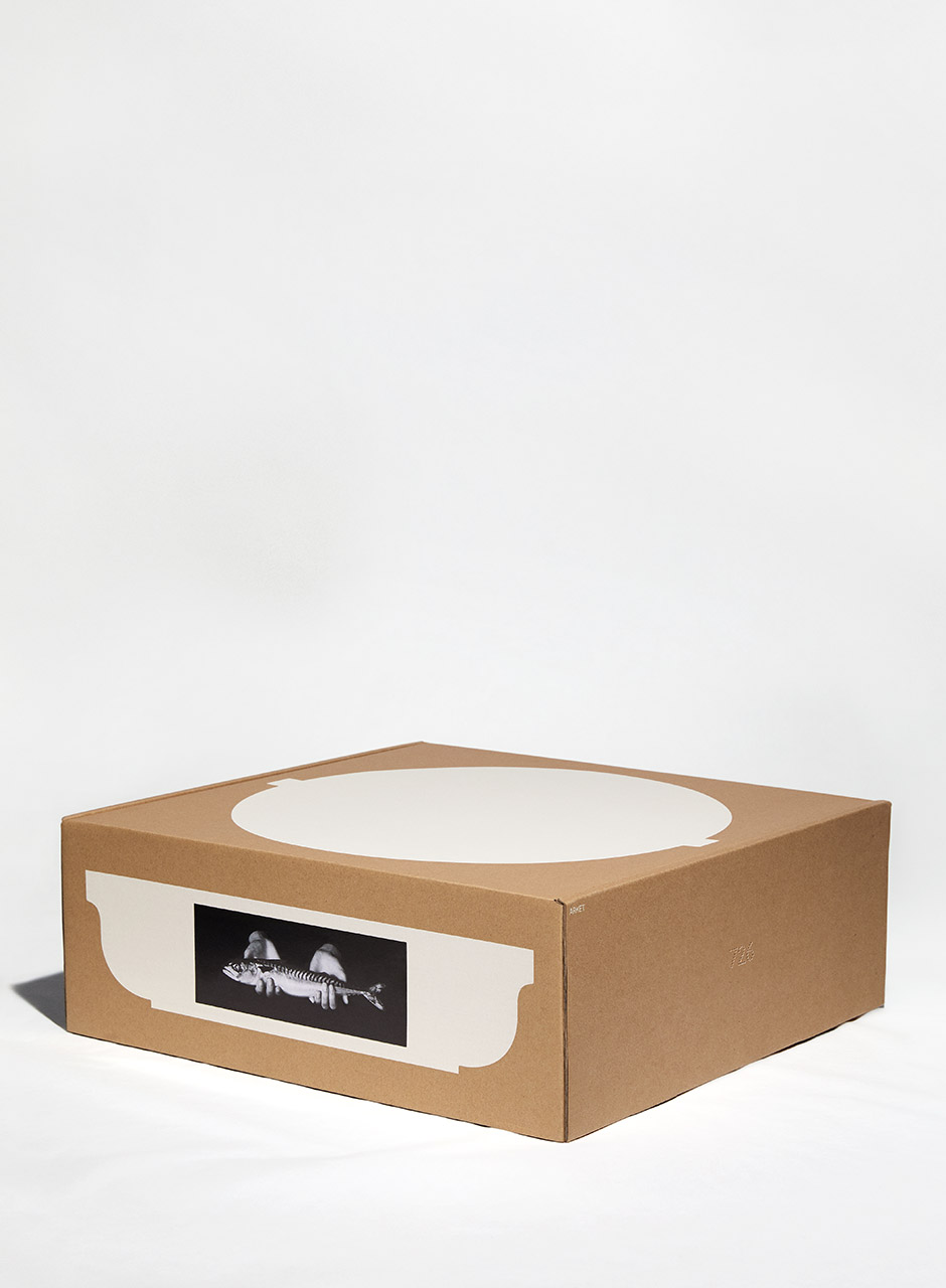
Arket: Homeware packaging
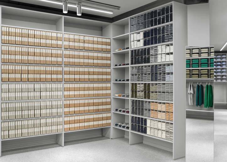
Arket: Sock and underwear packaging
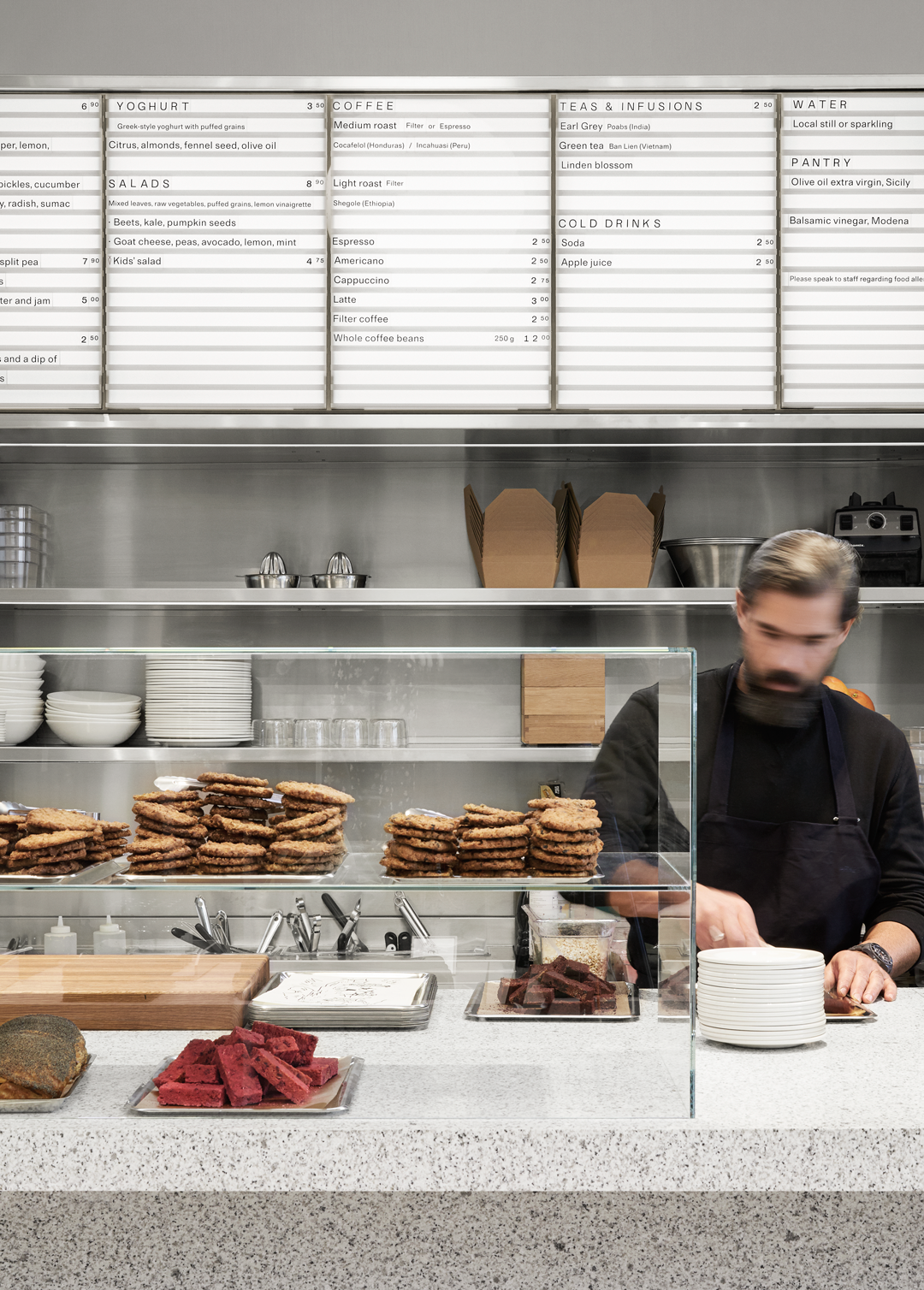
Arket: Café menu board
Arket: Coffee coin
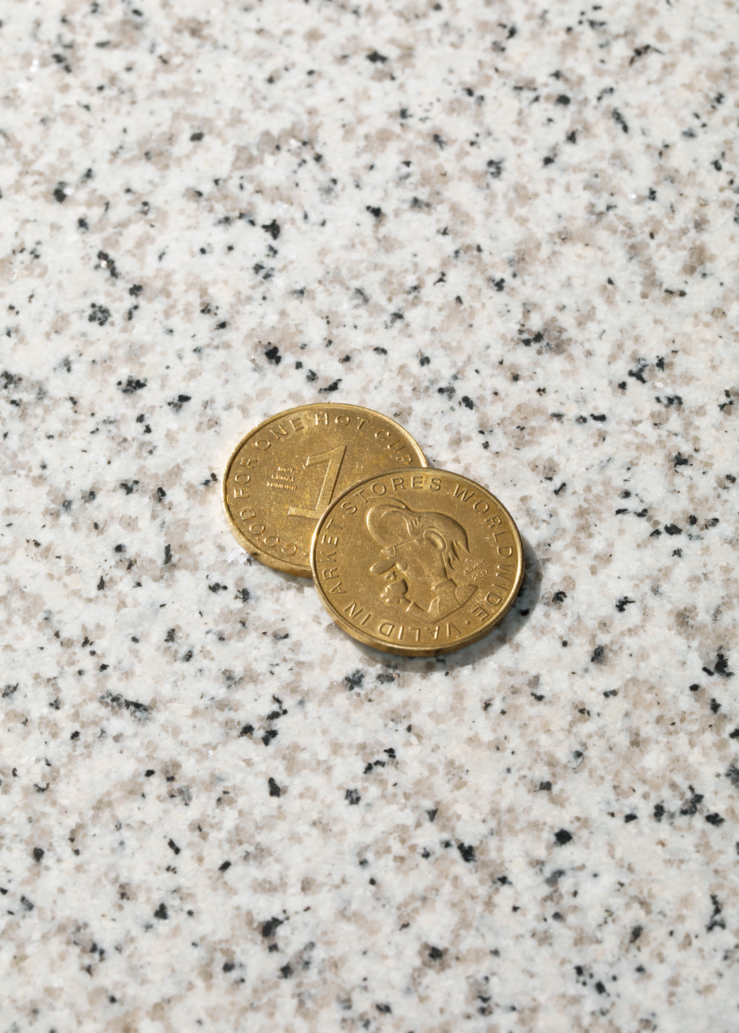
Arket: Coffee coin
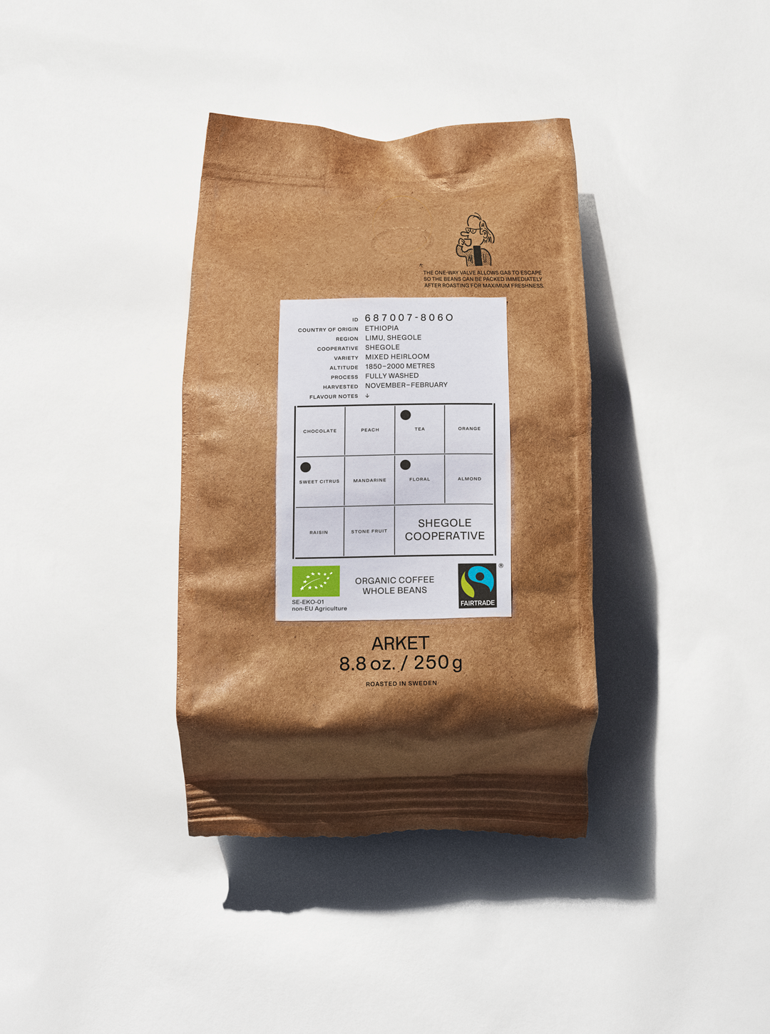
Arket: Coffee
Arket: Tray in lay
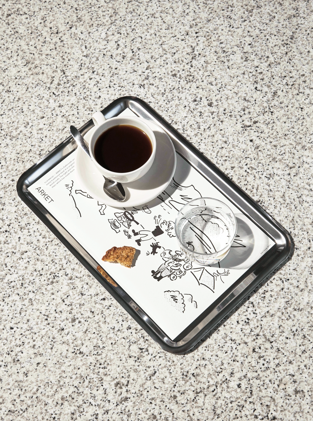
Arket: Tray in lay
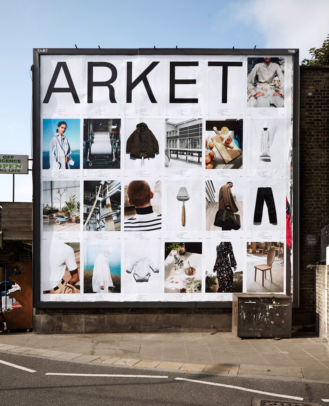
Arket: Prelaunch posters, Broadway Market, London
Share Article
Further Info
About the Author
—
Lucy (she/her) was part of the It’s Nice That team from 2016–2025, first joining as a staff writer after graduating from Chelsea College of Art with a degree in Graphic Design Communication, eventually becoming a senior editor on our editorial team, and most recently at Insights, a research-driven department with It’s Nice That.



