Anti’s community-led identity for Kulturhavna captures the power of participatory design
Designed and developed to evolve and adapt, Anti’s brand shows how design can service the community around it.
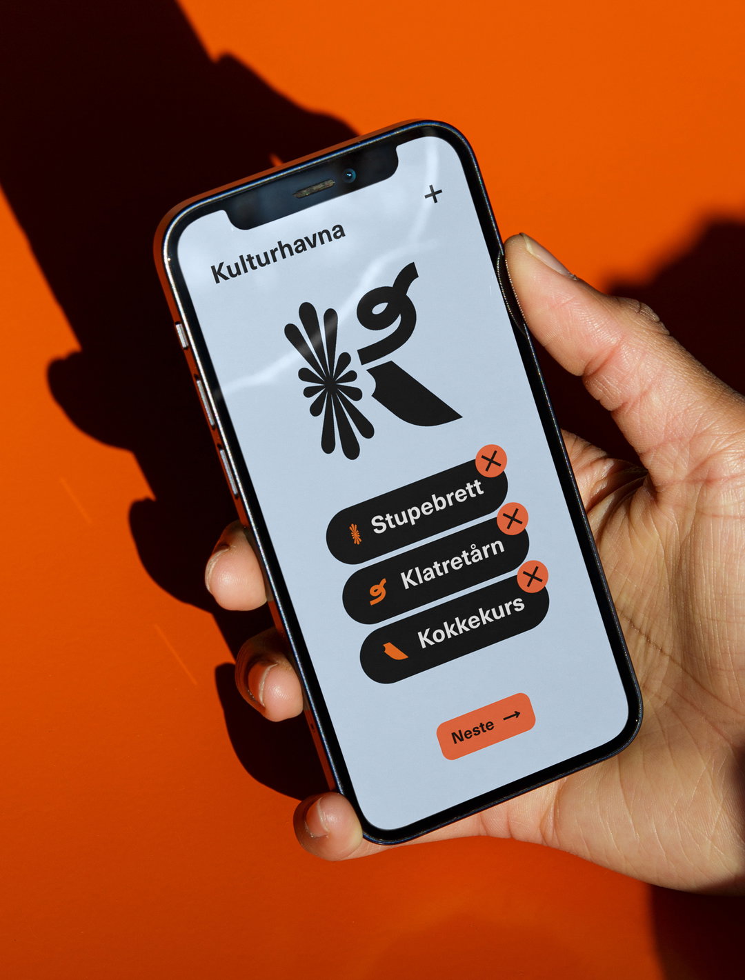
Norwegian creative agency Anti has created the identity for Kulturhavna, a community-led, urban development project based in Ålesund – a historic port city on Norway’s west coast. Shaped by its environment, the brand adapts, moves and morphs depending on its application, similar to how the development itself changes to meet its residents’ needs. “It is a temporary space for play, exploration, relaxation, and expression, evolving as it is utilised,” Anti’s creative director and designer, Mats Ottdal, explains. Anti worked closely with the project’s owner to learn about the ethos of the space: “The philosophy behind Kulturhavna’s brand is rooted in community participation,” Mats says. “Instead of imposing a fixed design, the brand is a living system that grows and changes based on user input.”
Mirroring Kulturhavna’s core beliefs, the subsequent identity is iterative and comprises a visual system based on 375 illustrative components and 125 activity icons, culminating in almost two million possible configurations. The team also needed to work against mainstream Norwegian public planning and development, which is often unengaging, failing to meet a broad audience. “We needed to develop a digital tool that could reach more people and invite meaningful participation,” Mats says. “It should be both simple and inspiring, this platform was designed to not only be functional but also contribute to an identity reflecting the temporary and ever-changing nature of the urban space.”
In line with Margaret Calvert’s quote “reducing the appearance to make the maximum sense at the minimum cost, ” Mats adds: “It wasn’t just about aesthetics but about translating people’s voices into visual elements.” As such, Anti opted for grotesque sans serif, Neue Haas Unica – an infamous hybridisation of Helvetica, Univers and Akzidenz Grotesk that’s renowned for its pragmatism. “This font is urban, informative, readable, and clear,” Mats says. “It provides a clean and structured contrast to the complex icon system,” and serves as a practical, accessible and understated foundation for the adaptable logomark and illustrations to flex upon.
One challenge Anti faced when developing the identity – considering its breadth and complexity – was ensuring a sense of cohesion across both digital and physical spaces. “The icon system had to adapt to everything from large signage to mobile screens without losing clarity or impact. Additionally, the participatory process added complexity,” Mats says. “It was also crucial that the identity had a functional purpose and meaning within the participatory process,” he notes, “ensuring it was not perceived as merely decorative.”
Anti’s persistence through the project’s challenges was worth it. A gratifying experience by all accounts, the participatory process lead to exciting and tangible outcomes, such as Kulturhavna’s skate park, sauna, festivals, basketball court and mini golf. Having shaped something that can action real change and foster a genuine sense of belonging though medium and creativity, Mats says that, “it’s inspiring to know that the brand is not just a logo but also a tool.” He continues: “The most rewarding part is seeing how the local community has started using the platform, watching ideas move from digital votes to reality demonstrates the power of participatory design.”
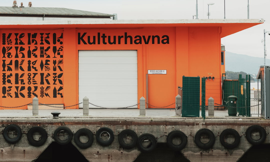
Kulturhavna (Copyright © Memoria, 2024)
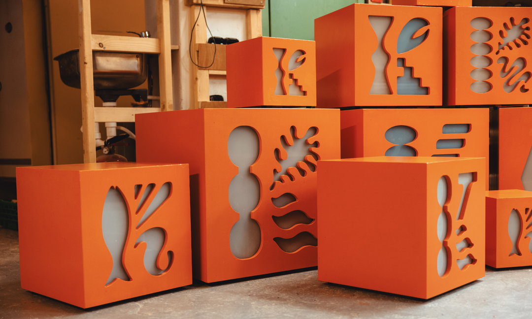
Kulturhavna: Crafted light cubes by Adrian Krogsæter (Copyright © Memoria, 2024)
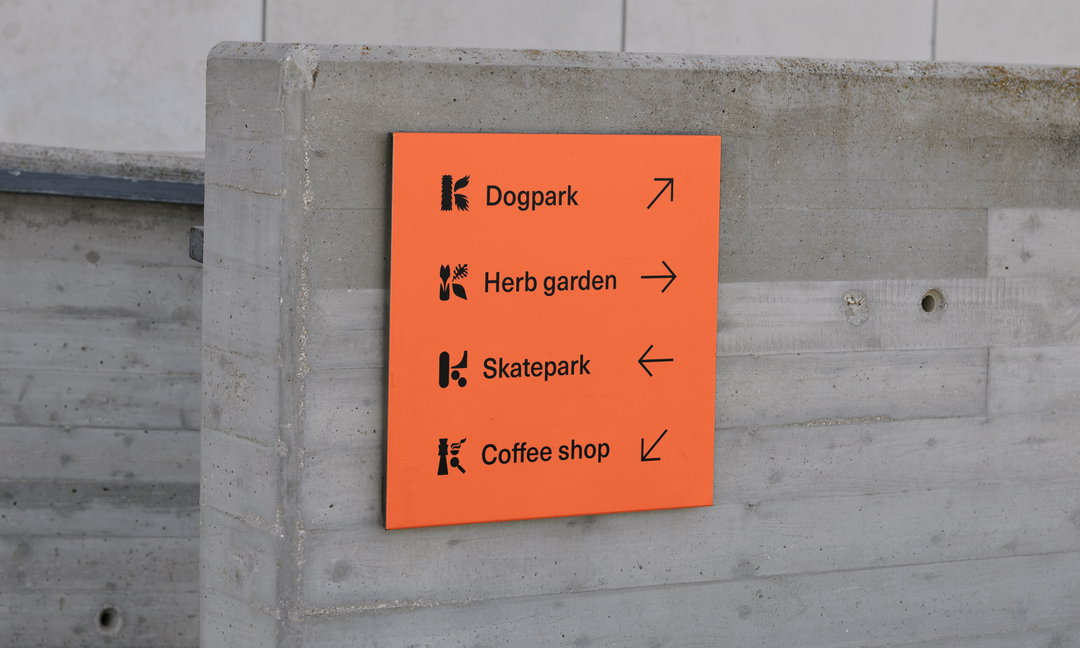
Kulturhavna: Signage (Copyright © ANTI, 2024)
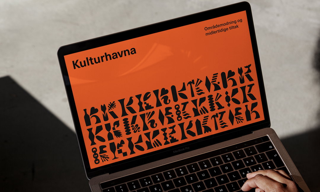
Kulturhavna (Copyright © ANTI, 2024)
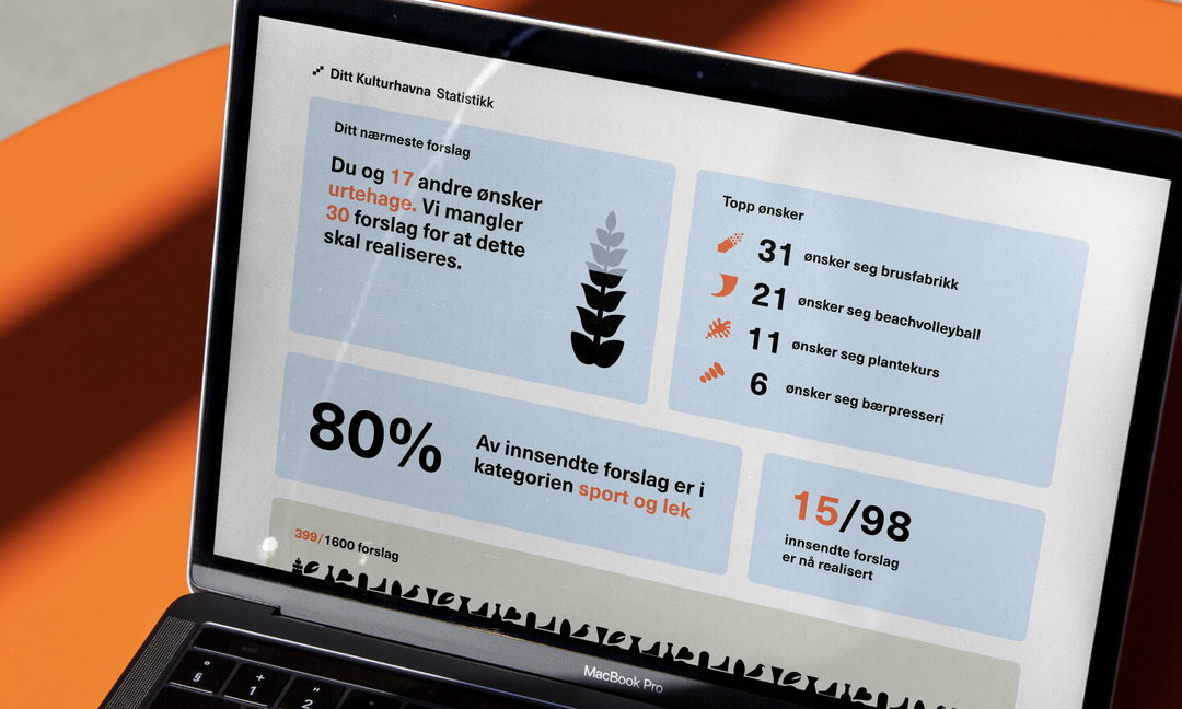
Kulturhavna: Data Overview (Copyright © ANTI, 2024)
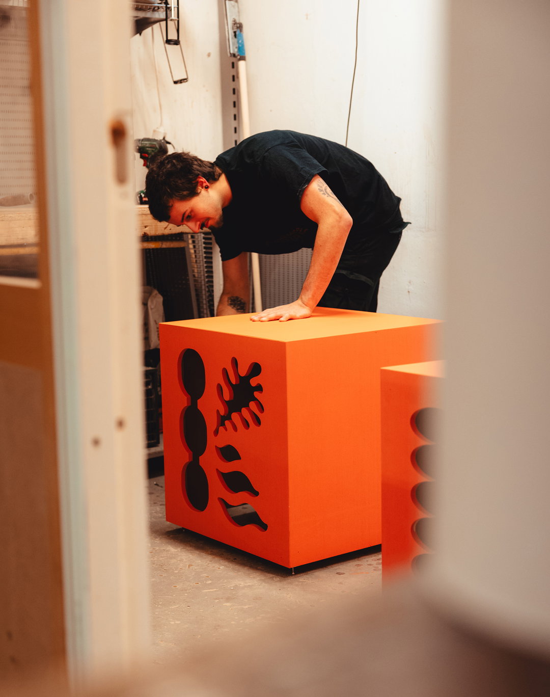
Kulturhavna: Crafted light cubes by Adrian Krogsæter (Copyright © Memoria, 2024)
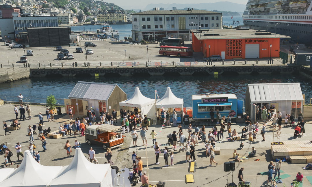
Kulturhavna (Copyright © Memoria, 2024)
Hero Header
Kulturhavna (Copyright © Memoria, 2024)
Share Article
Further Info
About the Author
—
Hailing from the West Midlands, and having originally joined It’s Nice That as an editorial assistant in March 2020, Harry is a freelance writer and designer – running his own independent practice, as well as being one-half of the Studio Ground Floor.