Revel in the retro-infused artwork of Aaron Lowell Denton
The Indiana-based designer and illustrator makes dreamy artworks for the likes of Devendra Banhart, Tame Impala and The War on Drugs, channeling their sound through abstract imagery and idiosyncratic type.
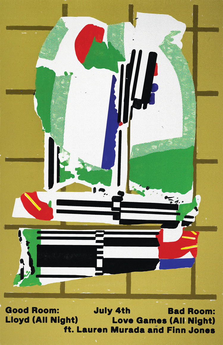
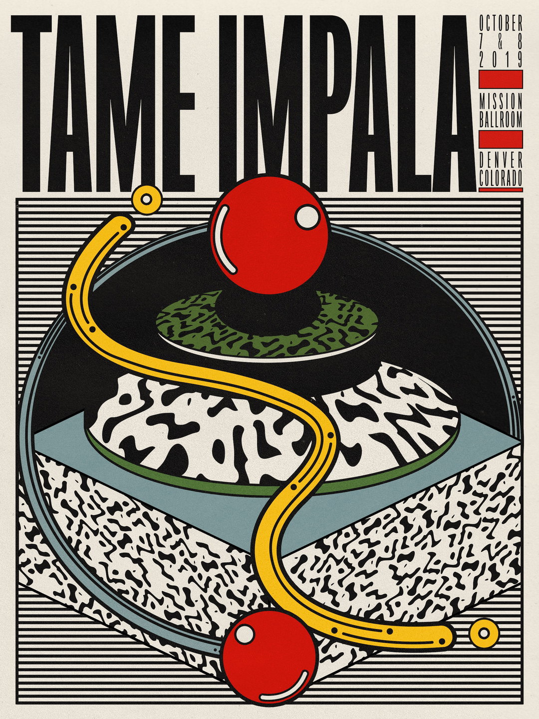
With its vibrant colours, abstract patterns and nostalgic vibes, the artwork of Aaron Lowell Denton has drawn the attention of some of the world’s best loved musicians. Devendra Banhart, John Maus, Stereolab, Tame Impala, The War on Drugs, Coin, Anemone, Makaya McCraven and Manu Dia have all commissioned the designer and illustrator to convey their sound through his covetable aesthetic. We last featured him a few years back, and since then his works have become more refined, detailed, and confident with shape and typography, while he’s moved on from just posters to album artwork, logos and LP layouts.
“For this interview I was looking back at some of the work I was doing in 2017 and couldn't even recognise it as my own, in a way,” Aaron says. “It's just a multitude of small changes that end up feeling like a real shift in vibe. I still do a lot of poster work, which is great for experimenting and trying out new things, but I've been enjoying the more collaborative environment of the more involved commissions. It's fun to discuss an idea and develop someone else's vision as opposed to always just living in your own visual environment. I guess it comes down to leaving the comfort zone.”
Aaron is part of a realm of illustration and design including the likes of Robert Beatty and River Cousin, who use gradients and surrealism to create dreamlike imagery. Aaron previously told us he looks to the likes of Kandinsky, Miro and Bridget Riley for inspiration, while his more recent work has pushed him into less abstract compositions – such as the projects for Coin, Tame Impala and Banhart – though the content of the images is still up for interpretation. “I like the challenge of representing an idea or sound with concrete imagery,” he says. “Essentially I'm trying to be more of an illustrator than I used to be, and I've learned a lot in trying to make that happen. I've also dived more into typography than I used to. I can get it in my head that each commission has a typeface that's meant for it, and if I can find it the rest of the piece will come together around that. At least that's been my intuition as of late.”
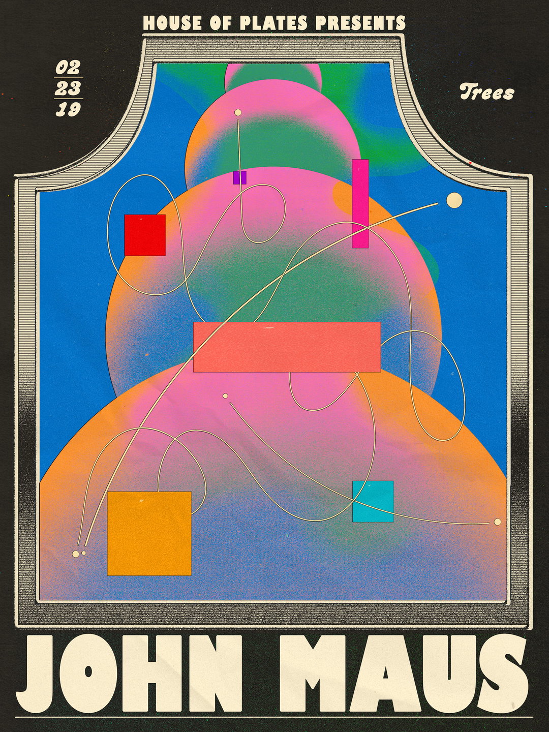
Aaron Lowell Denton: John Maus, Trees
Probably his “most seen” artwork, Aaron says is the record cover for Texas Sun, a collaboration between the band Khruangbin and Leon Bridges, which was shown in Times Square on the day of release. Bassist Laura Lee had “a pretty clear idea of what she wanted things to look like,” Aaron describes of the brief. “The first few drafts were pretty involved and I think too complex for what was needed. Eventually we settled on something pretty straightforward. It's a simpler design then I'd typically do but it fits the vibe of that music well. It was a nice reminder that sometimes less really is more.”
Similarly a visual departure from the bulk of his work, but a project Aaron is really proud of, is the poster for a Stereolab show. While the show was cancelled due to the coronavirus lockdown, Aaron is still happy to have worked with a band that he’s loved since he was a teenager. “I was given carte blanche to make whatever I wanted,” he explains of the project. “At the time I had just bought a few books on logo and typeface from different decades, and specifically this book Applied Typography really charmed me. There's all these Japanese logos in it from the 60s and 70s. One was this little robot character comprised of several ordinary shapes. I thought the composition was really clever and playful. That was definitely an inspiration for the finished design.” The result is a two-colour artwork that demonstrates Aaron’s knack for assembling geometry in brilliantly inventive ways, and a great example of his new ventures into type, with the band’s name built from simple shapes.
“I like to take on projects that feel slightly out of my wheelhouse,” he concludes. “It's fun to feel lost at the beginning of a commission and then find your way through.”
GalleryAaron Lowell Denton
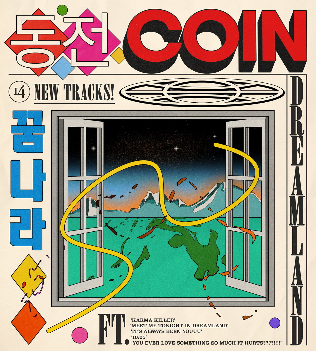
Coin
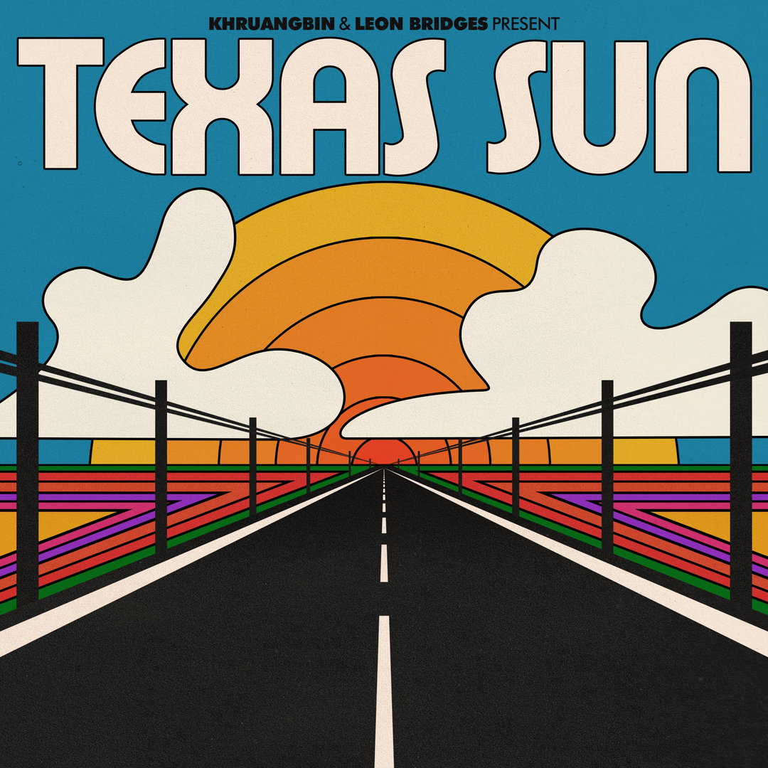
Texas Sun
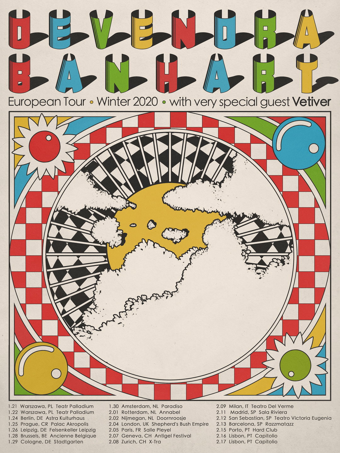
Devendra Banhart
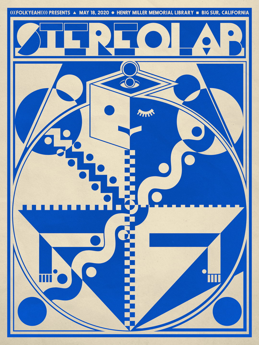
Stereolab
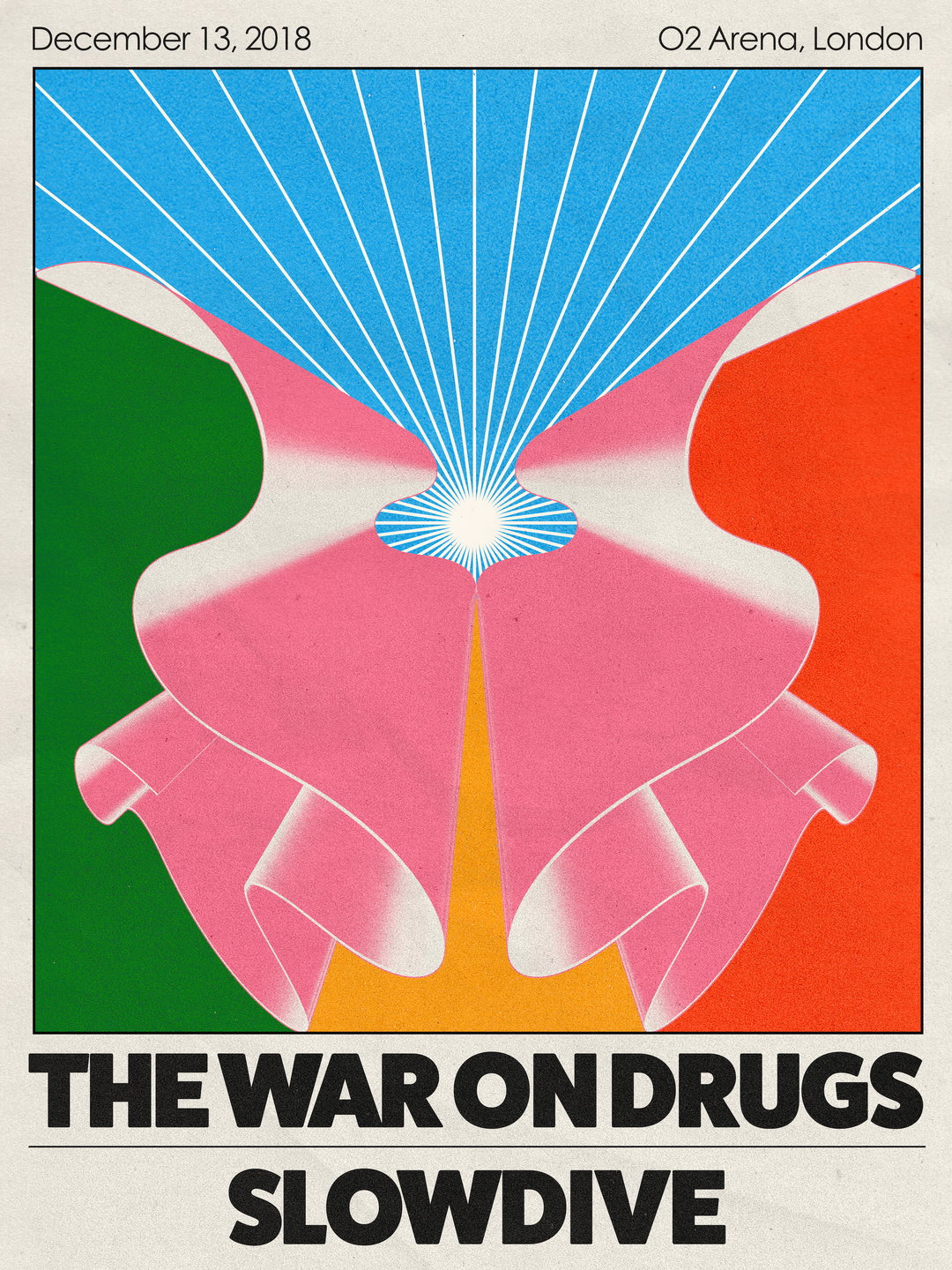
The War on Drugs
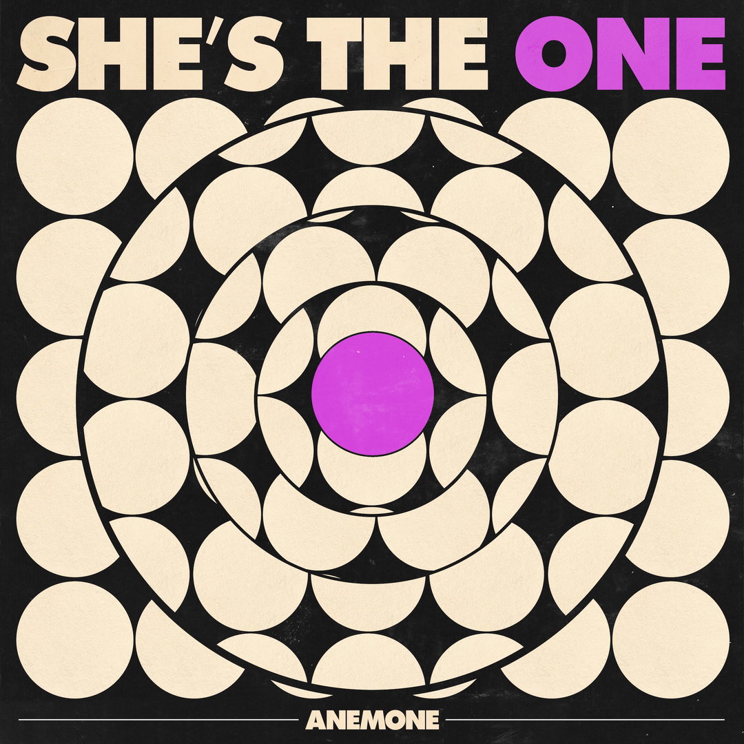
Anemone
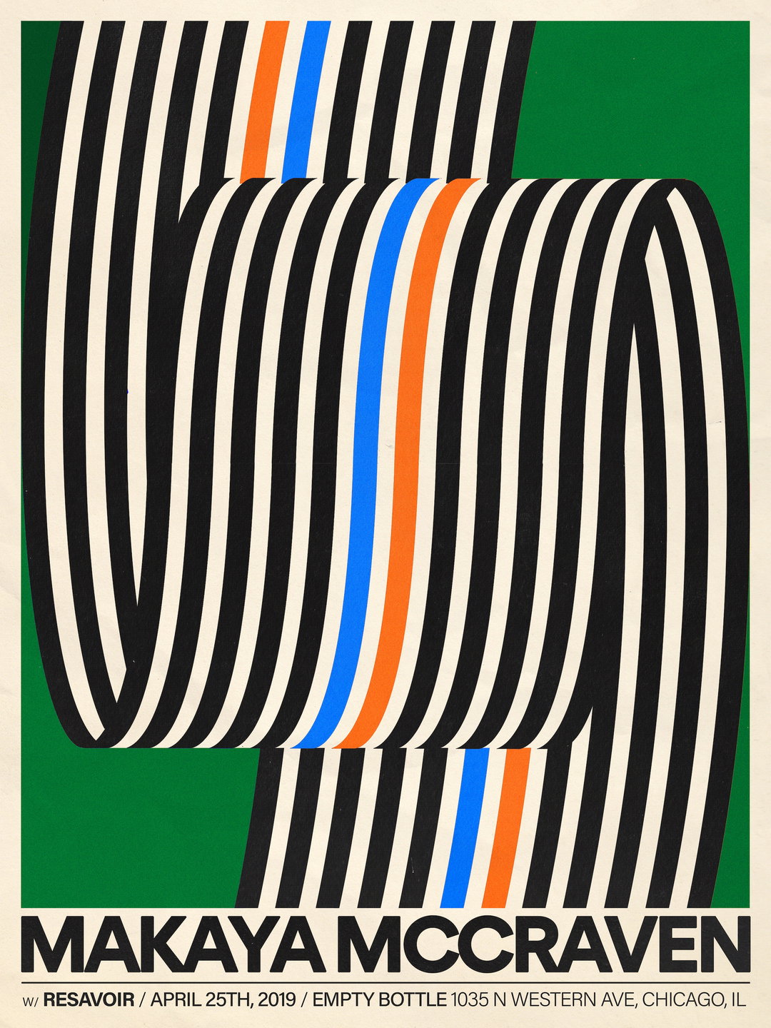
Makaya McCraven
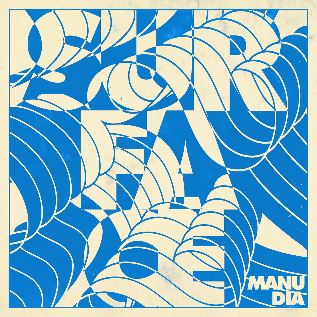
Manu Dia

Echo City Music Lab
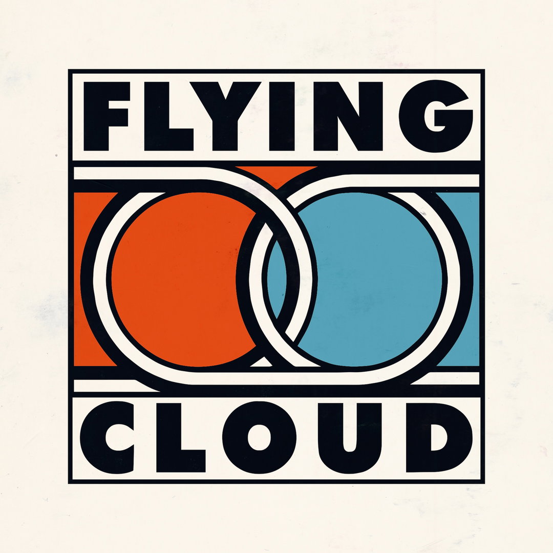
Flying Cloud
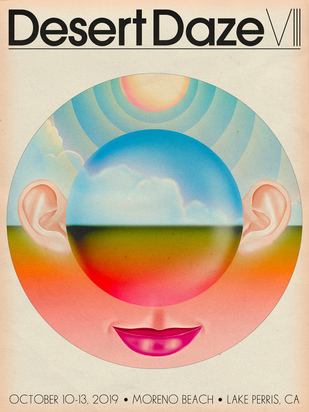
Desert Daze
Hero Header
Aaron Lowell Denton: Tame Impala
Share Article
About the Author
—
Jenny oversees editorial output across It’s Nice That. Get in touch with writing pitches for features or opinion pieces, big creative story tips, or questions about all things editorial. jb@itsnicethat.com
To submit your work to be featured on the site, please see our Submissions Guide.