




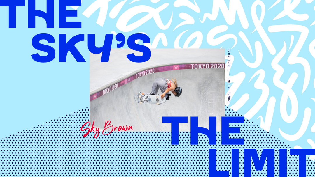
With Paris 2024 getting closer, a new look has been unveiled for Team GB by Thisaway and typographer Lewis McGuffie. The project hinges on a simple dilemma. Enthusiasm and engagement in the Team GB brand is obviously at high levels during the summer and winter games, but how do you keep the fire burning outside of that cycle? This rebrand tackles other aims too, like generating interest from younger fans and setting the brand up for a digital-first future.
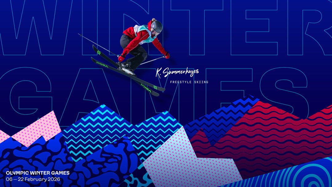
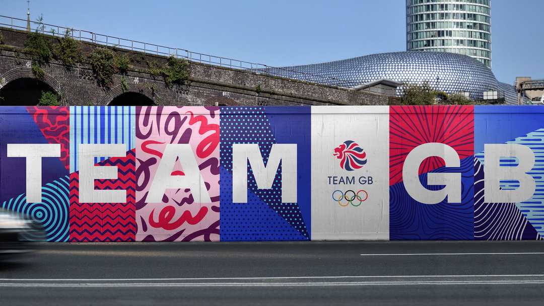
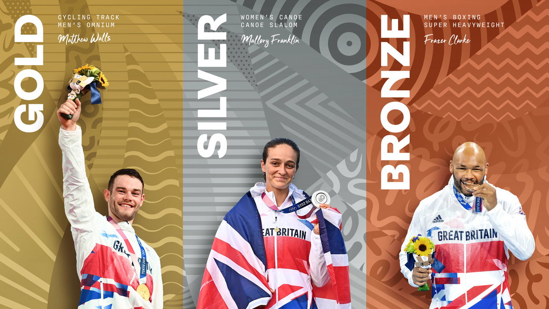
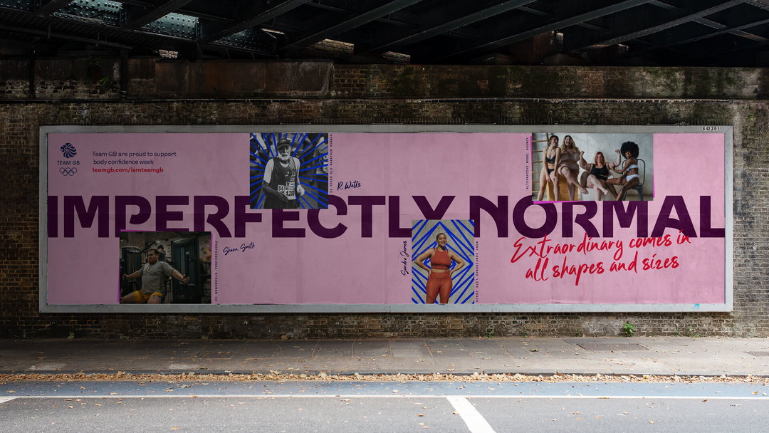
The old Team GB brand hasn’t been thrown out entirely. For example, the logo marque remains unchanged, which aligns with Thisaway’s mission to deepen engagement with existing brand heritage. You might spot that it all looks busier than usual as well, thanks to a new identity based on a set of decorative patterns. Thisaway says these patterns are inspired by qualities that make a successful athlete and are “intentionally abstract” to avoid association with any one particular sport.
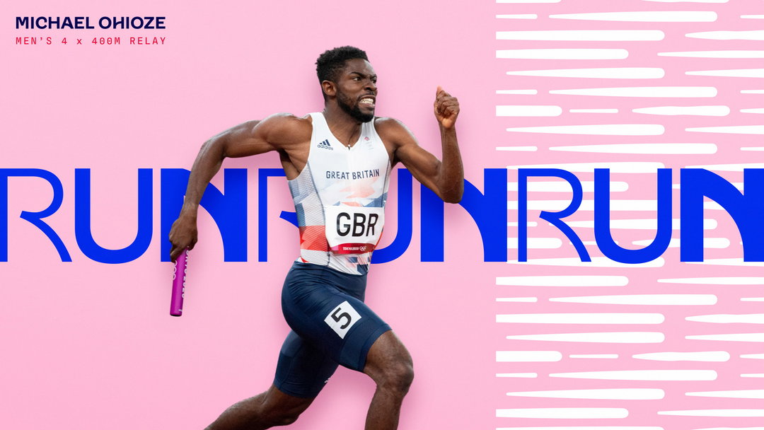
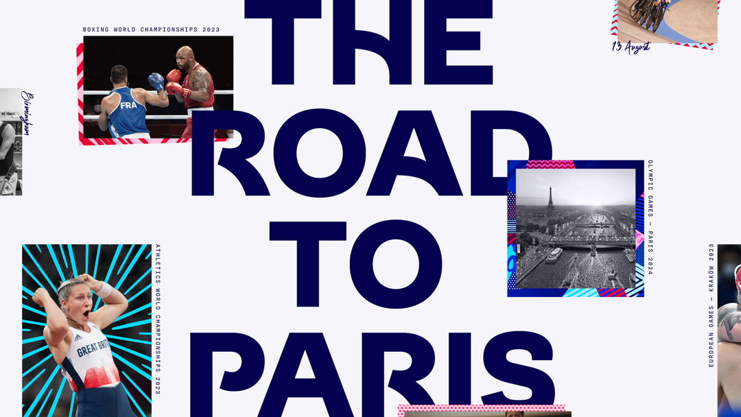
The existing red, white and blue palette has been extended – vibrant pinks and purples tie in with the expressive patterns now embedded across the brand. Lewis McGuffie has also created the new typeface, Team GB Sans, which includes a set of stylistic alternates that, as described in the press release, “reflect movement, energy and diversity”.
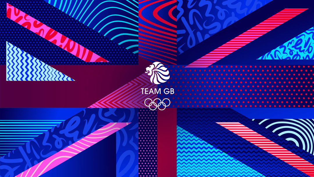
Thisaway: British Olympic Association, Team GB, typography by Lewis McGuffie (Copyright © Thisaway, 2023)
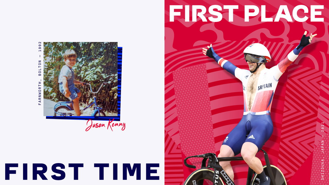
There has also been a shift in positioning from ‘Believe in Extraordinary’ to ‘Everyday Extraordinary’. Rather than focusing solely on athletic milestones, Team GB wants to place more emphasis on the ordinary people who make up Team GB, from its athletes to fans.
“Team GB is a household name that has a special place in the heart of the nation,” says Graeme Cook, Thisaway founder and creative director. “However, while awareness of the brand is very good, few people know what they stand for or what they look like. We’ve created a positioning that helps the brand tell the amazing stories and personal journeys of both elite athletes and everyday people. The new identity is now more memorable and iconic, and has the flexibility to be dialled up and down throughout the four-year Olympic cycle. We are delighted and proud to play a small part in helping the brand prepare for Paris 2024 and beyond.”
GalleryThisaway: British Olympic Association, Team GB, typography by Lewis McGuffie (Copyright © Thisaway, 2023)
Hero Header
Thisaway: British Olympic Association, Team GB, typography by Lewis McGuffie (Copyright © Thisaway, 2023)
Share Article
Further Info
About the Author
—
Liz (she/they) is the senior editor at Insights, a research-driven department within It’s Nice That. They previously ran the news section of the website. Get in contact with them for potential Insights collaborations or to discuss Insights’ public-facing reports.





