Designing The Guardian’s new Saturday magazine
We hear how the team behind the newly launched publication created a fresh visual identity for it, and how they got the first issue onto newsstands.
Share
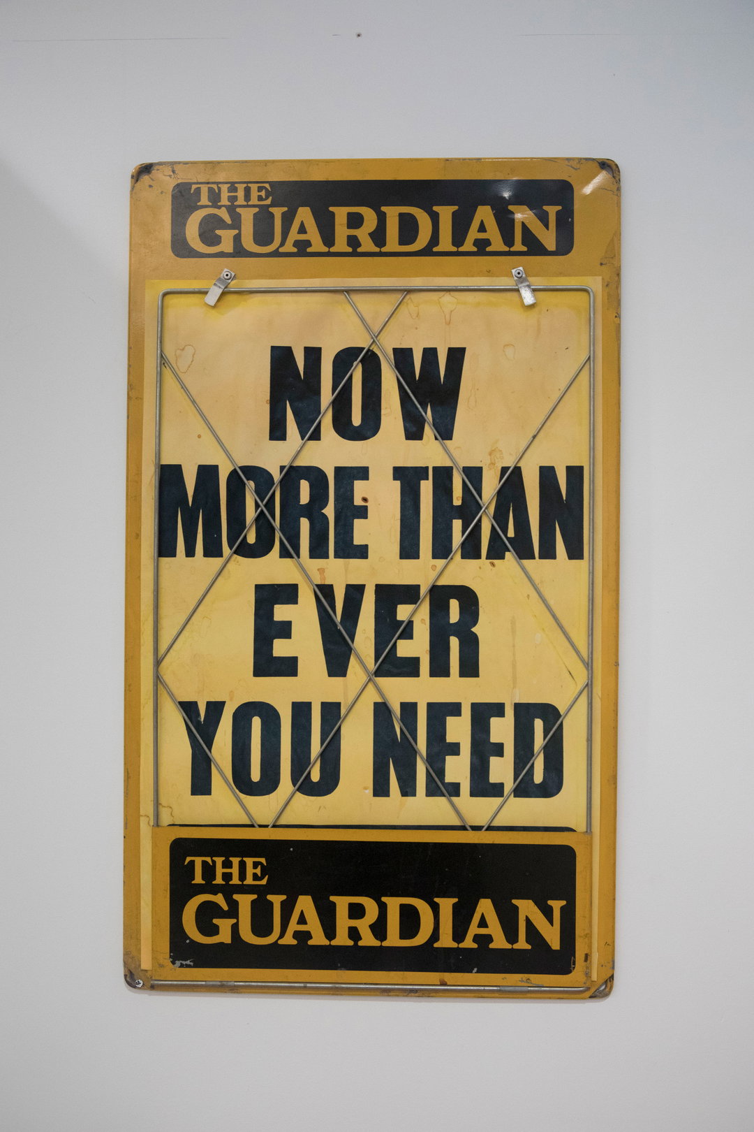
Outside the office of Katharine Viner, the editor-in-chief of The Guardian, there’s a poster on the wall with an urgent message spelt out in punchy typography. “Now more than ever, you need the Guardian,” it reads. This poster formed an important part of the inspiration for the team that just this past weekend launched the newspaper’s new Saturday magazine.
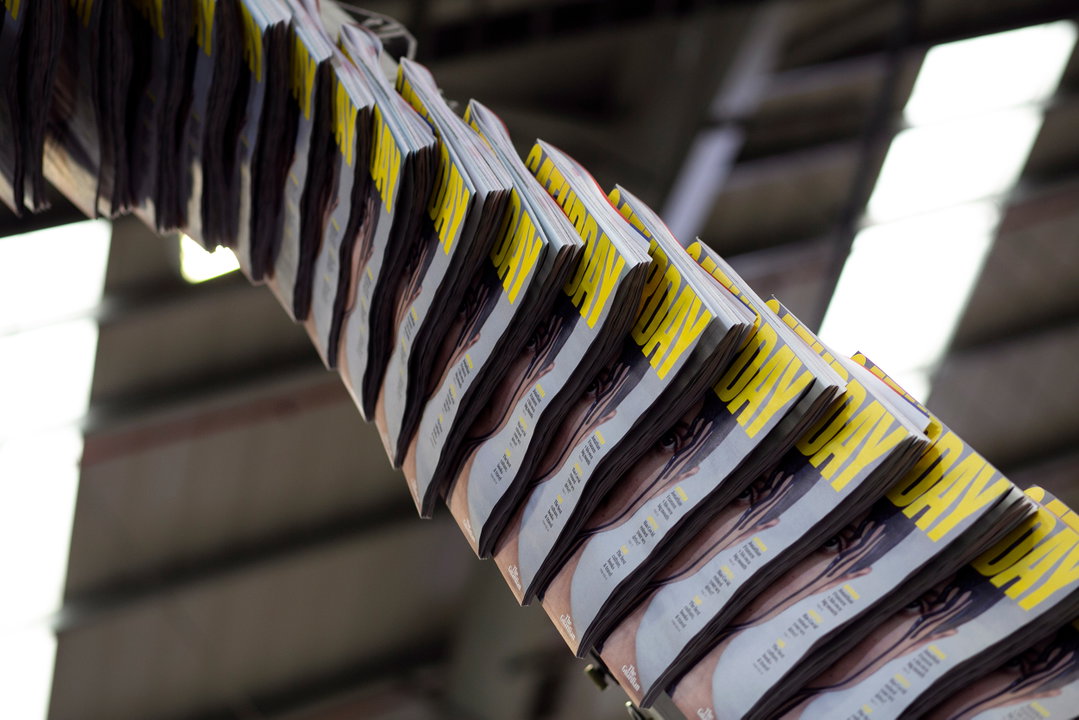
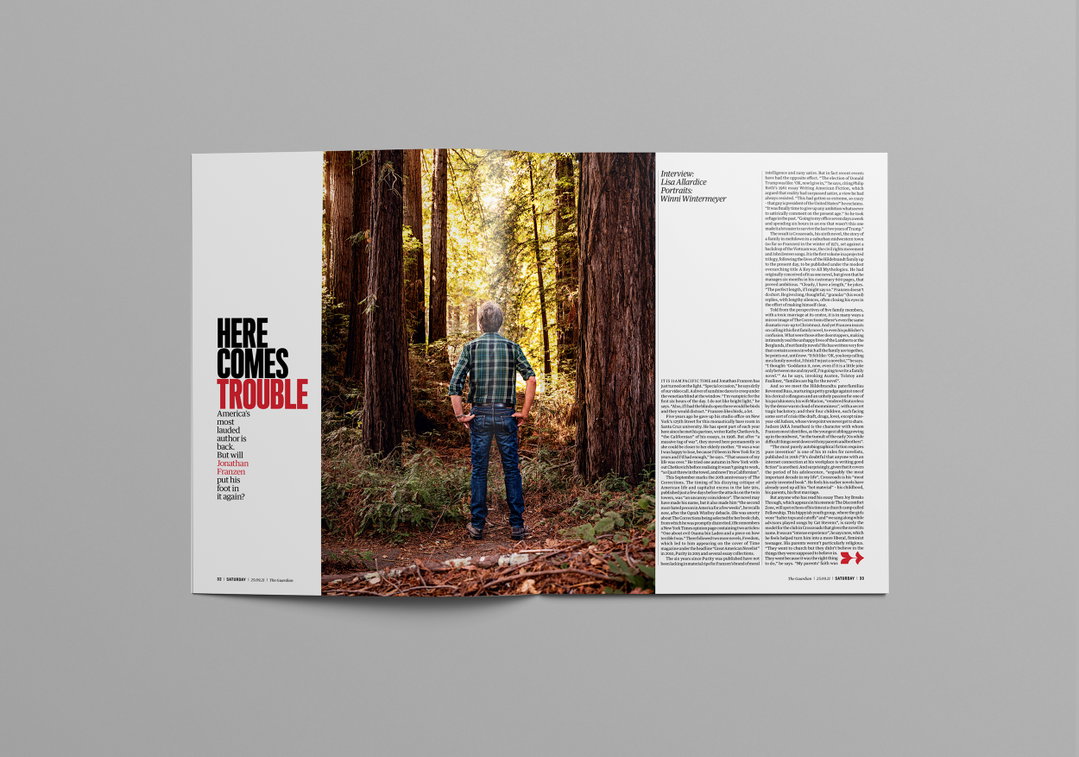
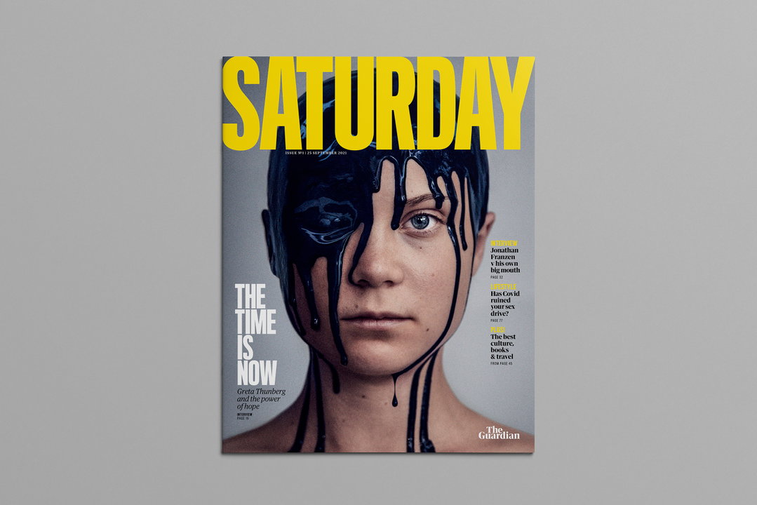
The magazine’s design team took a lesson from that impactful use of typography, deciding in the end to opt for Titling Gothic Skyline by Font Bureau for their bold new openers. As Chris Clarke, the newspaper’s deputy creative director, puts it: “Bold times call for a bold typeface.”
Chris worked with creative director Alex Breuer, alongside art directors Maggie Murphy, Sara Ramsbottom and Suzanne Lemon, on the new magazine, which felt like a significant departure from the previous design language of the paper and its supplements. “We felt that we’re in a secure enough position with our brand language that we can depart from our core palette and introduce this new typeface,” he tells It’s Nice That, adding that the new typeface is aimed at reflecting “the bravery and dynamism of our journalism”.
GalleryThe Guardian: Saturday magazine (Copyright © The Guardian, 2021)
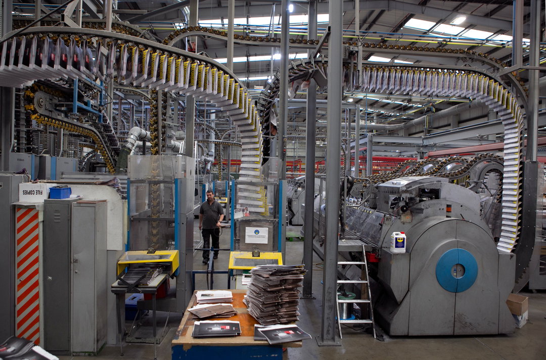
In terms of format, the team has opted for the largest size possible, maximising page area and minimising paper waste at the print site. The magazine’s standard length is 112 pages and is designed with what Chris describes as “a horizontal grid structure that underpins everything and ensures familiar alignments across the magazine”. This grid, and the bigger font size the team has used within the body copy, has ensured enhanced readability.
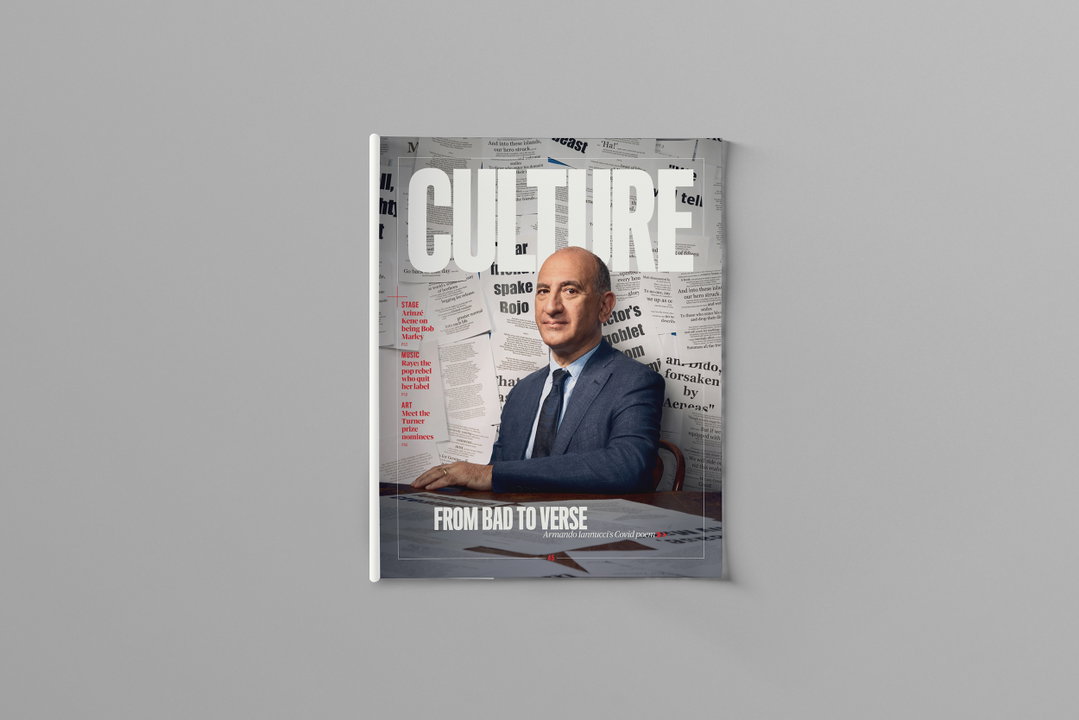
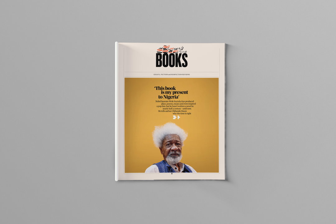
Readers will find the publication broken up into four discrete sections, each with its own vibrant colour palette to keep it distinct from the rest: Cuttings, Features, Culture, and then Lifestyle, which contains Books and Travel. “In a magazine of this size, navigation is vital,” says Chris, “and we refined the sections down to key themes to help the reader orientate themselves.”
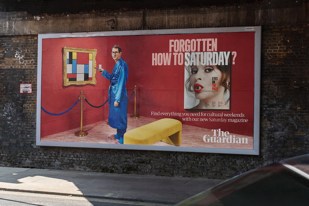
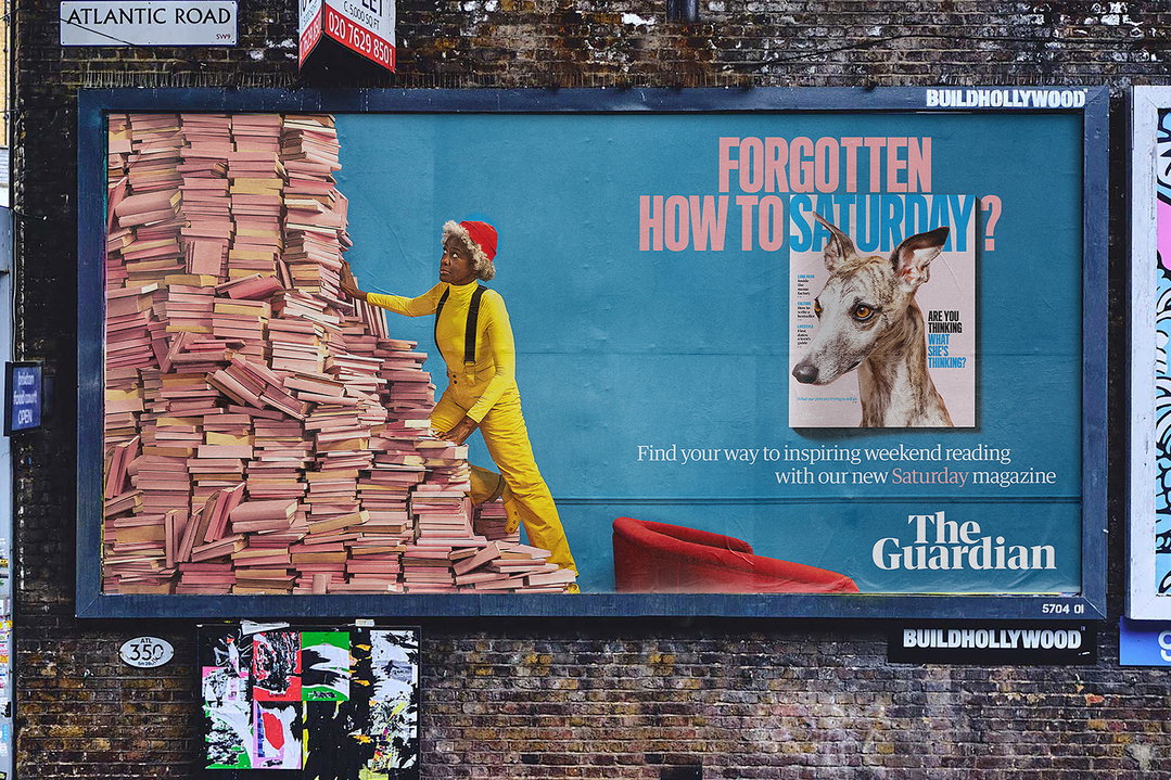
To promote the new magazine around the UK, the team also worked on a campaign which is running currently across social media and out-of-home billboards. The witty campaign plays on our pandemic-induced collective rustiness when it comes to going out, visiting cultural sites, travelling and eating in restaurants. “Forgotten how to Saturday?” the campaign asks, turning the day of the week into a verb that encompasses all of the weekend pursuits we used to be so accustomed to, but which now feel quite alien. The accompanying visuals depict a cast of slightly hapless individuals, who seem to have forgotten over the past 18 months and multiple lockdowns exactly how to visit a museum, choose a book to read, and dress up for an evening out and about.
GalleryThe Guardian: Saturday magazine (Copyright © The Guardian, 2021)
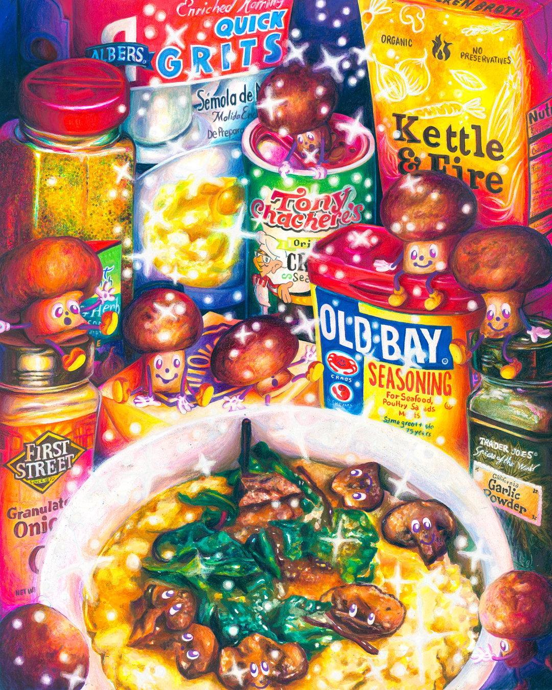
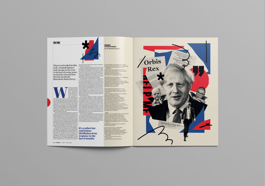
Flicking through the magazine, you’ll come across some uplifting use of illustration, from a fresh set of illustrated bylines by portrait artist Delphine Lee to some mascot-style spot illustrations by Lalalimola, which create what Chris calls “nice moments of joy”. The creatives commissioned for the first issue come from all over the globe, from Spain to Kenya to Italy, the US and UK. “We have created space for dramatic photography and illustrations, with the aim to be bold and ambitious in what we commission,” says Chris, who notes the talents of the magazine’s award-winning picture editors Kate Edwards, Caroline Hunter and Louis Siroy.
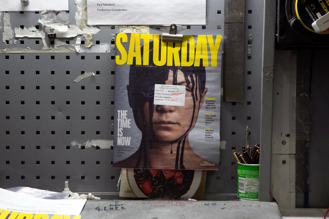
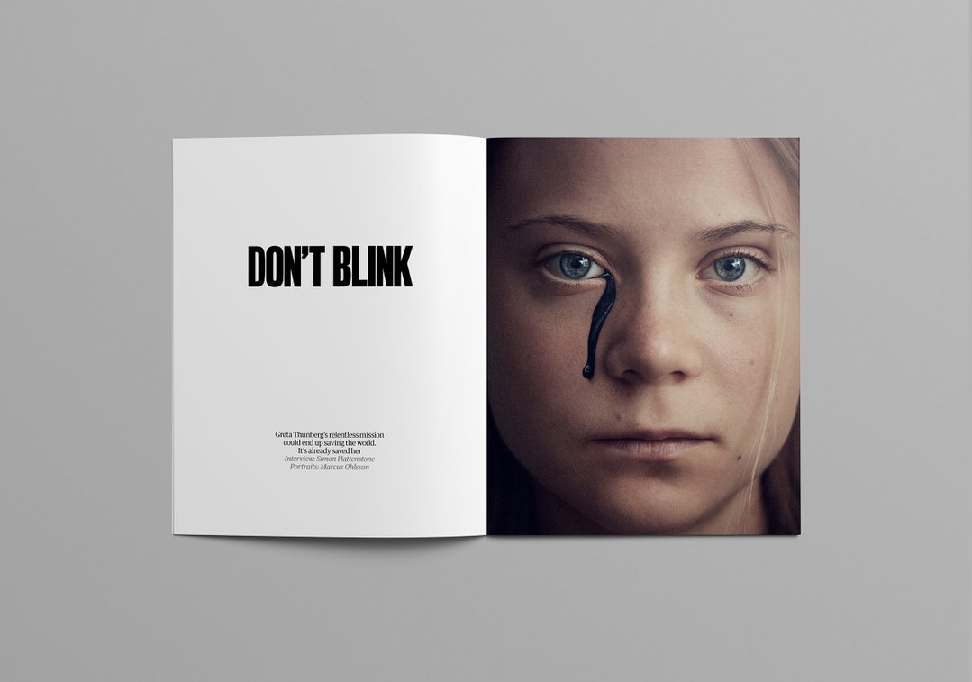
The cover of the first issue is dominated by an arresting portrait of climate activist Greta Thunberg, with what looks like crude oil dripping down her face, shot by Marcus Ohlsson. There is also a profile on the American novelist Jonathan Franzen, with a series of portraits shot by Winni Wintermeyer. There’s also photography by Martina Lang in collaboration with stylist and set designer Johanne Mills in the Beauty section, while Joanne Crawford brings to life the story “How far to the pub?”.
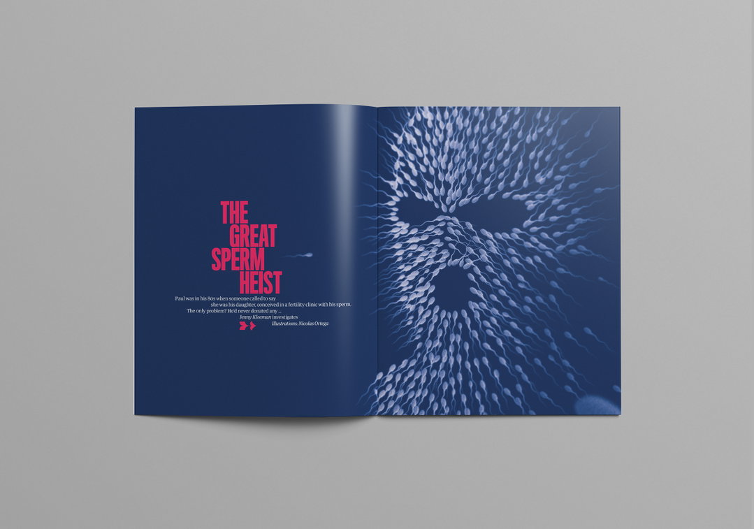
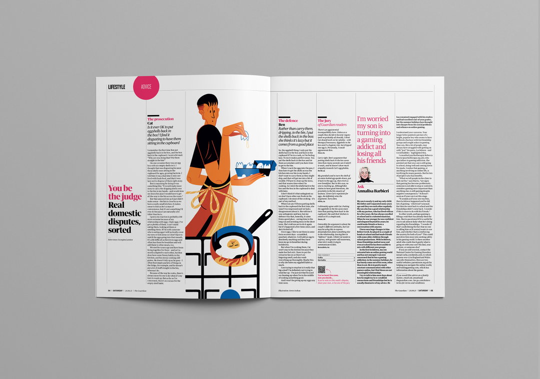
Elsewhere, we find illustrations by Timo Kuilder (in the Cuttings section) and by Nicolas Ortega (on the Opener for a feature called “The Great Sperm Heist”). Hennie Haworth illustrates the “Local’s Guide to Málaga” in the Travel section, while Joren Joshua illustrates the Lifestyle advice pages called “You be the judge”.
While we’re all lovers of print here and enjoy nothing more than seeing a magazine coming off the presses, Chris makes it clear that the Saturday visual language is also going to feed into how certain features are designed on the website and app. “We’re investing more design resource into the digital experiences of this content,” he notes, “and hoping to craft meaningful storytelling moments where we can.”
GalleryThe Guardian: Saturday magazine (Copyright © The Guardian, 2021)
Hero Header
The Guardian: Saturday magazine (Copyright © The Guardian, 2021)
Share Article
About the Author
—
Matt joined It’s Nice That as editor in October 2018 and was editor-in-chief in September 2020–2024. He was previously executive editor at Monocle magazine. He is now a freelance writer and editor.