Grope Sans: a very rude typeface by Bompas & Parr
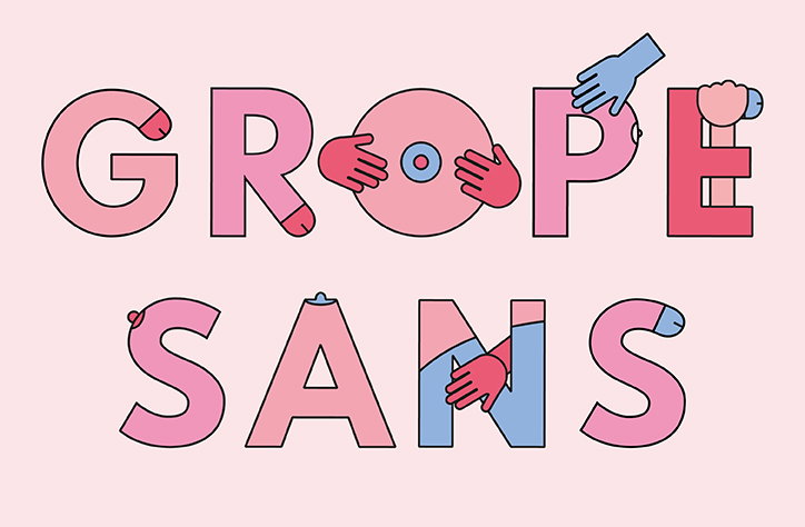
Bompas & Parr: Grope Sans
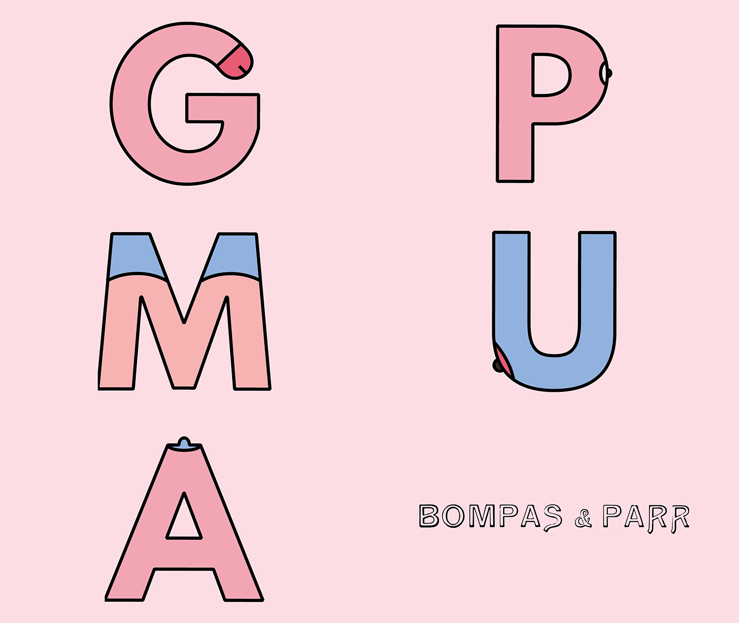
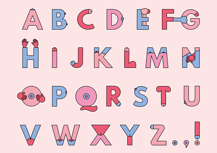
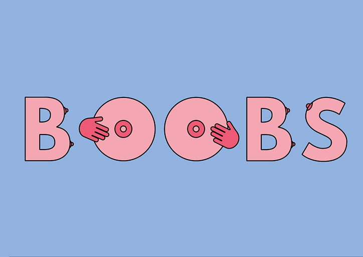
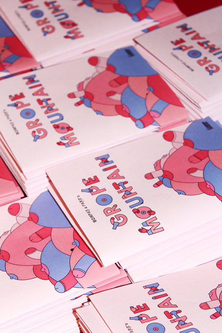
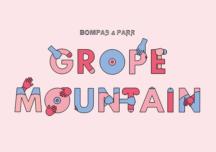
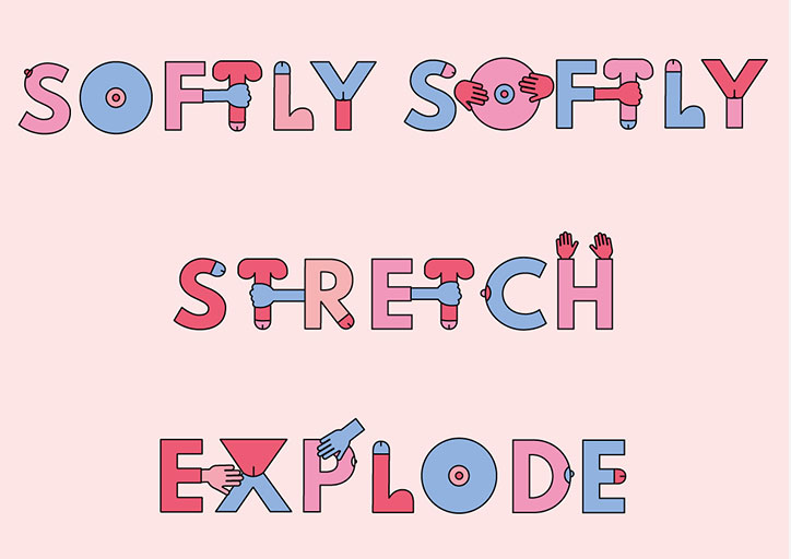
Bompas & Parr has released Grope Sans, a very rude typeface specially for Valentine’s Day. The face is inspired by the studio’s installation Grope Mountain – a climbing wall where the traditional holds are replaced with ones shaped like genitals. As such, each letter features anatomically themed appendages, from a small nipple on the P to the less subtle penis-shaped T, plus interactive hands.
The studio’s graphic designer Flo Fairweather clearly had a lot of fun on this project. “It’s surprisingly easy to turn most type forms into penises, vaginas and breasts. There are up to three variations on each letter, so an even representation of male and female parts can be achieved with every word. Every minor adjustment I made was laughter-inducing.”
The style of the type was inspired by cartoons and uses soft, cheery colours to allow the designer to be as crude as possible while keeping it lighthearted. It’s used in event signage, maps and hand-outs to help climbers navigate the installation.
Grope Mountain is available to visit in Liverpool today.
Download the typeface for free here.
Bompas & Parr: Grope Sans
Bompas & Parr: Grope Sans
Bompas & Parr: Grope Sans
Bompas & Parr: Grope Sans
Bompas & Parr: Grope Sans
Bompas & Parr: Grope Sans
Share Article
Further Info
About the Author
—
Jenny oversees editorial output across It’s Nice That. Get in touch with writing pitches for features or opinion pieces, big creative story tips, or questions about all things editorial. jb@itsnicethat.com
To submit your work to be featured on the site, please see our Submissions Guide.