- Words
- Emily Gosling
- —
- Date
- 28 September 2015
- Tags
Pentagram Partner Michael Bierut shares his wisdom on what makes a truly great logo design
Share
Share
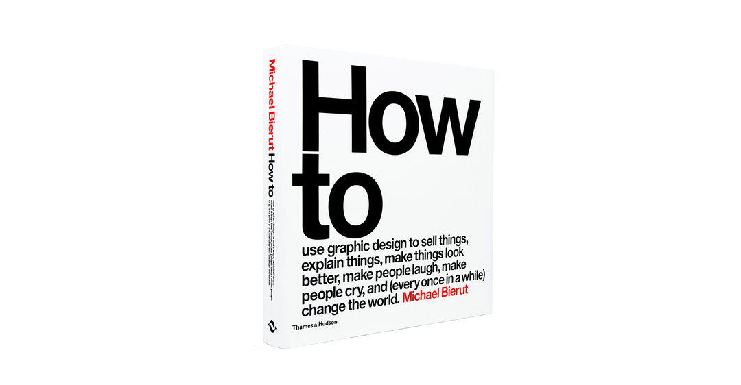
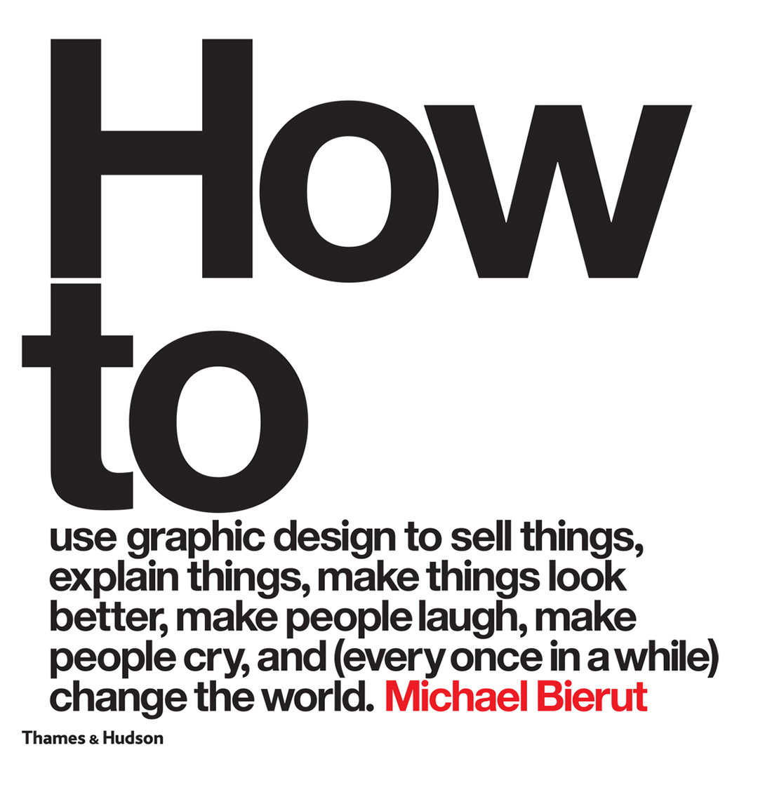
If there’s anyone who knows about designing logos – and indeed, why designing a logo is not designing an identity – it’s Pentagram partner Michael Bierut. His new book imparts wisdom on this topic and a whole heap of others, and below we reprint an extract in which he talks about what makes a great logo design, and how a true brand identity is “a world of associations that have accrued over time.”
How to make a mark: Logotypes and Symbols
The logo is the simplest form of graphic communication. In essence, it is a signature, a way to say, “This is me.” The illiterate’s scrawled X is a kind of logo, just as much as the calligraphic flourishes we associate with Queen Elizabeth or John Hancock. So are the peace sign and the swastika. And so, of course, are the graphic marks that represent Coca-Cola, Nike, McDonald’s and Apple.
The words we use to describe these things can be confusing. Some logos are essentially typography, like Microsoft’s. I call these logotypes or word marks. Others are shapes or images, which I call symbols. Sometimes these can be literal : the symbol for Apple is an apple; the symbol for Target is a target. Sometimes they depict real things but those things may have only an indirect association to what they symbolise. The Lacoste crocodile is derived from founder René Lacoste’s nickname; the three stripes of Adidas began as no more that decoration. And sometimes they’re utterly abstract, like the Chase Bank “beveled bagel,” or the Bass Ale red triangle, which dates back to 1777 and is one of the oldest logos in the world.
Everyone tends to get overly excited about logos. If you’re a company, communicating with honesty, taste and intelligence is hard work, requiring constant attention day after day. Designing a logo, on the other hand, is an exercise with a beginning and an end. Clients know what to budget for it, and designers know what to charge for it. So designers and clients often substitute the easy fix of the logo for the subtler challenge of being smart.
When we look at a well-known logo, what we perceive isn’t just a word or an image or an abstract form, but a world of associations that have accrued over time. As a result, people forget that a brand new logo seldom means a thing. It is an empty vessel awaiting the meaning that will be poured into it by history and experience. The best thing a designer can do is make that vessel the right shape for what it’s going to hold.
Michael is showing his work as part of the SVA’s Masters Series at SVA Chelsea Gallery, 601 w 26th Street, New York.
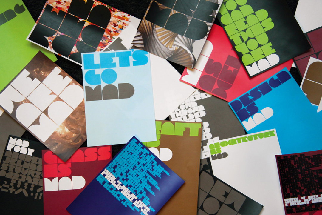
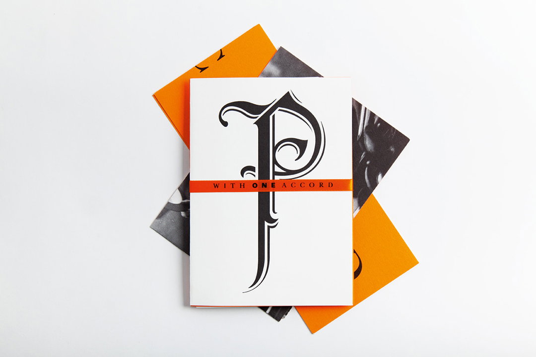
MAD Museum of Arts and Design identity
© Pentagram
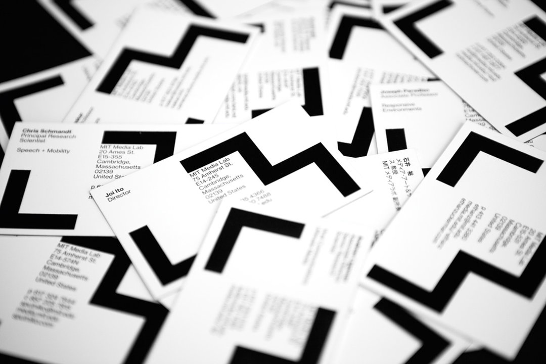
The MIT Media Lab logo, shown on a collection of business cards.
© Pentagram
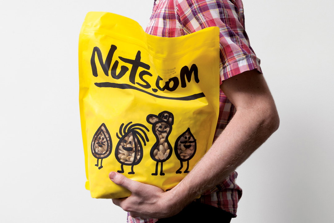
The new packaging for the company Nuts.com
© Pentagram
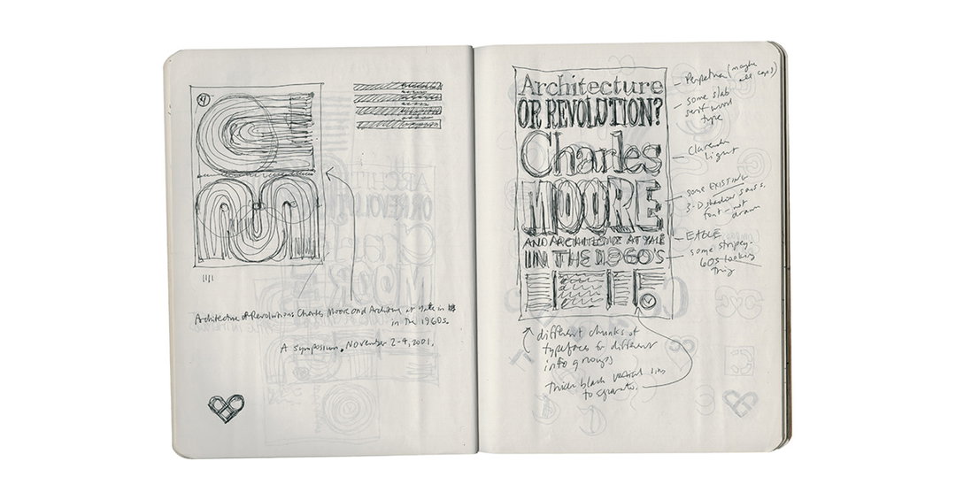
Composition book, No. 100.
© Michael Bierut
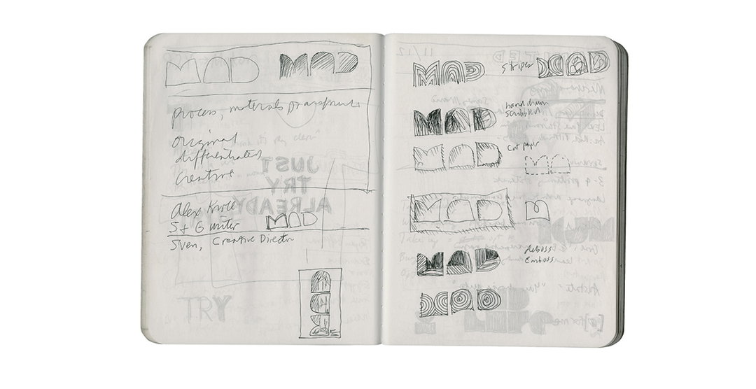
Composition book, No. 100.
© Michael Bierut
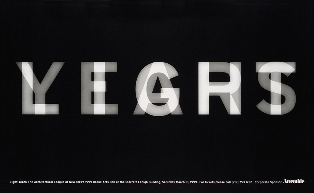
Poster for high school production Wait Until Dark.
© Michael Bierut
Share Article
About the Author
—
Emily joined It’s Nice That as Online Editor in the summer of 2014 after four years at Design Week. She is particularly interested in graphic design, branding and music. After working It's Nice That as both Online Editor and Deputy Editor, Emily left the company in 2016.