- Words
- Ruby Boddington
- —
- Date
- 13 August 2018
- Tags
"What is my opinion?": Graphic designer James Aspey's research-focused, typographic practice
Share
Share
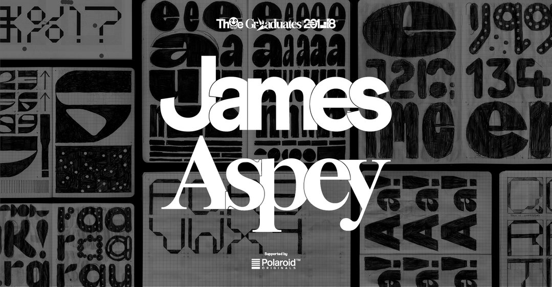
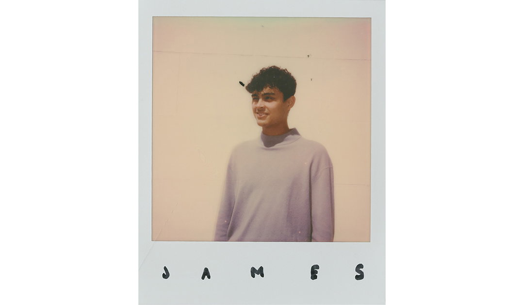
Originally from Portsmouth, graphic designer James Aspey has a propensity for all things type-related. Having found inspiration early on in some of the great 20th Century typographers, his own practice consists of interesting, speculative and unusual letterforms, used in both conceptual and commercial contexts.
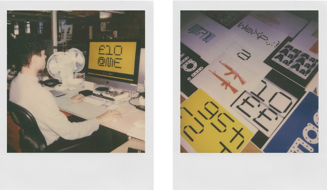
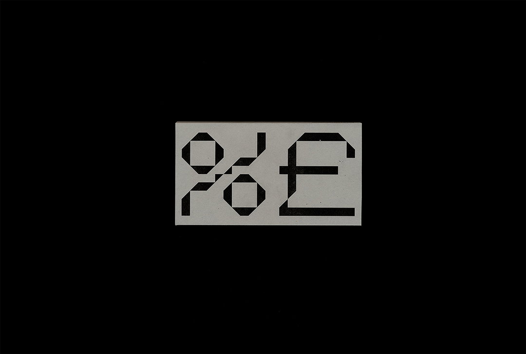
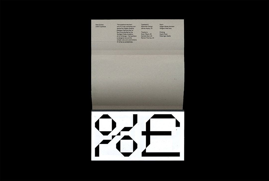
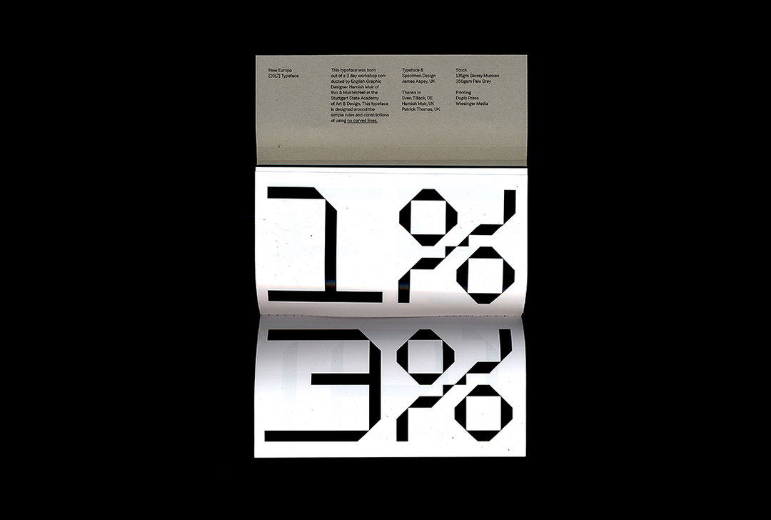
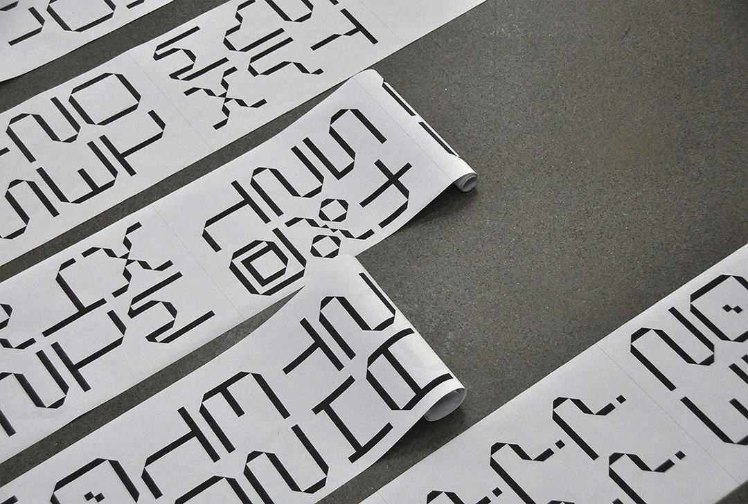
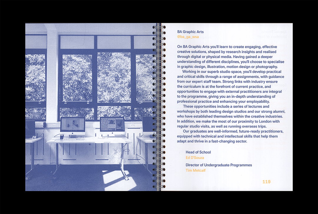
James studied at Winchester School of Art on the graphic design programme, a place that taught him design sensibilities and a research-focused approach. It was while studying abroad at Stuttgart State Academy of Art and Design under Patrick Thomas, however, that he discovered a proclivity for letters and numbers specifically. It was here that he developed New Europa, a typeface with a user-generated specimen to be used as a “supersize tool for visual communication”.
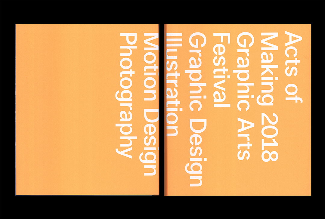
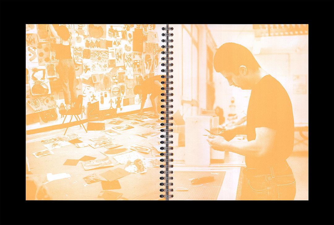
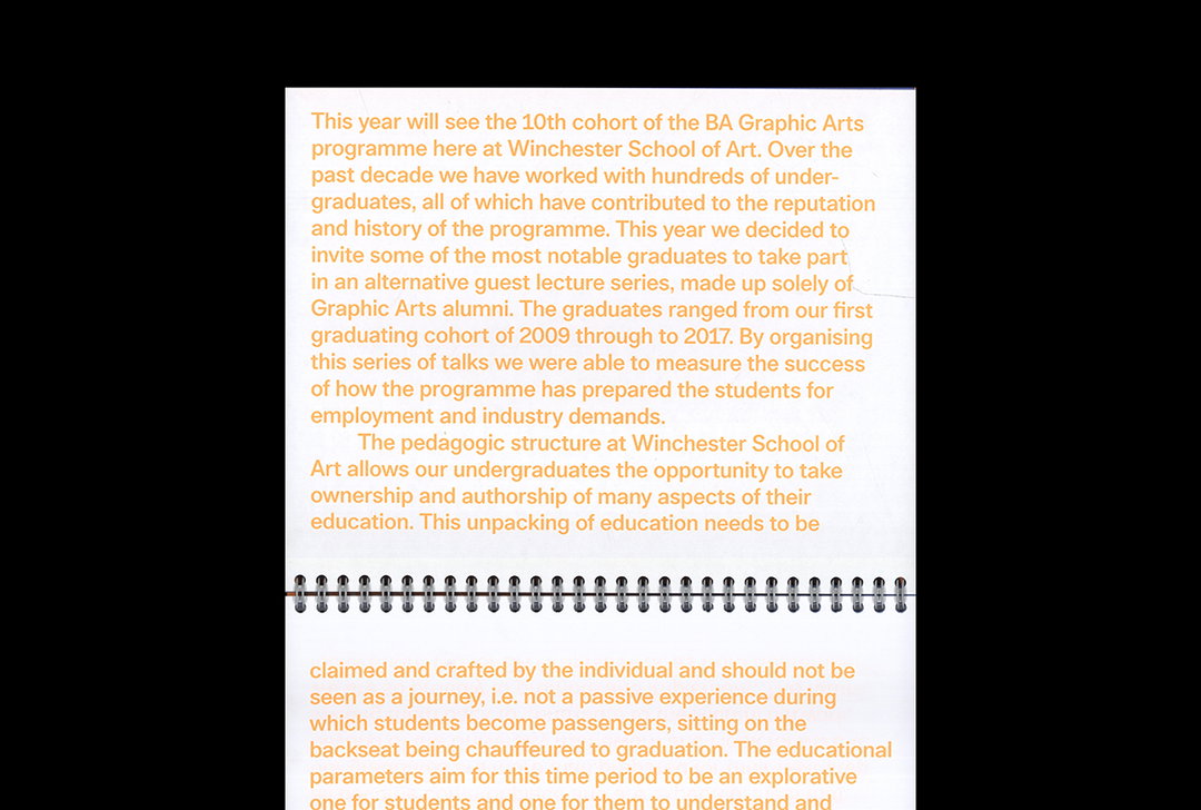
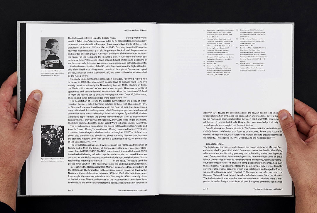
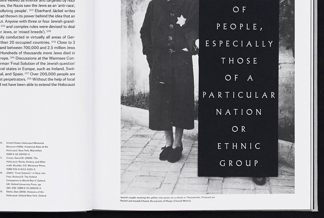
Beyond his typographic skills, James – who is currently interning at Pentagram’s London office – boasts everything from editorial design, code-based projects and visual identities. Not content with sound aesthetics, his projects question authorship and the role of the designer. Whether working on the identity for his course’s end of year show Acts of Making, or examining the semiotics of individual words in A Crime Without A Name, James keeps a series of central questions as a driving force for every decision: “Am I corrupting the content? Am I destroying it? Am I respecting it? What am I publishing this book for? What is my opinion?”
It’s Nice That: Why did you decide to study graphic design?
James Aspey: One thing that I enjoyed more than anything whilst at college was whenever I got the chance to work with typography. I found myself skimming through a collection of Swiss design books which my tutor owned, and it really informed me about what you could do with design, in particular, typography. Designers such as Wolfgang Weingart & Armin Hoffmann impressed me with their timeless work.
Alongside this, the creation of books was also something which I found particularly interesting. Being introduced to small, beautiful places such as W139 and San Serri over in Holland during my holidays in between semesters at college, I remember viewing such beautiful books in these places. Sometimes I would completely ignore what the book was about and just look at how the book was constructed, bound and typeset. I was eager to search for what stock it was printed on and who designed it. I suppose that just cemented it for me, if I was amazed by these small, delicate details then maybe I should pursue it further!
INT: Can you describe a project you’re most proud of and why?
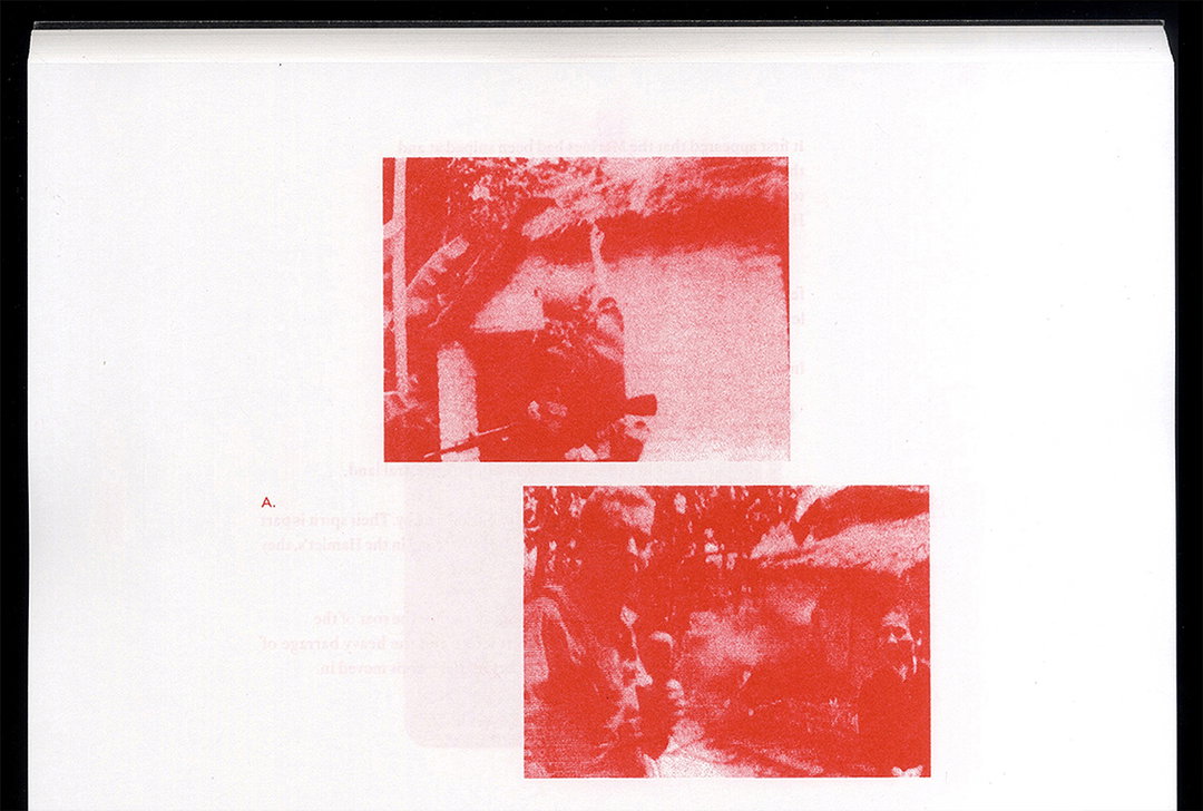
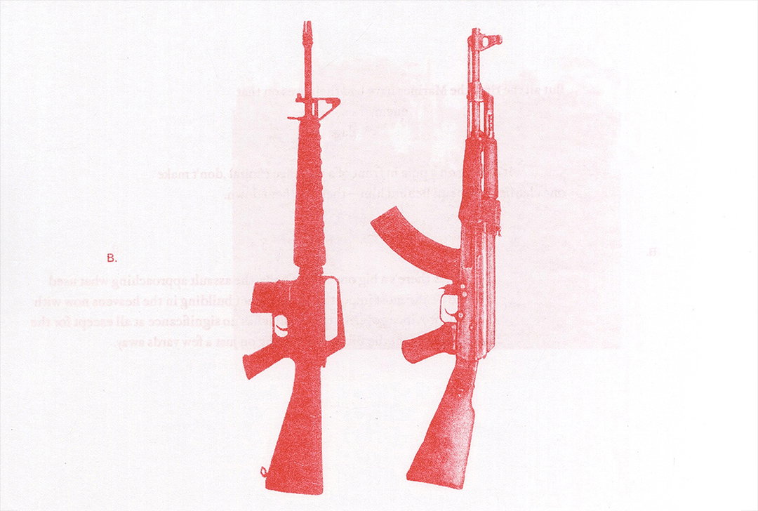
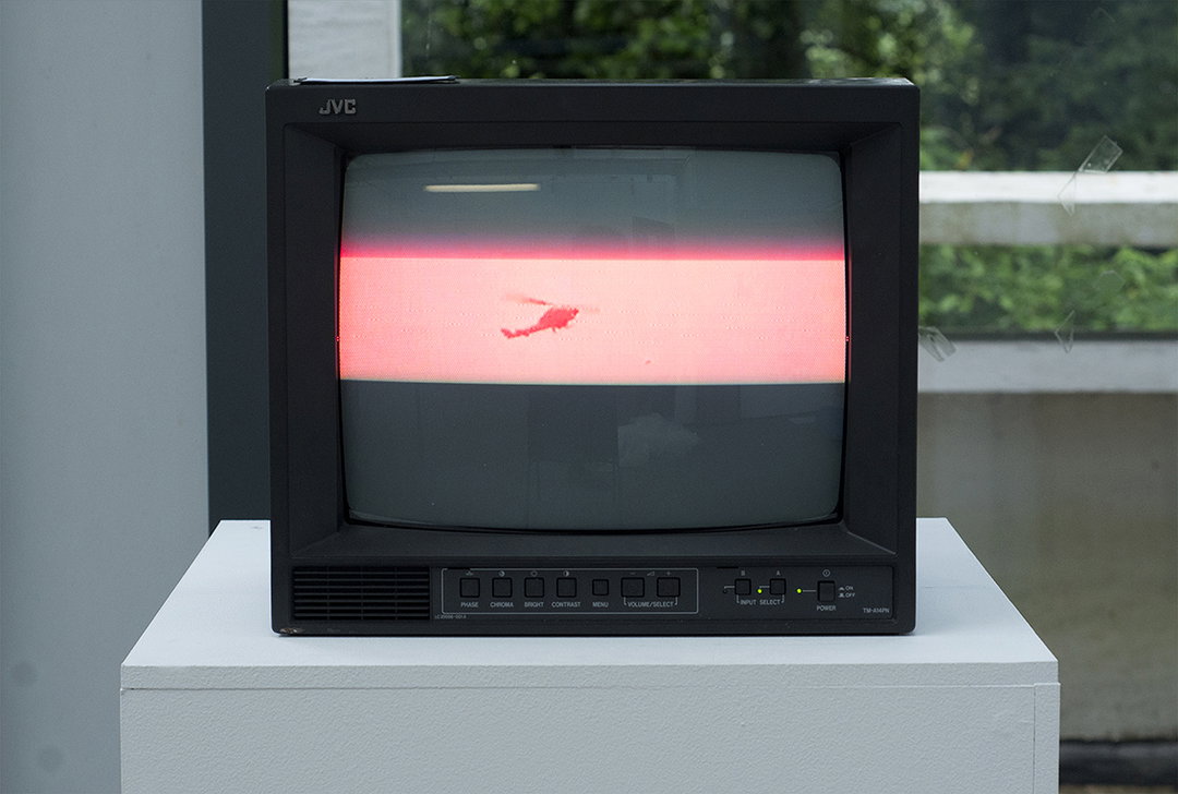
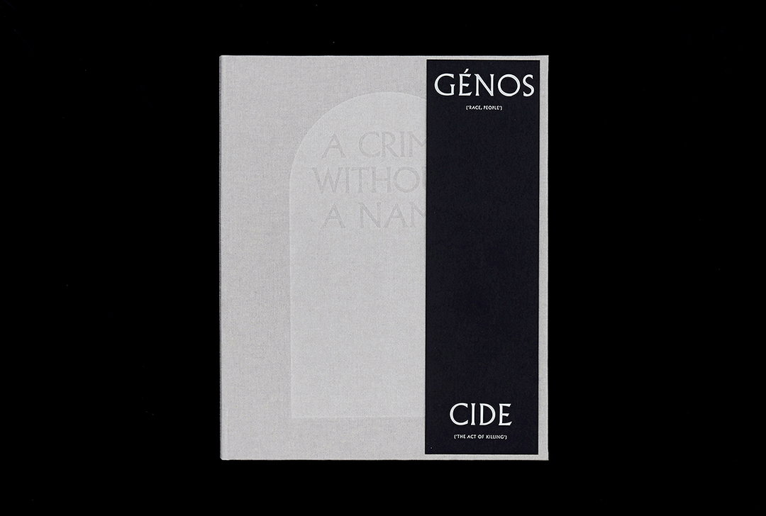
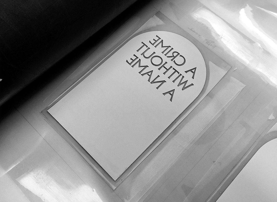
JA: The project I’m most proud of during my time at university is A Crime Without A Name. It examines the origins of the word genocide, a word coined from an adverse event. In 1941 Winston Churchill addressed the nation and described Germany’s atrocious war of terror as A Crime Without A Name – failing to find a single word to describe it. Due to this reason, genocide has been removed from the body text resulting in a void that represents the loss of those who suffered at the hands of the Nazi Party.
The project taught me a lot about typography, a lot of stuff that I didn’t even know existed! I remember sitting with my tutor Jodie Silsby as she pulled out so many things about its typographic treatment, which all seemed very daunting at the time to resolve but it was a great learning experience. This project also made me think about working with content which wasn’t mine. Because the topic is so delicate and serious, I felt that I had to approach it with respect and be smart about it. A Crime Without A Name really cemented my interest in exploring subjects with such strong history, I enjoyed researching about periods of time and using my findings to make a research-led project.
My tutors made me think about what I was doing with this content. They mentioned that you could just design a pretty book, but think about what you are doing with the content – you don’t want to just produce another book about Genocide? What’s your opinion? This project really set me up to think like this and it’s now how I approach most of my work, finding a standing point and exploring this through a narrative.
INT: What was the best bit about your time at university? And the worst?
JA: The best part of my university experience was actually leaving the UK to study abroad. I enrolled in the class of Patrick Thomas (Klasse Thomas) in my second year and it was such a memorable experience. To have the chance to be involved in workshops by the likes of Hamish Muir and Eike König and to work on fantastic projects such as Erasmus 30 DE with Klasse Thomas and the Industrial Design class at the school will be something I will always remember. Anyone who is thinking about studying abroad should definitely do it! The experience of meeting so many talented people in Germany is something I will greatly cherish.
The worst part of my university experience was always having to write long essays. Although I believe that it’s super important to write about your own or other people’s work, I always tend to struggle with articulating my thoughts on to paper.
INT: Is there a particular person who has shaped your university experience or creative outlook?
JA: Bruce Usher, who was actually one of the It’s Nice That graduates from 2011, I came in contact with him when he came to give a talk at the Winchester School of Art with Will Hudson. I began working with Bruce in his studio during my last year at university, his advice on leaving university and becoming a graduate was to be extremely helpful and allowed me to think really about what I want to do and where I wanted to work. I reminded me it was important not to rush into getting a job. But if you feel ready then go for it! Explore a range of studios and see what fits for you, if you don’t like it then that’s fine, at least you know!
INT: If you could create your dream project, what would it be?
JA: I’m not really sure what my dream project would be, but I’ve always been interested in archives. I’m not sure what the archive would be about, but I find interest in seeing what people collect, what people have in their homes, I feel that the objects they collect show their personalities. I actually collect a lot of things myself. This ranges from things picked up at places I’ve been to, such as galleries, to things that people have given me. I keep all these things in one place thinking that one day I will do something with them, sort through all the objects, bits of paper, photographs and collate them into something, a book? A private show? I’m not really sure.
Supported by Polaroid
Polaroid Originals is the new brand from Polaroid, dedicated to original format Polaroid analog instant photography. Find out more about their new and vintage cameras, plus film and accessories, on polaroidoriginals.com
The It’s Nice That Graduates 2018 is supported by Lecture in Progress and Polaroid Originals.
Share Article
Further Info
About the Author
—
Ruby is Senior Creative at It's Nice That, overseeing our visual output across platforms and projects. Before that, she was associate editor on the editorial team, after joining in September 2017 following graduation from Central Saint Martins.