- Words
- Ayla Angelos
- —
- Date
- 6 September 2023
- Tags
I’m a fake brand, in a fake world: The secrets behind designing a great fictional brand for TV and film
Duff Beer, Dunder Mifflin Paper, Wonka Candies, Barbie merchandise… We’ve seen countless made-up brands transcend seamlessly from the screen into the real world. So what’s the key to their success? We chat to the graphics team behind the Barbie film, Wes Anderson’s go-to graphic designer, motion designer and 3D artist Lorenzo Bernini, and Adult Swim’s president Michael Ouweleen.
Share
Share
The clock strikes 6pm. Your mum calls your name and you hastily sprint downstairs and nestle into the sofa with the rest of the family. It’s time for The Simpsons.
With its pop culture references, comedic plots and tales of daily life in Springfield, The Simpsons became a family ritual and global success for many reasons. Not only was it the first animation designed for both adults and kids, it also heralded catchphrases like “D’oh!”, predicted the future and was the birthplace of many infamous brands, like Duff Beer – Homer’s beverage of choice and a joke in itself, taking a jab at cheap, mass-market American beer brands.
Over the decades, Duff remained a staple feature of the Simpsons universe, promoted by the muscular, hip-thrusting, “ooh yeah”-chiming Duffman, a parody of Budweiser’s 70s-era mascot, Bud Man. In fact, Duff became such an important pillar to the show that real-life people wanted to have a sip of its success; many beers using the Duff branding were brewed across the US and further afield (albeit closed shortly after due to legal battles), and an official version was launched and sold at Universal Studios near to The Simpsons Ride. The show’s producer, 20th Century Fox, also started selling licensed Duff Beer in Chile in 2015. Duff is a prime example of what happens when a fictional brand becomes enough of a triumph to leap off the screen. So what makes a successful fictional brand, and are those qualities different to a real brand?
Fictional brands are used for a handful of reasons – building alternative realities or avoiding product placement fees are just two examples. Whether that’s through made-up labels designed to blend seamlessly into their fictional worlds, a futuristic soft drink enjoyed by a protagonist or an unrealistic fashion brand worn in a dystopian universe, every element on screen contributes to the authenticity of the narrative. Over the years, we’ve seen countless films and television programmes utilising the power of graphic design to build fictional brands and their fictional worlds. Wes Anderson’s singular visual worlds feature countless made-up brands, like a scary dog treat designed for Isle of Dogs. Adult Swim’s Rick and Morty has a meme-like fake door company in one of its episodes, as well as a host of real brands, too, like McDonald’s and Shoney’s. Whether real or fictional, branding on-screen is able to drive plots, tell jokes and develop characters.
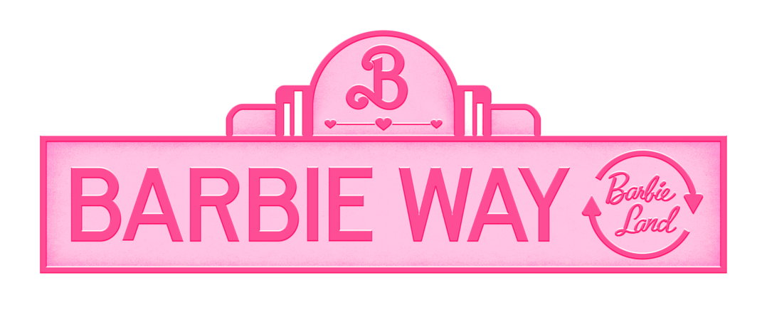
Barbie Way. Property of Warner Bros
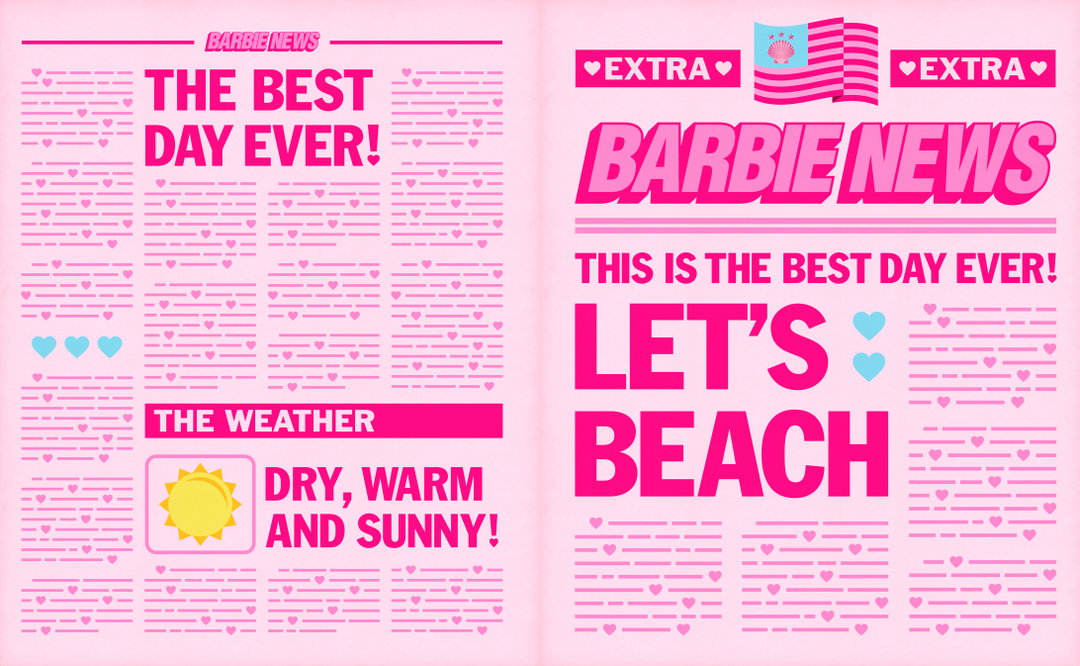
Barbie Newspaper. Property of Warner Bros
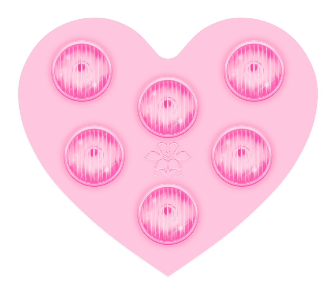
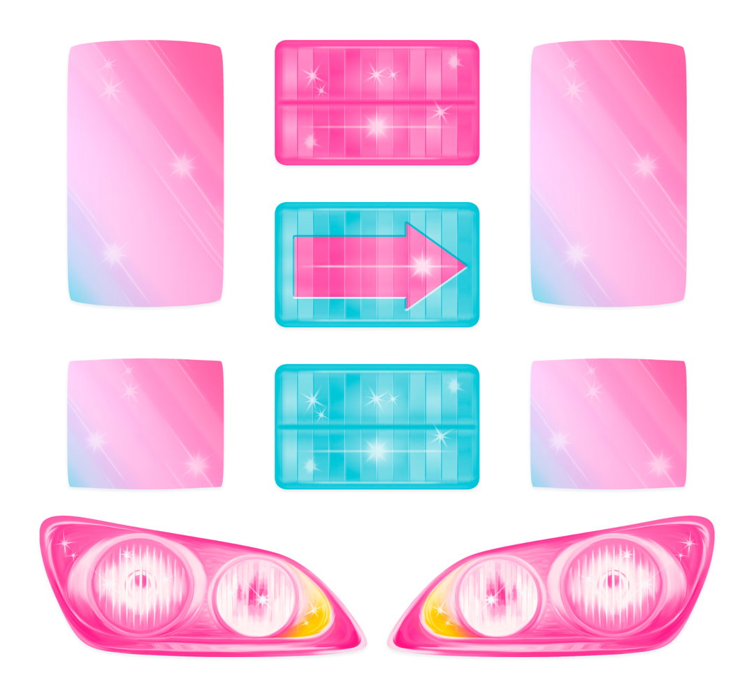
Or, in the case of the newly released Barbie, directed by Greta Gerwig, we’re also seeing a pre-existing, globally recognised brand steer the entire aesthetic of a film. The popular, mass-produced toy from Mattel is cemented in many childhoods from the past and present, so when the graphics team – consisting of lead graphic designer Alicia Martin, graphic designers Matilda Craston, Eleanor Lamb and Lauren Wakefield, and assistant graphic designer Maia Ruscombe-King – were tasked with rebranding such an iconic staple in people’s lives, that came with its own unique challenges. “Barbie is one of the most widely recognised brands in the world, so it comes with nostalgia and affection but also with preconceptions,” the graphics team says. “It required combining the joy and fun of the Barbie toy with a timeless elegance.”
“When the brand is the world, each individual item essentially becomes brandless – which was an exciting idea to play with.”
Barbie Movie Graphics team
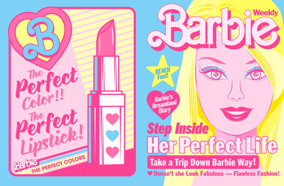
Barbie Mag. Property of Warner Bros
The film stars Margot Robbie as Barbie and Ryan Gosling as Ken, and follows the characters as they embark on a journey of self-discovery. As such, the aesthetic needed to be recognisable, but equally a little adult, satirical and self-referential. Doing just that, the overall look and feel of the film – helmed by set designers Sarah Greenwood and Katie Spencer – is fun, charming and gives a strong nod to the toy itself, referenced through shiny, doll-house-style buildings, faultlessly blue skies, fun splashes of pink and references to the Mattel archive. The set is inspired by Old Hollywood technicolour films and Slim Aaron’s flash-lit, dramatic and overly staged photographs of Palm Springs.
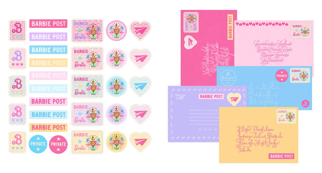
“We tried to approach the graphics in a similar way – the most joyful part of graphic design in the toy was the stickers and illustrated decals [a durable and transferable design prepared on special paper],” says the graphics team. “We chose to keep this element but refine the style so it wasn’t as crude or childlike.” Another key reference is Wayne Thiebaud, an American painter recognised for his colour depictions of everyday objects: lipsticks, cakes and ice creams. Describing his work as “timeless” and “textured”, the Barbie graphics team wanted to pull these elements into their own designs, resulting in a plethora of vibrant, digital paintings in their decals. “With typefaces for signs and newspapers, we went to old typeface books from 50s America rather than fonts,” the team continues. “This softened our designs and avoided them looking too new and modern.”
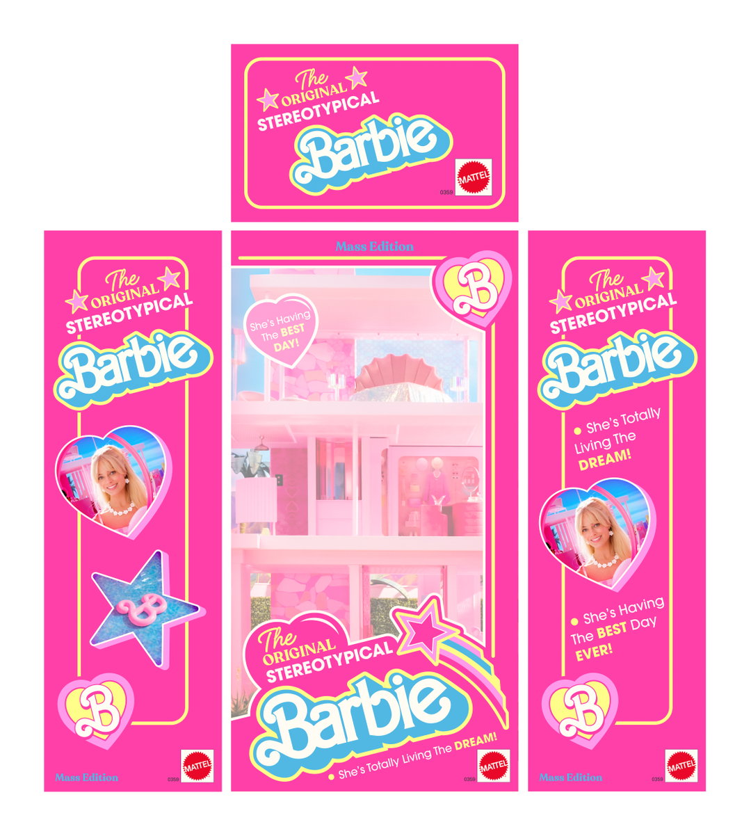
Barbie Box. Property of Warner Bros
1 of 6
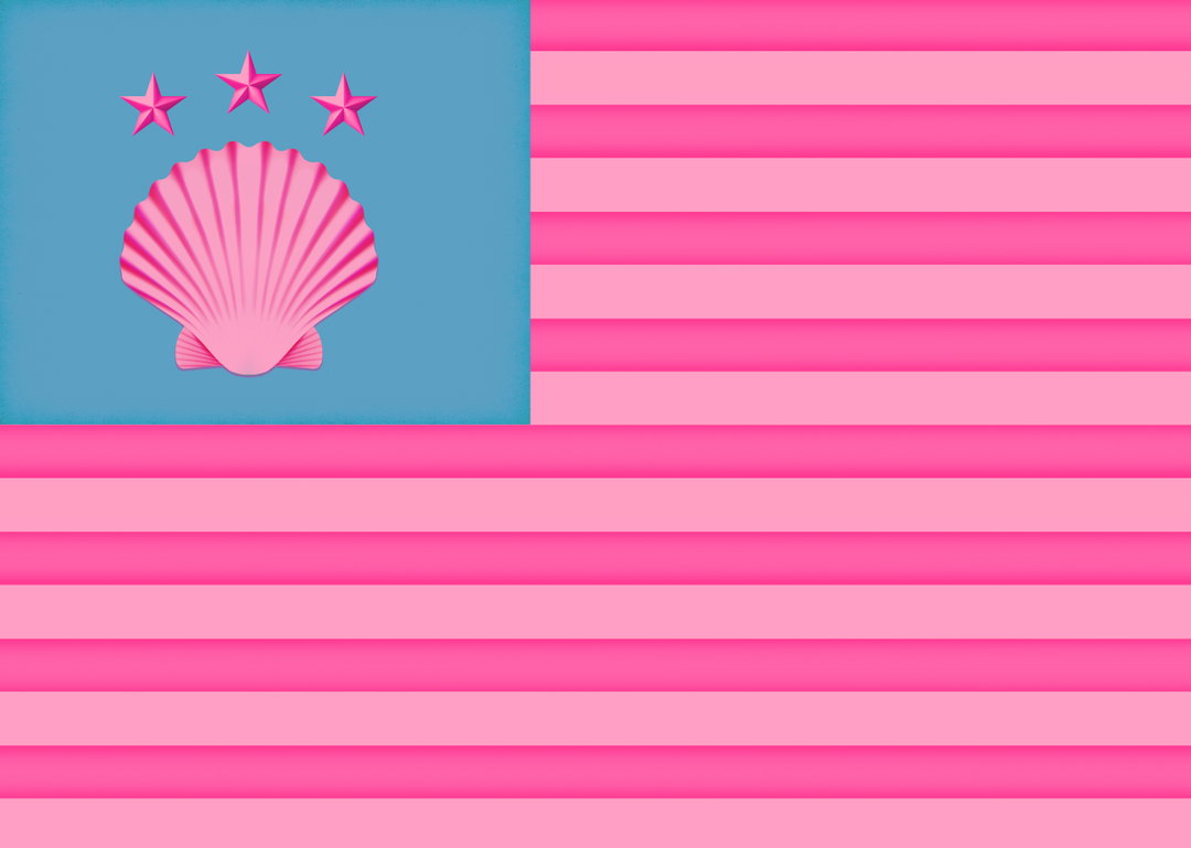
Barbie Land Flag. Property of Warner Bros
1 of 6
Barbie Land Flag. Property of Warner Bros
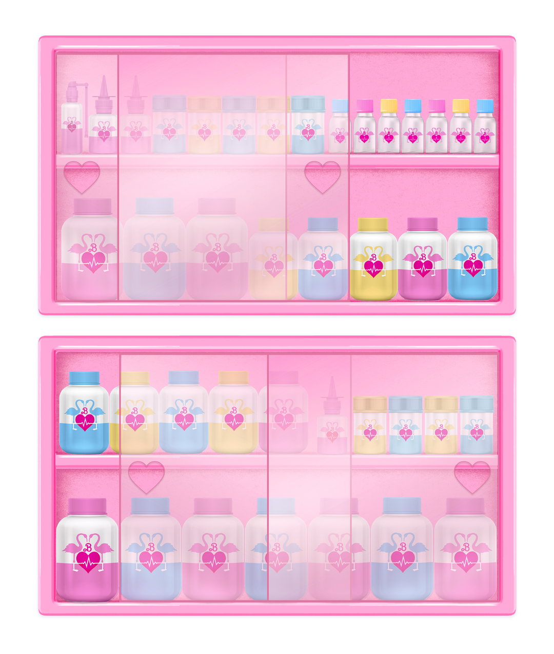
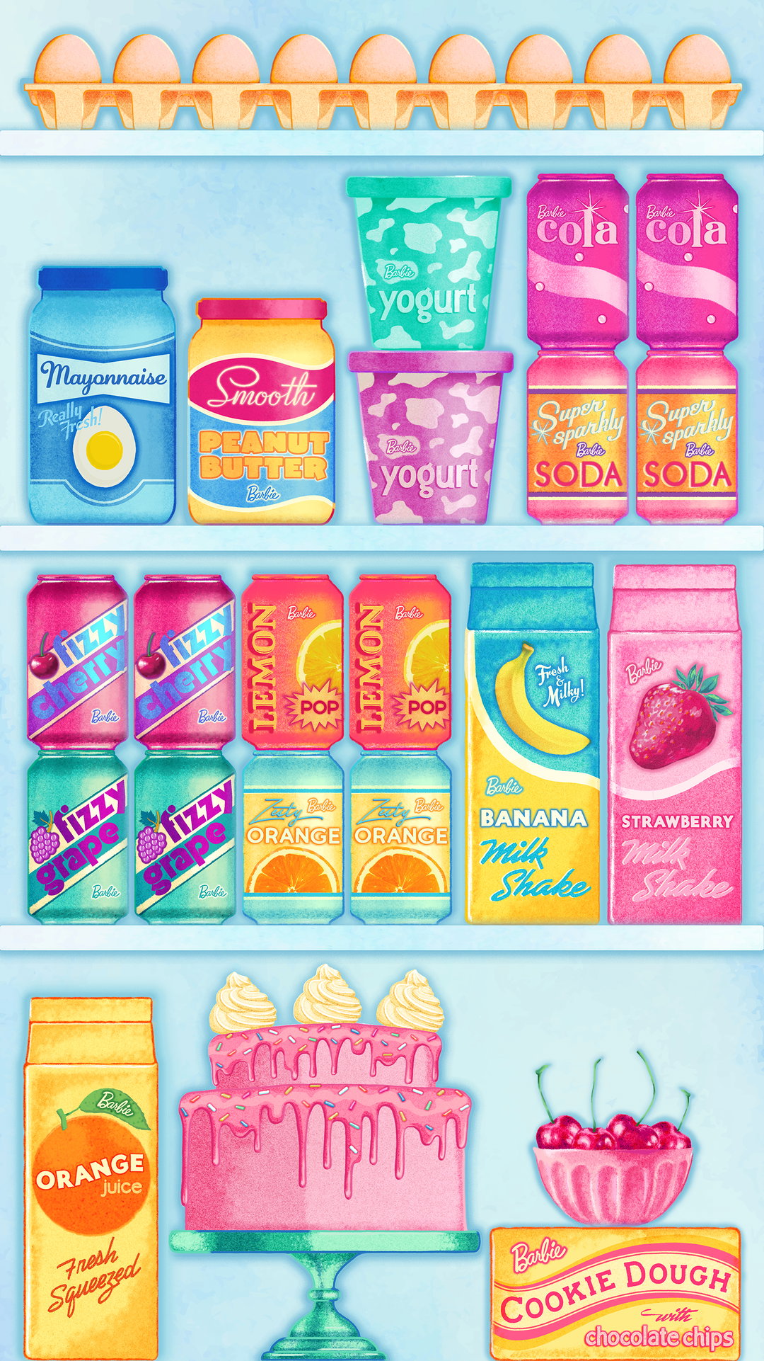
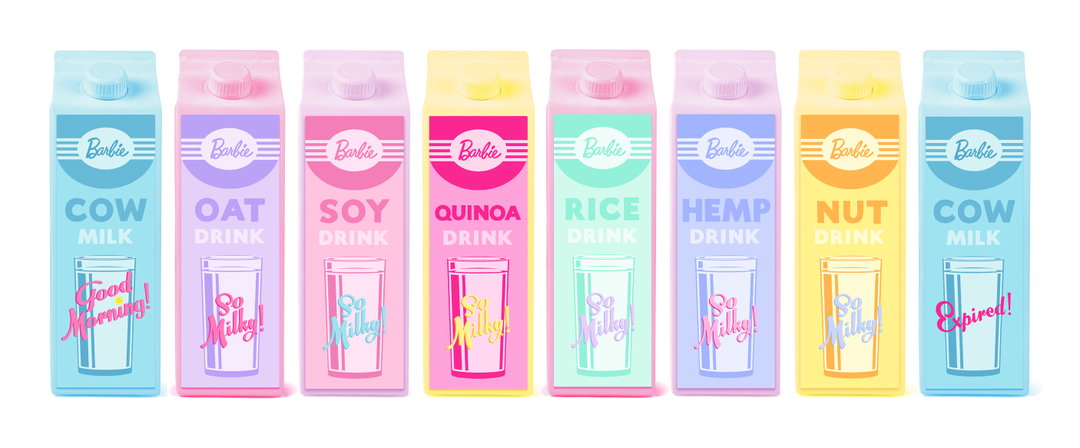
When it comes to branding in films, a common approach entails designing a mix of different brands housed under a particular time period or era that the film is set in. In the case of Barbie, the brand was already conceived and every graphical element throughout had to be synonymous with what it stands for. “In a sense, creating the packaging for the Barbie world was the opposite to how we would usually approach branding,” says the team. “It was refreshing to be creating one look that ran over everything. When the brand is the world, each individual item essentially becomes brandless – which was an exciting idea to play with.” Keeping everything in a cohesive Barbie look, the products seen on screen include milk cartons (oat, cow, soy, quinoa, rice, hemp and nut), a Barbie Weekly magazine, a newspaper, stamps, Barbie mail, cookie dough, mayonnaise and various other fridge items inspired by American menus from the 50s. For newspaper headings, magazine captions and product branding, the team were inspired by sign writing from the same era.
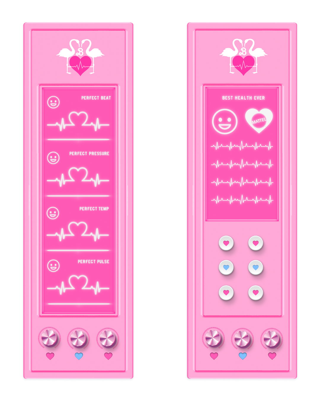
Barbie is an apt example of how a world-renowned franchise can steer the visual language of a film. “Graphic design is incredibly important to push the script forward, whether that’s through signage and packaging, or personal elements like handwriting and drawings,” says the team. “It is a tactile link between the character’s story and the set – a physical manifestation of dialogue and the character’s personality.”
Ambulance Panels. Property of Warner Bros
Barbie Milks. Property of Warner Bros
Barbie Mail. Property of Warner Bros
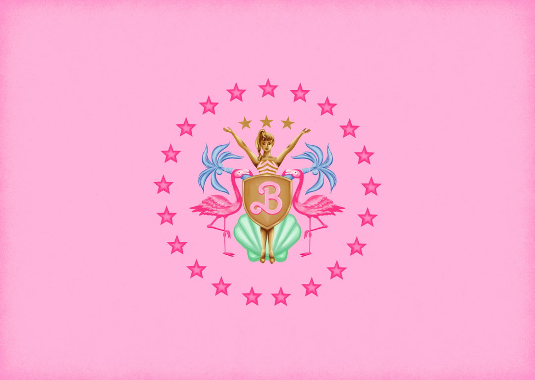
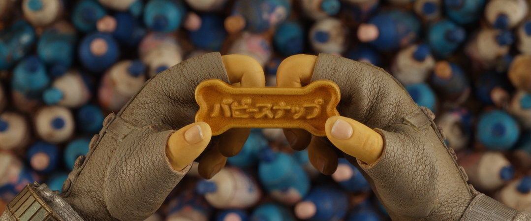
From top to bottom: Barbie Land Congress Flag. Property of Warner Bros; Wes Anderson: Isle of Dogs
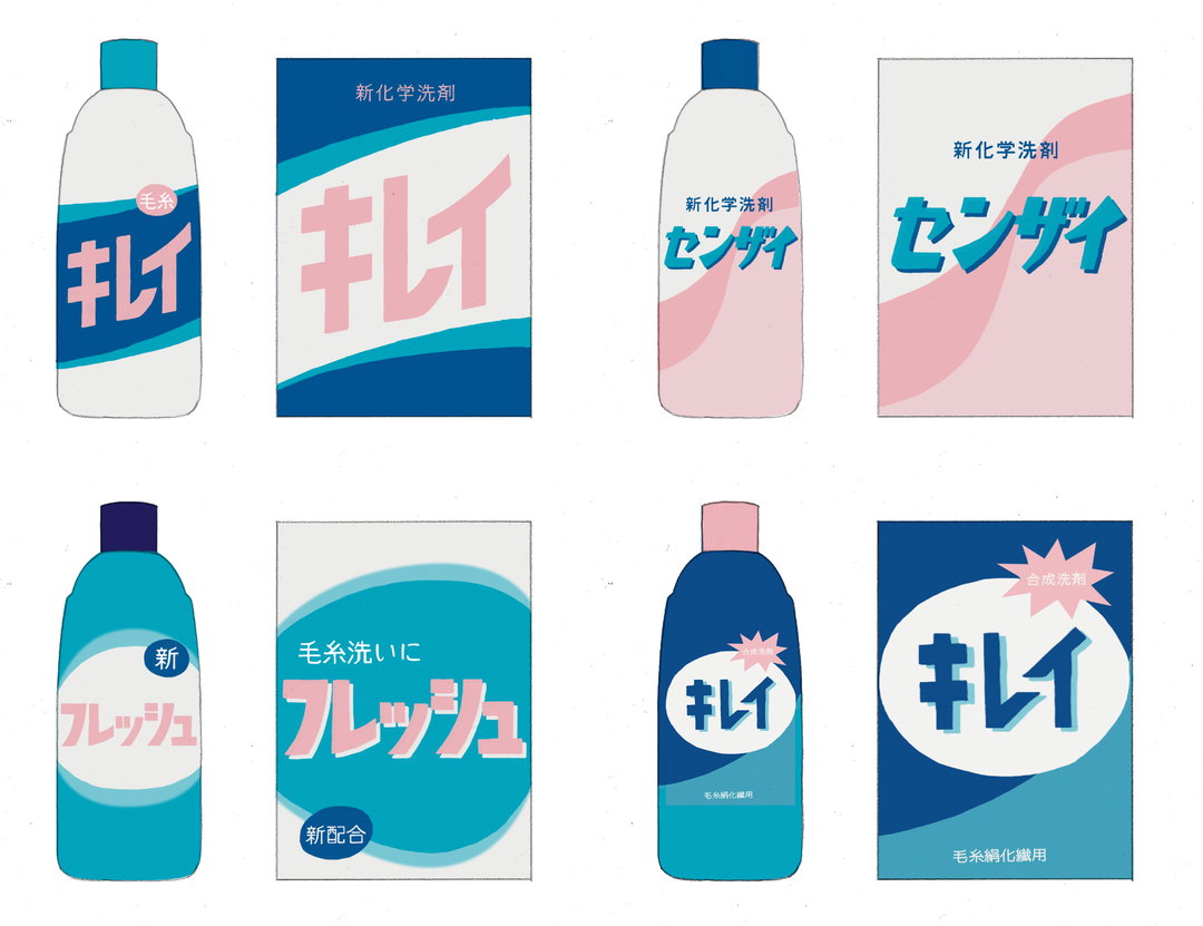
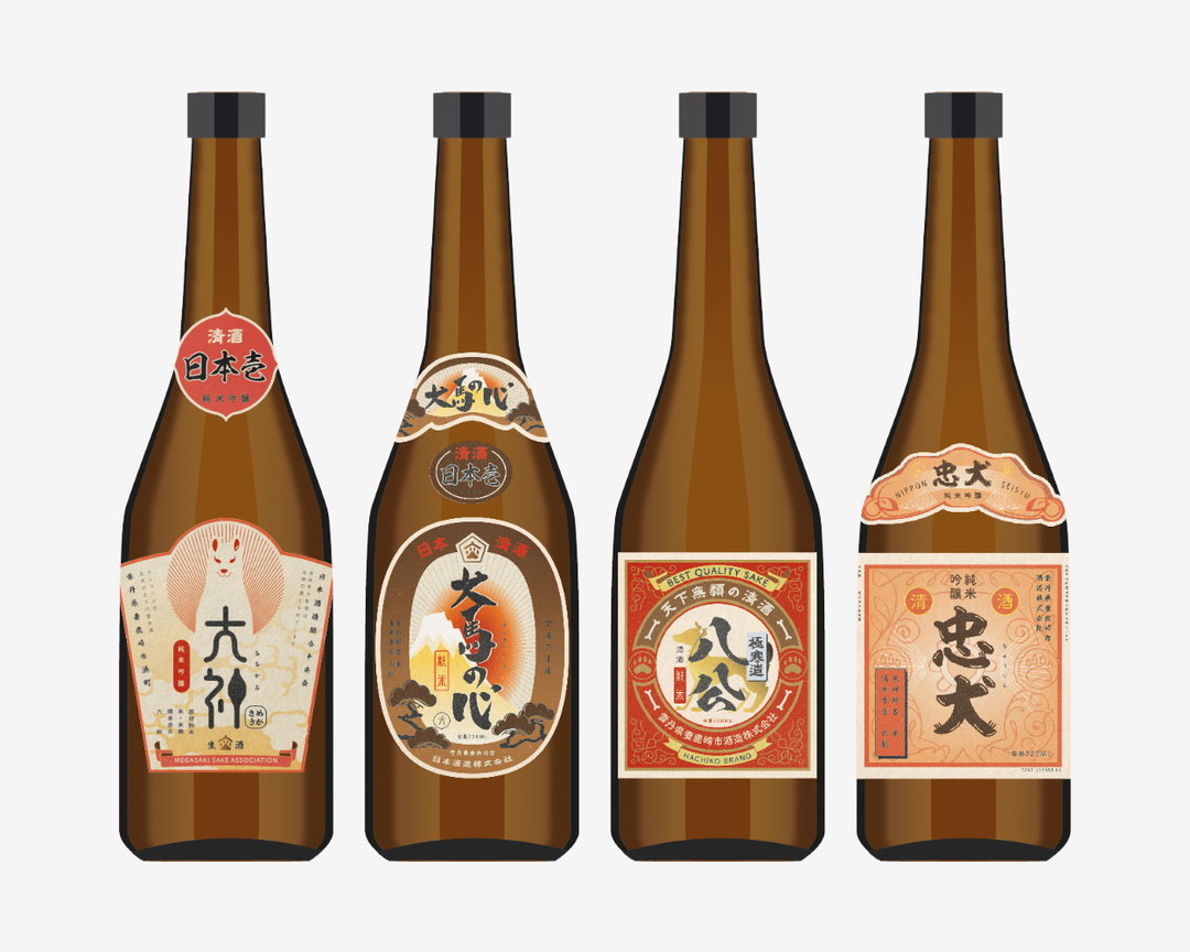
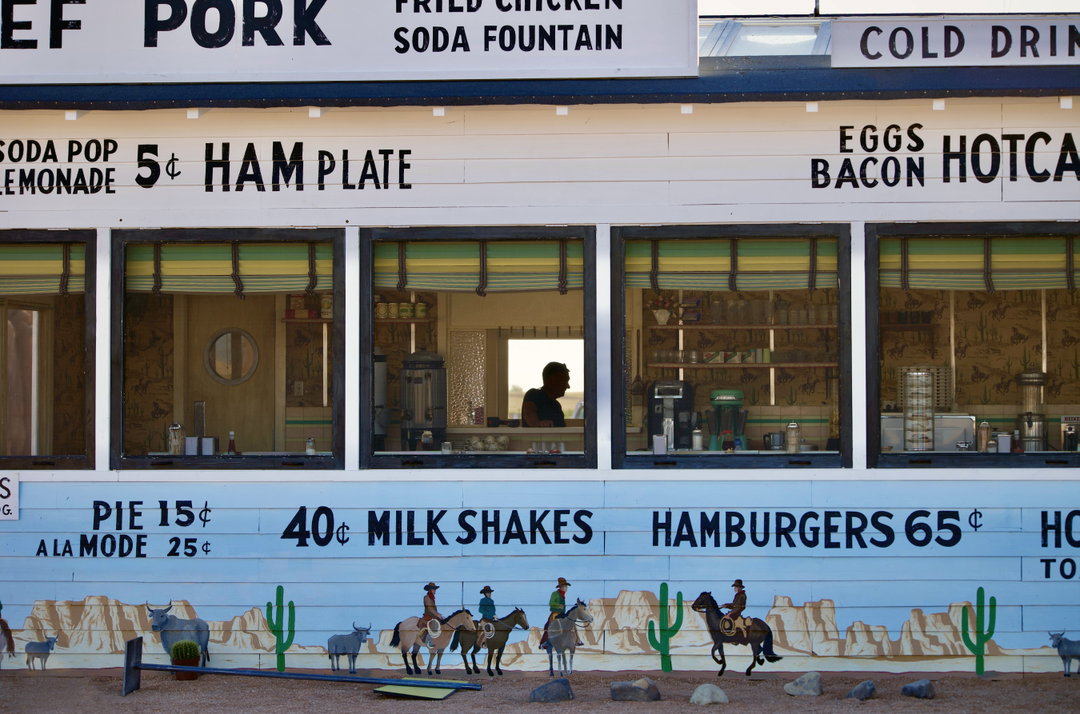
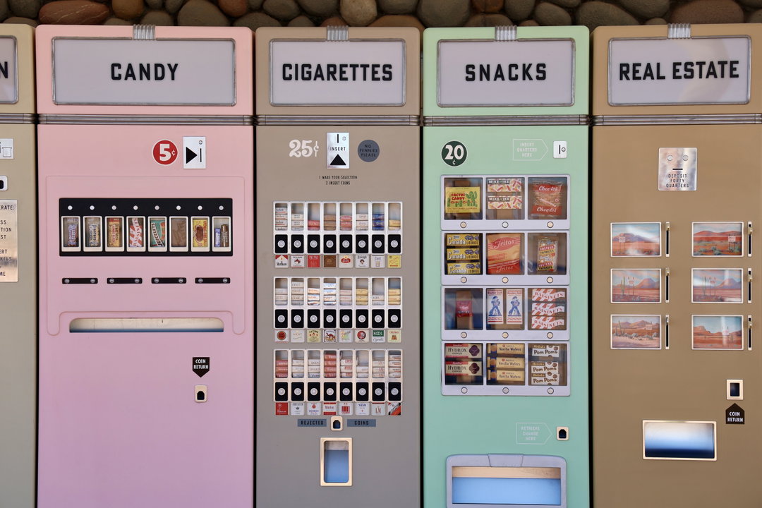
1 of 5
Wes Anderson: Isle of Dogs. Detergent
1 of 5
Wes Anderson: Isle of Dogs. Detergent
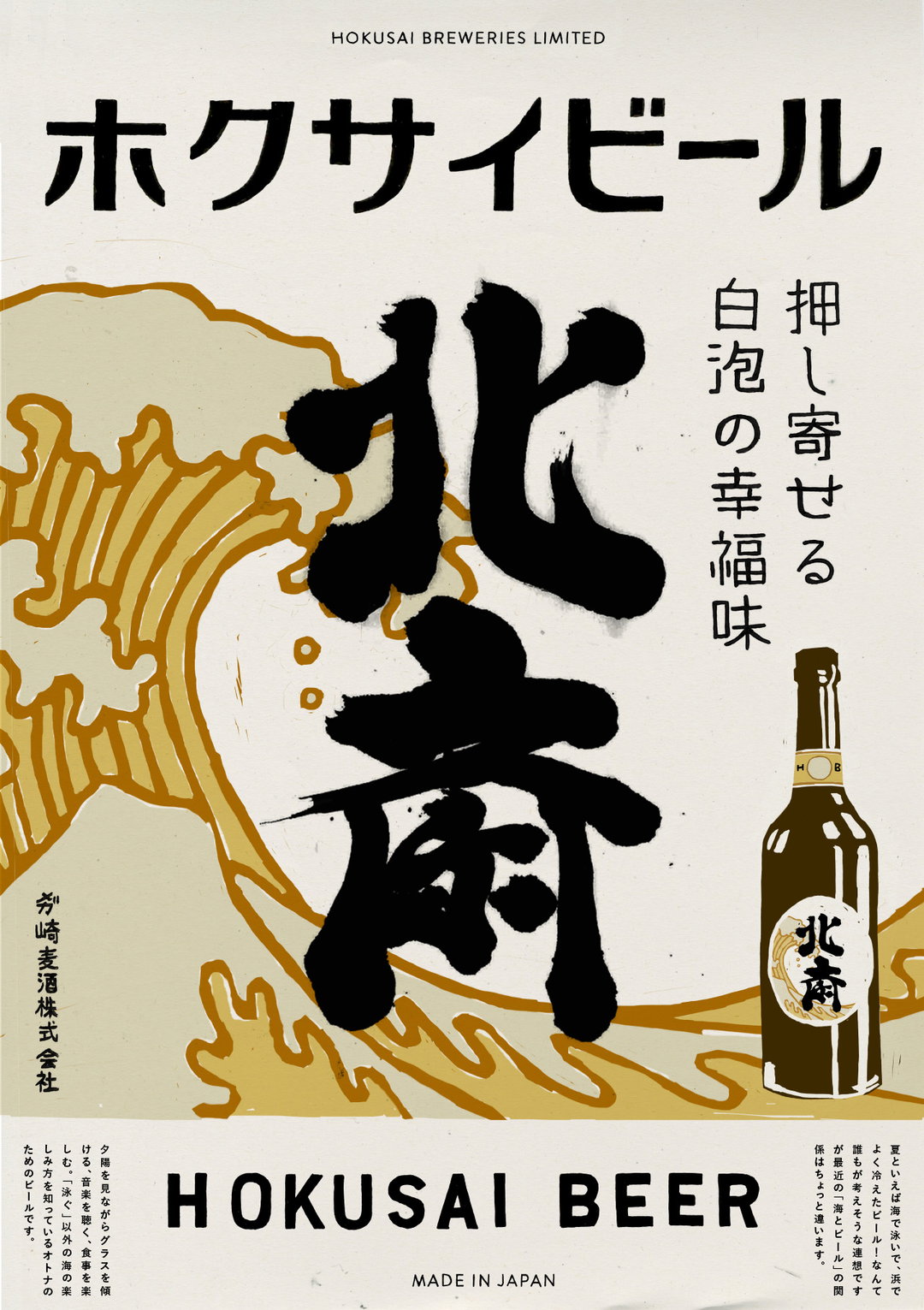
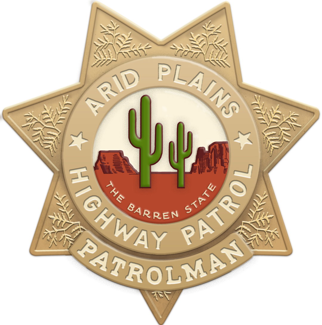
In a similar vein, London-based graphic designer Erica Dorn also believes that branding has the ability to drive character development. “A lot of products and fictional brands are associated with characters,” she says. “In a way, they’re character accessories that help establish who that person is.” Erica has a vast amount of experience working in the industry, most notably alongside Wes Anderson for films such as Asteroid City, Isle of Dogs and The French Dispatch. In a way, Wes Anderson has his own instantly recognisable brand and creative palette – i.e. rose-tinted colour palettes, dreamlike and rhythmical camera moves and symmetrical compositions. Erica explains how the process was informed by a close working relationship, where everything is personally approved by Anderson. “So if something doesn’t sit right with him, then it goes back to the design phase,” Erica explains. There’s no guidebook for designing a Wes Anderson film, but the director does have one requirement – the film’s graphics need to feel handmade. “Wes wants a less computer-y aesthetic,” she adds. “The team uses digital tools to speed up the process while keeping the handmade aesthetic as close as possible.”
“A lot of products and fictional brands are associated with characters. In a way, they’re character accessories that help establish who that person is.”
Erica Dorn
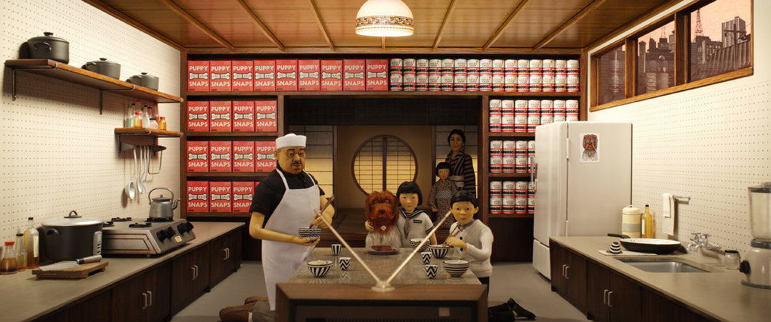
Wes Anderson: Isle of Dogs
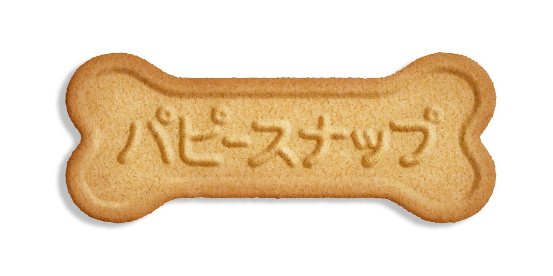
Wes Anderson: Isle of Dogs. Puppy Snaps
Wes Anderson: Isle of Dogs. Puppy Snaps
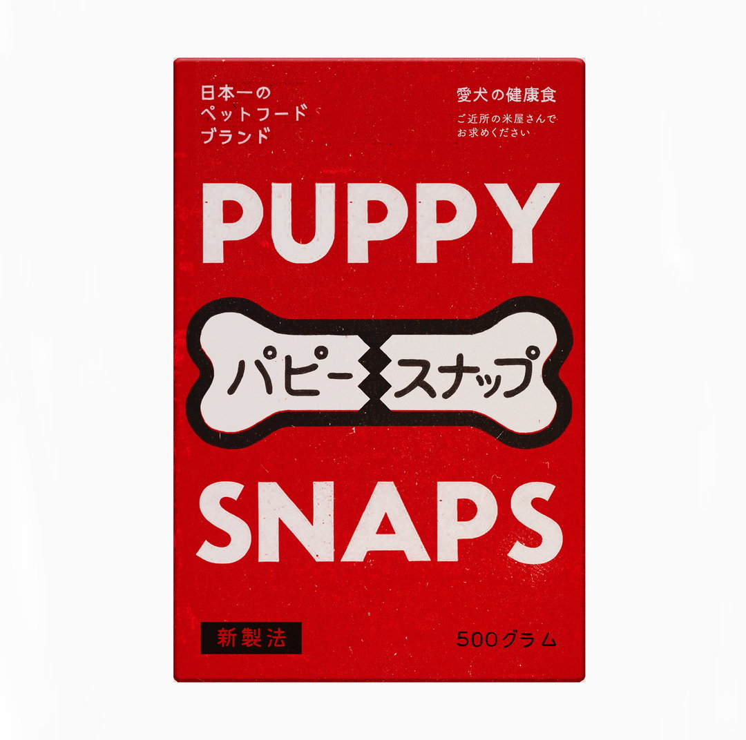
Wes Anderson: Isle of Dogs. Puppy Snaps
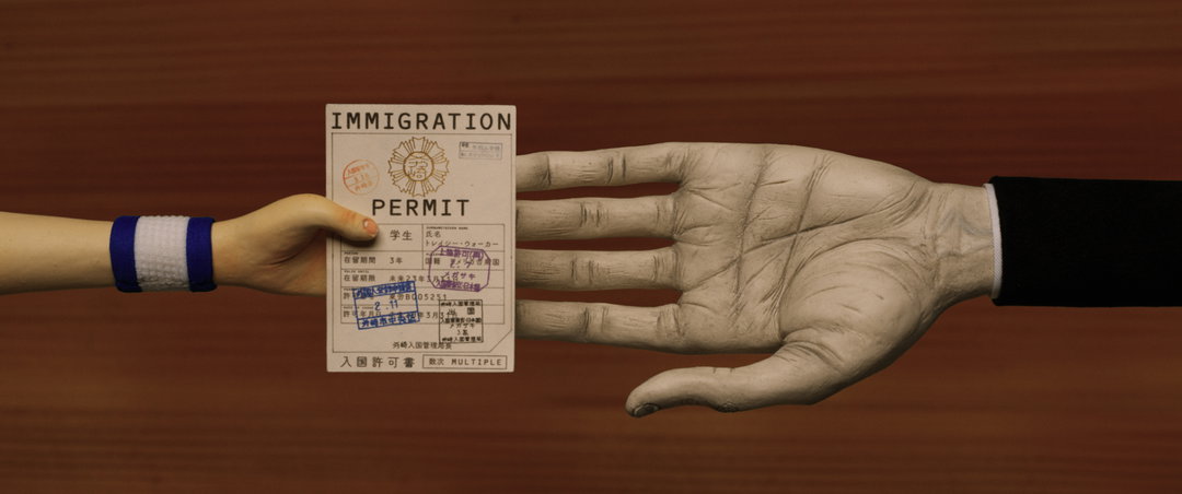
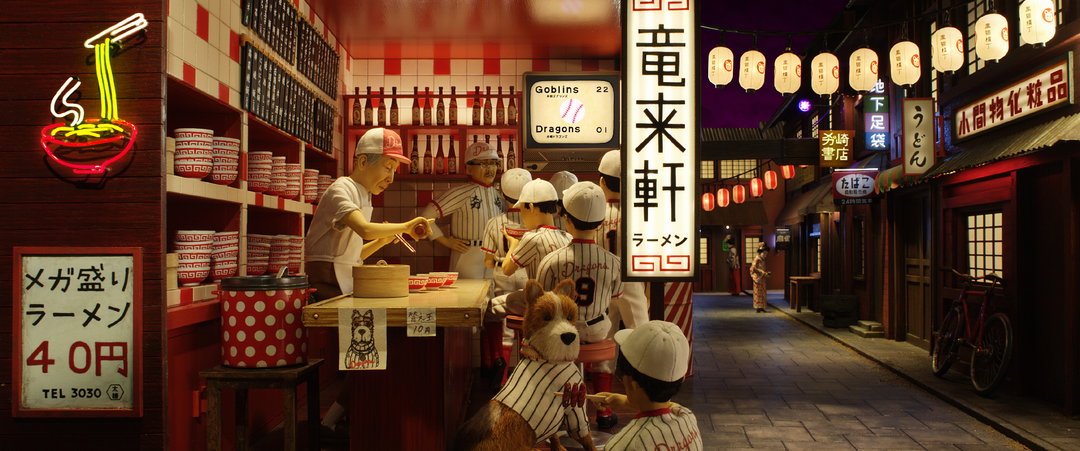
From top to bottom: Wes Anderson: Isle of Dogs. Dracy Immigration; Wes Anderson: Isle of Dogs
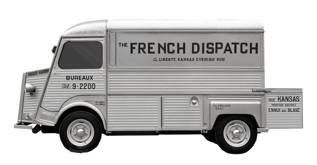
Wes Anderson: The French Dispatch
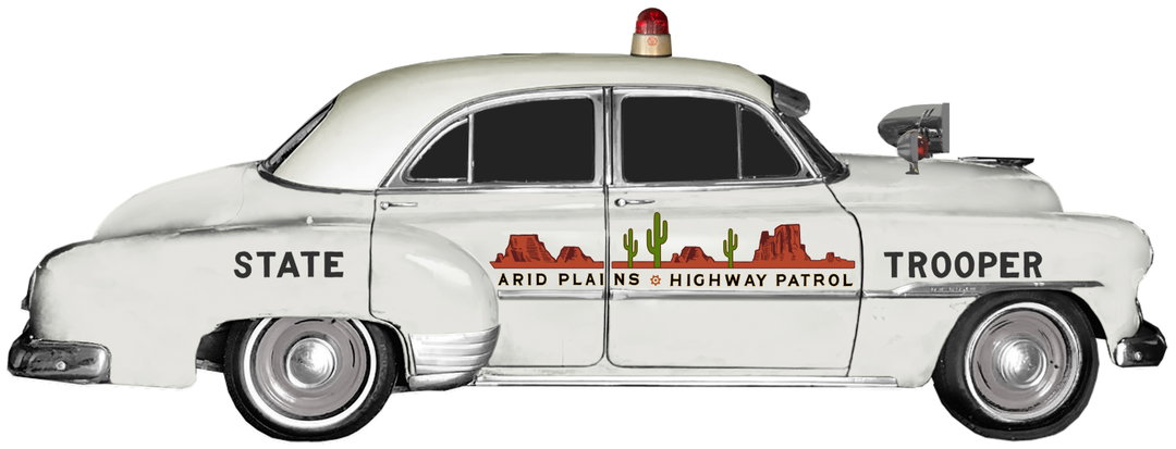
Wes Anderson: Asteroid City. State Trooper
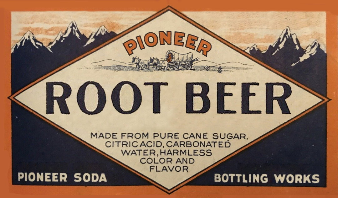

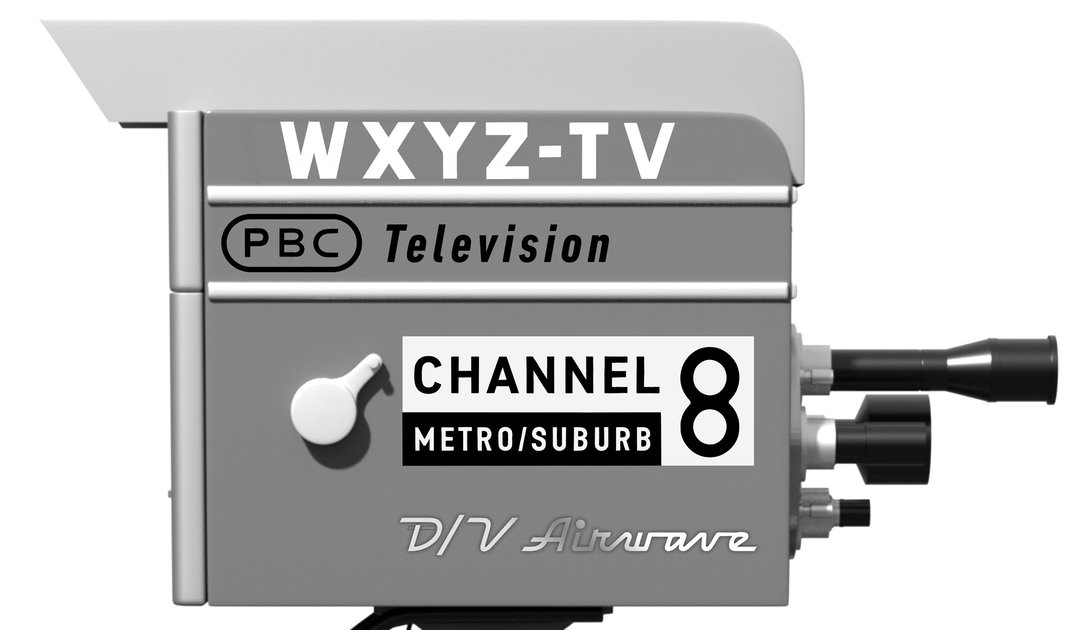
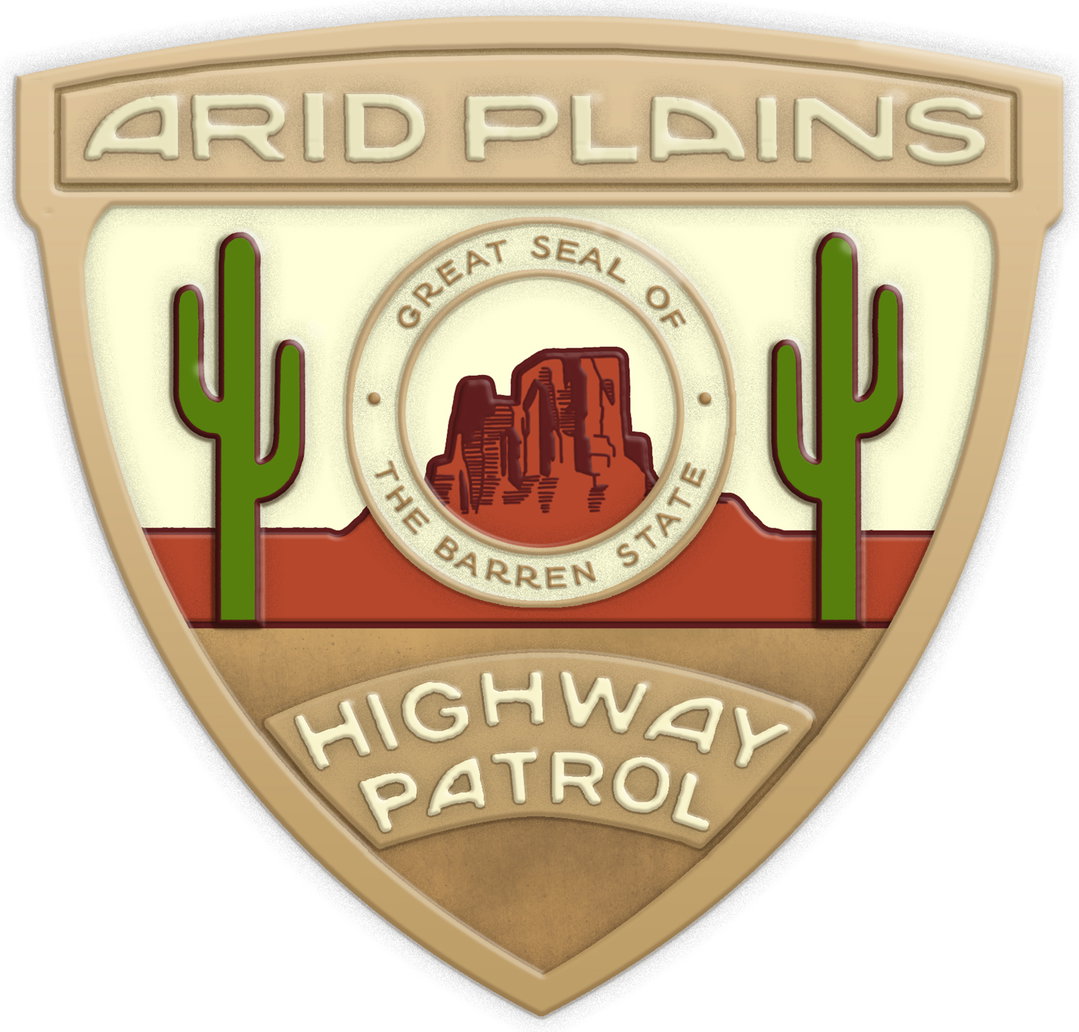
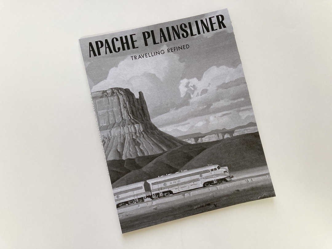
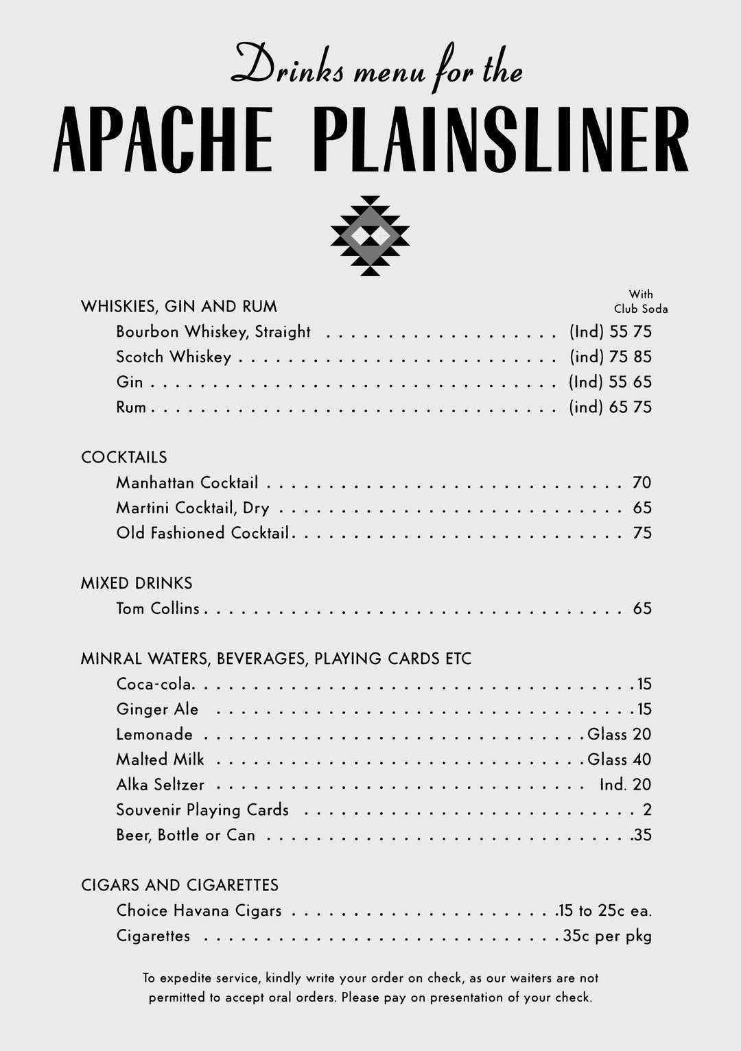
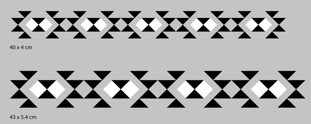
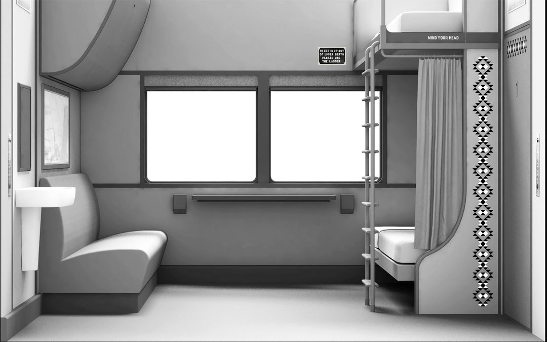
1 of 10
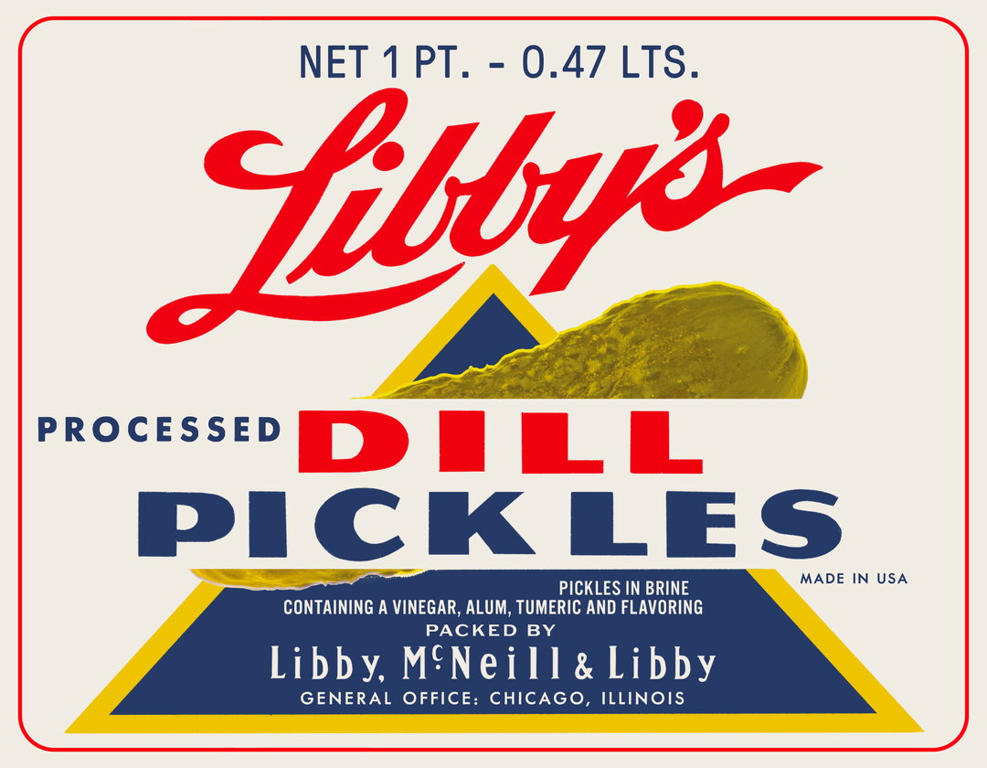
Wes Anderson: Asteroid City. Real brand: Libby's Dill Pickles
1 of 10
Wes Anderson: Asteroid City. Real brand: Libby's Dill Pickles
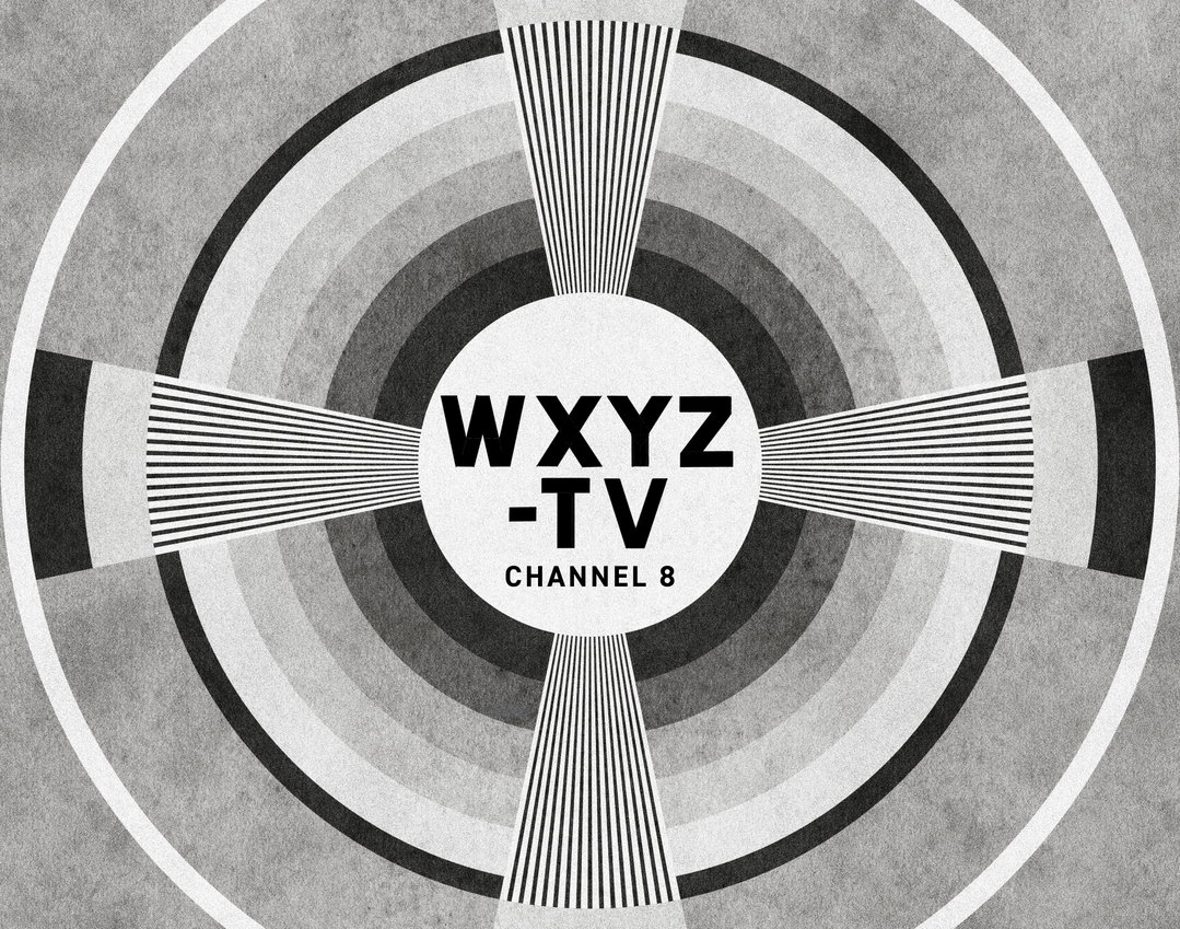
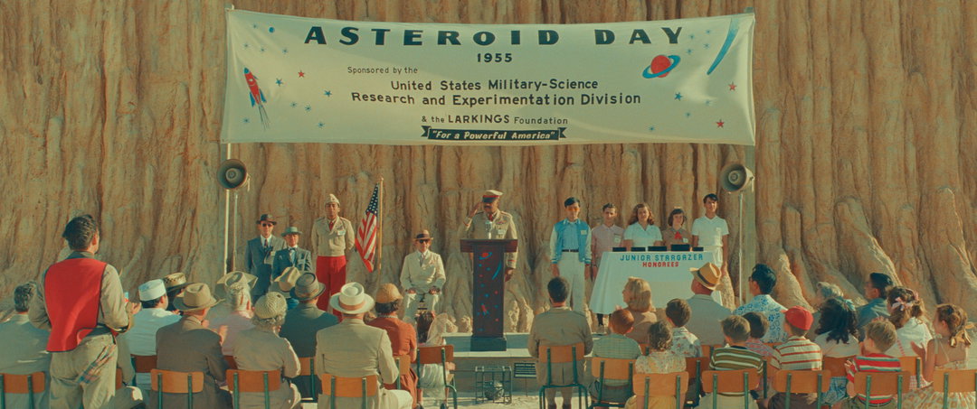
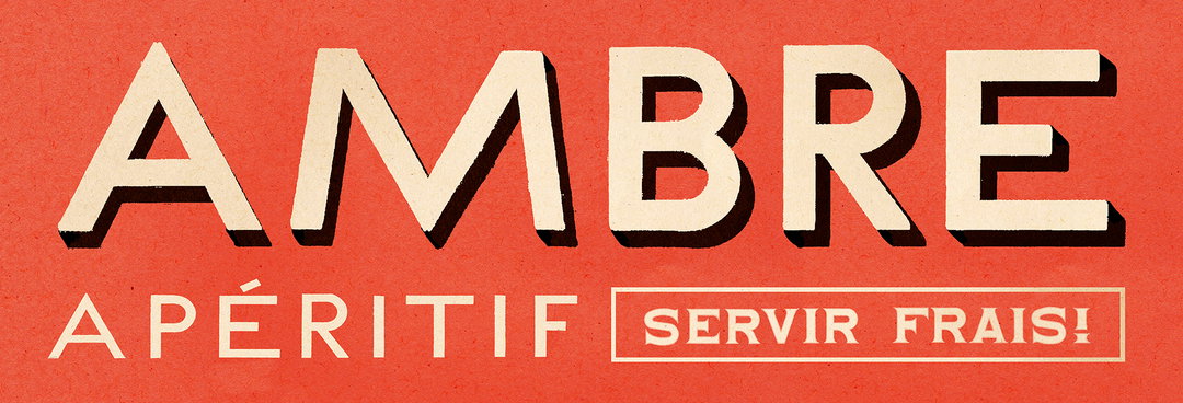
From top to bottom: Wes Anderson: Asteroid City. TV Testing Graphic; Wes Anderson: Asteroid City
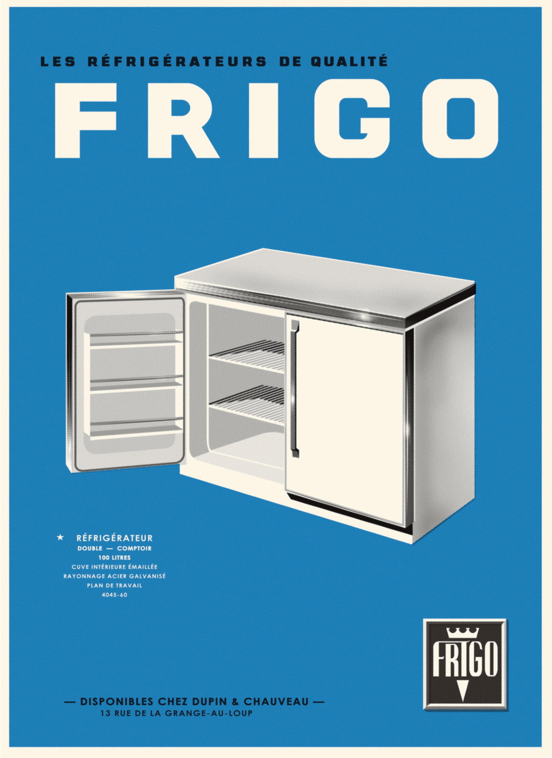
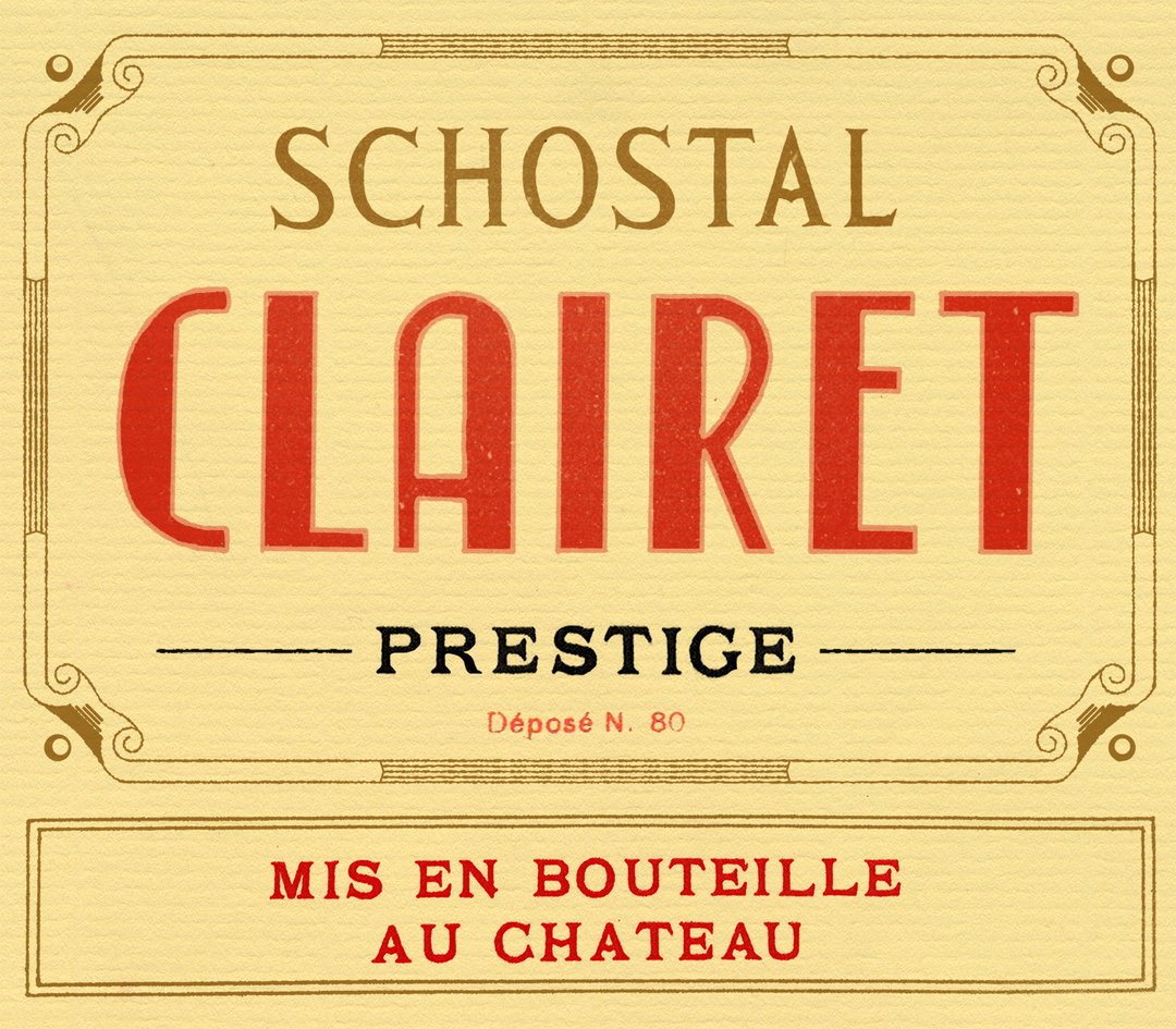
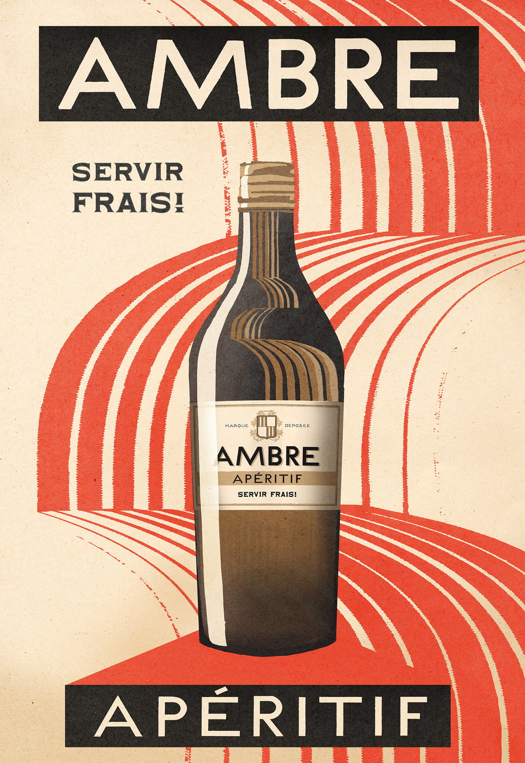
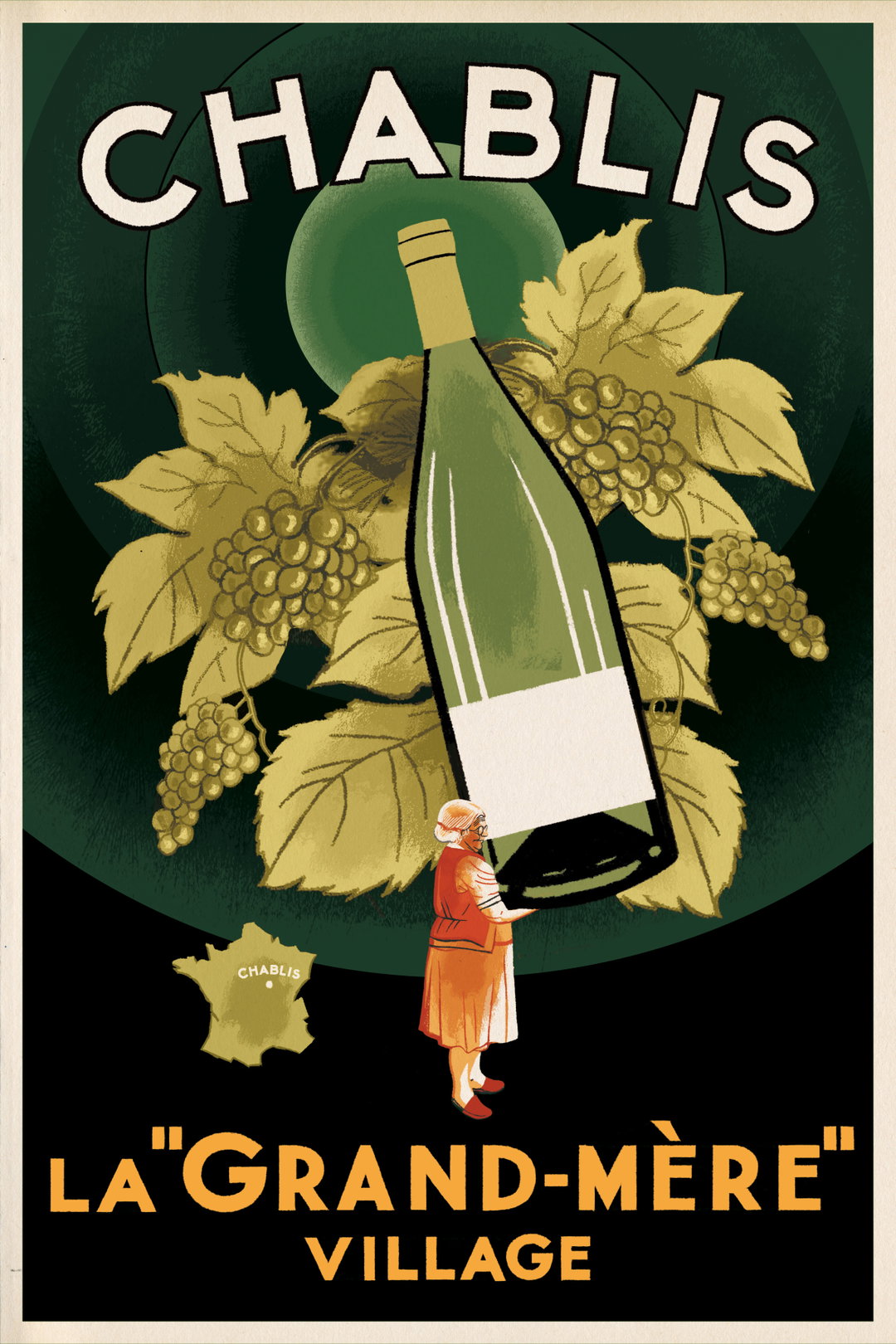
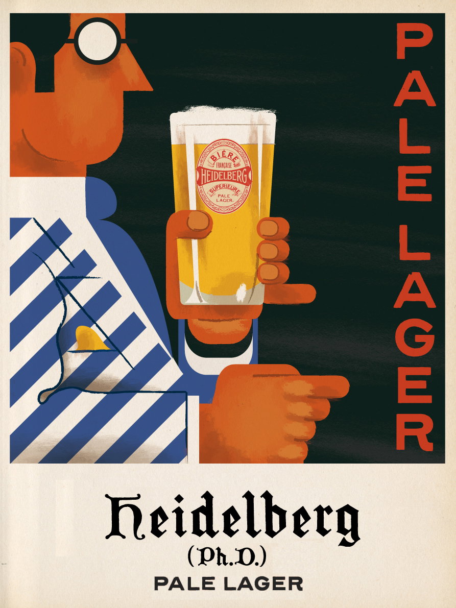
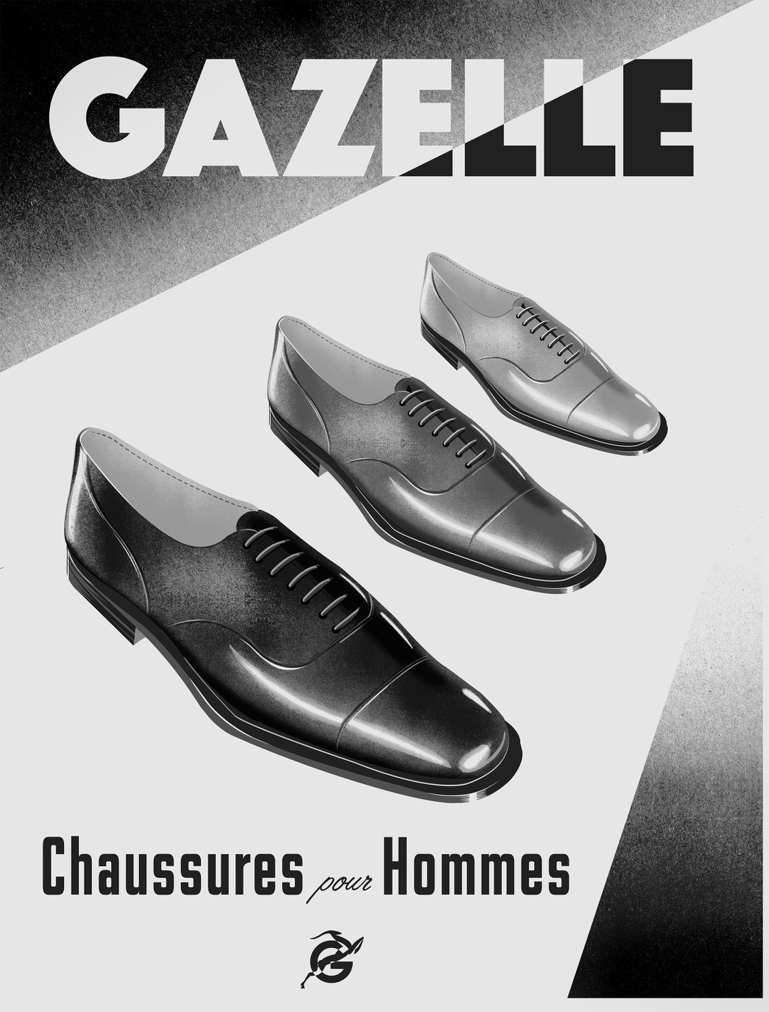
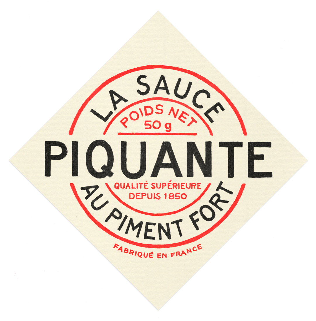
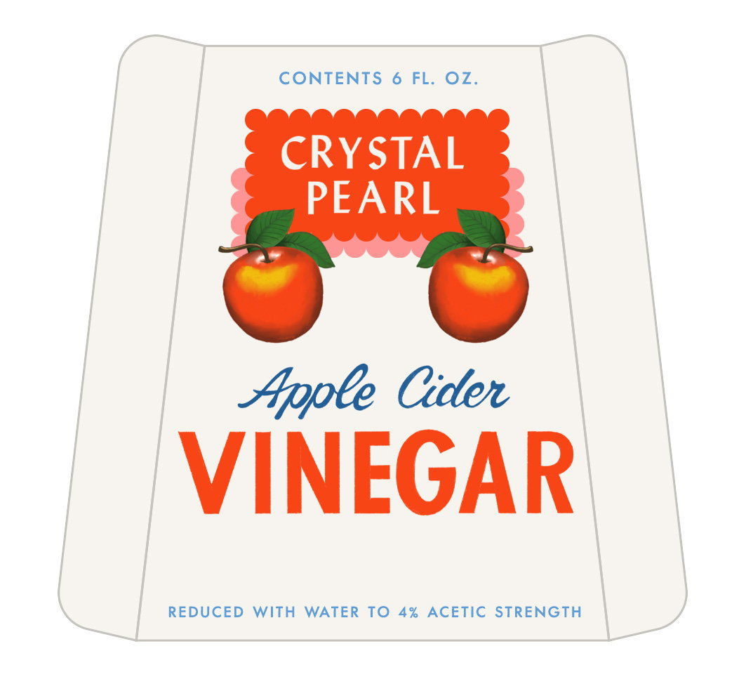
1 of 9
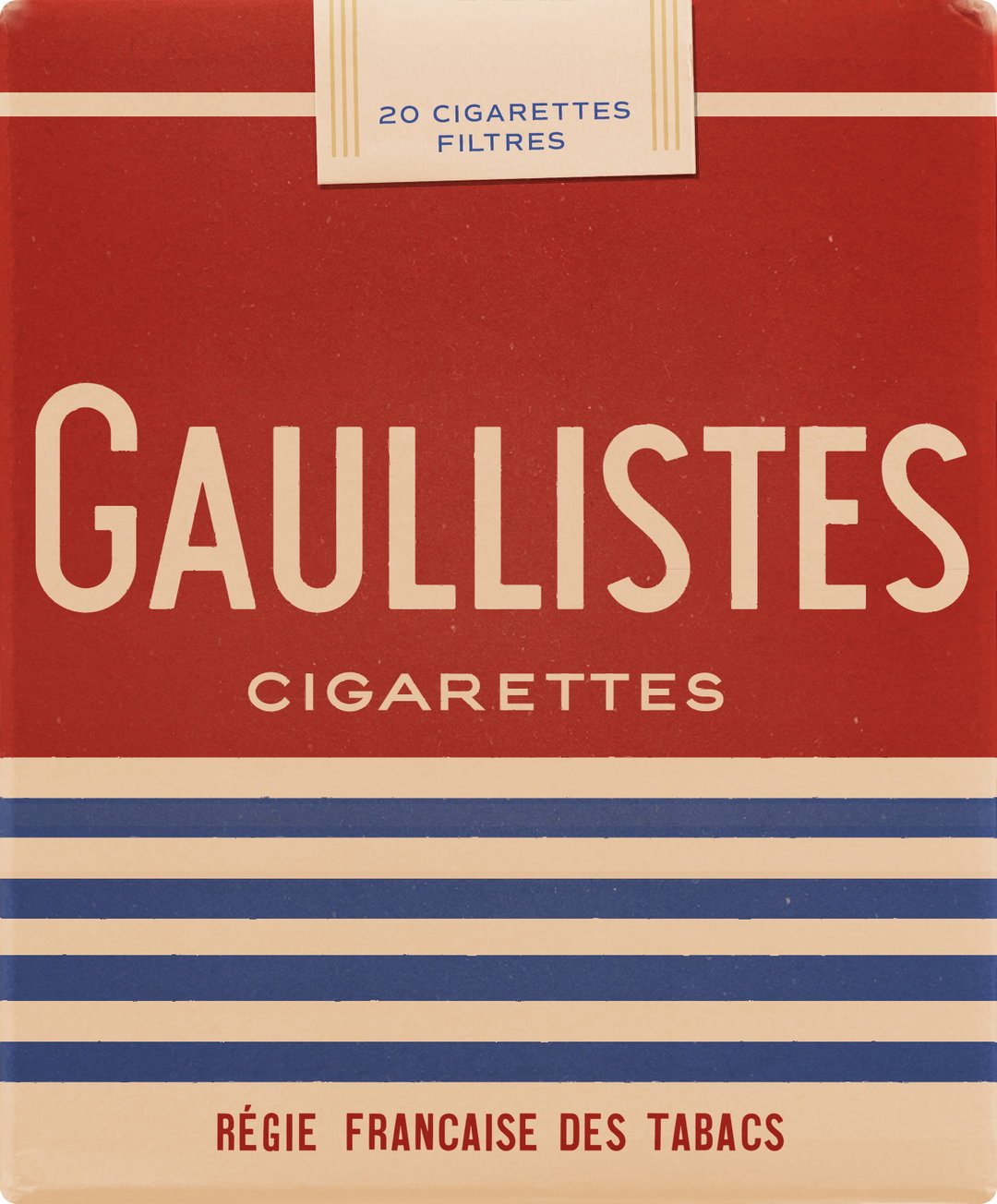
Wes Anderson: The French Dispatch. Gaullistes
1 of 9
Wes Anderson: The French Dispatch. Gaullistes
When it comes to the make-up of fictional brands, Erica notes how, if done correctly, they can make the stylised world feel like a real place, and can become a playground for the characters to fully express themselves within the storyline. In Asteroid City, for instance, all of the roadside cafes have menus written on the facade, because cars don’t have time to stop for a menu. “The cafe is the canvas of the menu board,” she says. Additionally, one of the characters named Shelly constantly carries a book entitled Invisible Spectrum Elemental Surface Atomic Spectroscopy. There’s also a Girl Scout character who’s always walking around with her Jam Krispies. “Often the brands have a purpose for existing in the script. It’s about understanding what the purpose of that action prop is, and what they’re trying to say about a particular character.”
This is just one side of the coin. According to Erica, there are two different categories for fictional brands: the hero and the background. The former are those that are memorable or scripted to help establish a character; the latter are those that blend into the background, or those that the design team have to create because they don’t have the legal clearance to use real ones. “On every film, it’s different,” she adds. In The French Dispatch, for example, the team fictionalised almost every single product – even the hot sauce had its own identity and design. By contrast, Asteroid City is awash with real brands like Ketchup, Tabasco and Campbell’s baked beans in order to give a sense of realism and familiarity. “These are iconic Americana brands that help situate the story and take you to a real time and place. I think it depends on what the director is aiming for.” When incorporating a real brand into the mix, Erica explains how she would usually try and find the precise product from the exact era, or at least be as close as possible. “Ultimately it’s about creating something that represents the essence of the story or the particular character, and is bold and memorable.”
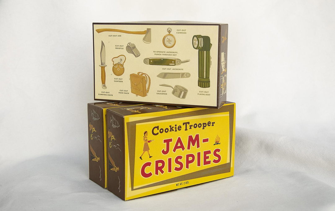
Wes Anderson: The French Dispatch. Fictional Brand: Jam Crispies
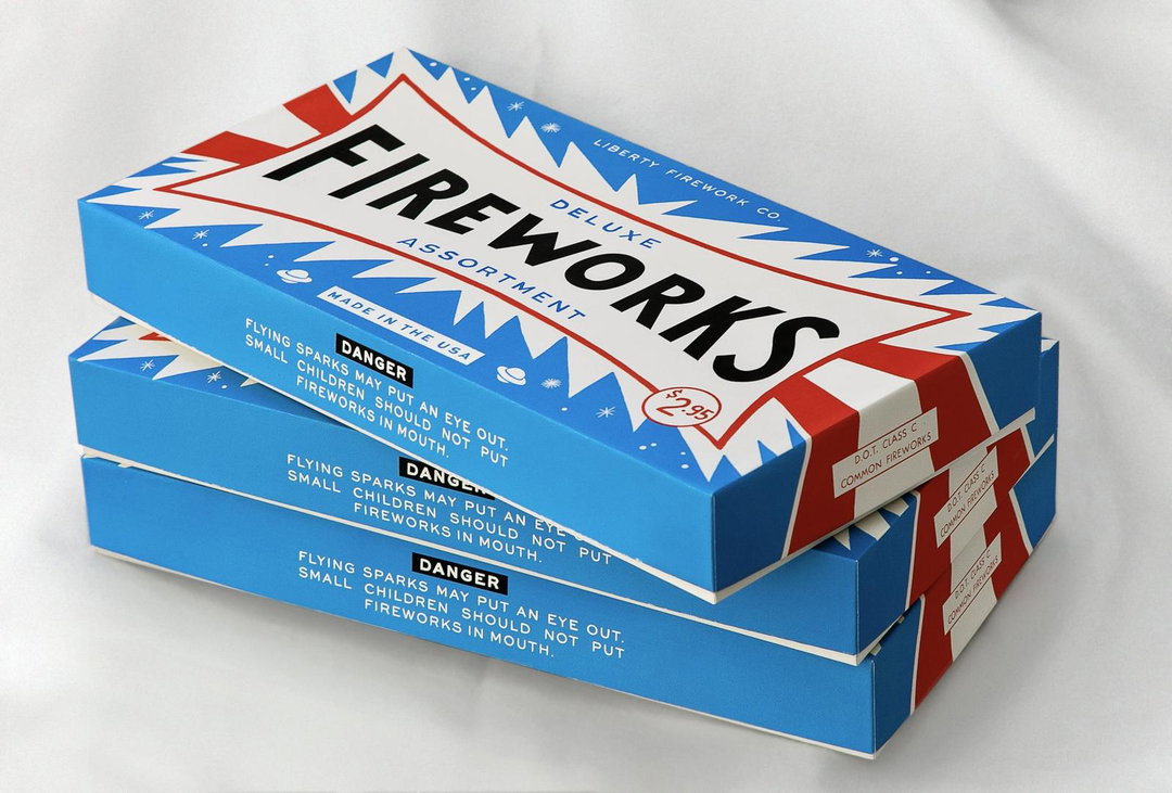
Wes Anderson: The French Dispatch. Fictional Brand: Fireworks Box
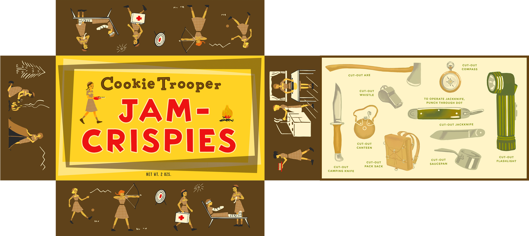
Wes Anderson: The French Dispatch. Fictional Brand: Jam Crispies
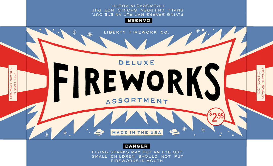
Wes Anderson: The French Dispatch. Fictional Brand: Fireworks Box
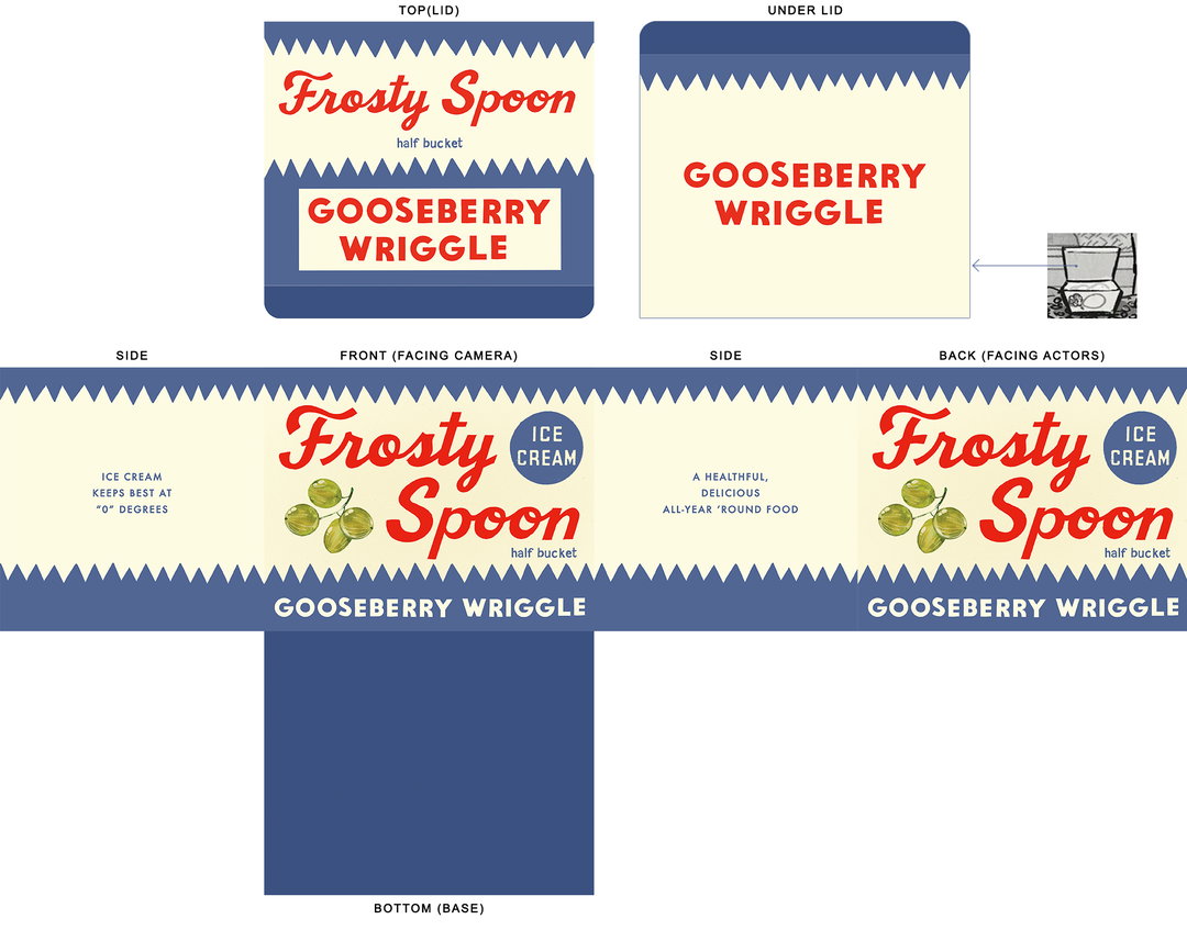
Wes Anderson: The French Dispatch. Fictional Brand: Frosty Spoon
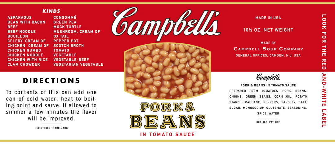

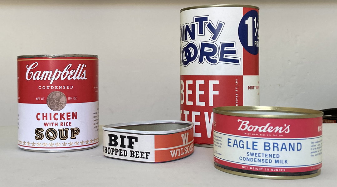
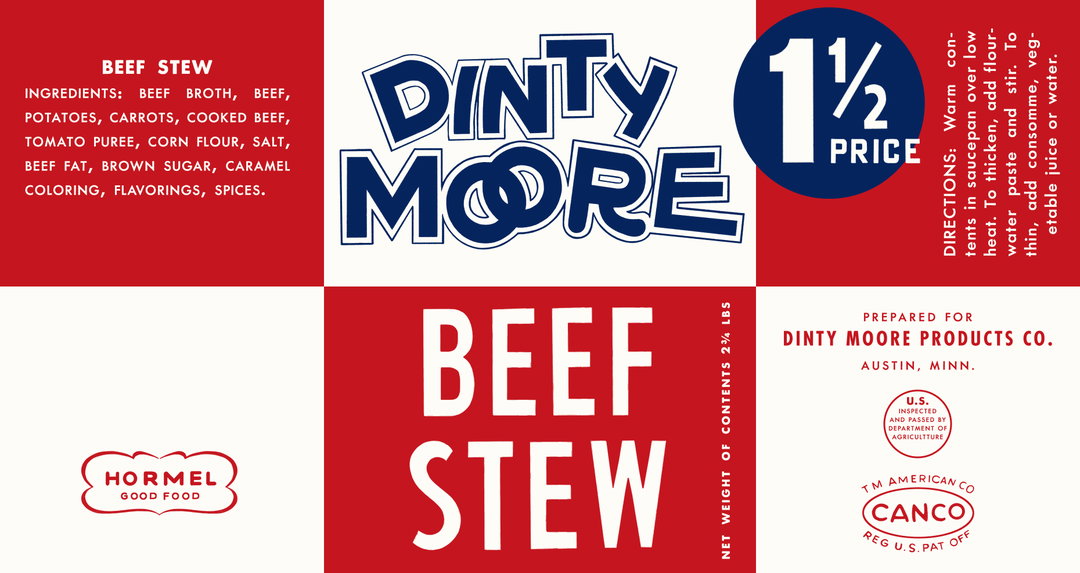
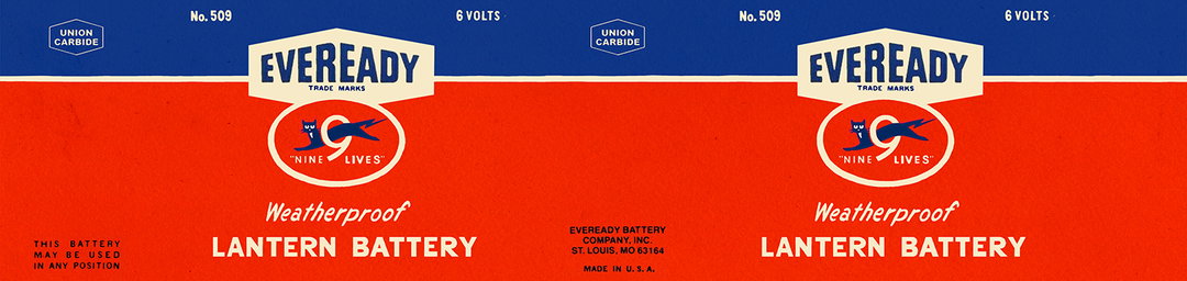
From top to bottom: Wes Anderson: The French Dispatch. Real Brand: Campbell's Beans; Wilson's Chopped Beaf; Wes Anderson: The French Dispatch. Real Brand: Campbell's Beans; Wes Anderson: The French Dispatch. Real Brand: Campbell's Chicken Soup; Wes Anderson: The French Dispatch. Real Brand: Dinty More Beef Stew; Wes Anderson: The French Dispatch. Fictional Brand: Firework Box
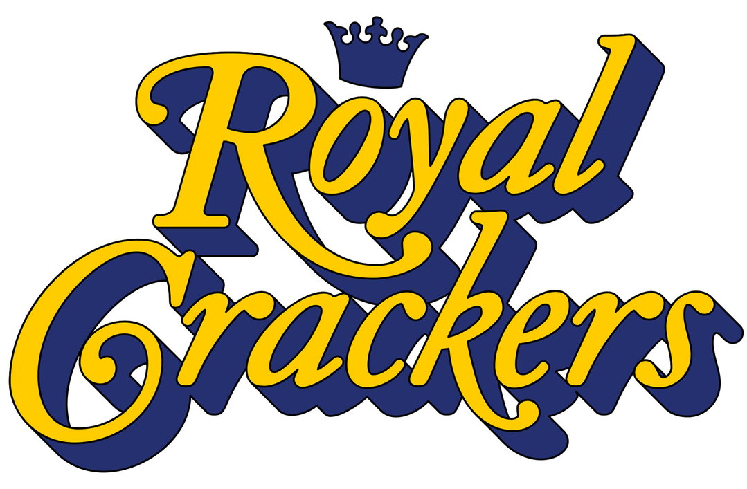
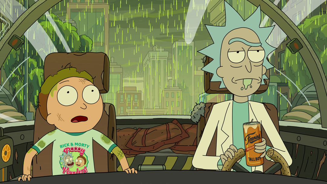
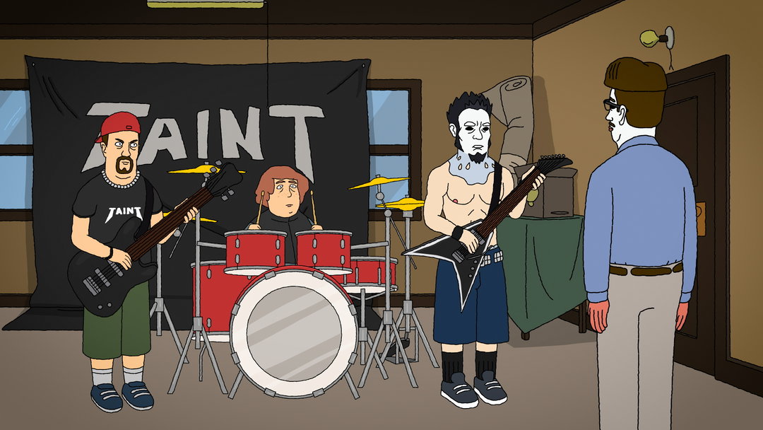
Adult Swim: Royal Crackers (top), Rick and Morty (Bottom)
While Erica argues that there’s a duality to fictional brands, Michael Ouweleen, president of Cartoon Network and Adult Swim says that fictional brands need to have one purpose: they need to be funny. Cartoon Network is the broadcaster of Adult Swim, a programmer responsible for shows such as Rick and Morty, Royal Crackers and many more. What makes an Adult Swim show very, well, Adult Swim, is its sense of world-building, strong main characters and comedy. “What they have in common is how people like to play with brands in shows, because it’s a fun way to make comedy out of things that influence everyone’s daily lives,” he says. “If it’s something that’s in the background to decorate the world, usually it’s a cheap joke. I think the brands that are in the background aren’t pulling their weight. A cheap joke isn't good development. Get rid of it or use it in a way that’s meaningful and intentional. Don’t just junk up the joint with fake brands.”
“The only difference between real brands and fake brands is it benefits fake brands to be hilarious, for something to be inherently wrong about the brand from the word go. That doesn't usually work for real brands.”
Michael Ouweleen
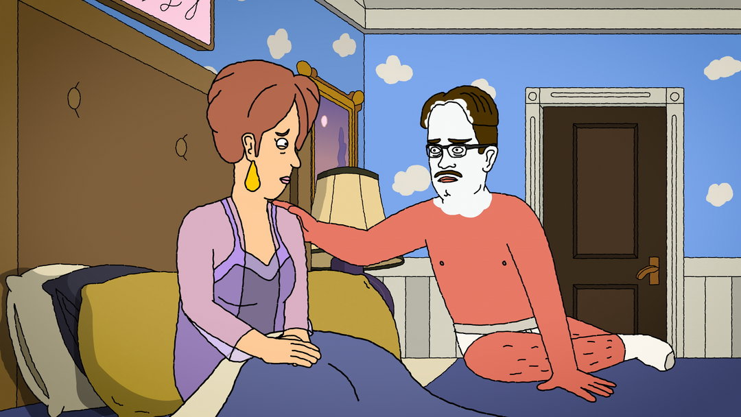
Adult Swim: Royal Crackers
Adult Swim: Royal Crackers
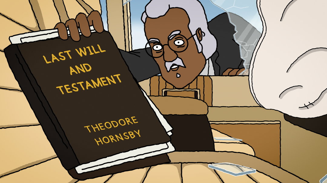
Adult Swim: Royal Crackers
Rick and Morty takes the idea of world-building and a good joke to the extreme. Created by Dan Harmon and Justin Roiland, the series parodies Back to the Future and Doctor Who, and is based on two characters – an “egotistical, narcissistic grandfather” and his “nervous” grandson who gets put into dangerous situations usually involving aliens. There’s an infinite multiverse in the Rick and Morty world, as well as endless versions of the characters, species and planets. “It’s world-building at its biggest,” says Michael. And in this multiverse, there are countless fake brands, like a mind-bending door company selling fake but real doors, which ended up becoming a meme in reality. “It became a way to make fun of companies,” he adds. Additionally, more “basic” brands like McDonald’s and Shoney’s also appear throughout the show, which Michael says is oddly reassuring. “When you have this sprawling, intergalactic, multi-dimensional world with infinite possibility, and Rick’s the most powerful person in the universe, the brands are super grounding and add normality to the family dynamics of this series.”
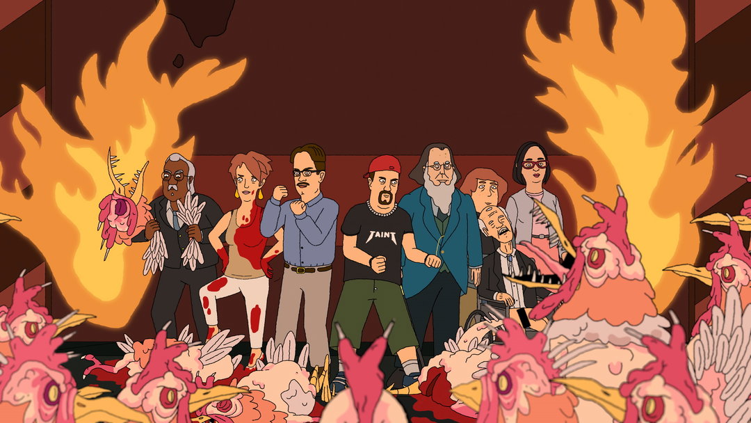
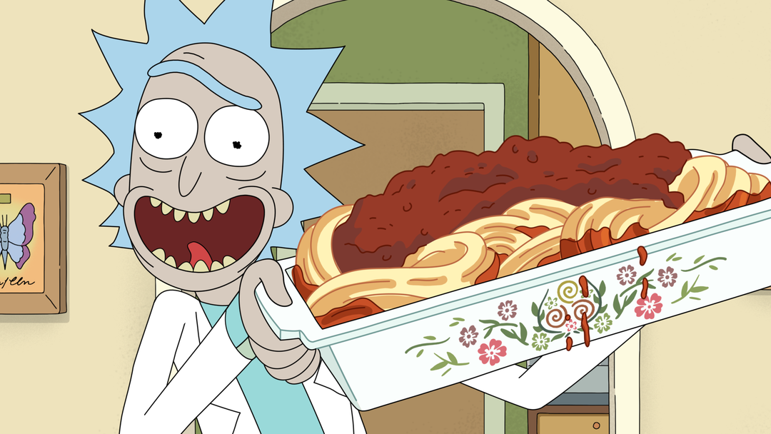
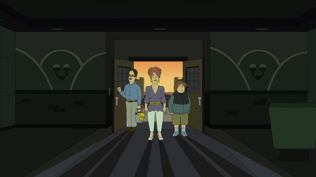
From top to bottom: Adult Swim: Royal Crackers; Rick and Morty; Royal Crackers
A sense of normality can (sort of) be seen in another show named Royal Crackers, created by Jason Ruiz. Likened to a “low-stakes” Succession, the show follows a family fighting over a cracker empire and home of the “most basic” kind of cracker going – the saltine. There’s no wacky universe here; instead the plot follows two rival snack companies as they battle for business. “There’s this whole worldview based around packaged snacks,” says Michael. Not too dissimilar from Barbie, the entire Royal Crackers universe is based on this cracker brand, from the logo, packaging, plot line and aesthetic to the ads featured within it. The team even went as far as creating a real-life billboard made entirely out of crackers to advertise the show. “It’s fun for animators to exercise their marketing muscles,” says Michael.
In Michael’s view, a fictional brand is made successful by its USP. “It’s the same thing that makes a great real brand,” he explains. “The only difference between real brands and fake brands is it benefits fake brands to be hilarious, for something to be inherently wrong about the brand from the word go. That doesn’t usually work for real brands.”
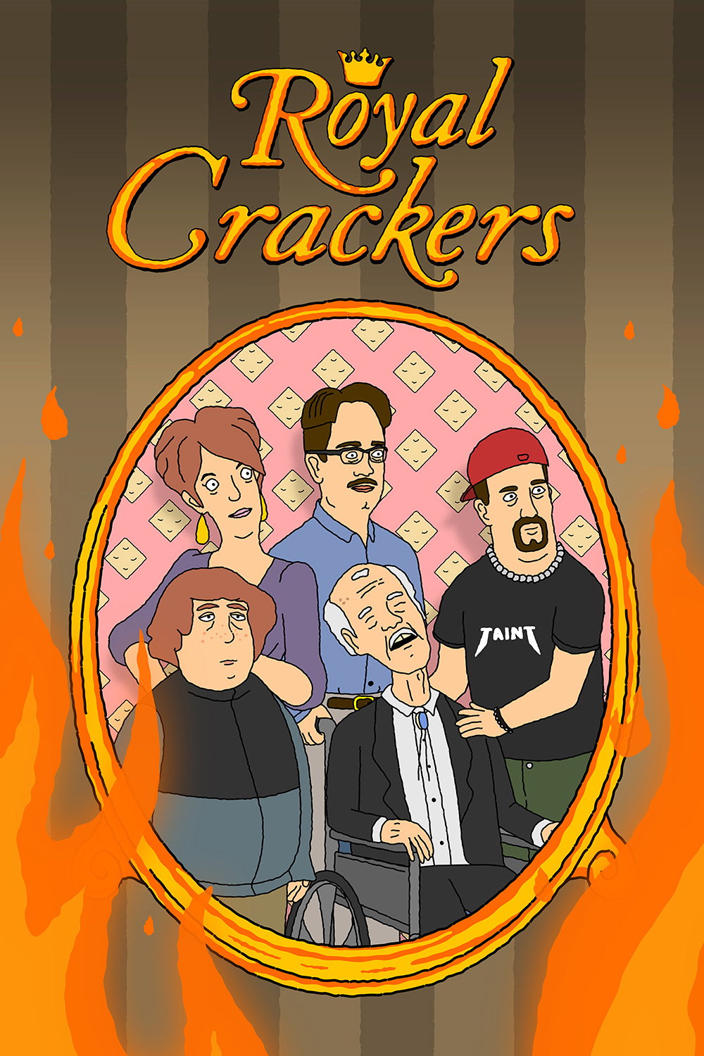
Adult Swim: Royal Crackers
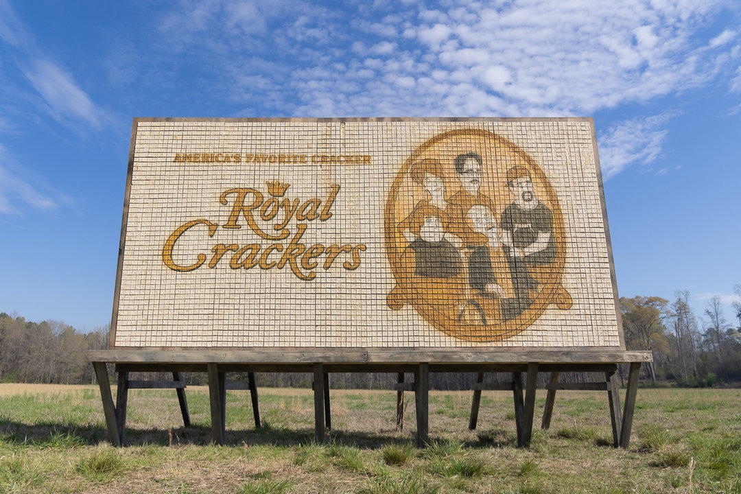
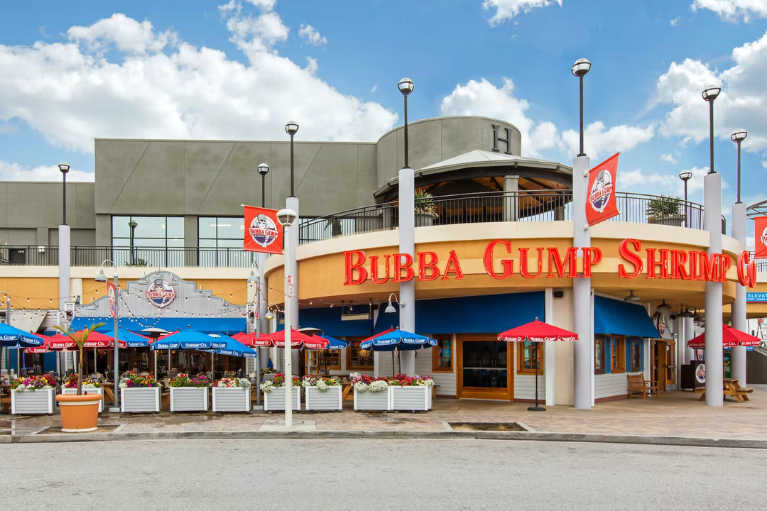
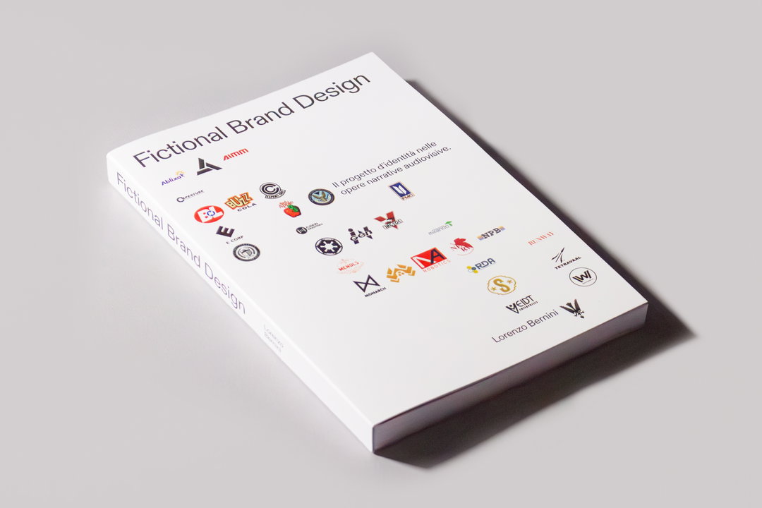
From top to bottom: Adult Swim: Royal Crackers; an interpretation of Eric Rosenberg's Bubba Gump Shrimp design from Forrest Gump. Courtesy of Fictional Brands Archive; Lorenzo Bernini: Fictional Brands Archive
It’s clear that the influence of fictional brands doesn’t end when the screen fades to black. These imaginative creations often transcend the confines of their fictional worlds, leaving a lasting imprint (and sometimes a laugh) on our reality – like Duff Beer did. This idea has captured the mind of motion designer and 3D artist Lorenzo Bernini who, for his graphic design dissertation, decided to research and archive the world of fictional brands. Through his research, he noticed how meticulous and extensive these identities are and, when done right, how they can fully be immersed into the real world as if they were a fully fledged OG brand. When this happens, it’s called defictionalisation – a term used to describe the moment a fake brand takes on a life of its own beyond the merchandising. “Using exactly the same principles as real brands, fictional brands can create an emotional connection and a sense of recognition that transcends the boundaries of the narrative world,” he says. Examples of such include Bubba Gump Shrimp Co., a restaurant chain that has reinterpreted Eric Rosenberg's original design featured in Forrest Gump, the Dunder Mifflin Paper brand from The Office, and the Wonka Candies from Willy Wonka and the Chocolate Factory.
“Using exactly the same principles as real brands, fictional brands can create an emotional connection and a sense of recognition that transcends the boundaries of the narrative world.”
Lorenzo Bernini
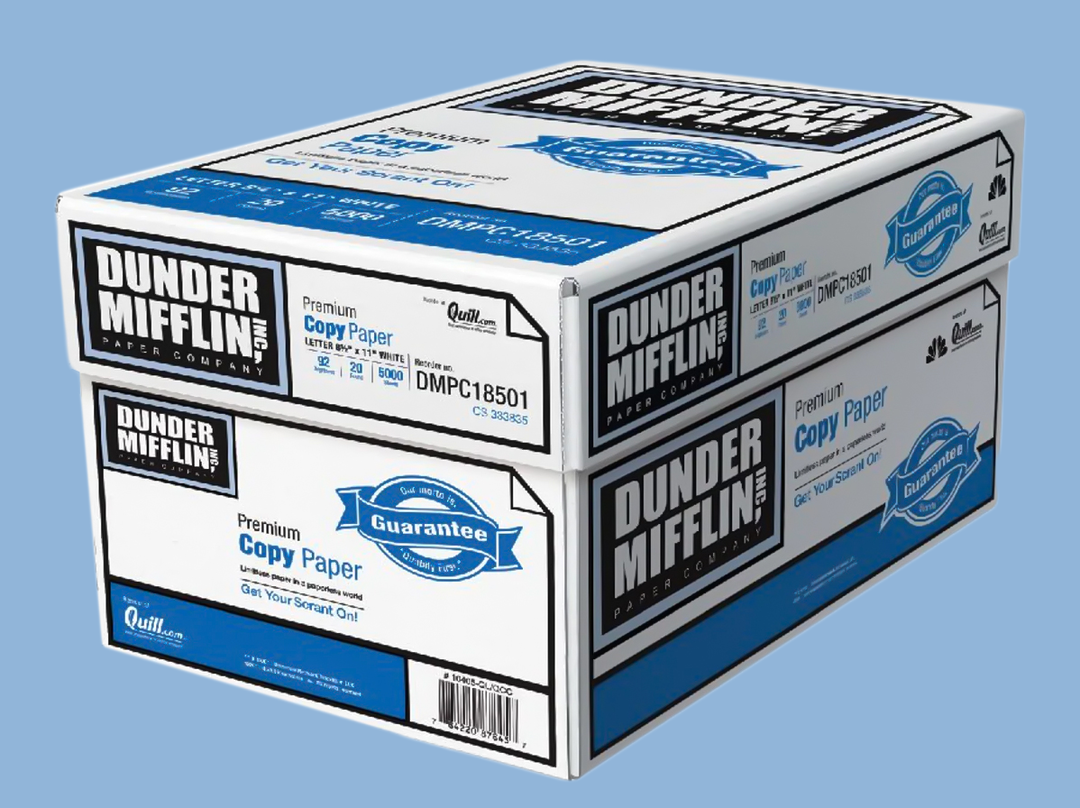
Dunder Mifflin from The Office. Courtesy of Fictional Brands Archive
Duff Beer from The Simpsons. Courtesy of Fictional Brands Archive
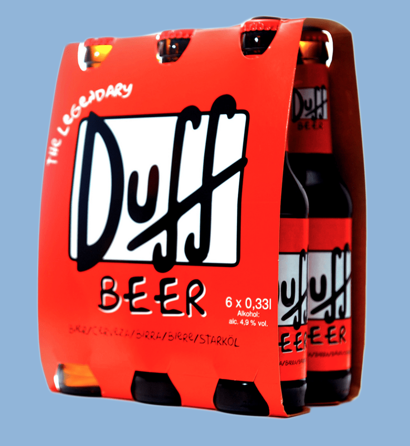
Duff Beer from The Simpsons. Courtesy of Fictional Brands Archive
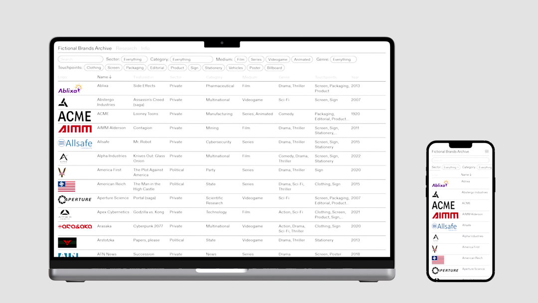
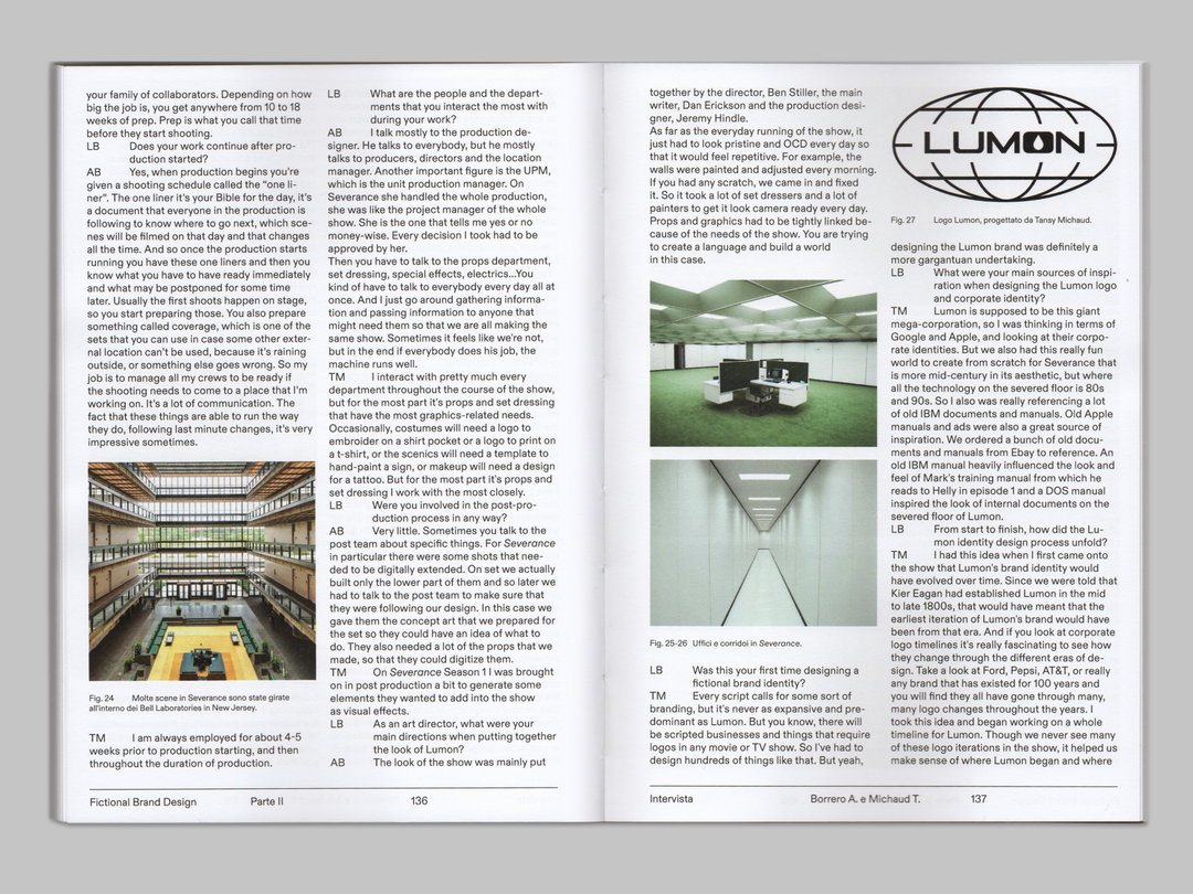
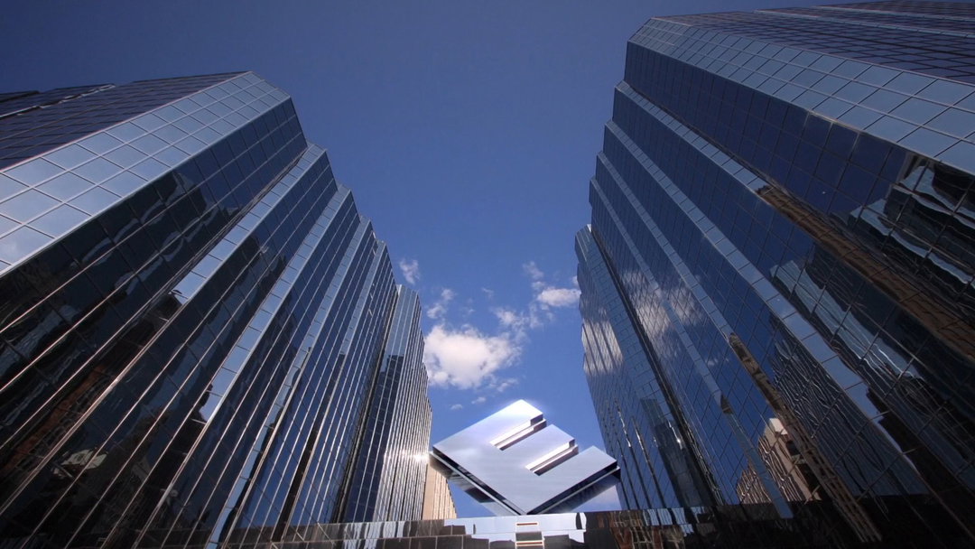
From top to bottom: Lorenzo Bernini: Fictional Brands Archive; E Corp from Mr. Robot. Courtesy of Fictional Brands Archive


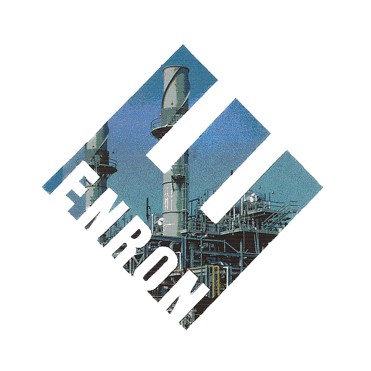
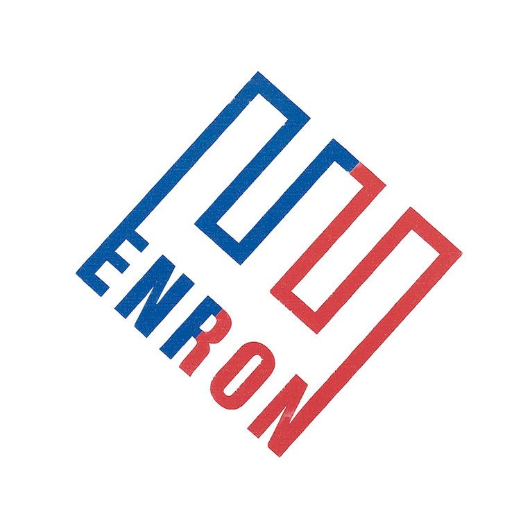
1 of 6
E Corp from Mr. Robot. Courtesy of Fictional Brands Archive
1 of 6
E Corp from Mr. Robot. Courtesy of Fictional Brands Archive
Like Erica, Lorenzo believes that successful fictional brands can either be a focal point of the narrative, or a seamless part of the background. “The best fictional brands are memorable and immediately recognisable,” he adds. They are more than just creative placeholders in the world of television and film. They are meticulously designed, multi-dimensional elements that enrich storytelling, provide commentary and resonate with audiences long after the credits have rolled. Whether evoking nostalgia or challenging societal norms, these brands remind us that reality is often crafted as much by our imaginations as by our experiences. They also remind us of the love and labour that go into designing a great fictional brand, and fictional world for that matter. With the current Writers Guild of America strike affecting the industry in demand of better pay and job security, and with three quarters of UK film and TV currently out of work, there has never been a better time to celebrate what they do.
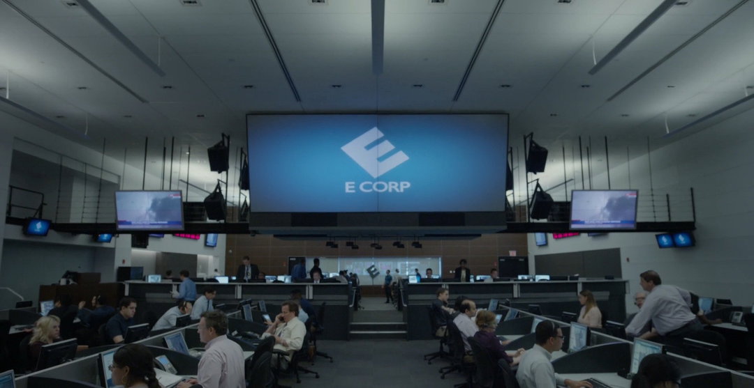
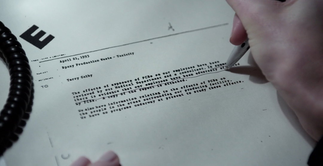
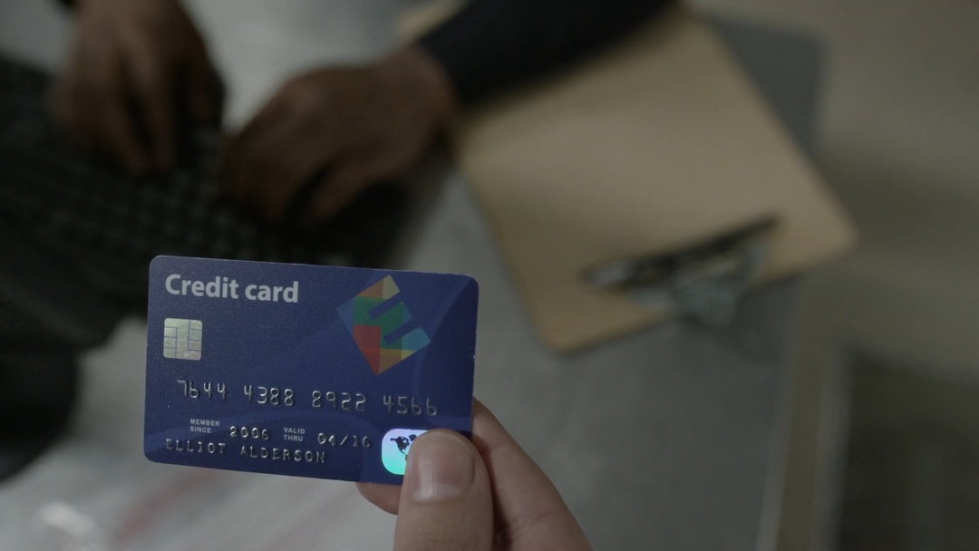
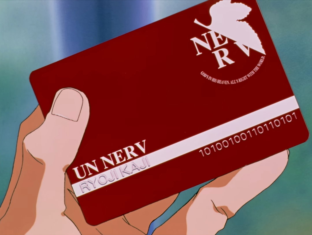
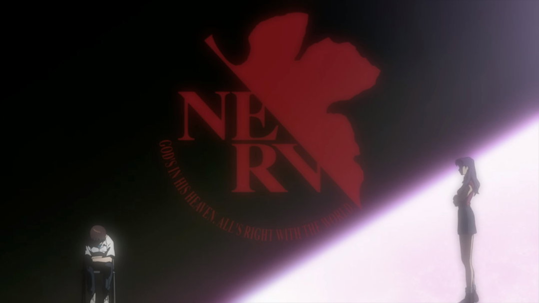
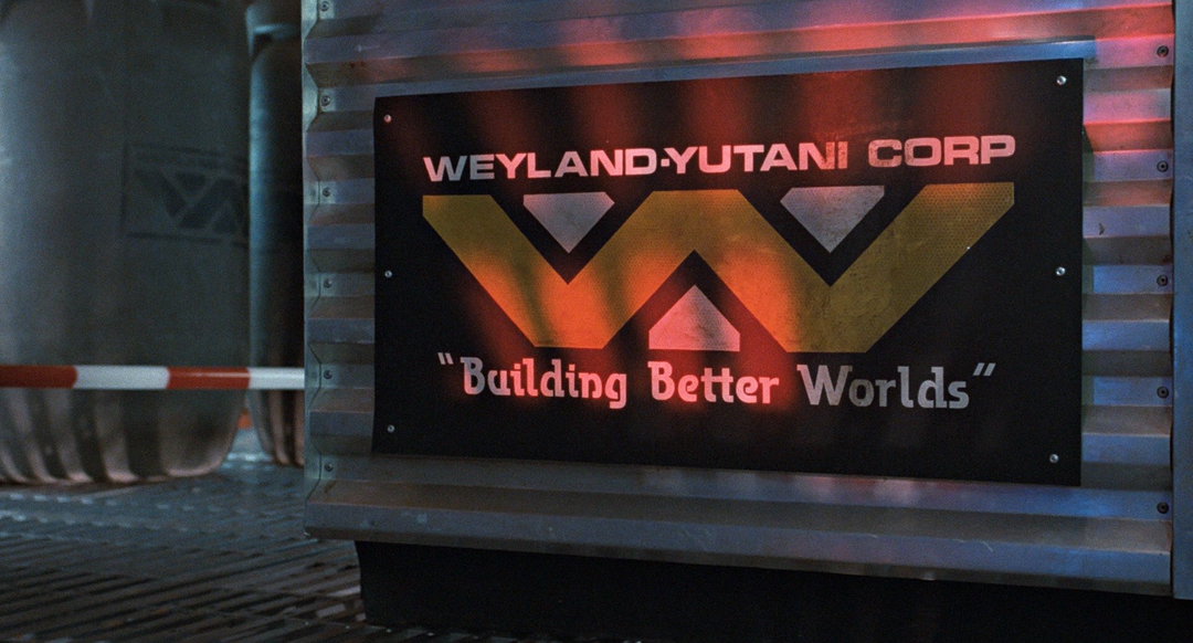
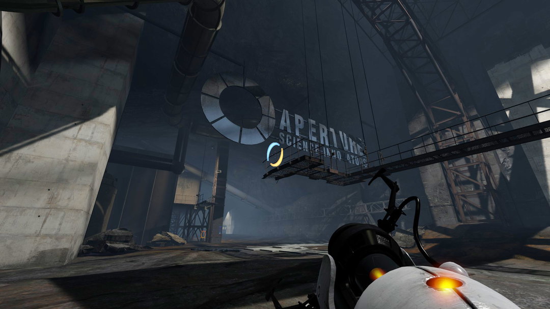
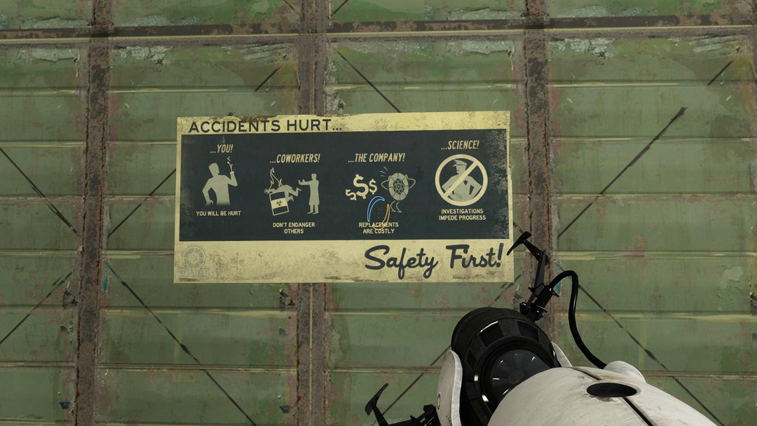
From top to bottom: E Corp from Mr. Robot. Courtesy of Fictional Brands Archive; NERV from Neon Genesis Evangelion (saga). Courtesy of Fictional Brands Archive; Weyland Utani from Alien (saga). Courtesy of Fictional Brands Archive; Aperture Science from Portal (saga). Courtesy of Fictional Brands Archive
Share Article
About the Author
—
Ayla is a London-based freelance writer, editor and consultant specialising in art, photography, design and culture. After joining It’s Nice That in 2017 as editorial assistant, she was interim online editor in 2022/2023 and continues to work with us on a freelance basis. She has written for i-D, Dazed, AnOther, WePresent, Port, Elephant and more, and she is also the managing editor of design magazine Anima.