




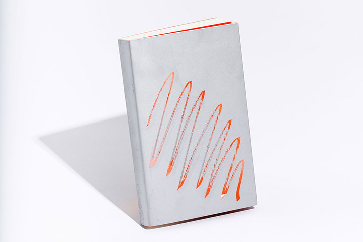
Graphic design studio Works creates scratchable cover for artist Min ha Park
Founded five years ago, Seoul-based graphic design studio Works is the creation of ongoing collaborators Harim and Yeonjeong. The two friends met during university more than ten years ago and continue to work together to this day under the creative studio’s name. “Creating the most direct and bold way to communicate the contents is our ultimate mission,” explain the founders.
Working across various fields of graphic design, the studio’s most recent project, Sun Gone, sees Harim and Yeonjeong tackle the exhibition graphics and book design for the artist Min ha Park’s latest show at Seoul’s One and J Gallery. With a print run of 500 bespoke publications, Sun Gone boasts a unique scratchable cover, encouraging an interactive element to the art of book design. The idea was conceived by Min ha Park and the cover, leading the designers to silkscreen each cover with lottery ink so when the book’s owner scratches away at the grey cover, a digital photo collage of the artist’s work is revealed underneath. Though each owner can personalise the book’s cover art as they wish, the main purpose of the scratchable surface is to “preserve the roughness of Min ha Park’s work within the catalogue.”
When asked what the designers enjoy most about their discipline, Harim and Yeonjeong comment that, “Compared with other mediums, graphic design allows us to envision an outcome quickly with ease. For the design duo, there is also a joy to making and trying out different printing methods and materials.
Ever since she was a child, Yeonjeong has wanted to pursue a career in graphic design. Obsessed with the lively graphics that adorned her clothing and various accessories, her interest in design was sparked at a young age. Alternatively, when Harim was young, she spent much of her time tracing Chinese letters onto transparent paper “enjoying the crafty feeling of drawing text by hand," continuing to feed back to her practice today.
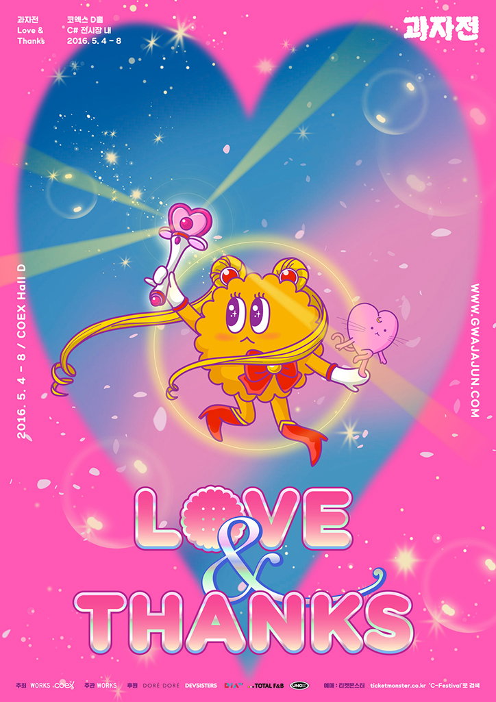
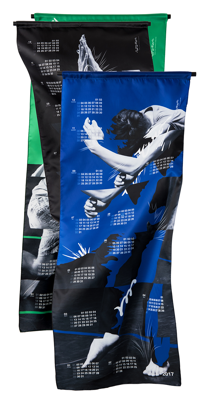
After studying product design at university, the two realised the flexibility of graphic design in comparison to the rigid structure of product. They moved into their chosen design field as a result and haven’t looked back since, going onto design a graphic identity for the likes of Fuji Film and Magnum Photos’ global exhibition, as well as many other dynamic print-based projects which have seen them express a myriad of skills and styles.
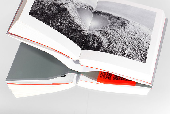
Works: Sun Gone
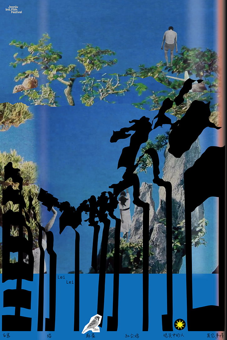
Works: Breathless Animals
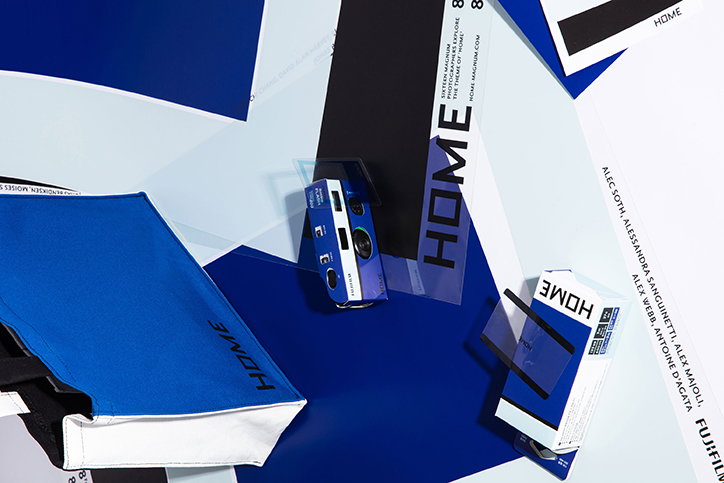
Works: Fuji Film, Home
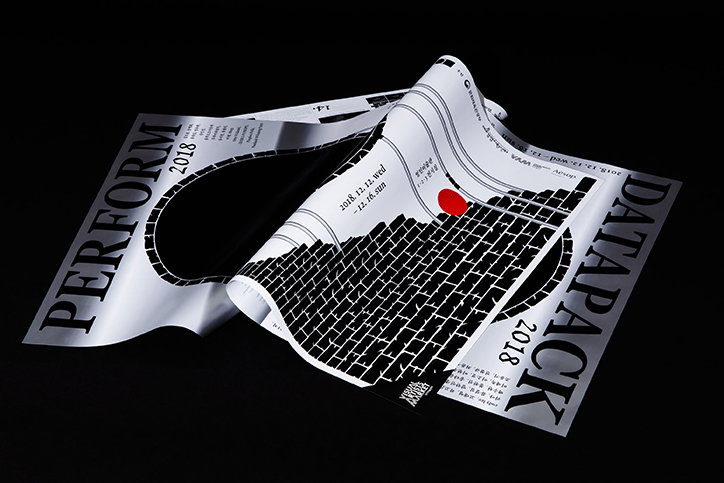
Works: Perform
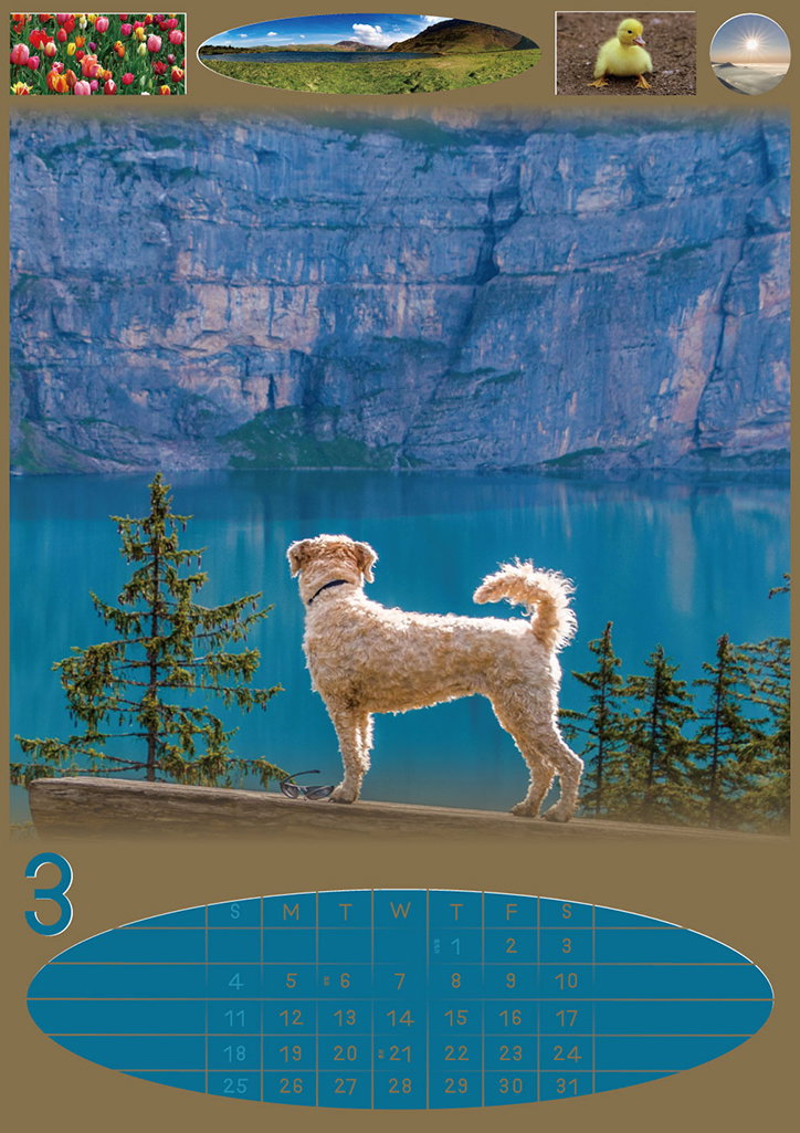
Works
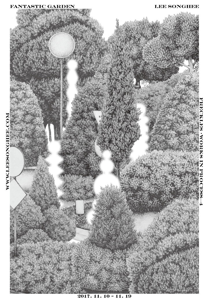
Works
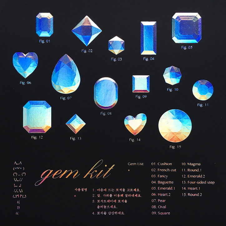
Works
Works
Works
Share Article
Further Info
About the Author
—
Jynann joined It’s Nice That as an editorial assistant in August 2018 after graduating from The Glasgow School of Art’s Communication Design degree. In March 2019 she became a staff writer and in June 2021, she was made associate editor. She went freelance in 2022.