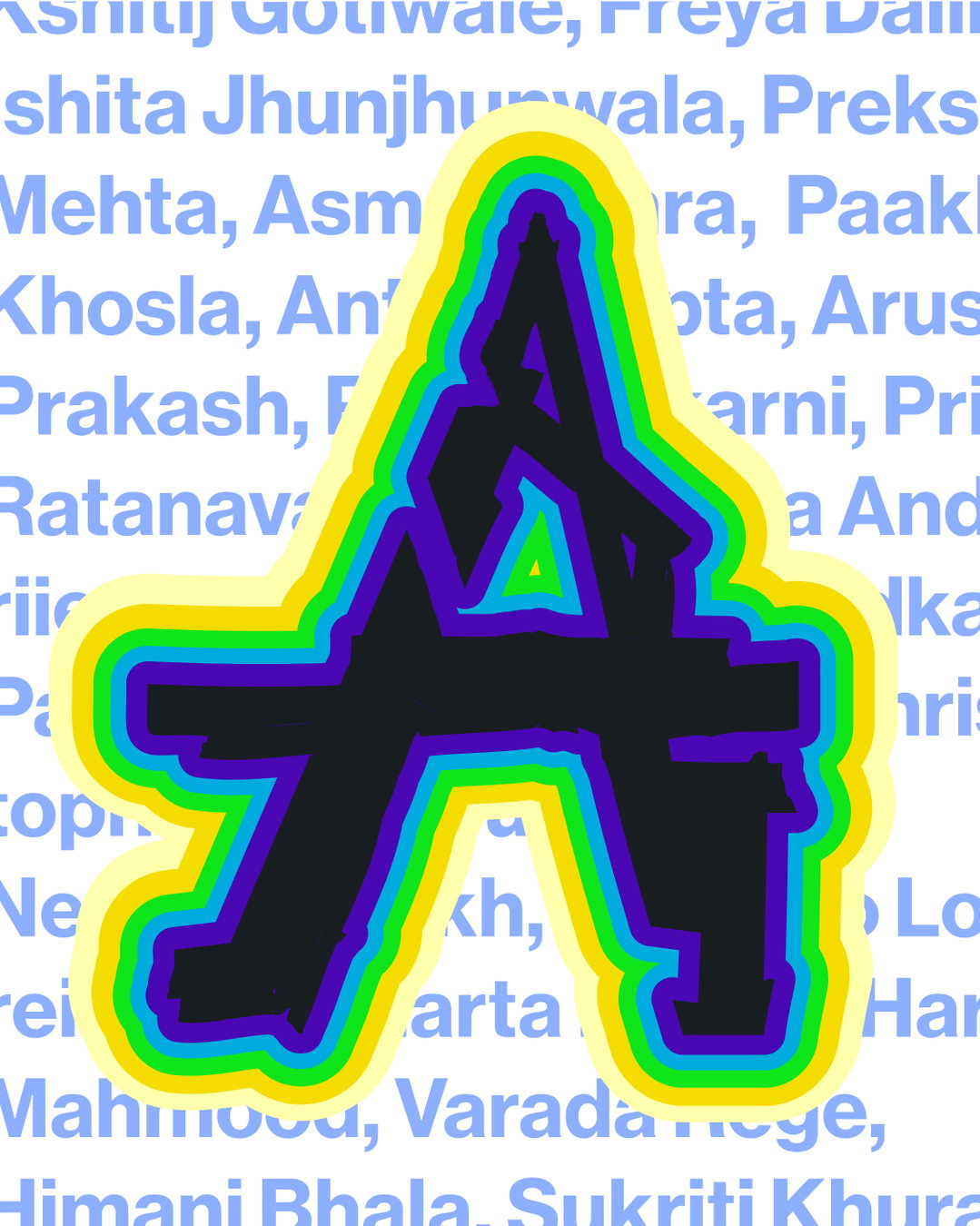
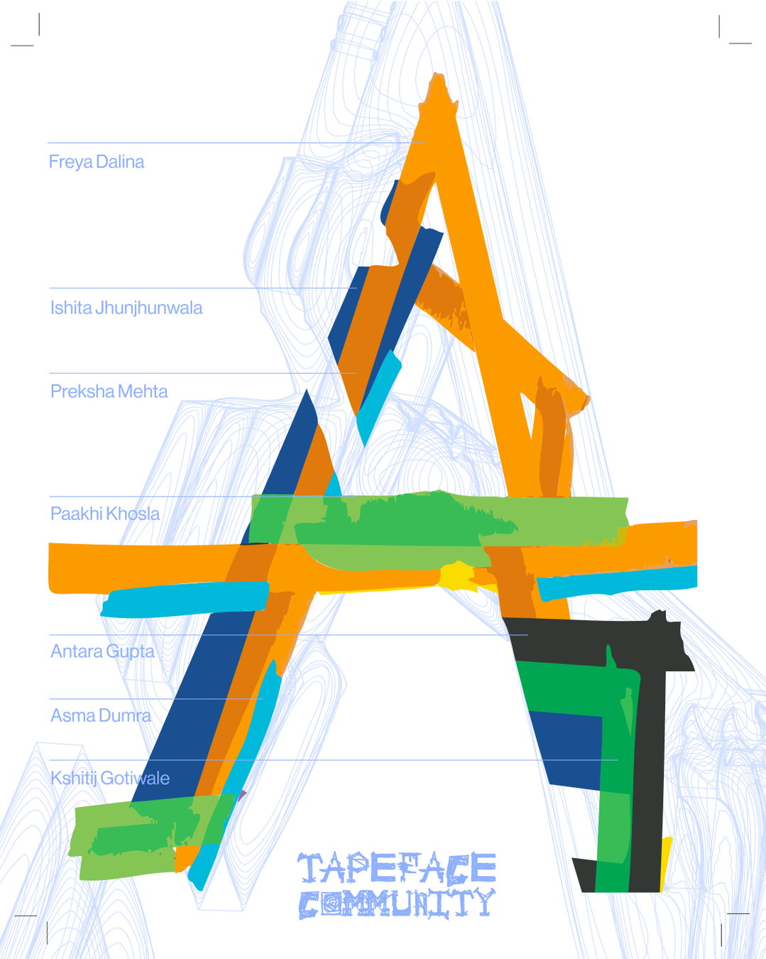
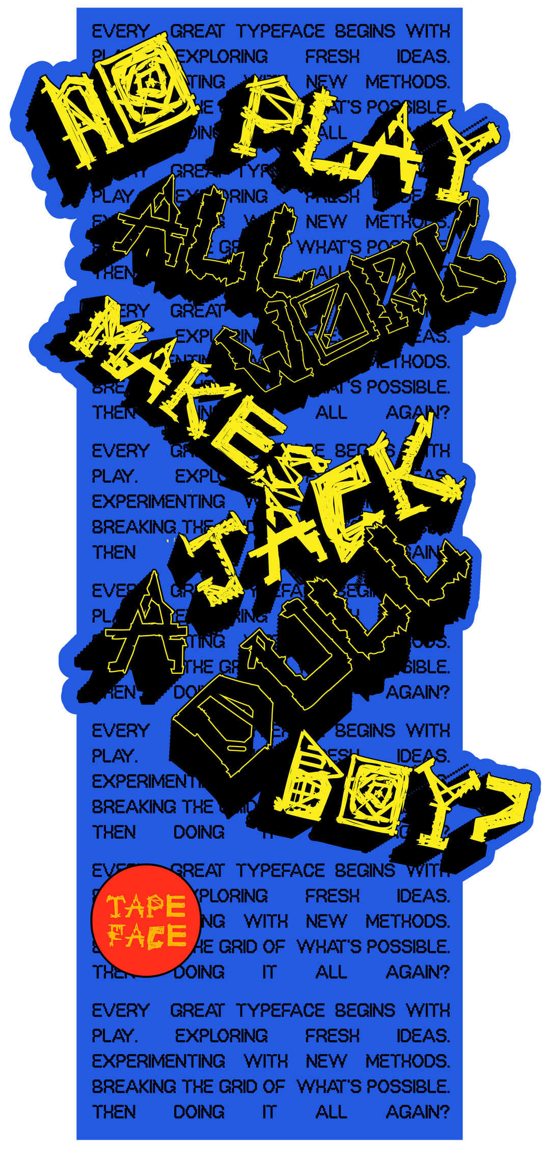
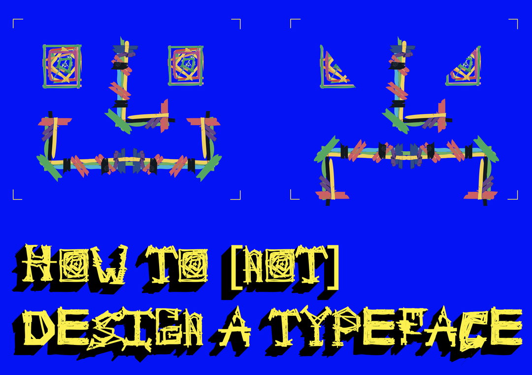
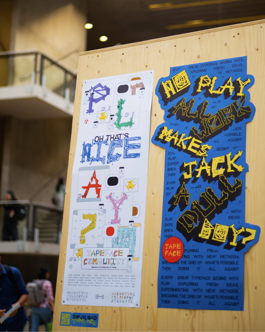
This collaborative typeface made from coloured tape is called... (you guessed it) Tapeface
The projects initiator, Varada Rege explains how the “fast, tactile and unruly” nature of tape made it the best medium to disrupt typographic tradition.
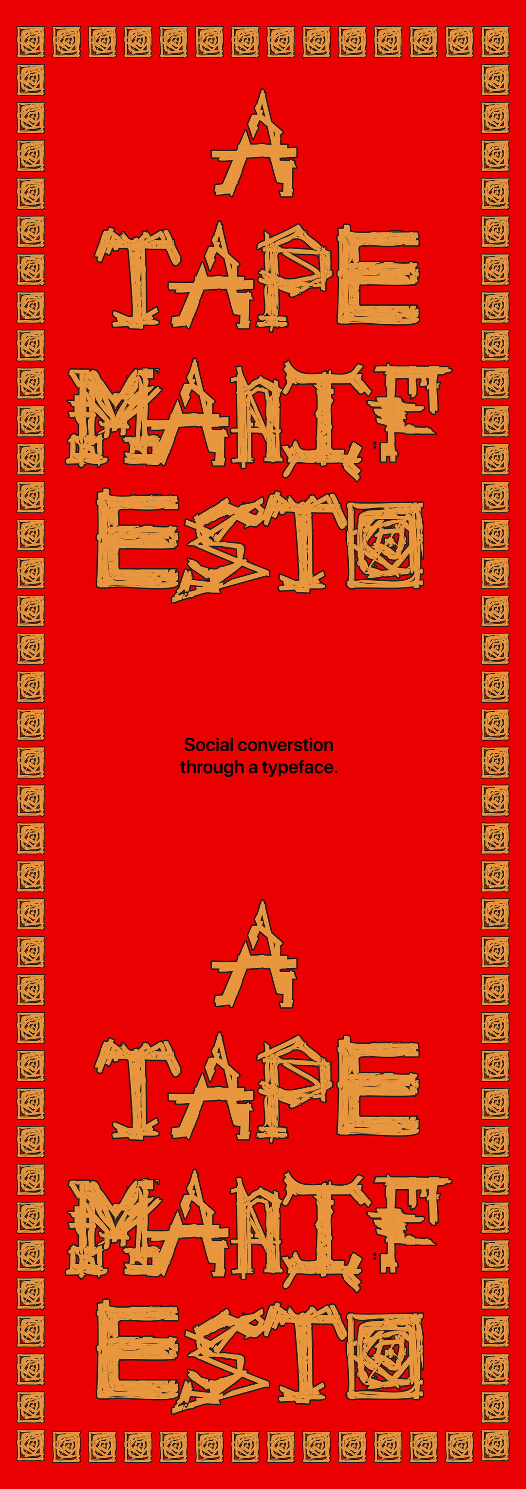
“It began with a very simple question: if a typeface is used by thousands, why shouldn’t it be created by thousands?” says Varada Rege, the Mumbai-born and London-based artist working across typography, systems and brand design. Varada is drawn to systems that allow for openness and reinterpretation, and typography as “a social, contextual practice” that pushes beyond singular authorship. This all makes sense when you see Tapeface, a typeface created from a tape system that thrives on collaboration, chaos and improvisation.
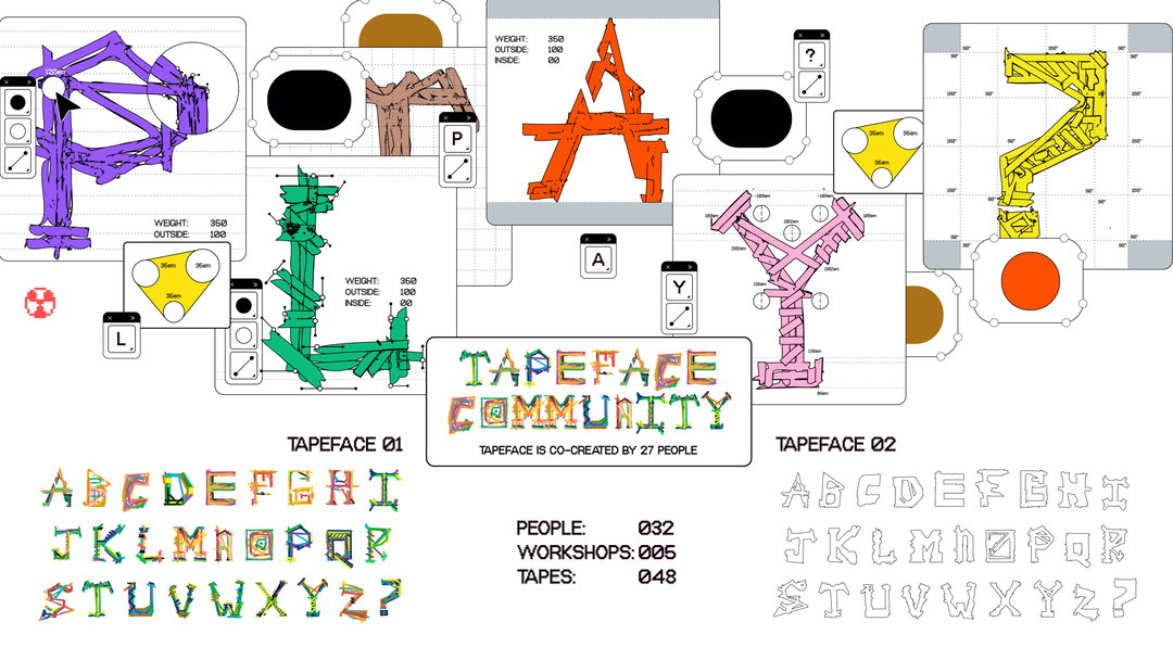
“When I first entered the design industry at 18, I always stayed away from type design because of the complexities of software and technical detail,” says Varada. “That inaccessibility and gatekeeping made me want to do the opposite, to break the barrier and make type design accessible to everyone.” Tapeface grew from the desire to open up a space that is usually closed off – to prove that type can be playful and accessible. The typeface itself is created from a workshop with 27 participants – each using a different colour of tape – the result is a typeface shaped by 54 hands that has a layered, punkish vibe.
Varada Rege: Tapeface (Copyright © Tapeface, 2025)
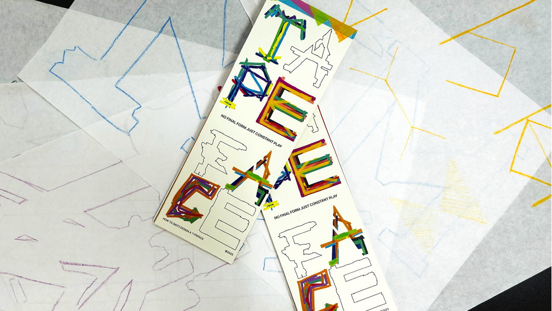
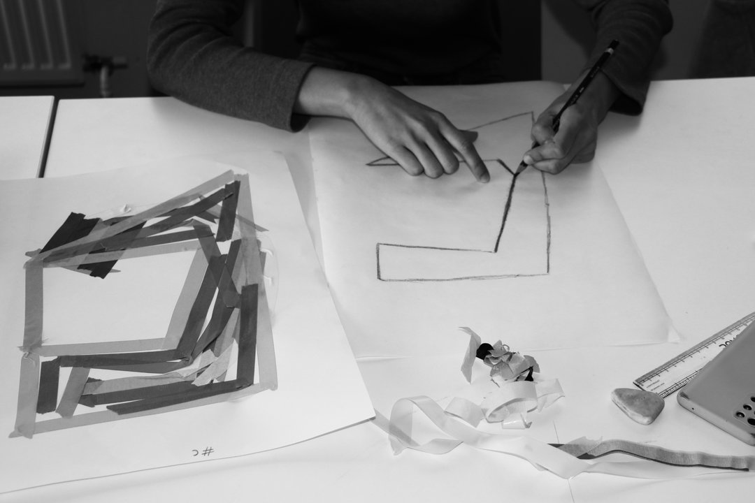
It’s an amazing idea, and it’s surprising that it hasn’t knowingly been done before. “Tape felt like the perfect tool to disrupt typographic tradition. It’s fast, tactile and unruly,” says Varada. “What fascinated me most was how tape could act as both a restriction and a liberation. It forces letterforms into sharp edges, but in the hands of 27 participants, it created shapes that I could never have imagined alone.” Every unruly typeface starts with chaos – and Varada wanted to challenge the myth of the solitary type designer. Working with clients taught Varada the value of designing within constraints, but Tapeface’s rules came from the toolkit: rotate the sheet every 30 seconds, add your tape, pass it on.
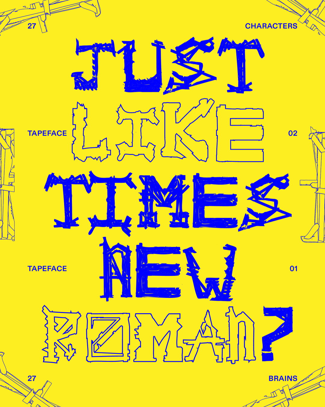
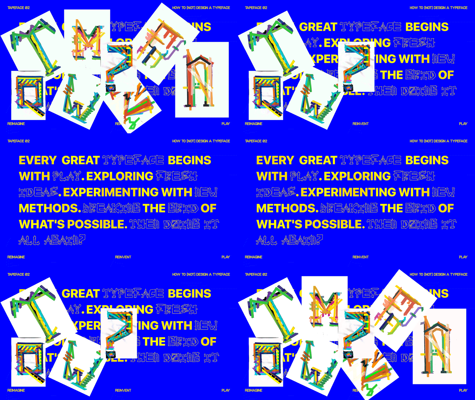
“Tapeface is not just a typeface, it’s a provocation. It asks: What happens when type design becomes accessible to anyone, regardless of training?” asks Varada. “The second phase, Tapeface 02, made these questions even sharper. Each participant became an editor rather than a maker, tracing only the parts they felt made a letter work. It was less about drawing and more about negotiating value, taste, and clarity within collective noise.” Where Tapeface really shines is in its conceptual greatness – where type design is participatory and always experimental, resisting polish in favour of play and challenges the notion of who gets to design type in the first place.
GalleryVarada Rege: Tapeface (Copyright © Tapeface, 2025)
Hero Header
Varada Rege: Tapeface (Copyright © Tapeface, 2025)
Share Article
Further Info
About the Author
—
Paul M (He/Him) is a Junior Writer at It’s Nice That since May 2025. He has a strong interest in graphic design, digital kitsch, multimedia painting, collage, nostalgia, analogue technology and all matters of strange stuff. pcm@itsnicethat.com
To submit your work to be featured on the site, see our Submissions Guide.