Uncommon’s myth-busting campaign for The Ordinary reveals the truth behind bogus beauty claims
Using confident yet paired back visuals, The Ordinary’s new campaign tackles misinformation across the beauty and cosmetics industry.
Share
International creative studio Uncommon has partnered with The Ordinary for the renowned skincare brand’s latest campaign, The Truth Should Be Ordinary, which looks to tackle the misinformation that proliferates the beauty industry. “It was born out of The Ordinary’s mission to bring universal access to quality skincare,” planning director Marco Del Valle tells us. “Particularly at a time when ‘truth’ feels increasingly irrelevant and so much scientific research is either hidden, under paywalls or inaccessible to a regular audience, it’s much easier for misinformation to spread.”
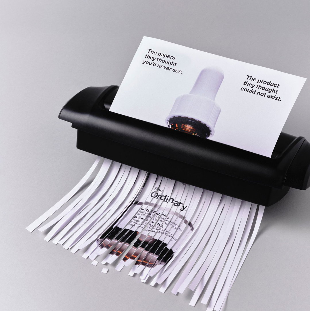
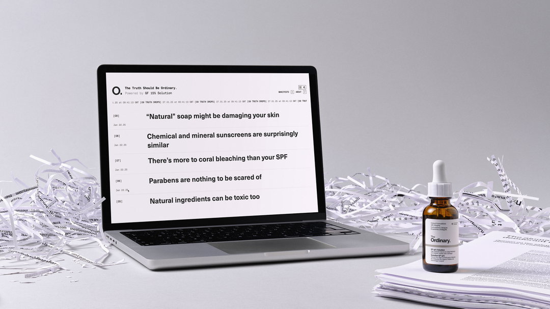
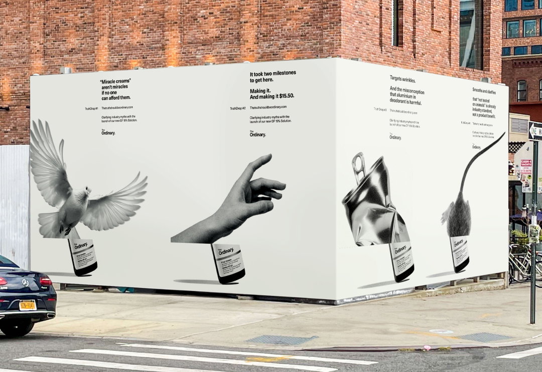
This insight led the campaign to become a vehicle for sharing scientific knowledge about skincare, with the aim of getting the resource into as many hands as possible and taking on big brands in the process. Offering an example, Marco debunks the myth that aluminium in your deodorant is a health risk. “We’ve seen so many podcasters and brands claiming aluminium is terrible for you,” he says, “which doesn’t line up with the science.” This is proven in digestible, original research papers which can all be found through The Ordinary’s online archive – freely accessible to anyone. “The interesting thing is that The Ordinary doesn’t even sell deodorant,” Marco adds, “we wanted to ensure these papers weren’t self-serving, and spoke to all of beauty, not just The Ordinary.”
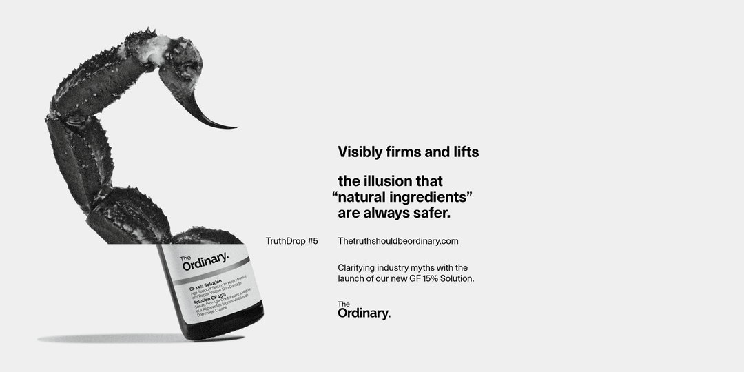
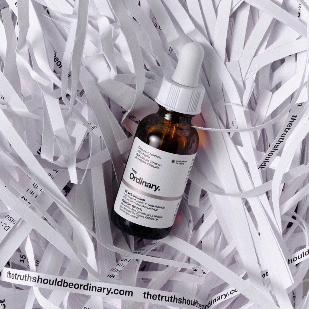
Uncommon: The Truth Should Be Ordinary (Copyright © The Ordinary, 2025)
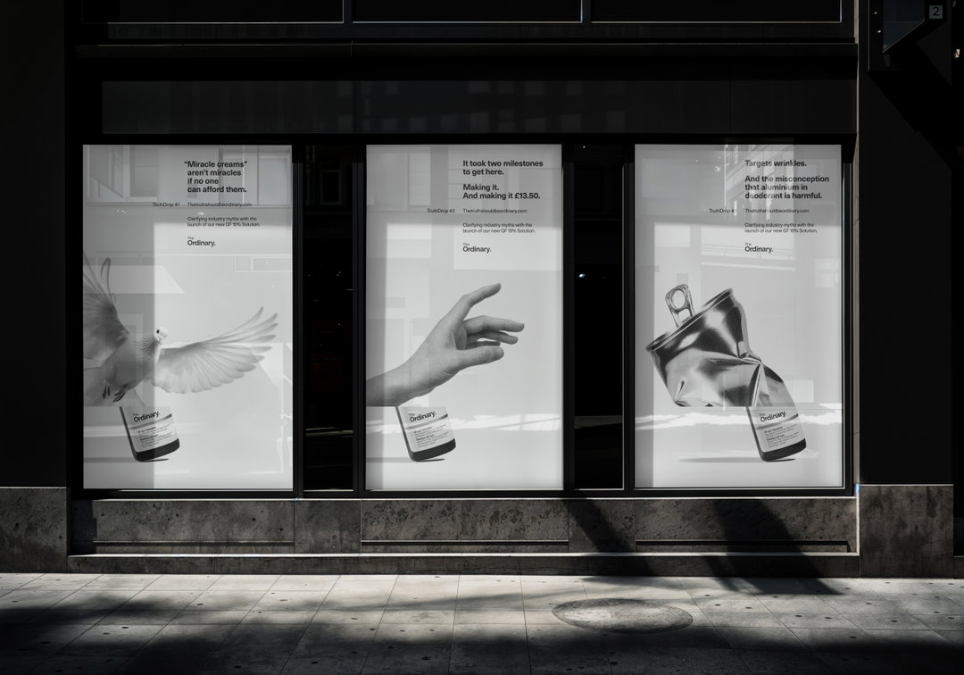
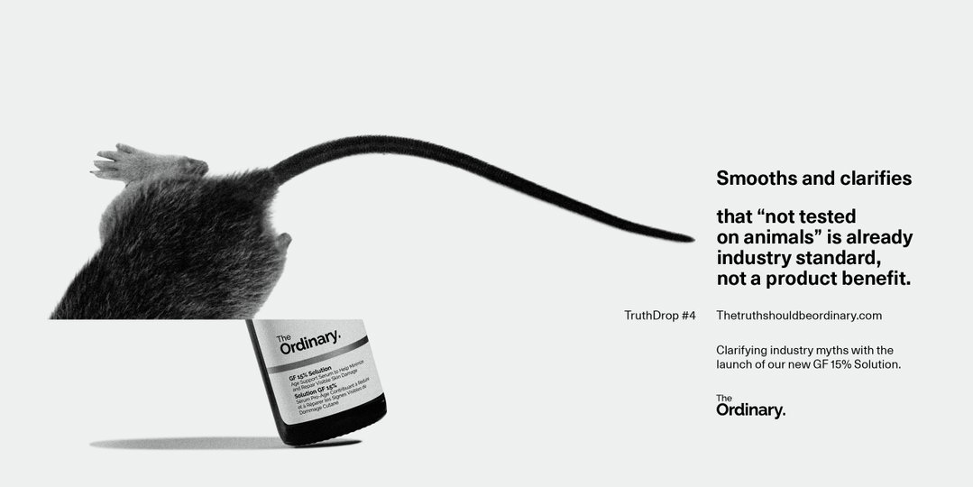
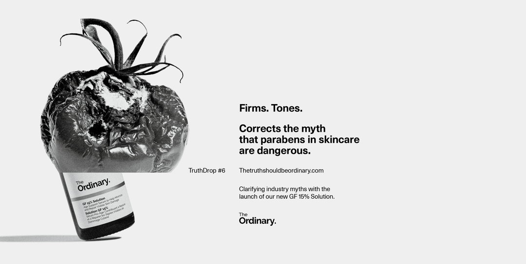
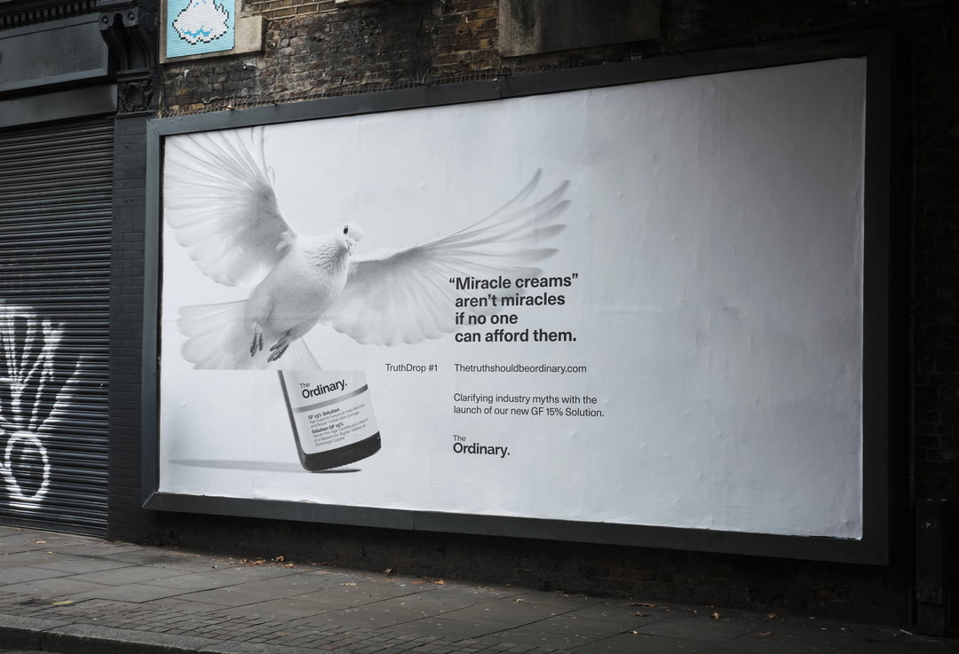
Embodying the campaign’s ambition of cutting through the noise, the visual language is equally stark and heavy-hitting – utilising image, type and layout in a straightforward, confident manner. “At its heart, this campaign is about one thing: truth,” senior creatives Ellie Daghlian and Elisa Czerwenka explain, “and truth doesn’t need a thousand colours or fonts or crazy imagery, it just needs space.”
Through this lens, Ellie and Elisa sought to visually contrast with the hustle and bustle of everyday, city-wide billboard and online campaigns. “The goal of this campaign was always to help people take a moment in their busy lives to read something truly unbiased and factual,” they explain. This approach therefore marries The Ordinary’s clinical integrity and the campaign’s hard-hitting tone. “In a world of noise and distractions, the white space that is baked into their identity always cuts through.”
GalleryUncommon: The Truth Should Be Ordinary (Copyright © The Ordinary, 2025)
Hero Header
Uncommon: The Trust Should Be Ordinary (Copyright © The Ordinary, 2025)
Share Article
Further Info
About the Author
—
Hailing from the West Midlands, and having originally joined It’s Nice That as an editorial assistant in March 2020, Harry is a freelance writer and designer – running his own independent practice, as well as being one-half of the Studio Ground Floor.