



Launch Recite Me assistive technology
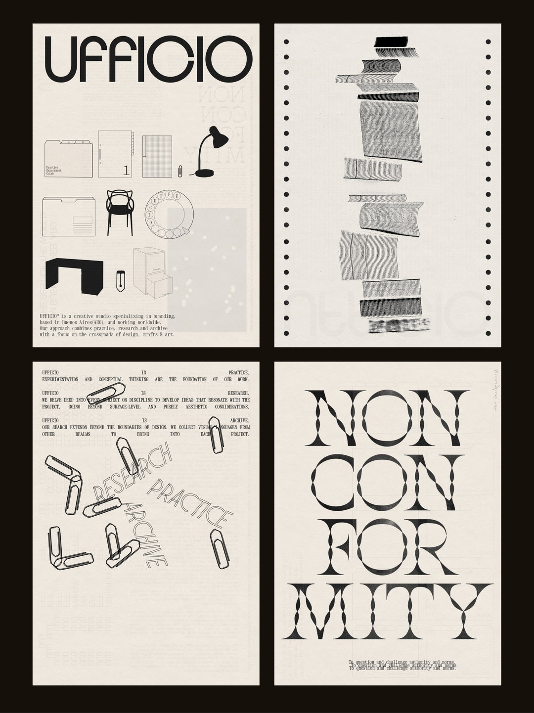
A two-page black and white design portfolio. The left page features the word “UFFICIO” in bold type above a grid of technical drawings of office furniture and a short introductory text. The right page shows a vertical sequence of torn paper strips above the word “NON CONFORMITY” split across four lines in a high-contrast serif typeface.

Meet Ufficio – the studio building bold, unique brands out of Buenos Aires

This small team is turning to history, popular culture and science for obscure and unexpected references that steer them away from established styles.

—
Date
13 January 2025

After ten years of experience as independent designers, seeking a way to push the boundaries of their craft and “embrace new creative challenges,” close collaborators Sofia Noceti and Crista Bernasconi came together to form Ufficio Studio in 2023. Fresh on the graphic design scene, the small Buenos Aires-based team specialises in crafting distinctive visual identities with a “conceptual approach and a lot of in-depth research”.

Since its start, the studio’s detail-oriented design work has spanned commercial and cultural projects alike, seeing it build identities for all sorts: from independent restaurants and small bakeries to tech startups and fashion brands. With no two projects quite the same, this kind of diversity “fuels our creativity and helps us avoid repetition as a studio,” says Sofia. By involving brands at every stage of a project, “collaboration lies at the heart of our process, both within our studio and with our clients,” shares Noceti, “so we are always aiming to push design into evocative, disruptive dimensions that challenge conventional perspectives [...] We value working with clients who share our passion and commitment to bold, meaningful ideas.”

In order to feed their wide variety of endeavours the studio’s inspiration “stems from a diverse range of sources”, Sofia tells us, which can be anything from: “a specific word heard in a conversation, the play of light and shadows on a wall or the nuances of sound,” she says. With a great deal of attention, the team turn to history, popular culture and science for unique, obscure and unexpected references that steer them away from the beaten track of established styles. Through research, Ufficio always seeks to find “something truly original, that’s rooted in an understanding of our clients aspirations”, to translate into a brand’s visual world.
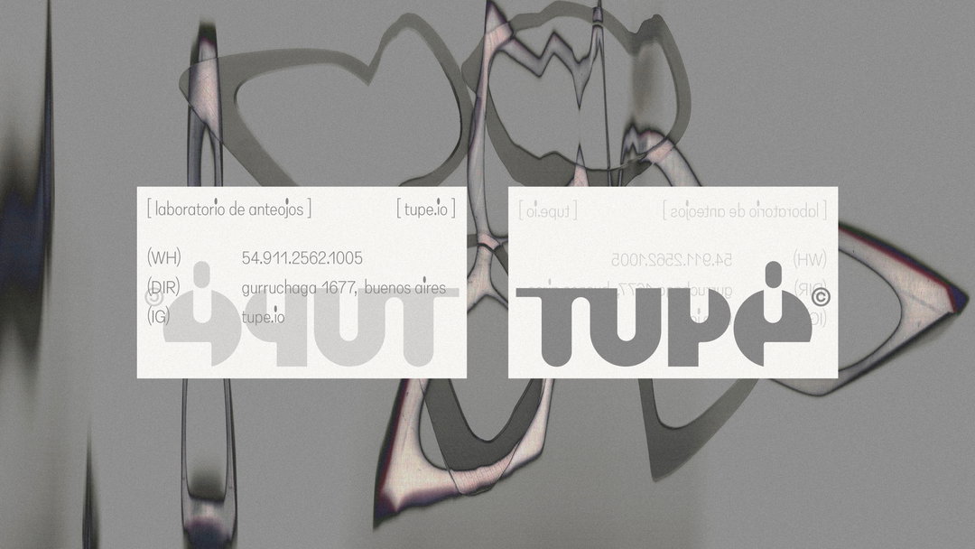
A graphic design featuring two white business cards laid over a distorted, mirrored background. The cards display the brand “Tupe” and the text “[laboratorio de anteojos]”.
Above

Ufficio: Tupé Branding (Copyright © Ufficio, 2024)
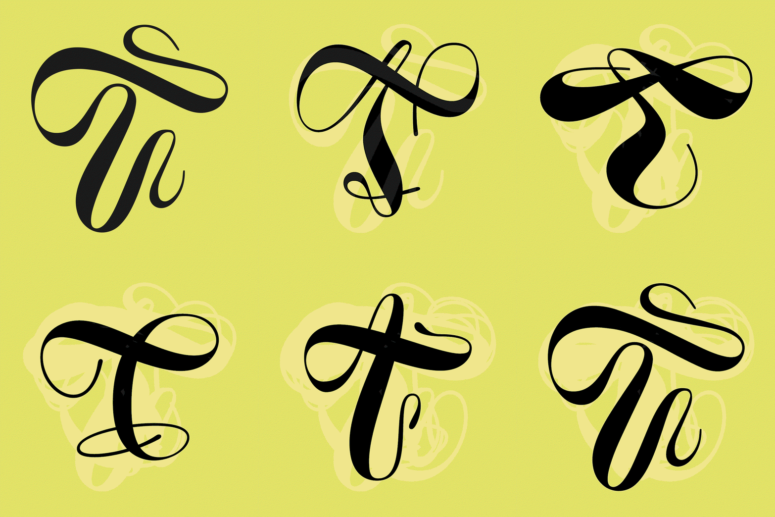
An animation in which a black calligraphic line morphs into various fluid, swirling shapes against a lime green background. The ribbon-like form twists and loops, shifting between abstract curves and letter-like figures.
Above

Ufficio: Teodelina Branding (Copyright © Ufficio, 2024)
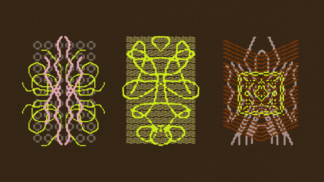
Three abstract digital illustrations of symmetrical, organic shapes set against a dark brown background. The figures use neon pink, lime green and orange lines to create intricate, mirrored patterns.
Above

Ufficio: Sister*hood: Branding & illustrations (Copyright © Ufficio, 2024)
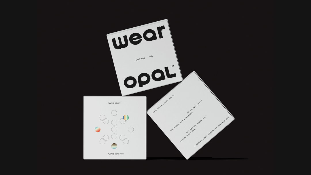
Three white square boxes are arranged against a black background. The top box features bold typography that reads “wear opal”, with “Opal Ring CC1” written in smaller text.
Above

Ufficio: Opal: Branding & Packaging (Copyright © Ufficio, 2024)
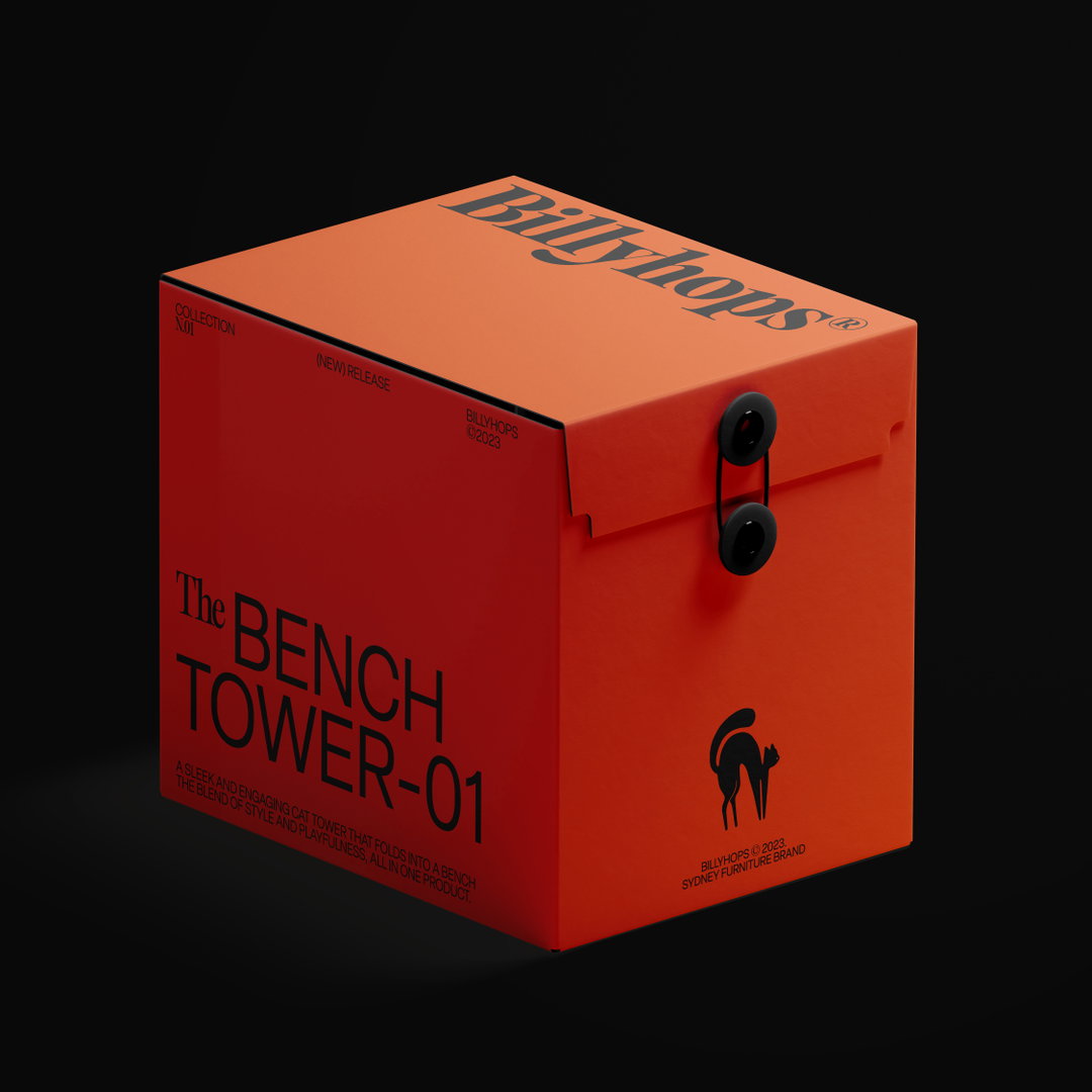
A bright orange product box against a black background. The side reads “The BENCH TOWER-01” above a short description of a cat tower that folds into a bench.
Above

Ufficio: Billyhops Branding & Packaging Proposal (Copyright © Ufficio, 2024)
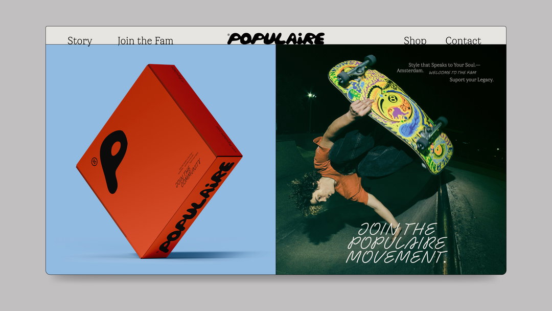
A website layout for the brand Populaire. On the left, a red box with a black “P” logo is set against a light blue background. On the right, a person performs a skateboard trick at night, with the text “Join the Populaire movement” below.
Above

Ufficio: Populaire Branding Visual research & website (Copyright © Ufficio, 2024)
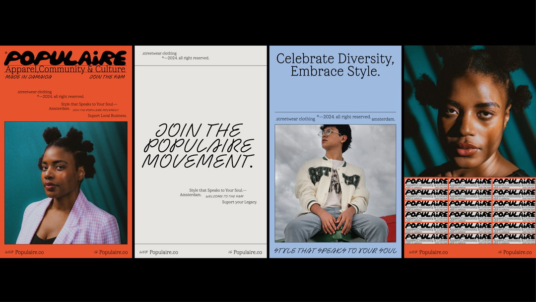
Four promotional posters for the streetwear brand Populaire. They feature a mix of portrait photography and bold typography with phrases including “Join the Populaire Movement” and “Celebrate Diversity, Embrace Style.”
Above

Ufficio: Populaire Branding Visual research & website (Copyright © Ufficio, 2024)
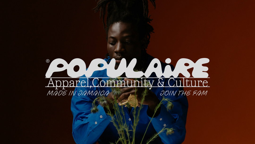
A person with dreadlocks wears a bright blue shirt and looks down at a plant. Overlaid white text reads “Populaire”, “Apparel, Community & Culture”, “Made in Jamaica” and “Join the Fam”.
Above

Ufficio: Populaire Branding Visual research & website (Copyright © Ufficio, 2024)
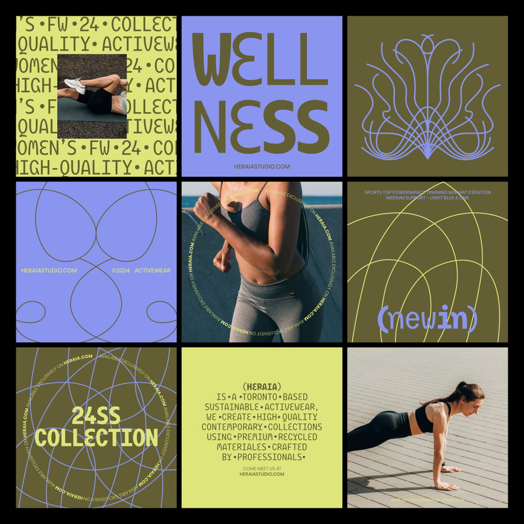
A grid of nine images for a sportswear brand. The layout mixes photographs of a person in activewear with bold typographic panels and abstract line drawings. One panel features the word “WELLNESS” in large, blue letters, while another reads “24SS COLLECTION”. A final text panel describes the brand as a “Toronto-based sustainable activewear” studio.
Above

Ufficio: Heraia Branding (Copyright © Ufficio, 2024)
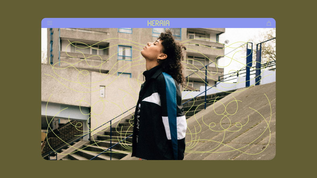
A person stands on concrete steps in front of a brutalist building, head tilted back with eyes closed. They wear a black and white jacket with a blue stripe, overlaid with flowing yellow line illustrations. The image is framed as a website header with a purple navigation bar reading “Heraia”.
Above

Ufficio: Heraia Branding (Copyright © Ufficio, 2024)
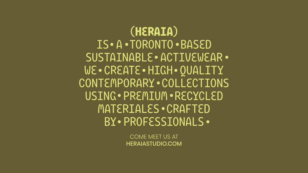
A typographic image on an olive green background. Yellow text reads “(Heraia) is a Toronto based sustainable activewear” brand that creates “high quality contemporary collections using premium recycled materiales”. A website address, “heraiastudio.com”, is listed at the bottom.
Above

Ufficio: Heraia Branding (Copyright © Ufficio, 2024)
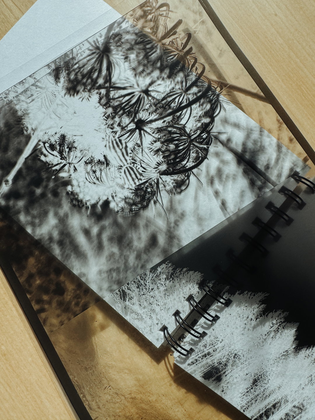
A spiral-bound sketchbook lies open on a wooden surface. The pages feature abstract, high-contrast black and white prints of organic, plant-like forms.
Above

Ufficio: Falena Cyanotype process for Branding (Copyright © Ufficio, 2024)
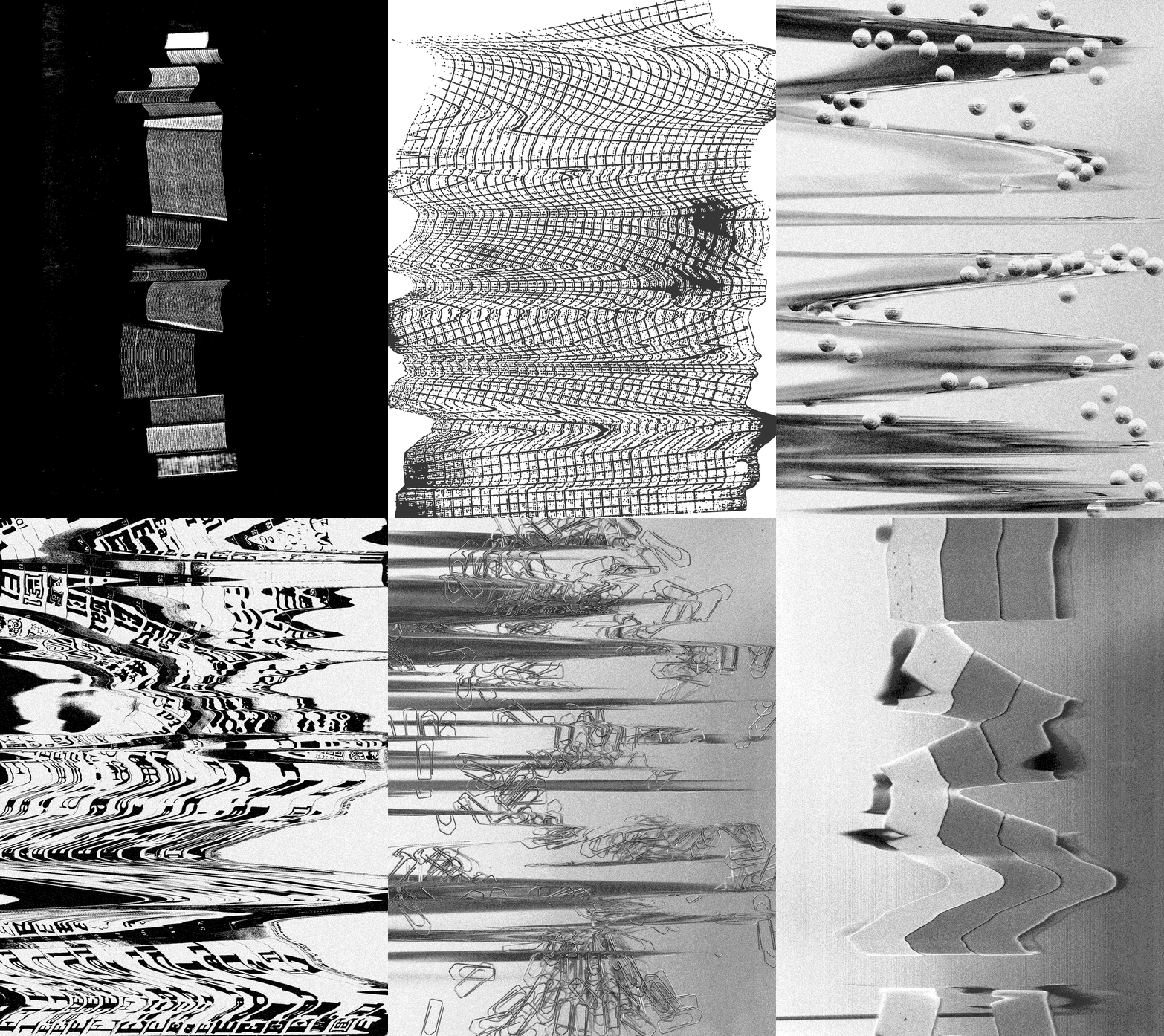
An animation in black and white that rapidly cycles through distorted, abstract imagery. It flashes between glitchy patterns, warped grids, fragmented rulers, and clusters of paperclips.
Above

Ufficio: Textures explorations for our Studio-Brand Identity (Copyright © Ufficio, 2024)

Hero Header

Ufficio: Posters for Studio Brand Identity (Copyright © Ufficio, 2024)

Share Article

About the Author

Ellis Tree

—

Ellis Tree (she/her) is a staff writer at It’s Nice That. She joined as a junior writer in April 2024 after graduating from Kingston School of Art with a degree in Graphic Design. Across her research, writing and visual work she has a particular interest in printmaking, self-publishing and expanded approaches to photography. ert@itsnicethat.com

To submit your work to be featured on the site, see our Submissions Guide.

It's Nice That Newsletters

Fancy a bit of It's Nice That in your inbox? Sign up to our newsletters and we'll keep you in the loop with everything good going on in the creative world.

