Days old bread built Super Studio’s new brand identity for Rose Bakery
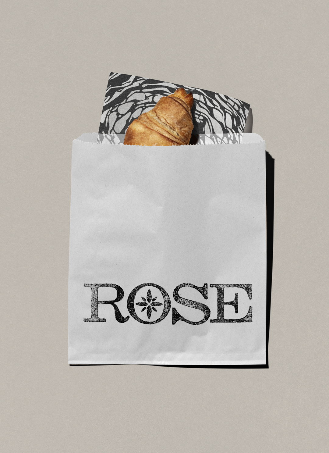
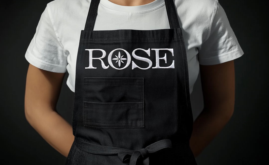
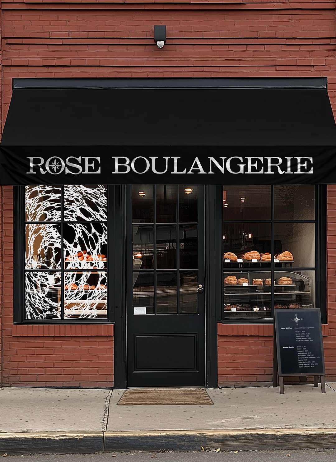
With a potato print-like technique and a logo inspired by lines scored into fresh dough, this identity pays homage to all the artisanal techniques of a traditional small town bakery.
Branding a bakery might be a dream project “but it does come with its challenges”, Carolane Godbout Isabel, the creative behind Super Studio, tells us. When the Canadian designer embarked on a brand identity for Rose Bakery, an independent boulangerie nestled in the picturesque village of Sainte-Flore, she was hesitant to build anything based on familiar aesthetics. With so many bakery brands out there, she wanted to create a new visual vernacular, one that focused on “craft and tactility, on making something as unique and hands-on as the way they approach their business”, she says.
The Quebec-based designer built her creative career in Montreal agencies before launching Super Studio two years ago. She took the leap into freelance life to pursue work in the food and hospitality space, as well as the cultural sector – the sectors she most enjoys designing for. “Over the years, I’ve honed an expertise in branding that doesn’t just tell a story but makes people taste, feel, and imagine the experience before they even step through the door,” she says. So, a brand identity for Rose was a perfect fit.
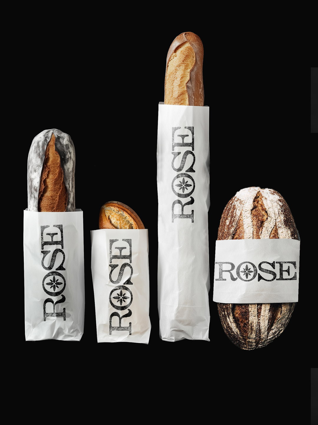
Super Studio: Rose Bakery (Copyright © Super Studio, 2025)
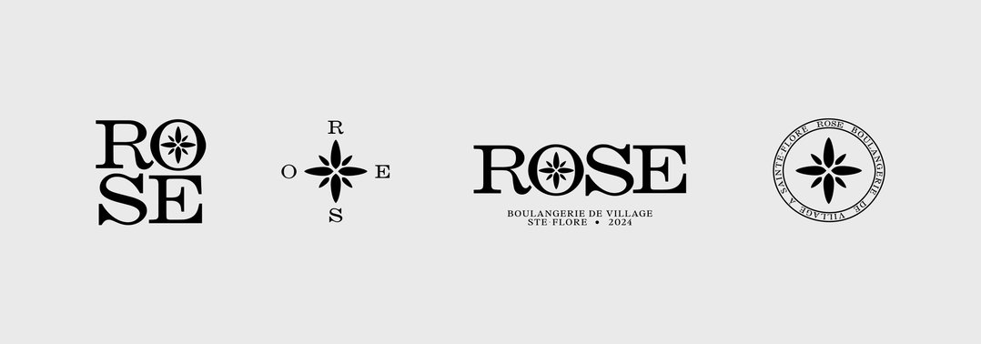
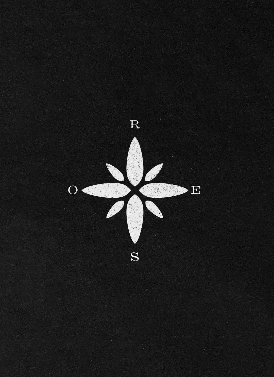
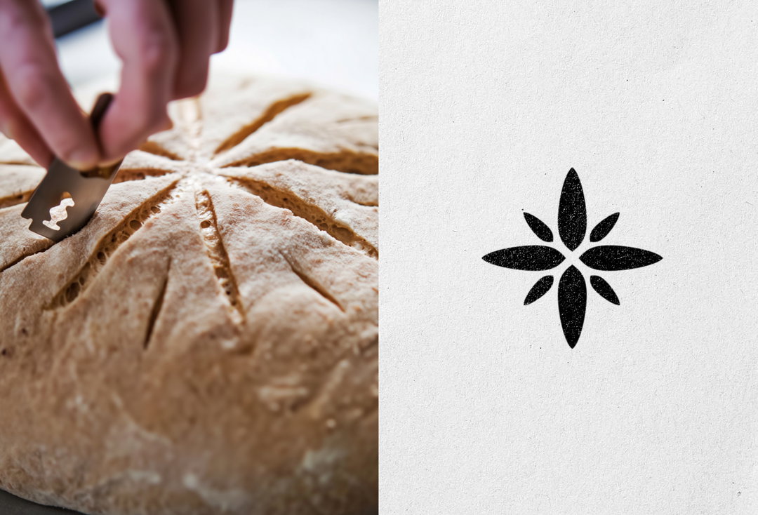
The owners of Rose Bakery were keen for their logo to be stamped in the form of a rose des vents (compass rose) and, being located in a remote village (“the kind of place that you need a map to find”), the idea had a logic to it. But what Carolane also wanted to bring in was a feel for the business’ ancestral techniques and use of local ingredients – all the elements of craft and heritage that go into making their goods.
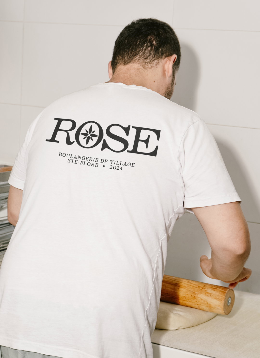
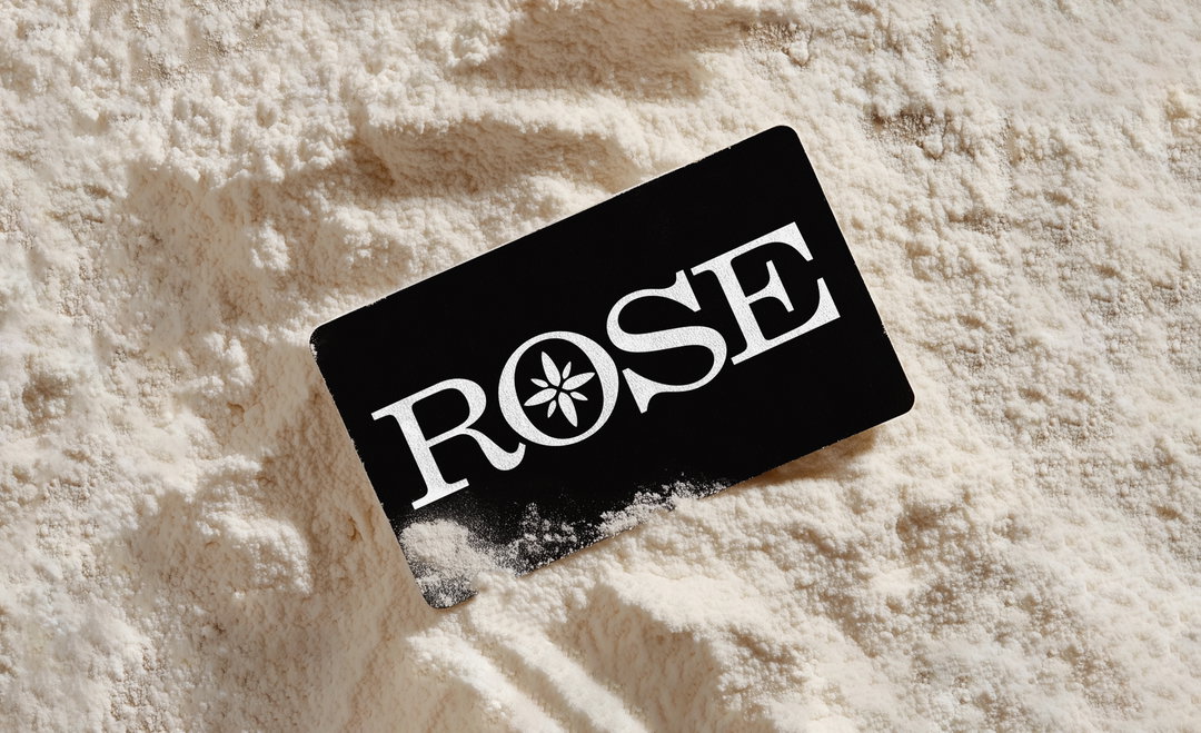
She eventually found her idea for a compass-like logo mark in the act of making bread itself: “My main inspiration came from the sharp, curved lines created when scoring fresh dough before baking. That organic motion became the foundation of the logo,” she says. The name Rose – conveniently having the natural symmetry of a four letter word – then became the compasses “four cardinal points”, a replacement for the usual north south, east and west.
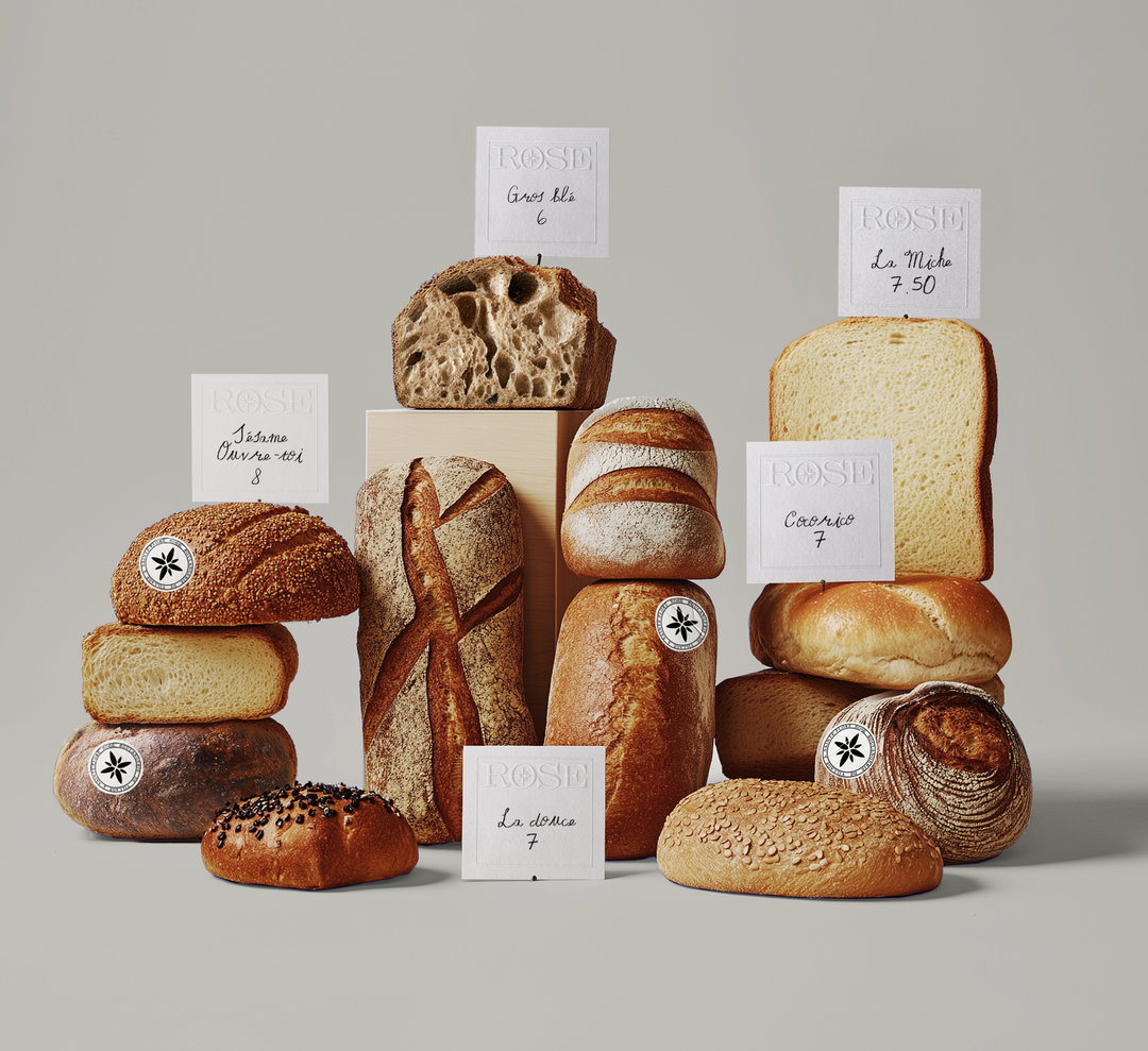
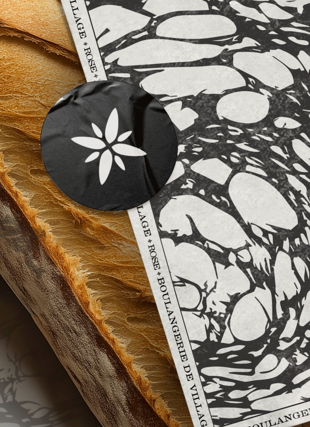
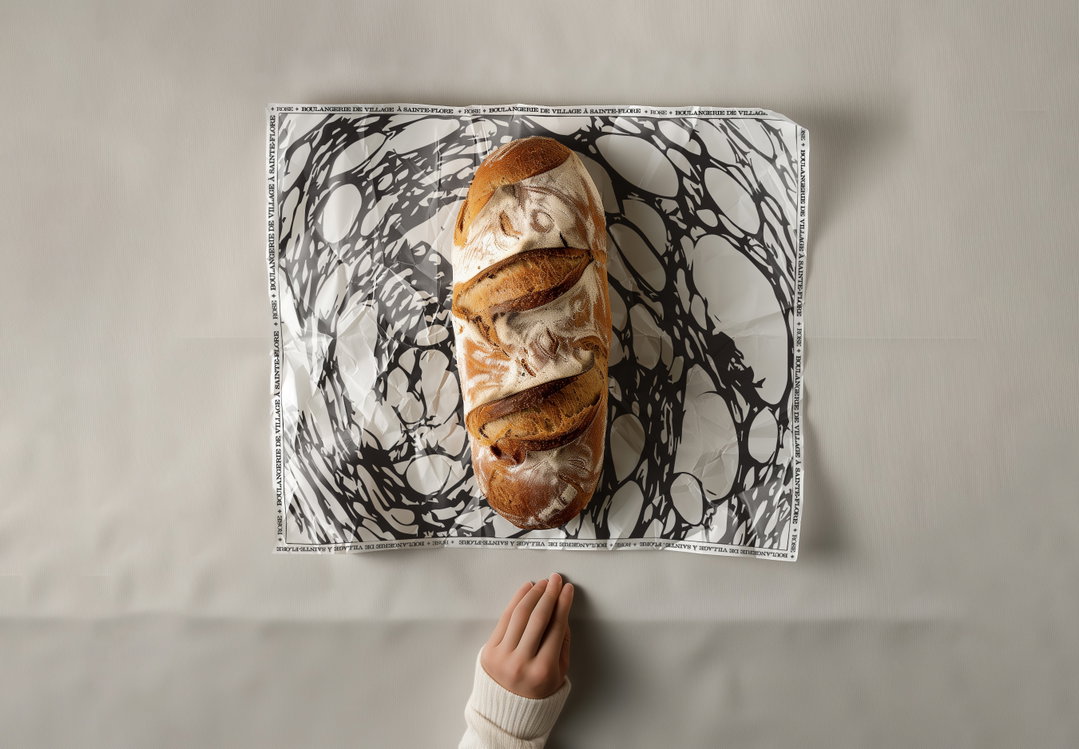
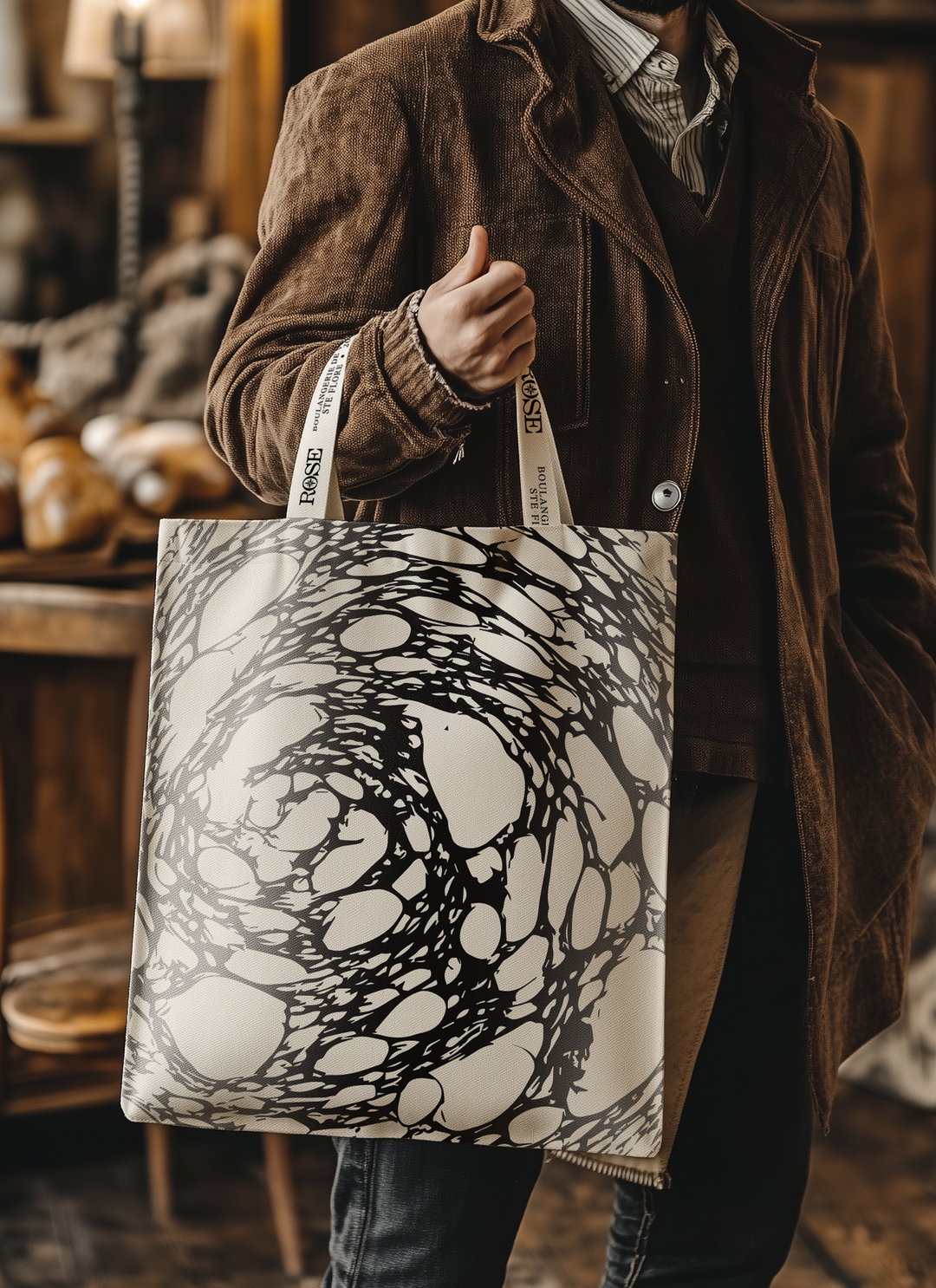
Then steering things even more towards a focus on artisanal making, Carolane created a series of unique print patterns that formed the background for the brand’s design system using offcuts from days-old bread from the bakery itself. Scraps that would have otherwise been thrown away were “given a second life as part of the brand”, in the form of monochromatic textures. These potato-style prints now live across Rose’s packaging, merchandise and other brand elements like window displays.
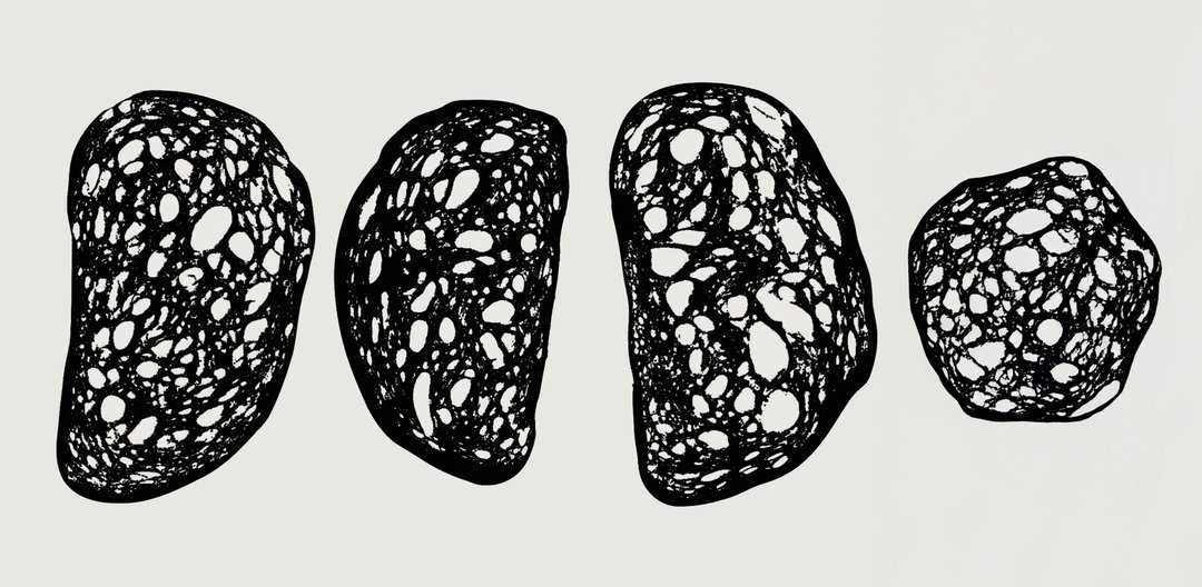
Super Studio: Rose Bakery (Copyright © Super Studio, 2025)
This clever, tactile textural element has received a lot of attention online over the past few weeks, the designer tells us, “so many people have called it innovative and new”, she says. “But the truth is it wasn’t my idea – it was my nine-year-old daughter’s.” As part of an art class project Carolane’s daughter had been printing with different food items the week before, “ingeniously using a croissant” to stamp some ink. “This moment sparked my entire approach for the final patterns”, says Carolane.
A rustic and handmade approach to building the brand’s visual catalogue, these printed elements were the perfect way to “celebrate both the creative process and the authenticity of each product”, reinforcing the brand’s position: “Guided by taste, rooted in the land.” With a minimal and authentic logo, it was also important that these textures added an edge to the bakery’s appearance that “empowered it to stand out”, ends Carolane. “I think we achieved something bold yet minimal, authentic yet innovative. And ultimately, that’s what I wanted people to feel, not just about the brand, but about the bakery and what they have built.”
GallerySuper Studio: Rose Bakery (Copyright © Super Studio, 2025)
Hero Header
Super Studio: Rose Bakery (Copyright © Super Studio, 2025)
Share Article
About the Author
—
Ellis Tree (she/her) is a staff writer at It’s Nice That. She joined as a junior writer in April 2024 after graduating from Kingston School of Art with a degree in Graphic Design. Across her research, writing and visual work she has a particular interest in printmaking, self-publishing and expanded approaches to photography. ert@itsnicethat.com
To submit your work to be featured on the site, see our Submissions Guide.