Studio Nari’s systematic rebrand of Field Day perpetually evolves
Marking the electronic music festival’s 15th anniversary, the rebrand turns Field Day’s identity into one that represents its genre and community.
Field Day festival has exponentially grown in scale, reputation and reverence over its 15 years, and to mark this anniversary, it was in need of a new brand identity to better reflect its stature in the music scene. In response, Studio Nari has designed a comprehensive visual and strategic overhaul – including brand and creative strategy, tone of voice, motion, 3D and visual identity. Through the project, Nari saw the opportunity to not only cement what Field Day is now but also craft an ever-evolving system that perpetually develops as the festival does too. The subsequent brand concept, ‘reactive future’, was born from this idea. “We created a strong core brand with a system that responds to the current climate,” lead designer Abbie Lilley says, “informing the thematic of each edition and ensuring the festival remains future-forward.”
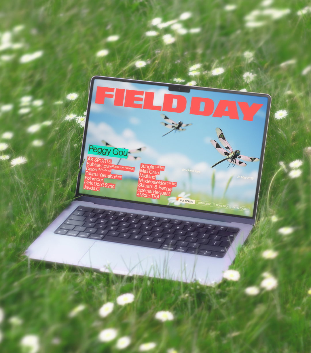
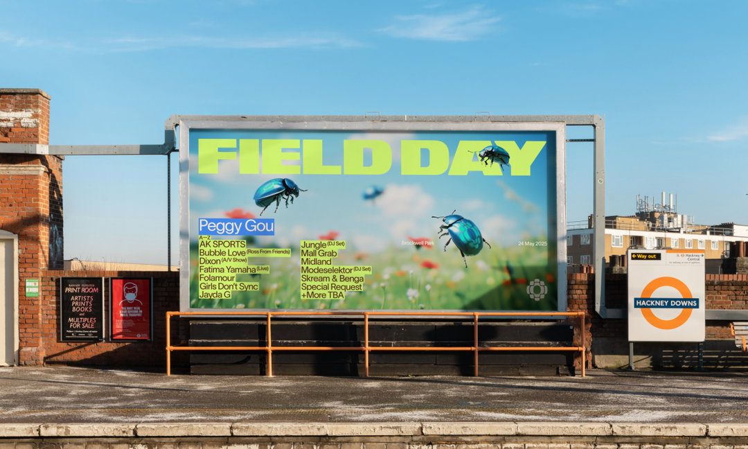
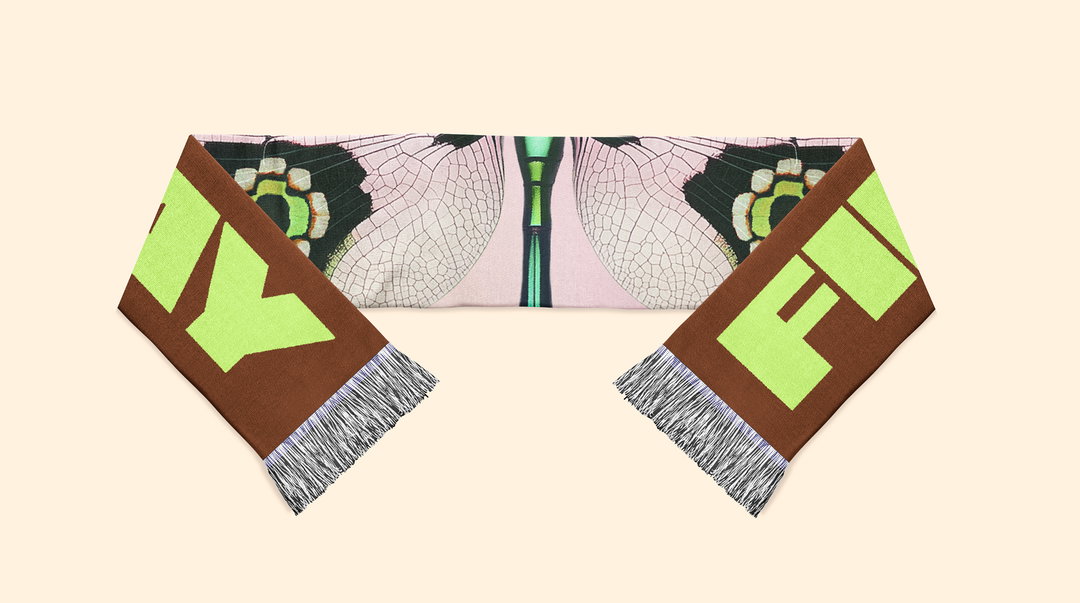
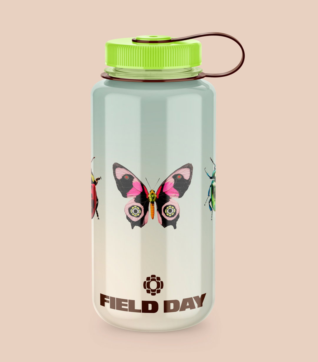
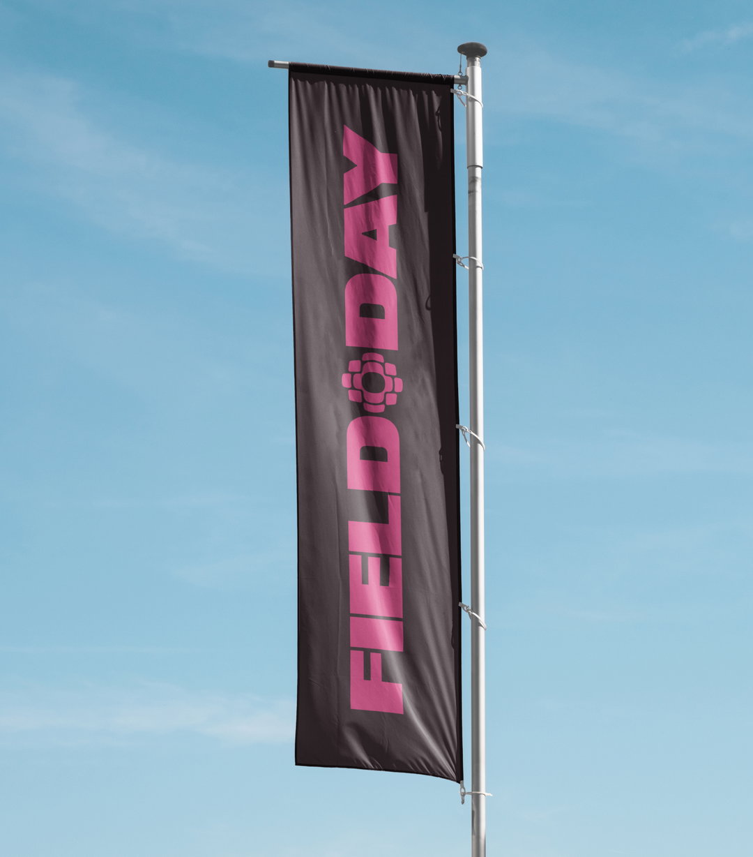
Sitting at the brand’s centre – immune to the visual identity’s continuous changes – is its wordmark, which acts as its steadfast foundation, whilst also more directly influencing its 2025 aesthetic. “For the inaugural edition, it was essential to communicate Field Day’s move from East London back to its roots in Brockwell Park. To reflect this pivotal transition, we fused the marque onto the bugs found within the fauna of the park,” Abbie says. Prior to this new rebrand, Field Day had never had a marque sitting at its centre, and the team set out to create one that would encapsulate the festival’s diehard community. “Its cyclical form and sense of reverberation reflect the festival’s lasting impact,” Abbie continues, “honouring its legacy while reinforcing its ongoing influence on London’s electronic music scene.”
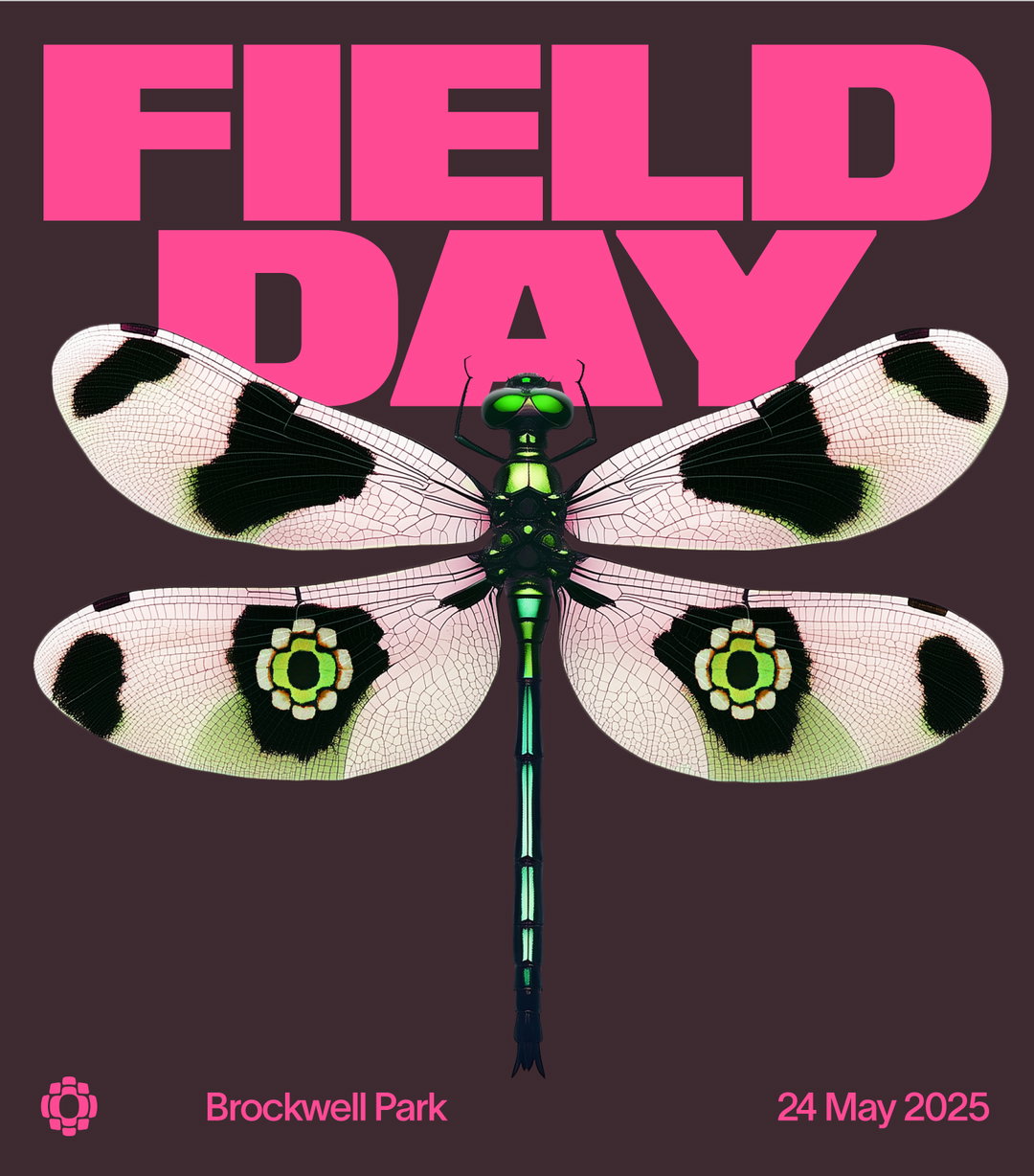
Studio NARI: Field Day (Copyright © Studio NARI, 2024).
The festival’s sonic influence continued across the brand’s rollout, directly informing its vigorous approach to motion. “The main inspiration came from electronic music itself,” motion designer, Harvey Lorimer, explains, “we wanted to create a language that was fast, energetic and confident,” which Studio Nari similarly explored in its approach to colour. “The colour palette was designed to capture the dynamic tension between the festival’s natural environment, and its high energy sound,” Abbie adds. “To balance these bold contrasts, soft gradients were built to symbolise a new dawn for the festival.”
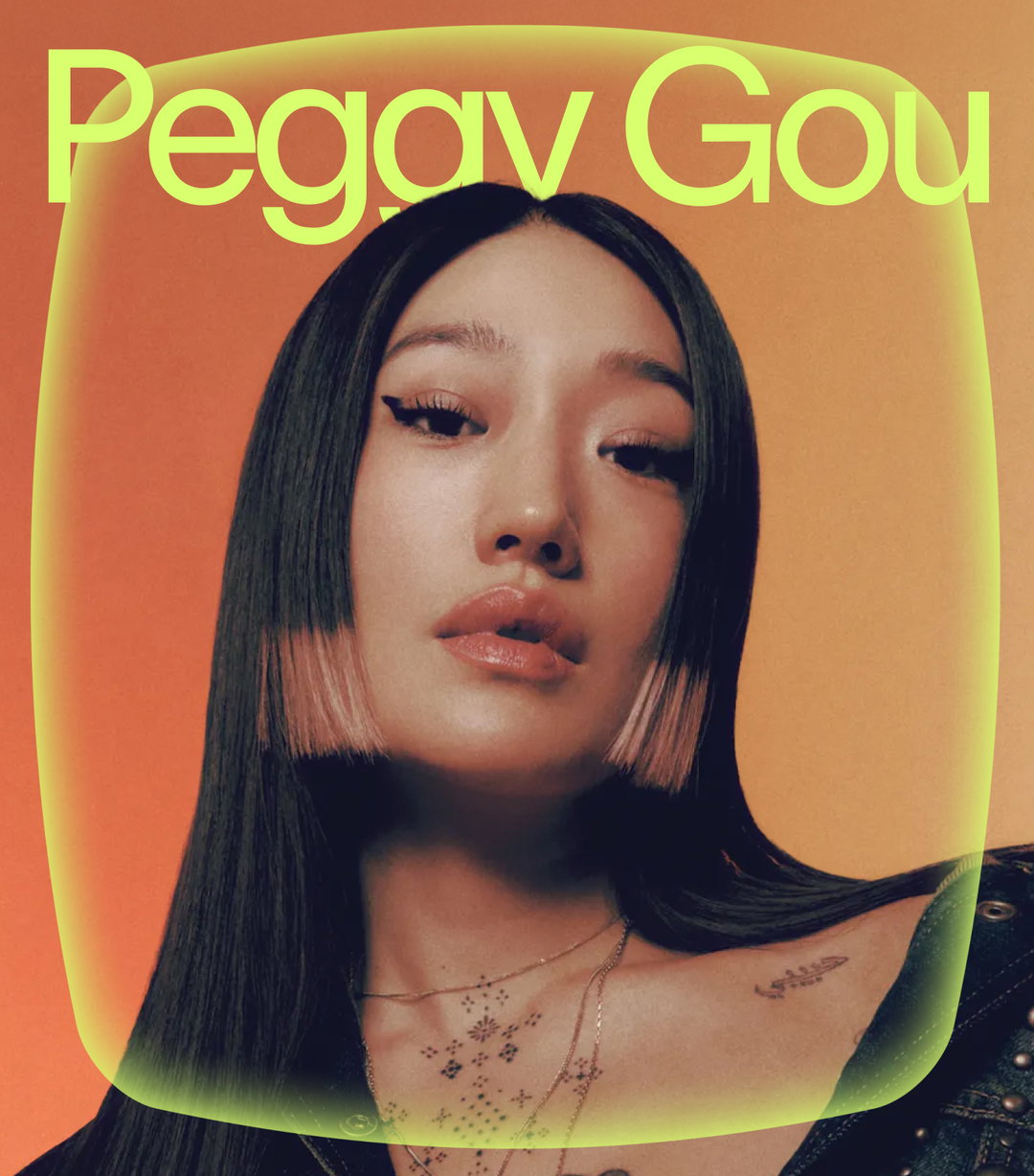
Amongst the brand’s kineticism, noise and vibrancy, TWK Lausanne, from the type foundry Weltkern, offers the dependable, versatile sans serif needed to ground the identity as it evolves. Abbie says that it offered the ”perfect balance” providing a high-legible yet equally striking counterpart to the variety of graphic elements flying about the system. “Throughout the identity we use modular platforms that fuse together to amplify the line-up, connect to icons, and highlight key dates,” she ends, “it was essential that the typography remained clear and legible, from heroing artist names to small-scale, contained furniture.”
GalleryStudio NARI: Field Day (Copyright © Studio NARI, 2024).
Hero Header
Studio NARI: Field Day (Copyright © Studio NARI, 2024).
Share Article
Further Info
About the Author
—
Hailing from the West Midlands, and having originally joined It’s Nice That as an editorial assistant in March 2020, Harry is a freelance writer and designer – running his own independent practice, as well as being one-half of the Studio Ground Floor.