Launch Recite Me assistive technology
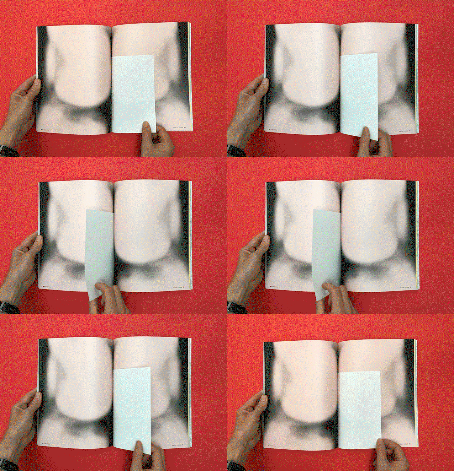
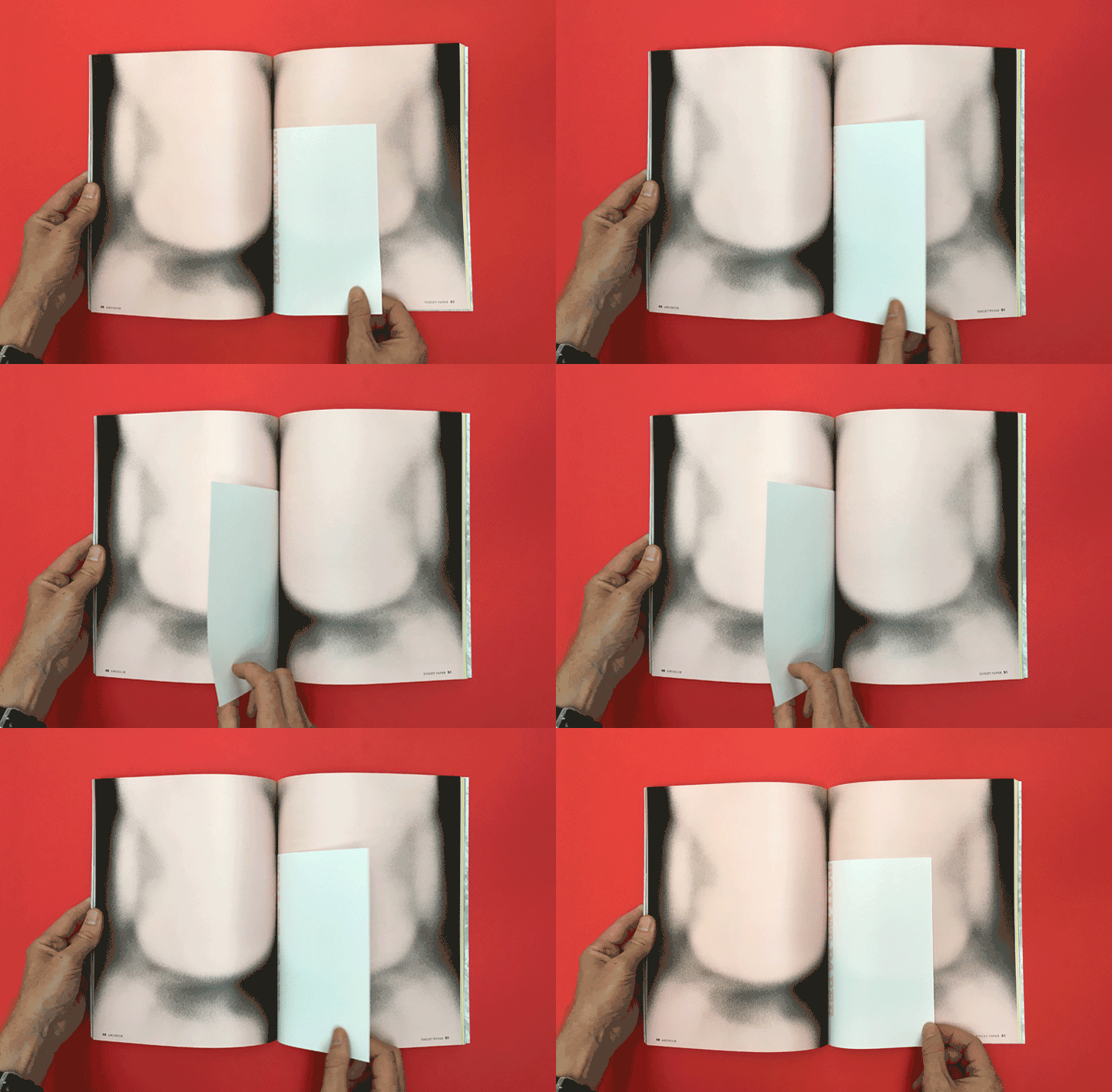
An animation in which a person’s hands slide a white piece of paper across the pages of an open book. The pages feature a blurred, fleshy image and the text “TOILET PAPER”.

Inventive independent magazines with hidden surprises, revealed by Stack

—
Date
17 July 2017

You can do some things in print that just aren’t possible on a screen. To coincide with the Stack Awards, which opens for entries today, looking for the most exciting independent print magazines published since October 2016, we asked Stack founder Steven Watson to pick some of the most inventive pieces of publishing he’s seen in the last few years. Here, he takes us through his selection, revealing their hidden surprises. “One of the things I’ve always loved is when publishers go a step further than they really need to,” he says, “and somehow use the physical object of the magazine itself to give readers more.”
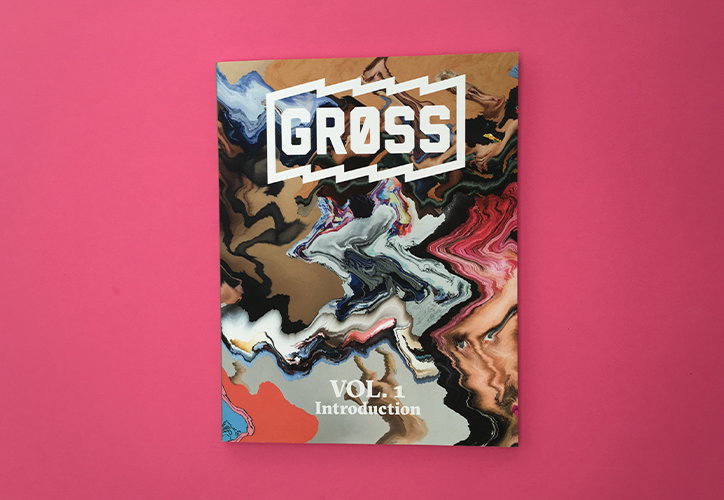
A magazine cover featuring a distorted, liquid-like collage of faces and colours. A bold white logo at the top reads “GROSS”, with “VOL. 1 Introduction” written in a serif font at the bottom.
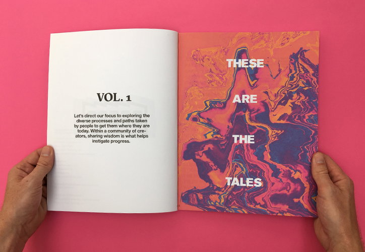
An open book held by two hands against a bright pink background. The left page reads “VOL. 1” above a short paragraph about exploring creative processes, while the right page features a colourful, marbled abstract pattern with the words “THESE ARE THE TALES”.
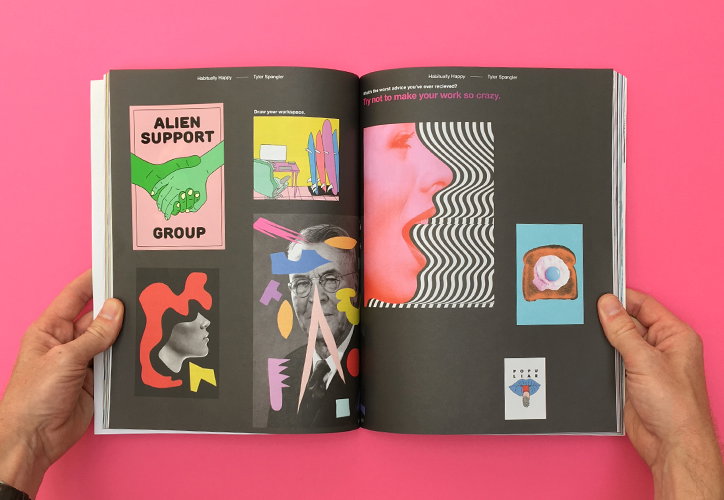
An open book held by two hands against a bright pink background. The pages feature a collage of graphics, including a poster that reads “ALIEN SUPPORT GROUP” and a portrait of a person in glasses.
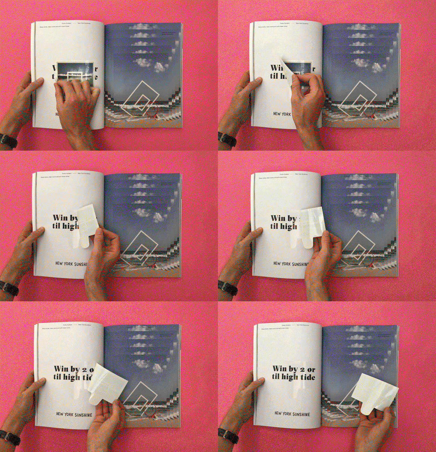
An animation in which a person peels away white paper strips from an open book to reveal text. The final page reads “Win by 2 or til high tide” and “NEW YORK SUNSHINE” against a pink background.

Gross (2017)

Everyone loves a good sticker, but in magazines they tend to be clumped together on special sheets or inserted loose so they end up getting lost. The makers of Gross came up with a novel solution by printing a spot varnish onto their pages and placing stickers by hand, allowing readers to peel them easily from the varnished areas. By printing extra illustrations, pull quotes and even GPS coordinates behind the stickers, they created a magazine that reveals more with every piece that’s taken away.
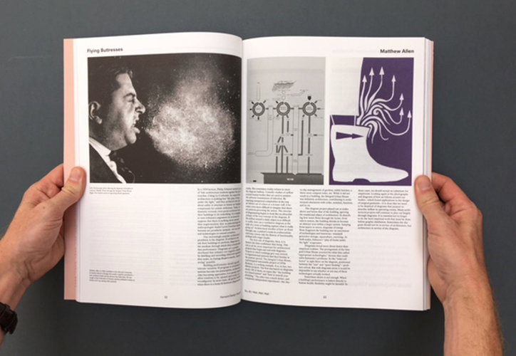
A person holds open a magazine to a spread featuring a black and white photo of a person shouting. The opposite page contains a technical diagram and a purple illustration of a boot with arrows pointing upwards.
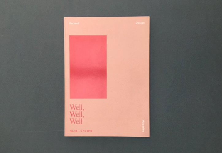
A peach-coloured magazine cover features a bold, pink rectangular block in the centre. Text at the top reads “Harvard Design”, while the bottom left reads “Well, Well, Well” and “No. 40 – 5 / S 2015”.
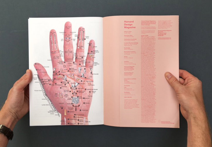
A person holds open a magazine to a double-page spread. The left page features a detailed anatomical illustration of a hand with various labels, while the right page is pink with the title “Harvard Design Magazine”.
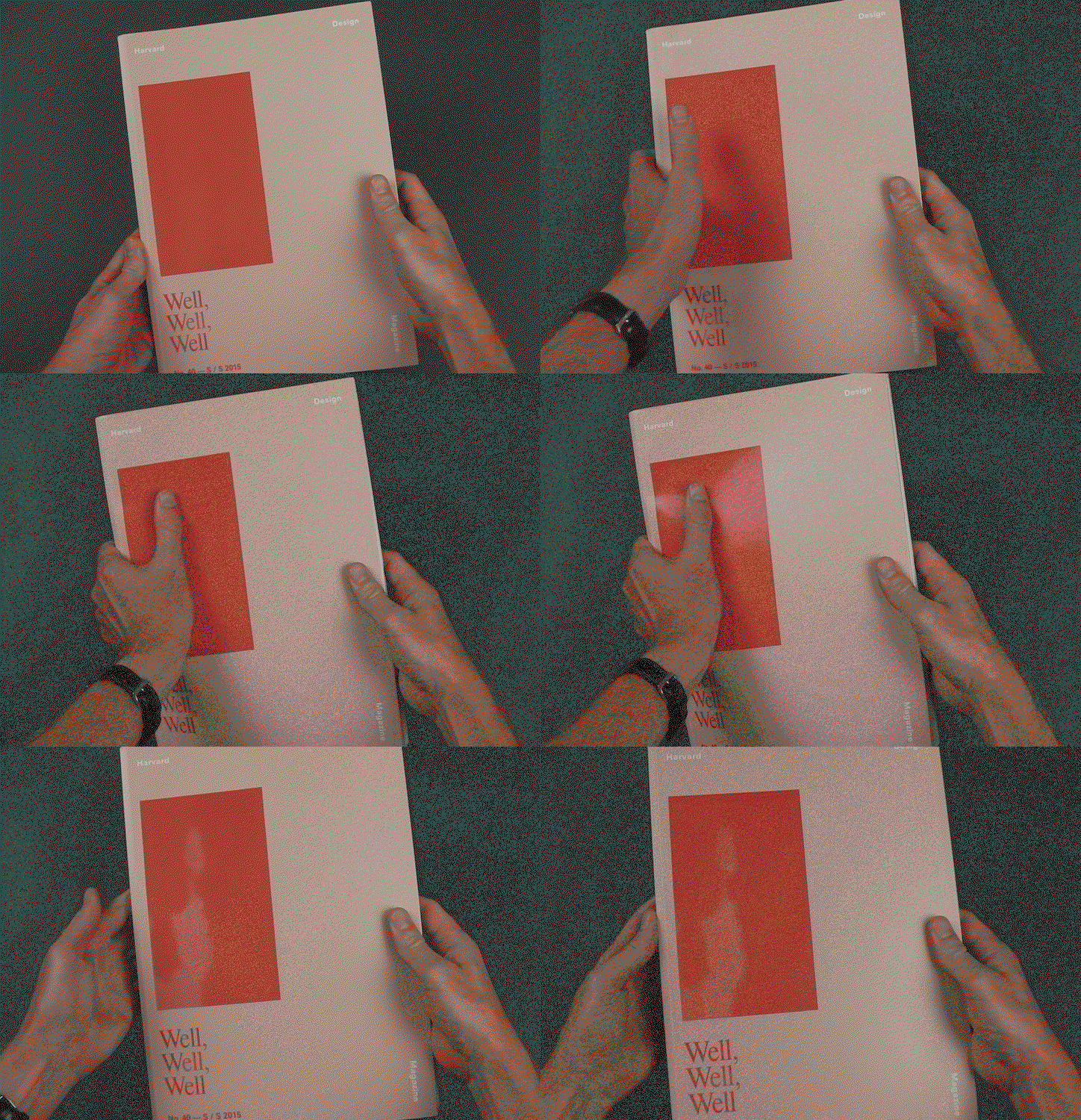
An animation in which two hands hold a pale pink magazine against a dark green background. The cover features a red rectangle and the words “Harvard Design Magazine” and “Well, Well, Well”.

Harvard Design Magazine (2015)

A totally fascinating biannual published by the Harvard University Graduate School of Design, this magazine has become renowned for its anti-newsstand covers, which flatly refuse to jump out at the reader. This issue is themed around health and wellbeing, presenting a wide range of perspectives from across cultures and generations, and ending with a chart of acupressure points for the left hand. It’s only on closing the magazine that the cover comes into its own, presenting the reader with an image of their own hand, created by a carefully placed panel of thermochromatic ink.
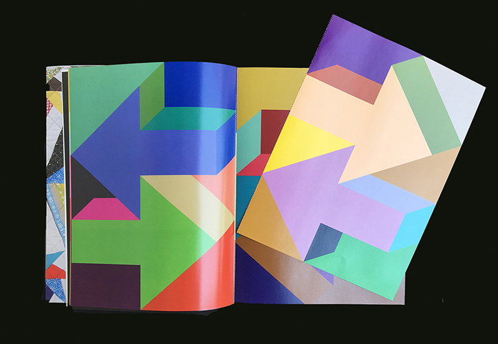
An open book displays a series of bold, colourful 3D arrows in various directions. The geometric shapes overlap in shades of blue, green, yellow and purple against a black background.
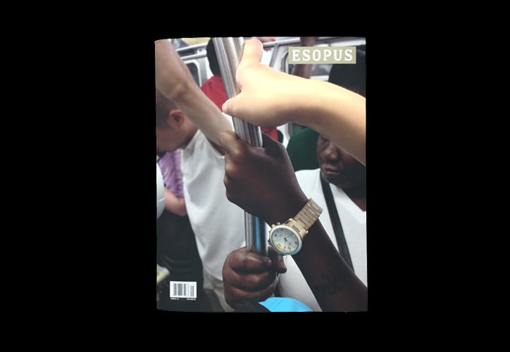
Several people hold onto a metal pole inside a crowded train or bus. A close-up focuses on two hands gripping the rail, one wearing a gold-toned watch. A small label in the top right corner reads “ESOPUS”.
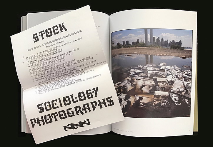
An open book displays a photograph of a puddle reflecting a city skyline, with several small black and white portraits floating on the water's surface. A white flyer rests over the left page, featuring bold typography that reads “STOCK” and “SOCIOLOGY PHOTOGRAPHS”.
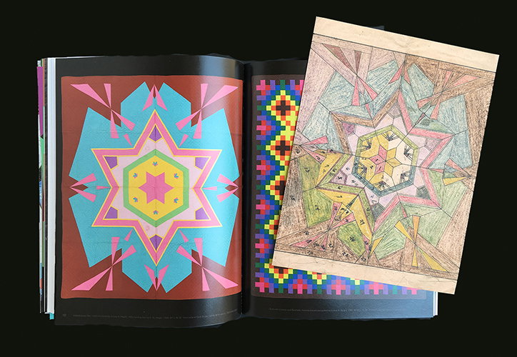
An open book displays two pages of vibrant, geometric patterns in pink, blue and yellow. A hand-drawn sketch of a similar symmetrical design on aged paper is laid over the right page.

Esopus (2017)

Published by New York’s not for profit Esopus Foundation, this is a magazine that goes far beyond the words and pictures on the page. A bewildering array of artist-produced pieces are included in the magazine, either tipped into specific stories, attached on perforated sheets, tucked into pouches or otherwise enclosed. Reading is just the start – Esopus wants you to make your own art from the magazine, and this issue includes Marco Maggi’s Drawing Set, which will see pages pulled out of the magazine and submitted by readers, on display at New York Public Library next Autumn.
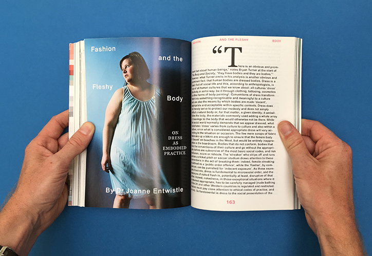
A person holds open a book to a spread titled “Fashion and the Fleshy Body” by Dr Joanne Entwistle. The left page features a portrait of a person in a white dress, while the right page contains a dense column of text.
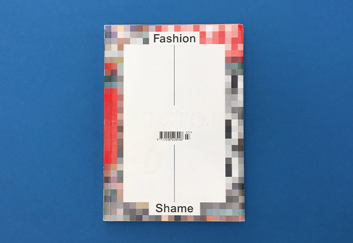
The back cover of a book set against a blue background. A central white rectangle is framed by a pixelated border of red, grey and blue, with the words “Fashion” at the top and “Shame” at the bottom.
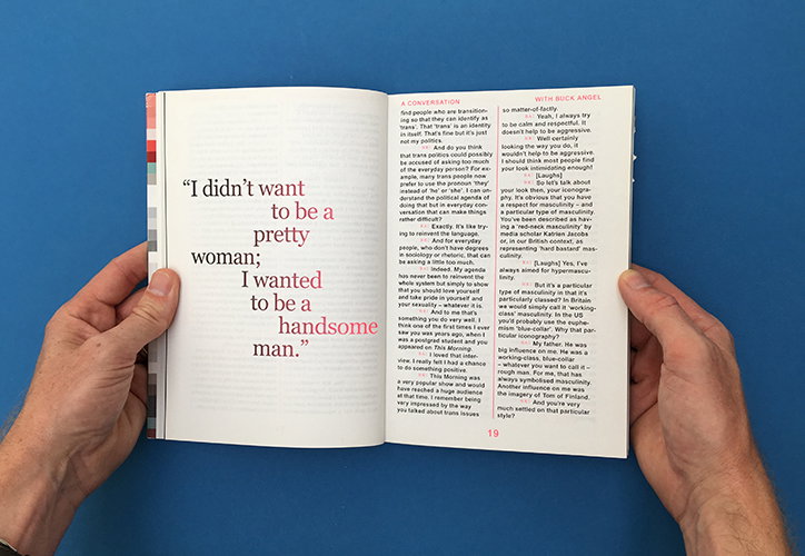
An open book displays a conversation with Buck Angel. On the left page, a large quote reads “I didn’t want to be a pretty woman; I wanted to be a handsome man.”
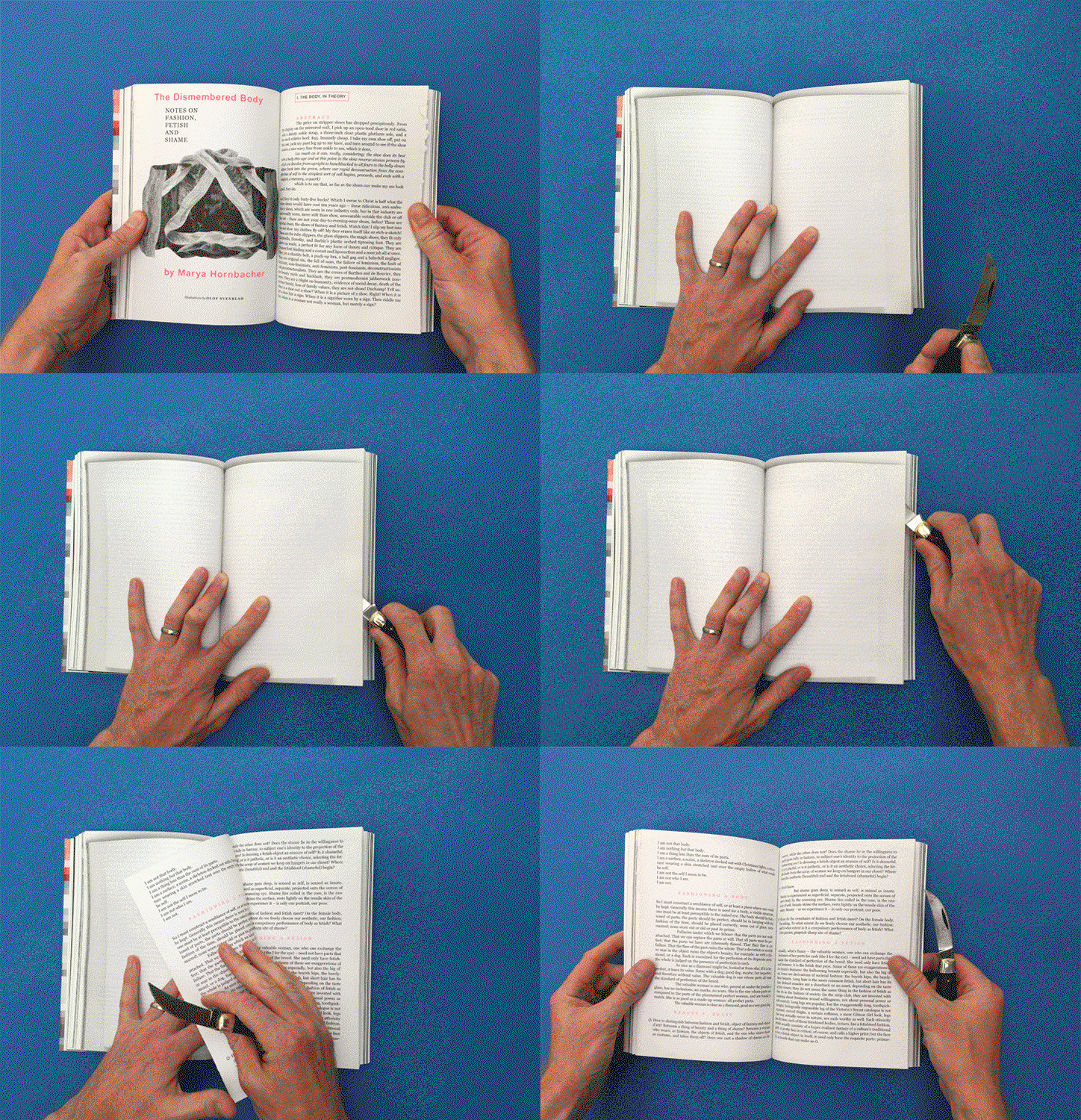
An animation in which a person’s hands flip through a book titled “The Dismembered Body” by Marya Hornbacher. They use a craft knife to cut through the pages of the open book against a blue background.

Vestoj (2012)

Each issue of Vestoj takes a conceptual, intellectual approach to fashion, and its third issue focuses on the subject of fashion and shame. It contains some brilliant writing on diverse subjects like prison uniforms and subservience, representations of race in fashion, and the constant presence of the naked body beneath clothes. My favourite part is a special section on fashion, fetish and shame, printed on pages that the reader has to literally cut open to read. It’s a powerful device, reminiscent of the Victorian novels that had to be cut open, and also a visceral act that obviously marks the magazine forever. And no, I still haven’t brought myself to cut all of them open…
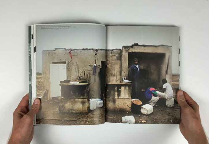
Two hands hold open a book to a double-page spread. The right page features a photograph of people gathered outside a weathered concrete building with open doorways.
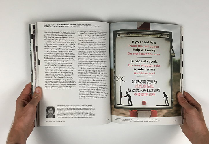
An open book held by two hands. The left page contains columns of text, while the right page shows a photo of a red emergency button with instructions in English, Spanish and Chinese.
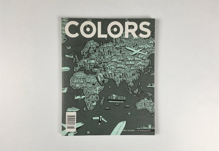
The cover of a magazine titled “Colors” features a detailed illustration of a world map. The map is filled with dense architectural structures and dotted with planes and ships.
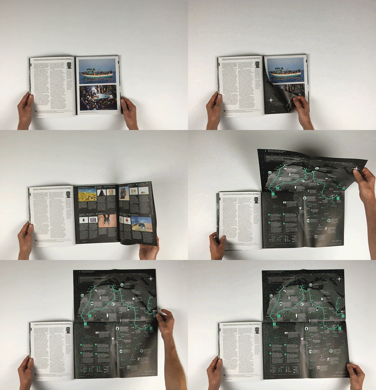
An animation in which a person flips through a book on a white surface. They unfold a large, dark grey map with glowing green lines and markers.

Colors (2014)

I could have chosen any number of examples from Colors, but the one that really sticks in my mind is the Moving House issue. This was the first thing I’d read anywhere about the 21st Century phenomenon that came to be known as the migrant crisis, and its big, fold-out pages full of maps, images and statistics showing some of the most common routes taken by refugees, asylum seekers and other vulnerable migrants do a brilliant job of communicating the scale and complexity of the problem. On the back cover it acknowledges that, “Forced to compress the globe onto a page, mapmakers must omit most information in order to make the rest intelligible,” but this remains one of the most illuminating and memorable magazines I’ve ever read.
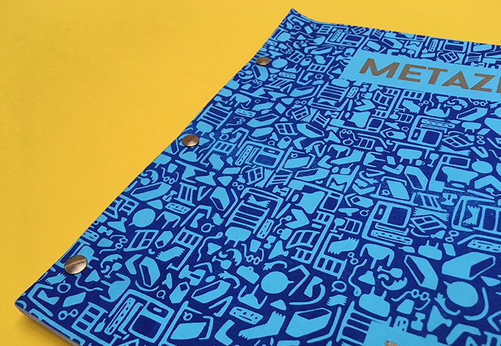
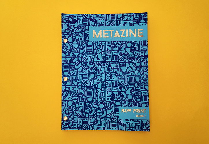
A blue folder with a dense, light blue pattern of electronic gadgets and tech components. The word “METAZI” is printed in large, gold letters in the top right corner.
A blue zine with a dense, doodle-style pattern of electronic gadgets and shapes. Gold foil text reads “METAZINE” at the top and “RAW PRINT ISSUE 1” at the bottom.
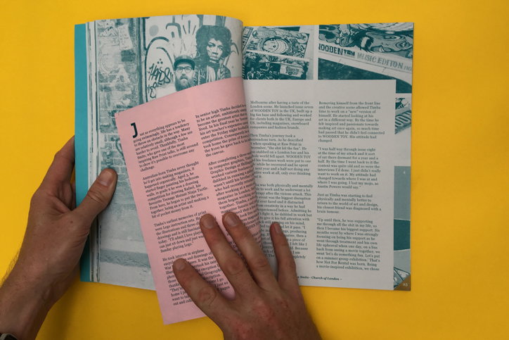
An open magazine spread features a profile of an artist. The left page shows a collage of sketches and a portrait of a person with curly hair, while the right page contains columns of text. Two hands hold the edges of the publication against a bright yellow background.
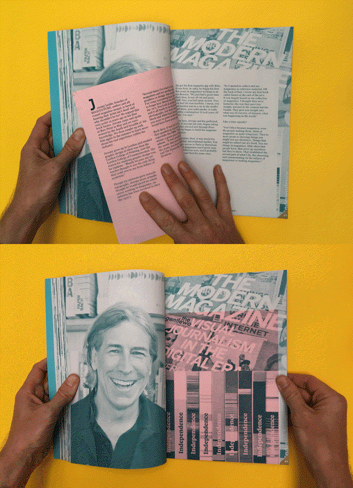
An animation in which a person’s hands flip through a magazine against a bright yellow background. The pages feature a portrait of a smiling person and bold text that reads “The Modern Magazine” and “Journalism in the Digital Era”.

Metazine (2015)

A magazine about magazines, Metazine is naturally interested in the physical print product. Its risoprinted pages are held together by a set of brass bolts, and inside a series of pink insets contain interviews with magazine makers, taken from the Raw Print events held in Nottingham from October 2014 – May 2015. It’s all handmade and there are various places where crop marks creep in or pages don’t quite align, but that all adds to the charm of this very personal passion project, run by Nottingham Trent lecturer Matt Gill and his students.
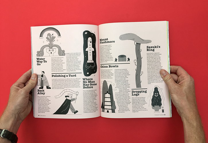
A person holds open an illustrated book against a bright red background. The pages feature a series of black and white drawings and text blocks with headings such as “Water Way To Go” and “Dropping Logs”.
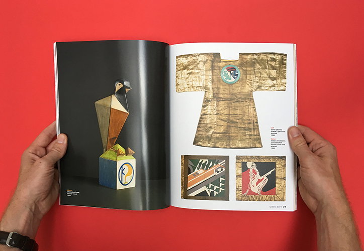
A person holds open a book against a bright red background. The left page shows a geometric sculpture on a blue plinth, while the right page features a gold-coloured garment and two square artworks.
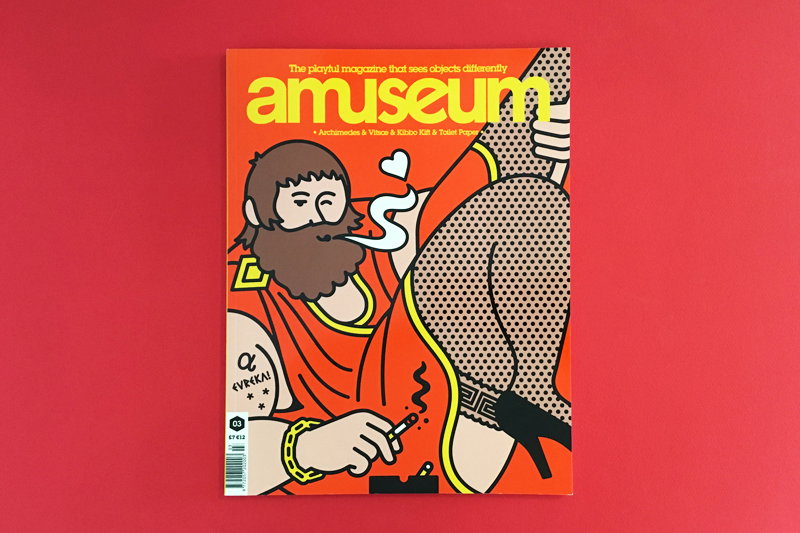
An illustration on the cover of “Amuseum” magazine shows a bearded figure in an orange robe. They look admiringly at a person’s leg and heel, while holding a cigarette.
An animation in which a person’s hands hold open a book against a red background. They slide a white rectangular piece of paper back and forth across a blurred, close-up image of a face.

Amuseum (2016)

We delivered this issue of Amuseum to our subscribers last year, and I love the sense of fun that runs through it. There’s a special section of toilet reading in the middle, literally all about toilets, and it kicks off with this cheeky spread illustrated by editor and art director Dan Stafford. (The flappy bit was originally going to be made of actual toilet paper, until the printers explained how difficult and expensive that would be.)
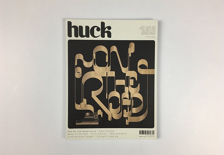
The cover of Huck magazine features the title “huck” in bold black lowercase letters. Below, the words “on the road” are rendered in a fluid, 3D metallic style against a black background.
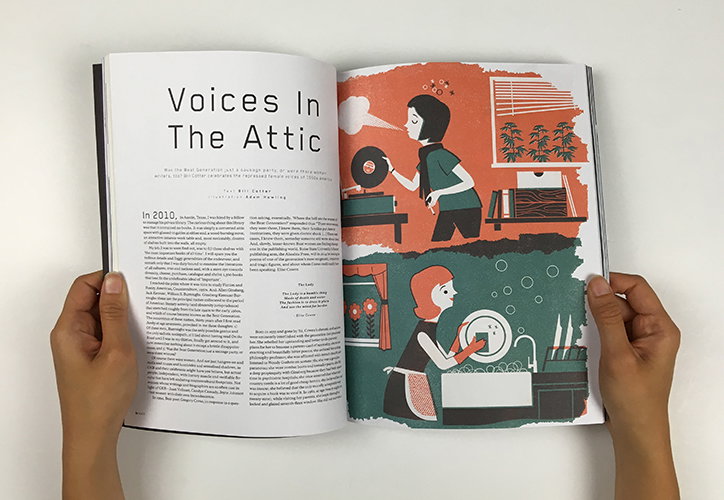
An open magazine displays a feature titled “Voices In The Attic”. The right-hand page features an illustration of two people in a room, one playing a vinyl record and another washing dishes.
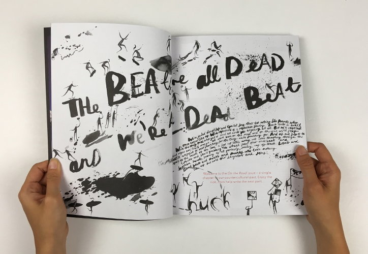
A person holds open a book featuring a black ink illustration across two pages. Large, expressive handwriting reads “The BEATles are all DEAD” and “we’re DEAD Beat”.
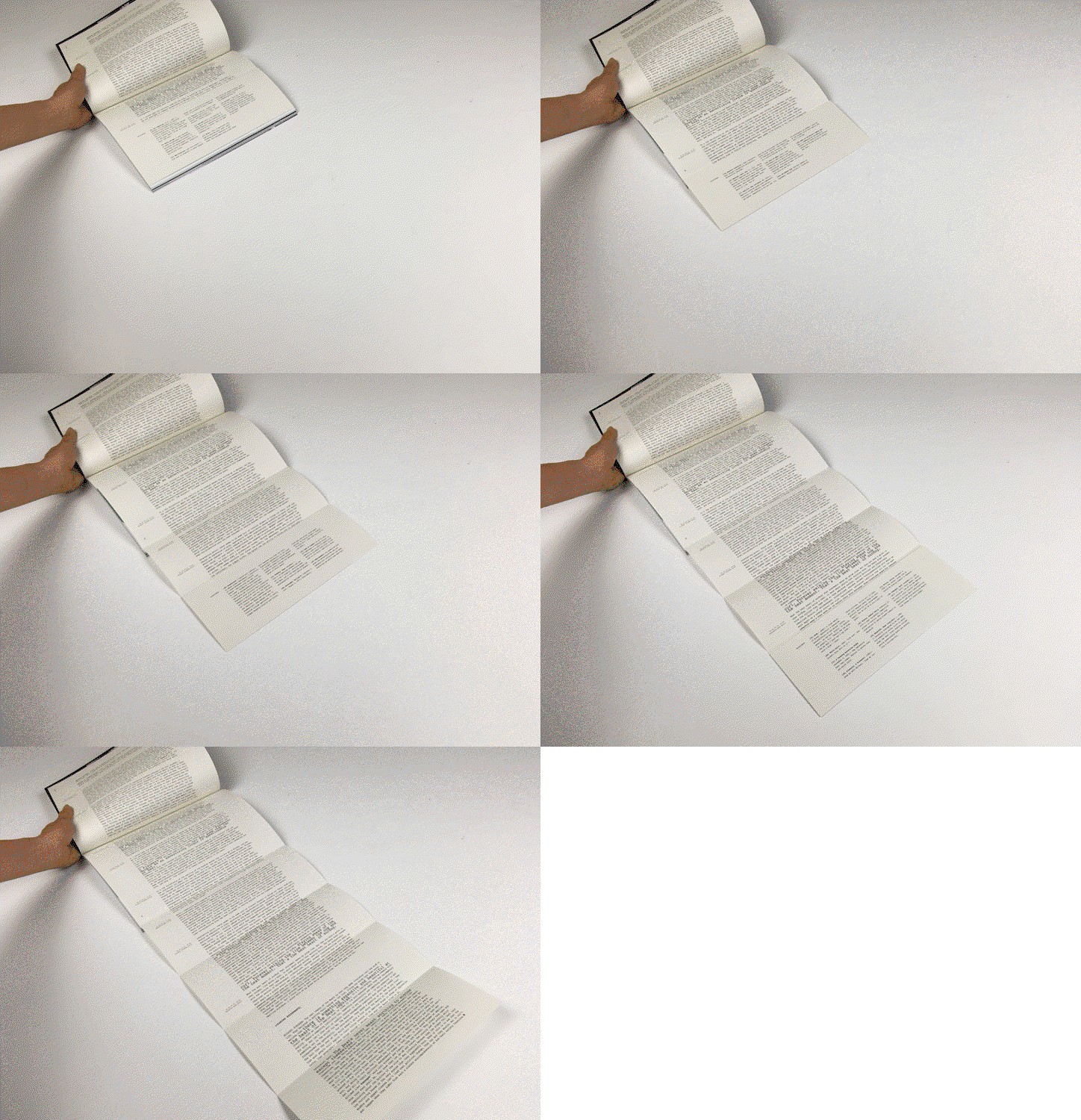
An animation in which a person’s hand unfolds a long, accordion-style book on a white surface. The pages are filled with dense columns of text.

Huck (2012)

For its On the Road issue, Huck wanted to recreate a sense of Kerouak’s legendary typewritten manuscript, so the makers produced this quadruple gatefold to hold an exchange between editor-at-large Mike Fordham and staff writer Tetsuhiko Endo. The reverse side of the extended pages contains a glossary of terms that reveals Huck’s enduring interests (more words are devoted to grappling with the definition of “Hipsterism” than are required for “Chomsky, Noam”, “Burroughs, William S” and “Baby Boomers” combined).
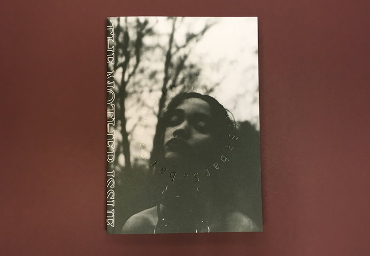
A black and white photograph on a book cover shows a person looking upwards against a backdrop of blurred trees. Stylised white text runs vertically down the left edge and curves around the person’s neck.
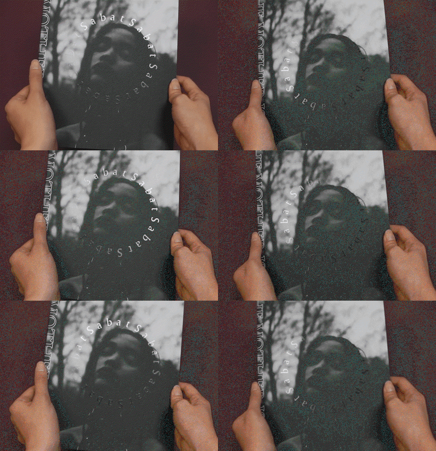
An animation in which two hands hold a grainy, black and white photograph of a person’s face against a backdrop of trees. The word “Sabat” appears and rotates in a circle around the central figure.
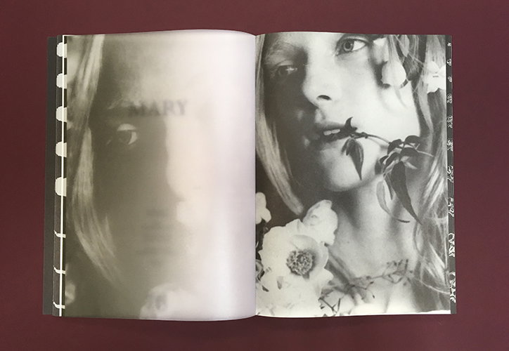
An open book shows two black and white portraits of a person. The left page is a soft-focus image with the word “MARY” printed across the face. The right page is a sharper close-up of the person with a flower stem held in their mouth.
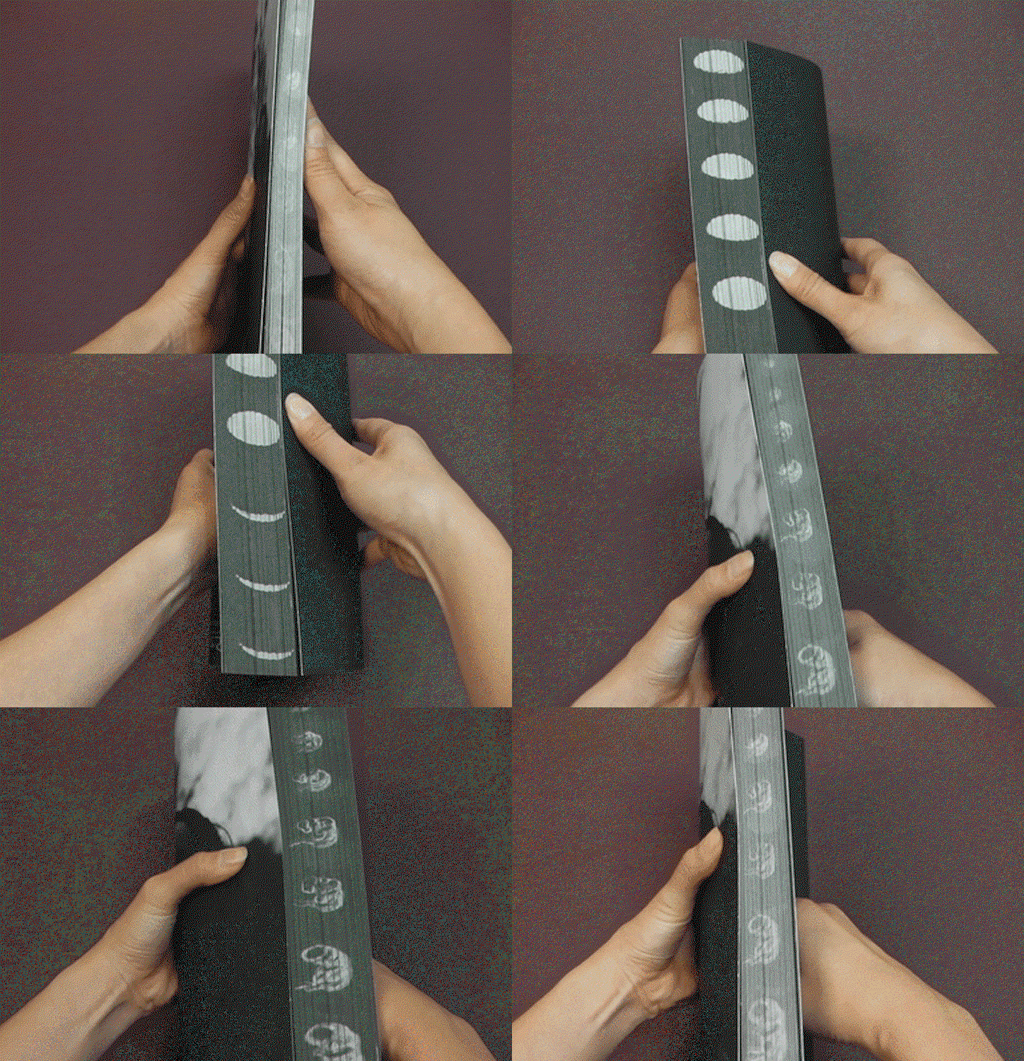
An animation in which a person holds a black book against a purple background. As they rotate the book, the white oval shapes on the spine shift to reveal a series of skull illustrations.

Sabat (2016)

A magazine of witchcraft, Sabat uses hidden elements to create a sense of the occult. For example last year’s Mother issue includes this moon / foetus detail, which creates a beautiful and very tactile symbol of regeneration and the passing of time, but only reveals itself when the magazine is being handled. Elsewhere in the issue there are transparent pages, hidden pentagrams and even the name on the cover of the magazine only reveals itself when it catches the light.

Share Article

About the Author

Steven Watson

—

Steven Watson started Stack in 2008 as a way of making it easier for people to read something new. He has spent the last 18 years surrounded by independent magazines, and he loves speaking and writing about them, and helping independent publishers to reach more readers.

It's Nice That Newsletters

Fancy a bit of It's Nice That in your inbox? Sign up to our newsletters and we'll keep you in the loop with everything good going on in the creative world.